A bee-swarm scatterplot illustrates decadal population changes by country from 1960s to 2020s, showcasing the percentage growth or decline for each decade
A4 Size Viz
World Bank
Interactive
Author
Aditya Dahiya
Published
May 24, 2024
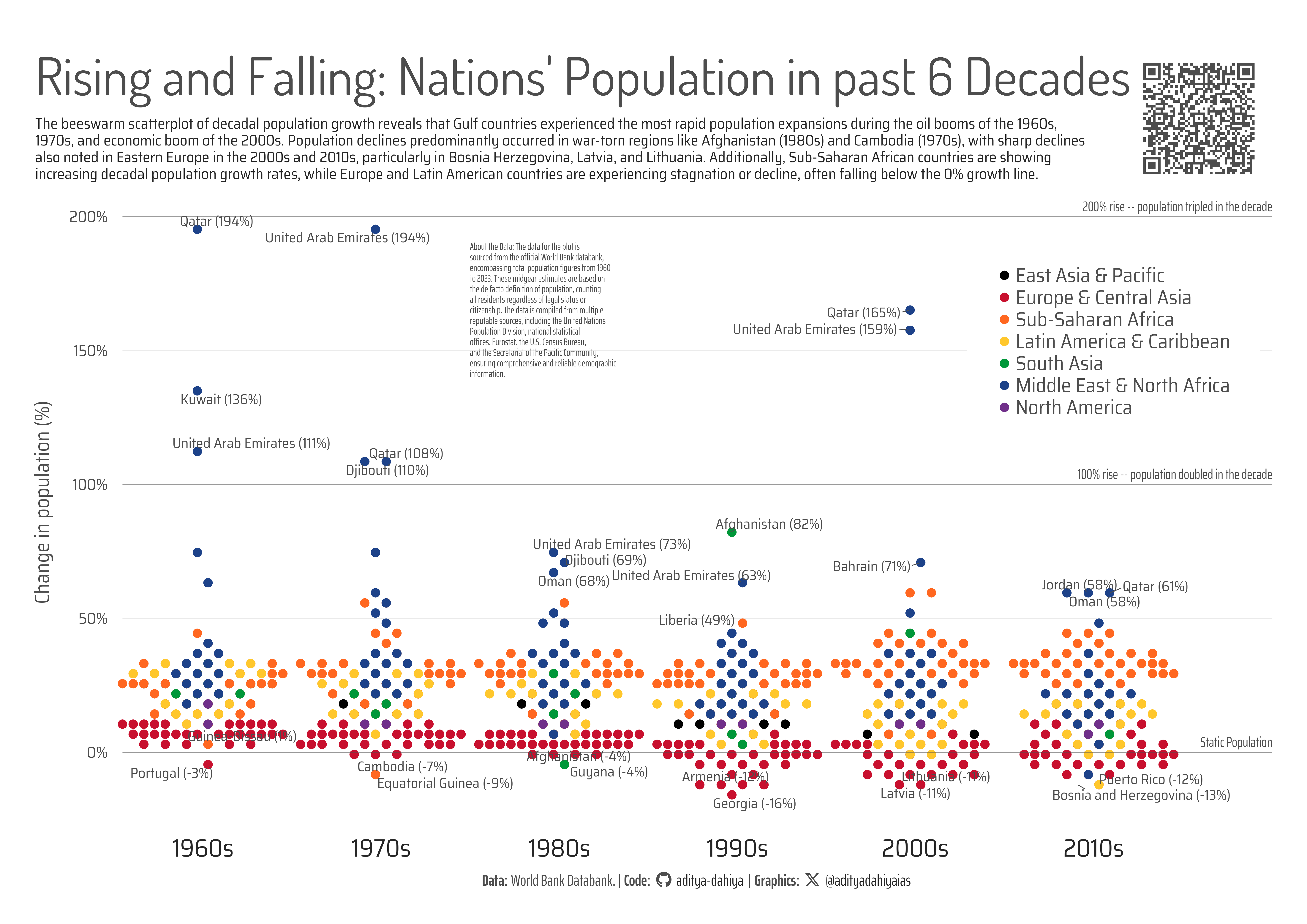
Rising and Falling: Nations’ Population in past 6 Decades
The graphic is a beeswarm scatter-plot illustrating the decadal population changes for each country from 1960 to 2020, based on data sourced from the official World Bankdatabank. This data, encompassing total population figures derived from midyear estimates, adheres to the de-facto population definition, counting all residents irrespective of legal status or citizenship. The data originates from multiple reputable sources, including the United Nations Population Division, various national statistical offices, Eurostat, the U.S. Census Bureau, and the Secretariat of the Pacific Community.
In the scatterplot, each column corresponds to a decade, with the y-axis representing the percentage change in population. Each dot signifies a country, color-coded by continent according to World Bank regions, effectively illustrating regional demographic trends over time. The plot also highlights and labels the most significant outliers, showcasing the three countries with the highest population increases and the two countries with the most substantial decreases for each decade, providing a clear visual representation of extreme demographic shifts across different periods.
This bee-swarm scatterplot illustrates decadal population changes by country from 1960s to 2020s, showcasing the percentage growth or decline for each decade. It reveals rapid population expansions in Gulf countries during economic booms and notable declines in war-torn and Eastern European nations, with color-coded dots representing different continents. The plot underscores the increasing growth rates in Sub-Saharan Africa and the stagnation or decline in Europe and Latin America.
An Interactive Version of the same chart
Code
# Data Import and Wrangling Toolslibrary(tidyverse) # All things tidylibrary(janitor) # Cleaning names etc.library(wbstats) # Fetching World Bank Data# Final plot toolslibrary(scales) # Nice Scales for ggplot2library(fontawesome) # Icons display in ggplot2library(ggtext) # Markdown text support for ggplot2library(showtext) # Display fonts in ggplot2library(gganimate) # For animation# Loading the datarawdf2 <-wb_data(indicator ="SP.POP.TOTL",start_date =1960,end_date =2023,return_wide =FALSE,gapfill =TRUE,mrv =65)# Correct Order of regions for plotting in coloursregion_levels <-c("East Asia & Pacific","Europe & Central Asia","Sub-Saharan Africa","Latin America & Caribbean","South Asia","Middle East & North Africa","North America")# Regions for the countrieslink_regions <- wbstats::wb_countries() |>select(iso2c, region) |>mutate(iso2c =str_to_lower(iso2c))# # Font for titles# font_add_google("Dosis",# family = "title_font"# ) # # # Font for the caption# font_add_google("Saira Extra Condensed",# family = "caption_font"# ) # # # Font for plot text# font_add_google("Saira Semi Condensed",# family = "body_font"# ) showtext_auto()# Background Colourbg_col <-"white"text_col <-"grey15"text_hil <-"grey30"mypal <- paletteer::paletteer_d("nbapalettes::nuggets_city2")# Base Text Sizebts <-10# Dataframe for this analysisdf3 <- rawdf2 |>select(country, iso2c, year = date, value) |>mutate(iso2c =str_to_lower(iso2c)) |>drop_na()# Not plotting very small territories with population below 750,000not_plot <- df3 |>filter(year ==2022) |>filter(value <7.5e5) |>pull(iso2c)# Decadal population risedecade_levels <-c("rise_overall","rise60s","rise70s","rise80s","rise90s","rise00s","rise10s")# Decade wise population rise in each countrydecade_df <- df3 |>filter(!(iso2c %in% not_plot)) |>mutate(year =paste0("y_", year)) |>pivot_wider(id_cols =c(country, iso2c),names_from = year,values_from = value ) |>mutate(rise_overall = (y_2023 - y_1961)/y_1961,rise60s = (y_1970 - y_1961)/y_1961,rise70s = (y_1980 - y_1971)/y_1971,rise80s = (y_1990 - y_1981)/y_1981,rise90s = (y_2000 - y_1991)/y_1991,rise00s = (y_2010 - y_2000)/y_2000,rise10s = (y_2020 - y_2010)/y_2010 ) |>select(country, iso2c, starts_with("rise")) |>pivot_longer(cols =-c(country, iso2c),names_to ="decade",values_to ="value" ) |>left_join(link_regions) |>mutate(decade =fct(decade, levels = decade_levels),region =fct(region, levels = region_levels) )# Selecting countries to highlight and annotate in the plot# Top 3 high rise countries each decadeselcon1 <- decade_df |>group_by(decade) |>slice_max(order_by = value, n =3) |>ungroup()# Bottom 2 countries in each decadeselcon2 <- decade_df |>group_by(decade) |>slice_min(order_by = value, n =2) |>ungroup()# Overall 10 most populous countriesselcon3 <- rawdf2 |>filter(date ==2022) |>slice_max(order_by = value, n =10) |>mutate(iso2c =str_to_lower(iso2c)) |>pull(iso2c)selcons <-bind_rows( selcon1, selcon2) |>mutate(to_show_text ="display")plotdf <- decade_df |>left_join(selcons) |>mutate(to_show_text =if_else(is.na(to_show_text),NA,paste0(country, " (", number(round(100*value), suffix ="%"),")") ) ) |>mutate(id_var =row_number())# Decadal rise overall for the worldoverall_decade_df <- df3 |>group_by(year) |>summarise(total_pop =sum(value, na.rm = T)) |>mutate(country ="World",year =paste0("y_", year), ) |>pivot_wider(id_cols = country,values_from = total_pop,names_from = year ) |>mutate(rise60s = (y_1970 - y_1961)/y_1961,rise70s = (y_1980 - y_1971)/y_1971,rise80s = (y_1990 - y_1981)/y_1981,rise90s = (y_2000 - y_1991)/y_1991,rise00s = (y_2010 - y_2000)/y_2000,rise10s = (y_2020 - y_2010)/y_2010,.keep ="none" ) |>pivot_longer(cols =everything(),names_to ="decade",values_to ="value" ) |>mutate(decade =fct(decade, levels = decade_levels))plot_title <-"Rising and Falling: Nations' Population in past 6 Decades"# Caption stuff for the plotsysfonts::font_add(family ="Font Awesome 6 Brands",regular = here::here("docs", "Font Awesome 6 Brands-Regular-400.otf"))github <-""github_username <-"aditya-dahiya"xtwitter <-""xtwitter_username <-"@adityadahiyaias"social_caption_1 <- glue::glue("<span style='font-family:\"Font Awesome 6 Brands\";'>{github};</span> <span style='color: {text_col}'>{github_username} </span>")social_caption_2 <- glue::glue("<span style='font-family:\"Font Awesome 6 Brands\";'>{xtwitter};</span> <span style='color: {text_col}'>{xtwitter_username}</span>")plot_caption <-paste0("**Data:** World Bank Databank. | ","**Code:** ", social_caption_1, " | **Graphics:** ", social_caption_2 )# Making an alternative for ggbeeswarm for interactivityplotdf0 <- plotdf |>mutate(y_value =round_to_fraction(value, 40))plotdf1 <- plotdf |>mutate(y_value =round_to_fraction(value, 40)) |>group_by(decade, y_value) |>slice_head(n =10) |>count() |>rename(gp_nos = n)# A position multiplication Factor (to manually create a beeswarm)position_vector <-seq(-0.4, +0.4, length.out =10)plotdf2 <- plotdf0 |>left_join(plotdf1) |>group_by(decade, y_value) |>arrange(decade, y_value) |>mutate(group_num =row_number()) |>mutate(y_jizz =case_when( group_num ==1~-0.04444444, group_num ==2~+0.04444444, group_num ==3~-0.13333333, group_num ==4~+0.13333333, group_num ==5~-0.22222222, group_num ==6~+0.22222222, group_num ==7~-0.31111111, group_num ==8~+0.31111111, group_num ==9~-0.40000000, group_num ==10~+0.40000000 )) |>mutate(y_var =as.numeric(decade) + y_jizz)bts =9library(ggiraph)g_base <- plotdf2 |>filter(decade !="rise_overall") |>ggplot(mapping =aes(x = y_var,y = y_value,label = country,colour = region,data_id = iso2c ) ) +# Beeswarm of the plot ggiraph::geom_point_interactive(mapping =aes(tooltip =paste0("Country: ", country,"\nRegion: ", region,"\nDecadal Population Change: ",round(value*100, 1), " %" ) ),pch =19,alpha =1,size =1.5, hover_nearest =FALSE ) +# Horizontal Line Annotationsgeom_hline(yintercept =1,colour = text_hil,linewidth =0.5,alpha =0.5 ) +annotate(geom ="text",label ="100% rise -- population doubled in the decade",x =8.1,y =1.02,# family = "caption_font",colour = text_hil,hjust =1,vjust =0,size = bts/2 ) +geom_hline(yintercept =2,colour = text_hil,linewidth =0.5,alpha =0.5 ) +annotate(geom ="text",label ="200% rise -- population tripled in the decade",x =8.1,y =2.02,# family = "caption_font",colour = text_hil,hjust =1,vjust =0,size = bts/2 ) +geom_hline(yintercept =0,colour = text_hil,linewidth =0.5,alpha =0.5 ) +annotate(geom ="text",label ="Static Population",x =8.1,y =0.02,# family = "caption_font",colour = text_hil,hjust =1,vjust =0,size = bts/2 ) +# Labelslabs(y ="Change in population (%)",x =NULL,colour =NULL,title = plot_title,caption = plot_caption,subtitle ="Hover over a dot to see Country details. Hover here to read about the Data Source." ) +# Scales and Coordinatesscale_color_manual_interactive(values = mypal,data_id =function(x) x, tooltip =function(x) x ) +scale_y_continuous(labels =label_percent() ) +scale_x_continuous(breaks =1:7,labels =c("", "1960s", "1970s", "1980s", "1990s", "2000s", "2010s"),limits =c(1.25, 8.15),expand =expansion(0) ) +coord_cartesian(clip ="off") +theme_minimal(# base_family = "body_font",base_size =20 ) +theme(legend.position ="inside",legend.position.inside =c(0.99, 0.92),panel.grid.minor.y =element_blank(),panel.grid.major.x =element_blank(),panel.grid.minor.x =element_blank(),legend.justification =c(1, 1),legend.text =element_text(colour = text_hil,# family = "body_font",size =1.5* bts ),legend.key.height =unit(2, "mm"),plot.title =element_text(size =3* bts,colour = text_hil,# family = "title_font" ),plot.subtitle =element_text_interactive(size =1.5* bts,colour = text_hil,# family = "title_font",data_id ="plot.subtitle",tooltip ="About the Data: The data for the plot is sourced from the official World Bank databank, encompassing total population figures from 1960 to 2023. These midyear estimates are based on the de facto definition of population, counting all residents regardless of legal status or citizenship. The data is compiled from multiple reputable sources, including the United Nations Population Division, national statistical offices, Eurostat, the U.S. Census Bureau, and the Secretariat of the Pacific Community, ensuring comprehensive and reliable demographic information." ),plot.caption =element_textbox(colour = text_hil,# family = "caption_font",hjust =0.5,size =1.5* bts ),panel.grid.major.y =element_line(linewidth =0.5 ),legend.background =element_rect(fill = bg_col,colour ="transparent" ),plot.title.position ="plot",axis.text.x =element_text(size =2* bts,colour = text_hil,margin =margin(0,0,0,0, "mm") ),axis.text.y =element_text(margin =margin(0,0,0,0, "mm"),size =1.5* bts ),axis.title =element_text(colour = text_hil,margin =margin(0,0,0,0, "mm"),size =1.5* bts ) )girafe(ggobj = g_base,options =list(opts_tooltip(opacity =1,css ="background-color:#ffffff;color:#333333;padding:2px;border-radius:3px;font-family:Arial" ),opts_hover(css ="stroke:black;stroke-width:3px;"),opts_hover_inv(css ="opacity:0.2;"),opts_zoom(max =10) ))
Figure 1: The beeswarm scatterplot of decadal population growth reveals that Gulf countries experienced the most rapid population expansions during the oil booms of the 1960s, 1970s, and economic boom of the 2000s. Population declines predominantly occurred in war-torn regions like Afghanistan (1980s) and Cambodia (1970s), with sharp declines also noted in Eastern Europe in the 2000s and 2010s, particularly in Bosnia Herzegovina, Latvia, and Lithuania. Additionally, Sub-Saharan African countries are showing increasing decadal population growth rates, while Europe and Latin American countries are experiencing stagnation or decline, often falling below the 0% growth line.
How I made these graphics?
Getting the data
Code
# Data Import and Wrangling Toolslibrary(tidyverse) # All things tidylibrary(janitor) # Cleaning names etc.library(wbstats) # Fetching World Bank Data# Final plot toolslibrary(scales) # Nice Scales for ggplot2library(fontawesome) # Icons display in ggplot2library(ggtext) # Markdown text support for ggplot2library(showtext) # Display fonts in ggplot2library(gganimate) # For animation
Setting Parameters
Code
# Font for titlesfont_add_google("Dosis",family ="title_font") # Font for the captionfont_add_google("Saira Extra Condensed",family ="caption_font") # Font for plot textfont_add_google("Saira Semi Condensed",family ="body_font") showtext_auto()# Background Colourbg_col <-"white"text_col <-"grey15"text_hil <-"grey30"mypal <- paletteer::paletteer_d("nbapalettes::nuggets_city2")# Base Text Sizebts <-20plot_title <-"Rising and Falling: Nations' Population in past 6 Decades"plot_subtitle <-str_wrap("The beeswarm scatterplot of decadal population growth reveals that Gulf countries experienced the most rapid population expansions during the oil booms of the 1960s, 1970s, and economic boom of the 2000s. Population declines predominantly occurred in war-torn regions like Afghanistan (1980s) and Cambodia (1970s), with sharp declines also noted in Eastern Europe in the 2000s and 2010s, particularly in Bosnia Herzegovina, Latvia, and Lithuania. Additionally, Sub-Saharan African countries are showing increasing decadal population growth rates, while Europe and Latin American countries are experiencing stagnation or decline, often falling below the 0% growth line.", 170)text1_annotate <-str_wrap("The population surges in the UAE, Qatar, and Kuwait during the 1960s, 1970s, and 2000s were driven primarily by the discovery and exploitation of vast oil reserves, leading to rapid economic growth and significant infrastructure development. This economic boom attracted a large influx of foreign workers and expatriates to support the burgeoning industries.", 40)text2_annotate <-str_wrap("About the Data: The data for the plot is sourced from the official World Bank databank, encompassing total population figures from 1960 to 2023. These midyear estimates are based on the de facto definition of population, counting all residents regardless of legal status or citizenship. The data is compiled from multiple reputable sources, including the United Nations Population Division, national statistical offices, Eurostat, the U.S. Census Bureau, and the Secretariat of the Pacific Community, ensuring comprehensive and reliable demographic information.", 50)# Caption stuff for the plotsysfonts::font_add(family ="Font Awesome 6 Brands",regular = here::here("docs", "Font Awesome 6 Brands-Regular-400.otf"))github <-""github_username <-"aditya-dahiya"xtwitter <-""xtwitter_username <-"@adityadahiyaias"social_caption_1 <- glue::glue("<span style='font-family:\"Font Awesome 6 Brands\";'>{github};</span> <span style='color: {text_col}'>{github_username} </span>")social_caption_2 <- glue::glue("<span style='font-family:\"Font Awesome 6 Brands\";'>{xtwitter};</span> <span style='color: {text_col}'>{xtwitter_username}</span>")plot_caption <-paste0("**Data:** World Bank Databank. | ","**Code:** ", social_caption_1, " | **Graphics:** ", social_caption_2 )
Data Wrangling
Code
library(wbstats)link_regions <- wbstats::wb_countries() |>select(iso2c, region) |>mutate(iso2c =str_to_lower(iso2c))df3 <- rawdf2 |>select(country, iso2c, year = date, value) |>mutate(iso2c =str_to_lower(iso2c)) |>drop_na()# Not plotting very small territories with population below 750,000not_plot <- df3 |>filter(year ==2022) |>filter(value <7.5e5) |>pull(iso2c)# A treemap to show how many coutnries lie within population of some# of the most populous countries# countries_to_visualize <- df3 |> # filter(year == 2022) |> # slice_max(order_by = value, n = 10) |> # pull(iso2c)# # too_small_countries <- df3 |> # filter(year == 2022) |> # filter(value < 1e5) |> # pull(country)# # df3 |> # mutate(# country = if_else(# iso2c %in% countries_to_visualize,# country,# "Others"# )# ) |> # group_by(year, country) |> # summarize(value = sum(value, na.rm = TRUE)) |> # ungroup() |> # ggplot(aes(x = year, y = value, fill = country, group = country)) +# ggstream::geom_stream(type = "proportional", colour = "white")# # # df3 |> # visdat::vis_miss()# # big_country <- "India"# view_year <- 2023# # total_pop_to_fill <- df3 |> # filter(year == view_year & country == big_country) |> # pull(value)# # plotdf3 <- df3 |> # filter(year == view_year) |> # arrange(value) |> # mutate(cumsum_value = cumsum(value)) |> # filter(cumsum_value <= total_pop_to_fill)# # plotdf3 |> # ggplot(aes(area = value, fill = country)) +# treemapify::geom_treemap(colour = "white") +# labs(# title = paste0("The scale of ", big_country, "'s population"),# subtitle = paste0("Population of ", # big_country, # " in ", view_year, ": ",# number(total_pop_to_fill, big.mark = ","),# "\n",# nrow(plotdf3), # " countries combined have lower population than ", # big_country)# ) +# theme_void() +# theme(# legend.position = "none",# plot.title = element_text(hjust = 0.5)# )# A new thought stream - decadal population risedecade_levels <-c("rise_overall","rise60s","rise70s","rise80s","rise90s","rise00s","rise10s")# Decade wise population rise in each countrydecade_df <- df3 |>filter(!(iso2c %in% not_plot)) |>mutate(year =paste0("y_", year)) |>pivot_wider(id_cols =c(country, iso2c),names_from = year,values_from = value ) |>mutate(rise_overall = (y_2023 - y_1961)/y_1961,rise60s = (y_1970 - y_1961)/y_1961,rise70s = (y_1980 - y_1971)/y_1971,rise80s = (y_1990 - y_1981)/y_1981,rise90s = (y_2000 - y_1991)/y_1991,rise00s = (y_2010 - y_2000)/y_2000,rise10s = (y_2020 - y_2010)/y_2010 ) |>select(country, iso2c, starts_with("rise")) |>pivot_longer(cols =-c(country, iso2c),names_to ="decade",values_to ="value" ) |>left_join(link_regions) |>mutate(decade =fct(decade, levels = decade_levels),region =fct(region, levels = region_levels) )# Selecting countries to highlight and annotate in the plot# Top 3 high rise countries each decadeselcon1 <- decade_df |>group_by(decade) |>slice_max(order_by = value, n =3) |>ungroup()# Bottom 2 countries in each decadeselcon2 <- decade_df |>group_by(decade) |>slice_min(order_by = value, n =2) |>ungroup()# Overall 10 most populous countriesselcon3 <- rawdf2 |>filter(date ==2022) |>slice_max(order_by = value, n =10) |>mutate(iso2c =str_to_lower(iso2c)) |>pull(iso2c)selcons <-bind_rows( selcon1, selcon2) |>mutate(to_show_text ="display")plotdf <- decade_df |>left_join(selcons) |>mutate(to_show_text =if_else(is.na(to_show_text),NA,paste0(country, " (", number(round(100*value), suffix ="%"),")") ) )# Decadal rise overall for the worldoverall_decade_df <- df3 |>group_by(year) |>summarise(total_pop =sum(value, na.rm = T)) |>mutate(country ="World",year =paste0("y_", year), ) |>pivot_wider(id_cols = country,values_from = total_pop,names_from = year ) |>mutate(rise60s = (y_1970 - y_1961)/y_1961,rise70s = (y_1980 - y_1971)/y_1971,rise80s = (y_1990 - y_1981)/y_1981,rise90s = (y_2000 - y_1991)/y_1991,rise00s = (y_2010 - y_2000)/y_2000,rise10s = (y_2020 - y_2010)/y_2010,.keep ="none" ) |>pivot_longer(cols =everything(),names_to ="decade",values_to ="value" ) |>mutate(decade =fct(decade, levels = decade_levels))