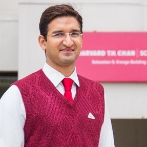
Hello! I’m Aditya Dahiya, a health financing and data visualization enthusiast with a penchant for making sense of the world’s messy data. I’ve been lucky enough to study MBBS and live at AIIMS, New Delhi, and earn a Master of Public Health from Harvard University — experiences that taught me the importance of both precision and perspective. Along the way, I’ve also been honored with a Fulbright Fellowship, which, while impressive on paper, mostly taught me how much there still is to learn!
When I’m not wading through the endless sea of paperwork at my job in Haryana’s bureaucracy, you can find me diving into my true passion: turning complex data into captivating visual tales. With R as my trusty sidekick—especially ggplot2—I strive to make the complicated a tad less daunting and a lot more delightful!
So feel free to browse through my presentations, reports, charts, or, other works. I hope you’ll find some clarity and maybe even a bit of fun in the visuals I’ve created. After all, who says data can’t be interesting?
