Key Learnings from, and Solutions to the exercises in Chapter 8 of the book Geocomputation with R by Robin Lovelace, Jakub Nowosad and Jannes Muenchow.
Geocomputation with R
Textbook Solutions
Author
Aditya Dahiya
Published
March 2, 2025
In this chapter, I use {tmap} (Tennekes 2018a), but I also use {ggplot2}(Wickham 2016) to produce equivalent maps, as produced by {tmap}(Tennekes 2018b) in the textbook. In addition, I use {cols4all}(Tennekes and Puts 2023) palettes for colour and fill scales. I am using pacman for quick loading and updating of packages.
Code
pacman::p_load( sf, # Simple Features in R terra, # Handling rasters in R tidyterra, # For plotting rasters in ggplot2 tidyverse, # All things tidy; Data Wrangling magrittr, # Using pipes with raster objects spData, # Spatial Datasets spDataLarge, # Large Spatial Datasets patchwork, # Composing plots gt, # Display GT tables with R tmap, # Using {tmap} for maps cols4all # Colour Palettes)# nz_elev = rast(system.file("raster/nz_elev.tif", package = "spDataLarge"))# install.packages("spDataLarge", repos = "https://geocompr.r-universe.dev")
9.1 Introduction
Cartography is a crucial aspect of geographic research, blending communication, detail, and creativity.
Static maps in R can be created using the plot() function, but advanced cartography benefits from dedicated packages.
The chapter focuses in-depth on the tmap package rather than multiple tools superficially.
Some example colour palettes to use in maps is shown below in Table 1.
Grammar of graphics: Like ggplot2, tmap follows a structured approach, separating input data from aesthetics (visual properties). Example, shown in Figure 1 .
Basic structure: Uses tm_shape() to define the input dataset (vector or raster), followed by layer elements like tm_fill() and tm_borders().
Layering approach:
tm_fill(): Fills (multi)polygon areas.
tm_borders(): Adds border outlines to (multi)polygons.
tm_polygons(): Combines fill and border.
tm_lines(): Draws lines for (multi)linestrings.
tm_symbols(): Adds symbols for points, lines, and polygons.
tm_raster(): Displays raster data.
tm_rgb(): Handles multi-layer rasters.
tm_text(): Adds text labels.
Layering operator: The + operator is used to add multiple layers.
Quick maps: qtm() provides a fast way to generate thematic maps (qtm(nz) ≈ tm_shape(nz) + tm_fill() + tm_borders()).
Limitations of qtm(): Less control over aesthetics, so not covered in detail in this chapter.
fill_alpha, col_alpha: Transparency for fill and border.
Applying aesthetics:
Use a column name to map a variable. Pass a character string referring to a column name.
Use a fixed value for constant aesthetics.
Additional arguments for visual variables:
.scale: Controls representation on the map and legend.
.legend: Customizes legend settings.
.free: Defines whether each facet uses the same or different scales.
Code
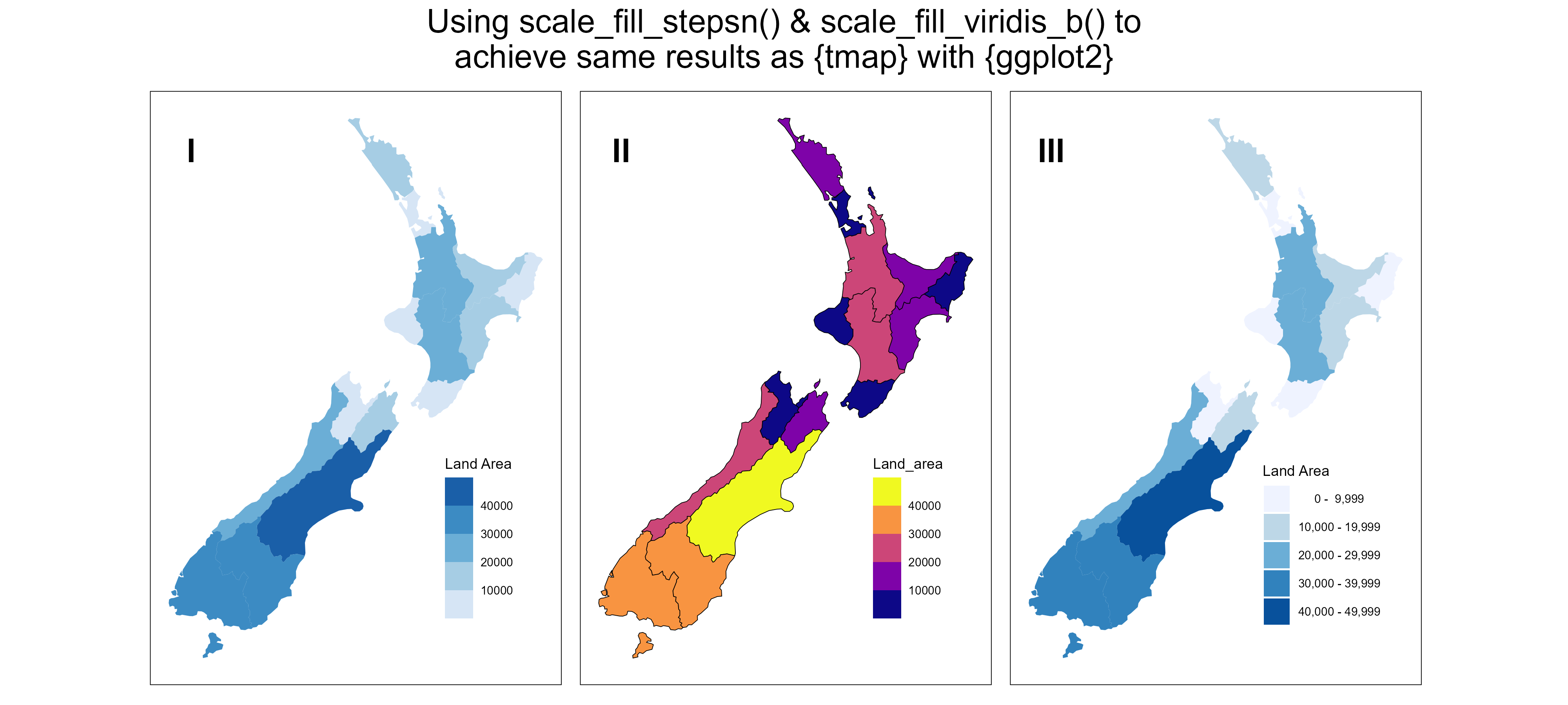
g1 <-ggplot() +geom_sf(data = nz,mapping =aes(fill = Land_area),colour ="transparent" ) +scale_fill_stepsn(colors =c4a(palette ="brewer.blues", type ="seq"),name ="Land Area" ) + ggthemes::theme_map() +theme(legend.position ="inside",legend.position.inside =c(0.9, 0.1),legend.justification =c(1, 0),panel.background =element_rect() )g2 <-ggplot() +geom_sf(data = nz,mapping =aes(fill = Land_area),colour ="black" ) + ggthemes::theme_map() +theme(legend.position ="inside",legend.position.inside =c(0.9, 0.1),legend.justification =c(1, 0),panel.background =element_rect() ) +scale_fill_viridis_b(option ="C")# If we want to replicate the {tmap} style bin labels, wiht {ggplot2},# some manual code in required (Credits: Grok3)# Load the New Zealand datanz <- spData::nz# Define bin widthbin_width <-10000# Determine breaks based on the data rangebreaks <-seq(from =floor(min(nz$Land_area) / bin_width) * bin_width, to =ceiling(max(nz$Land_area) / bin_width) * bin_width, by = bin_width )# Create labels for the binslabels <-paste0(format(breaks[-length(breaks)], big.mark =","), " - ", format(breaks[-1] -1, big.mark =",") )# Bin the land area datanz <- nz |>mutate(binned_land_area =cut( nz$Land_area, breaks = breaks, labels = labels, include.lowest =TRUE ) )# Generate colors for the binsn_bins <-length(levels(nz$binned_land_area))mypal <- cols4all::c4a(palette ="brewer.blues", n = n_bins)g3 <-ggplot() +geom_sf(data = nz,mapping =aes(fill = binned_land_area),colour ="transparent" ) +scale_fill_manual(values = mypal,name ="Land Area" ) + ggthemes::theme_map() +theme(legend.position ="inside",legend.position.inside =c(0.9, 0.1),legend.justification =c(1, 0),panel.background =element_rect(),legend.margin =margin(0,0,0,0, "pt"),legend.key =element_rect(colour =NA ),legend.text =element_text(hjust =0 ) )g <- g1 + g2 + g3 +plot_annotation(tag_levels ="I",title ="Using scale_fill_stepsn() & scale_fill_viridis_b() to\nachieve same results as {tmap} with {ggplot2}",theme =theme(plot.title =element_text(hjust =0.5,lineheight =0.9,size =20 ) ) ) &theme(plot.tag.location ="panel",plot.tag.position =c(0.1, 0.9),plot.tag =element_text(face ="bold",size =20 ) )ggsave(filename = here::here("book_solutions", "images", "chapter9-2-3.png"),plot = g,height =1800,width =4000,units ="px")
Figure 3
9.2.4 Scales
Scales define how values are visually represented in maps and legends, depending on the selected visual variable (e.g., fill.scale, col.scale, size.scale).
Default scale is tm_scale(), which auto-selects settings based on input data type (factor, numeric, integer).
Default values for visual variables can be checked with tmap_options().
Three main colour palette types:
Categorical: distinct colours for unordered categories (e.g., land cover classes).
Sequential: gradient from light to dark, for continuous numeric variables.
Diverging: two sequential palettes meeting at a neutral reference point (e.g., temperature anomalies).
Key considerations for colour choices:
Perceptibility: colours should match common associations (e.g., blue for water, green for vegetation).
Accessibility: use colour-blind-friendly palettes where possible.
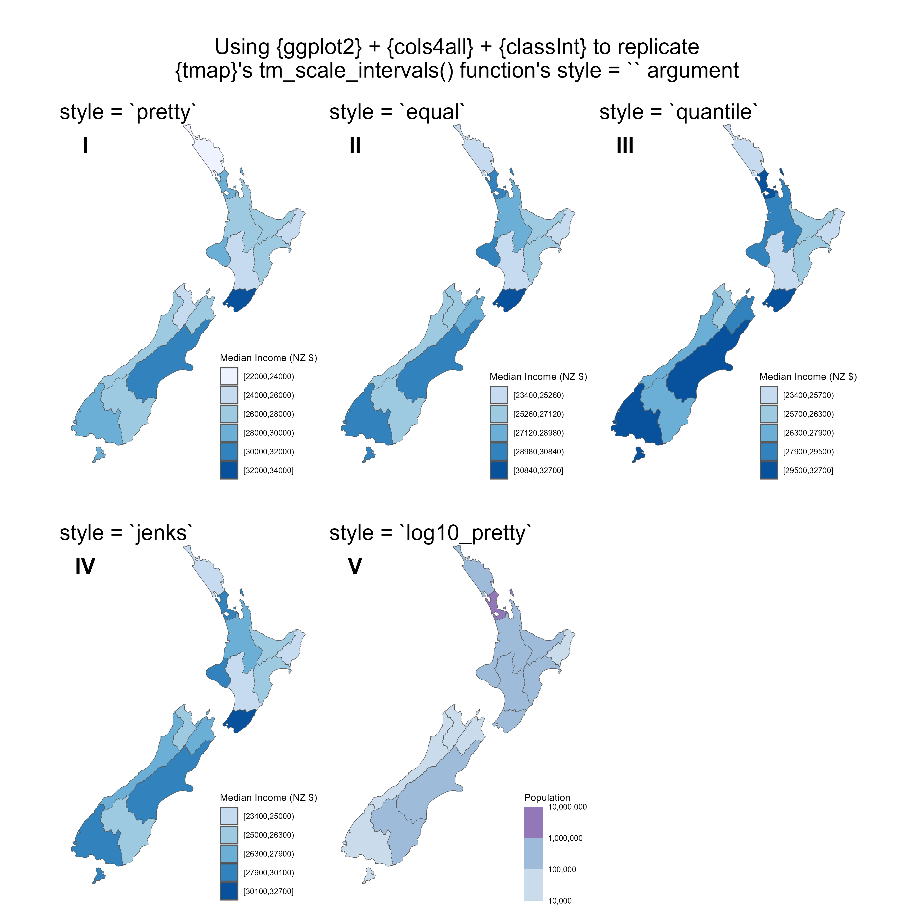
Use of classInt::classify_intervals() for Binned Data in Maps
The classify_intervals() function from the classInt package in R is a powerful tool for visualizing continuous data in maps, such as choropleth maps. It assigns values of a continuous variable—like population density or income levels—to discrete intervals based on break points calculated by methods like Jenks or quantiles using classIntervals(). This classification enables the data to be paired with a discrete color scale, simplifying the interpretation of spatial patterns and variations across regions. For instance, after determining breaks with classIntervals(), classify_intervals() can categorize each region’s value into a bin, producing a factor suitable for plotting with libraries like ggplot2 or tmap, enhancing map readability with clear legend ranges (e.g., “10,000 - 20,000”).
Available Styles in classIntervals() and Their Uses
Below is a table summarizing the classification styles available in classIntervals() and their practical applications:
Style
Description
Use Case
fixed
Uses user-defined, fixed break points.
Custom intervals, such as policy-driven thresholds.
equal
Splits the data range into equal-width intervals.
Uniformly distributed data or when equal ranges are significant.
pretty
Rounds breaks to “nice” numbers for readability.
Visually appealing breaks for general audience maps.
quantile
Ensures each interval has roughly equal observation counts.
Skewed data distributions to show spread effectively.
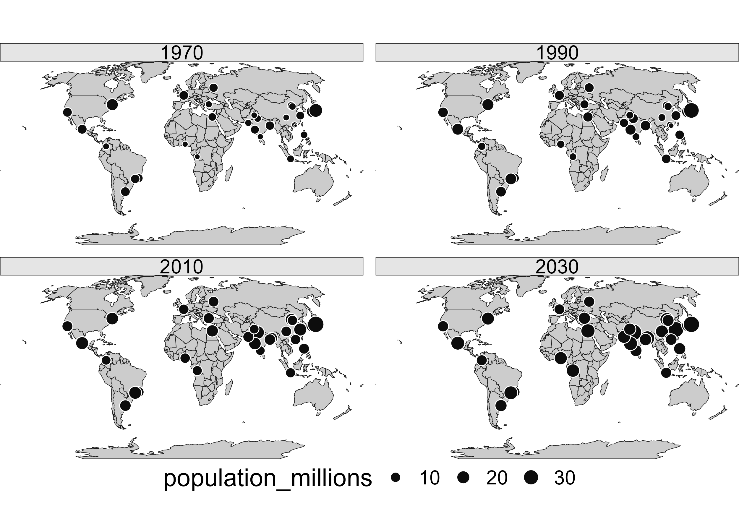
Figure 7: Faceted map showing the top 30 largest urban agglomerations from 1970 to 2030 based on population projections by the United Nations.
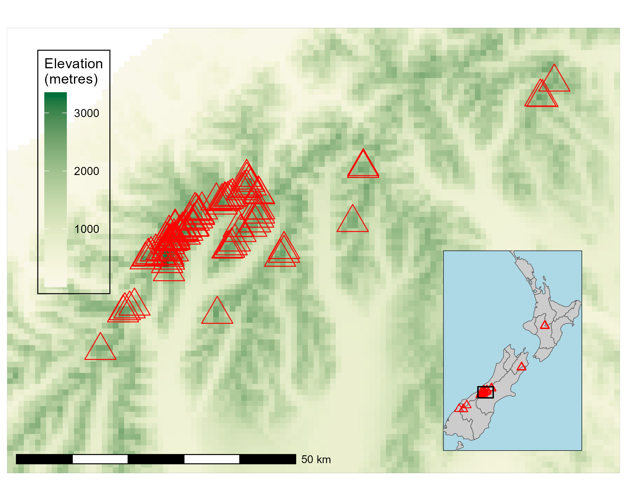
9.2.8 Inset maps
Inset maps are smaller maps embedded within or alongside a main map to provide geographic context, focus on specific areas, or represent non-contiguous regions.
Common Uses:
Show the location of a zoomed-in area within a larger region.
Compare non-contiguous areas, such as Hawaii and Alaska with the mainland USA.
Display complementary information on the same area (e.g., different themes or topics).
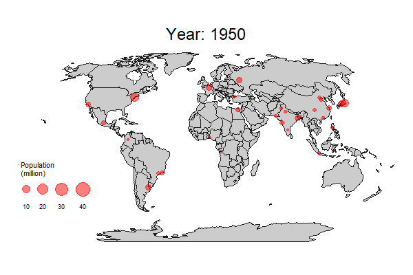
Figure 9: Global Urban Agglomerations (1950–2030): Shows the evolution of the world’s 30 largest cities.
Code
pacman::p_load( tidyverse, sf, historydata, lubridate, gganimate, scales)# pacman::p_install_gh("ropensci/USAboundaries")pacman::p_load_gh("ropensci/USAboundaries")# Step 1: Dates up to year 2000unique_years <-unique(historydata::us_state_populations$year)dates <-as.Date(paste0(unique_years, "-01-01"))dates <- dates[dates <=as.Date("2000-12-31")]# Step 2: Prepare population datastate_pop <- us_state_populations %>%select(year, state, population) %>%rename(name = state)# Step 3: Fetch and join boundaries by yearboundary_list <-map(dates, function(date) { states <-us_states(map_date = date) year_val <-year(date)if (date ==as.Date("2000-12-31")) year_val <-2010 states <- states %>%mutate(year = year_val) %>%left_join(state_pop %>%filter(year == year_val), by =c("name", "year"))})# Step 4: Combine all yearsusb_all <-bind_rows(boundary_list)# Step 5: Filter contiguous US and projectusb_all <- usb_all %>%filter(!str_detect(name, "Alaska|Hawaii")) %>%# Convert to NAD27 / US National Atlas Equal Area projectionst_transform("EPSG:9311") |>select(name, area_sqmi, terr_type, year, population) |>drop_na()rm(boundary_list, state_pop, dates, unique_years)# Can we make it simpler for easier animation plottingobject.size(usb_all) |>print(units ="Kb")usb_all |>st_simplify(dTolerance =5000) |>object.size() |>print(units ="Kb")year_levels <- usb_all |>st_drop_geometry() |>distinct(year) |>pull(year) |>as.character()plotdf <- usb_all |>st_simplify(dTolerance =5000) |>mutate(year =fct(as.character(year), levels = year_levels))g <- plotdf |>ggplot() +geom_sf(mapping =aes(fill = population) ) +scale_fill_stepsn(n.breaks =6,nice.breaks = T,limits =c(0, 30e6),oob = scales::squish,colours = paletteer::paletteer_d("ggprism::viridis", direction =-1),name ="Population",labels = scales::label_number(scale_cut =cut_short_scale()) ) +labs(title ="US State Populations in {closest_state}") +theme_void(base_size =16 ) +theme(legend.position ="inside",legend.position.inside =c(0.02, 0.02),legend.justification =c(0,0),legend.direction ="vertical",legend.title.position ="top",legend.text.position ="right",plot.title =element_text(hjust =0.5,size =30 ),legend.key.size =unit(30, "pt") ) +transition_states(year)anim_save( g, width =900, height =600, filename = here::here("book_solutions", "images", "chapter9-2-10.gif"),fps =4, duration =15,end_pause =2 )
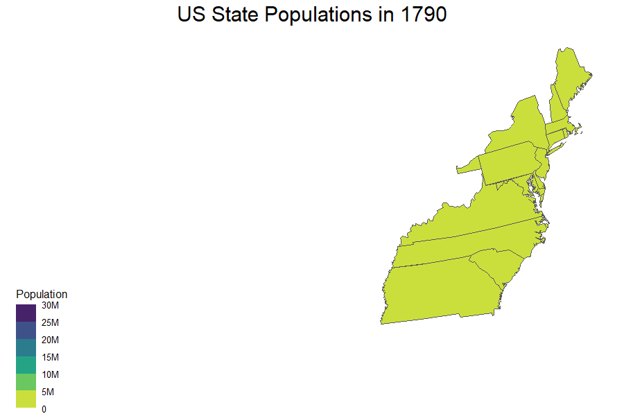
Figure 10: U.S. States Development (1790–2010): Depicts U.S. state formation and population growth over time.
9.4 Interactive Maps
Interactive maps enhance user engagement beyond static or animated maps by enabling actions like zooming, panning, clicking for pop-ups, tilting, and linking sub-plots (Pezanowski et al., 2018).
Slippy maps, or interactive web maps, are the most important kind. They became popular in R after the release of the leaflet package in 2015, which wraps the Leaflet.js library.
Several R packages build on Leaflet:
tmap: Offers both static and interactive maps using the same syntax.
Use tmap_mode("view") to switch to interactive mode.
Interactive features include tm_basemap() and synchronized facets with tm_facets_wrap(sync = TRUE).
Switch back with tmap_mode("plot").
mapview: A user-friendly one-liner for quick interactive visualization.
Provides GIS-like features (mouse position, scale bar, attribute queries).
Supports layering via + operator and works well with sf/SpatRaster objects.
Can auto-color attributes with zcol and supports alternate rendering backends (leafgl, mapdeck).
mapdeck: Leverages Deck.gl and WebGL for high-performance visualization.
Supports 2.5D views (tilt, rotate, extrude data).
Suitable for very large datasets (millions of points).
All interactive maps are rendered in the browser and are highly extensible and responsive, suitable for exploratory data analysis and presentation.
9.5 Mapping Applications
Limitations of Static Web Maps
While interactive web maps (e.g., those made with Leaflet) allow panning, zooming, and clicking, they are inherently static in terms of content and interface.
Web maps struggle to scale with large datasets.
Creating dashboards or visualizations with additional interactivity (e.g., graphs, filters) is difficult within the static web map paradigm.
Create a map showing the geographic distribution of the Human Development Index (HDI) across Africa with base graphics (hint: use plot()) and tmap packages (hint: use tm_shape(africa) + ...).
Name two advantages of each based on the experience.
Name three other mapping packages and an advantage of each.
Bonus: create three more maps of Africa using these three other packages.
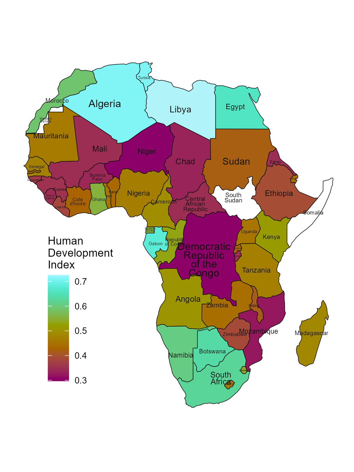
This solution creates a choropleth map of Africa showing the Human Development Index (HDI) distribution using ggplot2 and the geom_sf() function. The code demonstrates advanced mapping techniques by combining filled polygons colored by HDI values with country labels sized proportionally to their geographic area. Key features include using the Hawaii color palette for an aesthetically pleasing gradient, wrapping long country names for better readability, and positioning the legend strategically to avoid overlapping with the continent.
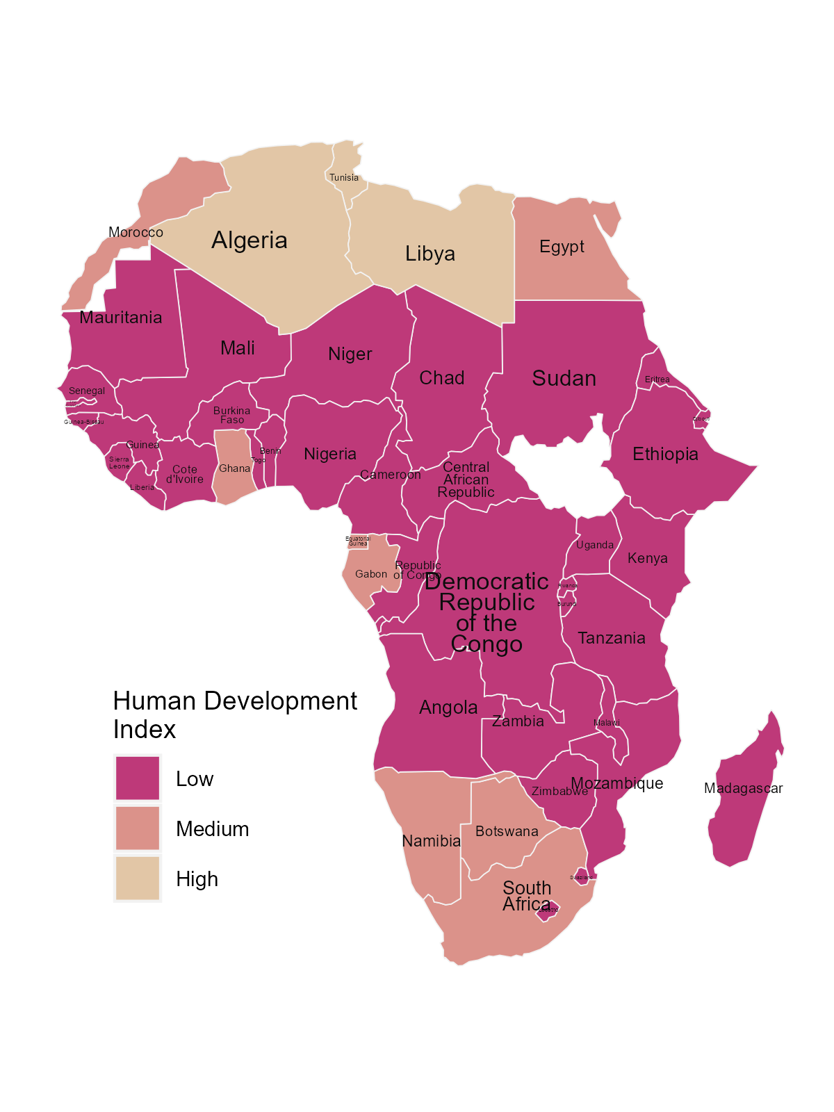
Extend the tmap created for the previous exercise so the legend has three bins: “High” (HDI above 0.7), “Medium” (HDI between 0.55 and 0.7) and “Low” (HDI below 0.55). Bonus: improve the map aesthetics, for example by changing the legend title, class labels and color palette.
This solution transforms the continuous HDI values into categorical bins using case_when() to create three meaningful groups: “High” (above 0.7), “Medium” (0.55-0.7), and “Low” (below 0.55). The code enhances the map’s visual appeal by implementing a custom color palette from the paletteer package, positioning the legend inside the plot area, and adding country labels with text wrapping and size scaling based on country area for better readability.
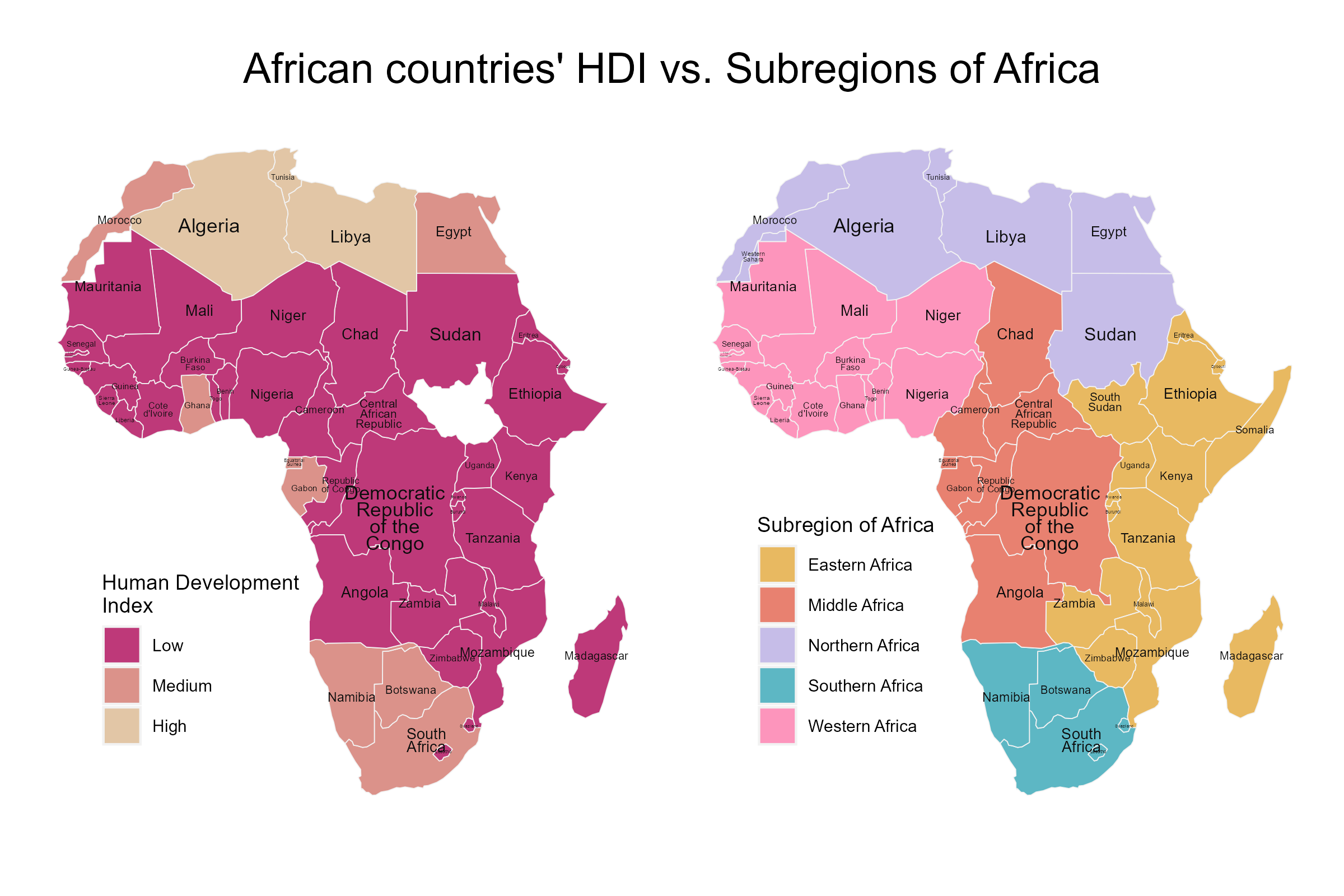
Represent africa’s subregions on the map. Change the default color palette and legend title. Next, combine this map and the map created in the previous exercise into a single plot.
This solution creates a choropleth map of Africa colored by subregion, using a custom color palette and positioned legend, then combines it with the previous HDI map using patchwork. The code calculates country areas to size the text labels appropriately, applies the “sylvie” color palette from the paletteer package for better visual distinction between subregions, and uses plot_annotation() to add a unified title across both maps in the composite visualization.
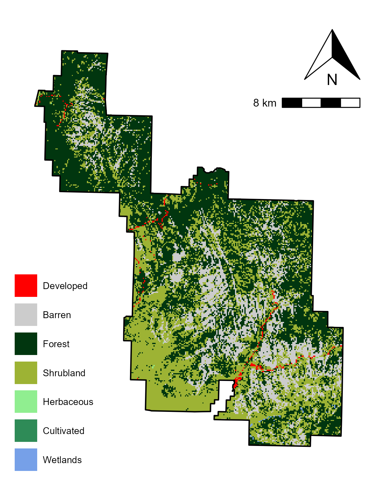
Change the default colors to match your perception of the land cover categories
Add a scale bar and north arrow and change the position of both to improve the map’s aesthetic appeal
Bonus: Add an inset map of Zion National Park’s location in the context of the state of Utah. (Hint: an object representing Utah can be subset from the us_states dataset.)
This solution creates a land cover map of Zion National Park by masking the National Land Cover Database (NLCD) raster data to the park boundaries and applying custom colors that intuitively represent different land cover types. The code transforms the park boundary to match the raster’s coordinate reference system, extracts the relevant land cover categories, and assigns meaningful colors (red for developed areas, various greens for vegetation types, blue for water, etc.). The map includes essential cartographic elements like a scale bar and north arrow positioned in the top-right corner, with the legend placed in the bottom-left to optimize the overall layout and visual appeal.
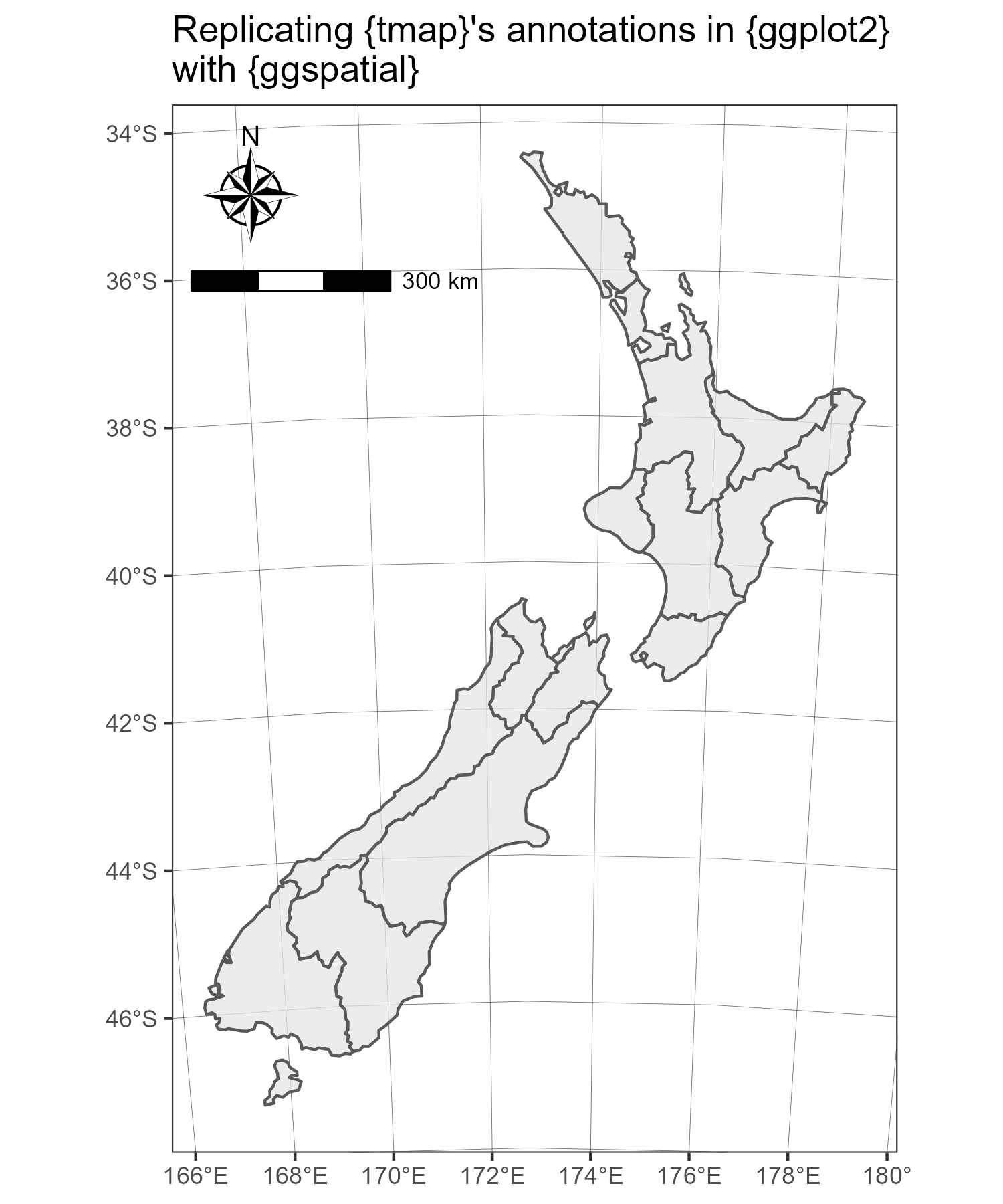
Reproduce Figure 9.1 and Figure 9.7 as closely as possible using the ggplot2 package.
E11.
Join us_states and us_states_df together and calculate a poverty rate for each state using the new dataset. Next, construct a continuous area cartogram based on total population. Finally, create and compare two maps of the poverty rate: (1) a standard choropleth map and (2) a map using the created cartogram boundaries. What is the information provided by the first and the second map? How do they differ from each other?
E12.
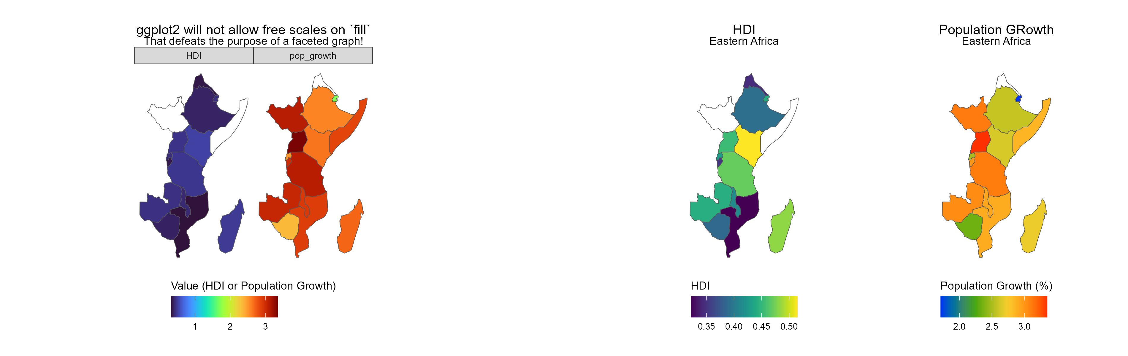
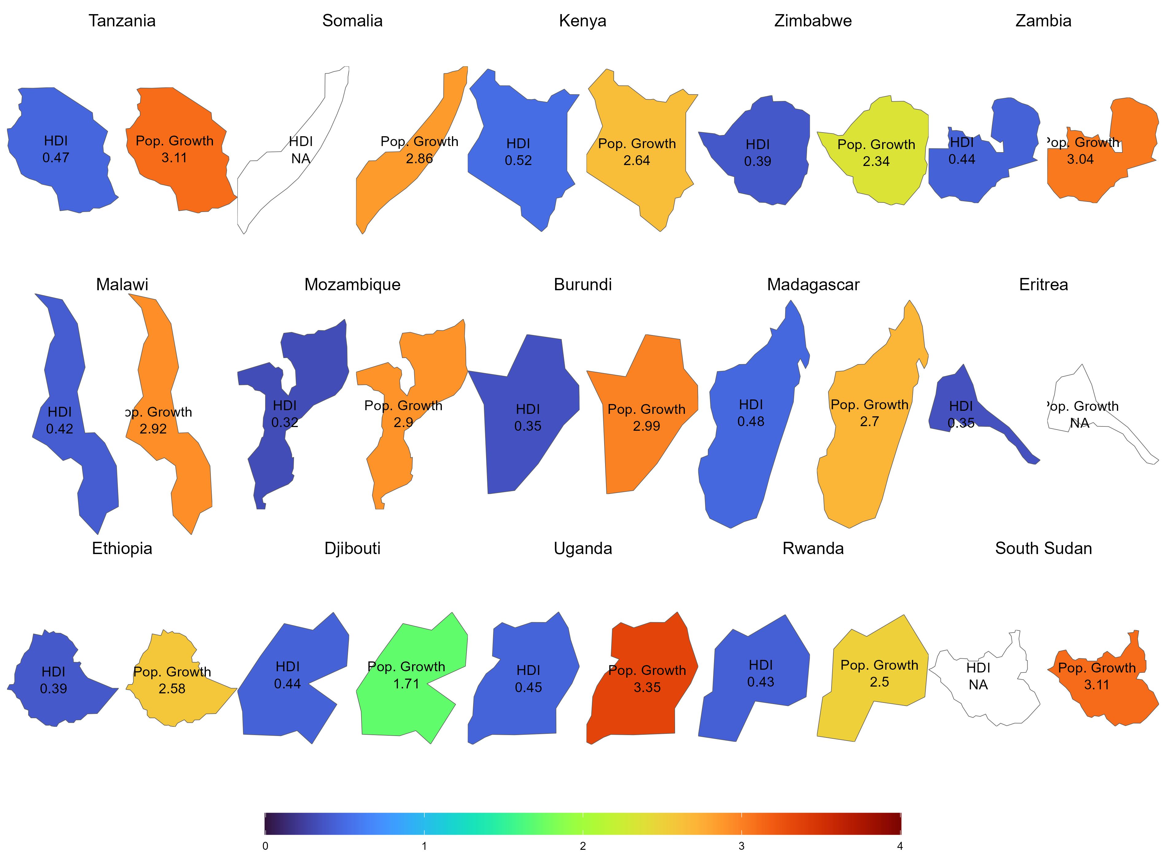
Visualize population growth in Africa. Next, compare it with the maps of a hexagonal and regular grid created using the geogrid package.