# Data Import and Wrangling Toolslibrary(tidyverse) # All things tidylibrary(sf) # Handling simple features in Rlibrary(terra) # Handling rasters in Rlibrary(tidyterra) # Rasters with ggplot2# Final plot toolslibrary(scales) # Nice Scales for ggplot2library(fontawesome) # Icons display in ggplot2library(ggtext) # Markdown text in ggplot2library(showtext) # Display fonts in ggplot2library(colorspace) # Lighten and Darken colours# Package to explorelibrary(geodata) # Geospatial Databts =12# Base Text Sizesysfonts::font_add_google("Saira Condensed", "body_font")showtext::showtext_auto()theme_set(theme_minimal(base_size = bts,base_family ="body_font" ) +theme(text =element_text(colour ="grey20",lineheight =0.3,margin =margin(0,0,0,0, "pt") ) ))# Some basic caption stuff# A base Colourbg_col <-"white"seecolor::print_color(bg_col)# Colour for highlighted texttext_hil <-"grey30"seecolor::print_color(text_hil)# Colour for the texttext_col <-"grey20"seecolor::print_color(text_col)# Caption stuff for the plotsysfonts::font_add(family ="Font Awesome 6 Brands",regular = here::here("docs", "Font Awesome 6 Brands-Regular-400.otf"))github <-""github_username <-"aditya-dahiya"xtwitter <-""xtwitter_username <-"@adityadahiyaias"social_caption_1 <- glue::glue("<span style='font-family:\"Font Awesome 6 Brands\";'>{github};</span> <span style='color: {text_hil}'>{github_username} </span>")social_caption_2 <- glue::glue("<span style='font-family:\"Font Awesome 6 Brands\";'>{xtwitter};</span> <span style='color: {text_hil}'>{xtwitter_username}</span>")plot_caption <-paste0("**Data**: {geodata} package "," | **Code:** ", social_caption_1, " | **Graphics:** ", social_caption_2 )rm(github, github_username, xtwitter, xtwitter_username, social_caption_1, social_caption_2)
Exploring the average monthly temperature climate data for Greenland
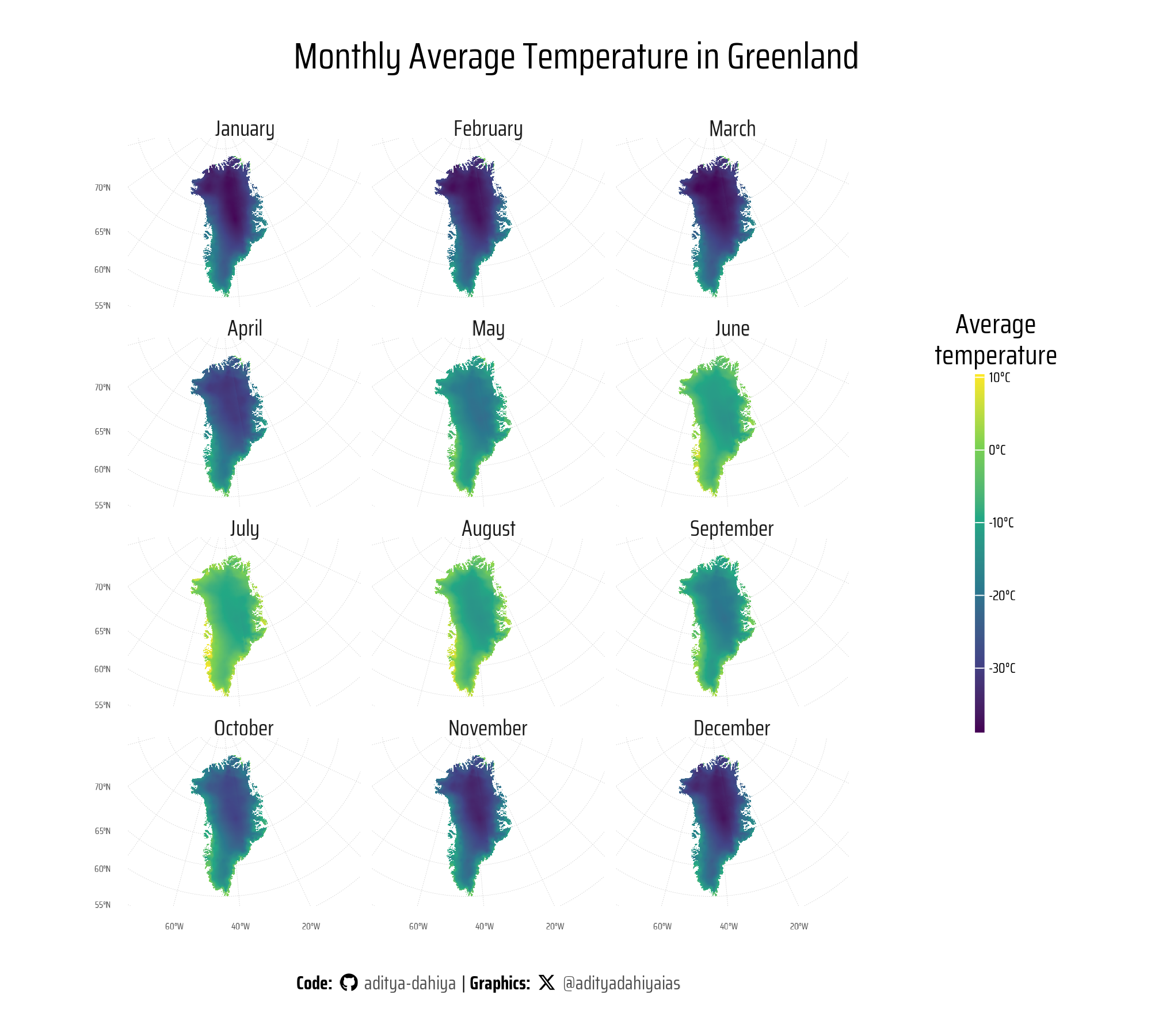
This code visualizes monthly average temperature data for Greenland using geospatial data and ggplot2 in R, leveraging key functions from the {geodata} package. The geodata::gadm() function is used to download Greenland’s administrative boundaries as vector data, which is processed into a simple feature object with sf::st_as_sf(). The geodata::worldclim_country() function retrieves average temperature climate data for Greenland. The climate data is aggregated for lower resolution using terra::aggregate(), cropped to Greenland’s boundaries with terra::crop(), and masked with terra::mask() to match the vector boundary. It is then reprojected to a North Pole Stereographic projection using terra::project(). A faceted ggplot ( Figure 1 ) is created to visualize temperature data across all 12 months, with color gradients representing temperature values, styled with a minimal theme.
Code
# Get Greenland's boundariesgreenland_vector <- geodata::gadm(country ="Greenland",path =tempdir(),resolution =2) |>st_as_sf()vec1 <- greenland_vector |>st_union() |>st_as_sf()# ggplot(greenland_vector) +# geom_sf()# Get Average Temperature Climate Data for Greenlanddf1 <-worldclim_country(country ="Greenland",var ="tavg",path =tempdir())# Studying the layers: there are 12 - for the 12 monthsdf1df1 |>crs() |>str_view()# Lower resolution for initial plots, and crop by Vector Mapdf2 <- df1 |> terra::aggregate(fact =10, fun = mean) |> terra::crop(vec1) |> terra::mask(vec1)# Project into CRS: North Pole Stereographicdf3 <- df2 |>project("EPSG:3413", method ="bilinear")strip_labels <- month.namenames(strip_labels) <-names(df2)g <-ggplot() +geom_spatraster(data = df3 ) +scale_fill_viridis_c(na.value ="transparent",labels =function(x) paste0(x, "°C"), ) +facet_wrap(~lyr,labeller =labeller(lyr = strip_labels),ncol =3,nrow =4 ) +coord_sf(clip ="off" ) +labs(title ="Monthly Average Temperature in Greenland",fill ="Average\ntemperature",caption = plot_caption ) +theme_minimal(base_family ="body_font",base_size = bts *3 ) +theme(axis.text =element_text(size = bts, margin =margin(0,0,0,0, "pt") ),axis.ticks.length =unit(0, "pt"),strip.text =element_text(margin =margin(0,0,0,0, "pt") ),panel.grid =element_line(linewidth =0.1,linetype =3,colour ="grey80" ),legend.position ="right",panel.spacing =unit(5, "pt"),panel.background =element_rect(fill ="transparent",colour ="transparent" ),# Legend Correctionslegend.title =element_text(margin =margin(0,0,3,0, "pt"),lineheight =0.3,hjust =0.5 ),legend.text =element_text(margin =margin(0,0,0,2, "pt"),size =18 ),legend.margin =margin(0,0,0,0, "pt"),legend.box.margin =margin(0,0,0,0, "pt"),legend.key.width =unit(4, "pt"),legend.key.height =unit(30, "pt"),plot.caption =element_textbox(hjust =0.5,size = bts *2 ),plot.title =element_text(size = bts *4,hjust =0.5 ),plot.title.position ="plot" )ggsave(plot = g,filename = here::here("geocomputation", "images", "geodata_package_1.png" ),height =1800,width =2000,units ="px",bg ="white")
Figure 1: Monthly Average Temperatures Across Greenland: showcasing temperature gradients for each month using a North Pole Stereographic projection.
Getting Elevation data with {geodata} and plotting sea level rise
This code demonstrates the simulation of various sea level rise scenarios using elevation data and visualizes the resulting impact on global landmass through raster manipulation and plotting. It leverages the elevation_global() function to obtain global elevation raster data, with a resolution of 10 arc-seconds. The if_else() function is used to simulate sea level rise scenarios by adjusting elevation data based on thresholds (1m, 10m, 50m, 100m, and 200m). The manipulated elevation data is then stored as layers in a raster object created with rast() from the terra package.
The raster is reprojected into an aesthetically pleasing projection (ESRI:54030) using project() for better visualization. The final map is plotted with ggplot(), incorporating the geom_spatraster() layer to display raster data and facet_wrap() to present the different scenarios.
Code
# Getting blobale elevation raster datage_raw <-elevation_global(res =10,path =tempdir())# Simulating Sea Leave Rise by different heightselev_tibble <-tibble(base =values(ge_raw),rise_1 =if_else(base <1, NA, base),rise_10 =if_else(base <10, NA, base),rise_40 =if_else(base <50, NA, base),rise_80 =if_else(base <100, NA, base),rise_100 =if_else(base <200, NA, base))# Make a blank raster of World Map sizege1 <-rast(nrow =dim(ge_raw)[1],ncol =dim(ge_raw)[2],nlyrs =ncol(elev_tibble))# Add values from the tibble to different layers of # the newly created rastervalues(ge1) <-as.matrix(elev_tibble)# Reproject Raster into a nice projection ge1 <- ge1 |>project("ESRI:54030")# Earlier Attempts that did not work# ge1 <- ge_raw# sea_level_rise = 1 # In metres# values(ge1) <- if_else(# values(ge_raw) < sea_level_rise,# NA,# values(ge_raw)# )# # paste0("ge", sea_level_rise) |> # assign(ge_raw)# strip_labels <-c("Current Sea Level",paste0("Rise by ", c(1, 10, 50, 100, 200), " metres"))names(strip_labels) <-paste0("lyr.", 1:6)g <-ggplot() +geom_spatraster(data = ge1 ) +facet_wrap(~lyr, ncol =2,labeller =labeller(lyr = strip_labels) ) +scale_fill_wiki_c(na.value ="lightblue" ) +coord_sf(clip ="off") +labs(title ="World Map: scenarios with rise in Sea Levels",subtitle ="Simulating different levels of sea level rise, and effect of landmass using simple raster arithmetic",caption = plot_caption,fill ="Elevation above sea level (m)" ) +theme_minimal(base_size =2* bts,base_family ="body_font" ) +theme(plot.margin =margin(0,0,0,0, "pt"),panel.spacing =unit(2, "pt"),legend.position ="bottom",legend.title.position ="top",panel.grid =element_blank(),plot.caption =element_textbox(hjust =0.5,margin =margin(5,0,5,0, "pt"),size = bts ),plot.title =element_text(margin =margin(15,0,0,0, "pt"),hjust =0.5,face ="bold" ),plot.subtitle =element_text(margin =margin(5,0,0,0, "pt"),hjust =0.5,size = bts *1.5 ),strip.text =element_text(margin =margin(2,0,-1,0, "pt"),face ="bold" ),legend.key.height =unit(5, "pt"),legend.box.margin =margin(-10,0,3,0, "pt"),legend.margin =margin(-10,0,0,0, "pt"),legend.title =element_text(margin =margin(0,0,2,0, "pt"),hjust =0.5 ),legend.text =element_text(margin =margin(1,0,0,0, "pt"),hjust =0.5,size = bts ) )ggsave(plot = g,filename = here::here("geocomputation", "images", "geodata_package_2.png" ),height =1150,width =1000,units ="px",bg ="lightblue")
An elevation map of the world plotted using geom_spatraster() which shows 6 facets - each with a different scenario of sea level rise with global warming - current levels, 1 m, 10 m, 50 m, 100 m and 200 m - drawn with simple raster arithmetic. The world is projected in Robinson Projection (ESRI:54030) to make is aesthetically pleasing.
Doing the same map for Europe
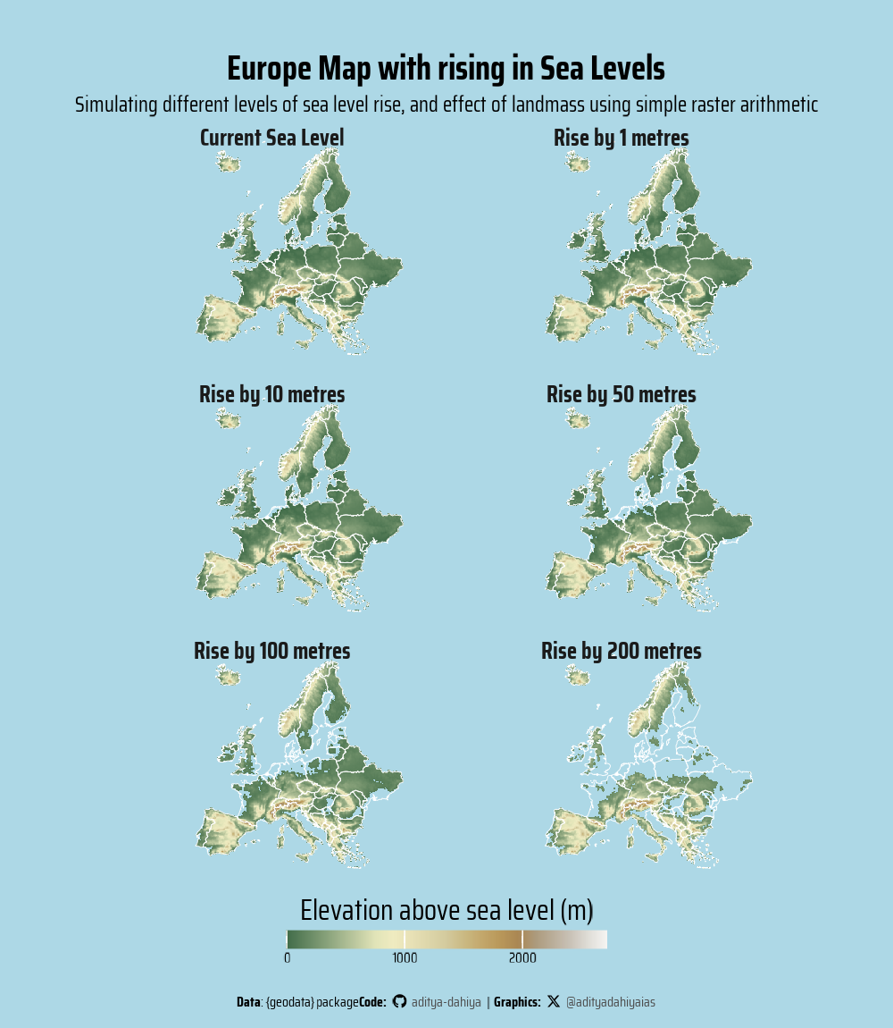
This code extends the sea level rise simulation to the European region by refining the raster data and restricting it to the continent’s boundaries. It first retrieves global elevation data using elevation_global(), then defines a bounding box to exclude distant islands and ensure a focused analysis on mainland Europe.
To obtain vector data for European countries, ne_countries() from the rnaturalearth package is used, selecting only relevant attributes. Unlike the previous global analysis, this visualization applies the ETRS89 / LAEA Europe projection (EPSG:32633) using project() to maintain spatial accuracy for the European context. The final visualization integrates raster data using geom_spatraster() and overlays country borders (shown in white colour) with geom_sf(), providing a detailed view of how landmass is affected by rising sea levels.
Code
# Getting global elevation raster datage_raw <-elevation_global(res =10,path =tempdir())# Create a bounding box to remove far off islands in Europebounding_box <-st_bbox(c(xmin =-25, xmax =45, ymin =31, ymax =70),crs ="EPSG:4326")# Get Vector Data on European Countrieseurope <- rnaturalearth::ne_countries(continent ="Europe",returnclass ="sf",scale ="medium") |>select(name, iso_a3, geometry) |>filter(!(name %in%c("Russia"))) |>st_crop(bounding_box)ggplot(europe) +geom_sf()whole_europe <- europe |>st_union() |>st_as_sf()# Check the mapggplot(whole_europe) +geom_sf()# Crop the global Elevation rasterge_europe <- ge_raw |> terra::crop(whole_europe) |> terra::mask(whole_europe)ggplot() +geom_spatraster(data = ge_europe)# Simulating Sea Leave Rise by different heightselev_tibble <-tibble(base =values(ge_europe),rise_1 =if_else(base <1, NA, base),rise_10 =if_else(base <10, NA, base),rise_40 =if_else(base <50, NA, base),rise_80 =if_else(base <100, NA, base),rise_100 =if_else(base <200, NA, base))# Make a blank raster of World Map sizege1 <-rast(nrow =dim(ge_europe)[1],ncol =dim(ge_europe)[2],nlyrs =ncol(elev_tibble),extent =ext(ge_europe),resolution =res(ge_europe))# Add values from the tibble to different layers of # the newly created rastervalues(ge1) <-as.matrix(elev_tibble)# Test the ge1# ge1# ge_europe# Reproject Raster into ETRS89 / LAEA Europe Projection for Europe ge_projected <- ge1 |>project("EPSG:32633")# Earlier Attempts that did not work# ge1 <- ge_raw# sea_level_rise = 1 # In metres# values(ge1) <- if_else(# values(ge_raw) < sea_level_rise,# NA,# values(ge_raw)# )# # paste0("ge", sea_level_rise) |> # assign(ge_raw)# strip_labels <-c("Current Sea Level",paste0("Rise by ", c(1, 10, 50, 100, 200), " metres"))names(strip_labels) <-paste0("lyr.", 1:6)g <-ggplot() +geom_spatraster(data = ge_projected ) +geom_sf(data = europe,colour ="white",fill ="transparent",linewidth =0.1 ) +facet_wrap(~lyr, ncol =2,labeller =labeller(lyr = strip_labels) ) +scale_fill_wiki_c(na.value ="lightblue" ) +coord_sf(clip ="off") +labs(title ="Europe Map with rising in Sea Levels",subtitle ="Simulating different levels of sea level rise, and effect of landmass using simple raster arithmetic",caption = plot_caption,fill ="Elevation above sea level (m)" ) +theme_minimal(base_size =2* bts,base_family ="body_font" ) +theme(plot.margin =margin(0,0,0,0, "pt"),panel.spacing =unit(2, "pt"),legend.position ="bottom",legend.title.position ="top",panel.grid =element_blank(),plot.caption =element_textbox(hjust =0.5,margin =margin(5,0,5,0, "pt"),size = bts ),plot.title =element_text(margin =margin(15,0,0,0, "pt"),hjust =0.5,face ="bold" ),plot.subtitle =element_text(margin =margin(3,0,1,0, "pt"),hjust =0.5,size = bts *1.5 ),strip.text =element_text(margin =margin(2,0,-9,0, "pt"),face ="bold" ),legend.key.height =unit(5, "pt"),legend.box.margin =margin(-10,0,3,0, "pt"),legend.margin =margin(-10,0,0,0, "pt"),legend.title =element_text(margin =margin(0,0,2,0, "pt"),hjust =0.5 ),legend.text =element_text(margin =margin(1,0,0,0, "pt"),hjust =0.5,size = bts ),axis.text =element_blank(),axis.ticks =element_blank(),axis.ticks.length =unit(0, "pt") )ggsave(plot = g,filename = here::here("geocomputation", "images", "geodata_package_3.png" ),height =1150,width =1000,units ="px",bg ="lightblue")
Simulating Sea Level Rise in Europe: This map visualizes the impact of rising sea levels on European landmass using raster-based elevation data. Different scenarios, ranging from current sea levels to rises of 1m, 10m, 50m, 100m, and 200m, are represented to illustrate potential changes in geography. The analysis is tailored to the European context with an accurate ETRS89 / LAEA projection. The existing borders of nations are shown in white.
Exploring Crop data from {geodata}
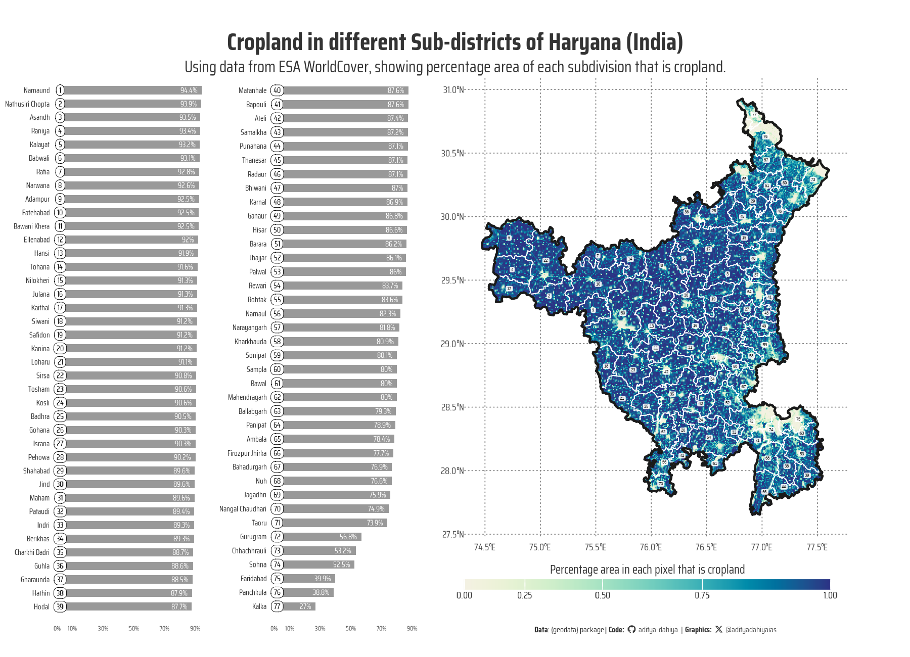
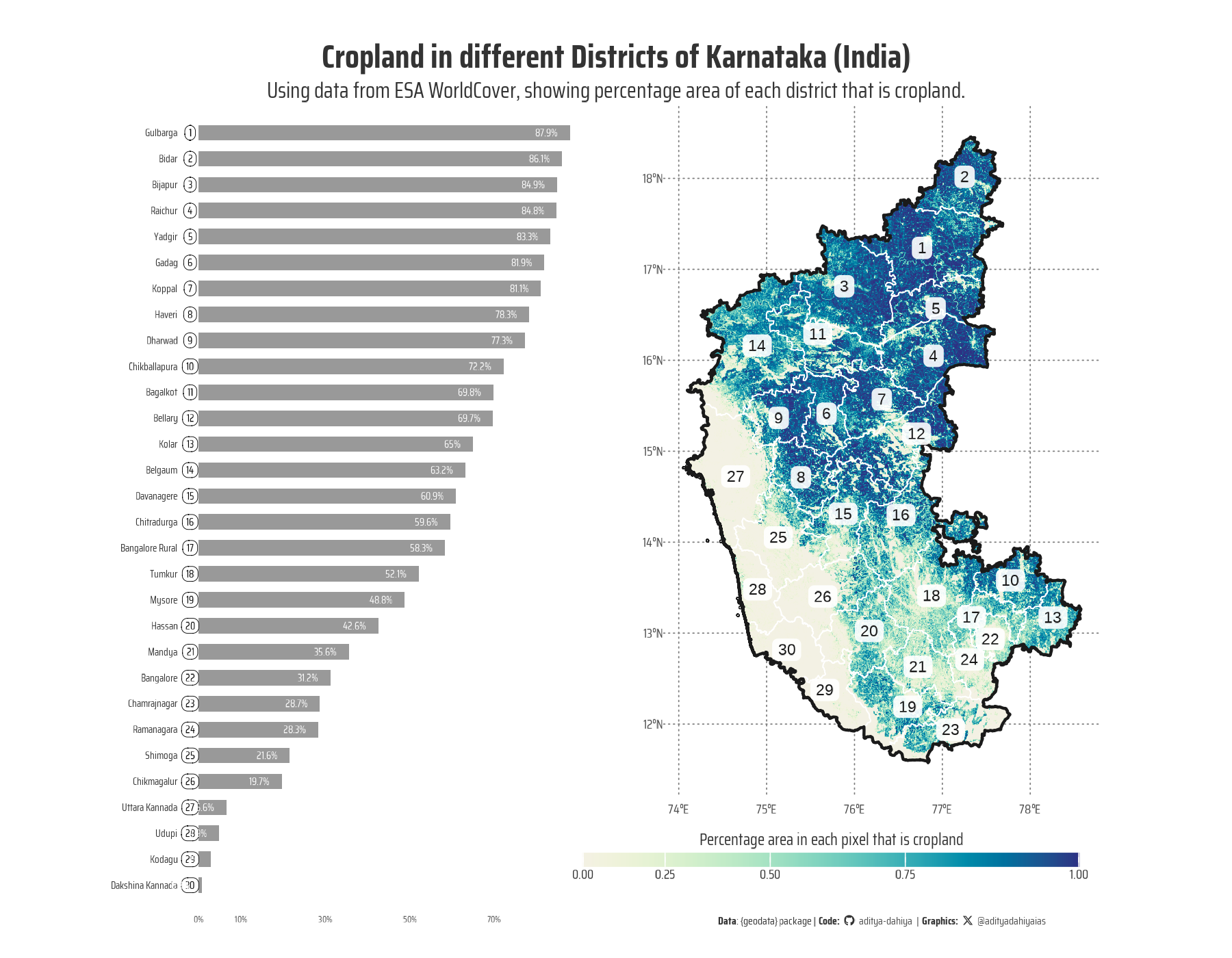
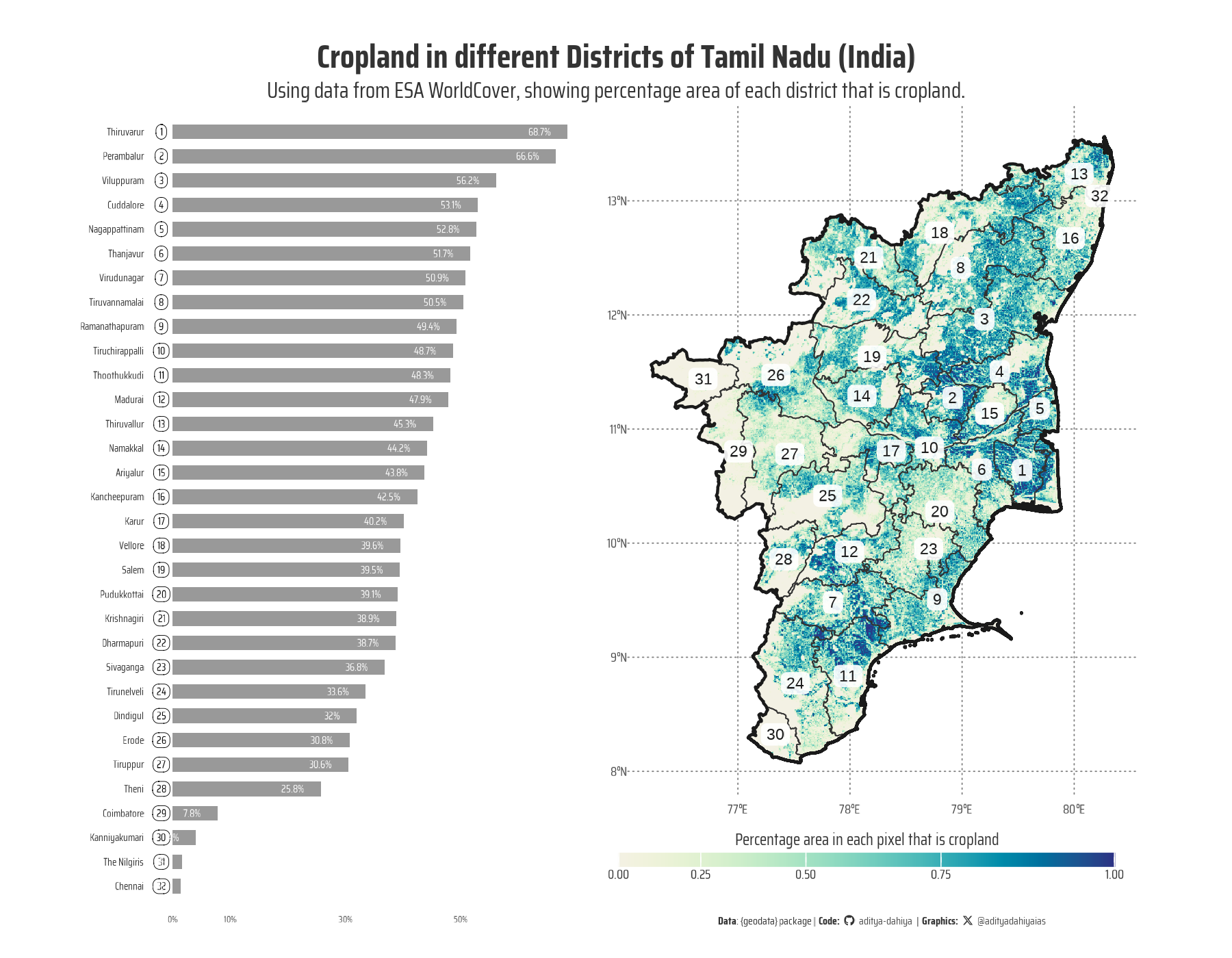
This R script uses open-source land cover data from the {geodata} package to analyze and visualize cropland distribution across Haryana’s subdistricts (tehsils). The dataset, derived from the ESA WorldCover dataset at a 0.3-second resolution, represents the fraction of cropland in each cell. The analysis starts by downloading global cropland data using geodata::cropland(). The Haryana subdistrict boundary shapefile is read using {sf} via read_sf(), cleaned with {janitor}, and transformed to EPSG:4326. The cropland raster is cropped and masked to Haryana’s boundaries using {terra} functions crop() and mask(). Raster extraction (terra::extract()) is performed to compute the average cropland percentage per subdistrict. The results are merged into the spatial data (left_join()) and ranked. Visualization is done using {ggplot2}, where an inset bar chart ranks subdistricts by cropland percentage.
g_base <-ggplot() +geom_spatraster(data = haryana_crop ) + paletteer::scale_fill_paletteer_c("grDevices::Blue-Yellow",direction =-1,na.value ="transparent",trans ="exp" ) +geom_sf(data = haryana_vec,colour ="white",fill ="transparent" ) +geom_sf(data = haryana_vec_boundary,colour ="grey10",linewidth =0.5,fill ="transparent" ) +geom_sf_label(data = haryana_vec,mapping =aes(label = rank),size =2,colour ="grey10",fill =alpha("white", 0.9),label.size =NA,label.r =unit(0.1, "lines"),label.padding =unit(0.1, "lines") ) +coord_sf(clip ="off") +labs(title ="Cropland in different Sub-districts of Haryana (India)",subtitle ="Using data from ESA WorldCover, showing percentage area of each subdivision that is cropland.",caption = plot_caption,fill ="Percentage area in each pixel that is cropland",x =NULL, y =NULL ) +theme_minimal(base_size = bts *1.5,base_family ="body_font" ) +theme(text =element_text(colour ="grey20",lineheight =0.3 ),plot.margin =margin(0,0,0,0, "pt"),legend.position ="inside",legend.position.inside =c(1, 0),legend.direction ="horizontal",legend.title.position ="top",legend.justification =c(1, 1),panel.grid =element_line(colour ="grey50",linetype =3,linewidth =0.2 ),plot.caption =element_textbox(hjust =0.5,margin =margin(35,0,5,0, "pt"),size = bts ),plot.title.position ="plot",plot.title =element_text(margin =margin(10,0,0,0, "pt"),hjust =0.5,face ="bold",size = bts *3 ),plot.subtitle =element_text(margin =margin(3,0,1,0, "pt"),hjust =0.5,size = bts *2 ),legend.key.height =unit(5, "pt"),legend.key.width =unit(35, "pt"),legend.box.margin =margin(10,5,3,0, "pt"),legend.margin =margin(10,5,0,0, "pt"),legend.title =element_text(margin =margin(0,0,2,0, "pt"),hjust =0.5 ),legend.text =element_text(margin =margin(1,0,0,0, "pt"),hjust =0.5 ),axis.text.y =element_text(margin =margin(0,0,0,180, "pt") ),axis.ticks =element_blank(),axis.ticks.length =unit(0, "pt") )library(patchwork)g <- g_base +inset_element(p = g_inset,left =-0.1, right =0.47,bottom =0, top =0.91,align_to ="full" )ggsave(plot = g,filename = here::here("geocomputation", "images", "geodata_package_4.png" ),height =1300,width =1800,units ="px",bg ="white")
This map visualizes the percentage of cropland across Haryana’s tehsils using high-resolution ESA WorldCover data. Each subdistrict is ranked by cropland coverage, with darker shades indicating higher agricultural presence. An inset chart provides a ranked comparison of tehsils, offering a clear insight into regional variations in cropland distribution. Data sourced from ESA WorldCover (CC BY 4.0).
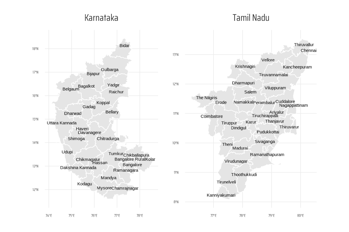
Getting GADM data of any country up-to small administrative units level
The geodata::gadm() function enables users to fetch administrative boundary data for any country at different levels of granularity. In the code given below, gadm() retrieves boundary data for India at three levels: state (level 1), district (level 2), and sub-district (level 3), storing them as simple features (sf) objects after conversion using st_as_sf().