Geospatial analysis of global population density patterns near rivers, lakes, and coastlines
Maps
Geocomputation
{terra}
Raster
Author
Aditya Dahiya
Published
August 1, 2025
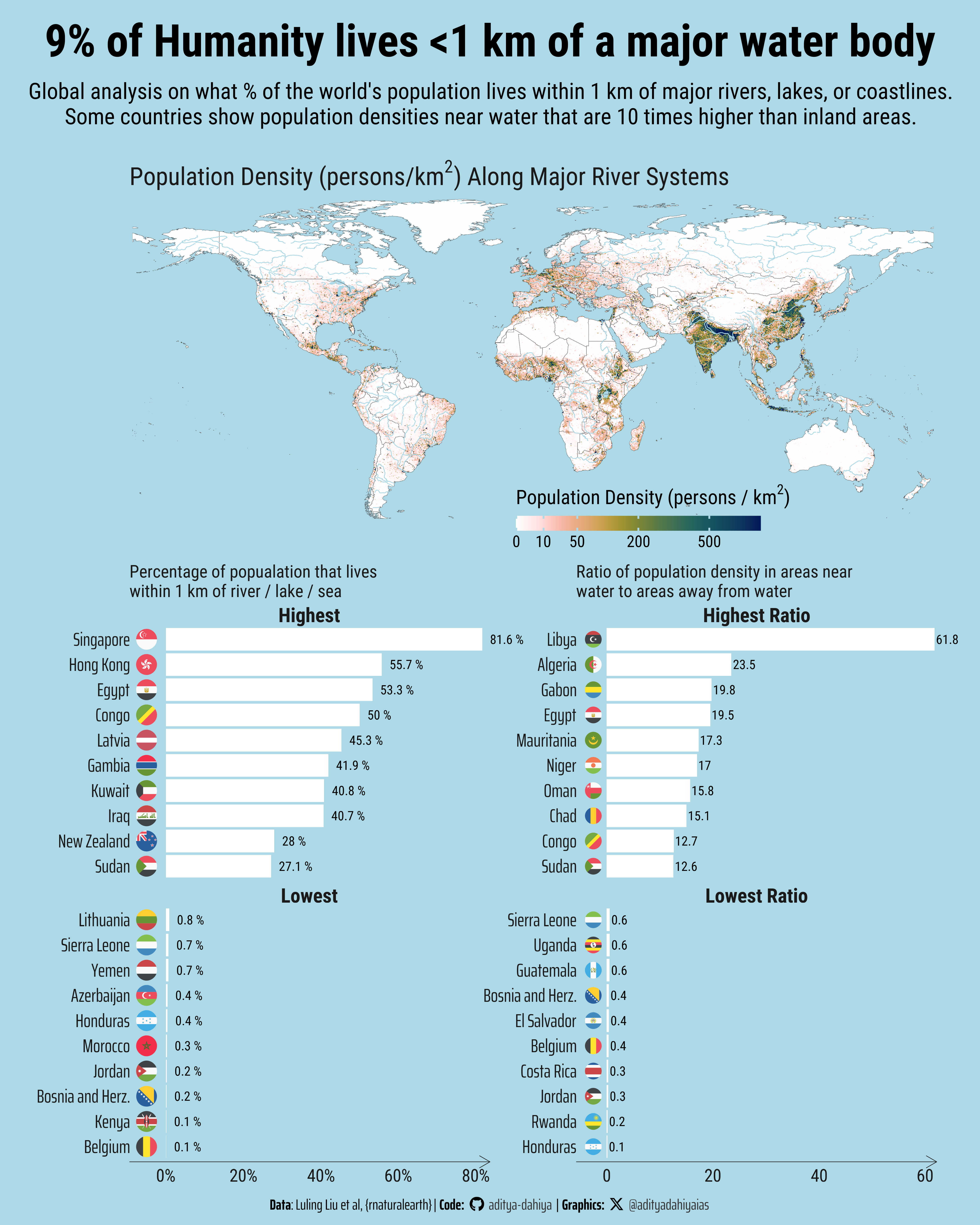
This geospatial analysis reveals fascinating patterns about humanity’s relationship with water bodies across the globe. The visualization combines a world map displaying population density gradients with major river systems, alongside comparative charts showing how different nations cluster around water sources.
Global population distribution relative to water bodies (2022). (A) World map showing population density with major rivers (blue lines), revealing concentration along waterways like the Nile, Ganges, and coastal areas. (B) Percentage of national populations living within 1 km of water bodies - island nations show near 100% while landlocked countries have much lower rates. (C) Ratio of population density near water versus inland areas, with some countries showing over 10-fold concentration differences. Analysis limited to countries >1 million population. Data: GlobPOP dataset (Liu et al., 2024).
The map clearly illustrates that the highest population densities (shown in darker colors) often align with major river corridors like the Nile, Ganges-Brahmaputra, Yangtze, and coastal regions, demonstrating the enduring importance of water access for human settlement. The analysis, built using the GlobPOP dataset developed by Luling Liu and colleagues, quantifies this relationship by calculating what percentage of each country’s population lives within 1 kilometer of rivers, lakes, or coastlines.
The charts reveal striking global variations: island nations and coastal countries show nearly 100% of their populations living near water, while landlocked countries with sparse river networks show much lower percentages. More intriguingly, the density ratio analysis exposes countries where population concentrates disproportionately near water sources - with some nations showing density ratios exceeding 10:1 between water-adjacent and inland areas. This pattern reflects both historical settlement preferences driven by agriculture, trade, and transportation needs, as well as contemporary economic advantages of water access. The analysis uses R’s powerful geospatial packages including {sf}, {terra}, and {rnaturalearth} to process global raster data and perform complex buffer operations around water features.
Introduction
This initial setup loads all the essential R packages needed for geospatial analysis and visualization. The code imports {tidyverse} for data manipulation, {sf} for vector spatial data handling, and {terra} for raster operations. Additional packages like {tidyterra} bridge the gap between terra objects and ggplot2, while {scales}, {ggtext}, and {patchwork} enhance the final visualization. The setup also configures custom fonts using {showtext} and establishes a consistent color palette that will be used throughout the analysis.
Code
# Data wrangling & visualizationlibrary(tidyverse) # Data manipulation & visualization# Spatial data handlinglibrary(sf) # Import, export, and manipulate vector datalibrary(terra) # Import, export, and manipulate raster data# ggplot2 extensionslibrary(tidyterra) # Helper functions for using terra with ggplot2# Final plot toolslibrary(scales) # Nice Scales for ggplot2library(fontawesome) # Icons display in ggplot2library(ggtext) # Markdown text in ggplot2library(showtext) # Display fonts in ggplot2library(patchwork) # Composing Plotsbts =90# Base Text Sizesysfonts::font_add_google("Roboto Condensed", "body_font")sysfonts::font_add_google("Oswald", "title_font")sysfonts::font_add_google("Saira Extra Condensed", "caption_font")showtext::showtext_auto()# A base Colourbg_col <-"lightblue"seecolor::print_color(bg_col)# Colour for highlighted texttext_hil <-"grey20"seecolor::print_color(text_hil)# Colour for the texttext_col <-"grey10"seecolor::print_color(text_col)# Caption stuff for the plotsysfonts::font_add(family ="Font Awesome 6 Brands",regular = here::here("docs", "Font Awesome 6 Brands-Regular-400.otf"))github <-""github_username <-"aditya-dahiya"xtwitter <-""xtwitter_username <-"@adityadahiyaias"social_caption_1 <- glue::glue("<span style='font-family:\"Font Awesome 6 Brands\";'>{github};</span> <span style='color: {text_hil}'>{github_username} </span>")social_caption_2 <- glue::glue("<span style='font-family:\"Font Awesome 6 Brands\";'>{xtwitter};</span> <span style='color: {text_hil}'>{xtwitter_username}</span>")plot_caption <-paste0("**Data**: Luling Liu et al, {rnaturalearth}"," | **Code:** ", social_caption_1, " | **Graphics:** ", social_caption_2 )rm(github, github_username, xtwitter, xtwitter_username, social_caption_1, social_caption_2)
Failed UK Rivers Attempt
This code chunk represents an initial attempt to extract river data for the UK using {osmdata} from OpenStreetMap. The approach involved downloading administrative boundaries using {geodata} and then querying OSM for water features. However, this method proved problematic because OSM data fragments rivers into multiple geometric types (points, lines, polygons, multipolygons), making it difficult to create a coherent river network visualization. This failed attempt led to switching to the more reliable {rnaturalearth} package for global river data.
Code
uk_raw_map <- geodata::gadm(country =c("GBR", "IRL"),path =tempdir()) |>st_as_sf() |> janitor::clean_names() |>select(country, name_1, varname_1, geometry)uk_raw_map |>object.size() |>print(units ="Mb")uk_map1 <- uk_raw_map |>st_simplify(dTolerance =1000) |>filter(country =="United Kingdom")map2 <- geodata::gadm(country =c("GBR", "IRL"),path =tempdir(),level =2) |>st_as_sf() |> janitor::clean_names()dublin <- map2 |>select(name_1, name_2, type_2, geometry) |>#st_drop_geometry() |> filter(name_1 =="Dublin")# uk_map1 |> # ggplot() +# geom_sf()uk_map1 |>object.size() |>print(units ="Mb")# Get Rivers for UKlibrary(osmdata)# uk_rivers_raw <- osmdata::opq(# bbox = st_bbox(uk_map1)# ) |># osmdata::add_osm_feature(# key = "water",# value = "river"# ) |># osmdata_sf()dublin_rivers <- osmdata::opq(bbox =st_bbox(dublin)) |> osmdata::add_osm_feature(key ="water",value ="river" ) |>osmdata_sf()dublin_rivers$osm_multipolygons |>ggplot() +geom_sf(colour ="blue" ) +geom_sf(data = dublin, fill =NA )# Learning: {osmdata} is not a great source to plot rivers as it splits them# into points, lines, polygons and multipolygons.
33-year population density rasters
This graphic draws on the GlobPOP dataset developed by Luling Liu, Xin Cao, Shijie Li, and Na Jie, and published in Scientific Data in 2024 (Sci Data 11:124). They created a continuous global gridded population product spanning 1990 to 2020 (with an extended version through 2022), at approximately 1 km spatial resolution (30 arc‑seconds), in both population count and density formats (github.com). Their methodology fused five existing population products—GHS‑POP, GRUMP, GPWv4, LandScan, and WorldPop—via a three‑stage framework of preprocessing, cluster analysis, and statistical learning (quantile regression), calibrated to official census data from the UN World Population Prospects 2022. They then validated the results using rigorous spatial and temporal assessments across 217 countries and eight representative countries and cities, demonstrating high accuracy overall.
The raster is aggregated by a factor of 10 using terra::aggregate() to reduce computational complexity while maintaining sufficient detail for global-scale analysis.
Code
# 1990 to 2022 year Global Population Density 30 sec arc resolution# Set Working Directory to a temporary one ---------------------------rast_2022 <- terra::rast("GlobPOP_Count_30arc_2022_I32.tiff") |># Reduce the granularity of the data to make it easier on computation and good to plot also terra::aggregate(fact =10)# ggplot() +# geom_spatraster(data = rast_2022)
Data on Country Boundaries and Rivers
This section acquires the spatial reference data needed to contextualize the population raster. Using {rnaturalearth}, I download medium-scale country boundaries and major river centerlines. The ne_countries() function provides clean national boundaries, while ne_download() retrieves the river network data. All spatial data is transformed to match the coordinate reference system of the population raster using st_transform() to ensure proper alignment for subsequent analysis.
Code
# Get boundaries of different countries using {rnaturalearth}pacman::p_load( rnaturalearth, rnaturalearthdata)# Get the world boundaries# This will be used to plot the population densitycountries_boundaries <-ne_countries(scale ="medium", returnclass ="sf") |>st_transform(crs(rast_2022)) |>select(name, iso_a3, geometry) |>arrange(name) |>mutate(id =row_number())global_map <- countries_boundaries |># To save time: perform geocomputation in projected CRSst_transform("EPSG:3857") |>st_union() |># Re-project back to Raster CRSst_transform(crs(rast_2022)) |>st_as_sf()object.size(global_map) |>print(units ="Mb")# Get global rivers datarivers <-ne_download(scale ="medium", type ='rivers_lake_centerlines', category ='physical', returnclass ="sf") |>select(name_en, geometry) |>st_transform(crs(rast_2022))rivers |>object.size() |>print(units ="Mb")coastline50 <- rnaturalearthdata::coastline50
Creating Water Proximity Buffers
The core geocomputation involves creating 1-kilometer buffer zones around all water bodies (rivers and coastlines) to define “near water” areas. Using st_buffer(), I generate these zones after transforming to a projected coordinate system (EPSG:3857) for accurate distance calculations. The st_union() function combines overlapping buffers into a single unified zone. This buffer zone becomes the key spatial mask for distinguishing populations living near versus away from water sources.
Code
# Generate a buffer of 1 km around the rivers# This will be used to calculate the population density near riversrivers_buffer_zone <- rivers |># Buffer operations in Geographic CRS are very very slow. Convert to a# projected CRSst_transform("EPSG:3857") |>st_buffer(dist =1000) |>st_union()coast_buffer_zone <- coastline50 |># Buffer operations in Geographic CRS are very very slow. Convert to a# projected CRSst_transform("EPSG:3857") |>st_buffer(dist =1000) |>st_union()# zone all over the world within 1 km of a water body: river or sea or lakewater_buffer_zone <-st_union( rivers_buffer_zone, coast_buffer_zone) |># Retransform back to Geographic CRS of the population rasterst_transform(crs(rast_2022))
Extracting Population Statistics by Country
This crucial step uses terra::extract() to calculate population statistics for each country. The function aggregates raster values within country boundaries using different summary functions - sum for total population counts and mean for average density. I perform separate extractions for the full population raster and the water-masked raster to quantify how much of each country’s population lives within the 1km water buffer zone. The population values are multiplied by 100 to correct for an observed scaling factor in the original dataset.
The final data processing step combines all extracted statistics into a comprehensive dataset using left_join() operations. Key metrics calculated include the percentage of each country’s population living near water (perc_pop_water) and the ratio of population density near water versus away from water (ratio_density). The data is filtered to include only countries with populations exceeding 1 million and those with complete data, while adding ISO country codes using {countrycode} for flag visualization.
Code
# Extract total population data for each country with country namestotal_population <- rast_2022 |> terra::extract( countries_boundaries, fun = sum, na.rm =TRUE, bind =TRUE) |>as_tibble() |>rename(pop = GlobPOP_Count_30arc_2022_I32) |># By observation, I see that the data is off by a factor of 100, so multiplymutate(pop = pop *100) |>arrange(desc(pop))# Extract total population density for each country with country namespopulation_density <- rast_2022 |> terra::extract( countries_boundaries, fun = mean, na.rm =TRUE, bind =TRUE) |>as_tibble() |>rename(density = GlobPOP_Count_30arc_2022_I32) |>arrange(desc(density))### Extract a raster of world population that lives within 1 km of a waterbody ###rast_water <- rast_2022 |> terra::mask(st_as_sf(water_buffer_zone))# Extract total population of each country within 1 km of a water bodytotal_population_water <- rast_water |> terra::extract( countries_boundaries, fun = sum, na.rm =TRUE, bind =TRUE) |>as_tibble() |>rename(pop_water = GlobPOP_Count_30arc_2022_I32) |># By observation, I see that the data is off by a factor of 100, so multiplymutate(pop_water = pop_water *100) |>arrange(desc(pop_water))# Extract total population density for 1 km near water body for each countrypopulation_density_water <- rast_water |> terra::extract( countries_boundaries, fun = mean, na.rm =TRUE, bind =TRUE) |>as_tibble() |>rename(density_water = GlobPOP_Count_30arc_2022_I32) |>arrange(desc(density_water))# Create a final tibble for population, its density, and near water body for each countryplotdf <- total_population |>left_join(total_population_water) |>mutate(perc_pop_water = pop_water / pop) |>left_join(population_density) |>left_join(population_density_water) |>mutate(ratio_density = density_water / density)# Only show countries with alteast 1 million populationplotdf2 <- plotdf |>filter(pop >1e6) |>filter(!is.na(perc_pop_water)) |>filter(!is.na(ratio_density)) |>mutate(iso2 = countrycode::countrycode(sourcevar = iso_a3,origin ="iso3c",destination ="iso2c" ),iso2 =str_to_lower(iso2) ) |>filter(!(name %in%c("Somaliland", "Palestine"))) |>filter(ratio_density !=0)# What percentage of world population lives near waterworld_percentage <- (plotdf |>pull(pop_water) |>sum(na.rm = T)) / (plotdf |>pull(pop) |>sum(na.rm = T))world_percentageplotdf |>summarise(ratio =weighted.mean(perc_pop_water, w = pop, na.rm = T) )
Creating the World Population Density Map
This section builds the main world map visualization using geom_spatraster() from tidyterra to display the population raster, overlaid with country boundaries and river networks. The color palette uses {paletteer} to apply a scientifically-designed color scale with square root transformation to better visualize the highly skewed population density distribution. The map is cropped to exclude Antarctica and styled with a clean theme using {ggthemes}.
Here I define a custom ggplot2 theme and create comparative bar charts showing the top and bottom 10 countries for both water proximity metrics. The charts use {ggflags} to display country flags alongside country names, making the visualization more engaging and easier to interpret. The data is ranked and filtered to highlight the most extreme cases - countries where populations are most and least concentrated near water sources.
The final step uses {patchwork} to combine all visualization elements into a cohesive infographic layout. The wrap_plots() function arranges the world map and comparative charts using a custom design matrix, while plot_annotation() adds titles, subtitles, and data attribution. The final graphic is exported using ggsave() with specific dimensions optimized for high-resolution display and sharing.
Code
my_design <- ("AABC")g4 <-wrap_plots(g1, g2, g3) +plot_layout(design = my_design, height =c(0.6, 1)) +plot_annotation(title ="9% of Humanity lives <1 km of a major water body",subtitle =str_wrap("Global analysis on what % of the world's population lives within 1 km of major rivers, lakes, or coastlines. Some countries show population densities near water that are 10 times higher than inland areas.", 110),caption = plot_caption,theme =theme(plot.title =element_text(margin =margin(5,0,5,0, "mm"),size =1.8* bts,hjust =0.5,family ="body_font",face ="bold" ),plot.subtitle =element_text(margin =margin(2,0,0,0, "mm"),hjust =0.5,family ="body_font",lineheight =0.3,size = bts *0.9 ),plot.caption =element_textbox(hjust =0.5,halign =0.5,size =0.6* bts,family ="caption_font",margin =margin(5,0,0,0,"mm") ),plot.margin =margin(5,5,5,5, "mm") ) ) &theme(plot.background =element_rect(fill =NA, colour =NA),panel.background =element_rect(fill =NA, colour =NA),panel.spacing.y =unit(2, "mm") )ggsave(plot = g4,filename = here::here("geocomputation", "images","rivers_pop_density_1.png" ),height =50,width =40,units ="cm",bg = bg_col)