library(tidyverse)
library(gt)
library(janitor)
library(nycflights13)
data("flights")Chapter 14
Numbers
14.3.1 Exercises
Question 1
How can you use count() to count the number rows with a missing value for a given variable?
We can use count() with weights as is.na(var_name) to the number of rows with missing values, as shown below
flights |>
  group_by(month) |>
  summarise(total = n(),
            missing = sum(is.na(dep_time))) |>
  gt()
flights |>
  group_by(month) |>
  count(wt = is.na(dep_time)) |>
  ungroup() |>
gt()| month | total | missing |
|---|---|---|
| 1 | 27004 | 521 |
| 2 | 24951 | 1261 |
| 3 | 28834 | 861 |
| 4 | 28330 | 668 |
| 5 | 28796 | 563 |
| 6 | 28243 | 1009 |
| 7 | 29425 | 940 |
| 8 | 29327 | 486 |
| 9 | 27574 | 452 |
| 10 | 28889 | 236 |
| 11 | 27268 | 233 |
| 12 | 28135 | 1025 |
| month | n |
|---|---|
| 1 | 521 |
| 2 | 1261 |
| 3 | 861 |
| 4 | 668 |
| 5 | 563 |
| 6 | 1009 |
| 7 | 940 |
| 8 | 486 |
| 9 | 452 |
| 10 | 236 |
| 11 | 233 |
| 12 | 1025 |
Question 2
Expand the following calls to count() to instead use group_by(), summarize(), and arrange():
flights |> count(dest, sort = TRUE)flights |> group_by(dest) |> summarise(n = n()) |> arrange(desc(n))# A tibble: 105 × 2 dest n <chr> <int> 1 ORD 17283 2 ATL 17215 3 LAX 16174 4 BOS 15508 5 MCO 14082 6 CLT 14064 7 SFO 13331 8 FLL 12055 9 MIA 11728 10 DCA 9705 # ℹ 95 more rowsflights |> count(tailnum, wt = distance)flights |> group_by(tailnum) |> summarise(n = sum(distance))# A tibble: 4,044 × 2 tailnum n <chr> <dbl> 1 D942DN 3418 2 N0EGMQ 250866 3 N10156 115966 4 N102UW 25722 5 N103US 24619 6 N104UW 25157 7 N10575 150194 8 N105UW 23618 9 N107US 21677 10 N108UW 32070 # ℹ 4,034 more rows
14.4.8 Exercises
Question 1
Explain in words what each line of the code used to generate Figure 14.1 does.
The explanation is given as annotation in the code below (i.e, lines starting with #): –
# Load in the data-set flights from package nycflights13
flights |>
  # Create a variable hour, which is the quotient of the division of
  # sched_dep_time by 100. Further, group the dataset by this newly
  # created variable "hour" to get data into 24 groups - one for each
  # hour.
  group_by(hour = sched_dep_time %/% 100) |>

  # For each gropu, i.e. all flights scheduled to depart in that
  # hour, compute the NAs, i.e. cancelled flights, then compute their
  # mean, i.e. proportion of cancelled flights; and also create a
  # variable n, which is the total number of flights
  summarize(prop_cancelled = mean(is.na(dep_time)), n = n()) |>

  # Remove the flights departing between 12 midnight and 1 am, since
  # these are very very few, and all are cancelled leading to a highly
  # skewed and uninformative graph
  filter(hour > 1) |>

  # Start a ggplot call, plotting the hour on the x-axis, and
  # proportion of cancelled flights on the y-axis
  ggplot(aes(x = hour, y = prop_cancelled)) +

  # Create a line graph,which joins the proportion of cancelled
  # flights for each hour. Also, put in in dark grey colour
  geom_line(color = "grey50") +

  # Add points for each hour, whose size varies with the total number
  # of flights in that hour
  geom_point(aes(size = n))
Question 2
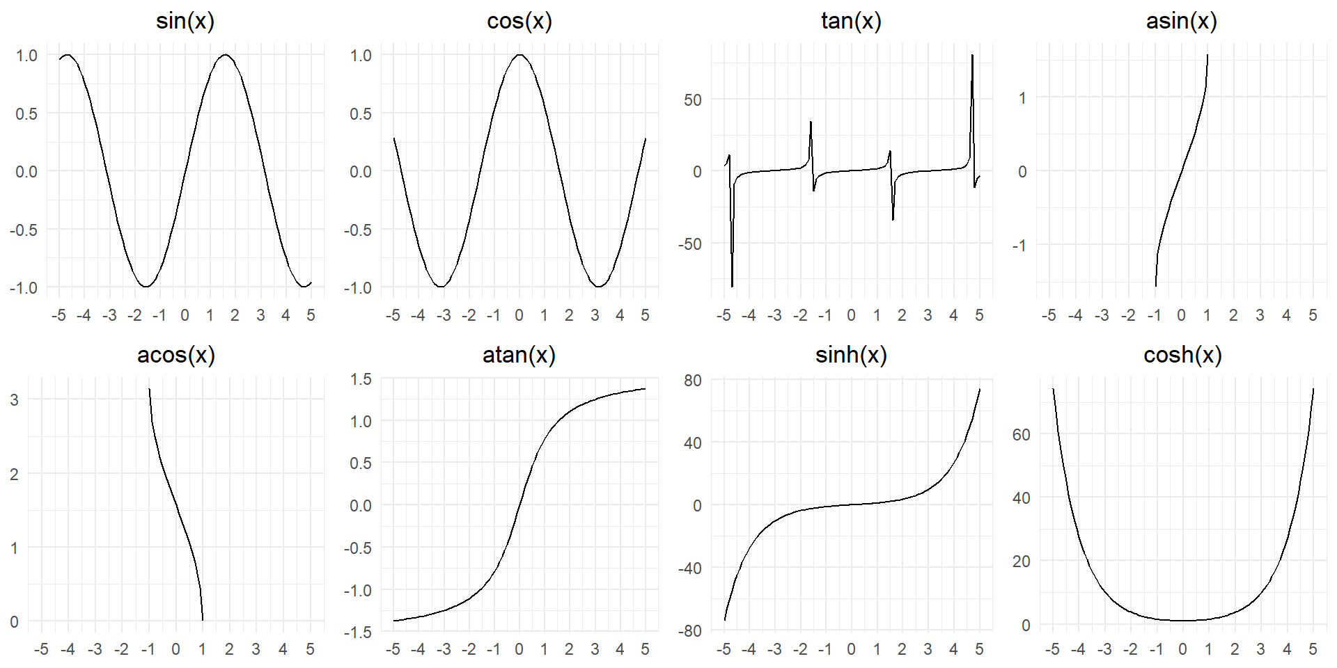
What trigonometric functions does R provide? Guess some names and look up the documentation. Do they use degrees or radians?
R provides several trigonometric functions, most of which operate in radians. Here’s a table listing some of the commonly used trigonometric functions in R, along with short descriptions and information about whether they use degrees or radians:
| Function | Description | Angle Measure |
|---|---|---|
sin(x) |
Sine function: Computes the sine of the angle x. |
Radians |
cos(x) |
Cosine function: Computes the cosine of the angle x. |
Radians |
tan(x) |
Tangent function: Computes the tangent of the angle x. |
Radians |
asin(x) or acos(x) |
Inverse sine or inverse cosine: Computes the angle whose sine or cosine is x. |
Radians |
atan(x) or atan2(y, x) |
Inverse tangent or arctangent: Computes the angle whose tangent is x or the angle between the point (x, y) and the origin. |
Radians |
sinh(x) |
Hyperbolic sine function: Computes the hyperbolic sine of x. |
Radians |
cosh(x) |
Hyperbolic cosine function: Computes the hyperbolic cosine of x. |
Radians |
tanh(x) |
Hyperbolic tangent function: Computes the hyperbolic tangent of x. |
Radians |
In R, trigonometric functions like sin, cos, and tan expect angles to be in radians by default. However, we can convert between degrees and radians using the deg2rad and rad2deg functions. For example, to compute the sine of an angle in degrees, you can use sin(deg2rad(angle)).
Code
df = tibble(x = seq(from = -5, to = +5, by = 0.1))
g = ggplot(df, aes(x = x)) +
  theme_minimal() +
  theme(plot.title = element_text(hjust = 0.5)) +
  labs(x = NULL, y = NULL) +
  scale_x_continuous(breaks = -5:5)
gridExtra::grid.arrange(
  g + geom_line(aes(y = sin(x))) + labs(title = "sin(x)"),
  g + geom_line(aes(y = cos(x))) + labs(title = "cos(x)"),
  g + geom_line(aes(y = tan(x))) + labs(title = "tan(x)"),
  g + geom_line(aes(y = asin(x))) + labs(title = "asin(x)"),
  g + geom_line(aes(y = acos(x))) + labs(title = "acos(x)"),
  g + geom_line(aes(y = atan(x))) + labs(title = "atan(x)"),
  g + geom_line(aes(y = sinh(x))) + labs(title = "sinh(x)"),
  g + geom_line(aes(y = cosh(x))) + labs(title = "cosh(x)"),

  nrow = 2
)
Question 3
Currently dep_time and sched_dep_time are convenient to look at, but hard to compute with because they’re not really continuous numbers. You can see the basic problem by running the code below: there’s a gap between each hour.
flights |>
  filter(month == 1, day == 1) |>
  ggplot(aes(x = sched_dep_time, y = dep_delay)) +
  geom_point()
Convert them to a more truthful representation of time (either fractional hours or minutes since midnight).
We can correct the sched_dep_time() using the two arithmetical functions %/% and %% to generate the decimal representation of time in hours as shown in the code for the graph on the right hand side in
Code
gridExtra::grid.arrange(
  flights |>
    filter(month == 1, day == 1) |>
    ggplot(aes(x = sched_dep_time, y = dep_delay)) +
    geom_point(size = 0.5) +
    labs(subtitle = "Incorrect scheduled departure time"),

  flights |>
    mutate(
      hour_dep = sched_dep_time %/% 100,
      min_dep  = sched_dep_time %%  100,
      time_dep = hour_dep + (min_dep/60)
    ) |>
    filter(month == 1, day == 1) |>
    ggplot(aes(x = time_dep, y = dep_delay)) +
    geom_point(size = 0.5) +
    labs(subtitle = "Improved and accurate scheduled departure time",
         x = "Scheduled Departure Time (in hrs)") +
    scale_x_continuous(breaks = seq(0,24,4)),

  ncol = 2)
Question 4
Round dep_time and arr_time to the nearest five minutes.
attach(flights)
flights |>
  slice_head(n = 50) |>
  mutate(
    dep_time_5 = round(dep_time/5) * 5,
    arr_time_5 = round(arr_time/5) * 5,
    .keep = "used"
  ) |>
  gt() |>
  opt_interactive()
Various Ranking functions in R
| Function | Description | Handling Ties |
|---|---|---|
min_rank() |
Assigns the minimum rank to each element. The way ranks are usually computed in sports. | Tied values get the same rank; next rank is skipped. |
row_number() |
Assigns every input a unique rank. Ties are given ranks based on the order of appearance, i.e. row number. | Tied values get different ranks, depending on the order of appearance in the data set. |
dense_rank() |
Assigns the minimum rank to each element. And, assigns the same rank to tied values without gaps. | Tied values get the same rank; no gaps in ranks. |
percent_rank() |
Computes the rank as a percentage of the total number of elements. It counts the total number of values less than xi, and divides it by the number of observations minus 1. | Tied values get the same rank; no gaps in ranks. |
cume_dist() |
Computes the cumulative distribution function (CDF) of the data. It counts the total number of values less than or equal to xi, and divides it by the number of observations. | Tied values get the same rank; no gaps in ranks. |
Code
df <- data.frame(Name = c("Alice", "Bob", "Carol", "David", "Eve"),                  Score = c(85, 92, 85, 78, 92))

# Apply ranking functions and store the results in new columns
df |>
  mutate(Min_Rank = min_rank(Score),
         Row_Number = row_number(Score),
         Dense_Rank = dense_rank(Score),
         Percent_Rank = percent_rank(Score),
         Cumulative_Dist = cume_dist(Score)) |>
gt()| Name | Score | Min_Rank | Row_Number | Dense_Rank | Percent_Rank | Cumulative_Dist |
|---|---|---|---|---|---|---|
| Alice | 85 | 2 | 2 | 2 | 0.25 | 0.6 |
| Bob | 92 | 4 | 4 | 3 | 0.75 | 1.0 |
| Carol | 85 | 2 | 3 | 2 | 0.25 | 0.6 |
| David | 78 | 1 | 1 | 1 | 0.00 | 0.2 |
| Eve | 92 | 4 | 5 | 3 | 0.75 | 1.0 |
14.5.4 Exercises
Question 1
Find the 10 most delayed flights using a ranking function. How do you want to handle ties? Carefully read the documentation for min_rank().
We can find the 10 most delayed flights by using min_rank() since it gives ties equal rank, while creating gaps, thus keeping the total number of the flights to 10.
flights |>
  select(sched_dep_time, dep_time, dep_delay, tailnum, dest, carrier) |>
  mutate(rank_delay = min_rank(desc(dep_delay))) |>
  arrange(rank_delay) |>
  slice_head(n = 10) |>
gt()| sched_dep_time | dep_time | dep_delay | tailnum | dest | carrier | rank_delay |
|---|---|---|---|---|---|---|
| 900 | 641 | 1301 | N384HA | HNL | HA | 1 |
| 1935 | 1432 | 1137 | N504MQ | CMH | MQ | 2 |
| 1635 | 1121 | 1126 | N517MQ | ORD | MQ | 3 |
| 1845 | 1139 | 1014 | N338AA | SFO | AA | 4 |
| 1600 | 845 | 1005 | N665MQ | CVG | MQ | 5 |
| 1900 | 1100 | 960 | N959DL | TPA | DL | 6 |
| 810 | 2321 | 911 | N927DA | MSP | DL | 7 |
| 1900 | 959 | 899 | N3762Y | PDX | DL | 8 |
| 759 | 2257 | 898 | N6716C | ATL | DL | 9 |
| 1700 | 756 | 896 | N5DMAA | MIA | AA | 10 |
Question 2
Which plane (tailnum) has the worst on-time record?
Using the code below, we can find the that the flight with tail number N844MH has the highest average departure delay of 32 minutes. However, this flight flew only once, so we might want to re-look for this delay statistic by removing the flights that flew less than 5 times.
Thus, amongst the flights that flew 5 times or more, the highest mean departure delay of the flight with tail number N665MQ.
# The flight tailnum with the highest average delay
flights |>
  group_by(tailnum) |>
  summarize(mean_delay = mean(dep_delay, na.rm = TRUE),
            n = n()) |>
  arrange(desc(mean_delay)) |>
  slice_head(n = 5)
# A tibble: 5 × 3
tailnum mean_delay n
<chr> <dbl> <int>
1 N844MH 297 1
2 N922EV 274 1
3 N587NW 272 1
4 N911DA 268 1
5 N851NW 233 1# The flight tailnum with the highest average delay amongst
# the flights that flew atleast 5 times or more
flights |>
group_by(tailnum) |>
summarize(mean_delay = mean(dep_delay, na.rm = TRUE),
nos_of_flights = n()) |>
filter(nos_of_flights >= 5) |>
arrange(desc(mean_delay)) |>
slice_head(n = 5)# A tibble: 5 × 3
tailnum mean_delay nos_of_flights
<chr> <dbl> <int>
1 N665MQ 177 6
2 N276AT 84.8 6
3 N652SW 79.5 6
4 N919FJ 78 6
5 N396SW 69.7 7Question 3
What time of day should you fly if you want to avoid delays as much as possible?
As shown in the Figure 4 , we should fly with the early morning flights, particularly 5 am to 7 am, to avoid delays as much as possible.
flights |>
  mutate(sched_dep_hour = sched_dep_time %/% 100) |>
  group_by(sched_dep_hour) |>
  summarize(
    mean_dep_delay = mean(dep_delay, na.rm = TRUE),
    nos_of_flights = n()
  ) |>
  drop_na() |>
  ggplot(aes(x = sched_dep_hour,
             y = mean_dep_delay)) +
  geom_line() +
  geom_point(aes(size = nos_of_flights),
             alpha = 0.5) +
  theme_light() +
  labs(x = "Depature Hour", y = "Average departure delay (min)",
       title = "Early morning flights have the least delay",
       size = "Number of flights") +
  scale_x_continuous(breaks = seq(5, 24, 2)) +
  theme(legend.position = "bottom")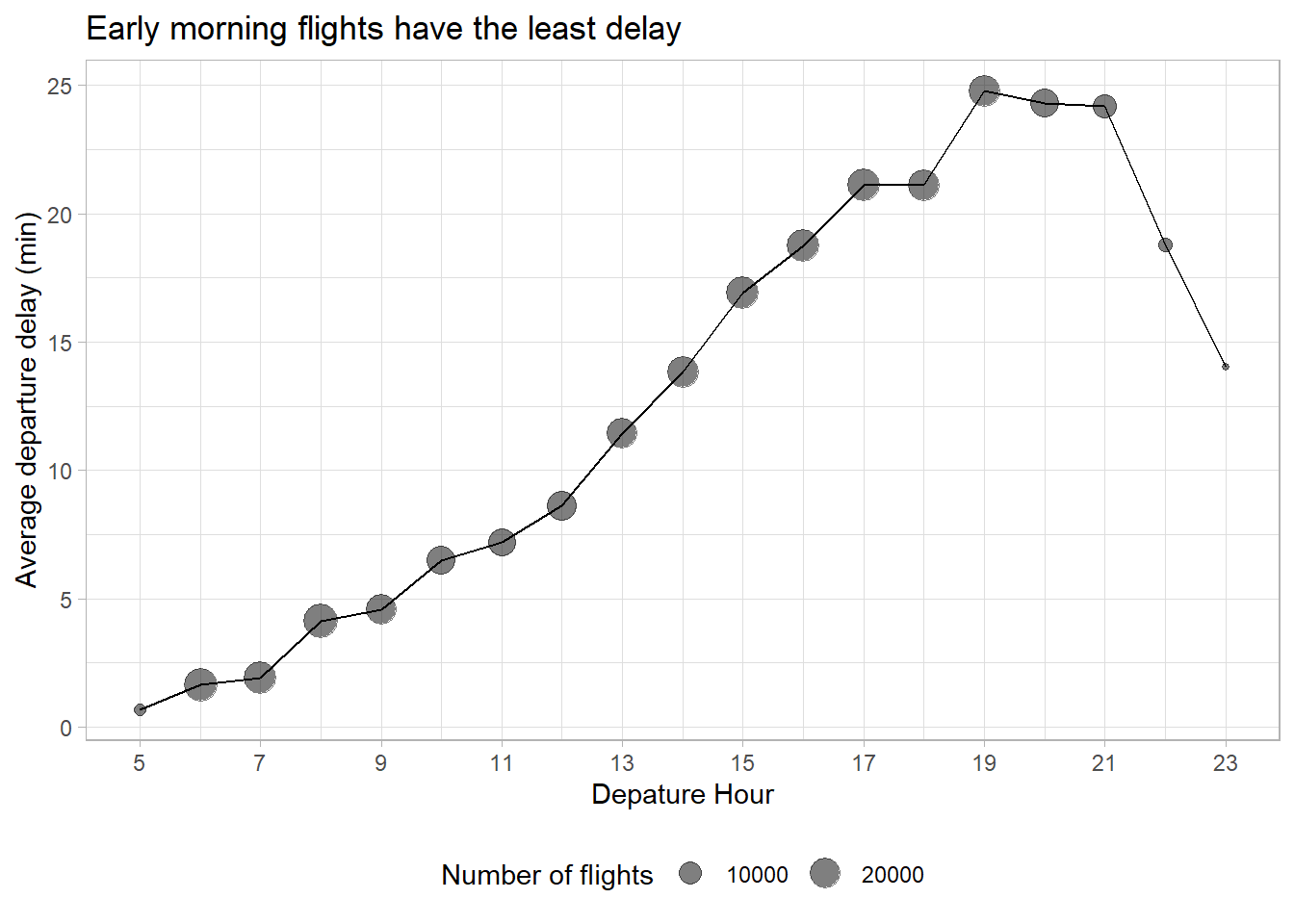
Question 4
What does flights |> group_by(dest) |> filter(row_number() < 4) do? What does flights |> group_by(dest) |> filter(row_number(dep_delay) < 4) do?
The code flights |> group_by(dest) |> filter(row_number() < 4) displays only three flights for each destination, selected on the basis of the order in which they appear in the flights data-set.
flights |>
  # reducing the number of columns for easy display
  select(carrier, dest, sched_dep_time, month, day) |>
  group_by(dest) |>
  # arrange(dest, sched_dep_time) |>
  filter(row_number() < 4)
# A tibble: 311 × 5
# Groups: dest [105]
carrier dest sched_dep_time month day
<chr> <chr> <int> <int> <int>
1 UA IAH 515 1 1
2 UA IAH 529 1 1
3 AA MIA 540 1 1
4 B6 BQN 545 1 1
5 DL ATL 600 1 1
6 UA ORD 558 1 1
7 B6 FLL 600 1 1
8 EV IAD 600 1 1
9 B6 MCO 600 1 1
10 AA ORD 600 1 1
# ℹ 301 more rowsOn the other hand, the code flights |> group_by(dest) |> filter(row_number(dep_delay) < 4) will display the three flights with the least departure delays for each destination. Further, in case of ties, it will select the flight which appears earlier in the data-set, i.e. on a earlier date.
flights |>
  # reducing the number of columns for easy display
  select(carrier, dest, sched_dep_time, month, day, dep_delay) |>
  group_by(dest) |>
  filter(row_number(dep_delay) < 4)
# A tibble: 310 × 6
# Groups: dest [104]
carrier dest sched_dep_time month day dep_delay
<chr> <chr> <int> <int> <int> <dbl>
1 UA JAC 851 1 1 -3
2 EV AVL 959 1 1 -13
3 DL PWM 2159 1 4 -19
4 UA MTJ 901 1 5 -2
5 EV BTV 2159 1 5 -16
6 B6 SJC 1810 1 7 -9
7 FL CAK 2030 1 7 -17
8 9E PIT 750 1 8 -15
9 EV BHM 1858 1 9 -11
10 EV MYR 827 1 10 -17
# ℹ 300 more rowsQuestion 5
For each destination, compute the total minutes of delay. For each flight, compute the proportion of the total delay for its destination.
The following code does the calculation desired: –
flights |>
  group_by(dest) |>
  mutate(
    total_delay = sum(dep_delay, na.rm = TRUE),
    prop_delay = dep_delay / total_delay,
    .keep = "used"
  )
# A tibble: 336,776 × 4
# Groups: dest [105]
dep_delay dest total_delay prop_delay
<dbl> <chr> <dbl> <dbl>
1 2 IAH 77012 0.0000260
2 4 IAH 77012 0.0000519
3 2 MIA 103261 0.0000194
4 -1 BQN 11032 -0.0000906
5 -6 ATL 211391 -0.0000284
6 -4 ORD 225840 -0.0000177
7 -5 FLL 151933 -0.0000329
8 -3 IAD 91555 -0.0000328
9 -3 MCO 157661 -0.0000190
10 -2 ORD 225840 -0.00000886
# ℹ 336,766 more rowsQuestion 6
Delays are typically temporally correlated: even once the problem that caused the initial delay has been resolved, later flights are delayed to allow earlier flights to leave. Using lag(), explore how the average flight delay for an hour is related to the average delay for the previous hour.
Here’s the code for the analysis with annotation at appropriate places: –
flights |>
  # Generate hour of departure
  mutate(hour = dep_time %/% 100) |>

  # Creating groups by each hour of depature for different days
  group_by(year, month, day, hour) |>

  # Remove 213 flights with NA as hour (i.e., cancelled flights)
  # to improve the subsequent plotting
  filter(!is.na(hour)) |>

  # Average delay and the number of flights in each hour
  summarize(
    dep_delay = mean(dep_delay, na.rm = TRUE),
    n = n(),
    .groups = "drop"
  ) |>

  # Removing hours in which there were less than 5 flights departing
  filter(n > 5) |>

  # Grouping to prevent using 11 pm hour delays as previous delays of the
  # next day's 5 am flights
  group_by(year, month, day) |>

  # A new variabe to show previous hour's average average departure delay
  mutate(
    prev_hour_delay = lag(dep_delay),
    morning_flights = hour == 5
  ) |>

  # Plotting to see correlation
  ggplot(aes(x = dep_delay,
             y = prev_hour_delay,
             col = morning_flights)) +
  geom_point(alpha = 0.5) +
  geom_smooth(se = FALSE) +
  geom_abline(slope = 1, intercept = 0, col = "grey") +
  theme_light() +
  coord_fixed() +
  scale_x_continuous(breaks = seq(0,300,60)) +
  scale_y_continuous(breaks = seq(0,300,60)) +
  scale_color_discrete(labels = c("Other flights",
                                  "Early Morning flights (5 am to 6 am)")) +
  labs(x = "Average Departure Delay in an hour (min)",
       y = "Average Departure Delay in the previous hour (min)",
       col = NULL,
       title = "Departure Delay correlates with delay in previous hour",
       subtitle = "The average departure delay in any hour is worse than previous hours's average delay. \nFurther, the early morning flights' delay doesn't depend on previous nights' delay.") +
  theme(legend.position = "bottom")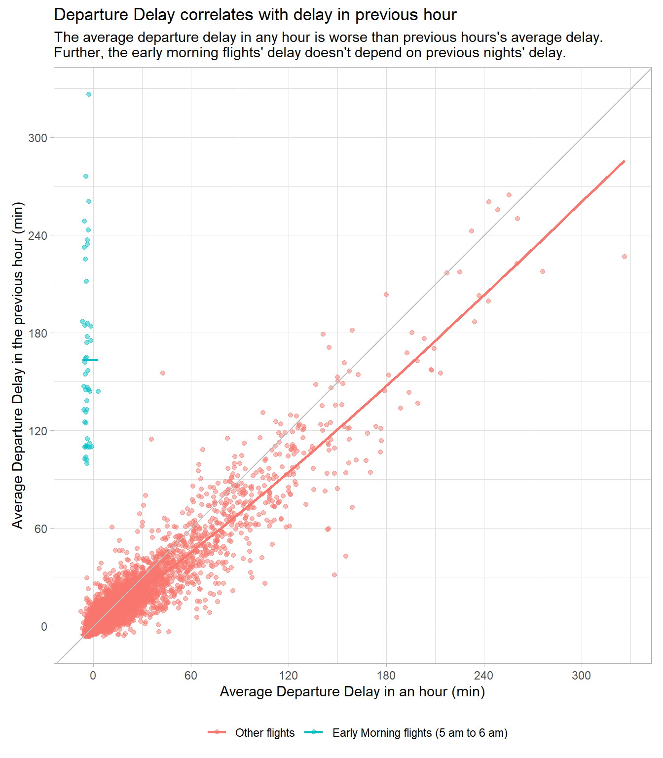
Question 7
Look at each destination. Can you find flights that are suspiciously fast (i.e. flights that represent a potential data entry error)? Compute the air time of a flight relative to the shortest flight to that destination. Which flights were most delayed in the air?
The Table 1 computes the average air time to each destination, and then computes the ratio of each flight’s airtime to the average air time. There are four flights with this ratio less than 0.6. Out of these, the flight N666DN to ATL destination with air time of just 65 minutes (compared to average 113 minutes) appears to be suspiciously fast, and a potential data entry error.
flights |>
  select(month, day, dest, tailnum, dep_time, arr_time, air_time) |>
  group_by(dest) |>
  mutate(
    mean_air_time = mean(air_time, na.rm = TRUE),
    fast_ratio = air_time/mean_air_time
  ) |>
  relocate(air_time, mean_air_time, fast_ratio) |>
  ungroup() |>
  arrange(fast_ratio) |>
  filter(fast_ratio < 0.6) |>
  gt() |>
  fmt_number(columns = c(mean_air_time, fast_ratio),
decimals = 2)| air_time | mean_air_time | fast_ratio | month | day | dest | tailnum | dep_time | arr_time |
|---|---|---|---|---|---|---|---|---|
| 21 | 38.95 | 0.54 | 3 | 2 | BOS | N947UW | 1450 | 1547 |
| 65 | 112.93 | 0.58 | 5 | 25 | ATL | N666DN | 1709 | 1923 |
| 55 | 93.39 | 0.59 | 5 | 13 | GSP | N14568 | 2040 | 2225 |
| 23 | 38.95 | 0.59 | 1 | 25 | BOS | N947UW | 1954 | 2131 |
The following code also computes the air time (air_time)of every flight relative to the shortest flight (min_air_time) for each destination in form a ratio (rel_ratio), and Figure 6 displays top 100 flights that were most delayed in the air. We observe that, of the 100 most delayed flights in-air: –
83 of these are flights to Boston (
BOS); with shortest air time of 21 minutes (a potential data entry) causing this over-representation of Boston flights in the current computation.Once Boston is removed, most of top 100 delayed in-air flights belong to destinations
PHL,DCAandATL. These again either represent a erroneous data entry (flightN666DNtoATLdestination with air time of just 65 minutes) or very short glifht destinations (PHLandDCA).
flights |>
  select(month, day, dest, tailnum, dep_time, arr_time, air_time) |>
  group_by(dest) |>
  mutate(
    min_air_time = min(air_time, na.rm = TRUE),
    rel_ratio = air_time/min_air_time
  ) |>
  relocate(air_time, min_air_time, rel_ratio) |>
  ungroup() |>
  arrange(desc(rel_ratio)) |>
  slice_head(n = 100) |>
  gt() |>
  fmt_number(columns = c(min_air_time, rel_ratio),
    decimals = 2) |>
opt_interactive()Question 8
Find all destinations that are flown by at least two carriers. Use those destinations to come up with a relative ranking of the carriers based on their performance for the same destination.
First, as shown in Figure 7 , we find out the destinations which have at-least two or more carriers. There are 76 such destinations.
Code
# Computing the destinations with atleast two carriers
df1 = flights |>
  group_by(dest) |>
  summarize(no_of_carriers = n_distinct(carrier)) |>
  filter(no_of_carriers > 1)

# Extracting the names of these carriers as a vector to use in filtering
# the data in subsequent steps, as a vector called "dest2"
dest2 = df1 |>
  select(dest) |>
  as_vector() |>
  unname()

# Displaying the table
df1 |>
  arrange(desc(no_of_carriers)) |>
  gt() |>
opt_interactive(page_size_default = 5)Then, in Figure 8 , we compute the three important parameters that we use to compare the performance of carriers: –
Average departure delay.
Proportion of flights cancelled.
Average delay in Air Time.
Code
# Ranking parameters can be based on: ---
# 1. Average Departure Delay
# 2. Proportion of flights cancelled
# 3. Average Delay in Air Time
# Note: I have not included arrival delay, as that will automatically
#       include the delay in the departure, and penalize the airline
#       twice for a departure delay.

df2 = flights |>
  filter(dest %in% dest2) |>
  group_by(dest, carrier) |>
  summarise(
    mean_dep_delay = mean(dep_delay, na.rm = TRUE),
    prop_cancelled = mean(is.na(dep_time)),
    mean_air_time  = mean(air_time, na.rm = TRUE),
    nos_of_flights = n()
  ) |>
  drop_na()

df2 |>
  ungroup() |>
  gt() |>
  fmt_number(decimals = 2,
             columns = -nos_of_flights) |>
opt_interactive()Thereafter, in Table 2 , we compute scores based on these three parameters for each carrier and rank them accordingly.
Code
# Ranking can be generated on basis of the least score calculated after
# giving equal weightage to the following in formula for each carrier as
# calculated by: (x - min(x)) / (max(x) - min(x))
# 1. Average Departure Delay
# 2. Proportion of flights cancelled
# 3. Average Delay in Air Time
df3 = df2 |>
  mutate(
    score_delay = (mean_dep_delay - min(mean_dep_delay))/(max(mean_dep_delay) - min(mean_dep_delay)),
    score_cancel = (prop_cancelled - min(prop_cancelled)) / (max(prop_cancelled) - min(prop_cancelled)),
    score_at = (mean_air_time - min(mean_air_time)) / (max(mean_air_time) - min(mean_air_time)),
    total_score = score_delay + score_cancel + score_at,
    rank_carrier = min_rank(total_score)
  ) |>
  drop_na()

# Displaying an example ranking for ATL and AUS
df3 |>
  filter(dest %in% c("ATL", "AUS")) |>
  gt() |>
  fmt_number(columns = -c(rank_carrier, nos_of_flights)) |>
  tab_spanner(label = "Scoring and Rank",
              columns = score_delay:rank_carrier) |>
  tab_spanner(label = "Statistics",
              columns = mean_dep_delay:nos_of_flights) |>
opt_stylize(style = 1)| carrier | Statistics | Scoring and Rank | |||||||
|---|---|---|---|---|---|---|---|---|---|
| mean_dep_delay | prop_cancelled | mean_air_time | nos_of_flights | score_delay | score_cancel | score_at | total_score | rank_carrier | |
| ATL | |||||||||
| 9E | 0.96 | 0.03 | 120.11 | 59 | 0.00 | 0.60 | 0.75 | 1.34 | 4 |
| DL | 10.41 | 0.01 | 112.16 | 10571 | 0.44 | 0.15 | 0.00 | 0.59 | 1 |
| EV | 22.40 | 0.06 | 114.05 | 1764 | 1.00 | 1.00 | 0.18 | 2.18 | 7 |
| FL | 18.45 | 0.02 | 114.44 | 2337 | 0.82 | 0.36 | 0.21 | 1.39 | 6 |
| MQ | 9.35 | 0.03 | 113.70 | 2322 | 0.39 | 0.56 | 0.14 | 1.10 | 3 |
| UA | 15.79 | 0.00 | 113.65 | 103 | 0.69 | 0.00 | 0.14 | 0.83 | 2 |
| WN | 2.34 | 0.02 | 122.81 | 59 | 0.06 | 0.30 | 1.00 | 1.36 | 5 |
| AUS | |||||||||
| 9E | 19.00 | 0.00 | 222.00 | 2 | 1.00 | 0.00 | 1.00 | 2.00 | 5 |
| AA | 15.25 | 0.02 | 215.07 | 365 | 0.75 | 1.00 | 0.36 | 2.11 | 6 |
| B6 | 14.94 | 0.00 | 213.85 | 747 | 0.73 | 0.24 | 0.25 | 1.22 | 3 |
| DL | 10.82 | 0.01 | 211.96 | 357 | 0.46 | 0.51 | 0.07 | 1.04 | 2 |
| UA | 14.92 | 0.01 | 211.28 | 670 | 0.73 | 0.54 | 0.01 | 1.28 | 4 |
| WN | 3.84 | 0.01 | 211.18 | 298 | 0.00 | 0.61 | 0.00 | 0.61 | 1 |
The final ranking of the carriers for each destination is displayed below in Table 3 with names of destinations as column names, and within each column, the best carrier at the top, worst carrier at the bottom.
Code
df3 |>
  arrange(dest, rank_carrier) |>
  select(dest, carrier, rank_carrier) |>
  ungroup() |>
  pivot_wider(names_from = rank_carrier,
              values_from = carrier) |>
  t() |>
  as_tibble() |>
  janitor::row_to_names(row_number = 1) |>
  gt() |>
  sub_missing(missing_text = "") |>
gtExtras::gt_theme_538()| ATL | AUS | AVL | BDL | BNA | BOS | BQN | BTV | BUF | BWI | CAE | CHS | CLE | CLT | CMH | CVG | DAY | DCA | DEN | DFW | DSM | DTW | EGE | FLL | GRR | GSO | GSP | HNL | HOU | IAD | IAH | IND | JAC | JAX | LAS | LAX | MCI | MCO | MEM | MHT | MIA | MKE | MSN | MSP | MSY | MVY | OMA | ORD | ORF | PBI | PDX | PHL | PHX | PIT | PWM | RDU | RIC | ROC | RSW | SAN | SAT | SDF | SEA | SFO | SJC | SJU | SLC | SRQ | STL | STT | SYR | TPA | TVC | TYS | XNA |
|---|---|---|---|---|---|---|---|---|---|---|---|---|---|---|---|---|---|---|---|---|---|---|---|---|---|---|---|---|---|---|---|---|---|---|---|---|---|---|---|---|---|---|---|---|---|---|---|---|---|---|---|---|---|---|---|---|---|---|---|---|---|---|---|---|---|---|---|---|---|---|---|---|---|---|
| DL | WN | 9E | EV | DL | DL | B6 | 9E | DL | WN | 9E | UA | UA | US | MQ | DL | 9E | UA | DL | EV | EV | DL | UA | DL | EV | 9E | 9E | HA | B6 | UA | UA | UA | DL | DL | VX | DL | DL | DL | DL | 9E | AA | WN | 9E | UA | UA | 9E | UA | UA | EV | UA | DL | DL | DL | UA | DL | UA | EV | B6 | 9E | DL | UA | UA | AS | DL | VX | DL | DL | EV | DL | DL | B6 | 9E | MQ | EV | EV |
| UA | DL | EV | UA | WN | AA | UA | B6 | EV | EV | EV | B6 | MQ | B6 | EV | 9E | EV | DL | UA | UA | 9E | UA | AA | UA | 9E | EV | EV | UA | WN | OO | AA | DL | UA | B6 | DL | B6 | 9E | AA | 9E | EV | DL | EV | EV | DL | DL | B6 | DL | AA | MQ | DL | UA | YV | UA | DL | B6 | B6 | 9E | 9E | B6 | B6 | DL | 9E | DL | UA | B6 | B6 | B6 | B6 | WN | AA | 9E | EV | EV | 9E | MQ |
| MQ | B6 | MQ | US | EV | B6 | 9E | 9E | OO | MQ | 9E | EV | US | B6 | 9E | OO | B6 | B6 | MQ | 9E | B6 | UA | EV | UA | EV | UA | 9E | OO | WN | EV | EV | 9E | B6 | B6 | US | US | MQ | EV | EV | EV | UA | UA | 9E | EV | B6 | B6 | UA | DL | UA | UA | EV | MQ | |||||||||||||||||||||||
| 9E | UA | 9E | EV | 9E | MQ | EV | EV | UA | MQ | 9E | F9 | AA | MQ | AA | 9E | EV | EV | UA | AA | B6 | FL | MQ | B6 | B6 | EV | EV | B6 | EV | MQ | DL | AA | UA | VX | AA | 9E | AA | UA | |||||||||||||||||||||||||||||||||||||
| WN | 9E | EV | B6 | 9E | EV | MQ | WN | EV | EV | 9E | AA | VX | 9E | 9E | MQ | AA | 9E | WN | 9E | 9E | AA | AA | MQ | DL | ||||||||||||||||||||||||||||||||||||||||||||||||||
| FL | AA | UA | YV | EV | 9E | YV | EV | EV | 9E | B6 | EV | AA | ||||||||||||||||||||||||||||||||||||||||||||||||||||||||||||||
| EV | 9E | 9E | OO | B6 |
14.6.7 Exercises
Question 1
Brainstorm at least 5 different ways to assess the typical delay characteristics of a group of flights. When is mean() useful? When is median() useful? When might you want to use something else? Should you use arrival delay or departure delay? Why might you want to use data from planes?
The different ways to assess the delay characteristics of a group of flights in form of a tabular comparison of various measures of central tendency are shown below: –
| Definition | Appropriate Data Types | Robustness to Outliers | Suitability | |
|---|---|---|---|---|
Mean
|
The sum of all values divided by the number of values. | Interval, Ratio | Sensitive to outliers | Commonly used for normally distributed data. |
Median
|
The middle value in a dataset when values are ordered, i.e., 50th percentile. | Ordinal, Interval, Ratio | Robust to outliers | Suitable for skewed data and data with outliers. |
Trimmed Mean
|
Mean calculated after removing a certain percentage of extreme values. | Interval, Ratio | Reduces the impact of outliers | Useful for data containing outliers, i.e. flights with abnormally high delay |
Weighted Mean
|
The sum of the products of values and their associated weights divided by the sum of the weights. | Interval, Ratio | Depends on the weighting scheme | Appropriate when different data points have different levels of importance. Example, if we give more importance to delay in short-haul flights, i.e., ratio of dep_delay to air_time |
Inter-Quartile Range
|
The difference between 25th and 75th percentile values in a dataset. | Interval, Ratio | Not sensitive to outliers | Provides a simple measure of central dispersion in the data. |
Percentile
|
The value below which a given percentage of data falls, e.g. 95th percentile | Interval, Ratio | Not influenced by outliers | Useful for identifying specific positions within a dataset. We could find 95th percentile instead to maximum dep_delay to avoid data entry errors affecting our computation. |
Winsorized Mean
|
Mean calculated after replacing extreme values with less extreme ones, say 5th and 95th percentile. | Interval, Ratio | Reduces the impact of outliers | Useful when we want to retain some information from outliers. |
Our choice of a measure depends on the characteristics of flights delay data and our specific analytical objectives.
mean()is useful when: –When we want to find the typical or central value of a dataset, sensitive to all data points.
When our data does not contain extreme outliers. That is, it is commonly used for normally distributed data or data that follows a symmetric bell-shaped curve.
median()is useful when: –When we want to find the middle value of a dataset. We want this when our data contains extreme values and outliers, perhaps due to data entry error.
Median is robust to outliers and is a better choice when the data contains extreme values or is skewed.
Caution:
median()may not provide as much information about the distribution of data as themean()does. It doesn’t consider the magnitude of differences between values.
When to use something else:
Mode: The mode is useful when we want to identify the most frequently occurring value(s) in a dataset. It’s suitable for nominal data (categories or labels) and not for departure delay data.
Geometric Mean: If we’re dealing with positive data that follows a multiplicative relationship (e.g., growth rates, financial returns), the geometric mean may be more appropriate than the arithmetic mean.
Trimmed Mean: When dealing with data that contains outliers, we can calculate a trimmed mean by removing a certain percentage of extreme values from both ends of the dataset. This can help reduce the impact of outliers on the mean.
Weighted Mean: If different data points have different levels of importance or weight, we can calculate a weighted mean to give more weight to specific values.
We should use departure delay instead of arrival delay, as most of the delay occurs only in departure. Once in air, the delay is minimal, and even if so, it is unavoidable due to safety reasons. The following table compares departure and arrival delays, and in my view, since our purpose of analysis is to compare airline carriers, we might use departure delay.
| Departure Delay | Arrival Delay | |
|---|---|---|
| Pros | Useful for assessing punctuality in departing flights. Important for passengers concerned about on-time departure. |
Provides a comprehensive view of overall travel delays. Reflects the entire flight experience, including in-flight issues. |
| Cons | Doesn’t account for delays occurring during the flight. Less relevant for passengers with long layovers or no connecting flights. May not fully represent the passenger’s overall experience. |
Doesn’t provide specific insight into departure punctuality. May not be as crucial for passengers with direct flights. May not reflect the airline’s performance in terms of prompt departures. |
We might use data from planes (to get flight aircraft make and year) and flights together as shown in the analysis below: –
Code
# Compute mean, median and trimmed mean for departure delay and delay
# in the airtime (i.e., time lost in air calculated by arr_delay minus
# dep_delay).
df1 =
flights |>
  group_by(tailnum) |>
  summarize(
    mean_dep_delay = mean(dep_delay, na.rm = TRUE),
    median_dep_delay = median(dep_delay, na.rm = TRUE),
    trim_mean_dep_delay = mean(dep_delay, na.rm = TRUE, trim = 0.025),
    mean_air_time_loss = mean(arr_delay - dep_delay, na.rm = TRUE),
    median_air_time_loss = median(arr_delay - dep_delay, na.rm = TRUE)
  )

df1 = inner_join(df1, planes, by = "tailnum")


df1 |>
  group_by(engine) |>
  summarize(
    median_delay = mean(median_dep_delay, na.rm = TRUE),
    nos = n()
  ) |>
  mutate(is_positive = if_else(median_delay > 0, +1, -1)) |>
  ggplot(aes(x = median_delay,
             y = engine,
             fill = factor(is_positive),
             label = paste0("Flights = ", nos))) +
  geom_bar(stat = "identity") +
  geom_text(hjust = 0.5) +
  theme_minimal() +
  scale_x_continuous(breaks = seq(-3, 5, 1)) +
  scale_fill_manual(values = c("#119644", "#ed523e")) +
  labs(x = "Average of the Median Depature Delays of each airplane (in minutes)",
       y = NULL,
       title = "Turbo-jet aircrafts have highest departure delays on average") +
  theme(axis.ticks.y = element_blank(),
        axis.title.y = element_blank(),
        legend.position = "blank",
        panel.grid = element_blank())
Code
top_m = df1 |>
  group_by(manufacturer) |>
  count() |>
  filter(n > 100) |>
  select(manufacturer) |>
  as_vector() |>
  unname()

df1 |>
  filter(manufacturer %in% top_m) |>
  group_by(manufacturer) |>
  summarize(
    nos = n(),
    median_delay = mean(median_dep_delay, na.rm = TRUE)
  ) |>
  mutate(is_positive = if_else(median_delay > 0, +1, -1)) |>
  ggplot(aes(x = median_delay,
             y = reorder(manufacturer, -median_delay),
             fill = factor(is_positive),
             label = paste0("Flights = ", nos))) +
  geom_bar(stat = "identity") +
  geom_text(position = "fill", hjust = 1.2) +
  theme_minimal() +
  scale_x_continuous(breaks = seq(-4, 4, 1)) +
  scale_fill_manual(values = c("#119644", "#ed523e")) +
  labs(x = "Average of the Median Depature Delays of flights of the manufacturer's aircrafts (in minutes)",
       y = NULL,
       title = "Average Departure Delays vary by the aircrafts' manufacturers: Boeing's airplanes get delayed the most") +
  theme(axis.ticks.y = element_blank(),
        axis.title.y = element_blank(),
        legend.position = "blank",
        panel.grid = element_blank(),
        plot.title.position = "plot")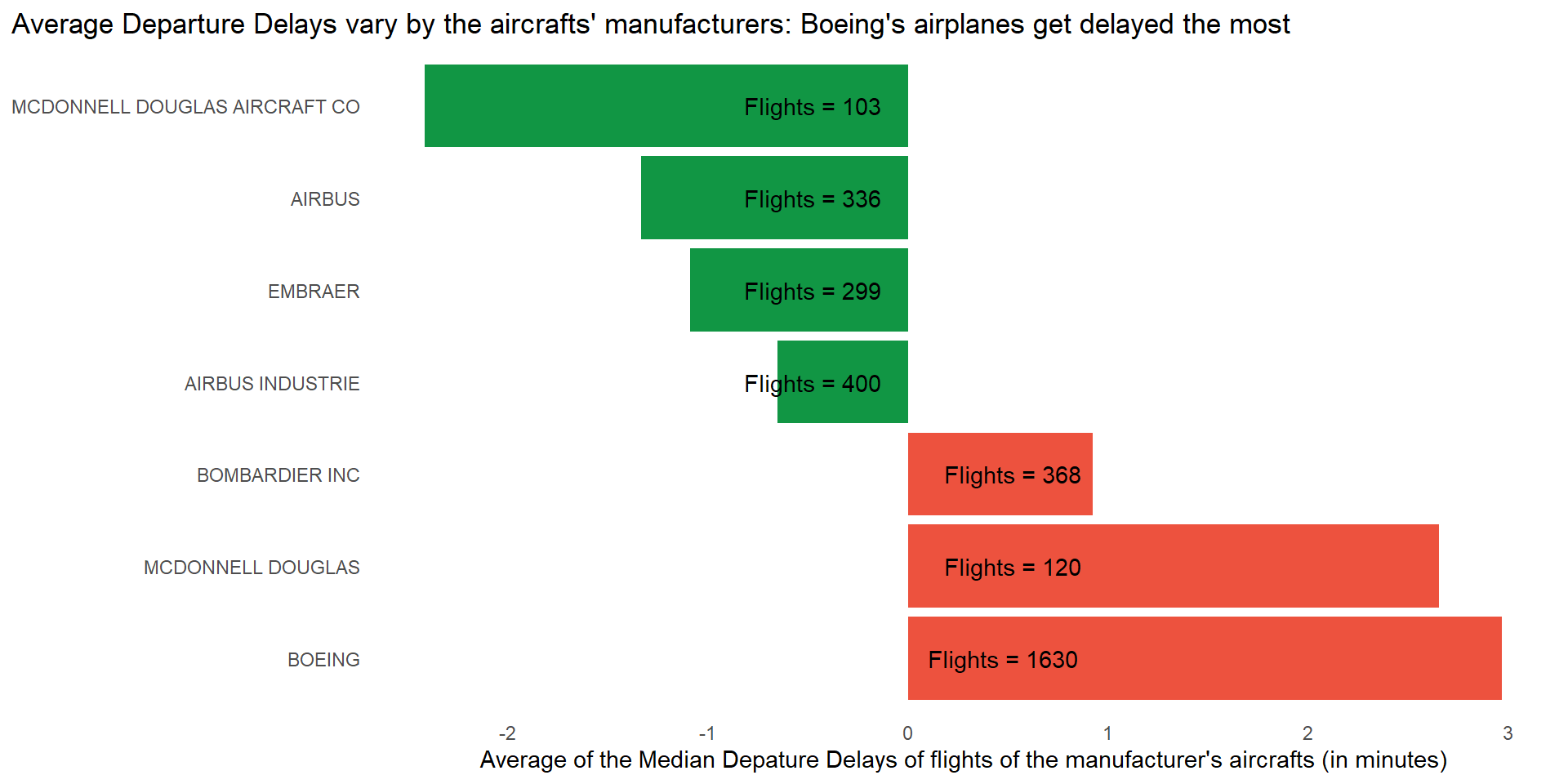
Question 2
Which destinations show the greatest variation in air speed?
To find the destinations that show the greatest variation in air speed, we can group the flights data-set by dest and then find the destinations which have the highest coefficient of variability, i.e. \(CV = \frac{sd}{\text{mean}} \cdot 100\), expressed as a percentage. The top 5 destinations with the greatest variation in air speed are in Table 4 .
The \(CV\) is expressed as a percentage and is useful to compare the relative variability of different destinations’ air speed because the mean airspeed for each destination is different.
The usefulness of the coefficient of variation depends on the context and the nature of the data you are dealing with. Here are a few points to consider. A higher \(CV\) indicates greater relative variability compared to the mean, while a lower CV suggests less relative variability.
Code
flights |>
  mutate(speed = 60 * distance/air_time) |>
  group_by(dest) |>
  summarise(
    nos = n(),
    mean = mean(speed, na.rm = TRUE),
    sd   = sd(speed, na.rm = TRUE),
    CV   = sd/mean) |>
  arrange(desc(CV)) |>
  slice_head(n = 5) |>
  gt() |>
  fmt_number(columns = -nos,
             decimals = 2) |>
  fmt_percent(columns = "CV") |>
  cols_label(
    dest = "Destination",
    nos = "Number of flights",
    mean = "Mean Air Speed (mph)",
    sd = "Std. Dev. Air Speed",
    CV = "Coeff. of Variation"
  ) |>
gtExtras::gt_theme_538()| Destination | Number of flights | Mean Air Speed (mph) | Std. Dev. Air Speed | Coeff. of Variation |
|---|---|---|---|---|
| PHL | 1632 | 176.45 | 30.66 | 17.38% |
| DCA | 9705 | 280.76 | 34.04 | 12.12% |
| BOS | 15508 | 297.62 | 32.57 | 10.94% |
| BDL | 443 | 277.01 | 29.85 | 10.77% |
| ACK | 265 | 288.95 | 30.56 | 10.58% |
Further, we can go one step ahead, and find whether there is a relation between destinations and air speeds along with their variability, graphically as shown in
Code
dest_vec = flights |>
  group_by(dest) |>
  count() |>
  filter(n > 10000) |>
  select(dest) |>
  as_vector() |>
  unname()

flights |>
  filter(dest %in% dest_vec) |>
  mutate(speed = 60 * distance/air_time) |>
  group_by(dest) |>
  mutate(m_s = mean(speed, na.rm = TRUE)) |>
  ggplot(aes(y = reorder(dest, m_s),
             x = speed)
         ) +
  geom_boxplot(outlier.alpha = 0.2,
               fill = "#cbc6cf") +
  theme_minimal() +
  labs(x = "Air speed (miles per hour)",
       y = NULL,
       title = "Farther destinations have higher average air speed of aircrafts, and lesser variability",
       subtitle = "Los Angeles bound aircrafts' average speed is much higher than Boston-bound aircrafts, but spread of data is lesser") +
  theme(panel.grid.major.y = element_blank(),
        panel.grid.minor = element_blank(),
        plot.title.position = "plot") +
  scale_x_continuous(breaks = seq(100, 600, 100)) +
  coord_cartesian(xlim = c(100, 600))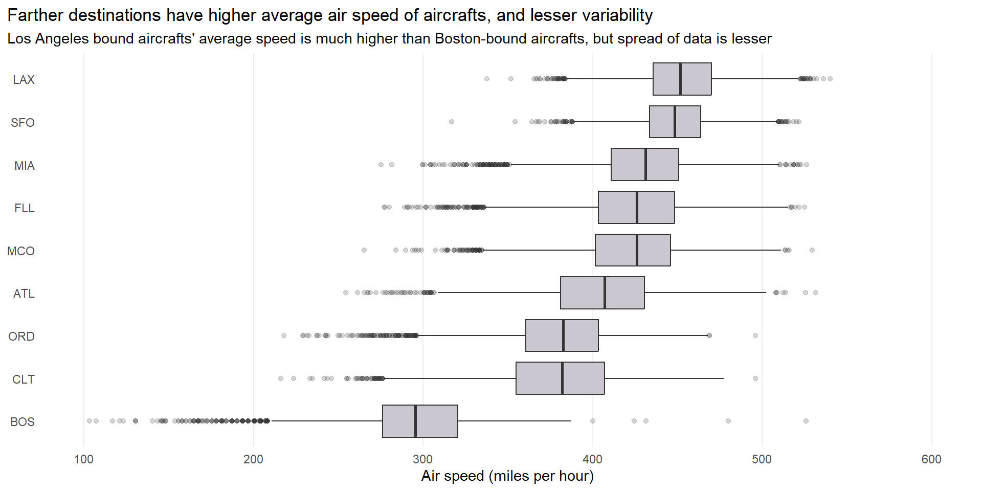
Question 3
Create a plot to further explore the adventures of EGE. Can you find any evidence that the airport moved locations? Can you find another variable that might explain the difference?
Once we start exploring the data, firstly, we observe in Figure 12 and Table 5 that the flight distances of the 213 flights to EGE in 2013 cluster into two groups: one around 1725 miles and the other around 1746 miles. Thus, this is one piece of evidence that the EGE airport changed locations.
Code
flights |>
  filter(dest == "EGE") |>
  group_by(distance) |>
  count() |>
  ungroup() |>
  gt() |>
  cols_label(
    distance = "Distance (in miles)",
    n = "Number of flights in 2013"
  ) |>
gtExtras::gt_theme_538()| Distance (in miles) | Number of flights in 2013 |
|---|---|
| 1725 | 51 |
| 1726 | 59 |
| 1746 | 44 |
| 1747 | 59 |
Code
flights |>
  filter(dest == "EGE") |>
  ggplot(aes(x = distance, y = 1)) +
  geom_jitter(width = 0,
              height = 0.1,
              alpha = 0.3) +
  theme_minimal() +
  coord_cartesian(xlim = c(1500, 1800),
                  ylim = c(0.8, 1.2)) +
  scale_x_continuous(breaks = c(1500, 1600, 1700, 1725, 1745, 1800)) +
  labs(title = "Flight distances to EGE cluster into two groups around 1725 and 1746 miles",
       x = "Flight Distance (miles)", y = NULL) +
  theme(panel.grid.minor = element_blank(),
        panel.grid.major.y = element_blank(),
        axis.text.y = element_blank(),
        axis.ticks.y = element_blank())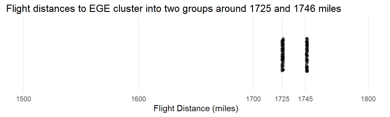
Now, upon exploring further, we find another variable, i.e., origin of the flights might explain the difference since EWR and JFK are slightly away from each other, even within New York City metropolitan area. The Table 6 explains this, and we conclude that after all, EGE airport may not have shifted after all.
Code
flights |>
  filter(dest == "EGE") |>
  group_by(origin) |>
  summarise(
    mean_of_distance = mean(distance, na.rm = TRUE),
    std_dev_of_distance = sd(distance, na.rm = TRUE),
    proportion_of_cancelled_flights = mean(is.na(dep_time)),
    number_of_flights = n()
  ) |>
  gt() |>
  fmt_percent(columns = proportion_of_cancelled_flights) |>
  fmt_number(decimals = 2,
             columns = c(mean_of_distance, std_dev_of_distance)) |>
  cols_label_with(fn = ~ janitor::make_clean_names(., case = "title")) |>
gtExtras::gt_theme_pff()| Origin | Mean of Distance | Std Dev of Distance | Proportion of Cancelled Flights | Number of Flights |
|---|---|---|---|---|
| EWR | 1,725.54 | 0.50 | 2.73% | 110 |
| JFK | 1,746.57 | 0.50 | 1.94% | 103 |