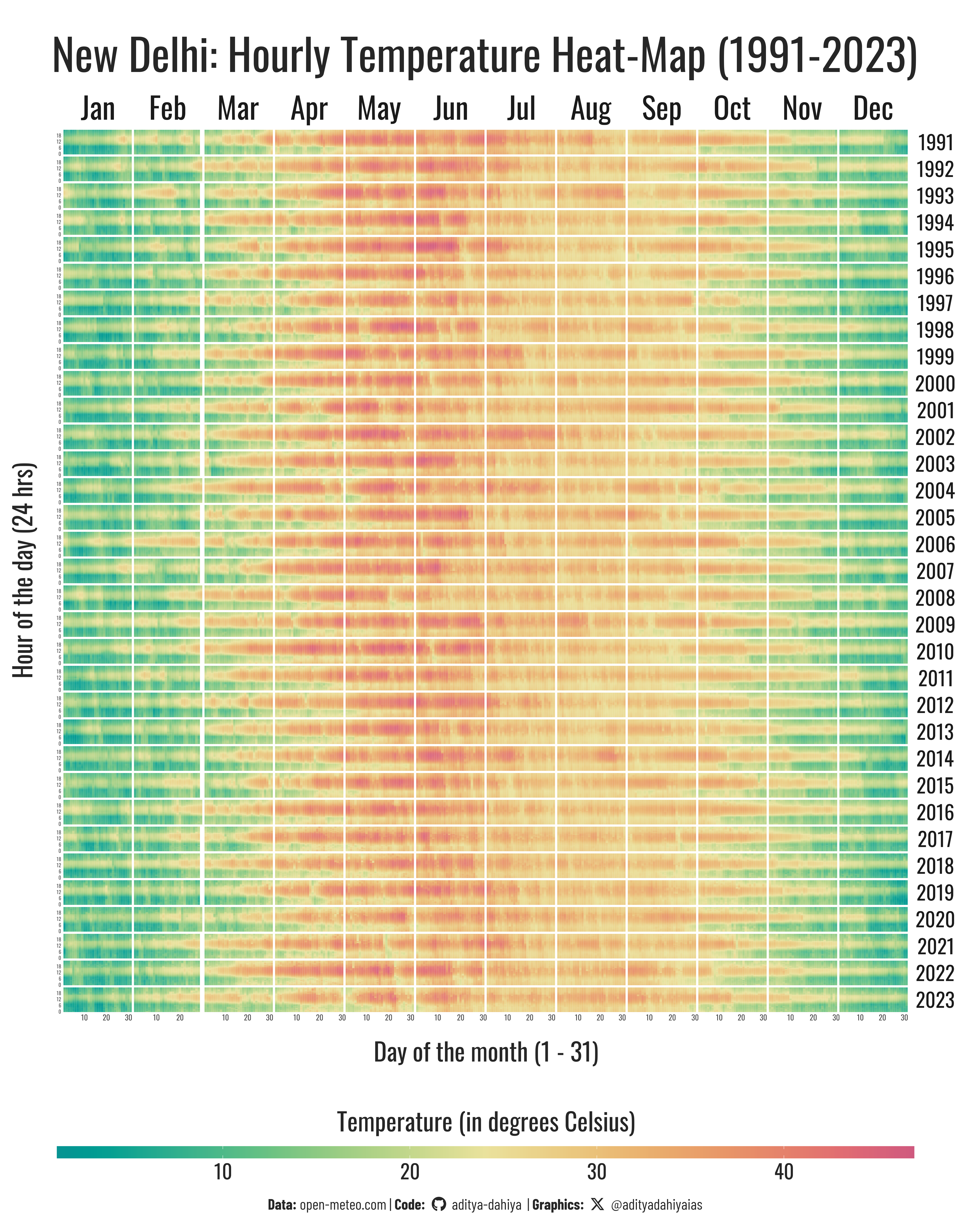
Figure 1: An hourly temperature heat map of the city of New Delhi from 1991-2023. X-axis denotes months and days, Y-axis denotes hours. Horizontal facets are the Months, and Vertical facets are the Years. Temperatures are coded in colour from green (cold) to yellow (medium) to red (hot).
How I made this graphic?
Loading libraries & data
Code
# Data Import and Wrangling Toolslibrary(tidyverse) # All things tidy# Final plot toolslibrary(scales) # Nice Scales for ggplot2library(fontawesome) # Icons display in ggplot2library(ggtext) # Markdown text support for ggplot2library(showtext) # Display fonts in ggplot2library(colorspace) # Lighten and Darken colourslibrary(seecolor) # To print and view colourslibrary(patchwork) # Combining plots# Get data in .csv from https://open-meteo.com# URL for this data:# https://open-meteo.com/en/docs/historical-weather-api#start_date=1990-01-01&end_date=2024-09-01&location_mode=csv_coordinates&csv_coordinates=28.7041,+77.1025rawdf <-read_csv( here::here("data/open-meteo-new-delhi-1950.csv"),skip =2)
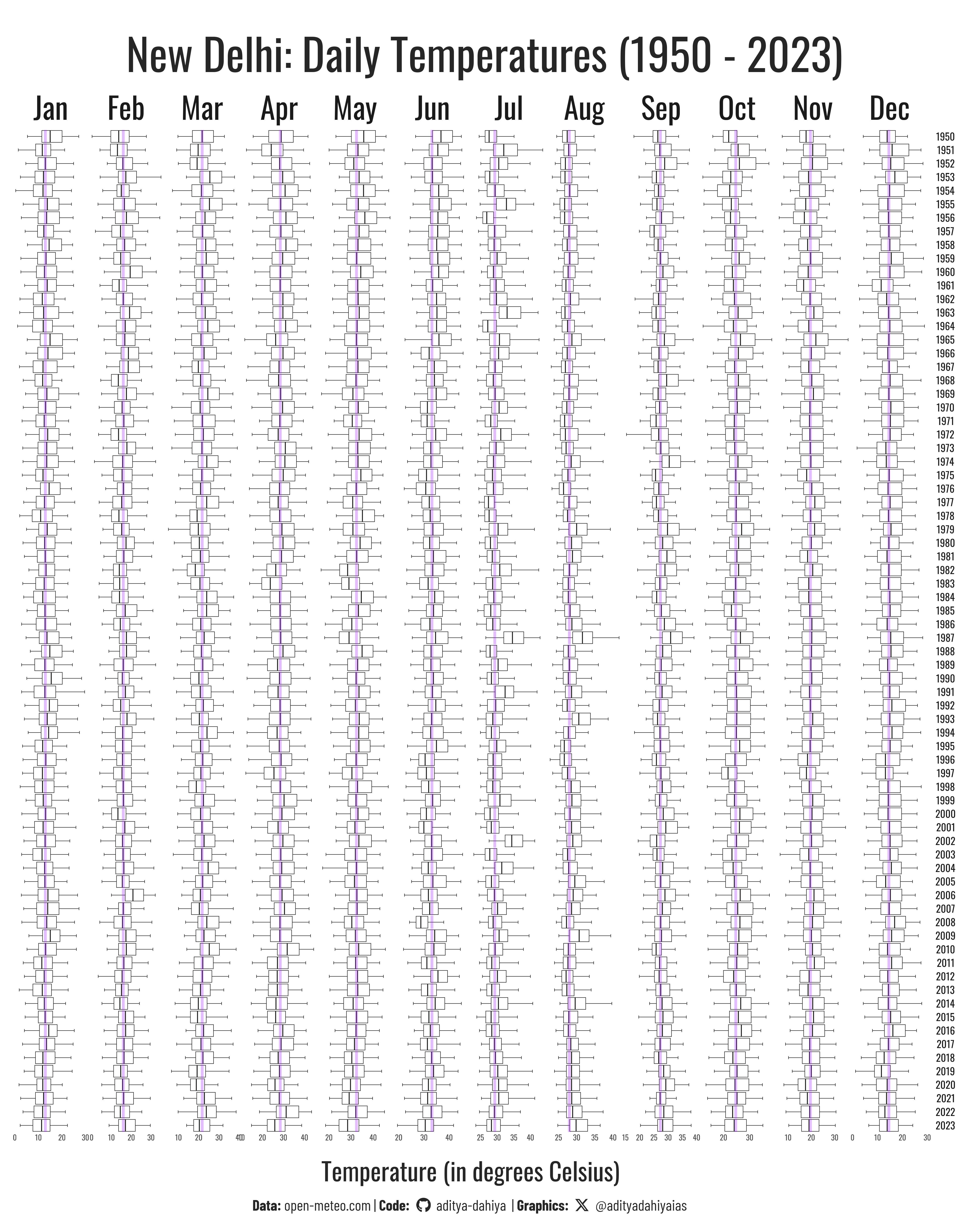
Figure 2: The same data with a boxplot. So indeed, we dont see any noticeable increase in temperatures - no discernable movement of boxplots to the right.
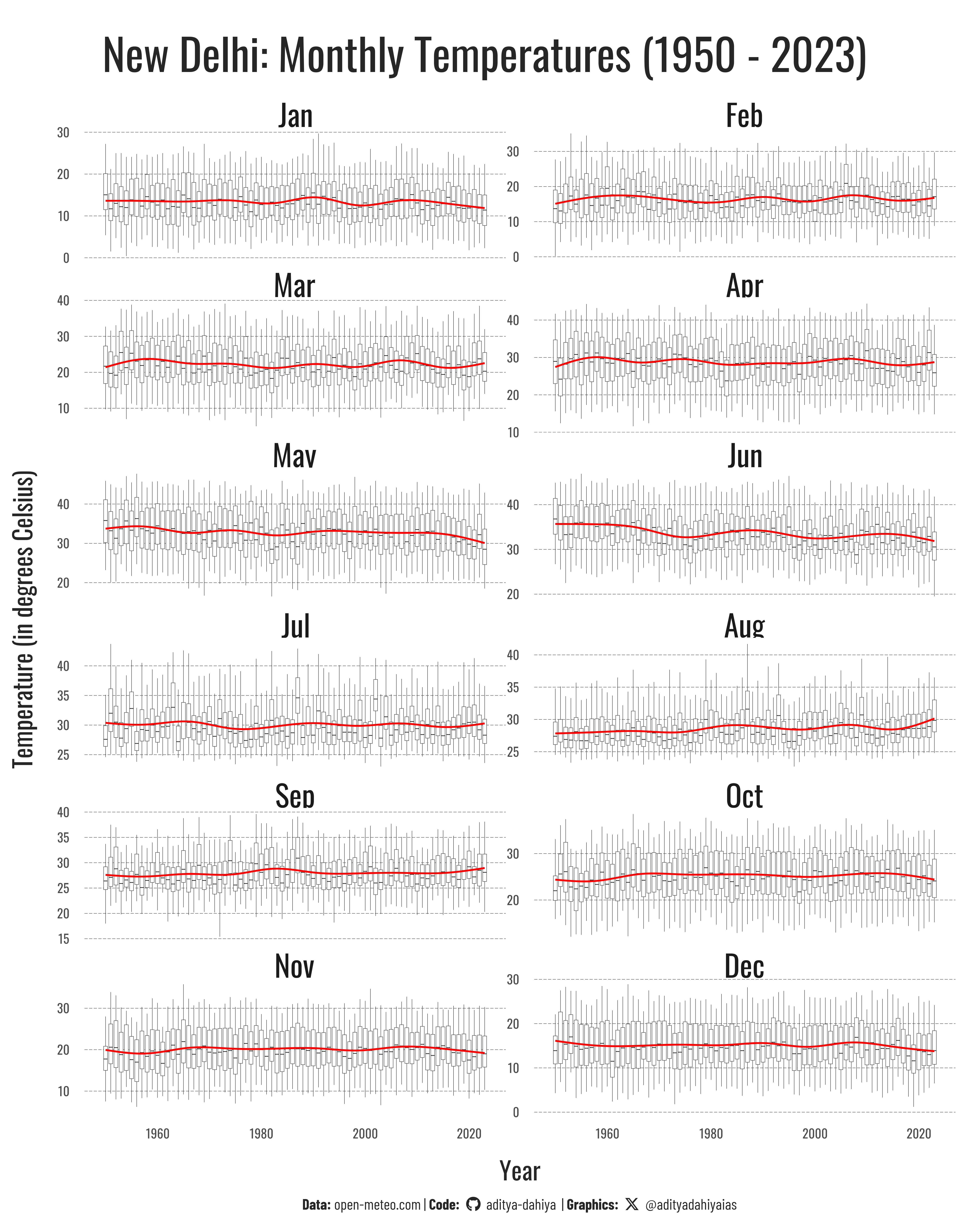
Another attempt with a boxplot overlaid with a smoother curve to see pattern