Radar Chart of Health Burdens in USA, China, India, and Globally

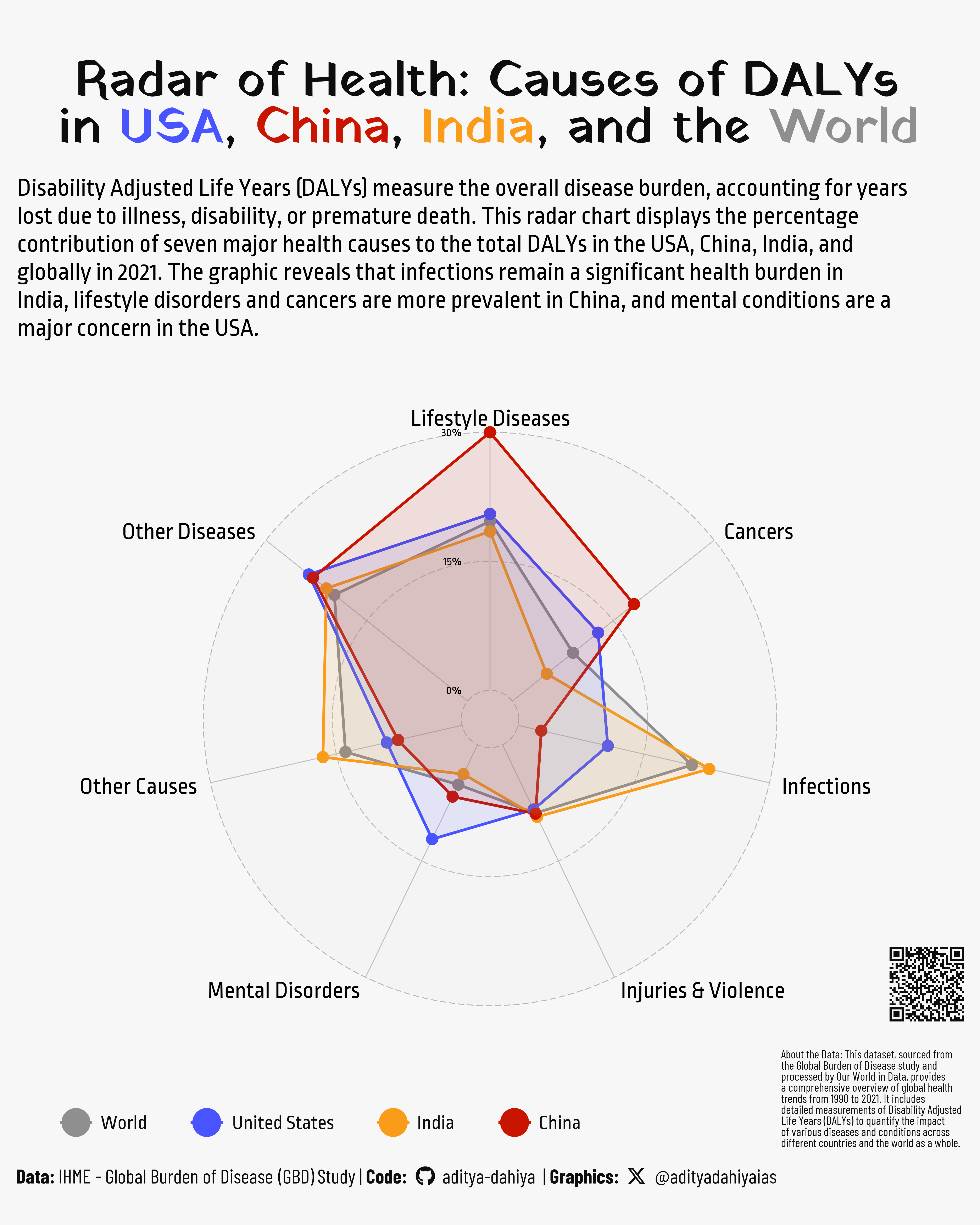
Comparing the Health Burdens: Percentage Contribution of Major Causes to Total DALYs in USA, China, India, and the World in 2021

A4 Size Viz
Our World in Data
Public Health
Author

Aditya Dahiya

Published

July 8, 2024

The dataset from Our World in Data provides comprehensive information on Disability Adjusted Life Years (DALYs) for various health conditions. The data is sourced from the IHME’s Global Burden of Disease (GBD) study and spans from 1990 to 2021. It was last updated on May 20, 2024. Detailed data can be retrieved from the Global Burden of Disease’s results tool here.

The radar chart reveals distinct health burden patterns among the USA, China, India, and the world in 2021. Infections remain a significant health issue in India, comparable to or exceeding global trends. China faces a higher burden from lifestyle disorders and cancers, reflecting its unique health challenges. In contrast, mental conditions are notably more impactful in the USA, causing more DALYs than in China, India, or globally. This visualization highlights the varying predominant health concerns across different regions.

Figure 1: This radar chart illustrates the percentage contribution of seven major health causes to the total Disability Adjusted Life Years (DALYs) in 2021 for the USA, China, India, and the world. Each vertex represents a different cause category, with colored polygons showing the distribution for each region, allowing for a comparative view of the health burdens across these entities.

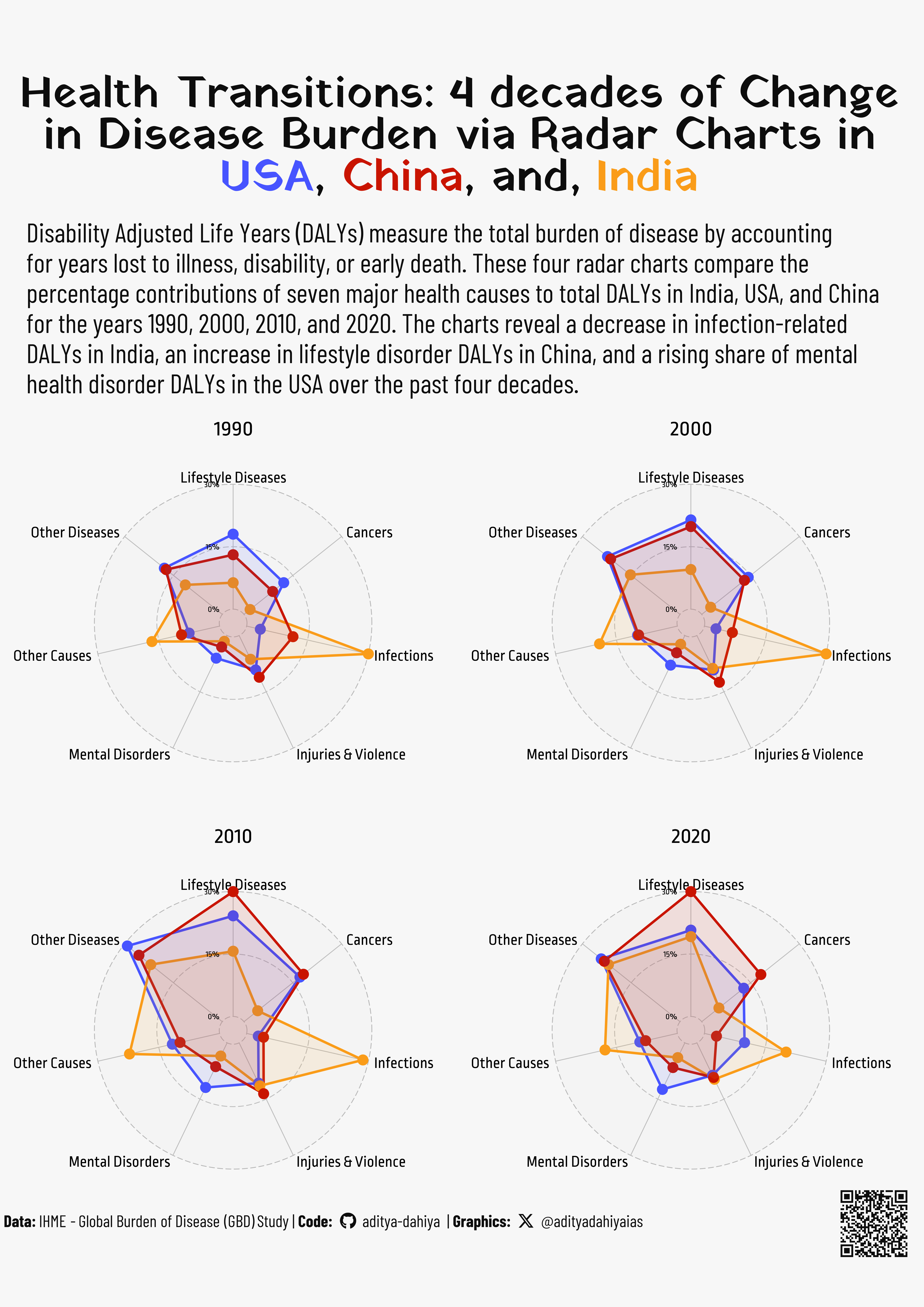
Evolving Health Burdens: A Radar Chart Analysis for India, USA, and China

Figure 2: This graphic presents four radar charts comparing the percentage contributions of seven major health causes to the total Disability Adjusted Life Years (DALYs) in India, USA, and China for the years 1990, 2000, 2010, and 2020. Each chart provides a visual representation of how the burden of disease has shifted across these countries over the past four decades. Different colors represent each country, highlighting changes in health burdens over time.

How I made these graphics?

Getting the data

Code
# Data Import and Wrangling Tools
library(tidyverse)            # All things tidy
library(owidR)                # Get data from Our World in R

# Final plot tools
library(scales)               # Nice Scales for ggplot2
library(fontawesome)          # Icons display in ggplot2
library(ggtext)               # Markdown text support
library(showtext)             # Display fonts in ggplot2
library(colorspace)           # To lighten and darken colours
library(patchwork)            # Combining plots
devtools::install_github("ricardo-bion/ggradar",
                          dependencies = TRUE)
library(ggradar)              # To draw Radar Maps

# search1 <- owidR::owid_search("burden of disease")

df1 <- owid("burden-of-disease-by-cause")

popdf <- owid("population-with-un-projections") |> 
  as_tibble() |> 
  janitor::clean_names() |> 
  rename(population = population_sex_all_age_all_variant_estimates) |> 
  select(-population_sex_all_age_all_variant_medium)

df2 <- df1 |> 
  as_tibble() |> 
  pivot_longer(
    cols = -c(year, entity, code),
    names_to = "indicator",
    values_to = "value"
  ) |> 
  mutate(
    indicator = str_remove(
      indicator,
      "Total number of DALYs from "
    ),
    indicator = str_remove(
      indicator,
      "\n"
    )
  ) |>
  mutate(
    indicator = str_to_title(
      indicator
    ),
    indicator = str_replace(
      indicator,
      "Hiv/Aids",
      "HIV / AIDS"
    ),
    indicator = str_replace_all(
      indicator,
      "And",
      "and"
    )
  )

Visualization Parameters

Code
# Font for titles
font_add_google("Yatra One",
  family = "title_font"
) 

# Font for the caption
font_add_google("Barlow Condensed",
  family = "caption_font"
) 

# Font for plot text
font_add_google("Ropa Sans",
  family = "body_font"
) 

showtext_auto()

# Colour Palette
mypal <- c("#c91400", "#fa9c19", "#4754ff", "#8f8f8f")
# Background Colour
bg_col <- "#f7f7f7"
text_col <- "black"
text_hil <- "grey5"

# Base Text Size
bts <- 90

plot_title <- glue::glue("Radar of Health: Causes of DALYs<br>in <b style='color:{mypal[3]}'>USA</b>, <b style='color:{mypal[1]}'>China</b>, <b style='color:{mypal[2]}'>India</b>, and the <b style='color:{mypal[4]}'>World</b>")

plot_subtitle <- str_wrap("Disability Adjusted Life Years (DALYs) measure the overall disease burden, accounting for years lost due to illness, disability, or premature death. This radar chart displays the percentage contribution of seven major health causes to the total DALYs in the USA, China, India, and globally in 2021. The graphic reveals that infections remain a significant health burden in India, lifestyle disorders and cancers are more prevalent in China, and mental conditions are a major concern in the USA.", 95)

data_annotation <- "About the Data: This dataset, sourced from the Global Burden of Disease study and processed by Our World in Data, provides a comprehensive overview of global health trends from 1990 to 2021. It includes detailed measurements of Disability Adjusted Life Years (DALYs) to quantify the impact of various diseases and conditions across different countries and the world as a whole."

# Caption stuff for the plot
sysfonts::font_add(
  family = "Font Awesome 6 Brands",
  regular = here::here("docs", "Font Awesome 6 Brands-Regular-400.otf")
)
github <- "&#xf09b"
github_username <- "aditya-dahiya"
xtwitter <- "&#xe61b"
xtwitter_username <- "@adityadahiyaias"
social_caption_1 <- glue::glue("<span style='font-family:\"Font Awesome 6 Brands\";'>{github};</span> <span style='color: {text_hil}'>{github_username}  </span>")
social_caption_2 <- glue::glue("<span style='font-family:\"Font Awesome 6 Brands\";'>{xtwitter};</span> <span style='color: {text_hil}'>{xtwitter_username}</span>")

plot_caption <- paste0(
  "**Data:** IHME - Global Burden of Disease (GBD) Study  |  ",
  "**Code:** ", 
  social_caption_1, 
  " |  **Graphics:** ", 
  social_caption_2
  )
rm(github, github_username, xtwitter, 
   xtwitter_username, social_caption_1, social_caption_2)

Data Wrangling

Code
df2 |> 
  filter(entity == "World") |> 
  group_by(indicator) |> 
  summarise(total = sum(value)) |> 
  arrange(desc(total)) |> 
  print(n  = Inf)

sel_cons <- c("India", "World", "China", "United States")

plotdf <- df2 |> 
  filter(entity %in% sel_cons) |> 
  group_by(entity, year) |> 
  mutate(
    indicator = case_when(
      indicator %in% c(
        "Cardiovascular Diseases",
        "Diabetes and Kidney Diseases"
      ) ~ "Lifestyle Diseases",
      indicator %in% c(
        "Other Infectious Diseases",
        "Respiratory Infections and Tuberculosis",
        "Enteric Infections",
        "Neglected Tropical Diseases and Malaria",
        "HIV / AIDS and Sexually Transmitted Infections"
      ) ~ "Infections",
      indicator %in% c(
        "Neoplasms"
      ) ~ "Cancers",
      indicator %in% c(
        "Other Non-Communicable Diseases",
        "Musculoskeletal Disorders",
        "Chronic Respiratory Diseases",
        "Digestive Diseases",
        "Skin and Subcutaneous Diseases",
        "Maternal Disorders"
      ) ~ "Other Diseases",
      indicator %in% c(
        "Unintentional Injuries",
        "Transport Injuries",
        "Self-Harm",
        "Interpersonal Violence",
        "Conflict and Terrorism",
        "Exposure To Forces Of Nature"
      ) ~ "Injuries & Violence",
      indicator %in% c(
        "Neurological Disorders",
        "Substance Use Disorders"
      ) ~ "Mental Disorders",
       .default = "Other Causes"
    )
  ) |> 
  ungroup() |> 
  group_by(entity, code, year, indicator) |> 
  summarise(value = sum(value)) |> 
  ungroup() |> 
  left_join(popdf |> filter(entity %in% sel_cons)) |> 
  group_by(entity, code, year) |> 
  mutate(
    perc = 100 * value / sum(value),
    daly_pop = 100 * value / population
    ) |> 
  ungroup() |> 
  mutate(
    indicator = fct(
      indicator,
      levels = c(
        "Lifestyle Diseases",
        "Cancers",
        "Infections",
        "Mental Disorders",
        "Injuries & Violence",
        "Other Causes",
        "Other Diseases"
      )
    )
  )

Visualization

Code
# Attempt with ggradar
g <- plotdf |> 
  filter(year == 2021) |> 
  ungroup() |> 
  select(year, entity, indicator, perc) |> 
  pivot_wider(
    id_cols = c(entity, year),
    names_from = indicator,
    values_from = perc
  ) |>
  select(-year) |> 
  relocate(
    `Lifestyle Diseases`,
    .after = entity
  ) |> 
  mutate(
    entity = fct(
      entity, 
      levels = plotdf |> distinct(entity) |> 
               pull(entity) |> sort(decreasing = T)
      )
  ) |> 
  ggradar::ggradar(
    base.size = bts * 2,
    font.radar = "body_font",
    values.radar = c("0%", "15%", "30%"),
    grid.line.width = 0.5,
    gridline.min.colour = "grey70",
    gridline.mid.colour = "grey70",
    gridline.max.colour = "grey70",
    grid.label.size = bts / 5,
    axis.label.offset = 1.05,
    axis.label.size = bts / 3,
    background.circle.colour = "grey90",
    fill = TRUE,
    fill.alpha = 0.1
  ) +
  coord_equal(clip = "off") +
  scale_colour_manual(values = rev(mypal)) +
  scale_fill_manual(values = rev(mypal)) +
  guides(
    fill = "none",
    colour = guide_legend(
      override.aes = list(
        size = 15
      )
    )
  ) +
  labs(
    title = plot_title,
    subtitle = plot_subtitle,
    caption = plot_caption
  ) +
  theme_void(
    base_size = bts,
    base_family = "body_font"
  ) +
  theme(
    legend.position = "bottom",
    plot.title = element_markdown(
      colour = text_hil,
      hjust = 0.5,
      size = bts * 2,
      margin = margin(10,0,0,0, "mm"),
      family = "title_font",
      lineheight = 0.3
    ),
    plot.subtitle = element_text(
      colour = text_col,
      lineheight = 0.3,
      hjust = 0,
      margin = margin(10,0,0,0, "mm")
    ),
    plot.caption = element_textbox(
      hjust = 0,
      colour = text_hil,
      margin = margin(10,0,0,0, "mm"),
      family = "caption_font"
    ),
    plot.margin = margin(10,5,10,5, "mm"),
    legend.text = element_text(
      hjust = 0,
      margin = margin(0,0,0,2, "mm"),
      colour = text_hil
    ),
    legend.margin = margin(0,0,0,0, "mm"),
    legend.box.margin = margin(0,0,0,0, "mm"),
    legend.justification = c(0,1),
    legend.background = element_rect(
      fill = "transparent",
      colour = "transparent"
    )
  )

Adding Insets and visualizing Figure 1

Code
p_data <- ggplot() +
  annotate(
    geom = "text",
    x = 0, y = 0,
    label = str_wrap(data_annotation, 45),
    family = "caption_font",
    lineheight = 0.25,
    size = bts / 6,
    colour = text_hil,
    hjust = 0,
    vjust = 1
  ) +
  theme_void()

# QR Code for the plot
url_graphics <- paste0(
  "https://aditya-dahiya.github.io/projects_presentations/projects/",
  # The file name of the current .qmd file
  "owid_daly_spider",
  ".qmd"
)

# remotes::install_github('coolbutuseless/ggqr')
# library(ggqr)
plot_qr <- ggplot(
  data = NULL, 
  aes(x = 0, y = 0, label = url_graphics)
  ) + 
  ggqr::geom_qr(
    colour = text_hil, 
    fill = bg_col,
    size = 1.2
    ) +
  # labs(caption = "Scan for the Interactive Version") +
  coord_fixed() +
  theme_void() +
  theme(plot.background = element_rect(
    fill = NA, 
    colour = NA
    ),
    plot.caption = element_text(
      hjust = 0.5,
      margin = margin(0,0,0,0, "mm"),
      family = "caption_font",
      size = bts/1.8
    )
  )


library(patchwork)
g2 <- g + 
  inset_element(
    p = p_data,
    left = 0.6, right = 1,
    top = 0.25, bottom = 0.02,
    align_to = "full",
    clip = FALSE,
    on_top = TRUE
  ) + 
  inset_element(
    p = plot_qr,
    left = 0.9, right = 1,
    top = 0.24, bottom = 0.14,
    align_to = "full",
    clip = FALSE,
    on_top = TRUE
  ) +
  plot_annotation(
    theme = theme(
      plot.background = element_rect(
        fill = "transparent",
        colour = "transparent"
      ),
      panel.background = element_rect(
        fill = "transparent",
        colour = "transparent"
      )
    )
  )

Making an A4 size graphic for comparison across years shown in Figure 2

Code
mypal <- c("#c91400", "#fa9c19", "#4754ff")

plot_title <- glue::glue("Health Transitions: 4 decades of Change<br>in Disease Burden via Radar Charts in<br><b style='color:{mypal[3]}'>USA</b>, <b style='color:{mypal[1]}'>China</b>, and, <b style='color:{mypal[2]}'>India</b>")

plot_subtitle <- str_wrap("Disability Adjusted Life Years (DALYs) measure the total burden of disease by accounting for years lost to illness, disability, or early death. These four radar charts compare the percentage contributions of seven major health causes to total DALYs in India, USA, and China for the years 1990, 2000, 2010, and 2020. The charts reveal a decrease in infection-related DALYs in India, an increase in lifestyle disorder DALYs in China, and a rising share of mental health disorder DALYs in the USA over the past four decades.", 95)

radar_plot <- function(year_plot = 2010){
  plotdf |> 
  filter(year == year_plot) |> 
  filter(entity != "World") |> 
  ungroup() |> 
  select(year, entity, indicator, perc) |> 
  pivot_wider(
    id_cols = c(entity, year),
    names_from = indicator,
    values_from = perc
  ) |>
  select(-year) |> 
  relocate(
    `Lifestyle Diseases`,
    .after = entity
  ) |> 
  mutate(
    entity = fct(
      entity, 
      levels = plotdf |> distinct(entity) |> 
               pull(entity) |> sort(decreasing = T)
      )
  ) |> 
  ggradar::ggradar(
    base.size = bts,
    font.radar = "body_font",
    values.radar = c("0%", "15%", "30%"),
    grid.line.width = 0.5,
    gridline.min.colour = "grey70",
    gridline.mid.colour = "grey70",
    gridline.max.colour = "grey70",
    grid.label.size = bts/6,
    axis.label.offset = 1.05,
    axis.label.size = bts/4,
    background.circle.colour = "grey90",
    fill = TRUE,
    fill.alpha = 0.1
  ) +
  coord_equal(clip = "off") +
  scale_colour_manual(values = rev(mypal)) +
  scale_fill_manual(values = rev(mypal)) +
  guides(
    fill = "none",
    colour = guide_legend(
      override.aes = list(
        size = 15
      )
    )
  ) +
  labs(
    subtitle = year_plot
  ) +
  theme_void(
    base_size = bts,
    base_family = "body_font"
  ) +
  theme(
    legend.position = "none",
    plot.subtitle = element_text(
      size = bts * 1,
      colour = text_col,
      lineheight = 0.3,
      hjust = 0.5,
      margin = margin(10,0,0,0, "mm")
    ),
    plot.margin = margin(0,0,0,0, "mm")
  )
}

g <- patchwork::wrap_plots(
  radar_plot(1990),
  radar_plot(2000),
  radar_plot(2010),
  radar_plot(2020),
  ncol = 2,
  nrow = 2,
  byrow = TRUE
) +
  plot_annotation(
    title = plot_title,
    subtitle = plot_subtitle,
    caption = plot_caption,
    theme = theme(
        plot.title = element_markdown(
        colour = text_hil,
        hjust = 0.5,
        size = bts * 2,
        margin = margin(20,0,0,0, "mm"),
        family = "title_font",
        lineheight = 0.3
      ),
      plot.subtitle = element_text(
        colour = text_hil,
        lineheight = 0.3,
        hjust = 0,
        margin = margin(10,0,0,10, "mm"),
        size = bts * 1.2,
        family = "caption_font"
      ),
      plot.caption = element_textbox(
        hjust = 0,
        colour = text_hil,
        margin = margin(0,0,20,0, "mm"),
        family = "caption_font",
        size = bts * 0.75
      ),
      plot.background = element_rect(
        fill = "transparent",
        colour = "transparent"
      ),
      panel.background = element_rect(
        fill = "transparent",
        colour = "transparent"
      )
    )
  )

p_data <- ggplot() +
  annotate(
    geom = "text",
    x = 0, y = 0,
    label = str_wrap(data_annotation, 40),
    family = "caption_font",
    lineheight = 0.25,
    size = bts / 6,
    colour = text_hil,
    hjust = 0,
    vjust = 1
  ) +
  theme_void()

# QR Code for the plot
url_graphics <- paste0(
  "https://aditya-dahiya.github.io/projects_presentations/projects/",
  # The file name of the current .qmd file
  "owid_daly_spider",
  ".qmd"
)

# remotes::install_github('coolbutuseless/ggqr')
# library(ggqr)
plot_qr <- ggplot(
  data = NULL, 
  aes(x = 0, y = 0, label = url_graphics)
  ) + 
  ggqr::geom_qr(
    colour = text_hil, 
    fill = bg_col,
    size = 1.2
    ) +
  # labs(caption = "Scan for the Interactive Version") +
  coord_fixed() +
  theme_void() +
  theme(plot.background = element_rect(
    fill = NA, 
    colour = NA
    ),
    plot.caption = element_text(
      hjust = 0.5,
      margin = margin(0,0,0,0, "mm"),
      family = "caption_font",
      size = bts/1.8
    )
  )

g2 <- g + 
  inset_element(
    p = plot_qr,
    left = 0.8, right = 1,
    top = 0.1, bottom = -0.15,
    align_to = "full",
    clip = FALSE,
    on_top = TRUE
  ) +
  plot_annotation(
    theme = theme(
      plot.background = element_rect(
        fill = "transparent",
        colour = "transparent"
      ),
      panel.background = element_rect(
        fill = "transparent",
        colour = "transparent"
      )
    )
  )

ggsave(
  filename = here::here("data_vizs", "a4_owid_daly_spiders.png"),
  plot = g2,
  height = 297 * 2,
  width = 210 * 2,
  units = "mm",
  bg = bg_col
)

Save a thumbnail

Code
ggsave(
  filename = here::here("data_vizs", "owid_daly_spider.png"),
  plot = g2,
  height = 500,
  width = 400,
  units = "mm",
  bg = bg_col
)

library(magick)
# Saving a thumbnail for the webpage
image_read(here::here("data_vizs", 
                      "owid_daly_spider.png")) |> 
  image_resize(geometry = "400") |> 
  image_write(here::here("data_vizs", "thumbnails", 
                         "owid_daly_spider.png"))