Comparing burden of disease: India vs China

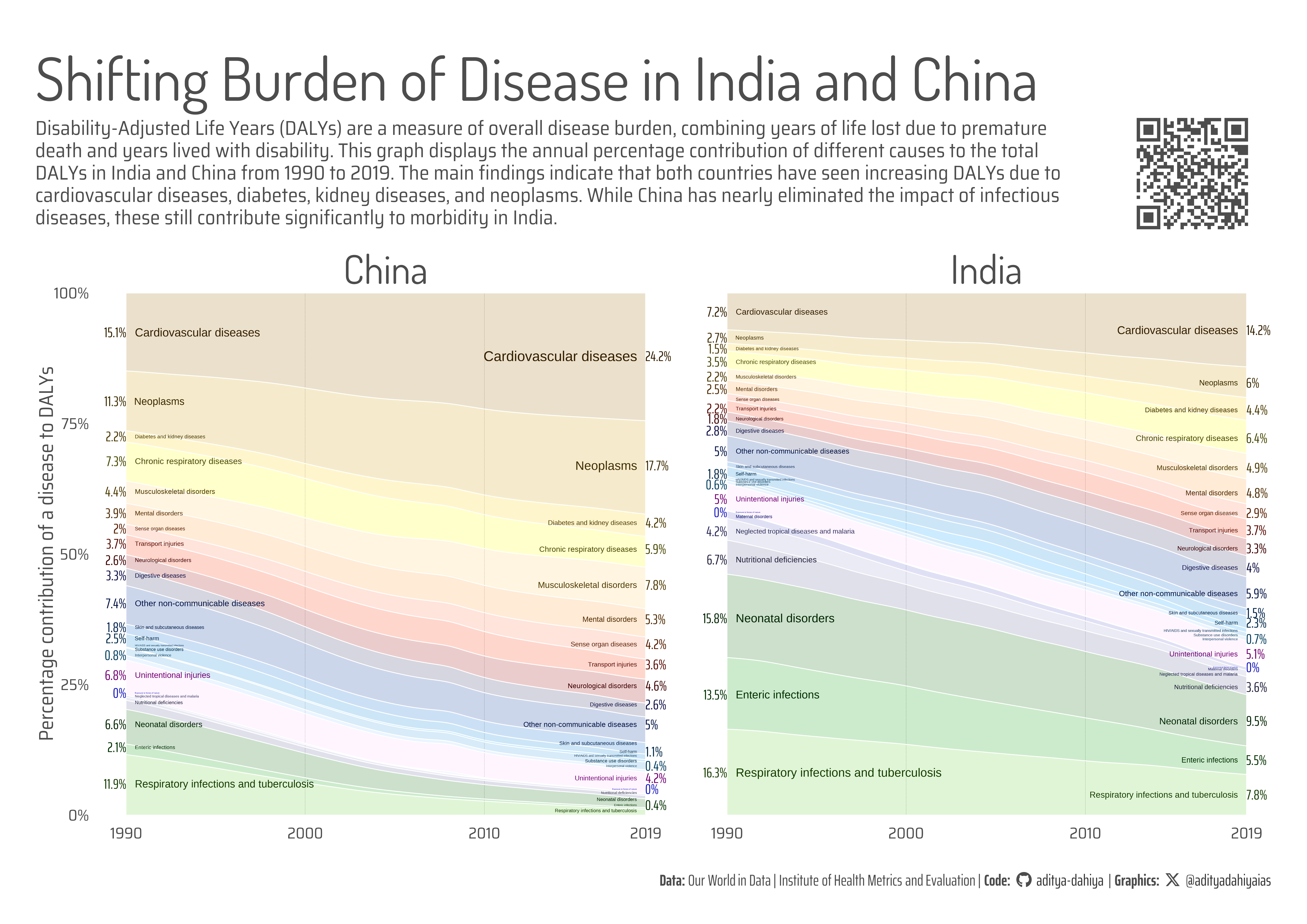
A graphic displaying annual percentage contribution of 27 different causes to the total Disability-Adjusted Life Years (DALYs) in India and China from 1990 to 2019, highlighting the rising burden of cardiovascular diseases, diabetes, kidney diseases, and neoplasms in both countries, the near eradication of infectious diseases in China, and the persistent impact of infectious diseases in India.

A4 Size Viz
Our World in Data
Interactive
Author

Aditya Dahiya

Published

May 25, 2024

Major Causes of Disability-Adjusted Life Years (DALYs)

The data used in this visualization project illustrates the share of total disease burden by cause worldwide in 2019, measured in Disability-Adjusted Life Years (DALYs). DALYs represent the total burden of disease, accounting for both the years of life lost due to premature death and the years lived with disability. One DALY equates to one year of healthy life lost. This comprehensive measure allows for the comparison of the overall burden of different diseases and injuries. The data, sourced from the Institute for Health Metrics and Evaluation’s Global Burden of Disease Study (2019) and processed by Our World in Data, categorizes diseases into three main groups: non-communicable diseases (blue), communicable, maternal, neonatal, and nutritional diseases (red), and injuries (grey).

The graph illustrates the annual percentage contribution of 27 different causes to the total Disability-Adjusted Life Years (DALYs) in India and China from 1990 to 2019. The findings reveal that both countries have experienced a rise in DALYs due to cardiovascular diseases, diabetes, kidney diseases, and neoplasms. Notably, China has nearly eradicated infectious diseases, resulting in minimal impact on overall morbidity, whereas these diseases still significantly affect public health in India.

Annual percentage contribution of 27 different causes to the total Disability-Adjusted Life Years (DALYs) in India and China from 1990 to 2019, highlighting the rising burden of cardiovascular diseases, diabetes, kidney diseases, and neoplasms in both countries, the near eradication of infectious diseases in China, and the persistent impact of infectious diseases and nutritional deficiencies in India.

Data Source: Institute for Health Metrics and Evaluation, Global Burden of Disease (2019) – processed by Our World in Data.

An interactive version of the same plot (work in-progress)

How I made this graphic?

Getting the data

Code
# Data Import and Wrangling Tools
library(tidyverse)            # All things tidy
library(owidR)                # Get data from Our World in R

# Final plot tools
library(scales)               # Nice Scales for ggplot2
library(fontawesome)          # Icons display in ggplot2
library(ggtext)               # Markdown text support for ggplot2
library(showtext)             # Display fonts in ggplot2
library(colorspace)           # To lighten and darken colours

# The Expansion pack to ggplot2
library(ggforce)              # to learn some new geom-extensions

# Search Our World in Data for Wheat Production Dataset
# owidR::owid_search("Share of total disease burden by cause")


rawdf <- owid("share-of-total-disease-burden-by-cause")

Visualization Parameters

Code
# Font for titles
font_add_google("Dosis",
  family = "title_font"
) 

# Font for the caption
font_add_google("Saira Extra Condensed",
  family = "caption_font"
) 

# Font for plot text
font_add_google("Saira Semi Condensed",
  family = "body_font"
) 

showtext_auto()

# Background Colour
bg_col <- "white"
text_col <- "grey20"
text_hil <- "grey30"

mypal <- paletteer::paletteer_d("palettesForR::Windows")[-c(5:6, 19:20)]

# Base Text Size
bts <- 80


plot_title <- "Shifting Burden of Disease in India and China"

plot_subtitle <- str_wrap("Disability-Adjusted Life Years (DALYs) are a measure of overall disease burden, combining years of life lost due to premature death and years lived with disability. This graph displays the annual percentage contribution of different causes to the total DALYs in India and China from 1990 to 2019. The main findings indicate that both countries have seen increasing DALYs due to cardiovascular diseases, diabetes, kidney diseases, and neoplasms. While China has nearly eliminated the impact of infectious diseases, these still contribute significantly to morbidity in India. ", 130)
str_view(plot_subtitle)

# Caption stuff for the plot
sysfonts::font_add(
  family = "Font Awesome 6 Brands",
  regular = here::here("docs", "Font Awesome 6 Brands-Regular-400.otf")
)
github <- "&#xf09b"
github_username <- "aditya-dahiya"
xtwitter <- "&#xe61b"
xtwitter_username <- "@adityadahiyaias"
social_caption_1 <- glue::glue("<span style='font-family:\"Font Awesome 6 Brands\";'>{github};</span> <span style='color: {text_col}'>{github_username}  </span>")
social_caption_2 <- glue::glue("<span style='font-family:\"Font Awesome 6 Brands\";'>{xtwitter};</span> <span style='color: {text_col}'>{xtwitter_username}</span>")


plot_caption <- paste0(
  "**Data:** Our World in Data | Institute of Health Metrics and Evaluation |  ",
  "**Code:** ", 
  social_caption_1, 
  " |  **Graphics:** ", 
  social_caption_2
  )

Data Wrangling

Code
# An Overall view of the data
# rawdf |> 
#   as_tibble() |> 
#   View()

# Missingness in the data
# rawdf |> 
#   as_tibble() |> 
#   visdat::vis_dat()

# Get data for India and China for comparison

ind_df <- rawdf |>
  as_tibble() |> 
  filter(entity %in% c("India", "China")) |> 
  pivot_longer(
    cols = -c(entity, code, year),
    names_to = "indicator",
    values_to = "perc_value"
  ) |> 
  separate_wider_delim(
    cols = indicator,
    names = c(NA, "indicator", NA, NA),
    delim = " - "
  ) |> 
  group_by(entity, code, year) |> 
  mutate(perc_value = perc_value / sum(perc_value))

# Change in share of DALYs in 30 years
change30yr <- ind_df |> 
  filter(entity == "India") |> 
  filter(year %in% c(1990, 2019)) |> 
  mutate(year = paste0("y_", year)) |> 
  pivot_wider(
    id_cols = c(entity, code, indicator),
    names_from = year,
    values_from = perc_value
  ) |> 
  mutate(change = y_2019 - y_1990) |> 
  arrange(change)

levels_indicator <- change30yr |> pull(indicator)

plotdf <- ind_df |> 
  mutate(
    indicator = fct_rev(
      fct(indicator, levels = levels_indicator)
      )
    )

# piedf <- plotdf |> 
#   filter(year %in% c(1990, 2000, 2010, 2019)) |> 
#   mutate(col_var = if_else(
#     indicator == "Cardiovascular diseases",
#     "Cardiovascular diseases",
#     "Others")
#   ) |> 
#   group_by(entity, code, year, col_var) |> 
#   summarise(perc_value = sum(perc_value)) |> 
#   pivot_wider(
#     id_cols = c(entity, code, year),
#     names_from = col_var,
#     values_from = perc_value
#   ) |> 
#   mutate(y_var = 1.1)

Visualization

Code
g_base <- plotdf |> 
  ggplot(aes(year, perc_value, 
             fill = indicator, 
             colour = indicator)) +
  ggstream::geom_stream(
    type = "proportional",
    colour = bg_col,
    alpha = 0.2
  ) +
  
  # Labels on x-axis end
  geom_text(
    data = plotdf |> filter(year == 2019),
    mapping = aes(
      x = 2018.5,
      label  = indicator, 
      size = perc_value
      ),
    position = position_stack(vjust = 0.5),
    hjust = 1,
    check_overlap = TRUE
  ) +
  
  # Labels on x-axis start
  geom_text(
    data = plotdf |> filter(year == 1990),
    mapping = aes(
      x = 1990.5,
      label  = indicator, 
      size = perc_value
      ),
    position = position_stack(vjust = 0.5),
    hjust = 0,
    check_overlap = TRUE
  ) +
  scale_size(range = c(2, 20)) +
  
  # Percentage labels
  geom_text(
    data = plotdf |> filter(year %in% c(1990, 2019)),
    mapping = aes(label = paste0(round(100*perc_value, 1), "%")),
    position = position_stack(vjust = 0.5),
    hjust = "outward",
    check_overlap = TRUE,
    family = "caption_font",
    size = bts / 4
  ) +
  
  # Scales and Coordinates
  scale_x_continuous(
    breaks = c(1990, 2000, 2010, 2019),
    limits = c(1989.5, 2019.5),
    expand = expansion(0.03)
  ) +
  scale_y_continuous(
    expand = expansion(0),
    breaks = seq(0, 1, 0.25),
    labels = label_percent()
  ) +
  coord_cartesian(
    clip = "off"
  ) +
  scale_fill_manual(values = mypal) +
  scale_colour_manual(values = mypal |> darken(0.7)) +
  
  # Faceting
  facet_wrap(~ entity, ncol = 2) +
  
  # Labels
  labs(
    x = NULL,
    y = "Percentage contribution of a disease to DALYs",
    title = plot_title,
    subtitle = plot_subtitle,
    caption = plot_caption
  ) +
  theme_minimal(
    base_family = "body_font",
    base_size = bts
  ) +
  theme(
    legend.position = "none",
    axis.ticks = element_blank(),
    axis.ticks.length = unit(0, "mm"),
    panel.grid.minor = element_blank(),
    panel.grid.major.y = element_blank(),
    panel.grid.major.x = element_line(
      linetype = "dashed",
      linewidth = 0.1,
      colour = text_col
    ),
    strip.text = element_text(
      size = bts * 2,
      hjust = 0.5,
      margin = margin(10,0,2,0, "mm"),
      colour = text_hil,
      family = "title_font"
    ),
    plot.title = element_text(
      hjust = 0,
      colour = text_hil,
      family = "title_font",
      size = 3 * bts,
      margin = margin(10,0,0,0, "mm")
    ),
    plot.subtitle = element_text(
      hjust = 0,
      lineheight = 0.3,
      colour = text_hil,
      margin = margin(3,0,0,0, "mm")
    ),
    plot.caption = element_textbox(
      hjust = 1,
      colour = text_hil,
      family = "caption_font"
    ),
    axis.text = element_text(
      colour = text_hil,
      margin = margin(0,0,0,0, "mm")
    ),
    plot.title.position = "plot",
    axis.title.y = element_text(
      hjust = 0.5,
      vjust = 0,
      margin = margin(0,0,0,0, "mm"),
      colour = text_hil
    )
  )

Add annotations and insets

Code
# QR Code for the plot
url_graphics <- paste0(
  "https://aditya-dahiya.github.io/projects_presentations/projects/",
  # The file name of the current .qmd file
  "owid_dalys",
  ".qmd"
)
# remotes::install_github('coolbutuseless/ggqr')
# library(ggqr)
plot_qr <- ggplot(
  data = NULL, 
  aes(x = 0, y = 0, label = url_graphics)
  ) + 
  ggqr::geom_qr(
    colour = text_hil, 
    fill = bg_col,
    size = 2
    ) +
  # labs(caption = "Scan for the Interactive Version") +
  coord_fixed() +
  theme_void() +
  theme(plot.background = element_rect(
    fill = NA, 
    colour = NA
    ),
    plot.caption = element_text(
      hjust = 0.5,
      margin = margin(0,0,0,0, "mm"),
      family = "caption_font",
      size = bts/1.8
    )
  )
plot_qr

library(patchwork)
g <- g_base +
  inset_element(
    p = plot_qr,
    left = 0.85, right = 0.98,
    top = 0.88, bottom = 0.75,
    align_to = "full"
  ) +
  plot_annotation(
    theme = theme(
      plot.background = element_rect(
        fill = "transparent",
        colour = "transparent"
      ),
      panel.background = element_rect(
        fill = "transparent",
        colour = "transparent"
      )
    )
  )

Save graphic and a thumbnail

Code
ggsave(
  filename = here::here("data_vizs", "owid_dalys.png"),
  plot = g,
  height = 210 * 2,
  width = 297 * 2,
  units = "mm",
  bg = bg_col
)


library(magick)
# Saving a thumbnail for the webpage
image_read(here::here("data_vizs", 
                      "owid_dalys.png")) |> 
  image_resize(geometry = "400") |> 
  image_write(here::here("data_vizs", "thumbnails", 
                         "owid_dalys.png"))