Sex Ratios at Birth Worldwide (1970-2020)

Examining global shifts in birth sex ratios over five decades, highlighting the impact of technology and cultural preferences on gender imbalances.

A4 Size Viz
Our World in Data
Public Health
Author

Aditya Dahiya

Published

June 24, 2024

Decades of Imbalance: Sex Ratios at Birth Worldwide (1970-2020)

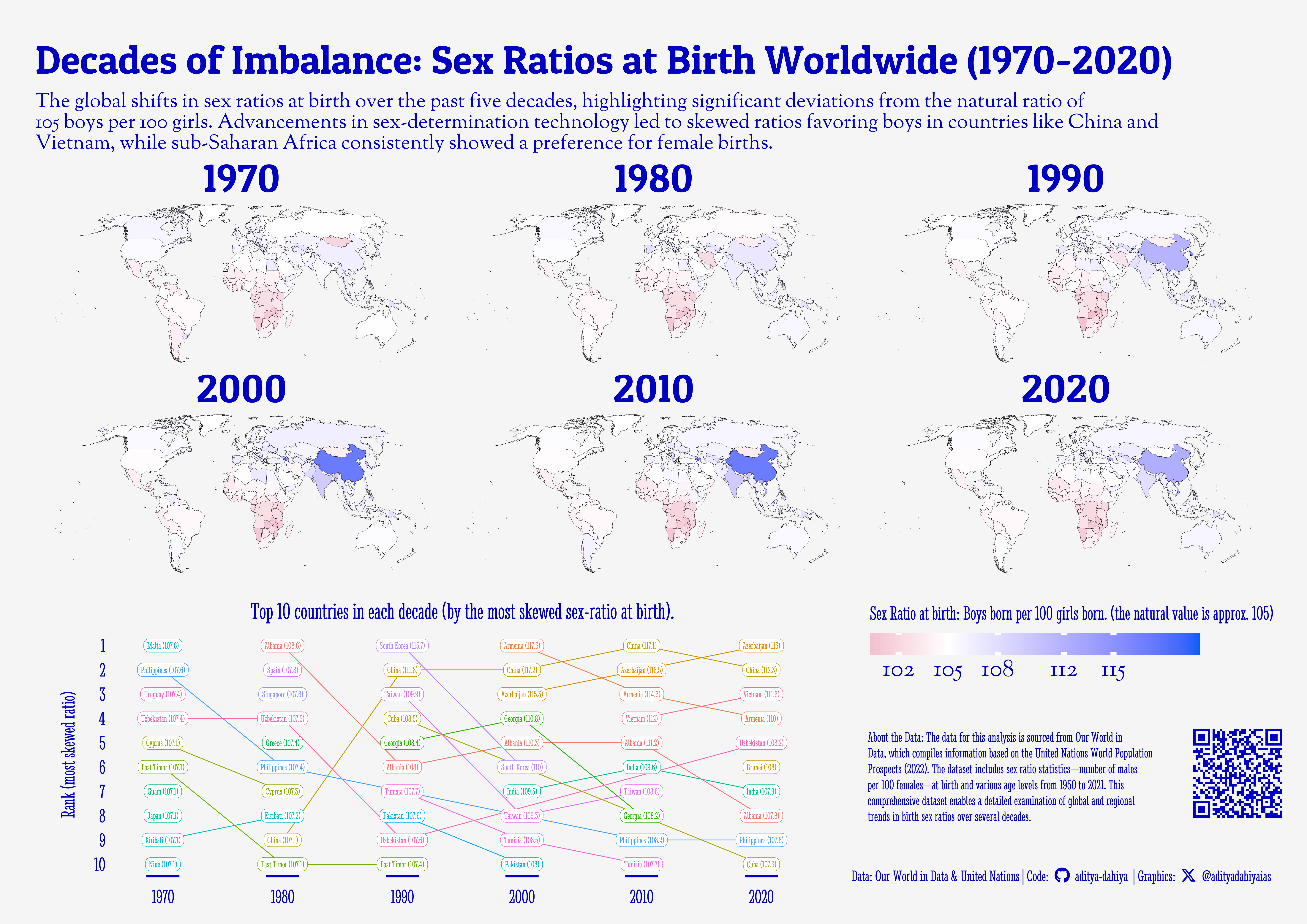
The graphic, based on data from Our World in Data (2022), compiled from United Nations World Population Prospects (2022), illustrates the sex ratio at birth across various countries from 1970 to 2020. The world maps for each decade depict the number of boys born per 100 girls, highlighting significant deviations from the natural sex ratio of 105 boys per 100 girls. The findings reveal that with the advent of sex-determination technology, countries like China, Azerbaijan, Vietnam, and Armenia experienced increasingly skewed sex ratios, favouring male births. Conversely, sub-Saharan African nations traditionally displayed a preference for female births, resulting in lower male-to-female birth ratios than expected. Recently, countries like China and India are trending back towards a balanced sex ratio at birth after decades of a strong preference for male children. The inset below the maps identifies the top 10 countries with the highest male births for each decade, underscoring regional and temporal variations in birth gender preferences.

The graphic displays the sex ratios at birth, measured as the number of boys born per 100 girls, across various countries from 1970 to 2020. It includes six world maps, each representing a different decade, and highlights the changes in birth gender ratios over time. Additionally, an inset lists the top 10 countries with the highest male birth ratios for each decade, providing a detailed view of global and regional patterns.

How I made this graphic?

Getting the data

Code
# Data Import and Wrangling Tools
library(tidyverse)            # All things tidy
library(owidR)                # Get data from Our World in R

# Final plot tools
library(scales)               # Nice Scales for ggplot2
library(fontawesome)          # Icons display in ggplot2
library(ggtext)               # Markdown text support for ggplot2
library(showtext)             # Display fonts in ggplot2
library(colorspace)           # To lighten and darken colours

search_terms <- owidR::owid_search("gender")
search_terms_1 <- owidR::owid_search("sex ratio")

rawdf <- owidR::owid("sex-ratio-by-age")

Visualization Parameters

Code
# Font for titles
font_add_google("Patua One",
  family = "title_font"
) 

# Font for the caption
font_add_google("Stint Ultra Condensed",
  family = "caption_font"
) 

# Font for plot text
font_add_google("Sorts Mill Goudy",
  family = "body_font"
) 

showtext_auto()

# Colour Palette
mypal <- c("#F5F5F5FF", "#0000C0FF", "#0000FFFF", "#C31E6EFF", "#8B3A62FF")

# Background Colour
bg_col <- mypal[1]
text_col <- mypal[2]
text_hil <- mypal[2]

# Base Text Size
bts <- 80

plot_title <- "Decades of Imbalance: Sex Ratios at Birth Worldwide (1970-2020)"

plot_subtitle <- "The global shifts in sex ratios at birth over the past five decades, highlighting significant deviations from the natural ratio of 105 boys per 100 girls. Advancements in sex-determination technology led to skewed ratios favoring boys in countries like China and Vietnam, while sub-Saharan Africa consistently showed a preference for female births."
plot_subtitle <- str_wrap(plot_subtitle, 135)
str_view(plot_subtitle)

inset_title <- "Top 10 countries in each decade (by the most skewed sex-ratio at birth)."

data_annotation <- "About the Data: The data for this analysis is sourced from Our World in Data, which compiles information based on the United Nations World Population Prospects (2022). The dataset includes sex ratio statistics—number of males per 100 females—at birth and various age levels from 1950 to 2021. This comprehensive dataset enables a detailed examination of global and regional trends in birth sex ratios over several decades."

# Caption stuff for the plot
sysfonts::font_add(
  family = "Font Awesome 6 Brands",
  regular = here::here("docs", "Font Awesome 6 Brands-Regular-400.otf")
)
github <- "&#xf09b"
github_username <- "aditya-dahiya"
xtwitter <- "&#xe61b"
xtwitter_username <- "@adityadahiyaias"
social_caption_1 <- glue::glue("<span style='font-family:\"Font Awesome 6 Brands\";'>{github};</span> <span style='color: {text_hil}'>{github_username}  </span>")
social_caption_2 <- glue::glue("<span style='font-family:\"Font Awesome 6 Brands\";'>{xtwitter};</span> <span style='color: {text_hil}'>{xtwitter_username}</span>")

plot_caption <- paste0(
  "**Data:** Our World in Data & United Nations  |  ",
  "**Code:** ", 
  social_caption_1, 
  " |  **Graphics:** ", 
  social_caption_2
  )

Data Wrangling

Code
df1 <- rawdf |> 
  as_tibble() |> 
  janitor::clean_names() |>
  
  pivot_longer(
    cols = -c(entity, code, year),
    names_to = "variable",
    values_to = "value"
  ) |> 
  mutate(
    variable = str_replace_all(variable, "_birth_", "_0_"),
    variable = parse_number(variable)
  )

df2 <- df1 |> 
  # Keeping data only for the year 2021
  filter(year == 2021) |> 

  filter(is.na(code)) |> 
  filter(str_detect(entity, "(UN)"))

y_axis_breaks <- df2 |> 
  distinct(variable) |> 
  pull(variable) |> 
  sort()

df2 |> 
  ggplot(
    mapping = aes(
      x = value,
      y = variable,
      colour = entity
    )
  ) +
  geom_point() +
  geom_vline(xintercept = 100) +
  scale_y_continuous(
    breaks = y_axis_breaks
  ) +
  facet_wrap(~ entity, nrow = 1) +
  theme(
    legend.position = "none",
    panel.grid.minor = element_blank()
  )

library(rnaturalearth)
library(sf)
map_data <- ne_countries(
  scale = "medium",
  returnclass = "sf"
  ) |> 
  select(sovereignt, iso_a3, geometry) |> 
  rename(code = iso_a3, name = sovereignt) |> 
  sf::st_transform(crs = "ESRI:54030") |> 
  mutate(
    code = case_when(
      name == "France" ~ "FRA",
      name == "Norway" ~ "NOR",
      .default = code
    )
  )

years_to_plot <- seq(1970, 2020, 10)

mapdf1 <- df1 |> 
  filter(year %in% years_to_plot) |> 
  filter(variable == 0) |> 
  left_join(map_data, relationship = "many-to-many") |> 
  filter(!is.na(name))

plotdf1 <- df1 |> 
  filter(year %in% years_to_plot) |> 
  filter(variable == 0) |> 
  left_join(map_data, relationship = "many-to-many") |> 
  drop_na() |> 
  select(-geometry) |>
  # Drop some outliers (small island nations)
  filter(!(code %in% c("LIE", "MNP", "HKG", "MNE", 
                       "MKD", "TON", "PLW", "WSM",
                       "MAC", "NRU", "BIH", "PNG"))) |> 
  group_by(year) |> 
  slice_max(order_by = value, n = 10, with_ties = FALSE) |> 
  mutate(rank_num = rank(desc(value), ties.method = "first")) |>
  mutate(name = paste0(entity, " (", round(value,1), ")"))

# Correct map of India
india_map <- read_sf(here::here("data", "india_map", "India_Country_Boundary.shp")) |> 
  st_simplify(dTolerance = 1000) |> 
  st_transform(crs = 4326)

Visualization

Code
g_base <- mapdf1 |> 
  ggplot(
    mapping = aes(
      geometry = geometry,
      fill = value
    )
  ) +
  geom_sf(
    colour = "black",
    linewidth = 0.1
  ) +
  geom_sf(
    data = india_map,
    fill = "transparent",
    linewidth = 0.1
  ) +
  coord_sf(crs = "ESRI:54030") +
  scale_fill_gradient2(
    low = "#C31E6EFF",
    mid = "white",
    high = "#035efc",
    midpoint = 105, 
    na.value = "white", 
    breaks = c(102, 105, 108, 112, 115),
    name = "Sex Ratio at birth: Boys born per 100 girls born. (the natural value is approx. 105)"
  ) +
  facet_wrap(~ year) +
  labs(
    title = plot_title,
    caption = plot_caption,
    subtitle = plot_subtitle
  ) +
  ggthemes:: theme_map(
    base_family = "body_font",
    base_size = bts
  ) +
  theme(
    legend.position.inside = c(0.65, 0.02),
    legend.justification = c(0, 1),
    legend.direction = "horizontal",
    legend.title.position = "top",
    strip.background = element_blank(),
    strip.text = element_text(
      colour = text_col,
      margin = margin(0,0,0,0, "mm"),
      size = 2 * bts,
      family = "title_font"
    ), 
    panel.border = element_blank(),
    panel.background = element_rect(
      fill = "transparent", 
      colour = "transparent"
    ),
    panel.spacing.x = unit(0, "mm"),
    panel.spacing.y = unit(0, "mm"),
    legend.title = element_text(
      colour = text_col,
      margin = margin(0,0,5,0, "mm"),
      lineheight = 0.35,
      family = "caption_font"
    ),
    legend.text = element_text(
      colour = text_col,
      margin = margin(2,0,0,0, "mm"),
      size = 1.2 * bts
    ),
    legend.ticks = element_line(
      colour = "white"
    ),
    plot.title = element_text(
      hjust = 0,
      colour = text_col,
      family = "title_font",
      margin = margin(5,0,5,0, "mm"),
      size = 2 * bts
    ),
    plot.subtitle = element_text(
      lineheight = 0.28,
      colour = text_col,
      hjust = 0,
      margin = margin(0,0,0,0, "mm")
    ),
    plot.caption = element_textbox(
      hjust = 1, 
      family = "caption_font",
      margin = margin(120,0,2,0, "mm"),
      colour = text_col
    ),
    legend.key.width = unit(30, "mm"),
    legend.key.height = unit(10, "mm"),
    legend.background = element_rect(
      fill = "transparent",
      colour = "transparent"
    )
  )

g_inset <- plotdf1 |> 
  ggplot(mapping = aes(
    x = year,
    y = rank_num,
    label = name,
    group = entity,
    colour = entity
    )
  ) +
  geom_line() +
  geom_label(
    lineheight = 0.3,
    hjust = 0.5,
    family = "caption_font",
    size = bts / 6,
    label.padding = unit(0.1, "lines")
  ) +
  scale_y_reverse(
    breaks = 1:10,
    name = "Rank (most skewed ratio)"
  ) +
  scale_x_continuous(
    breaks = years_to_plot
  ) +
  labs(title = inset_title) +
  # paletteer::scale_colour_paletteer_d("Polychrome::palette36") +
  theme_classic(
    base_family = "caption_font",
    base_size = bts
  ) +
  theme(
    axis.ticks.y = element_blank(),
    axis.line = element_blank(),
    axis.title.x = element_blank(),
    legend.position = "none",
    axis.ticks.x = element_line(
      linewidth = 20,
      colour = text_col
    ),
    axis.ticks.length.x = unit(1, "mm"),
    axis.text = element_text(
      colour = text_col,
      size = bts
    ),
    axis.title.y = element_text(
      colour = text_col
    ),
    plot.title = element_text(
      hjust = 0.5,
      lineheight = 0.25, 
      margin = margin(0,0,5,0, "mm"),
      colour = text_col
    ),
    plot.background = element_rect(
      fill = "transparent",
      colour = "transparent"
    ),
    panel.background = element_rect(
      fill = "transparent",
      colour = "transparent"
    )
  )

Add annotations and insets

Code
# QR Code for the plot
url_graphics <- paste0(
  "https://aditya-dahiya.github.io/projects_presentations/projects/",
  # The file name of the current .qmd file
  "owid_gender_ratio",
  ".qmd"
)
# remotes::install_github('coolbutuseless/ggqr')
# library(ggqr)
plot_qr <- ggplot(
  data = NULL, 
  aes(x = 0, y = 0, label = url_graphics)
  ) + 
  ggqr::geom_qr(
    colour = text_col, 
    fill = bg_col,
    size = 1.6
    ) +
  # labs(caption = "Scan for the Interactive Version") +
  coord_fixed() +
  theme_void() +
  theme(plot.background = element_rect(
    fill = NA, 
    colour = NA
    ),
    plot.caption = element_text(
      hjust = 0.5,
      margin = margin(0,0,0,0, "mm"),
      family = "caption_font",
      size = bts/1.8
    )
  )

g2 <- ggplot() +
  annotate(
    geom = "text",
    x = 0, y = 0,
    label = str_wrap(data_annotation, 80),
    size = bts / 4,
    family = "caption_font",
    colour = text_col,
    lineheight = 0.3,
    hjust = 0,
    vjust = 1
  ) +
  theme_void() +
  theme(
    plot.background = element_rect(
      fill = "transparent",
      colour = "transparent"
    ),
    panel.background = element_rect(
      fill = "transparent",
      colour = "transparent"
    )
  )


library(patchwork)
g <- g_base +
  inset_element(
    p = g_inset,
    top = 0.38, bottom = -0.02,
    left = 0.02, right = 0.63,
    align_to = "full"
  ) +
  inset_element(
    p = g2,
    left = 0.43, right = 0.9,
    top = 0.31, bottom = 0.10,
    align_to = "full"
  ) +
  inset_element(
    p = plot_qr,
    left = 0.9, right = 1,
    top = 0.27, bottom = 0.05,
    align_to = "full"
  ) +
  plot_annotation(
    theme = theme(
      plot.background = element_rect(
        fill = "transparent",
        colour = "transparent"
      ),
      panel.background = element_rect(
        fill = "transparent",
        colour = "transparent"
      )
    )
  )

Save graphic and a thumbnail

Code
ggsave(
  filename = here::here("data_vizs", "a4_owid_gender_ratio.png"),
  plot = g,
  height = 210 * 2,
  width = 297 * 2,
  units = "mm",
  bg = bg_col
)

library(magick)
# Saving a thumbnail for the webpage
image_read(here::here("data_vizs", 
                      "a4_owid_gender_ratio.png")) |> 
  image_resize(geometry = "400") |> 
  image_write(here::here("data_vizs", "thumbnails", 
                         "owid_gender_ratio.png"))