Seven Decades of Sex Ratio Dynamics in Male-Preferred Societies: China, India, and Vietnam
A4 Size Viz
Our World in Data
Public Health
Author
Aditya Dahiya
Published
June 25, 2024
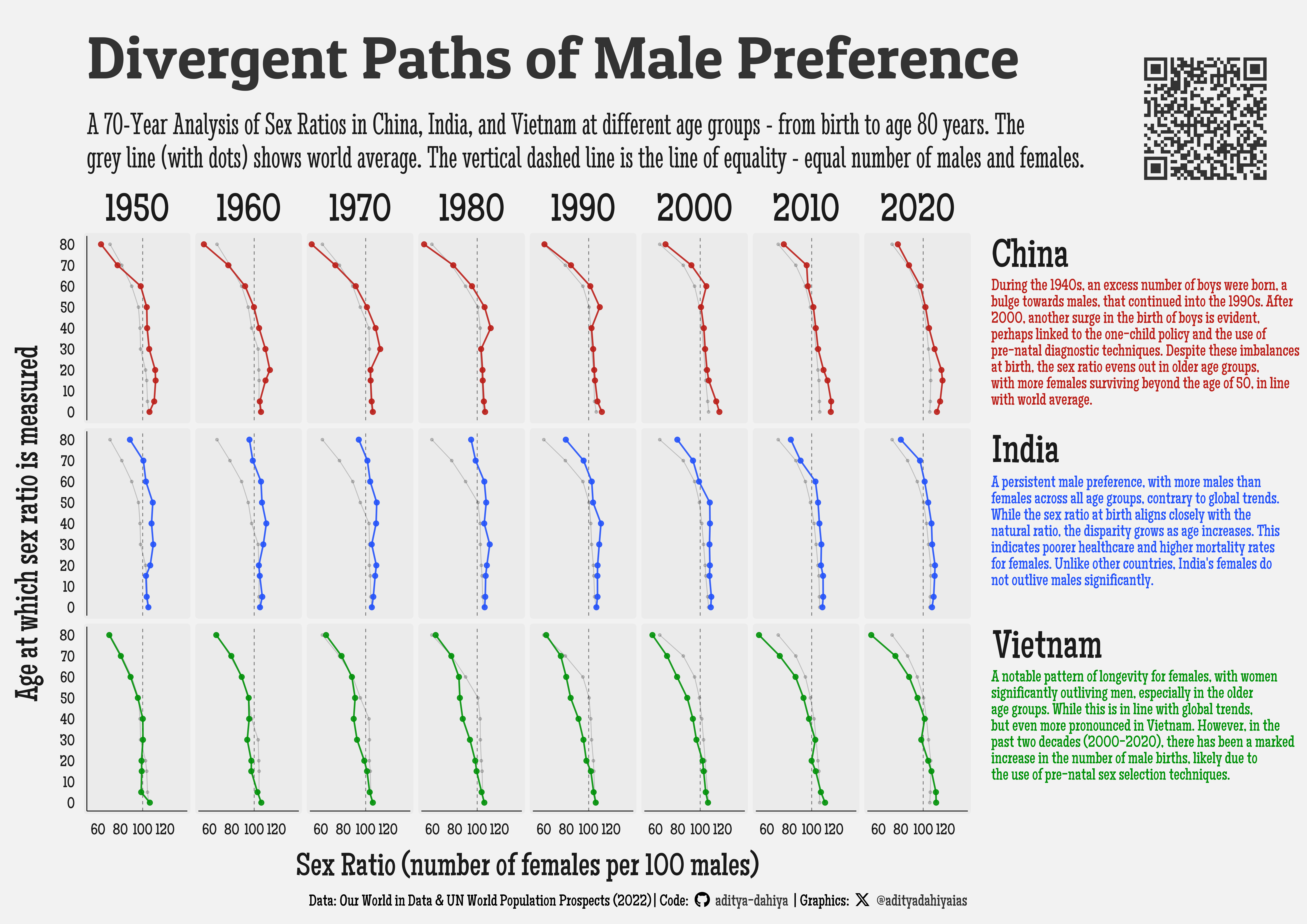
The data for this graphic is sourced from Our World in Data, based on United Nations World Population Prospects (2022). It showcases the sex ratios at different ages—from birth to 80 years—across three countries with a historical preference for male children: China, India, and Vietnam, spanning seven decades from the 1950s to the 2010s. The graphic reveals distinct patterns in how male preference impacts sex ratios over time. In China, the one-child policy and prenatal diagnostics significantly skewed birth ratios towards males, but a balance is seen in older age groups. India exhibits a consistent male dominance across all ages, reflecting poorer female healthcare and higher mortality. Vietnam, while showing increased male births in recent decades, continues to have females outliving males significantly, indicating better health outcomes for women as they age.
This graphic illustrates the sex ratios at different ages—ranging from birth to 80 years—across three countries: China, India, and Vietnam. Each row represents a country, while each column depicts a decade from the 1950s to the 2010s. The x-axis shows the sex ratio (number of females per 100 males), and the y-axis represents the age groups.
How I made this graphic?
Getting the data
Code
# Data Import and Wrangling Toolslibrary(tidyverse) # All things tidylibrary(owidR) # Get data from Our World in R# Final plot toolslibrary(scales) # Nice Scales for ggplot2library(fontawesome) # Icons display in ggplot2library(ggtext) # Markdown text support for ggplot2library(showtext) # Display fonts in ggplot2library(colorspace) # To lighten and darken colourssearch_terms <- owidR::owid_search("gender")search_terms_1 <- owidR::owid_search("sex ratio")search_terms_2 <- owidR::owid_search("population")search_terms_2 |>as_tibble() |>View()rawdf <- owidR::owid("sex-ratio-by-age")rawdf1 <- owidR::owid("population-with-un-projections")
Visualization Parameters
Code
# Font for titlesfont_add_google("Patua One",family ="title_font") # Font for the captionfont_add_google("Stint Ultra Condensed",family ="caption_font") # Font for plot textfont_add_google("Maiden Orange",family ="body_font") showtext_auto()# Colour Palettemypal <-c("#ba1e18", "#2352fa", "#019109")# Background Colourbg_col <-"grey95"text_col <-"grey10"text_hil <-"grey20"# Base Text Sizebts <-80plot_title <-"Divergent Paths of Male Preference"plot_subtitle <-"A 70-Year Analysis of Sex Ratios in China, India, and Vietnam at different age groups - from birth to age 80 years. The\ngrey line (with dots) shows world average. The vertical dashed line is the line of equality - equal number of males and females."data_annotation <-"About the Data: The data for this analysis is sourced from Our World in Data, which compiles information based on the United Nations World Population Prospects (2022). The dataset includes sex ratio statistics—number of males per 100 females—at birth and various age levels from 1950 to 2021. This comprehensive dataset enables a detailed examination of global and regional trends in birth sex ratios over several decades."# Caption stuff for the plotsysfonts::font_add(family ="Font Awesome 6 Brands",regular = here::here("docs", "Font Awesome 6 Brands-Regular-400.otf"))github <-""github_username <-"aditya-dahiya"xtwitter <-""xtwitter_username <-"@adityadahiyaias"social_caption_1 <- glue::glue("<span style='font-family:\"Font Awesome 6 Brands\";'>{github};</span> <span style='color: {text_hil}'>{github_username} </span>")social_caption_2 <- glue::glue("<span style='font-family:\"Font Awesome 6 Brands\";'>{xtwitter};</span> <span style='color: {text_hil}'>{xtwitter_username}</span>")plot_caption <-paste0("**Data:** Our World in Data & UN World Population Prospects (2022) | ","**Code:** ", social_caption_1, " | **Graphics:** ", social_caption_2 )rm(github, github_username, xtwitter, xtwitter_username, social_caption_1, social_caption_2)china_text <-"During the 1940s, an excess number of boys were born, a bulge towards males, that continued into the 1990s. After 2000, another surge in the birth of boys is evident, perhaps linked to the one-child policy and the use of pre-natal diagnostic techniques. Despite these imbalances at birth, the sex ratio evens out in older age groups, with more females surviving beyond the age of 50, in line with world average."india_text <-"A persistent male preference, with more males than females across all age groups, contrary to global trends. While the sex ratio at birth aligns closely with the natural ratio, the disparity grows as age increases. This indicates poorer healthcare and higher mortality rates for females. Unlike other countries, India's females do not outlive males significantly."vietnam_text <-"A notable pattern of longevity for females, with women significantly outliving men, especially in the older age groups. While this is in line with global trends, but even more pronounced in Vietnam. However, in the past two decades (2000-2020), there has been a marked increase in the number of male births, likely due to the use of pre-natal sex selection techniques."
Data Wrangling
Code
# Select only important and populous countries to avoid randomness# possible in small population micronationsfilter_countries <- rawdf1 |>as_tibble() |>filter(year ==2020) |>filter(!is.na(code)) |>select(-`Population - Sex: all - Age: all - Variant: medium`) |>rename(pop =`Population - Sex: all - Age: all - Variant: estimates`) |>slice_max(order_by = pop, n =100)# Prepare the datadf1 <- rawdf |>as_tibble() |> janitor::clean_names() |>pivot_longer(cols =-c(entity, code, year),names_to ="variable",values_to ="value" ) |>mutate(variable =str_replace_all(variable, "_birth_", "_0_"),variable =parse_number(variable) ) |>filter(code %in% filter_countries$code)# Get the age levels at which we have data on sex-ratioage_levels <- df1$variable |>unique() |>sort()# df1 |> # filter(!is.na(code)) |> # filter(year %in% seq(1970, 2020, 10)) |> # filter(variable <= 80) |> # ggplot(# mapping = aes(# y = value,# x = variable,# group = entity, # colour = code == "IND"# )# ) +# geom_line(# alpha = 0.1# ) +# geom_text(# mapping = aes(# label = code# ),# family = "caption_font",# check_overlap = TRUE# ) +# geom_hline(# yintercept = 100,# linetype = "dashed"# ) +# scale_y_continuous(# limits = c(50, 120)# ) +# scale_x_continuous(# breaks = age_levels# ) +# coord_flip() +# scale_alpha_manual(values = c(0.1, 1)) +# facet_wrap(~ year, nrow = 1)plotdf1 <- df1 |>filter(year %in%seq(1950, 2020, 10)) |>filter(variable <=80) plotdf1_world <- plotdf1 |>filter(code =="OWID_WRL") |>select(-code)# Strip labellingstrip_labels <-c("China", "India", "Vietnam")names(strip_labels) <-c("CHN", "IND", "VNM")