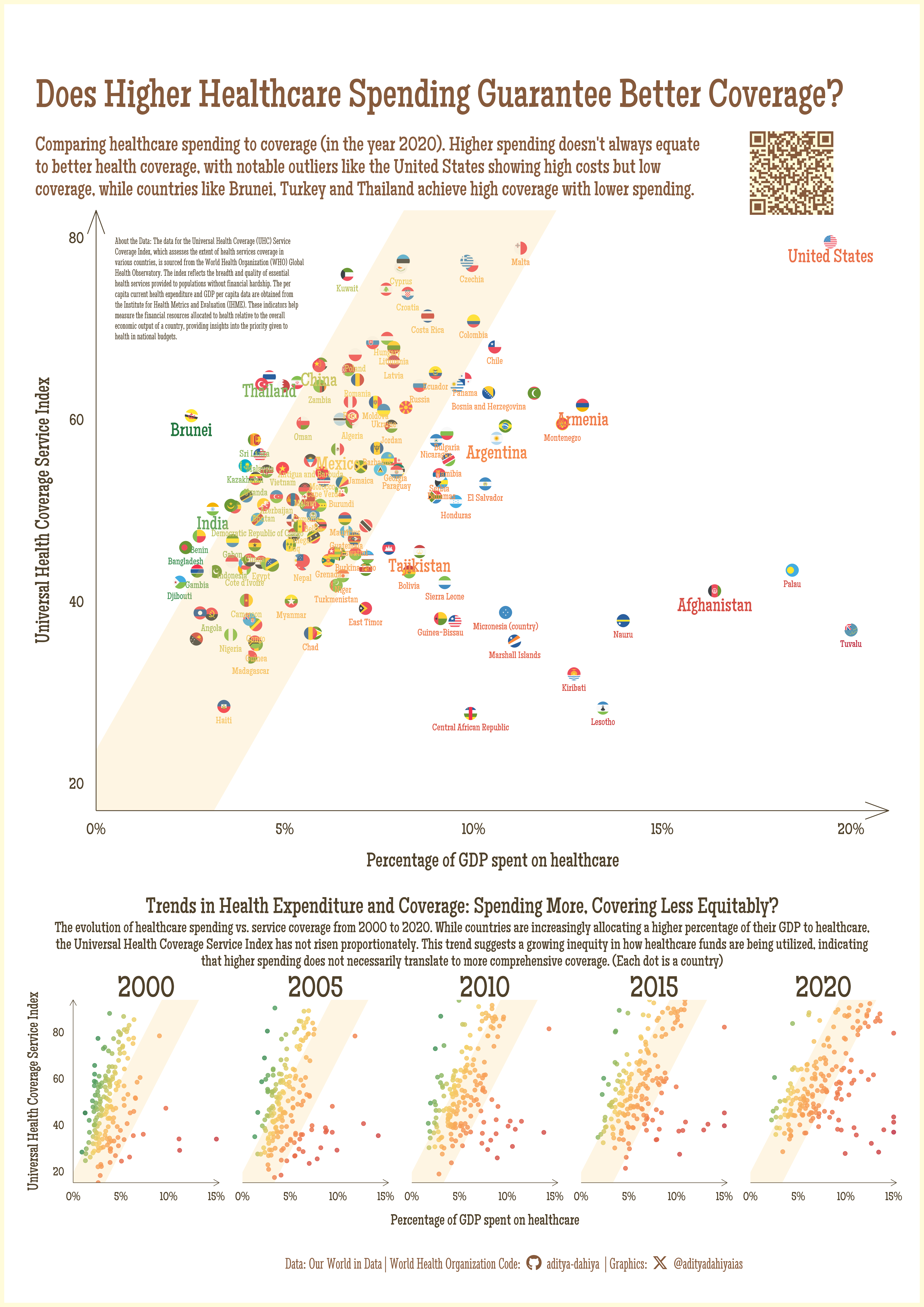
Does Higher Healthcare Spending Guarantee Better Coverage?
Comparing healthcare spending to coverage (in the year 2020). Higher spending doesn’t always equate to better health coverage, with notable outliers like the United States showing high costs but low coverage, while countries like Brunei, Turkey and Thailand achieve high coverage with lower spending.
A4 Size Viz
Our World in Data
Public Health
Author
Aditya Dahiya
Published
June 4, 2024
Health Expenditure vs. Coverage: Are We Balancing the Scales?
The scatterplot for the year 2020, using data from Our World in Data and the Institute of Health Metrics and Evaluation (IHME), illustrates the relationship between per capita health expenditure as a percentage of GDP and the Universal Health Coverage (UHC) Service Index across various countries. The graphic reveals that while many countries align along a central diagonal, indicating a proportional relationship between health spending and coverage, significant outliers exist. Countries such as Turkey, Thailand, and Brunei achieve higher UHC indices despite relatively low spending, highlighted in green. Conversely, nations like the United States, Afghanistan, Argentina, and Brazil, along with several small island nations (e.g., Tuvalu, Palau, Nauru, Lesotho, Marshall Islands), exhibit lower coverage relative to their health expenditure, marked in red. Notably, the United States stands out as a wealthy country with exceptionally high health spending but inadequate coverage. These findings suggest that the efficiency and allocation of healthcare spending are crucial for achieving extensive and equitable health coverage, rather than the sheer amount of money spent.
The top scatterplot compares per capita health expenditure as a percentage of GDP (x-axis) to the Universal Health Coverage Service Index (y-axis) for the year 2020, with each dot representing a country. The bottom faceted scatterplot series displays the same indicators across five time points: 2000, 2005, 2010, 2015, and 2020. Each panel shows the percentage of GDP spent on healthcare (x-axis) against the UHC Service Index (y-axis), with each dot representing a country. Over the two decades, healthcare spending has generally increased, but the UHC Index has not risen proportionately, suggesting growing inequity in healthcare fund utilization.
How I made this graphic?
Getting the data
Code
# Data Import and Wrangling Toolslibrary(tidyverse) # All things tidylibrary(owidR) # Get data from Our World in R# Final plot toolslibrary(scales) # Nice Scales for ggplot2library(fontawesome) # Icons display in ggplot2library(ggtext) # Markdown text support for ggplot2library(showtext) # Display fonts in ggplot2library(colorspace) # To lighten and darken colours# The Expansion pack to ggplot2library(ggforce) # To learn some new geom-extensionslibrary(wbstats) # To fetch World Bank data on Country# Codes and GDP per capita# Credits: https://stackoverflow.com/questions/48199791/rounded-corners-in-ggplot2# Credits @X: @TeunvandenBrand# devtools::install_github("teunbrand/elementalist")library(elementalist) # Rounded corners of panels# Data from 1990 to 2021# Coverage of essential health services, as defined by the # UHC service coverage index - Both Sexes - Estimaterawdf1 <- owidR::owid("healthcare-access-quality-ihme")# Our World in Data# Current health expenditure per capita, PPP (current international $)# GDP per capita Population (historical estimates) Countries Continentsrawdf2 <- owidR::owid("healthcare-expenditure-vs-gdp")# Getting country ISO2 codes for geom_flag()rawdf3 <- wbstats::wb_countries()
Visualization Parameters
Code
# Font for titlesfont_add_google("Glegoo",family ="title_font") # Font for the captionfont_add_google("Stint Ultra Condensed",family ="caption_font") # Font for plot textfont_add_google("Maiden Orange",family ="body_font") showtext_auto()# Colour Palettemypal <- paletteer::paletteer_d("PNWColors::Mushroom")mypal# Background Colourbg_col <- mypal[6]text_col <- mypal[1]text_hil <- mypal[2]# Base Text Sizebts <-80plot_title <-"Does Higher Healthcare Spending Guarantee Better Coverage?"plot_subtitle <-str_wrap("Comparing healthcare spending to coverage (in the year 2020). Higher spending doesn't always equate to better health coverage, with notable outliers like the United States showing high costs but low coverage, while countries like Brunei, Turkey and Thailand achieve high coverage with lower spending.", 160)str_view(plot_subtitle)# Caption stuff for the plotsysfonts::font_add(family ="Font Awesome 6 Brands",regular = here::here("docs", "Font Awesome 6 Brands-Regular-400.otf"))github <-""github_username <-"aditya-dahiya"xtwitter <-""xtwitter_username <-"@adityadahiyaias"social_caption_1 <- glue::glue("<span style='font-family:\"Font Awesome 6 Brands\";'>{github};</span> <span style='color: {text_hil}'>{github_username} </span>")social_caption_2 <- glue::glue("<span style='font-family:\"Font Awesome 6 Brands\";'>{xtwitter};</span> <span style='color: {text_hil}'>{xtwitter_username}</span>")plot_caption <-paste0("**Data:** Our World in Data | World Health Organization | ","**Code:** ", social_caption_1, " | **Graphics:** ", social_caption_2 )about_the_data <-"About the Data: The data for the Universal Health Coverage (UHC) Service Coverage Index, which assesses the extent of health services coverage in various countries, is sourced from the World Health Organization (WHO) Global Health Observatory. The index reflects the breadth and quality of essential health services provided to populations without financial hardship. The per capita current health expenditure and GDP per capita data are obtained from the Institute for Health Metrics and Evaluation (IHME). These indicators help measure the financial resources allocated to health relative to the overall economic output of a country, providing insights into the priority given to health in national budgets."inset_title <-"Trends in Health Expenditure and Coverage: Spending More, Covering Less Equitably?"inset_subtitle <-str_wrap("The evolution of healthcare spending vs. service coverage from 2000 to 2020. While countries are increasingly allocating a higher percentage of their GDP to healthcare, the Universal Health Coverage Service Index has not risen proportionately. This trend suggests a growing inequity in how healthcare funds are being utilized, indicating that higher spending does not necessarily translate to more comprehensive coverage. (Each dot is a country)", 225)str_view(inset_subtitle)
Exploratory Data Analysis and Data Wrangling
Code
# temp1 <- owidR::owid_search("Healthcare")# temp2 <- owidR::owid_search("health")# Universal Health Coverage Service Indexdf1 <- rawdf1 |>as_tibble() |>rename(coverage =`Coverage of essential health services, as defined by the UHC service coverage index - Both Sexes - Estimate`) |>rename(country = entity )# Current Health Expenditure (Per Person) and GDP Per Capitadf2 <- rawdf2 |>as_tibble() |> janitor::clean_names() |>select(-countries_continents, -population_historical) |>drop_na() |>rename(country = entity,health_exp = current_health_expenditure_per_capita_ppp_current_international )plotdf <- df1 |>left_join(df2) |>drop_na()plotdf |>count(year, sort = T) |>ggplot(aes(y = n, x = year) ) +geom_point() +scale_x_continuous(breaks =2000:2021)plotdf |>pull(year) |>range()highlight_countries <-c("Turkey", "Thailand", "Brunei", "United States", "Afghanistan", "Argentina", "Brazil", "India","China", "Mexico", "Armenia", "Tajikistan")merge_codes <- rawdf3 |>select(iso3c, iso2c) |>mutate(iso2c =str_to_lower(iso2c)) |>rename(code = iso3c)plotdf1 <- plotdf |>mutate(ratio = health_exp / gdp_per_capita,col_var =sqrt(coverage) /sqrt(ratio),size_var = country %in% highlight_countries ) |>arrange(desc(size_var)) |>left_join(merge_codes)range(plotdf1$col_var)