Life Expectancy at different Age Groups

A4 Size Viz
Our World in Data
Public Health
Author

Aditya Dahiya

Published

May 31, 2024

Life Expectancy Improvements Over Time

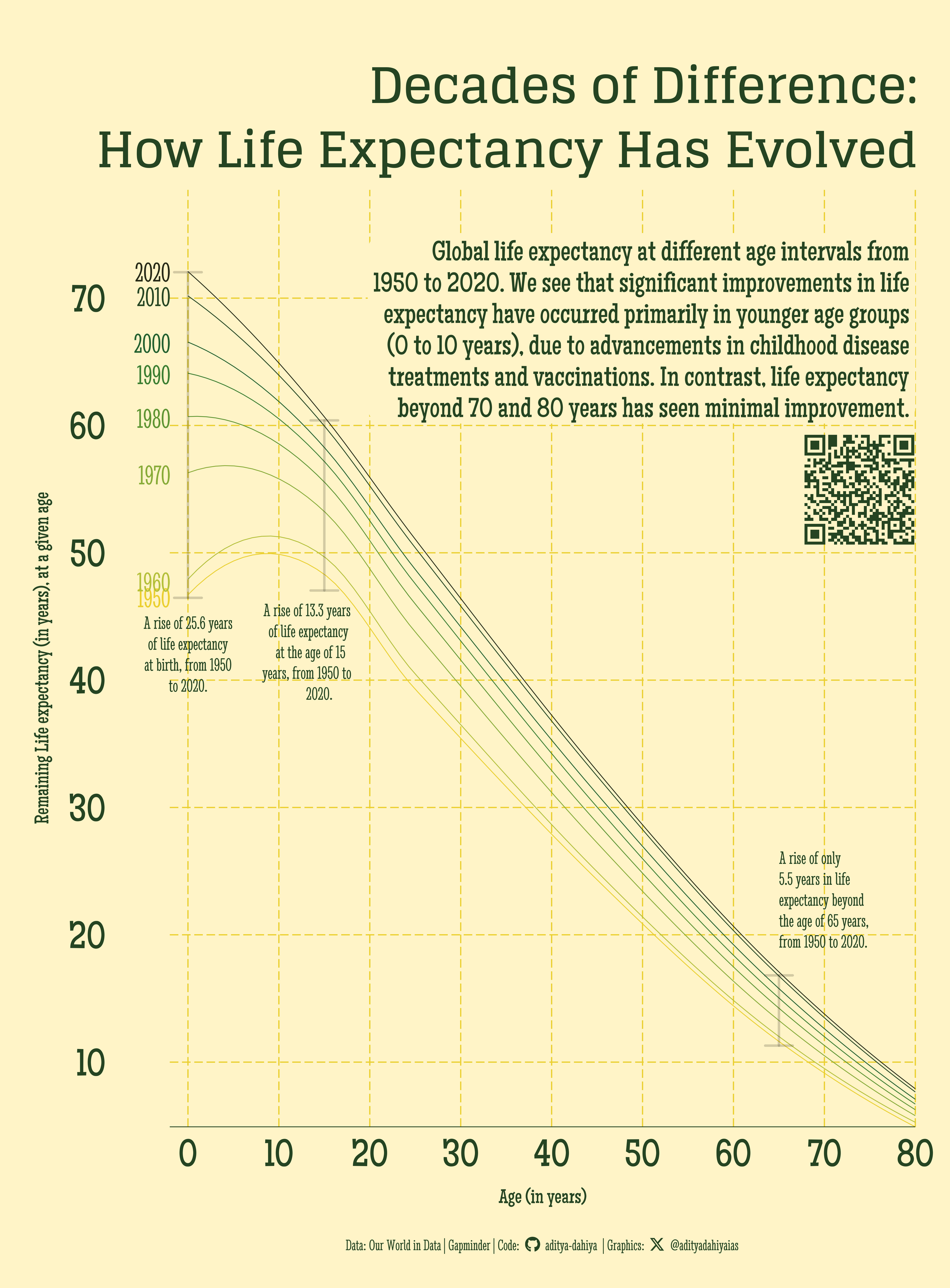
The data on life expectancy at birth and at various age intervals (10, 20, 30, …, 80) was sourced from “Our World in Data” and Gapminder.org. The line graph, which plots life expectancy over the last seven decades (1950, 1960, …, 2020), reveals that significant improvements in life expectancy have predominantly occurred in the younger age groups, particularly from birth to age 10. This suggests that advancements in treating childhood diseases and increased vaccination efforts have been crucial. Conversely, there has been minimal improvement in life expectancy for those beyond 70 and 80 years. The most substantial gains in life expectancy for younger age groups were observed during the 1960 to 1970 decade.

Global Life Expectancy Trends (1950-2020): This graph shows significant improvements in life expectancy at younger ages, particularly due to advancements in childhood disease treatments and vaccinations. In contrast, life expectancy gains beyond 70 years have been minimal over the decades.

How I made this graphic?

Getting the data

Code
# Data Import and Wrangling Tools
library(tidyverse)            # All things tidy
library(owidR)                # Get data from Our World in R

# Final plot tools
library(scales)               # Nice Scales for ggplot2
library(fontawesome)          # Icons display in ggplot2
library(ggtext)               # Markdown text support for ggplot2
library(showtext)             # Display fonts in ggplot2
library(colorspace)           # To lighten and darken colours

# The Expansion pack to ggplot2
library(ggforce)              # to learn some new geom-extensions

# Searrch for the life expectancy indicators in Our World in Data
temp1 <- owid_search("life expectancy") |> 
  as_tibble()

# Select an indicator
sel_indicator <- temp1 |> 
  filter(str_detect(title, "Remaining")) |> 
  slice_head(n = 1) |> 
  pull(chart_id)

# Raw Data
temp <- owid(chart_id = sel_indicator)

Visualization Parameters

Code
# Font for titles
font_add_google("Glegoo",
  family = "title_font"
) 

# Font for the caption
font_add_google("Stint Ultra Condensed",
  family = "caption_font"
) 

# Font for plot text
font_add_google("Maiden Orange",
  family = "body_font"
) 

showtext_auto()

# Colour Palette
mypal <- paletteer::paletteer_d("MoMAColors::Alkalay2")


# Background Colour
bg_col <- mypal[1] |> lighten(0.75)
text_col <- mypal[8]
text_hil <- mypal[7]

# Base Text Size
bts <- 80

plot_title <- "Decades of Difference:\nHow Life Expectancy Has Evolved"

plot_subtitle <- str_wrap("Global life expectancy at different age intervals from 1950 to 2020. We see that significant improvements in life expectancy have occurred primarily in younger age groups (0 to 10 years), due to advancements in childhood disease treatments and vaccinations. In contrast, life expectancy beyond 70 and 80 years has seen minimal improvement.", 60)
str_view(plot_subtitle)

# Caption stuff for the plot
sysfonts::font_add(
  family = "Font Awesome 6 Brands",
  regular = here::here("docs", "Font Awesome 6 Brands-Regular-400.otf")
)
github <- "&#xf09b"
github_username <- "aditya-dahiya"
xtwitter <- "&#xe61b"
xtwitter_username <- "@adityadahiyaias"
social_caption_1 <- glue::glue("<span style='font-family:\"Font Awesome 6 Brands\";'>{github};</span> <span style='color: {text_hil}'>{github_username}  </span>")
social_caption_2 <- glue::glue("<span style='font-family:\"Font Awesome 6 Brands\";'>{xtwitter};</span> <span style='color: {text_hil}'>{xtwitter_username}</span>")


plot_caption <- paste0(
  "**Data:** Our World in Data | Gapminder |  ",
  "**Code:** ", 
  social_caption_1, 
  " |  **Graphics:** ", 
  social_caption_2
  )

Data Wrangling

Code
df <- temp |> 
  as_tibble() |> 
  janitor::clean_names() |> 
  rename(country = entity)

plotdf <-  df |>
  filter(country == "World") |> 
  filter(year %in% seq(1950, 2020, 10)) |> 
  pivot_longer(
    cols = starts_with("life_"),
    values_to = "value",
    names_to = "age_group"
  ) |> 
  mutate(
    age_group = str_replace_all(age_group, "birth", "0"),
    age_group = parse_number(age_group),
    year = as.character(year)
  )

labels_df <- plotdf |> 
  filter(age_group == 0)

ann0_v <- labels_df |> 
  pull(value) |> 
  range()

ann15_v <- plotdf |> 
  filter(age_group == 15) |> 
  pull(value) |> 
  range()

ann65_v <- plotdf |> 
  filter(age_group == 65) |> 
  pull(value) |> 
  range()

ann_df <- tibble(
  at_0 = ann0_v,
  at_15 = ann15_v,
  at_65 = ann65_v
) |> 
  mutate(
    y_var = c("ymin", "ymax")
  ) |> 
  pivot_longer(
    cols = -y_var,
    names_to = "group_var",
    values_to = "value"
  ) |> 
  pivot_wider(
    id_cols = group_var,
    names_from = y_var,
    values_from = value
  ) |> 
  mutate(
    x_var = parse_number(group_var)
  )

ann0_v[2] - ann0_v[1]

Visualization

Code
g_base <- plotdf |>  
  ggplot(
    mapping = aes(
      x = age_group,
      y = value,
      colour = year,
      group = year
    )
  ) +
  
  # Geoms and actual data plot
  geom_smooth(
    se = FALSE,
    linewidth = 0.5
  ) +
  geom_text(
    data = labels_df,
    mapping = aes(label = year),
    hjust = 1,
    nudge_x = -2,
    family = "caption_font",
    size = bts / 2
  ) +
  
  geom_segment(
    data = ann_df,
    mapping = aes(
      x = x_var,
      y = ymin,
      yend = ymax,
      group = group_var
    ),
    colour = text_col,
    alpha = 0.2,
    arrow = arrow(ends = "both", angle = 90),
    linewidth = 1.5,
    lineend = "round"
  ) +
  
  # Annotations
  annotate(
    geom = "label",
    x = 80, 
    y = 75,
    hjust = 1, 
    vjust = 1,
    fill = bg_col,
    label.size = NA,
    label.padding = unit(3, "mm"),
    label = plot_subtitle,
    family = "body_font",
    size = bts / 2,
    colour = text_hil,
    lineheight = 0.3
  ) +
  annotate(
    geom = "text", x = 0, y = 45, hjust = 0.5, vjust = 1,
    colour = text_hil, size = bts/3, lineheight = 0.3,
    family = "caption_font",
    label = str_wrap("A rise of 25.6 years of life expectancy at birth, from 1950 to 2020.", 20)
  ) +
  
  annotate(
    geom = "text", x = 15, y = 46, hjust = 0.7, vjust = 1,
    colour = text_hil, size = bts/3, lineheight = 0.3,
    family = "caption_font",
    label = str_wrap("A rise of 13.3 years of life expectancy at the age of 15 years, from 1950 to 2020.", 20)
  ) +
  
  annotate(
    geom = "text", x = 65, y = 19, hjust = 0, vjust = 0,
    colour = text_hil, size = bts/3, lineheight = 0.3,
    family = "caption_font",
    label = str_wrap("A rise of only 5.5 years in life expectancy beyond the age of 65 years, from 1950 to 2020.", 20)
  ) +
  
  # Scales and Coordinates
  scale_y_continuous(
    expand = expansion(c(0, 0.05)),
    breaks = seq(0, 80, 10)
  ) +
  scale_x_continuous(
    expand = expansion(c(0, 0)),
    breaks = seq(0, 80, 10)
  ) +
  scale_colour_manual(
    values = paletteer::paletteer_d("MoMAColors::Alkalay2")
  ) +
  coord_cartesian(
    clip = "off"
  ) +
  labs(
    x = "Age (in years)",
    y = "Remaining Life expectancy (in years), at a given age",
    title = plot_title,
    caption = plot_caption
  ) +
  theme_minimal(
    base_family = "body_font",
    base_size = bts
  ) +
  theme(
    legend.position = "none",
    legend.justification = c(1, 1),
    plot.title = element_text(
      colour = text_hil,
      family = "title_font",
      hjust = 1,
      margin = margin(15,0,5,0, "mm"),
      size = 2.5 * bts,
      face = "bold",
      lineheight = 0.35
    ),
    plot.caption = element_textbox(
      colour = text_hil,
      family = "caption_font",
      hjust = 0.5
    ),
    plot.subtitle = element_blank(),
    panel.grid.minor = element_blank(),
    panel.grid.major = element_line(
      colour = mypal[1],
      linewidth = 0.75,
      linetype = "longdash"
    ),
    axis.text.y = element_text(
      margin = margin(0,30,0,0, "mm"),
      colour = text_hil,
      size = 2 * bts
    ),
    axis.text.x = element_text(
      colour = text_hil,
      size = bts * 2
    ),
    axis.title = element_text(
      colour = text_hil
    ),
    axis.ticks.length = unit(0, "mm"),
    axis.line.x = element_line(
      linetype = 1,
      colour = text_hil,
      linewidth = 0.5
    ),
    panel.background = element_rect(
      fill = bg_col,
      colour = bg_col
    ),
    plot.background = element_rect(
      fill = bg_col,
      colour = bg_col
    )
  )

Add annotations and insets

Code
# QR Code for the plot
url_graphics <- paste0(
  "https://aditya-dahiya.github.io/projects_presentations/projects/",
  # The file name of the current .qmd file
  "owid_le_ages",
  ".qmd"
)
# remotes::install_github('coolbutuseless/ggqr')
# library(ggqr)
plot_qr <- ggplot(
  data = NULL, 
  aes(x = 0, y = 0, label = url_graphics)
  ) + 
  ggqr::geom_qr(
    colour = text_hil, 
    fill = bg_col,
    size = 2
    ) +
  # labs(caption = "Scan for the Interactive Version") +
  coord_fixed() +
  theme_void() +
  theme(plot.background = element_rect(
    fill = NA, 
    colour = NA
    ),
    plot.caption = element_text(
      hjust = 0.5,
      margin = margin(0,0,0,0, "mm"),
      family = "caption_font",
      size = bts/1.8
    )
  )
plot_qr

library(patchwork)
g <- g_base +
  inset_element(
    p = plot_qr,
    left = 0.85, right = 1,
    top = 0.76, bottom = 0.6,
    align_to = "panel"
  ) +
  plot_annotation(
    theme = theme(
      plot.background = element_rect(
        fill = "transparent",
        colour = "transparent"
      ),
      panel.background = element_rect(
        fill = "transparent",
        colour = "transparent"
      )
    )
  )

Save graphic and a thumbnail

Code
ggsave(
  filename = here::here("data_vizs", "a4_owid_le_ages.png"),
  plot = g,
  height = 297 * 2,
  width = 219 * 2,
  units = "mm",
  bg = bg_col
)

library(magick)
# Saving a thumbnail for the webpage
image_read(here::here("data_vizs", 
                      "owid_le_ages.png")) |> 
  image_resize(geometry = "400") |> 
  image_write(here::here("data_vizs", "thumbnails", 
                         "owid_le_ages.png"))