Decades of Change: How Life Expectancy Gains (at birth and beyond 65) have Shifted.
Life expectancy gains have evolved over the past six decades: rapid improvements in life expectancy at birth the 1960s and 1970s driven by modern medicine in poorer countries, and the recent focus on elderly care in wealthier nations.
A4 Size Viz
Our World in Data
Public Health
Author
Aditya Dahiya
Published
June 2, 2024
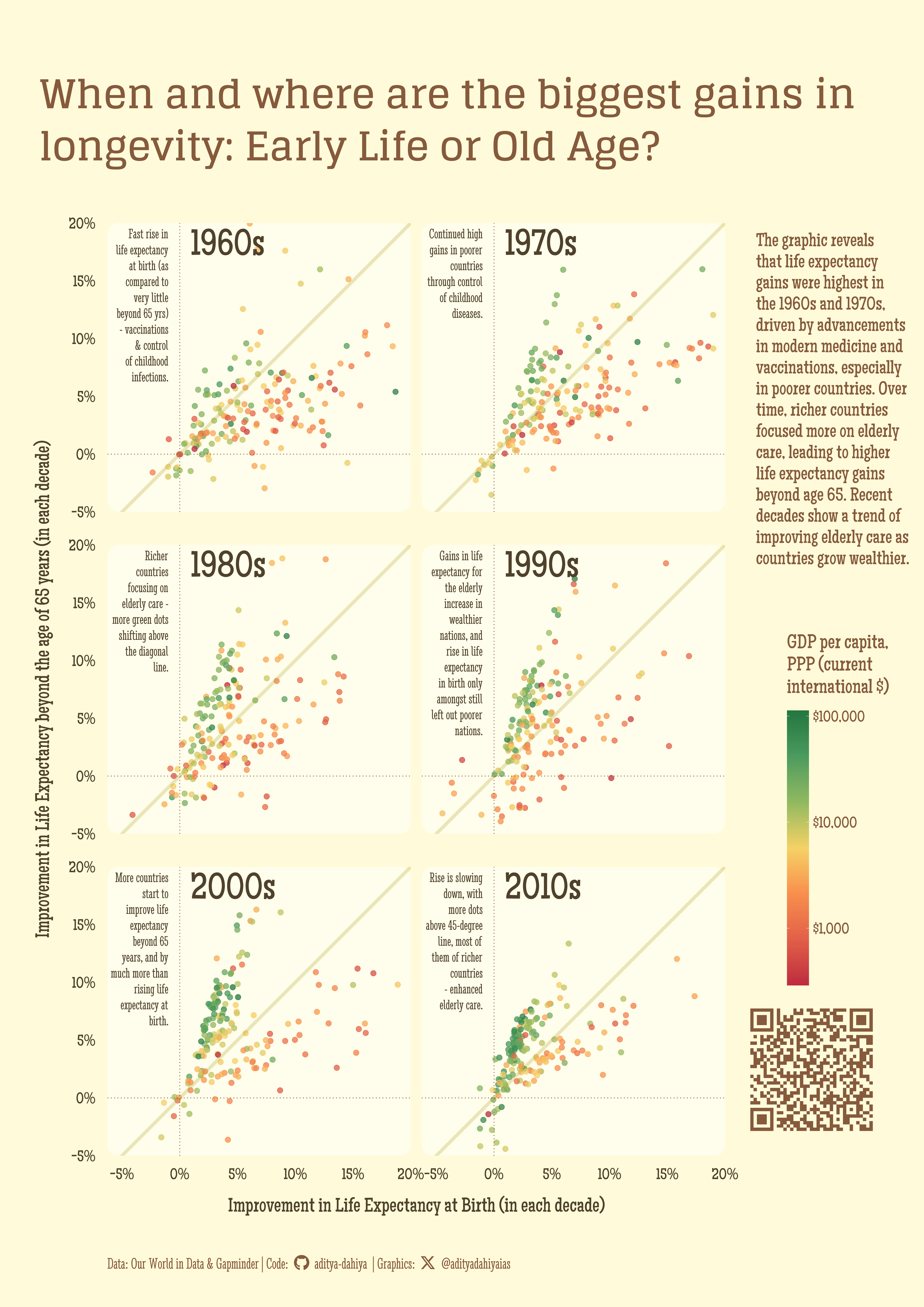
Where are the biggest gains in life expectancy: Early Life or Old Age?
The graph is based on life expectancy data sourced from Our World in Data (using owidRpackage) and Gapminder.org, comparing the percentage rise in life expectancy at birth with the percentage rise in life expectancy beyond age 65 across six decades (1960s-2010s) for various countries. Each dot represents a country and is colored by its GDP per capita, with red indicating low GDP per capita (poor countries) and green indicating high GDP per capita (rich countries). The 45-degree line represents equal percentage rises for both indicators.
Main Findings:
The overall rate of rise in life expectancy was highest in the 1960s and 1970s, reflecting the rapid spread of modern medicine in the post-World War II era, and has been slowing down globally.
Most of the gains in the initial decades were in poorer countries due to widespread vaccinations and control of childhood infectious diseases, indicated by most dots being below the 45-degree line in the 1960s and 1970s.
Richer countries (green dots) have focused more on elderly care, resulting in a higher rise in life expectancy beyond 65 years compared to poorer countries (red dots).
Over recent decades, as countries grow richer, more are improving life expectancy beyond 65 years through enhanced elderly care, shown by more dots appearing above the 45-degree line.
Percentage Rise in Life Expectancy: This graph compares the percentage rise in life expectancy at birth (x-axis) and beyond age 65 (y-axis) across six decades (1960s-2010s) for various countries. Each dot represents a country, colored by its GDP per capita, with red for low GDP (poor countries) and green for high GDP (rich countries). The 45-degree line indicates equal percentage rises for both indicators.
How I made this graphic?
Getting the data
Code
# Data Import and Wrangling Toolslibrary(tidyverse) # All things tidylibrary(owidR) # Get data from Our World in R# Final plot toolslibrary(scales) # Nice Scales for ggplot2library(fontawesome) # Icons display in ggplot2library(ggtext) # Markdown text support for ggplot2library(showtext) # Display fonts in ggplot2library(colorspace) # To lighten and darken colours# The Expansion pack to ggplot2library(ggforce) # To learn some new geom-extensionslibrary(wbstats) # To fetch World Bank data on Country# Codes and GDP per capita# Credits: https://stackoverflow.com/questions/48199791/rounded-corners-in-ggplot2# Credits @X: @TeunvandenBrandlibrary(elementalist) # Rounded corners of panels# Searrch for the life expectancy indicators in Our World in Datatemp1 <-owid_search("life expectancy") |>as_tibble()# Select an indicatorsel_indicator <- temp1 |>filter(str_detect(title, "Remaining")) |>slice_head(n =1) |>pull(chart_id)# Raw Datarawdf <-owid(chart_id = sel_indicator) |>as_tibble() |> janitor::clean_names()# Get list of countries from World Bank with ISO Codeswb_cons <- wbstats::wb_countries()# List of World Bank Indicators# wb_inds <- wbstats::wb_indicators()# wb_inds |># filter(str_detect(indicator, "GDP per capita")) |> # filter(indicator_id == "NY.GDP.PCAP.PP.CD") |> # pull(indicator)indicator_definition <-"GDP per capita, PPP (current international $)"# To obtain data on GDP per capita (for colouring the dots)rawdf2 <-wb_data(indicator ="NY.GDP.PCAP.PP.CD") rm(temp1, sel_indicator)
Visualization Parameters
Code
# Font for titlesfont_add_google("Glegoo",family ="title_font") # Font for the captionfont_add_google("Stint Ultra Condensed",family ="caption_font") # Font for plot textfont_add_google("Maiden Orange",family ="body_font") showtext_auto()# Colour Palettemypal <- paletteer::paletteer_d("PNWColors::Mushroom")mypal# Background Colourbg_col <- mypal[6]panel_col <-lighten(bg_col, 0.5)colpal <-c("#C53540FF", "#32834AFF", "#F1D066FF")text_col <- mypal[1]text_hil <- mypal[2]# Base Text Sizebts <-80plot_title <-"When and where are the biggest gains in\nlongevity: Early Life or Old Age?"str_view(plot_title)plot_subtitle <-"The graphic reveals that life expectancy gains were highest in the 1960s and 1970s, driven by advancements in modern medicine and vaccinations, especially in poorer countries. Over time, richer countries focused more on elderly care, leading to higher life expectancy gains beyond age 65. Recent decades show a trend of improving elderly care as countries grow wealthier."# Caption stuff for the plotsysfonts::font_add(family ="Font Awesome 6 Brands",regular = here::here("docs", "Font Awesome 6 Brands-Regular-400.otf"))github <-""github_username <-"aditya-dahiya"xtwitter <-""xtwitter_username <-"@adityadahiyaias"social_caption_1 <- glue::glue("<span style='font-family:\"Font Awesome 6 Brands\";'>{github};</span> <span style='color: {text_hil}'>{github_username} </span>")social_caption_2 <- glue::glue("<span style='font-family:\"Font Awesome 6 Brands\";'>{xtwitter};</span> <span style='color: {text_hil}'>{xtwitter_username}</span>")plot_caption <-paste0("**Data:** Our World in Data & Gapminder | ","**Code:** ", social_caption_1, " | **Graphics:** ", social_caption_2 )
Data Wrangling
Code
df <- rawdf |>filter(!is.na(code)) |>select(entity, code, year, life_expectancy_at_birth_period, life_expectancy_at_65_period) |>pivot_longer(cols =starts_with("life_"),names_to ="variable",values_to ="value" ) |># Note: In the decade of 2010s, I have compared 2019 and 2010 # to negate the imapct of Covid-19 pandemic which serious# impacted life expectancy globallyfilter(year %in%c(seq(1950, 2010, 10), 2019)) |>mutate(year =paste0("y_", year)) |>arrange(entity, variable, year) |>group_by(entity, variable) |>mutate(improvement = (value -lag(value))/value ) |>drop_na() |>ungroup() |>mutate(decade =case_when( year =="y_1960"~"1950s", year =="y_1970"~"1960s", year =="y_1980"~"1970s", year =="y_1990"~"1980s", year =="y_2000"~"1990s", year =="y_2010"~"2000s", year =="y_2019"~"2010s" ) ) |>select(-year, -value) |>pivot_wider(id_cols =c(entity, code, decade),values_from = improvement,names_from = variable ) |>filter(decade !="1950s")# From WB: A celaned tibble on income levels & ISO Codesdf1 <- wb_cons |>select(entity = country,code = iso3c, iso2c, income_level_iso3c ) |>mutate(iso2c =str_to_lower(iso2c))# WB Data: clean and format it to match our base data-setdf2 <- rawdf2 |>select(code = iso3c,entity = country,year = date,gdp_per_capita =`NY.GDP.PCAP.PP.CD` ) |>fill(gdp_per_capita, .direction ="up") |>filter(year %in%seq(1965, 2015, 10)) |>mutate(decade =case_when( year ==1965~"1960s", year ==1975~"1970s", year ==1985~"1980s", year ==1995~"1990s", year ==2005~"2000s", year ==2015~"2010s" ) )plotdf <- df |>left_join(df1) |>left_join(df2)# Text Annotations to each panelannotationdf <-tibble(decade =c("1960s", "1970s", "1980s", "1990s", "2000s", "2010s"),finding =c("Fast rise in life expectancy at birth (as compared to very little beyond 65 yrs) - vaccinations & control of childhood infections.","Continued high gains in poorer countries through control of childhood diseases.","Richer countries focusing on elderly care - more green dots shifting above the diagonal line.","Gains in life expectancy for the elderly increase in wealthier nations, and rise in life expectancy in birth only amongst still left out poorer nations.","More countries start to improve life expectancy beyond 65 years, and by much more than rising life expectancy at birth.","Rise is slowing down, with more dots above 45-degree line, most of them of richer countries - enhanced elderly care."))