Technological Leapfrogging: Mobile Phones Over Landlines in the Developing World

A4 Size Viz
Our World in Data
Author

Aditya Dahiya

Published

June 26, 2024

Leapfrogging Landlines: The Mobile Revolution in Developing Nations

Reproduced from Our World in Data’s post.

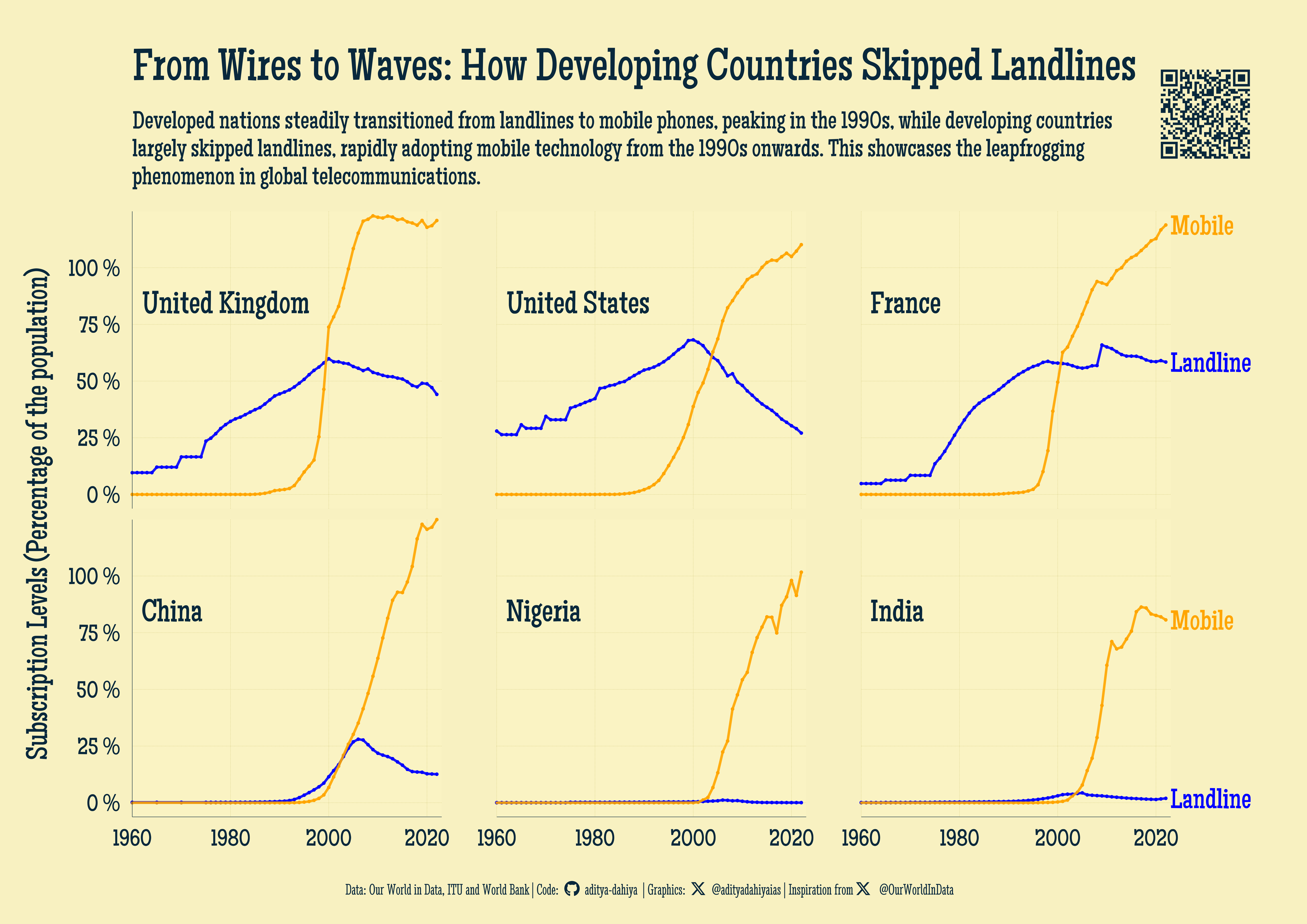
The data on landline and mobile phone connections from 1960 to 2020 for six countries—USA, UK, France, China, Nigeria, and India—has been sourced from multiple sources compiled by the World Bank and processed by Our World in Data. This data highlights the percentage of the population with mobile and landline connections, presented in a line chart with separate facets for each country.

The graph shows a clear distinction between developed and developing countries in terms of their telecommunications adoption. In developed countries (USA, UK, France), landline adoption grew steadily throughout the 20th century, peaking in the 1990s with up to 75% of the population. However, with the advent of mobile technology in the 1990s, mobile phone adoption surged, leading to a decline in landline usage since the early 2000s.

In contrast, developing countries (China, Nigeria, India) exhibit a different pattern. Landline adoption remained minimal in these regions. Instead, there was a rapid increase in mobile phone usage from the 1990s onwards. This phenomenon aligns with the concept of “leapfrogging,” where developing countries bypass intermediate technologies—in this case, landlines—and directly adopt more advanced technologies, such as mobile phones.

China presents a slight deviation from this pattern, showing some intermediate landline adoption before significantly transitioning to mobile phones, similar to India and Nigeria. The chart thus illustrates the differing trajectories in telecommunication advancements between developed and developing nations, with developing countries leveraging newer technologies to expedite their communication infrastructure development.

This graphic illustrates the percentage of the population with mobile (orange line) and land-line (blue line) connections from 1960 to 2020, with the x-axis representing the years and the y-axis representing the percentage of people. The top row features facets for developed countries (USA, UK, France), while the bottom row displays facets for developing countries (China, Nigeria, India).

How I made this graphic?

Getting the data

Code
# Data Import and Wrangling Tools
library(tidyverse)            # All things tidy
library(owidR)                # Get data from Our World in R

# Final plot tools
library(scales)               # Nice Scales for ggplot2
library(fontawesome)          # Icons display in ggplot2
library(ggtext)               # Markdown text support for ggplot2
library(showtext)             # Display fonts in ggplot2

# owidR::owid_search("mobile")

rawdf <- owidR::owid("mobile-landline-subscriptions")

Visualization Parameters

Code
# Font for titles
font_add_google("Patua One",
  family = "title_font"
) 

# Font for the caption
font_add_google("Stint Ultra Condensed",
  family = "caption_font"
) 

# Font for plot text
font_add_google("Maiden Orange",
  family = "body_font"
) 

showtext_auto()

# Colour Palette
mypal <- c("#ba1e18", "#2352fa", "#019109")

# Background Colour
bg_col <- colorspace::lighten("#F2EBBBFF", 0.3)
text_col <- "#09283CFF"
text_hil <- "#09283CFF"

# Base Text Size
bts <- 80

plot_title <- "From Wires to Waves: How Developing Countries Skipped Landlines"

plot_subtitle <- str_wrap("Developed nations steadily transitioned from landlines to mobile phones, peaking in the 1990s, while developing countries largely skipped landlines, rapidly adopting mobile technology from the 1990s onwards. This showcases the leapfrogging phenomenon in global telecommunications.", 125)

data_annotation <- "About the Data: The data on landline and mobile phone connections from 1960 to 2020 for the USA, UK, France, China, Nigeria, and India is sourced from multiple sources compiled by the World Bank and processed by Our World in Data. It is part of the World Development Indicators, which are derived from officially-recognized international sources, including the International Telecommunication Union (ITU). This comprehensive dataset provides insights into the telecommunications infrastructure and its evolution across different countries, reflecting both historical and modern trends in technology adoption and usage."

# Caption stuff for the plot
sysfonts::font_add(
  family = "Font Awesome 6 Brands",
  regular = here::here("docs", "Font Awesome 6 Brands-Regular-400.otf")
)
github <- "&#xf09b"
github_username <- "aditya-dahiya"
xtwitter <- "&#xe61b"
xtwitter_username <- "@adityadahiyaias"
social_caption_1 <- glue::glue("<span style='font-family:\"Font Awesome 6 Brands\";'>{github};</span> <span style='color: {text_hil}'>{github_username}  </span>")
social_caption_2 <- glue::glue("<span style='font-family:\"Font Awesome 6 Brands\";'>{xtwitter};</span> <span style='color: {text_hil}'>{xtwitter_username}</span>")

social_caption_3 <- glue::glue("<span style='font-family:\"Font Awesome 6 Brands\";'>{xtwitter};</span> <span style='color: {text_hil}'> @OurWorldInData </span>")


plot_caption <- paste0(
  "**Data:** Our World in Data, ITU and World Bank   |  ",
  "**Code:** ", 
  social_caption_1, 
  " |  **Graphics:** ", 
  social_caption_2, 
  "  |  Inspiration from ",
  social_caption_3
  )

rm(github, github_username, xtwitter, 
   xtwitter_username, social_caption_1, social_caption_2,
   social_caption_3)

Data Wrangling

Code
entity_levels <- c("United Kingdom", "United States", "France", "China", "Nigeria", "India")

df1 <- rawdf |> 
  as_tibble() |> 
  janitor::clean_names() |> 
  rename(
    mobile = mobile_cellular_subscriptions_per_100_people,
    landline = fixed_telephone_subscriptions_per_100_people
  ) |> 
  filter(
    code %in% c("IND", "USA", "GBR", "CHN", "NGA", "FRA")
  )  |> 
  pivot_longer(
    cols = c(mobile, landline),
    names_to = "variable",
    values_to = "value"
  ) |> 
  mutate(
    entity = fct(entity, levels = entity_levels)
  ) |> 
  group_by(variable) |> 
  fill(value, .direction = "up") |> 
  mutate(
    var_label = if_else(
      entity %in% c("France", "India") & year == 2022,
      str_to_sentence(variable),
      NA
    )
  )

df2 <- df1 |> 
  distinct(entity, code)

Visualization

Code
g_base <- df1 |> 
  ggplot(
    mapping = aes(
      x = year,
      y = value,
      colour = variable
    )
  ) +
  geom_text(
    mapping = aes(
      label = var_label
    ),
    hjust = 0,
    size = bts / 2,
    nudge_x = 1,
    family = "body_font"
  ) +
  geom_point(
    size = 1.5
  ) +
  geom_line(
    linewidth = 1.5,
    alpha = 0.9,
    lineend = "round"
  ) +
  geom_text(
    data = df2,
    mapping = aes(
      x = 1962, y = 80,
      label = entity
    ),
    hjust = 0, 
    vjust = 0,
    colour = text_col,
    family = "body_font",
    size = bts / 1.8
  ) +
  scale_x_continuous(
    expand = expansion(0)
  ) +
  scale_y_continuous(
    expand = expansion(c(0.05, 0)),
    labels = label_number(suffix = " %")
  ) +
  scale_colour_manual(
    values = c("blue", "orange")
  ) +
  facet_wrap(~ entity) +
  coord_cartesian(
    clip = "off"
  ) +
  labs(
    x = NULL,
    y = "Subscription Levels (Percentage of the population)",
    title = plot_title,
    subtitle = plot_subtitle,
    caption = plot_caption
  ) +
  theme_classic(
    base_family = "body_font",
    base_size = bts
  ) +
  theme(
    strip.text = element_blank(),
    strip.background = element_blank(),
    panel.grid.minor = element_blank(),
    plot.caption = element_textbox(
      colour = text_hil,
      hjust = 0.5,
      family = "caption_font"
    ),
    plot.subtitle = element_text(
      lineheight = 0.3,
      colour = text_hil,
      margin = margin(0,0,10,0, "mm"),
      size = 1.25 * bts
    ),
    plot.title = element_text(
      colour = text_hil,
      size = 2.3 * bts,
      margin = margin(10,0,10,0, "mm")
    ),
    legend.position = "none",
    legend.title.position = "left",
    panel.background = element_rect(
      fill = colorspace::lighten(bg_col, 0.1),
      colour = "transparent"
    ),
    panel.grid.major = element_line(
      linewidth = 0.2,
      linetype = 3, 
      colour = colorspace::darken(bg_col, 0.3)
    ),
    plot.background = element_rect(
      fill = "transparent",
      colour = "transparent"
    ),
    axis.title = element_text(
      colour = text_col,
      size = bts * 1.5
    ),
    panel.spacing.y = unit(5, "mm"),
    panel.spacing.x = unit(25, "mm"),
    axis.line = element_line(
      colour = text_col,
      linewidth = 0.25
    ),
    axis.ticks = element_blank(),
    axis.ticks.length = unit(0, "mm"),
    axis.text = element_text(
      colour = text_col,
      size = 1.2 * bts,
      margin = margin(2,2,2,2, "mm")
    ),
    plot.margin = margin(10,60,10,10, "mm")
  )

Add annotations and insets

Code
# QR Code for the plot
url_graphics <- paste0(
  "https://aditya-dahiya.github.io/projects_presentations/projects/",
  # The file name of the current .qmd file
  "owid_mobile_landline",
  ".qmd"
)
# remotes::install_github('coolbutuseless/ggqr')
# library(ggqr)
plot_qr <- ggplot(
  data = NULL, 
  aes(x = 0, y = 0, label = url_graphics)
  ) + 
  ggqr::geom_qr(
    colour = text_hil, 
    fill = bg_col,
    size = 1.6
    ) +
  # labs(caption = "Scan for the Interactive Version") +
  coord_fixed() +
  theme_void() +
  theme(plot.background = element_rect(
    fill = NA, 
    colour = NA
    ),
    plot.caption = element_text(
      hjust = 0.5,
      margin = margin(0,0,0,0, "mm"),
      family = "caption_font",
      size = bts/1.8
    )
  )

library(patchwork)
g <- g_base +
  inset_element(
    p = plot_qr,
    left = 0.85, right = 1,
    bottom = 0.8, top = 0.96, 
    align_to = "full"
  ) +
  plot_annotation(
    theme = theme(
      plot.background = element_rect(
        fill = "transparent",
        colour = "transparent"
      ),
      panel.background = element_rect(
        fill = "transparent",
        colour = "transparent"
      )
    )
  )

Save graphic and a thumbnail

Code
ggsave(
  filename = here::here("data_vizs", "a4_owid_mobile_landline.png"),
  plot = g,
  height = 210 * 2,
  width = 297 * 2,
  units = "mm",
  bg = bg_col
)

library(magick)
# Saving a thumbnail for the webpage
image_read(here::here("data_vizs", 
                      "a4_owid_mobile_landline.png")) |> 
  image_resize(geometry = "400") |> 
  image_write(here::here("data_vizs", "thumbnails", 
                         "owid_mobile_landline.png"))