American Idol Episodes’ Viewership

Using #TidyTuesday data on American Idol Episodes’ viewership to draw trends over its 18 seasons

#TidyTuesday
Author

Aditya Dahiya

Published

July 26, 2024

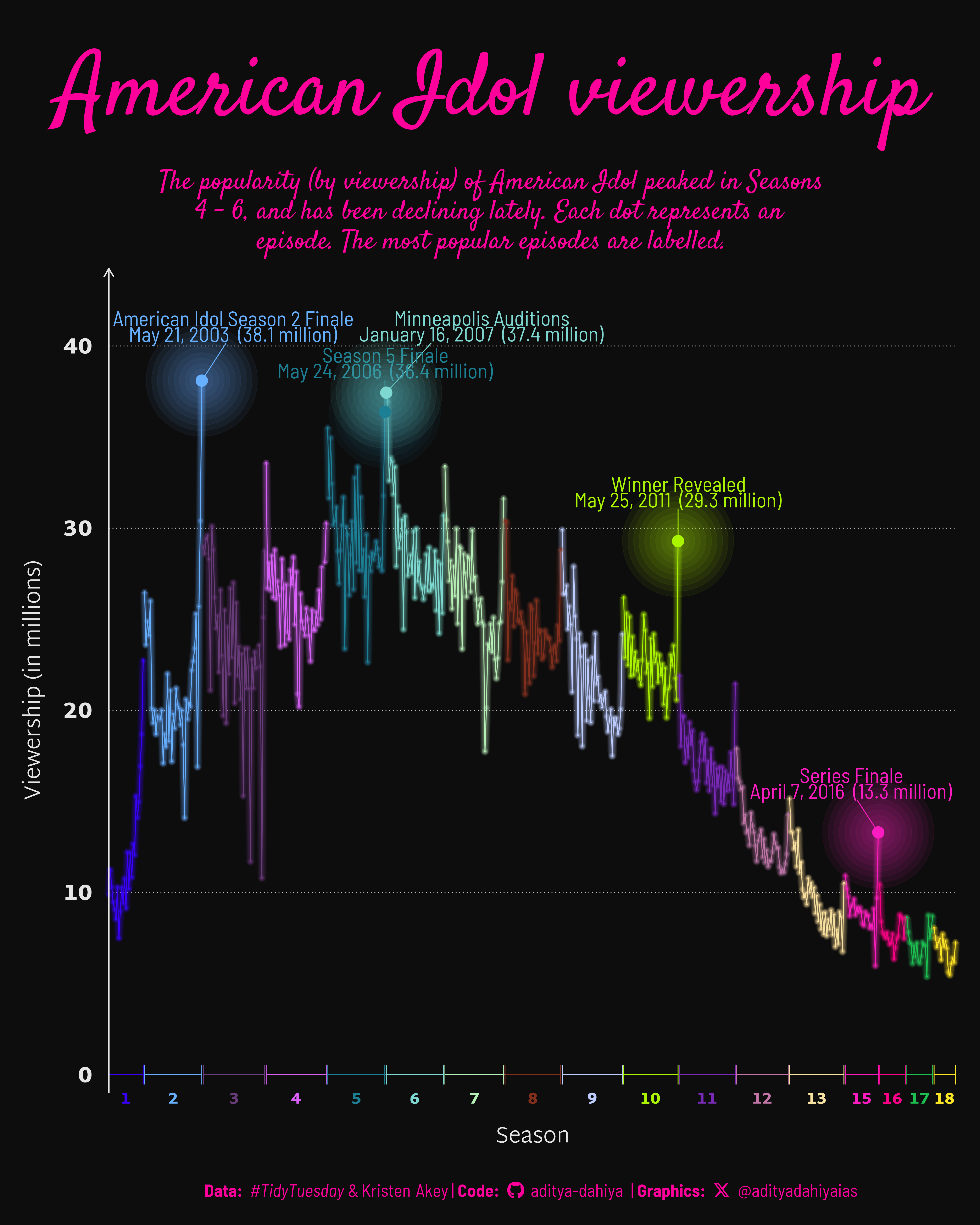
The American Idol dataset, compiled by kkakey, is a comprehensive collection of information spanning seasons 1-18 of the popular TV show “American Idol.” This dataset, available on GitHub, aggregates data from Wikipedia, offering insights into various aspects of the show. The primary dataset, ratings.csv, contains detailed episode ratings and viewership statistics.

A line chart on viewership (on y-axis) of the episodes (on x-axis) of American Idol’s 18 seasons. The most popular episodes are labelled.

How I made this graphic?

Loading libraries & data

Code
# Data Import and Wrangling Tools
library(tidyverse)            # All things tidy

# Final plot tools
library(scales)               # Nice Scales for ggplot2
library(fontawesome)          # Icons display in ggplot2
library(ggtext)               # Markdown text support for ggplot2
library(showtext)             # Display fonts in ggplot2
library(colorspace)           # Lighten and Darken colours
library(patchwork)            # Combining plots
library(ggshadow)             # Shadows and Glowing lines / points

# Getting the data
# auditions <- readr::read_csv('https://raw.githubusercontent.com/rfordatascience/tidytuesday/master/data/2024/2024-07-23/auditions.csv')
# eliminations <- readr::read_csv('https://raw.githubusercontent.com/rfordatascience/tidytuesday/master/data/2024/2024-07-23/eliminations.csv')
# finalists <- readr::read_csv('https://raw.githubusercontent.com/rfordatascience/tidytuesday/master/data/2024/2024-07-23/finalists.csv')
ratings <- readr::read_csv('https://raw.githubusercontent.com/rfordatascience/tidytuesday/master/data/2024/2024-07-23/ratings.csv')
# seasons <- readr::read_csv('https://raw.githubusercontent.com/rfordatascience/tidytuesday/master/data/2024/2024-07-23/seasons.csv')
# songs <- readr::read_csv('https://raw.githubusercontent.com/rfordatascience/tidytuesday/master/data/2024/2024-07-23/songs.csv')

Data Wrangling

Code
plotdf <- ratings |> 
  arrange(season, show_number) |> 
  mutate(id = row_number()) |> 
  select(id, season, show_number, viewers_in_millions,
         weekrank, airdate, episode) |> 
  mutate(
    weekrank = as.numeric(weekrank)
  )

xaxis_df <- plotdf |> 
  group_by(season) |> 
  summarise(
    x_min = min(id),
    x_max = max(id),
    x_mean = (min(id) + max(id)) / 2
  )

labels_df <- plotdf |> 
  group_by(season) |> 
  slice_max(viewers_in_millions, n = 1) |> 
  filter(season %in% c(2, 5, 6, 10, 15)) |> 
  ungroup() |> 
  mutate(label_var = paste0(
    episode, 
    "\n", 
    airdate, 
    "  (", round(viewers_in_millions, 1), " million)"))

Visualization Parameters

Code
# Font for titles
font_add_google("Satisfy",
  family = "title_font"
) 

# Font for the caption
font_add_google("Barlow Semi Condensed",
  family = "caption_font"
) 

# Font for plot text
font_add_google("Martel Sans",
  family = "body_font",
  regular.wt = 300,
  bold.wt = 900
) 

showtext_auto()

# Credits for coffeee palette
mypal <- paletteer::paletteer_d("Polychrome::palette36", direction = -1)
seecolor::print_color(mypal)

bg_col <- "grey5"
text_col <-  "grey90"
text_hil <- "#fe019a"

bts <- 80

# Caption stuff for the plot
sysfonts::font_add(
  family = "Font Awesome 6 Brands",
  regular = here::here("docs", "Font Awesome 6 Brands-Regular-400.otf")
)
github <- "&#xf09b"
github_username <- "aditya-dahiya"
xtwitter <- "&#xe61b"
xtwitter_username <- "@adityadahiyaias"
social_caption_1 <- glue::glue("<span style='font-family:\"Font Awesome 6 Brands\";'>{github};</span> <span style='color: {text_hil}'>{github_username}  </span>")
social_caption_2 <- glue::glue("<span style='font-family:\"Font Awesome 6 Brands\";'>{xtwitter};</span> <span style='color: {text_hil}'>{xtwitter_username}</span>")

plot_title <- "American Idol viewership"

plot_subtitle <- str_wrap("The popularity (by viewership) of American Idol peaked in Seasons 4 - 6, and has been declining lately. Each dot represents an episode. The most popular episodes are labelled.", 65)
str_view(plot_subtitle)

plot_caption <- paste0(
  "**Data:** _#TidyTuesday_ &  Kristen Akey", 
  " |  **Code:** ", 
  social_caption_1, 
  " |  **Graphics:** ", 
  social_caption_2
  )

rm(github, github_username, xtwitter, 
   xtwitter_username, social_caption_1, 
   social_caption_2)

The static plot:

Code
g <- plotdf |> 
  ggplot(
    mapping = aes(
      x = id, 
      y = viewers_in_millions,
      colour = as_factor(season)
    )
  ) +
  geom_glowline() +
  geom_glowpoint() +
  geom_segment(
    data = xaxis_df,
    mapping = aes(
      x = x_min,
      xend = x_max,
      y = 0
    ),
    arrow = arrow(
      ends = "both", 
      angle = 90,
      length = unit(4, "mm")
    )
  ) +
  geom_text(
    data = xaxis_df,
    mapping = aes(
      y = -1,
      x = x_mean,
      label = season
    ),
    vjust = 1,
    size = bts / 4,
    fontface = "bold",
    family = "body_font"
  ) +
  ggrepel::geom_text_repel(
    data = labels_df,
    mapping = aes(label = label_var),
    family = "caption_font",
    force = 10,
    lineheight = 0.2,
    size = bts / 3,
    vjust = 0,
    nudge_y = 4
  ) +
  geom_glowpoint(
    data = labels_df,
    size = 6
  ) +
  scale_colour_manual(values = mypal) +
  scale_y_continuous(expand = expansion(c(0, 0.05))) +
  scale_x_continuous(expand = expansion(0)) +
  coord_cartesian(clip = "off") +
  # Labels for the plot
  labs(
    title = plot_title,
    subtitle = plot_subtitle,
    caption = plot_caption,
    x = "Season", y = "Viewership (in millions)"
  ) +

  # Theme Elements
  theme_minimal(
    base_size = bts,
    base_family = "body_font"
  ) +
  
  theme(
    legend.position = "none",
    panel.grid = element_blank(),
    panel.grid.major.y = element_line(
      colour = lighten(bg_col, 0.8),
      linewidth = 0.5, 
      linetype = 3
    ),
    axis.text.x = element_blank(),
    axis.title = element_text(
      colour = text_col,
      margin = margin(0,0,0,0, "mm")
    ),
    axis.text.y = element_text(
      size = bts,
      colour = text_col,
      margin = margin(0,0,0,0, "mm"),
      face = "bold"
    ),
    axis.line.y = element_line(
      arrow = arrow(length = unit(4, "mm")),
      colour = text_col,
      linewidth = 0.75
    ),
    plot.background = element_rect(
      fill = "transparent",
      colour = "transparent"
    ),
    panel.background = element_rect(
      fill = "transparent",
      colour = "transparent"
    ),
    plot.caption = element_textbox(
      colour = text_hil,
      family = "caption_font",
      hjust = 0.5
    ),
    plot.title = element_text(
      hjust = 0.5,
      size = 4 * bts,
      colour = text_hil,
      margin = margin(10,0,0,0, "mm"),
      family = "title_font"
    ),
    plot.subtitle = element_text(
      colour = text_hil,
      size = 1.2 * bts,
      hjust = 0.5, 
      lineheight = 0.3,
      margin = margin(5,0,3,0, "mm"),
      family = "title_font"
    ),
    plot.margin = margin(10,10,10,10, "mm"),
    plot.title.position = "plot"
  )

ggsave(
  filename = here::here("data_vizs", "tidy_american_idol.png"),
  plot = g,
  width = 400,    # Best Twitter Aspect Ratio = 5:4
  height = 500,   
  units = "mm",
  bg = bg_col
)

Savings the graphics

Code
library(magick)
# Saving a thumbnail for the webpage
image_read(here::here("data_vizs", "tidy_american_idol.png")) |> 
  image_resize(geometry = "400") |> 
  image_write(here::here("data_vizs", "thumbnails", "tidy_american_idol.png"))