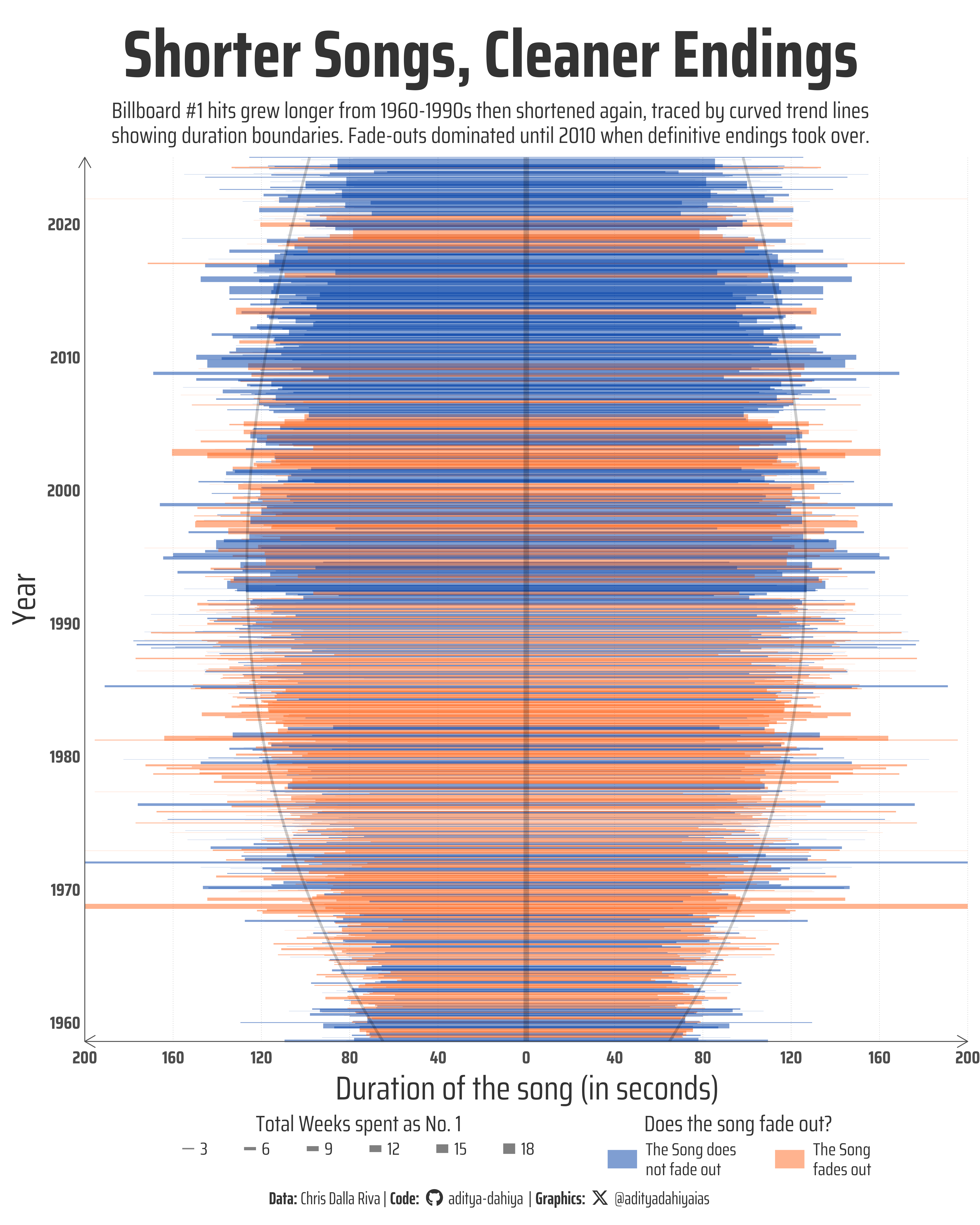
Chart-toppers peaked in duration during the 1990s after decades of growth, while the once-popular fade-out technique largely disappeared after 2010.
#TidyTuesday
Author
Aditya Dahiya
Published
August 28, 2025
About the Data
The Billboard Hot 100 Number Ones Database represents a comprehensive collection of data about every song to reach number one on the Billboard Hot 100 between August 4, 1958 and January 11, 2025. This extensive dataset was meticulously compiled by Chris Dalla Riva over seven years as part of his research for the book Uncharted Territory: What Numbers Tell Us about the Biggest Hit Songs and Ourselves, and continues to power his music analytics newsletter Can’t Get Much Higher. The database contains detailed information across 87 variables for each chart-topper, including musical characteristics sourced from Spotify, genre classifications from both Dalla Riva’s team and Discogs, songwriter and producer credits from BMI/ASCAP databases, demographic information about artists, lyrical content analysis, and technical details like song structure, instrumentation, and recording characteristics. This rich dataset enables researchers to explore trends in popular music across nearly seven decades, from the evolution of song length and musical keys to changing patterns in artist demographics and lyrical themes, providing unprecedented insights into the cultural and musical landscape of American popular music.
Figure 1: This visualization maps the evolution of Billboard Hot 100 #1 hits from 1958 to 2025, with each horizontal line segment representing a chart-topping song. The x-axis shows song duration in seconds, centered at zero and extending symmetrically to show each song’s length. The y-axis displays the release year. Line segment width indicates weeks spent at #1, while colors distinguish between songs that fade out (orange) versus those with definitive endings (blue). Two curved trend lines trace the average duration boundaries over time, revealing how hit songs lengthened from the 1960s through 1990s before shortening again in recent decades, while the predominance of fade-outs has declined since 2010.
How I Made This Graphic
Loading required libraries
Code
pacman::p_load( tidyverse, # All things tidy scales, # Nice Scales for ggplot2 fontawesome, # Icons display in ggplot2 ggtext, # Markdown text support for ggplot2 showtext, # Display fonts in ggplot2 colorspace, # Lighten and Darken colours patchwork, # Composing Plots sf # Spatial Operations)# Using R# Option 2: Read directly from GitHubbillboard <- readr::read_csv('https://raw.githubusercontent.com/rfordatascience/tidytuesday/main/data/2025/2025-08-26/billboard.csv')# topics <- readr::read_csv('https://raw.githubusercontent.com/rfordatascience/tidytuesday/main/data/2025/2025-08-26/topics.csv')
Visualization Parameters
Code
# Font for titlesfont_add_google("Saira",family ="title_font") # Font for the captionfont_add_google("Saira Condensed",family ="body_font") # Font for plot textfont_add_google("Saira Extra Condensed",family ="caption_font") showtext_auto()# A base Colourbg_col <-"white"seecolor::print_color(bg_col)# Colour for highlighted texttext_hil <-"grey20"seecolor::print_color(text_hil)# Colour for the texttext_col <-"grey20"seecolor::print_color(text_col)line_col <-"grey30"# Define Base Text Sizebts <-80# Caption stuff for the plotsysfonts::font_add(family ="Font Awesome 6 Brands",regular = here::here("docs", "Font Awesome 6 Brands-Regular-400.otf"))github <-""github_username <-"aditya-dahiya"xtwitter <-""xtwitter_username <-"@adityadahiyaias"social_caption_1 <- glue::glue("<span style='font-family:\"Font Awesome 6 Brands\";'>{github};</span> <span style='color: {text_hil}'>{github_username} </span>")social_caption_2 <- glue::glue("<span style='font-family:\"Font Awesome 6 Brands\";'>{xtwitter};</span> <span style='color: {text_hil}'>{xtwitter_username}</span>")plot_caption <-paste0("**Data:** Chris Dalla Riva", " | **Code:** ", social_caption_1, " | **Graphics:** ", social_caption_2 )rm(github, github_username, xtwitter, xtwitter_username, social_caption_1, social_caption_2)# Add text to plot-------------------------------------------------plot_title <-"Shorter Songs, Cleaner Endings"plot_subtitle <-"Billboard #1 hits grew longer from 1960-1990s then shortened again, traced by curved trend lines showing duration boundaries. Fade-outs dominated until 2010 when definitive endings took over."|>str_wrap(100)str_view(plot_subtitle)
Exploratory Data Analysis and Wrangling
Code
# billboard |> # ggplot(# mapping = aes(# x = length_sec# )# ) +# geom_histogram(# fill = "white",# colour = "grey20",# bins = 100# )# # billboard |> # distinct(cdr_genre)# # pacman::p_load(summarytools)# billboard |> # dfSummary() |> # view()plotdf <- billboard |>mutate(length_x_min =0- (length_sec/2),length_x_max =0+ (length_sec/2),colour_var =case_when( artist_male ==0~"Female", artist_male ==1~"Male", artist_male ==2~"Both Male and Female", artist_male ==3~"Both Male and Female" ),date =as_date(date) )
# Saving a thumbnaillibrary(magick)# Saving a thumbnail for the webpageimage_read(here::here("data_vizs", "tidy_billboard_hot_100.png")) |>image_resize(geometry ="x400") |>image_write( here::here("data_vizs", "thumbnails", "tidy_billboard_hot_100.png" ) )
Session Info
Code
pacman::p_load( tidyverse, # All things tidy scales, # Nice Scales for ggplot2 fontawesome, # Icons display in ggplot2 ggtext, # Markdown text support for ggplot2 showtext, # Display fonts in ggplot2 colorspace, # Lighten and Darken colours patchwork # Composing Plots)sessioninfo::session_info()$packages |>as_tibble() |> dplyr::select(package, version = loadedversion, date, source) |> dplyr::arrange(package) |> janitor::clean_names(case ="title" ) |> gt::gt() |> gt::opt_interactive(use_search =TRUE ) |> gtExtras::gt_theme_espn()
Table 1: R Packages and their versions used in the creation of this page and graphics