Using ggplot2, ggrepel, geomtextpath, and the tidyverse to explore correlations between festival burn durations and meteorological measurements
#TidyTuesday
Author
Aditya Dahiya
Published
December 6, 2025
About the Data
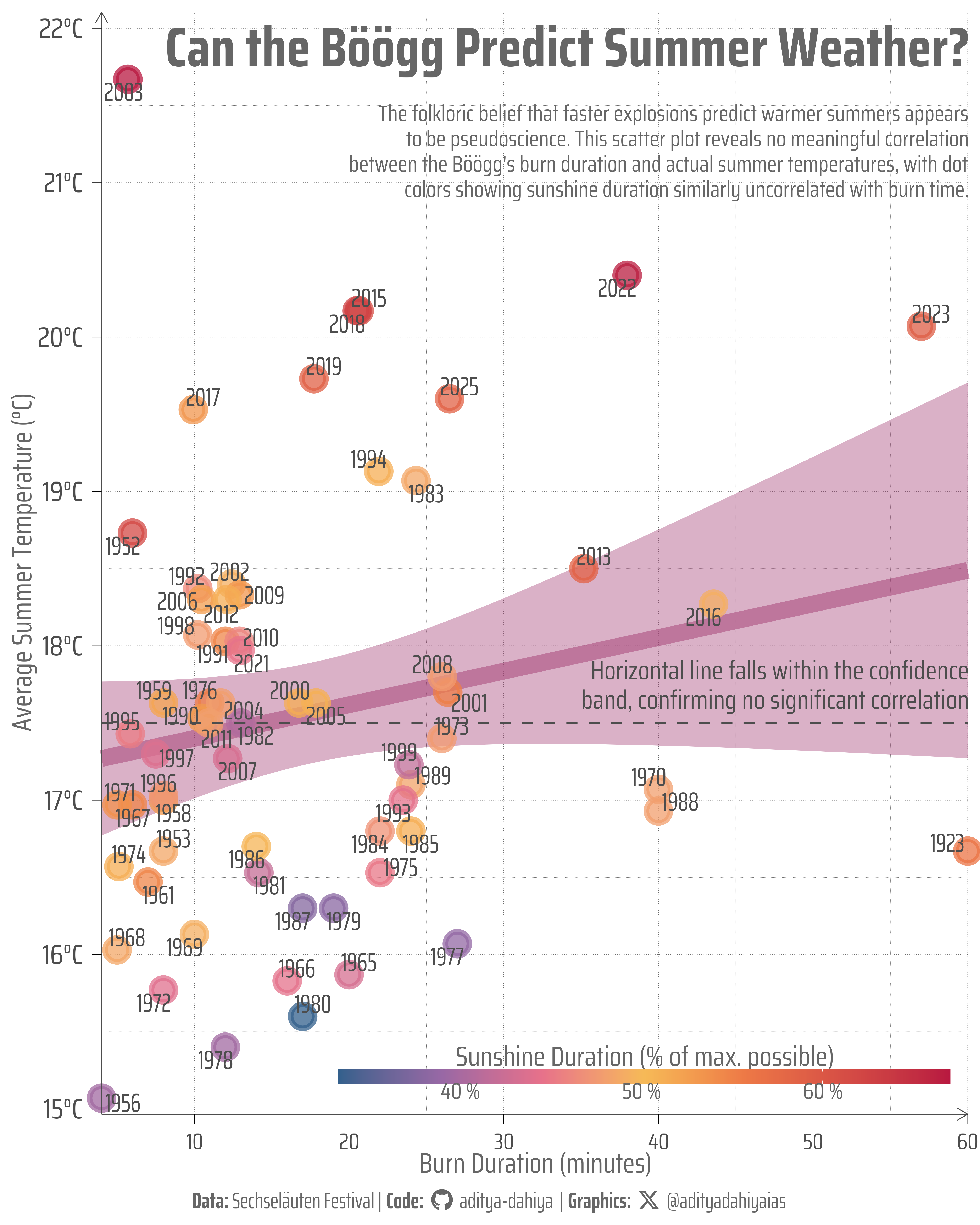
This dataset explores the folkloric weather prediction tradition of Zurich’s Sechseläuten spring festival, which features the Böögg, a cotton wool snowman effigy stuffed with fireworks. According to tradition, the faster the Böögg’s head explodes, the better the summer weather will be. The data, curated by Matt (econmaett), pairs historical burn duration records (measured in minutes from ignition to explosion) with meteorological measurements from subsequent summer months, including average, minimum, and maximum air temperatures at 2 meters above ground (in degrees Celsius), total sunshine duration (in hours and as a percentage of possible maximum), and total precipitation (in millimeters).
Figure 1: This scatter plot examines whether Zurich’s Sechseläuten festival tradition—that faster Böögg explosions predict warmer summers—holds statistical merit. Each point represents a year (1956-2025), positioned by burn duration (x-axis, in minutes) and average summer temperature (y-axis, in °C). Point colors indicate sunshine duration as a percentage of maximum possible. The regression line with 95% confidence interval reveals no meaningful correlation, as demonstrated by the horizontal reference line falling entirely within the confidence band. The folklore appears to be pseudoscience rather than predictive meteorology.
How I Made This Graphic
.
Loading required libraries
Code
pacman::p_load( tidyverse, # All things tidy scales, # Nice Scales for ggplot2 fontawesome, # Icons display in ggplot2 ggtext, # Markdown text support for ggplot2 showtext, # Display fonts in ggplot2 colorspace, # Lighten and Darken colours patchwork # Composing Plots)pacman::p_load(ggcorrplot, ggrepel, geomtextpath)sechselaeuten <- readr::read_csv('https://raw.githubusercontent.com/rfordatascience/tidytuesday/main/data/2025/2025-12-02/sechselaeuten.csv')
Visualization Parameters
Code
# Font for titlesfont_add_google("Saira",family ="title_font")# Font for the captionfont_add_google("Saira Condensed",family ="body_font")# Font for plot textfont_add_google("Saira Extra Condensed",family ="caption_font")showtext_auto()# A base Colourbg_col <-"white"seecolor::print_color(bg_col)# Colour for highlighted texttext_hil <-"grey40"seecolor::print_color(text_hil)# Colour for the texttext_col <-"grey30"seecolor::print_color(text_col)line_col <-"grey30"# Define Base Text Sizebts <-80# Caption stuff for the plotsysfonts::font_add(family ="Font Awesome 6 Brands",regular = here::here("docs", "Font Awesome 6 Brands-Regular-400.otf"))github <-""github_username <-"aditya-dahiya"xtwitter <-""xtwitter_username <-"@adityadahiyaias"social_caption_1 <- glue::glue("<span style='font-family:\"Font Awesome 6 Brands\";'>{github};</span> <span style='color: {text_hil}'>{github_username} </span>")social_caption_2 <- glue::glue("<span style='font-family:\"Font Awesome 6 Brands\";'>{xtwitter};</span> <span style='color: {text_hil}'>{xtwitter_username}</span>")plot_caption <-paste0("**Data:** Sechseläuten Festival"," | **Code:** ", social_caption_1," | **Graphics:** ", social_caption_2)rm( github, github_username, xtwitter, xtwitter_username, social_caption_1, social_caption_2)
bts =100# Create subtitle textsubtitle_text <-"The folkloric belief that faster explosions predict warmer summers appears to be pseudoscience. This scatter plot reveals no meaningful correlation between the Böögg's burn duration and actual summer temperatures, with dot colors showing sunshine duration similarly uncorrelated with burn time."# Create the scatter plotg <- sechselaeuten |>ggplot(mapping =aes(x = duration, y = tre200m0) ) +# Add a trend linegeom_smooth(method ="lm", se =TRUE, color =alpha("#A23B72", 0.5), fill =alpha("#A23B72", 0.15) ) +# Add colored points based on sunshine durationgeom_point(aes(colour = sremaxmv), size = bts /10, pch =19,alpha =0.75 ) +# Color scale for sunshine paletteer::scale_colour_paletteer_c("ggthemes::Sunset-Sunrise Diverging",labels =label_number(suffix =" %") ) +# Add year labels with ggrepel to avoid overlapgeom_text_repel(aes(label = year),size = bts /3,box.padding =0.2,point.padding =0.2,segment.color ="transparent",segment.size =0.1,max.overlaps =Inf,colour = text_col,family ="caption_font" ) +# Add title as text annotationannotate(geom ="text",x =60, y =22,label ="Can the Böögg Predict Summer Weather?",hjust =1,vjust =1,size = bts *0.7,fontface ="bold",family ="body_font",lineheight =0.3,colour = text_hil ) +# Add subtitle as text annotationannotate(geom ="text",x =60, y =21.5,label = subtitle_text |>str_wrap(75),hjust =1,vjust =1,size = bts /3.5,color ="grey40",lineheight =0.3,family ="body_font" ) +# Add a horizontal line to prove no meaningful correlationgeom_hline(yintercept =17.5, linetype ="dashed", color = text_col, linewidth =1.5 ) +annotate(geom ="text",x =60, y =17.5,label ="Horizontal line falls within the confidence\nband, confirming no significant correlation",hjust =1,vjust =-0.3,size = bts /3,color = text_col,fontface ="italic",lineheight =0.3 ) +# Labelslabs(x ="Burn Duration (minutes)",y ="Average Summer Temperature (°C)",colour ="Sunshine Duration (% of max. possible)",caption = plot_caption ) +scale_y_continuous(expand =expansion(0.015),labels =function(x) paste0(x, "°C"),breaks =15:22 ) +scale_x_continuous(expand =expansion(0.0) ) +coord_cartesian(clip ="off" ) +theme_minimal(base_family ="body_font",base_size = bts ) +theme(legend.position ="inside",legend.position.inside =c(0.98,0.01),legend.justification =c(1,0),legend.direction ="horizontal",legend.margin =margin(0,0,0,0, "mm"),legend.title =element_text(margin =margin(0,0,0,0, "mm"),hjust =0.5 ),legend.text =element_text(margin =margin(0,0,0,0, "mm") ),legend.text.position ="bottom",legend.title.position ="top",legend.key.width =unit(50, "mm"),# Overalltext =element_text(margin =margin(0, 0, 0, 0, "mm"),colour = text_hil,lineheight =0.3 ),# Axesaxis.text.x.bottom =element_text(margin =margin(4,0,0,0, "mm") ),axis.title.x.bottom =element_text(margin =margin(0,0,0,0, "mm") ),axis.text.y.left =element_text(size = bts,margin =margin(0,4,0,0, "mm") ),axis.title.y.left =element_text(margin =margin(0,0,0,0, "mm") ),axis.ticks.x.bottom =element_line(linewidth =0.3 ),axis.ticks.y.left =element_line(linewidth =0.3 ),axis.ticks.length.x =unit(4, "mm"),axis.ticks.length.y.left =unit(4, "mm"),axis.line =element_line(arrow =arrow(length =unit(5, "mm") ),linewidth =0.5,colour = text_col ),panel.grid =element_line(linetype =3,linewidth =0.3,colour = text_hil ),panel.grid.minor =element_line(linetype =3,linewidth =0.15,colour = text_hil ),plot.caption =element_markdown(family ="caption_font",hjust =0.5,margin =margin(5,0,0,0, "mm"),colour = text_hil ),plot.caption.position ="plot",plot.title.position ="plot",plot.margin =margin(5, 5, 5, 5, "mm") )ggsave(filename = here::here("data_vizs","tidy_exploding_snowman.png" ),plot = g,width =400,height =500,units ="mm",bg = bg_col)
Savings the thumbnail for the webpage
Code
# Saving a thumbnaillibrary(magick)# Saving a thumbnail for the webpageimage_read(here::here("data_vizs","tidy_exploding_snowman.png")) |>image_resize(geometry ="x400") |>image_write( here::here("data_vizs","thumbnails","tidy_exploding_snowman.png" ) )
Session Info
Code
pacman::p_load( tidyverse, # All things tidy scales, # Nice Scales for ggplot2 fontawesome, # Icons display in ggplot2 ggtext, # Markdown text support for ggplot2 showtext, # Display fonts in ggplot2 colorspace, # Lighten and Darken colours patchwork, # Composing Plots ggh4x, # Proportional facets ggchicklet, # Rounded bars ggstream # Labels in stacked bar chart)sessioninfo::session_info()$packages |>as_tibble() |># The attached column is TRUE for packages that were # explicitly loaded with library() dplyr::filter(attached ==TRUE) |> dplyr::select(package,version = loadedversion, date, source ) |> dplyr::arrange(package) |> janitor::clean_names(case ="title" ) |> gt::gt() |> gt::opt_interactive(use_search =TRUE ) |> gtExtras::gt_theme_espn()
Table 1: R Packages and their versions used in the creation of this page and graphics