Using scatterpie and sf to visualize global extreme weather attribution studies
#TidyTuesday
Maps
{scatterpie}
Pie Chart
Author
Aditya Dahiya
Published
August 23, 2025
About the Data
This dataset explores extreme weather attribution studies, sourced from Carbon Brief’s comprehensive article Mapped: How climate change affects extreme weather around the world. Last updated in November 2024, the data includes individual entries for attribution studies that calculate whether and by how much climate change affected the intensity, frequency, or impact of extreme weather events—ranging from wildfires in the US and drought in South Africa to record-breaking rainfall in Pakistan and typhoons in Taiwan. The dataset covers studies published over multiple years, including both traditional attribution studies and rapid attribution studies (analyses completed within days of an event occurring). Each entry contains detailed information about the event studied, geographic location using ISO country codes, event classification based on climate change influence, publication details, and whether the study represents a rapid response analysis. For those interested in the evolution of this scientific field, Carbon Brief also provides an in-depth Q&A article exploring the development of extreme weather attribution science. The dataset was curated by Rajo for the #TidyTuesday weekly data project, making it an excellent resource for exploring questions about how attribution studies have evolved over time, which types of extreme events are most commonly studied, regional focus patterns, and trends in climate change influence across different weather phenomena.
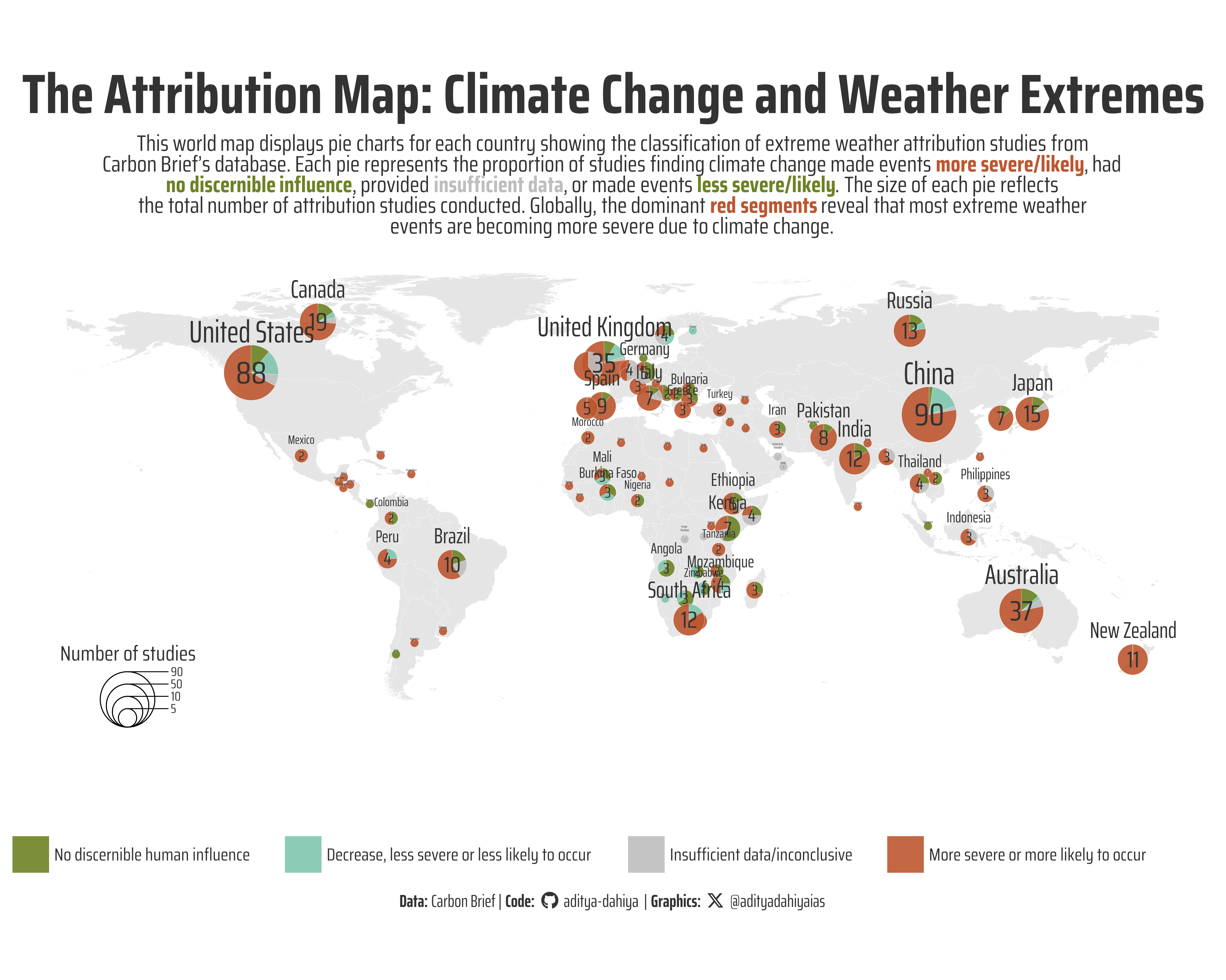
Figure 1: This world map visualizes extreme weather attribution studies by country using proportional pie charts from Carbon Brief’s database. Each pie chart is positioned at a country’s geographic center, with slice sizes representing the proportion of studies finding climate change made events more severe/likely, had no discernible human influence, provided insufficient data, or made events less severe/likely. Pie chart sizes correspond to the total number of attribution studies conducted per country. The visualization reveals the global scientific consensus that climate change is predominantly making extreme weather events more dangerous worldwide.
How I Made This Graphic
This world map visualization was created using R’s powerful geospatial and data visualization ecosystem. The foundation began with data wrangling using the tidyverse suite, where I filtered the attribution studies data to focus on event-specific studies and parsed country codes using separate_longer_delim() to handle multi-country studies. The base world map was generated using rnaturalearth::ne_countries() and processed with the sf package for spatial operations, including coordinate transformation and centroid calculation to position pie charts at each country’s geographic center. The key visualization technique employed the scatterpie package, specifically geom_scatterpie(), which creates proportional pie charts where each slice represents the classification of extreme weather events (more severe/likely, no discernible influence, insufficient data, or less severe/likely). Typography was enhanced using showtext with Google Fonts integration via font_add_google(), while ggtext enabled markdown formatting in plot elements. The spatial coordinate system was managed through coord_sf() with EPSG:4326 projection, and custom legends were positioned using geom_scatterpie_legend(). Color palettes were sourced from paletteer, and the final composition used ggthemes::theme_map() for a clean cartographic aesthetic. The resulting visualization effectively demonstrates that across most countries with recorded extreme weather attribution studies, the majority of events are classified as “more severe or more likely to occur” due to climate change, represented by the dominant color in most pie charts globally.
Loading required libraries
Code
pacman::p_load( tidyverse, # All things tidy scales, # Nice Scales for ggplot2 fontawesome, # Icons display in ggplot2 ggtext, # Markdown text support for ggplot2 showtext, # Display fonts in ggplot2 colorspace, # Lighten and Darken colours patchwork, # Composing Plots sf # Spatial Operations)# Option 2: Read data directly from GitHubattribution_studies <- readr::read_csv('https://raw.githubusercontent.com/rfordatascience/tidytuesday/main/data/2025/2025-08-12/attribution_studies.csv')# attribution_studies_raw <- readr::read_csv('https://raw.githubusercontent.com/rfordatascience/tidytuesday/main/data/2025/2025-08-12/attribution_studies_raw.csv')
Visualization Parameters
Code
# Font for titlesfont_add_google("Saira",family ="title_font") # Font for the captionfont_add_google("Saira Condensed",family ="body_font") # Font for plot textfont_add_google("Saira Extra Condensed",family ="caption_font") showtext_auto()# A base Colourbg_col <-"white"seecolor::print_color(bg_col)# Colour for highlighted texttext_hil <-"grey20"seecolor::print_color(text_hil)# Colour for the texttext_col <-"grey20"seecolor::print_color(text_col)line_col <-"grey30"# Custom Colours for dotscustom_dot_colours <- paletteer::paletteer_d("nbapalettes::cavaliers_retro")# Custom size for dotssize_var <-14# Define Base Text Sizebts <-80# Caption stuff for the plotsysfonts::font_add(family ="Font Awesome 6 Brands",regular = here::here("docs", "Font Awesome 6 Brands-Regular-400.otf"))github <-""github_username <-"aditya-dahiya"xtwitter <-""xtwitter_username <-"@adityadahiyaias"social_caption_1 <- glue::glue("<span style='font-family:\"Font Awesome 6 Brands\";'>{github};</span> <span style='color: {text_hil}'>{github_username} </span>")social_caption_2 <- glue::glue("<span style='font-family:\"Font Awesome 6 Brands\";'>{xtwitter};</span> <span style='color: {text_hil}'>{xtwitter_username}</span>")plot_caption <-paste0("**Data:** Carbon Brief", " | **Code:** ", social_caption_1, " | **Graphics:** ", social_caption_2 )rm(github, github_username, xtwitter, xtwitter_username, social_caption_1, social_caption_2)# Add text to plot-------------------------------------------------plot_title <-"The Attribution Map: Climate Change and Weather Extremes"plot_subtitle <-"This world map displays pie charts for each country showing the classification of extreme weather attribution studies from<br>Carbon Brief's database. Each pie represents the proportion of studies finding climate change made events <span style='color:#BD5630FF'>**more severe/likely**</span>, had<br><span style='color:#6D8325FF'>**no discernible influence**</span>, provided <span style='color:grey'>**insufficient data**</span>, or made events <span style='color:#6D8325FF'>**less severe/likely**</span>. The size of each pie reflects<br>the total number of attribution studies conducted. Globally, the dominant <span style='color:#BD5630FF'>**red segments**</span> reveal that most extreme weather<br>events are becoming more severe due to climate change."str_view(plot_subtitle)
Exploratory Data Analysis and Wrangling
Code
# pacman::p_load(summarytools)# A base world map to plotworld_map <- rnaturalearth::ne_countries(scale ="large") |>select(iso_a3, geometry) |>rename(iso3c = iso_a3)# Get data on classification and year by countries to try to make a pie chart# for each country on top of a world mapdf1 <- attribution_studies |>mutate(event_year =parse_number(event_year) ) |>#filter(event_year > 1900) |> filter(study_focus =="Event") |>filter(!is.na(iso_country_code)) |>select(event_year, iso_country_code, classification) |>rename(iso3c = iso_country_code) |>separate_longer_delim(cols = iso3c, ",") |>count(iso3c, classification)# Make data in format that {scatterpie} understandsdf_scatterpie <- df1 |>pivot_wider(id_cols = iso3c,names_from = classification,values_from = n ) |>mutate(across(everything(), ~replace_na(.x, 0))) |>left_join( df1 |>group_by(iso3c) |>summarise(radius_var =sum(n)) ) |># add centroids of each countryleft_join( world_map |>st_transform(crs ="EPSG:3857") |> sf::st_centroid() |>st_transform(crs ="EPSG:4326") |>st_coordinates() |>as_tibble() |>bind_cols(world_map |>st_drop_geometry() |>select(iso3c)) |>rename(longitude = X, latitude = Y) ) |>mutate(iso3c_label = countrycode::countrycode( iso3c, origin ="iso3c", destination ="country.name.en" ) ) |>arrange(desc(radius_var))pacman::p_load(scatterpie)
# Saving a thumbnaillibrary(magick)# Saving a thumbnail for the webpageimage_read(here::here("data_vizs", "tidy_extreme_weather_studies.png")) |>image_resize(geometry ="x400") |>image_write( here::here("data_vizs", "thumbnails", "tidy_extreme_weather_studies.png" ) )
Session Info
Code
pacman::p_load( tidyverse, # All things tidy scales, # Nice Scales for ggplot2 fontawesome, # Icons display in ggplot2 ggtext, # Markdown text support for ggplot2 showtext, # Display fonts in ggplot2 colorspace, # Lighten and Darken colours patchwork # Composing Plots)sessioninfo::session_info()$packages |>as_tibble() |> dplyr::select(package, version = loadedversion, date, source) |> dplyr::arrange(package) |> janitor::clean_names(case ="title" ) |> gt::gt() |> gt::opt_interactive(use_search =TRUE ) |> gtExtras::gt_theme_espn()
Table 1: R Packages and their versions used in the creation of this page and graphics