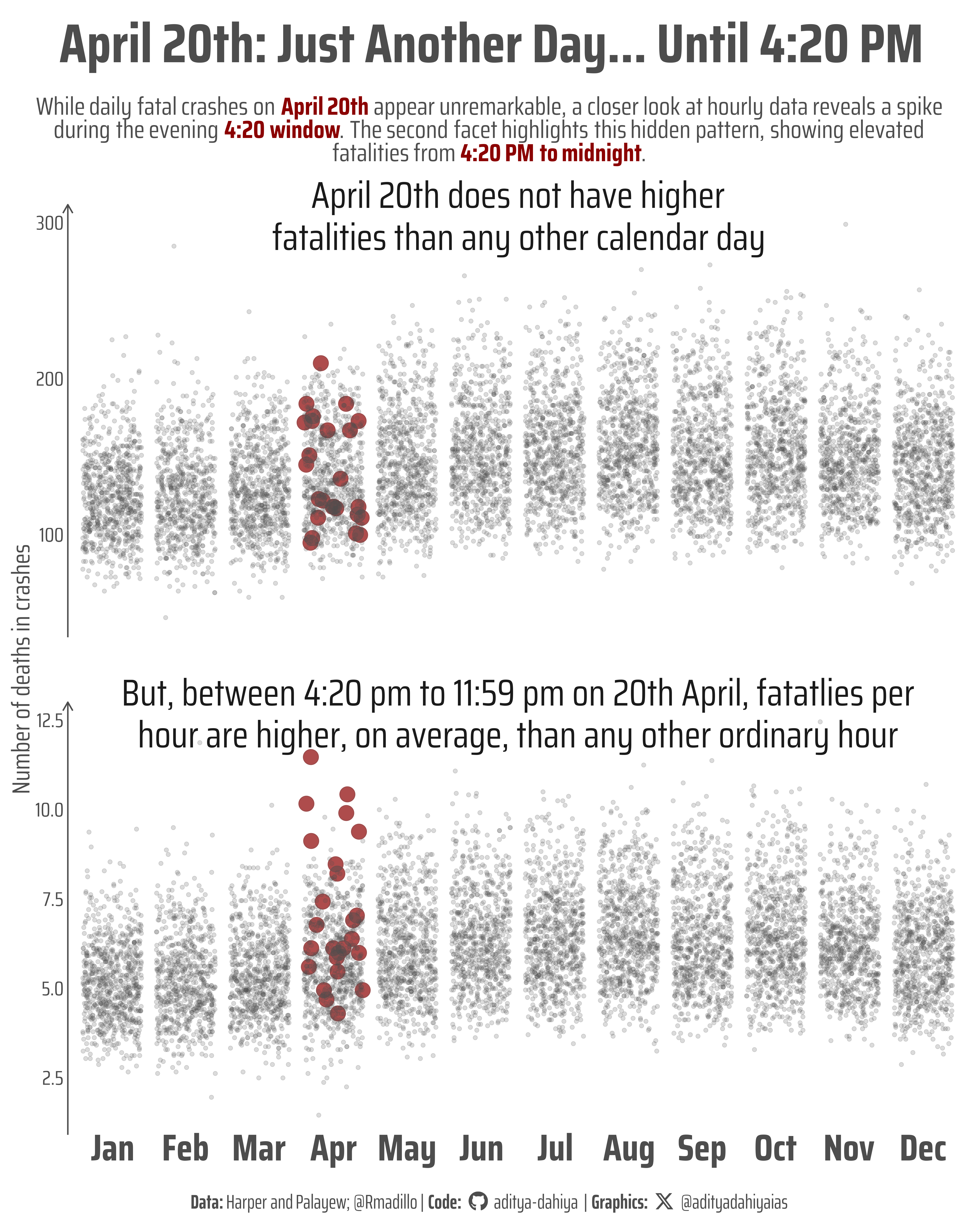
While daily fatal crashes on April 20th appear unremarkable, a closer look at hourly data reveals a spike during the evening “4:20” window. The second facet highlights this hidden pattern, showing elevated fatalities from 4:20 PM to midnight.
#TidyTuesday
{ggblend}
Author
Aditya Dahiya
Published
April 24, 2025
About the Data
This week’s dataset comes from the TidyTuesday project, originally submitted by @Rmadillo as part of an analysis on fatal car crashes in the United States during the “4/20 holiday”—specifically between 4:20pm and 11:59pm on April 20th. The dataset builds on a 2019 study by Harper and Palayew that revisited earlier findings from Staples and Redelmeier (2018) which had suggested a significant spike in traffic fatalities on 4/20. Harper and Palayew’s replication study used a broader time window and more robust methods, finding no strong signal linking fatal crashes specifically to 4/20, but did confirm elevated risks around other major holidays like July 4th. The dataset includes daily_accidents.csv (fatality counts by date), daily_accidents_420.csv (indicating whether an accident occurred during the 4/20 timeframe), and daily_accidents_420_time.csv (flagging accidents during the 4:20pm–11:59pm window on any day). The data can be accessed directly via GitHub or loaded using the tidytuesdayR or pydytuesday libraries in R and Python, respectively. Thank you to Jon Harmon and the Data Science Learning Community for curating this resource.
Figure 1: This graphic explores fatal car crashes in the U.S. from 1992 to 2016, with each dot representing one day. The first facet shows daily fatalities by month, revealing no unusual spike on April 20th (highlighted in dark red). The second facet plots hourly fatalities, uncovering a distinct increase in deaths during the evening hours of April 20th (4:20 PM to 11:59 PM). While the date may seem statistically ordinary at a daily scale, zooming into the evening hours reveals a significant rise in fatal crashes—suggesting that the true signal is hidden in the finer resolution of time.
How I made this graphic?
To create this graphic, a rich set of R packages was employed to streamline data wrangling, visual storytelling, and layout design. The foundational tidyverse suite handled data import and transformation, while scales provided refined axis labeling. For polished visuals, ggtext enabled markdown-styled subtitles and captions, fontawesome embedded social icons, and showtext displayed custom Google Fonts. The color aesthetics were fine-tuned using colorspace, and patchwork was prepared for composing multiple plots if needed. Images were handled by magick and ggimage. To identify patterns, two datasets were grouped and summarized using dplyr verbs, distinguishing April 20th from other days. Finally, ggplot2 and ggblend layered jittered points with color-coded emphasis and custom annotations, producing a clean yet revealing plot exported via ggsave().
Loading required libraries
Code
pacman::p_load( tidyverse, # All things tidy scales, # Nice Scales for ggplot2 fontawesome, # Icons display in ggplot2 ggtext, # Markdown text support for ggplot2 showtext, # Display fonts in ggplot2 colorspace, # Lighten and Darken colours magick, # Download images and edit them ggimage, # Display images in ggplot2 patchwork # Composing Plots)daily_accidents <- readr::read_csv('https://raw.githubusercontent.com/rfordatascience/tidytuesday/main/data/2025/2025-04-22/daily_accidents.csv')daily_accidents_420 <- readr::read_csv('https://raw.githubusercontent.com/rfordatascience/tidytuesday/main/data/2025/2025-04-22/daily_accidents_420.csv')
Visualization Parameters
Code
# Font for titlesfont_add_google("Saira",family ="title_font") # Font for the captionfont_add_google("Saira Extra Condensed",family ="caption_font") # Font for plot textfont_add_google("Saira Condensed",family ="body_font") showtext_auto()# cols4all::c4a_gui()mypal <-c("#FF7502", "#C55CC9", "#0F6F74")# A base Colourbg_col <-"white"seecolor::print_color(bg_col)# Colour for highlighted texttext_hil <-"grey30"seecolor::print_color(text_hil)# Colour for the texttext_col <-"grey30"seecolor::print_color(text_col)line_col <-"grey30"# Define Base Text Sizebts <-90# Caption stuff for the plotsysfonts::font_add(family ="Font Awesome 6 Brands",regular = here::here("docs", "Font Awesome 6 Brands-Regular-400.otf"))github <-""github_username <-"aditya-dahiya"xtwitter <-""xtwitter_username <-"@adityadahiyaias"social_caption_1 <- glue::glue("<span style='font-family:\"Font Awesome 6 Brands\";'>{github};</span> <span style='color: {text_hil}'>{github_username} </span>")social_caption_2 <- glue::glue("<span style='font-family:\"Font Awesome 6 Brands\";'>{xtwitter};</span> <span style='color: {text_hil}'>{xtwitter_username}</span>")plot_caption <-paste0("**Data:** Harper and Palayew; @Rmadillo", " | **Code:** ", social_caption_1, " | **Graphics:** ", social_caption_2 )rm(github, github_username, xtwitter, xtwitter_username, social_caption_1, social_caption_2)# Add text to plot-------------------------------------------------plot_title <-"April 20th: Just Another Day... Until 4:20 PM"plot_subtitle <-"While daily fatal crashes on <b style='color:darkred'>April 20th</b> appear unremarkable, a closer look at hourly data reveals a spike<br>during the evening <b style='color:darkred'>4:20 window</b>. The second facet highlights this hidden pattern, showing elevated<br>fatalities from <b style='color:darkred'>4:20 PM to midnight</b>."
Exploratory Data Analysis and Wrangling
Code
library(summarytools)daily_accidents |>dfSummary() |>view()daily_accidents_420 |>dfSummary() |>view()daily_accidents_420 |>group_by(e420) |>summarise(avg_fatalities =mean(fatalities_count, na.rm =TRUE) )df_by_day <- daily_accidents_420 |>group_by(date) |>summarise(fatalities_count =sum(fatalities_count, na.rm = T) ) |>mutate(e420 =if_else(month(date) ==4&day(date) ==20,TRUE,FALSE ) )df_by_hour <- daily_accidents_420 |>group_by(date, e420) |>summarise(fatalities_count =sum(fatalities_count, na.rm = T)) |>ungroup() |>mutate(fatalities_count =if_else( e420, fatalities_count /7.67, fatalities_count /24 ) )df_plot <-bind_rows( df_by_day |>mutate(facet_var ="April 20th does not have higher\nfatalities than any other calendar day" ),df_by_hour |>mutate(facet_var ="But, between 4:20 pm to 11:59 pm on 20th April, fatatlies per\nhour are higher, on average, than any other ordinary hour" ))
# Saving a thumbnaillibrary(magick)# Saving a thumbnail for the webpageimage_read(here::here("data_vizs", "tidy_fatal_car_crashes_420.png")) |>image_resize(geometry ="x400") |>image_write( here::here("data_vizs", "thumbnails", "tidy_fatal_car_crashes_420.png" ) )
Session Info
Code
pacman::p_load( tidyverse, # All things tidy scales, # Nice Scales for ggplot2 fontawesome, # Icons display in ggplot2 ggtext, # Markdown text support for ggplot2 showtext, # Display fonts in ggplot2 colorspace, # Lighten and Darken colours magick, # Download images and edit them ggimage, # Display images in ggplot2 patchwork # Composing Plots)sessioninfo::session_info()$packages |>as_tibble() |>select(package, version = loadedversion, date, source) |>arrange(package) |> janitor::clean_names(case ="title" ) |> gt::gt() |> gt::opt_interactive(use_search =TRUE ) |> gtExtras::gt_theme_espn()
Table 1: R Packages and their versions used in the creation of this page and graphics