The Age Gap: Female vs Male Chess Players Worldwide

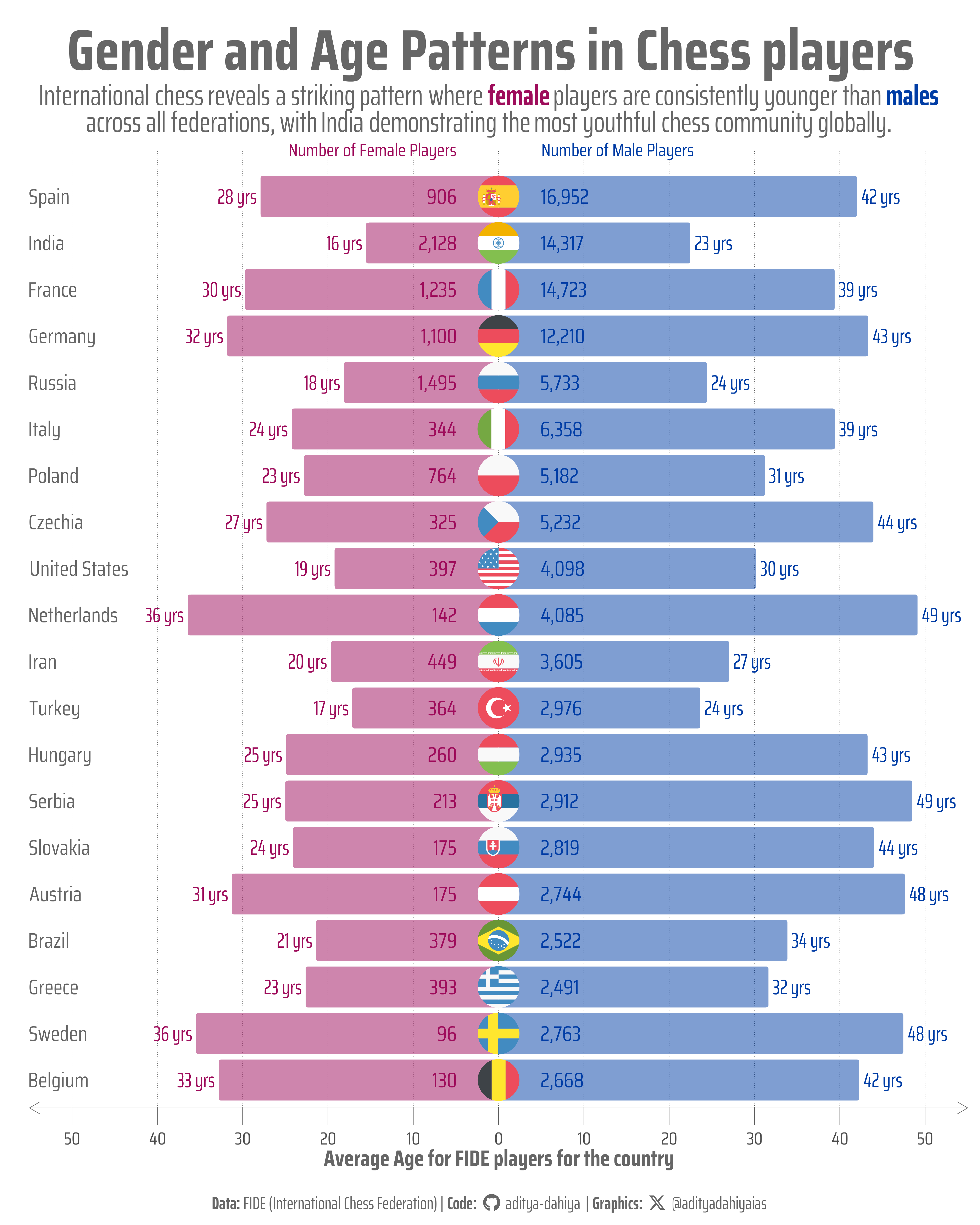
The global chess landscape shows women competing at younger ages than men universally, while India stands out as having the youngest average age among all major chess federations.

#TidyTuesday
Author

Aditya Dahiya

Published

September 26, 2025

About the Data

This dataset features chess player ratings from the FIDE (International Chess Federation) for August and September 2025, sourced from FIDE’s monthly rating publications available on their official website. Chess ratings, based on the Elo rating system, provide a numerical estimate of a player’s strength relative to other competitors, with ratings increasing or decreasing based on performance against expected outcomes. The September 2025 rating list reflects results from major tournaments including the Sinquefield Cup, Quantbox Chennai Grand Masters, 61st International Akiba Rubinstein Chess Festival, and the Spanish League Honor Division 2025 held in Linares. Each player record includes their unique FIDE identification number, federation code (similar to IOC country codes), various titles ranging from Grandmaster (GM) to Candidate Master (CM), current Elo rating, number of games played, and birth year. The dataset was curated by Jessica Moore as part of the #TidyTuesday weekly data project, providing researchers and chess enthusiasts with comprehensive rating data to analyze player improvements, federation distributions, ranking changes, and youth player performance trends.

Figure 1: This population pyramid visualization displays the average age and player count distribution across the top 20 chess federations by total registered players from FIDE’s August 2025 ratings. Each horizontal bar represents a federation, with blue bars extending rightward showing male players and pink bars extending leftward representing female players. The length of each bar corresponds to the average age of players in that gender group, while the numbers displayed indicate the total count of registered players. Country flags appear at the center dividing line between male and female demographics. The x-axis represents average age in years, with the scale showing absolute values for both directions. The data illustrates a consistent pattern where female players maintain younger average ages than their male counterparts across all federations.

How I Made This Graphic

Loading required libraries

Code
pacman::p_load(
  tidyverse, # All things tidy

  scales, # Nice Scales for ggplot2
  fontawesome, # Icons display in ggplot2
  ggtext, # Markdown text support for ggplot2
  showtext, # Display fonts in ggplot2
  colorspace, # Lighten and Darken colours

  patchwork  # Composing Plots
)


fide_ratings_august <- readr::read_csv('https://raw.githubusercontent.com/rfordatascience/tidytuesday/main/data/2025/2025-09-23/fide_ratings_august.csv')
# fide_ratings_september <- readr::read_csv('https://raw.githubusercontent.com/rfordatascience/tidytuesday/main/data/2025/2025-09-23/fide_ratings_september.csv')

Visualization Parameters

Code
# Font for titles
font_add_google("Saira",
  family = "title_font"
)

# Font for the caption
font_add_google("Saira Condensed",
  family = "body_font"
)

# Font for plot text
font_add_google("Saira Extra Condensed",
  family = "caption_font"
)

showtext_auto()

# A base Colour
bg_col <- "white"
seecolor::print_color(bg_col)

# Colour for highlighted text
text_hil <- "grey40"
seecolor::print_color(text_hil)

# Colour for the text
text_col <- "grey30"
seecolor::print_color(text_col)

line_col <- "grey30"

# Define Base Text Size
bts <- 80

# Caption stuff for the plot
sysfonts::font_add(
  family = "Font Awesome 6 Brands",
  regular = here::here("docs", "Font Awesome 6 Brands-Regular-400.otf")
)
github <- "&#xf09b"
github_username <- "aditya-dahiya"
xtwitter <- "&#xe61b"
xtwitter_username <- "@adityadahiyaias"
social_caption_1 <- glue::glue("<span style='font-family:\"Font Awesome 6 Brands\";'>{github};</span> <span style='color: {text_hil}'>{github_username}  </span>")
social_caption_2 <- glue::glue("<span style='font-family:\"Font Awesome 6 Brands\";'>{xtwitter};</span> <span style='color: {text_hil}'>{xtwitter_username}</span>")
plot_caption <- paste0(
  "**Data:**  FIDE (International Chess Federation)",
  " |  **Code:** ",
  social_caption_1,
  " |  **Graphics:** ",
  social_caption_2
)
rm(
  github, github_username, xtwitter,
  xtwitter_username, social_caption_1,
  social_caption_2
)

# Add text to plot-------------------------------------------------
plot_title <- "Gender and Age Patterns in Chess players"

plot_subtitle <- "International chess reveals a striking pattern where <span style='color:#9E0C5BFF'>**female**</span> players are consistently younger than <span style='color:#003DA5FF'>**males**</span><br>across all federations, with India demonstrating the most youthful chess community globally."

str_view(plot_subtitle)

Exploratory Data Analysis and Wrangling

Code
# pacman::p_load(summarytools)
# 
# fide_ratings_august |> 
#   dfSummary() |> 
#   view()
# 
# fide_ratings_september |> 
#   dfSummary() |> 
#   view()
# 
# pacman::p_unload(summarytools)


df1 <- fide_ratings_august |> 
  mutate(age = 2025 - bday) |> 
  select(id, fed, age, sex, rating, games) |> 
  group_by(fed, sex) |> 
  summarise(
    nos = n(),
    age = mean(age, na.rm = TRUE),
    rating = mean(rating, na.rm = TRUE),
    games = mean(games, na.rm = TRUE)
  ) |>  
  group_by(fed) |> 
  mutate(total_player = sum(nos)) |> 
  ungroup() |> 
  slice_max(
    order_by = total_player,
    n = 40,
    with_ties = TRUE
  ) |> 
  mutate(
    age = if_else(sex == "F", -age, age),
    rating = if_else(sex == "F", -rating, rating)
  )

country_levels <- df1 |> 
  arrange(total_player) |> 
  pull(fed) |> 
  unique()

countrycode::guess_field(df1$fed)

df2 <- df1 |> 
  mutate(fed = fct(fed, levels = country_levels)) |> 
  mutate(
    country_code = str_to_lower(
      countrycode::countrycode(
        fed,
        "ioc",
        "iso2c"
      )
    ),
    country_name = countrycode::countrycode(
      country_code,
      "iso2c",
      "country.name.en"
    )
  )

cpicks <-  c("#003DA5FF", "#9E0C5BFF")

The Plot

Code
g <- df2 |> 
  ggplot(
    mapping = aes(
      x = fed,
      y = age
    )
  ) +
  
  # Plotting the data for males
  ggchicklet::geom_chicklet(
    data = df2 |> filter(sex == "M"),
    fill = cpicks[1],
    alpha = 0.5
  ) +
  geom_text(
    data = df2 |> filter(sex == "M"),
    mapping = aes(label = paste0(round(age, 0), " yrs")),
    family = "caption_font",
    hjust = -0.1,
    colour = cpicks[1],
    size = bts / 3
  ) +
  geom_text(
    data = df2 |> filter(sex == "M"),
    mapping = aes(
      label = number(nos, big.mark = ","),
      y = 5
    ),
    family = "body_font",
    hjust = 0,
    colour = cpicks[1],
    size = bts / 3
  ) +
  
  # Plotting the data for Females
  ggchicklet::geom_chicklet(
    data = df2 |> filter(sex == "F"),
    fill = cpicks[2],
    alpha = 0.5
  ) +
  geom_text(
    data = df2 |> filter(sex == "F"),
    mapping = aes(label = paste0(round(-age, 0), " yrs")),
    family = "caption_font",
    hjust = 1.1,
    colour = cpicks[2],
    size = bts / 3
  ) +
  geom_text(
    data = df2 |> filter(sex == "F"),
    mapping = aes(
      label = number(nos, big.mark = ","),
      y = -5
    ),
    family = "body_font",
    hjust = 1,
    colour = cpicks[2],
    size = bts / 3
  ) +
  
  # Add Country Names
  geom_text(
    data = df2 |> filter(sex == "F"),
    mapping = aes(label = country_name, y = -55),
    family = "body_font",
    hjust = 0,
    colour = text_hil,
    size = bts / 3
  ) +
  
  # Add flags in the center
  ggflags::geom_flag(
    data = df2 |> filter(sex == "M"),
    mapping = aes(country = country_code),
    y = 0,
    size = 20
  ) +
  
  # Add text annotations for "Number of Players"
  geom_text(
    data = data.frame(x = 21, y = 5),
    mapping = aes(x = x, y = y),
    label = "Number of Male Players",
    family = "body_font",
    color = cpicks[1],
    size = bts / 3.5,
    hjust = 0,
    inherit.aes = FALSE,
    lineheight = 0.3
  ) +
  geom_text(
    data = data.frame(x = 21, y = -5),
    mapping = aes(x = x, y = y),
    label = "Number of Female Players",
    family = "body_font",
    color = cpicks[2],
    size = bts / 3.5,
    hjust = 1,
    inherit.aes = FALSE,
    lineheight = 0.3
  ) +
  
  scale_y_continuous(
    labels = function(x) abs(x), # Remove minus signs
    limits = c(-55, 55),
    breaks = seq(-60, 60, 10),
    expand = expansion(0)
  ) +
  coord_flip(
    clip = "off"
  ) +

  labs(
    title = plot_title,
    subtitle = plot_subtitle,
    caption = plot_caption,
    y = "Average Age for FIDE players for the country",
    x = NULL,
    colour = NULL,
    fill = NULL
  ) +
  theme_minimal(
    base_family = "body_font",
    base_size = bts
  ) +
  theme(
    legend.position = "none",
    
    # Overall
    text = element_text(
      margin = margin(0, 0, 0, 0, "mm"),
      colour = text_col,
      lineheight = 0.3
    ),
    
    # Axes
    axis.text.y = element_blank(),
    axis.text.x = element_text(
      margin = margin(3,0,0,0, "mm")
    ),
    axis.ticks.y = element_blank(),
    axis.ticks.x = element_line(
      colour = text_hil,
      linewidth = 0.3
    ),
    axis.ticks.length = unit(7, "mm"),
    axis.line.y = element_blank(),
    axis.line.x = element_line(
      arrow = arrow(length = unit(5, "mm"), ends = "both"),
      linewidth = 0.3,
      colour = text_hil
    ),
    axis.title.x = element_text(
      margin = margin(1,0,5,0, "mm"),
      colour = text_hil,
      size = bts,
      face = "bold"
    ),
    panel.grid = element_blank(),
    panel.grid.major.x = element_line(
      linetype = 3,
      linewidth = 0.3,
      colour = text_hil
    ),
    
    # Labels and Strip Text
    plot.title = element_text(
      margin = margin(5, 0, 2, 0, "mm"),
      hjust = 0.5,
      vjust = 0.5,
      colour = text_hil,
      size = 2.6 * bts,
      family = "body_font",
      face = "bold"
    ),
    plot.subtitle = element_textbox(
      margin = margin(2, 0, 5, 0, "mm"),
      vjust = 0.5,
      colour = text_hil,
      size = 1.3 * bts,
      hjust = 0.5,
      halign = 0.5,
      family = "caption_font",
      lineheight = 0.3
    ),
    plot.caption = element_markdown(
      family = "caption_font",
      hjust = 0.5,
      margin = margin(5,0,0,0, "mm"),
      colour = text_hil
    ),
    plot.caption.position = "plot",
    plot.title.position = "plot",
    plot.margin = margin(5, 5, 5, 5, "mm")
  )

ggsave(
  filename = here::here(
    "data_vizs",
    "tidy_fide_chess_ratings.png"
  ),
  plot = g,
  width = 400,
  height = 500,
  units = "mm",
  bg = bg_col
)

Savings the thumbnail for the webpage

Code
# Saving a thumbnail

library(magick)

# Saving a thumbnail for the webpage
image_read(here::here(
  "data_vizs",
  "tidy_fide_chess_ratings.png"
)) |>
  image_resize(geometry = "x400") |>
  image_write(
    here::here(
      "data_vizs",
      "thumbnails",
      "tidy_fide_chess_ratings.png"
    )
  )

Session Info

Code
sessioninfo::session_info()$packages |>
  as_tibble() |>
  dplyr::select(package,
    version = loadedversion,
    date, source
  ) |>
  dplyr::arrange(package) |>
  janitor::clean_names(
    case = "title"
  ) |>
  gt::gt() |>
  gt::opt_interactive(
    use_search = TRUE
  ) |>
  gtExtras::gt_theme_espn()
Table 1: R Packages and their versions used in the creation of this page and graphics

Links