Measuring passport strength through visa-free access to global destinations.
#TidyTuesday
{ggflags}
{ggtext}
Claude Sonnet Code
Author
Aditya Dahiya
Published
September 14, 2025
About the Data
The dataset explores passport power through the Henley Passport Index, produced by Henley & Partners, which measures visa-free travel access for passport holders worldwide. The index assigns a score of 1 to destinations where no visa is required, or where travelers can obtain a visa on arrival, visitor’s permit, or electronic travel authority (ETA) without pre-departure government approval. A score of 0 is given when a traditional visa or government-approved electronic visa (e-Visa) is required before departure. The total passport score equals the number of visa-free destinations available to holders of that passport. Henley & Partners updates the Global Passport Index rankings monthly, with recent changes to US passport rankings drawing significant media attention. The data is sourced from the Henley Passport Index API and includes comprehensive information about visa requirements, visa-free access, and electronic travel authorizations across different countries and regions over multiple years, providing insights into how passport strength correlates with geopolitical relationships, economic stability, and international mobility trends.
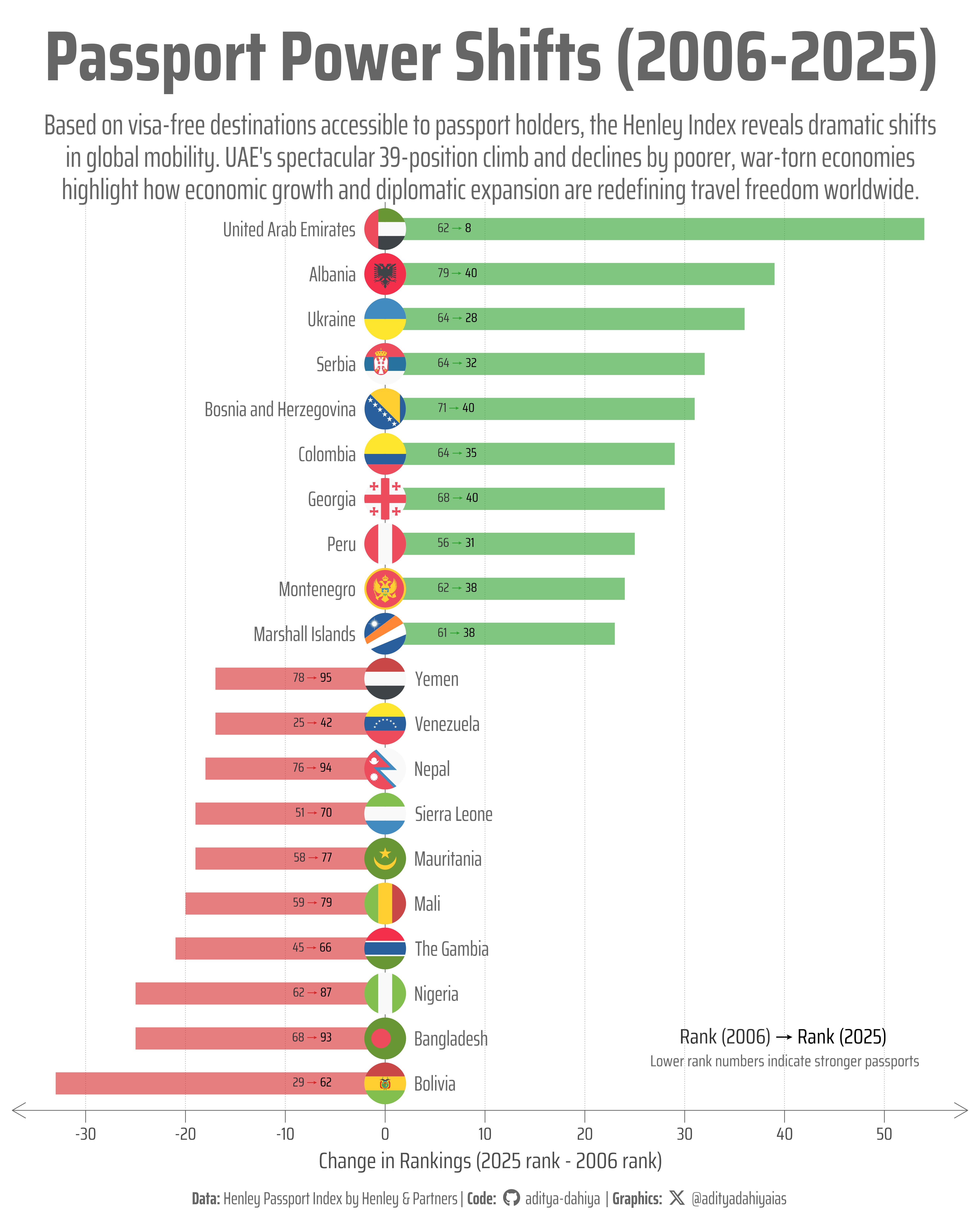
Figure 1: Each bar represents a country’s change in Henley Passport Index ranking between 2006 and 2025. Positive values (green bars extending right) show improved rankings, while negative values (red bars extending left) indicate declined rankings. Flags mark each country, with labels positioned to avoid overlap.
How I Made This Graphic
Loading required libraries
Code
pacman::p_load(ggforce)# To plot geom_convex_hull()pacman::p_load(MASS, fields)pacman::p_load( tidyverse, # All things tidy scales, # Nice Scales for ggplot2 fontawesome, # Icons display in ggplot2 ggtext, # Markdown text support for ggplot2 showtext, # Display fonts in ggplot2 colorspace, # Lighten and Darken colours patchwork, # Composing Plots sf # Spatial Operations)# install.packages("ggflags", repos = c(# "https://jimjam-slam.r-universe.dev",# "https://cloud.r-project.org"))pacman::p_load(ggflags)country_lists <- readr::read_csv("https://raw.githubusercontent.com/rfordatascience/tidytuesday/main/data/2025/2025-09-09/country_lists.csv")rank_by_year <- readr::read_csv("https://raw.githubusercontent.com/rfordatascience/tidytuesday/main/data/2025/2025-09-09/rank_by_year.csv")
Visualization Parameters
Code
# Font for titlesfont_add_google("Saira",family ="title_font")# Font for the captionfont_add_google("Saira Condensed",family ="body_font")# Font for plot textfont_add_google("Saira Extra Condensed",family ="caption_font")showtext_auto()# A base Colourbg_col <-"white"seecolor::print_color(bg_col)# Colour for highlighted texttext_hil <-"grey40"seecolor::print_color(text_hil)# Colour for the texttext_col <-"grey30"seecolor::print_color(text_col)line_col <-"grey30"# Define Base Text Sizebts <-80# Caption stuff for the plotsysfonts::font_add(family ="Font Awesome 6 Brands",regular = here::here("docs", "Font Awesome 6 Brands-Regular-400.otf"))github <-""github_username <-"aditya-dahiya"xtwitter <-""xtwitter_username <-"@adityadahiyaias"social_caption_1 <- glue::glue("<span style='font-family:\"Font Awesome 6 Brands\";'>{github};</span> <span style='color: {text_hil}'>{github_username} </span>")social_caption_2 <- glue::glue("<span style='font-family:\"Font Awesome 6 Brands\";'>{xtwitter};</span> <span style='color: {text_hil}'>{xtwitter_username}</span>")plot_caption <-paste0("**Data:** Henley Passport Index by Henley & Partners"," | **Code:** ", social_caption_1," | **Graphics:** ", social_caption_2)rm( github, github_username, xtwitter, xtwitter_username, social_caption_1, social_caption_2)# Add text to plot-------------------------------------------------plot_title <-"Passport Power Shifts (2006-2025)"plot_subtitle <-"Based on visa-free destinations accessible to passport holders, the Henley Index reveals dramatic shifts in global mobility. UAE's spectacular 39-position climb and declines by poorer, war-torn economies highlight how economic growth and diplomatic expansion are redefining travel freedom worldwide."|>str_wrap(105)str_view(plot_subtitle)# Caption stuff for the plotsysfonts::font_add(family ="Font Awesome 6 Brands",regular = here::here("docs", "Font Awesome 6 Brands-Regular-400.otf"))github <-""github_username <-"aditya-dahiya"xtwitter <-""xtwitter_username <-"@adityadahiyaias"social_caption_1 <- glue::glue("<span style='font-family:\"Font Awesome 6 Brands\";'>{github};</span> <span style='color: {text_hil}'>{github_username} </span>")social_caption_2 <- glue::glue("<span style='font-family:\"Font Awesome 6 Brands\";'>{xtwitter};</span> <span style='color: {text_hil}'>{xtwitter_username}</span>")plot_caption_2 <-paste0("**Data:** Henley Passport Index by Henley & Partners","<br>**Code:** ", social_caption_1,"<br>**Graphics:** ", social_caption_2)rm( github, github_username, xtwitter, xtwitter_username, social_caption_1, social_caption_2)
Exploratory Data Analysis and Wrangling
Code
# pacman::p_load(summarytools)# # country_lists |># dfSummary() |># view()# # rank_by_year |># dfSummary() |># view()# # pacman::p_unload(summarytools)# # # A basic plot of changing ranks# rank_by_year |># ggplot(# aes(# x = year,# y = rank,# group = code,# colour = code# )# ) +# geom_line() +# theme(# legend.position = "none"# )# # Credits: Claude Sonnet 4.0# Calculate ranking changes from 2006 to 2025ranking_changes <- rank_by_year %>%# Filter for the start and end yearsfilter(year %in%c(2006, 2025)) %>%# Ensure we have both years for each countrygroup_by(code, country) %>%filter(n() ==2) %>%# Calculate the change in ranking (2006 rank - 2025 rank)# Positive values mean improvement (lower rank number = better)summarise(rank_2006 = rank[year ==2006],rank_2025 = rank[year ==2025],rank_change = rank_2006 - rank_2025,.groups ="drop" ) %>%# Sort by rank change to identify top moversarrange(desc(rank_change))# # View the biggest improvers and fallers# print("Top 10 Countries with Most Improved Rankings:")# head(ranking_changes, 10)# # print("Top 10 Countries with Most Fallen Rankings:")# tail(ranking_changes, 10)# # # Create the change column# rank_by_year_with_change <- rank_by_year %>%# left_join(# ranking_changes %>%# mutate(# change = case_when(# # Top 10 improvers (highest positive rank_change)# rank(-rank_change, ties.method = "first") <= 10 ~ "improved",# # Top 10 fallers (lowest/most negative rank_change)# rank(rank_change, ties.method = "first") <= 10 ~ "fallen",# # All others# TRUE ~ "others"# )# ) %>%# select(code, change),# by = "code"# ) %>%# # Handle countries that might not have data for both 2006 and 2025# mutate(change = ifelse(is.na(change), "others", change))# # # Verify the results# print("Summary of change categories:")# rank_by_year_with_change %>%# count(change)# # # Show the top improvers and fallers with their details# print("Top 10 Improved Countries (2006 vs 2025):")# ranking_changes %>%# head(10) %>%# select(country, rank_2006, rank_2025, rank_change)# # print("Top 10 Fallen Countries (2006 vs 2025):")# ranking_changes %>%# tail(10) %>%# select(country, rank_2006, rank_2025, rank_change)# # # Optional: Create a visualization of the biggest changes# library(ggplot2)top_movers <- ranking_changes %>%slice(c(1:10, (nrow(.)-9):nrow(.))) %>%mutate(direction =ifelse(rank_change >0, "Improved", "Fallen"),country_ordered =fct_reorder(country, rank_change),# Convert country codes to lowercase for ggflagsflag_code =str_to_lower(code),# Create modified rank_change that leaves gap for flagsbase_x =case_when( rank_change >0~1.5, rank_change <0~-1.5,.default =0 ),# Position for country labelslabel_x =case_when( direction =="Improved"~-3, direction =="Fallen"~3,TRUE~0 ),# Hjust for country labelslabel_hjust =case_when( direction =="Improved"~1, direction =="Fallen"~0,TRUE~0.5 ) )country_lists |>select(code, country, visa_free_access)############################# Plot 2 ######################################## Get country codes for Visa Free Access# Inspiration: Claude AI Sonnet 4.0library(tidyverse)library(jsonlite)codes_filter <- ggflags::lflags |>names()# Extract visa-free access data to long formatvisa_free_long <- country_lists %>%select(code, country, visa_free_access) %>%# Filter out rows with empty or null visa_free_accessfilter(!is.na(visa_free_access) & visa_free_access !="[]"& visa_free_access !="") %>%# Parse JSON and extract country codesmutate(# Parse the JSON string to extract the nested arrayparsed_json =map(visa_free_access, ~{tryCatch({# Parse the JSON - it appears to be a nested array format parsed <-fromJSON(.x, flatten =TRUE)# Extract the first level of the nested structureif(is.list(parsed) &&length(parsed) >0) { parsed[[1]] } else {NULL } }, error =function(e) {# Return NULL if parsing failsNULL }) }) ) %>%# Filter out rows where JSON parsing failedfilter(!map_lgl(parsed_json, is.null)) %>%# Unnest the parsed JSON data with name separationunnest(parsed_json, names_sep ="_") %>%# Clean and select relevant columnsselect(origin_code = code,origin_country = country,destination_code = parsed_json_code, # This will be the "code" field from JSONdestination_country = parsed_json_name # This will be the "name" field from JSON ) %>%# Remove any rows with missing destination codesfilter(!is.na(destination_code) & destination_code !="") |>mutate(across(.cols =c(origin_code, destination_code),.fns = str_to_lower ) )# Show summary by origin countryvisa_free_summary <- visa_free_long %>%group_by(origin_code, origin_country) %>%summarise(visa_free_destinations =n(),.groups ='drop' ) %>%arrange(desc(visa_free_destinations))library(tidyverse)# Prepare the data for plottingvisa_free_plot_data <- visa_free_long %>%select(origin_country, origin_code, destination_code) %>%filter(destination_code %in% codes_filter) |># Count visa-free destinations per origin countrygroup_by(origin_code, origin_country) %>%mutate(total_destinations =n()) %>%ungroup() %>%# Order origin countries by total destinations (most at top)mutate(origin_country_ordered =fct_reorder(origin_country, total_destinations, .desc =TRUE),origin_country_ordered =fct_rev(origin_country_ordered) ) %>%# For each origin country, arrange destinations and create symmetric x positionsgroup_by(origin_code) %>%arrange(destination_code) %>%mutate(rank_num =row_number(),n_destinations =n(),# Create symmetric positions around 0x_position =if (n_destinations[1] ==1) {0 } else {seq(-((n_destinations[1] -1) /2), ((n_destinations[1] -1) /2), length.out = n_destinations[1]) } ) %>%ungroup()
This visualization was created using R to transform complex passport data into an intuitive flag-based display. The foundation relied on the tidyverse ecosystem for data manipulation, particularly using jsonlite to parse the nested JSON structure containing visa-free access information from the Henley Passport Index API. The core challenge involved unnesting the complex JSON data structure and creating symmetric positioning for destination flags around a central axis using conditional logic within grouped mutate() operations. The visual appeal comes from the ggflags package, which renders actual country flags instead of text labels, making patterns immediately recognizable. I used geom_flag() twice: once for visa-free destinations positioned symmetrically along each row, and again for origin country flags anchored to the left edge using x = -Inf positioning. Typography and styling leverage showtext for Google Fonts integration (Saira font family), while ggtext enables rich text formatting for the caption with embedded social media icons using Font Awesome. The annotations system replaces traditional plot titles with precisely positioned text elements using annotate(geom = "text") and annotate(geom = "richtext"), providing complete control over placement and styling.
Code
# Create the plotg <- visa_free_plot_data |>ggplot(mapping =aes(x = x_position,y = origin_country_ordered,label = destination_code,country = destination_code ) ) +geom_point(alpha =0.1) +geom_flag(aes(country = destination_code), size =2.7) +# Add origin country flags at the left endgeom_flag(aes(country = origin_code, y = origin_country_ordered), x =-Inf, size =3,inherit.aes =FALSE,data = visa_free_plot_data %>%count(origin_code, origin_country_ordered) ) +geom_text(aes(label =paste0("(", visa_free_destinations, ")"),y = origin_country_ordered ), x =-Inf, size = bts /9,hjust =1.5,family ="caption_font",colour = text_col,inherit.aes =FALSE,data = visa_free_plot_data |>left_join(visa_free_summary) ) +# Add title annotation at bottom leftannotate(geom ="text",x =Inf, y =-Inf,label ="Global\nVisa-Free\nAccess\nPatterns",hjust =1.02, vjust =-1.7,colour = text_hil,size =3.5* bts *0.35, # Convert to geom_text sizefamily ="body_font",fontface ="bold",lineheight =0.25 ) +# Add subtitle annotation below titleannotate(geom ="text",x =Inf, y =-Inf,label ="Each dot represents a destination country with visa-free access for the Country's passport holders"|>str_wrap(20) |>str_view(),hjust =1.02, vjust =-0.6,colour = text_hil,size =1.7* bts *0.35, # Convert to geom_text sizefamily ="caption_font",lineheight =0.3 ) +# Add caption annotation at bottom rightannotate(geom ="richtext",x =Inf, y =-Inf,label = plot_caption_2, # Replace with your actual captionhjust =1.02, vjust =-0.5,colour = text_hil,size = bts *0.8*0.35, # Convert to geom_richtext sizefamily ="caption_font",fill =NA,label.color =NA,lineheight =0.35 ) +scale_x_continuous(breaks =NULL,expand =expansion(mult =c(0.01, 0.01)) ) +coord_cartesian(clip ="off") +labs(title =NULL, # Remove plot titlesubtitle =NULL, # Remove plot subtitlex =NULL,y =NULL ) +theme_minimal(base_family ="body_font",base_size = bts ) +theme(legend.position ="none",# Overalltext =element_text(margin =margin(0, 0, 0, 0, "mm"),colour = text_col,lineheight =0.3 ),# Axesaxis.text.y =element_text(hjust =1, margin =margin(0,7.5,0,0, "mm"),size = bts /3,family ="caption_font" ),axis.ticks.y =element_blank(),axis.ticks.length.y =unit(0, "mm"),axis.text.x =element_blank(),axis.ticks.length.x =unit(0, "mm"),axis.ticks.x =element_blank(),axis.line.x =element_blank(),axis.title.x =element_blank(),panel.grid =element_blank(),# Remove plot title and subtitle themes since they're now annotationsplot.title =element_blank(),plot.subtitle =element_blank(),plot.caption =element_blank(), # Remove since using annotation insteadplot.caption.position ="plot",plot.title.position ="plot",plot.margin =margin(5, 5, 5, 5, "mm") )ggsave(filename = here::here("data_vizs","tidy_henley_passport_index_2.png" ),plot = g,width =400,height =550,units ="mm",bg = bg_col)
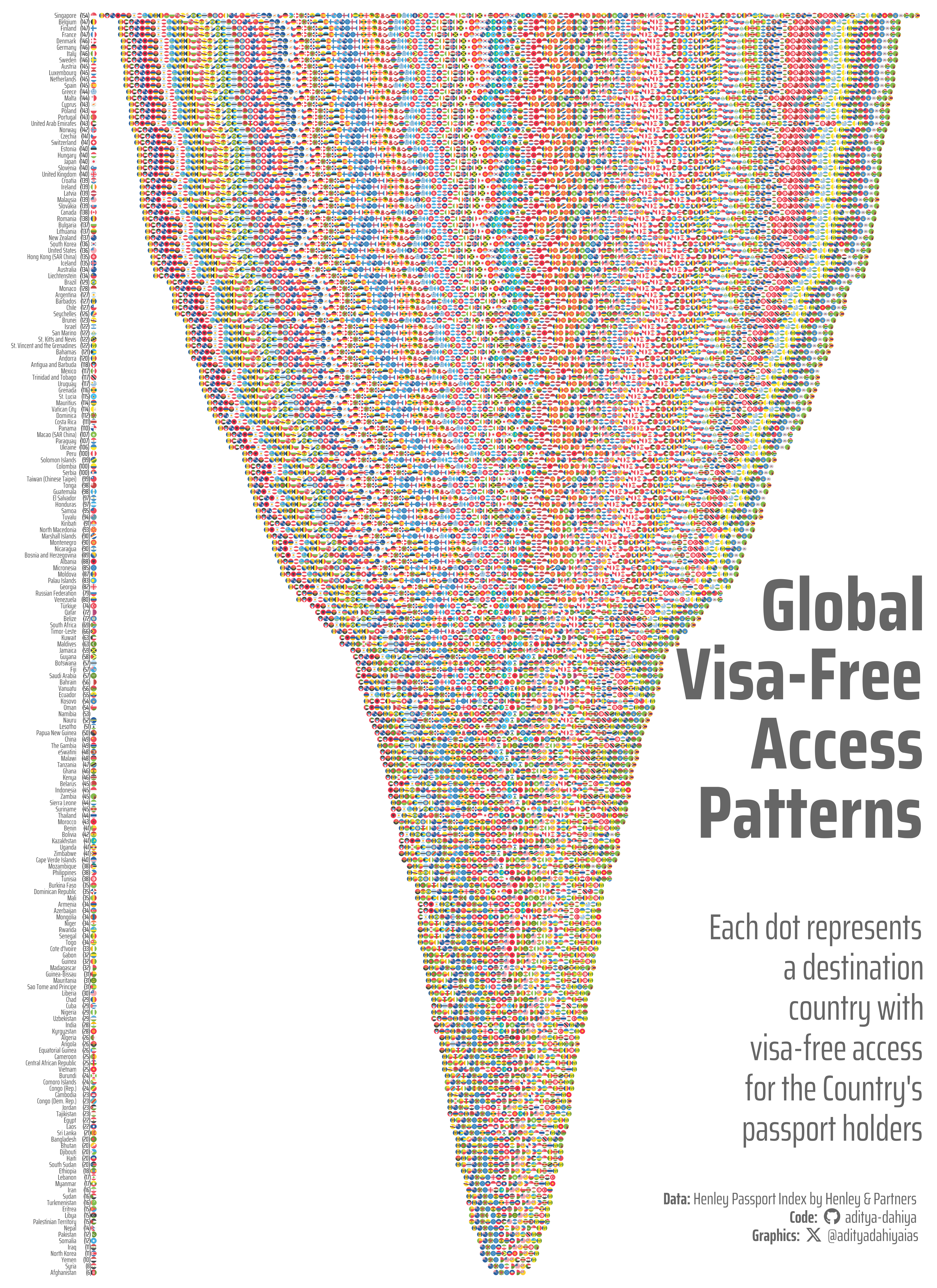
This visualization displays global visa-free travel patterns using the Henley Passport Index data. Each row represents a passport-holding country (shown by flags on the left), ordered from most to least visa-free destinations. The colored dots represent destination countries where visa-free travel is permitted, positioned symmetrically around the center axis. Destination countries are depicted as flag icons rather than text labels, making travel patterns immediately recognizable. Numbers in parentheses indicate the total count of visa-free destinations available to each passport holder.
Savings the thumbnail for the webpage
Code
# Saving a thumbnaillibrary(magick)# Saving a thumbnail for the webpageimage_read(here::here("data_vizs","tidy_henley_passport_index_2.png")) |>image_resize(geometry ="x400") |>image_write( here::here("data_vizs","thumbnails","tidy_henley_passport_index.png" ) )