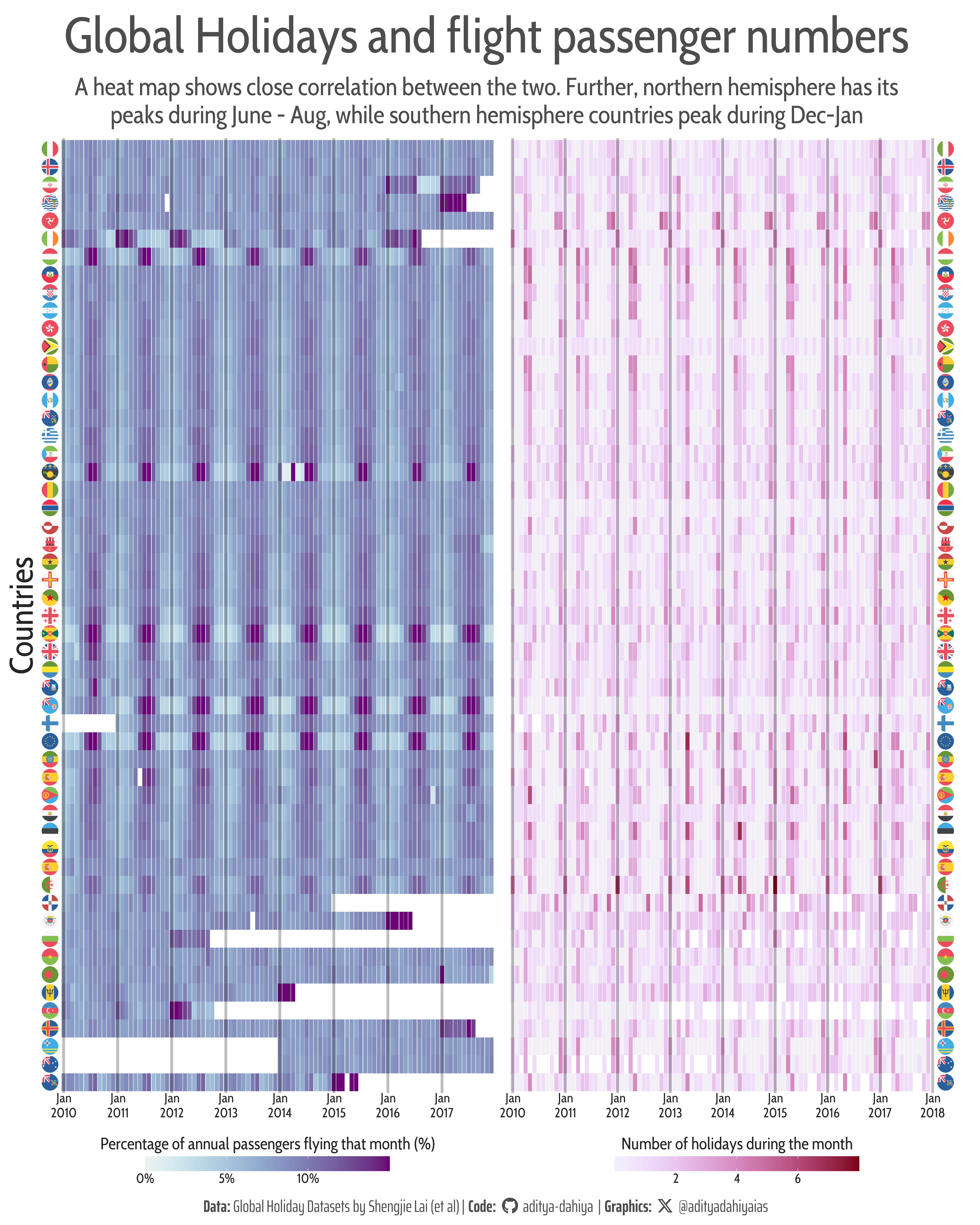
A comparative heatmap of number of holidays per month, and percentage of annual flight passenger traffic that month.
#TidyTuesday
Author
Aditya Dahiya
Published
December 26, 2024
About the Data
The dataset provides insights into the impact of global holidays on seasonal human mobility and population dynamics, offering a comprehensive resource for understanding spatiotemporal trends. It consists of two primary components:
Public and school holidays data (2010–2019), organized at daily, weekly, and monthly timescales, and
Airline passenger volumes from 90 countries between 2010 and 2018, segmented into domestic and international categories.
Figure 1: A comparative heatmap of number of holidays per month, and percentage of annual flight passenger traffic that month.
How I made this graphic?
Loading required libraries, data import & creating custom functions.
Code
# Data Import and Wrangling Toolslibrary(tidyverse) # All things tidy# Final plot toolslibrary(scales) # Nice Scales for ggplot2library(fontawesome) # Icons display in ggplot2library(ggtext) # Markdown text support for ggplot2library(showtext) # Display fonts in ggplot2library(colorspace) # Lighten and Darken colourslibrary(patchwork) # Compiling Plots# Option 2: Read directly from GitHubglobal_holidays <- readr::read_csv('https://raw.githubusercontent.com/rfordatascience/tidytuesday/main/data/2024/2024-12-24/global_holidays.csv') |> janitor::clean_names()monthly_passengers <- readr::read_csv('https://raw.githubusercontent.com/rfordatascience/tidytuesday/main/data/2024/2024-12-24/monthly_passengers.csv') |> janitor::clean_names()
Additional sorting Data: Obtained using Grok2 by x.ai
Code
# Please list the ISO-3 country codes of all the countries in the world, but sort them in the order from North to South of the latitude their capitals.# Give the output in form of a tibble, with three columns: rank, iso3, hemisphere. (where hemispehere is either north or south)# Then filter it with an additional prompt from distinct values in our EDA dataset# Perfect. Now can you reorder these, instead of north to south, now by promxity to each other, i.e. starting with North America, then Europe, East Asia, South Asia, South East Asia, Africa, then South America and then Oceania.# Within each group also, keep nearby countries together.# Perfect. And add a column of Continent as well.ranking_df <- tibble::tibble(rank =1:134,iso3 =c(# North America"USA", "CAN", "MEX", "GTM", "SLV", "CRI", "PAN", "JAM", "DOM", "BRB", "LCA",# Europe"ISL", "NOR", "SWE", "DNK", "FRO", "GBR", "IRL", "NLD", "BEL", "LUX", "DEU", "POL", "CZE", "SVK", "AUT", "CHE", "FRA", "GIB", "ESP", "PRT", "ITA", "MLT", "HRV", "SVN", "HUN", "BIH", "SRB", "MNE", "ALB", "GRC", "MKD", "BGR", "ROU", "MDA", "UKR", "BLR", "LTU", "LVA", "EST", "FIN", "RUS",# East Asia"KOR", "PRK", "JPN", "CHN", "TWN", "HKG", "MAC",# South Asia"IND", "PAK", "BGD", "LKA", # Southeast Asia"THA", "KHM", "MYS", "SGP", "PHL", "VNM", # Africa"EGY", "MAR", "TUN", "LBY", "DZA", "NGA", "SEN", "GHA", "CIV", "MLI", "BFA", "NER", "TCD", "CMR", "GAB", "GNQ", "COG", "COD", "AGO", "ZAF", "NAM", "BWA", "ZWE", "ZMB", "MWI", "MOZ", "TZA", "KEN", "UGA", "RWA", "BDI", "ETH", "SSD", "SDN", "DJI", "SOM", "ERI", "CAF",# South America"COL", "VEN", "GUY", "SUR", "ECU", "PER", "BOL", "BRA", "CHL", "ARG", "URY", "PRY", # Oceania"AUS", "NZL", "PNG", "FSM", "MHL", "NRU", "PLW", "CYM", "FJI", "SLB", "KIR", "TUV", "WSM", "TON", "MTQ" ),hemisphere =c(rep("north", 11), rep("north", 41), rep("north", 7), rep("north", 4), rep("north", 6), rep("north", 39), rep("south", 12),rep("south", 14) ))levels_iso3 <-c(# North America"USA", "CAN", "MEX", "GTM", "SLV", "CRI", "PAN", "JAM", "DOM", "BRB", "LCA",# Europe"ISL", "NOR", "SWE", "DNK", "FRO", "GBR", "IRL", "NLD", "BEL", "LUX", "DEU", "POL", "CZE", "SVK", "AUT", "CHE", "FRA", "GIB", "ESP", "PRT", "ITA", "MLT", "HRV", "SVN", "HUN", "BIH", "SRB", "MNE", "ALB", "GRC", "MKD", "BGR", "ROU", "MDA", "UKR", "BLR", "LTU", "LVA", "EST", "FIN", "RUS","MAR", "TUN", "LBY", "DZA", "NGA", "SEN", "GHA", "CIV", "MLI", "BFA", "NER", "TCD", "CMR", "GAB", "GNQ", "COG", "COD", "AGO", "ZAF", "NAM", "BWA", "ZWE", "ZMB", "MWI", "MOZ", "TZA", "KEN", "UGA", "RWA", "BDI", "ETH", "SSD", "SDN", "DJI", "SOM", "ERI", "CAF",# South America"COL", "VEN", "GUY", "SUR", "ECU", "PER", "BOL", "BRA", "CHL", "ARG", "URY", "PRY", # Oceania"AUS", "NZL", "PNG", "FSM", "MHL", "NRU", "PLW", "CYM", "FJI", "SLB", "KIR", "TUV", "WSM", "TON", "MTQ" )levels_iso2 <- levels_iso3 |> countrycode::countrycode(origin ="iso3c",destination ="iso2c" ) |>str_to_lower()
Visualization Parameters
Code
# Font for titlesfont_add_google("Cabin Condensed",family ="title_font") # Font for the captionfont_add_google("Saira Extra Condensed",family ="caption_font") # Font for plot textfont_add_google("Cabin Condensed",family ="body_font") showtext_auto()# A base Colourbg_col <-"white"seecolor::print_color(bg_col)# Colour for highlighted texttext_hil <-"grey30"seecolor::print_color(text_hil)# Colour for the texttext_col <-"grey15"seecolor::print_color(text_col)# Define Base Text Sizebts <-60# Caption stuff for the plotsysfonts::font_add(family ="Font Awesome 6 Brands",regular = here::here("docs", "Font Awesome 6 Brands-Regular-400.otf"))github <-""github_username <-"aditya-dahiya"xtwitter <-""xtwitter_username <-"@adityadahiyaias"social_caption_1 <- glue::glue("<span style='font-family:\"Font Awesome 6 Brands\";'>{github};</span> <span style='color: {text_hil}'>{github_username} </span>")social_caption_2 <- glue::glue("<span style='font-family:\"Font Awesome 6 Brands\";'>{xtwitter};</span> <span style='color: {text_hil}'>{xtwitter_username}</span>")plot_caption <-paste0("**Data:** Global Holiday Datasets by Shengjie Lai (et al) ", " | **Code:** ", social_caption_1, " | **Graphics:** ", social_caption_2 )rm(github, github_username, xtwitter, xtwitter_username, social_caption_1, social_caption_2)# Add text to plot-------------------------------------------------plot_title <-"Global Holidays and flight passenger numbers"plot_subtitle <-"A heat map shows close correlation between the two. Further, northern hemisphere has its peaks during June - Aug, while southern hemisphere countries peak during Dec-Jan"
# Saving a thumbnaillibrary(magick)# Saving a thumbnail for the webpageimage_read(here::here("data_vizs", "tidy_holidays_travel.png")) |>image_resize(geometry ="x400") |>image_write( here::here("data_vizs", "thumbnails", "tidy_holidays_travel.png" ) )
Session Info
Code
# Data Import and Wrangling Toolslibrary(tidyverse) # All things tidy# Final plot toolslibrary(scales) # Nice Scales for ggplot2library(fontawesome) # Icons display in ggplot2library(ggtext) # Markdown text support for ggplot2library(showtext) # Display fonts in ggplot2library(colorspace) # Lighten and Darken colourslibrary(patchwork) # Compiling Plotssessioninfo::session_info()$packages |>as_tibble() |>select(package, version = loadedversion, date, source) |>arrange(package) |> janitor::clean_names(case ="title" ) |> gt::gt() |> gt::opt_interactive(use_search =TRUE ) |> gtExtras::gt_theme_espn()
Table 1: R Packages and their versions used in the creation of this page and graphics