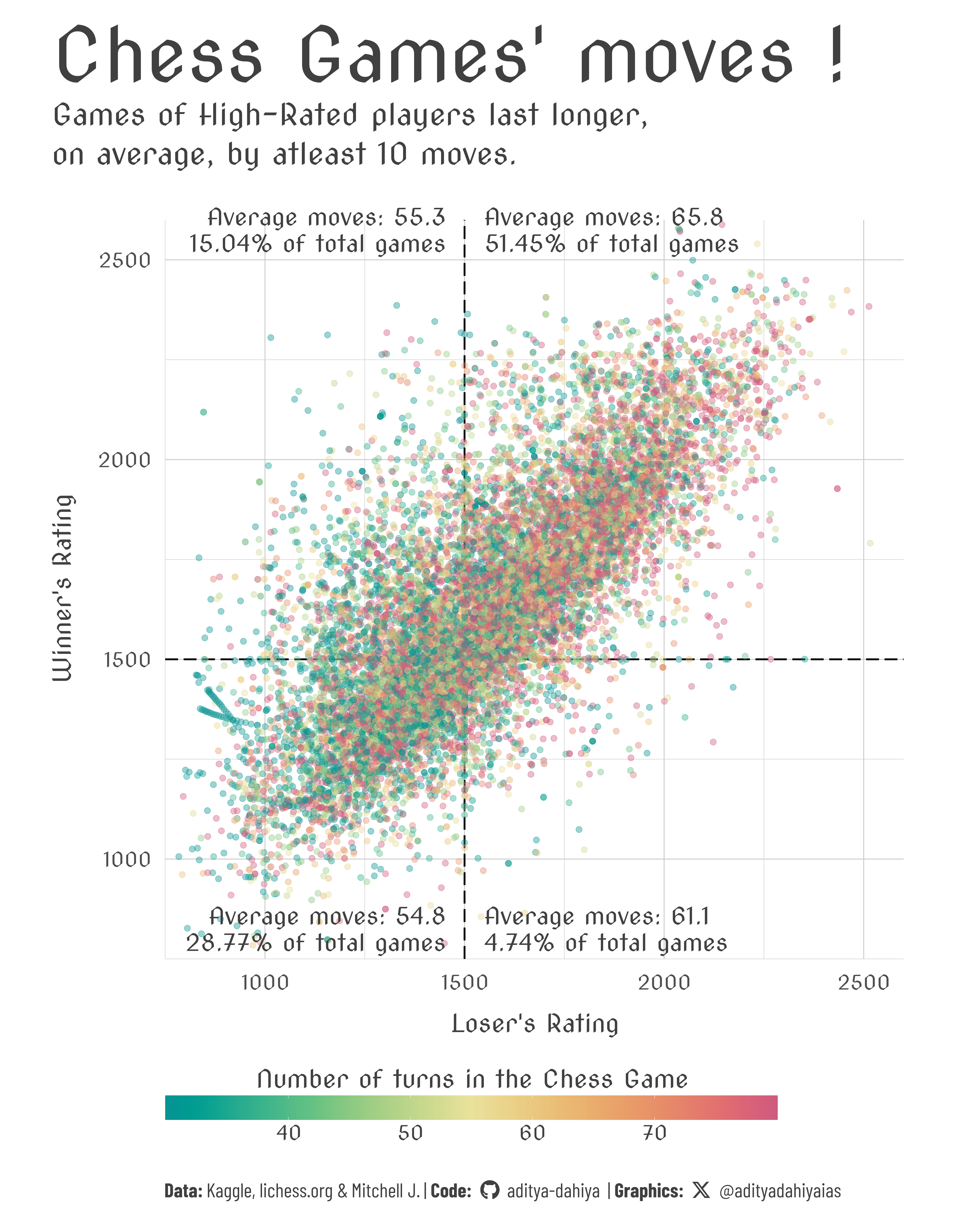
Figure 1: A scatter plot on player-ratings shows that the average number of moves per game are higher (red colour) for high-rated players, and lower (green-colour) for low-rated players.
How I made this graphic?
Loading libraries & data
Code
# Data Import and Wrangling Toolslibrary(tidyverse) # All things tidy# Final plot toolslibrary(scales) # Nice Scales for ggplot2library(fontawesome) # Icons display in ggplot2library(ggtext) # Markdown text support for ggplot2library(showtext) # Display fonts in ggplot2library(colorspace) # Lighten and Darken colourslibrary(seecolor) # To print and view colourslibrary(patchwork) # Combining plotslibrary(waffle) # Waffle Charts in R# Getting the datachess <- readr::read_csv('https://raw.githubusercontent.com/rfordatascience/tidytuesday/master/data/2024/2024-10-01/chess.csv')