Exploring Lisa Lendway’s vegetable garden from summer 2020 and summer 2021, from her {gardenR} package.
#TidyTuesday
Author
Aditya Dahiya
Published
May 29, 2024
Lisa’s Vegetable Garden Data
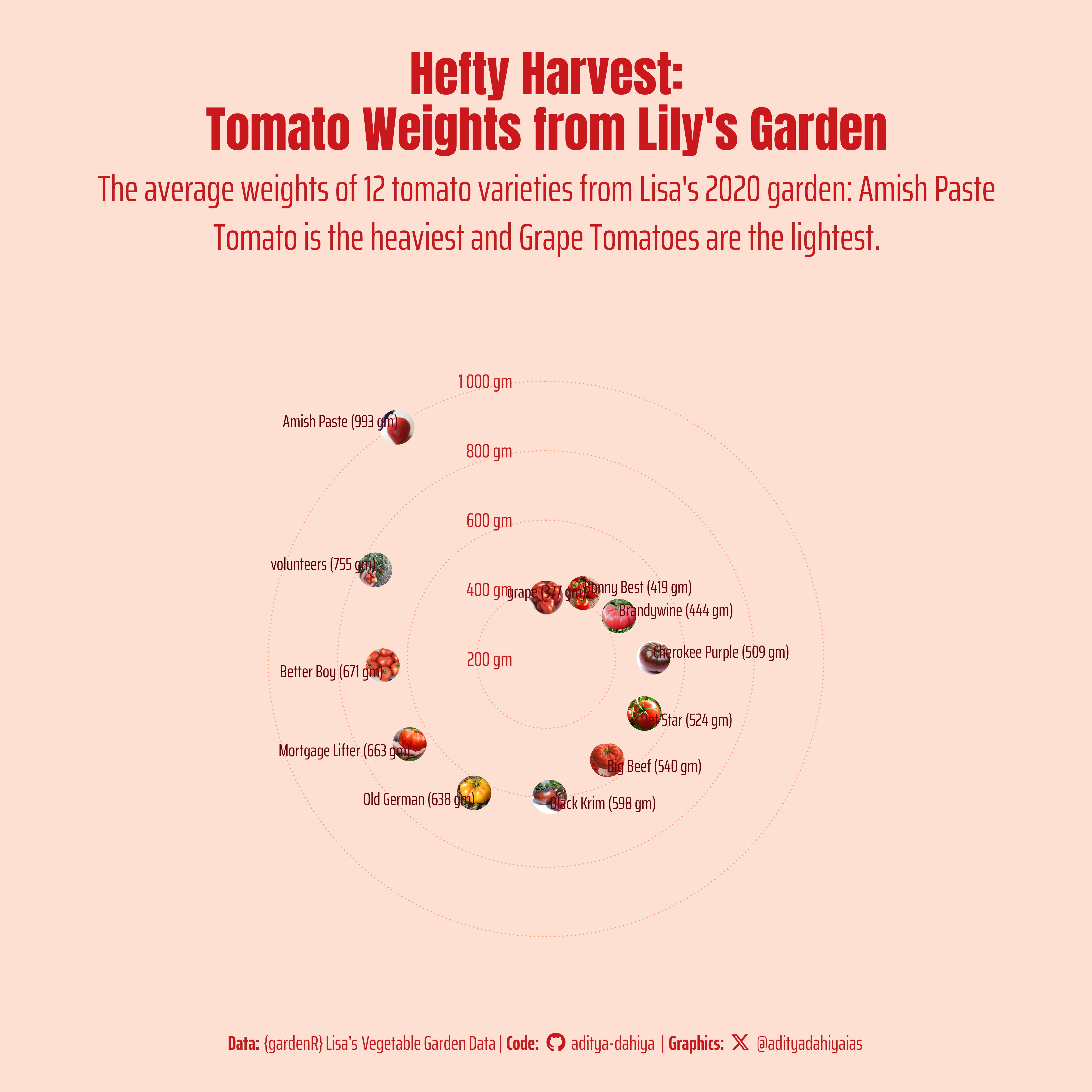
The data for this analysis is sourced from the gardenR package , which contains records from Lisa Lendway’s vegetable garden, collected during the summers of 2020 and 2021. This dataset, first introduced in 2021 and updated with 2021 data on January 29, 2022, was utilized in Lisa Lendway’s Introduction to Data Science course at Macalester College to teach various data science concepts. The circular graph created from this data illustrates the average weights of 12 different tomato varieties harvested in 2020. The analysis reveals that the Amish Paste Tomato variety is the heaviest, while the Grape Tomatoes are the smallest. This visual representation provides a clear comparison of the tomato varieties based on their average weights.
This circular plot displays the average weights of 12 different tomato varieties harvested in 2020 from Lisa’s vegetable garden. The Amish Paste Tomato stands out as the heaviest variety, while the Grape Tomatoes are the smallest. The visualization provides a clear comparison of each variety’s average weight.
How I made this graphic?
Loading required libraries, data import & creating custom functions
Code
# Data Import and Wrangling Toolslibrary(tidyverse) # All things tidy# Final plot toolslibrary(scales) # Nice Scales for ggplot2library(fontawesome) # Icons display in ggplot2library(ggtext) # Markdown text support for ggplot2library(showtext) # Display fonts in ggplot2library(colorspace) # Lighten and Darken colourslibrary(patchwork) # Combining plots# Extras and Annotationslibrary(magick) # Image processinglibrary(ggfittext) # Fitting labels inside bar plots# Load Dataharvest_2020 <- readr::read_csv('https://raw.githubusercontent.com/rfordatascience/tidytuesday/master/data/2024/2024-05-28/harvest_2020.csv')
Exploratory Data Analysis & Data Wrangling
Code
bg_col <-"#fcd7d4"harvest_2020 |> visdat::vis_dat()harvest_2020 |> summarytools::dfSummary() |> summarytools::view()df <- harvest_2020 |>filter(vegetable =="tomatoes") |>group_by(vegetable, variety) |>summarise(avg_wt =mean(weight, na.rm =TRUE),n =n() ) |>ungroup() |>mutate(id =row_number(),file_name =paste0("temp1_tomato_", id, ".png" ) )library(magick)for (i in1:12) { im <- magick::image_read(paste0("temp_tomato_", i, ".jpg"))# Technique Credits: https://stackoverflow.com/questions/64597525/r-magick-square-crop-and-circular-mask# get height, width and crop longer side to match shorter side ii <-image_info(im) ii_min <-min(ii$width, ii$height) im1 <-image_crop( im, geometry =paste0(ii_min, "x", ii_min, "+0+0"), repage =TRUE )# create a new image with white background and black circle fig <-image_draw(image_blank(ii_min, ii_min))symbols(ii_min /2, ii_min /2, circles = (ii_min /2) -3, bg ="black", inches =FALSE, add =TRUE)dev.off()# create an image composite using both images im2 <- magick::image_composite(im1, fig, operator ="copyopacity") im2 <-image_resize(im2, "x400")# set background as whiteimage_write(image = magick::image_background(im2, bg_col),path =paste0("temp1_tomato_", i,".png"),format ="png" )}
Visualization Parameters
Code
# Font for titlesfont_add_google("Anton",family ="title_font") # Font for the captionfont_add_google("Saira Extra Condensed",family ="caption_font") # Font for plot textfont_add_google("Saira",family ="body_font") bts <-80showtext_auto()# Credits for coffeee palettemypal <- paletteer::paletteer_d("RColorBrewer::Reds")bg_col <- mypal[2]text_col <- mypal[9]text_hil <- mypal[7]line_col <- mypal[4]# Caption stuff for the plotsysfonts::font_add(family ="Font Awesome 6 Brands",regular = here::here("docs", "Font Awesome 6 Brands-Regular-400.otf"))github <-""github_username <-"aditya-dahiya"xtwitter <-""xtwitter_username <-"@adityadahiyaias"social_caption_1 <- glue::glue("<span style='font-family:\"Font Awesome 6 Brands\";'>{github};</span> <span style='color: {text_hil}'>{github_username} </span>")social_caption_2 <- glue::glue("<span style='font-family:\"Font Awesome 6 Brands\";'>{xtwitter};</span> <span style='color: {text_hil}'>{xtwitter_username}</span>")
Annotation Text for the Plot
Code
plot_title <-"Hefty Harvest:\nTomato Weights from Lily's Garden"plot_caption <-paste0("**Data:** {gardenR} Lisa's Vegetable Garden Data", " | **Code:** ", social_caption_1, " | **Graphics:** ", social_caption_2 )plot_subtitle <-str_wrap("The average weights of 12 tomato varieties from Lisa's 2020 garden: Amish Paste Tomato is the heaviest and Grape Tomatoes are the lightest.", 80)