Mapping NSF Grant Losses by Directorate and Grant Type
Using {vayr}’s packcircles, grants are plotted as dots by directorate and type. Each dot reflects a terminated NSF grant. Bar plots summarize funding losses.
#TidyTuesday
{packcircles}
{vayr}
Author
Aditya Dahiya
Published
May 5, 2025
About the Data
The dataset for this week focuses on a wave of grant terminations by the U.S. National Science Foundation (NSF) under the Trump administration, beginning on April 18, 2025. In an extraordinary and potentially unlawful move, over 1,000 NSF grants—funding a wide range of scientific research and education projects—have been abruptly cancelled, with no option for appeal. These terminations have sparked concern across the scientific community, with researchers warning of long-term harm to U.S. innovation and global scientific leadership. Because the federal government has not disclosed the full list of affected grants, the data were crowdsourced and compiled by Grant Watch, drawing contributions from researchers and program administrators. The dataset, curated by Noam Ross and Scott Delaney, includes grant-level details such as funding amounts, institutional affiliations, congressional districts, and project abstracts. Available through the TidyTuesday project, it invites analysis into patterns of funding cuts—by geography, topic, and institutional type—and allows comparisons with broader NSF and NIH funding trends.
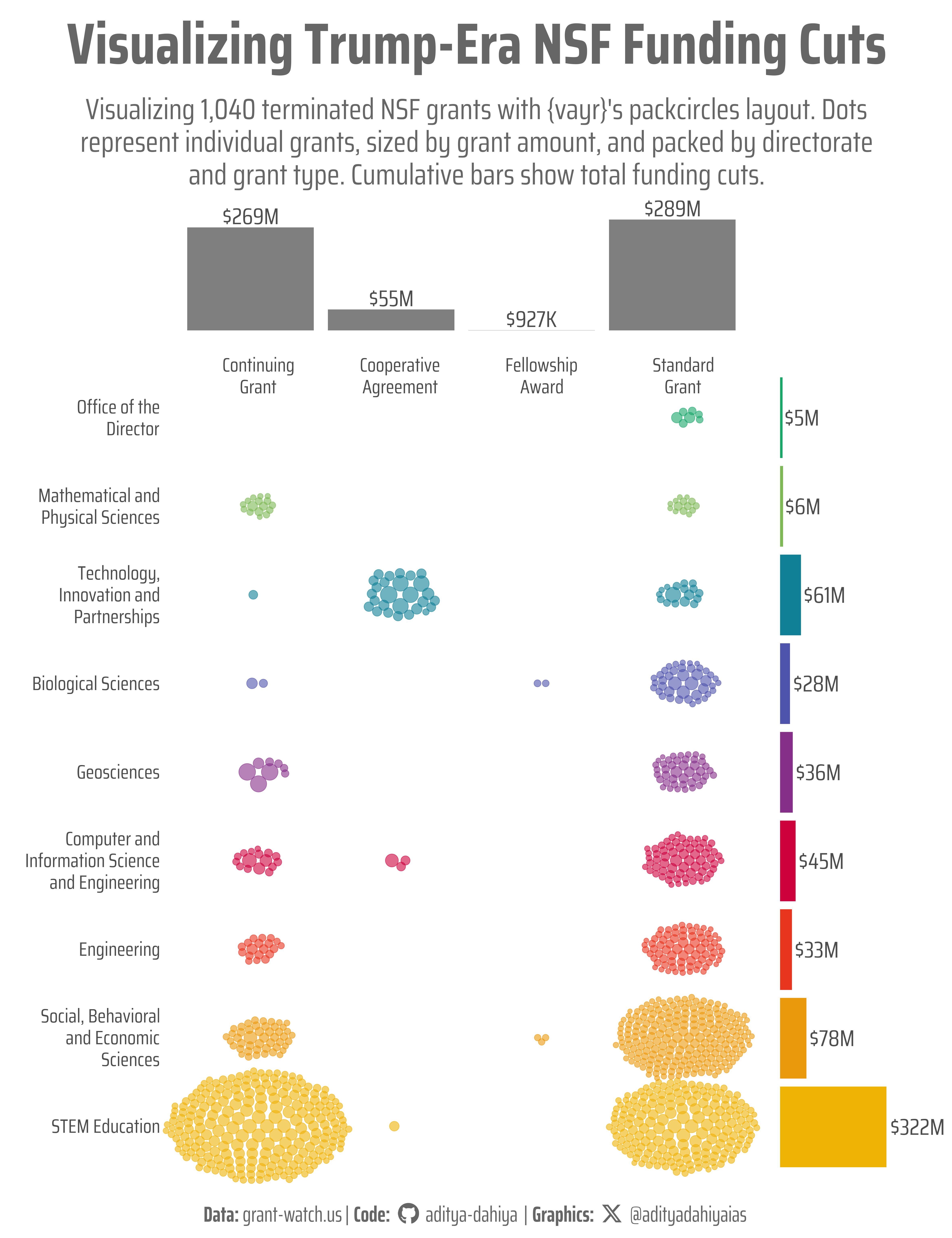
Figure 1: This graphic visualizes approximately 1,400 terminated NSF grants under the Trump administration in 2025, using a packcircles layout. The Y-axis lists nine NSF directorates, while the X-axis categorizes grants into four types: continuous, standard, fellowship, and cooperative. Each dot represents a single grant, arranged via position_circlepack() from the {vayr} package. Cumulative bar plots along the axes display the total funding committed via USAspending.gov for each directorate and grant type. Key findings reveal that STEM Education faced the largest funding cuts, predominantly in continuing grants, while Technology and Innovation saw the most cooperative agreement terminations.
How I made this graphic?
How the Graphic Was Created
The graphic visualizing 1,040 terminated NSF grants was crafted using the {vayr} R package’s position_circlepack() to arrange grant dots in a packed layout by directorate and grant type within a {ggplot2} plot. Data from nsf_terminations.csv was processed with {tidyverse} for cleaning and grouping by award type and directorate. Dot sizes reflected funding amounts, colored by directorate using {paletteer}’s palette. Cumulative bar plots, built with {ggplot2}, were added via {patchwork} to show total funding cuts, with text styled using {ggtext} and fonts from {showtext}.
Loading required libraries
Code
pacman::p_load( tidyverse, # All things tidy scales, # Nice Scales for ggplot2 fontawesome, # Icons display in ggplot2 ggtext, # Markdown text support for ggplot2 showtext, # Display fonts in ggplot2 colorspace, # Lighten and Darken colours magick, # Download images and edit them ggimage, # Display images in ggplot2 patchwork, # Composing Plots vayr, # visualize as you randomize packcircles # Circles Packed layout)# Option 2: Read directly from GitHubnsf_terminations <- readr::read_csv('https://raw.githubusercontent.com/rfordatascience/tidytuesday/main/data/2025/2025-05-06/nsf_terminations.csv')
The {vayr} R package, developed by Alexander Coppock, provides specialized extensions for {ggplot2} to support the “Visualize as You Randomize” principles outlined in his 2020 paper. Designed for randomized experiments, it enhances data visualization by offering position adjustments like position_sunflowerdodge() and position_circlepack() to reduce over-plotting and organize data in “data-space” effectively. These tools help convey experimental design, analysis, and results clearly by mapping design elements to aesthetic parameters. Available on CRAN, {vayr} requires {ggplot2}, {packcircles}, and {withr}, with development versions installable via GitHub. It includes datasets like patriot_act for practical visualization demonstrations.
Visualization Parameters
Code
# Font for titlesfont_add_google("Saira",family ="title_font") # Font for the captionfont_add_google("Saira Extra Condensed",family ="caption_font") # Font for plot textfont_add_google("Saira Condensed",family ="body_font") showtext_auto()# A base Colourbg_col <-"white"seecolor::print_color(bg_col)# Colour for highlighted texttext_hil <-"grey40"seecolor::print_color(text_hil)# Colour for the texttext_col <-"grey30"seecolor::print_color(text_col)line_col <-"grey30"# Define Base Text Sizebts <-90# Caption stuff for the plotsysfonts::font_add(family ="Font Awesome 6 Brands",regular = here::here("docs", "Font Awesome 6 Brands-Regular-400.otf"))github <-""github_username <-"aditya-dahiya"xtwitter <-""xtwitter_username <-"@adityadahiyaias"social_caption_1 <- glue::glue("<span style='font-family:\"Font Awesome 6 Brands\";'>{github};</span> <span style='color: {text_hil}'>{github_username} </span>")social_caption_2 <- glue::glue("<span style='font-family:\"Font Awesome 6 Brands\";'>{xtwitter};</span> <span style='color: {text_hil}'>{xtwitter_username}</span>")plot_caption <-paste0("**Data:** grant-watch.us", " | **Code:** ", social_caption_1, " | **Graphics:** ", social_caption_2 )rm(github, github_username, xtwitter, xtwitter_username, social_caption_1, social_caption_2)# Add text to plot-------------------------------------------------plot_subtitle <-str_wrap("Visualizing 1,040 terminated NSF grants with {vayr}'s packcircles layout. Dots represent individual grants, sized by grant amount, and packed by directorate and grant type. Cumulative bars show total funding cuts.", 80)str_view(plot_subtitle)plot_title <-"Visualizing Trump-Era NSF Funding Cuts"
# Saving a thumbnaillibrary(magick)# Saving a thumbnail for the webpageimage_read(here::here("data_vizs", "tidy_nsf_grants.png")) |>image_resize(geometry ="x400") |>image_write( here::here("data_vizs", "thumbnails", "tidy_nsf_grants.png" ) )
Session Info
Code
pacman::p_load( tidyverse, # All things tidy scales, # Nice Scales for ggplot2 fontawesome, # Icons display in ggplot2 ggtext, # Markdown text support for ggplot2 showtext, # Display fonts in ggplot2 colorspace, # Lighten and Darken colours magick, # Download images and edit them ggimage, # Display images in ggplot2 patchwork, # Composing Plots vayr, # visualize as you randomize packcircles # Circles Packed layout)sessioninfo::session_info()$packages |>as_tibble() |>select(package, version = loadedversion, date, source) |>arrange(package) |> janitor::clean_names(case ="title" ) |> gt::gt() |> gt::opt_interactive(use_search =TRUE ) |> gtExtras::gt_theme_espn()
Table 1: R Packages and their versions used in the creation of this page and graphics