An exploration of Sydney Harbour’s swim site safety using {ggplot2}, {sf}, {scatterpie}, {ggtext}, and {ggmap}
#TidyTuesday
Raster
Maps
{ggmap}
{scatterpie}
{sf}
{terra}
Author
Aditya Dahiya
Published
May 17, 2025
About the Data
This week’s dataset explores the water quality of Sydney’s iconic beaches, with a focus on how environmental factors like rainfall impact bacterial contamination at swimming sites. The primary source of data is the New South Wales Beachwatch program, which monitors recreational water safety across coastal and estuarine swim spots. The topic has gained particular relevance following recent news highlighting pollution risks after heavy rainfall. The dataset, curated by Jen Richmond (R-Ladies Sydney), spans from 1991 to 2025 and includes measurements of enterococci bacteria levels, water temperature, and conductivity, alongside historical weather data such as daily rainfall and temperature. You can access the data through the {tidytuesdayR} R package or download directly from GitHub. This dataset offers a valuable opportunity to analyze trends in water quality over time, assess the impact of precipitation on bacterial contamination, and identify vulnerable swimming sites—perfect for sharpening your data wrangling and visualization skills in R, Python, or Julia.
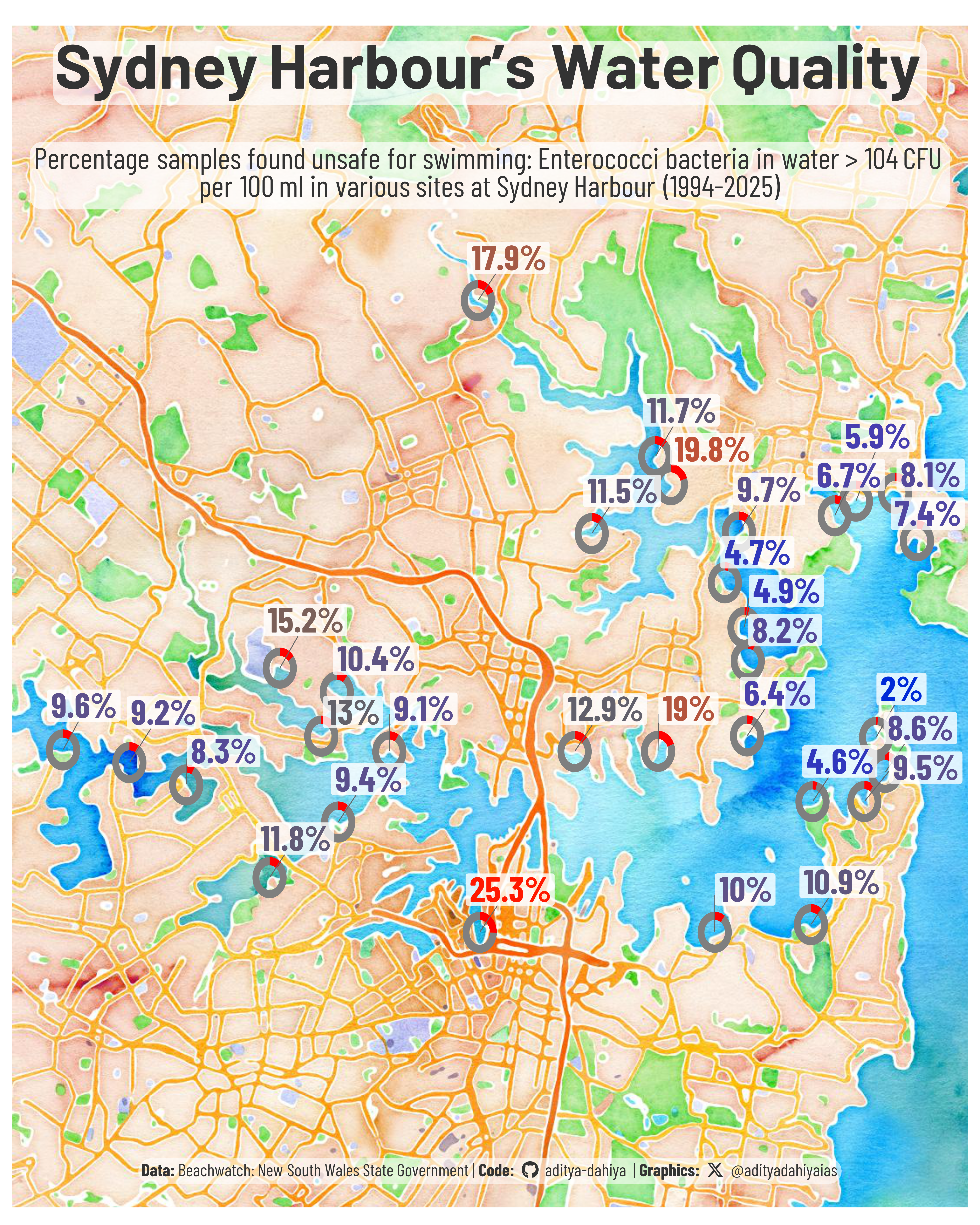
Figure 1: This map visualizes water quality across Sydney Harbour’s swim sites from 1994 to 2025. Each donut chart represents a site, showing the proportion of water samples that exceeded safe limits for Enterococci bacteria—levels above 104 CFU per 100 mL are considered unsafe for swimming. Red segments indicate polluted samples, while grey denotes safe ones. Labels display the percentage of unsafe samples. The watercolor basemap provides geographic context, helping highlight which sites have had persistently poor water quality over time. Data source: Beachwatch, New South Wales State Government.
How the Graphic Was Created
To create this graphic, I used R and a suite of powerful tidyverse packages for data wrangling and visualization. The data, sourced from the TidyTuesday project, included measurements of enterococci bacteria at various Sydney Harbour swim sites. I combined this with weather data using dplyr joins and spatially enabled the dataset with the help of sf for geospatial operations. A watercolor basemap of Sydney was retrieved via ggmap and terra to act as the visual canvas. I mapped the pollution levels using donut charts embedded into the map with scatterpie, showing the proportion of unsafe water samples at each location. To style the plot, I used fonts loaded from Google via showtext and integrated social media icons with fontawesome. Text elements were enhanced using ggtext for markdown rendering, and paletteer added a perceptually uniform color scale. Finally, I composed the plot using ggplot2 and cleaned up aesthetics with theme_void() and geom_label_repel() from ggrepel to display percentages clearly without overlap.
Loading required libraries
Code
pacman::p_load( tidyverse, # All things tidy scales, # Nice Scales for ggplot2 fontawesome, # Icons display in ggplot2 ggtext, # Markdown text support for ggplot2 showtext, # Display fonts in ggplot2 colorspace, # Lighten and Darken colours magick, # Download images and edit them ggimage, # Display images in ggplot2 patchwork, # Composing Plots scatterpie # Pie-charts within maps)# Load Geospatial Mapping packagespacman::p_load(ggmap, sf, terra, tidyterra)water_quality <- readr::read_csv('https://raw.githubusercontent.com/rfordatascience/tidytuesday/main/data/2025/2025-05-20/water_quality.csv')weather <- readr::read_csv('https://raw.githubusercontent.com/rfordatascience/tidytuesday/main/data/2025/2025-05-20/weather.csv')
Visualization Parameters
Code
# Font for titlesfont_add_google("Barlow",family ="title_font") # Font for the captionfont_add_google("Barlow Condensed",family ="caption_font") # Font for plot textfont_add_google("Barlow Semi Condensed",family ="body_font") showtext_auto()# A base Colourbg_col <-"white"seecolor::print_color(bg_col)# Colour for highlighted texttext_hil <-"grey20"seecolor::print_color(text_hil)# Colour for the texttext_col <-"grey20"seecolor::print_color(text_col)line_col <-"grey30"# Define Base Text Sizebts <-90# Caption stuff for the plotsysfonts::font_add(family ="Font Awesome 6 Brands",regular = here::here("docs", "Font Awesome 6 Brands-Regular-400.otf"))github <-""github_username <-"aditya-dahiya"xtwitter <-""xtwitter_username <-"@adityadahiyaias"social_caption_1 <- glue::glue("<span style='font-family:\"Font Awesome 6 Brands\";'>{github};</span> <span style='color: {text_hil}'>{github_username} </span>")social_caption_2 <- glue::glue("<span style='font-family:\"Font Awesome 6 Brands\";'>{xtwitter};</span> <span style='color: {text_hil}'>{xtwitter_username}</span>")plot_caption <-paste0("**Data:** Beachwatch: New South Wales State Government", " | **Code:** ", social_caption_1, " | **Graphics:** ", social_caption_2 )rm(github, github_username, xtwitter, xtwitter_username, social_caption_1, social_caption_2)# Add text to plot-------------------------------------------------plot_subtitle <-str_wrap("Percentage samples found unsafe for swimming: Enterococci bacteria in water > 104 CFU per 100 ml in various sites at Sydney Harbour (1994-2025)", 85) |>str_replace_all("\\\n", "<br>")str_view(plot_subtitle)plot_title <-"Sydney Harbour's Water Quality"
# Saving a thumbnaillibrary(magick)# Saving a thumbnail for the webpageimage_read(here::here("data_vizs", "tidy_nsw_beaches.png")) |>image_resize(geometry ="x400") |>image_write( here::here("data_vizs", "thumbnails", "tidy_nsw_beaches.png" ) )
Session Info
Table 1: R Packages and their versions used in the creation of this page and graphics