Logistic Regression Visualization with ggplot2 and ggnewscale
Using dual color scales, text annotations, and curved arrows to communicate model predictions
#TidyTuesday
Logistic Regression
{ggnewscale}
Author
Aditya Dahiya
Published
November 5, 2025
About the Data
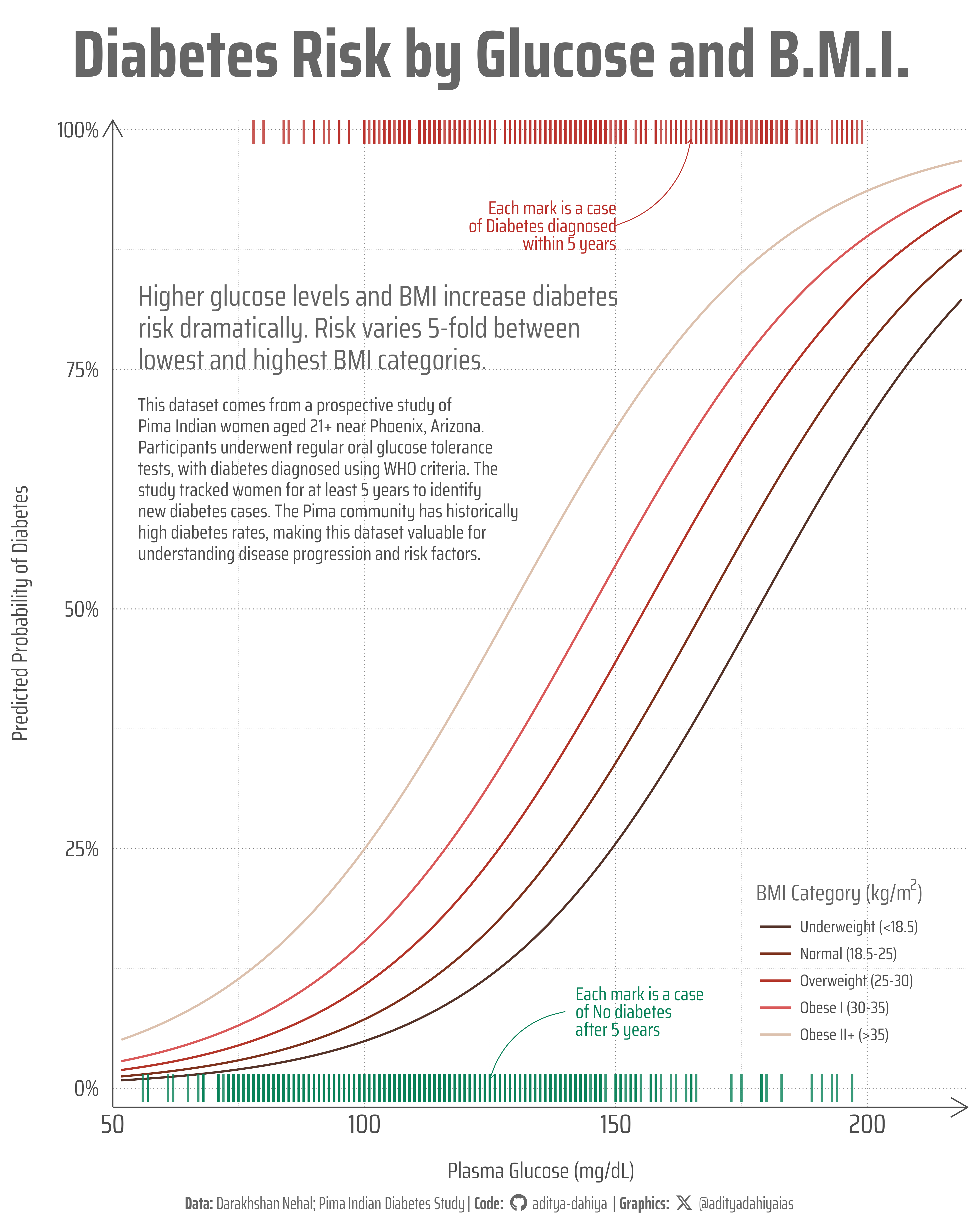
This dataset originates from a prospective observational cohort study of type 2 diabetes among women of Pima Indian heritage living near Phoenix, Arizona. The study focused exclusively on women aged 21 and older who underwent regular oral glucose tolerance tests, with diabetes diagnosis determined using World Health Organization (WHO) criteria. The dataset includes key clinical measurements such as plasma glucose concentration, serum insulin levels, body mass index (BMI), triceps skinfold thickness (a measure of subcutaneous fat), and a diabetes pedigree score that quantifies family history by weighting the genetic relatedness of family members with diabetes. The Pima Indian community has been extensively studied in diabetes research due to historically high rates of type 2 diabetes, making this dataset particularly valuable for understanding the disease’s progression and risk factors. This week’s #TidyTuesday dataset was curated by Darakhshan Nehal and is available for exploration in R, Python, and Julia.
Figure 1: This visualization displays predicted diabetes probabilities from a logistic regression model using plasma glucose levels, BMI, and family history. Each colored line represents a different BMI category, showing how diabetes risk increases with glucose levels. Higher BMI categories (warmer colors) show steeper probability curves. Vertical marks indicate actual patient outcomes: green marks represent women who remained diabetes-free after 5 years, while red marks indicate those diagnosed with diabetes. The clustering of red marks at higher glucose values confirms the model’s predictive accuracy.
How I Made This Graphic
Loading required libraries
Code
pacman::p_load( tidyverse, # All things tidy scales, # Nice Scales for ggplot2 fontawesome, # Icons display in ggplot2 ggtext, # Markdown text support for ggplot2 showtext, # Display fonts in ggplot2 colorspace, # Lighten and Darken colours patchwork, # Composing Plots gghalves # For half geoms with ggplot2)diabetes <- readr::read_csv('https://raw.githubusercontent.com/rfordatascience/tidytuesday/main/data/2025/2025-11-11/diabetes.csv')
Visualization Parameters
Code
# Font for titlesfont_add_google("Saira",family ="title_font")# Font for the captionfont_add_google("Saira Condensed",family ="body_font")# Font for plot textfont_add_google("Saira Extra Condensed",family ="caption_font")showtext_auto()# A base Colourbg_col <-"white"seecolor::print_color(bg_col)# Colour for highlighted texttext_hil <-"grey40"seecolor::print_color(text_hil)# Colour for the texttext_col <-"grey30"seecolor::print_color(text_col)line_col <-"grey30"# Define Base Text Sizebts <-80# Caption stuff for the plotsysfonts::font_add(family ="Font Awesome 6 Brands",regular = here::here("docs", "Font Awesome 6 Brands-Regular-400.otf"))github <-""github_username <-"aditya-dahiya"xtwitter <-""xtwitter_username <-"@adityadahiyaias"social_caption_1 <- glue::glue("<span style='font-family:\"Font Awesome 6 Brands\";'>{github};</span> <span style='color: {text_hil}'>{github_username} </span>")social_caption_2 <- glue::glue("<span style='font-family:\"Font Awesome 6 Brands\";'>{xtwitter};</span> <span style='color: {text_hil}'>{xtwitter_username}</span>")plot_caption <-paste0("**Data:** Darakhshan Nehal; Pima Indian Diabetes Study"," | **Code:** ", social_caption_1," | **Graphics:** ", social_caption_2)rm( github, github_username, xtwitter, xtwitter_username, social_caption_1, social_caption_2)# Add text to plot-------------------------------------------------plot_title <-"tidy_pima_diabetes_study"plot_subtitle <-"tidy_pima_diabetes_study"|>str_wrap(90)plot_subtitle |>str_view()
Exploratory Data Analysis and Wrangling
Code
# pacman::p_load(summarytools)# # diabetes |> # dfSummary() |> # view()# # diabetes |> # summary()# # pacman::p_unload(summarytools)library(tidyverse)library(broom)# Read data, create BMI categories, fit model, generate predictions, and plotdiabetes <- diabetes |>mutate(diabetes_binary =if_else(diabetes_5y =="pos", 1, 0)) |># Create BMI categories based on standard clinical cutoffsmutate(bmi_category =cut(bmi, breaks =c(-Inf, 18.5, 25, 30, 35, Inf),labels =c("Underweight (<18.5)", "Normal (18.5-25)", "Overweight (25-30)", "Obese I (30-35)", "Obese II+ (>35)"),right =FALSE)) |># Remove rows with missing values in key variablesdrop_na(`glucose_mg-dl`, bmi, pedigree, diabetes_binary)# Fit logistic regression modelmodel <-glm(diabetes_binary ~`glucose_mg-dl`+ bmi + pedigree, data = diabetes, family =binomial())# Generate prediction data and create plotplotdf <-expand_grid(`glucose_mg-dl`=seq(min(diabetes$`glucose_mg-dl`), 1.5*max(diabetes$`glucose_mg-dl`), length.out =100),bmi =c(17, 22, 27.5, 32.5, 40), # Representative values for each categorypedigree =median(diabetes$pedigree)) |>mutate(bmi_category =cut(bmi, breaks =c(-Inf, 18.5, 25, 30, 35, Inf),labels =c("Underweight (<18.5)", "Normal (18.5-25)", "Overweight (25-30)", "Obese I (30-35)", "Obese II+ (>35)"),right =FALSE)) |>rowwise() |>mutate(pred_prob =predict(model, newdata =tibble(`glucose_mg-dl`=`glucose_mg-dl`, bmi = bmi, pedigree = pedigree), type ="response")) |>ungroup()
The Plot
Code
g <- plotdf |>ggplot(mapping =aes(x =`glucose_mg-dl`, y = pred_prob,colour = bmi_category ) ) +geom_line(linewidth =1.2 ) +scale_x_continuous(expand =expansion(0),limits =c(50, 220) ) + paletteer::scale_colour_paletteer_d("fishualize::Epinephelus_striatus",name =expression("BMI Category (kg/m"^2*")") ) +scale_y_continuous(labels = scales::percent_format(),expand =expansion(c(0.02, 0.01)) ) + ggnewscale::new_scale_colour() +geom_point(data = diabetes, mapping =aes(x =`glucose_mg-dl`, y = diabetes_binary, color = diabetes_5y ),alpha =0.8, size =36,shape =124# "|" character ) + paletteer::scale_colour_paletteer_d("ggthemes::wsj_red_green",guide ="none" ) +# Subtitle annotation in top leftannotate("text",x =55, y =0.75,label ="Higher glucose levels and BMI increase diabetes risk dramatically. Risk varies 5-fold between lowest and highest BMI categories."|>str_wrap(50),hjust =0, vjust =0,size = bts *0.45,family ="body_font",colour = text_hil,lineheight =0.3 ) +# About the Data annotationannotate("text",x =55, y =0.72,label =str_wrap("This dataset comes from a prospective study of Pima Indian women aged 21+ near Phoenix, Arizona. Participants underwent regular oral glucose tolerance tests, with diabetes diagnosed using WHO criteria. The study tracked women for at least 5 years to identify new diabetes cases. The Pima community has historically high diabetes rates, making this dataset valuable for understanding disease progression and risk factors.", width =55),hjust =0, vjust =1,size = bts *0.3,family ="body_font",colour = text_col,lineheight =0.3 ) +# Curved arrow and label for negative outcomes (green)annotate("curve",x =140, y =0.08,xend =125, yend =0.01,curvature =0.3,arrow =arrow(length =unit(2, "mm")),colour ="#088158FF",linewidth =0.5 ) +annotate("text",x =142, y =0.08,label ="Each mark is a case\nof No diabetes\nafter 5 years",hjust =0, vjust =0.5,size = bts *0.3,family ="body_font",colour ="#088158FF",lineheight =0.25 ) +# Curved arrow and label for positive outcomes (red)annotate("curve",x =150, y =0.9,xend =165, yend =0.99,curvature =0.3,arrow =arrow(length =unit(2, "mm")),colour ="#BA2F2AFF",linewidth =0.5 ) +annotate("text",x =150, y =0.9,label ="Each mark is a case\nof Diabetes diagnosed\nwithin 5 years",hjust =1, vjust =0.5,size = bts *0.3,family ="body_font",colour ="#BA2F2AFF",lineheight =0.25 ) +labs(title ="Diabetes Risk by Glucose and B.M.I.",x ="Plasma Glucose (mg/dL)",y ="Predicted Probability of Diabetes",caption = plot_caption ) +theme_minimal(base_family ="body_font",base_size = bts ) +theme(legend.position =c(0.85, 0.15),legend.background =element_rect(fill =NA,colour =NA,linewidth =0.3 ),legend.key.height =unit(4, "mm"),legend.key.width =unit(16, "mm"),legend.key.spacing.y =unit(5, "mm"),legend.title =element_text(size = bts,face ="bold",colour = text_hil,margin =margin(0,0,5,0, "mm") ),legend.text =element_text(size = bts *0.75,colour = text_col,margin =margin(0,0,0,2, "mm") ),# Overalltext =element_text(margin =margin(0, 0, 0, 0, "mm"),colour = text_col,lineheight =0.3 ),# Axesaxis.text.x.bottom =element_text(size = bts *1.2,margin =margin(3, 3, 3, 3, "mm") ),axis.text.y.left =element_text(size = bts,margin =margin(3, 6, 3, 3, "mm") ),axis.title =element_text(margin =margin(2,2,2,2, "mm") ),axis.ticks.x.bottom =element_blank(),axis.ticks.length.x =unit(0, "mm"),axis.ticks.length.y.left =unit(0, "mm"),axis.line =element_line(colour = text_col,arrow =arrow(length =unit(8, "mm")),linewidth =0.75 ),panel.grid.major =element_line(colour ="grey50",linewidth =0.5,linetype =3 ),panel.grid.minor =element_line(colour ="grey75",linewidth =0.25,linetype =3 ),# Labels and Strip Textplot.title =element_text(margin =margin(5, 0, 15, 0, "mm"),hjust =0.5,vjust =0.5,colour = text_hil,size =3* bts,family ="body_font",face ="bold",lineheight =0.25 ),plot.caption =element_markdown(family ="caption_font",hjust =0.5,margin =margin(5, 0, 0, 0, "mm"),colour = text_hil ),plot.caption.position ="plot",plot.title.position ="plot",plot.margin =margin(5, 5, 5, 5, "mm") )ggsave(filename = here::here("data_vizs","tidy_pima_diabetes_study.png" ),plot = g,width =400,height =500,units ="mm",bg = bg_col)
Savings the thumbnail for the webpage
Code
# Saving a thumbnaillibrary(magick)# Saving a thumbnail for the webpageimage_read(here::here("data_vizs","tidy_pima_diabetes_study.png")) |>image_resize(geometry ="x400") |>image_write( here::here("data_vizs","thumbnails","tidy_pima_diabetes_study.png" ) )
Session Info
Code
pacman::p_load( tidyverse, # All things tidy scales, # Nice Scales for ggplot2 fontawesome, # Icons display in ggplot2 ggtext, # Markdown text support for ggplot2 showtext, # Display fonts in ggplot2 colorspace, # Lighten and Darken colours patchwork, # Composing Plots gghalves # For half geoms with ggplot2)sessioninfo::session_info()$packages |>as_tibble() |># The attached column is TRUE for packages that were # explicitly loaded with library() dplyr::filter(attached ==TRUE) |> dplyr::select(package,version = loadedversion, date, source ) |> dplyr::arrange(package) |> janitor::clean_names(case ="title" ) |> gt::gt() |> gt::opt_interactive(use_search =TRUE ) |> gtExtras::gt_theme_espn()
Table 1: R Packages and their versions used in the creation of this page and graphics