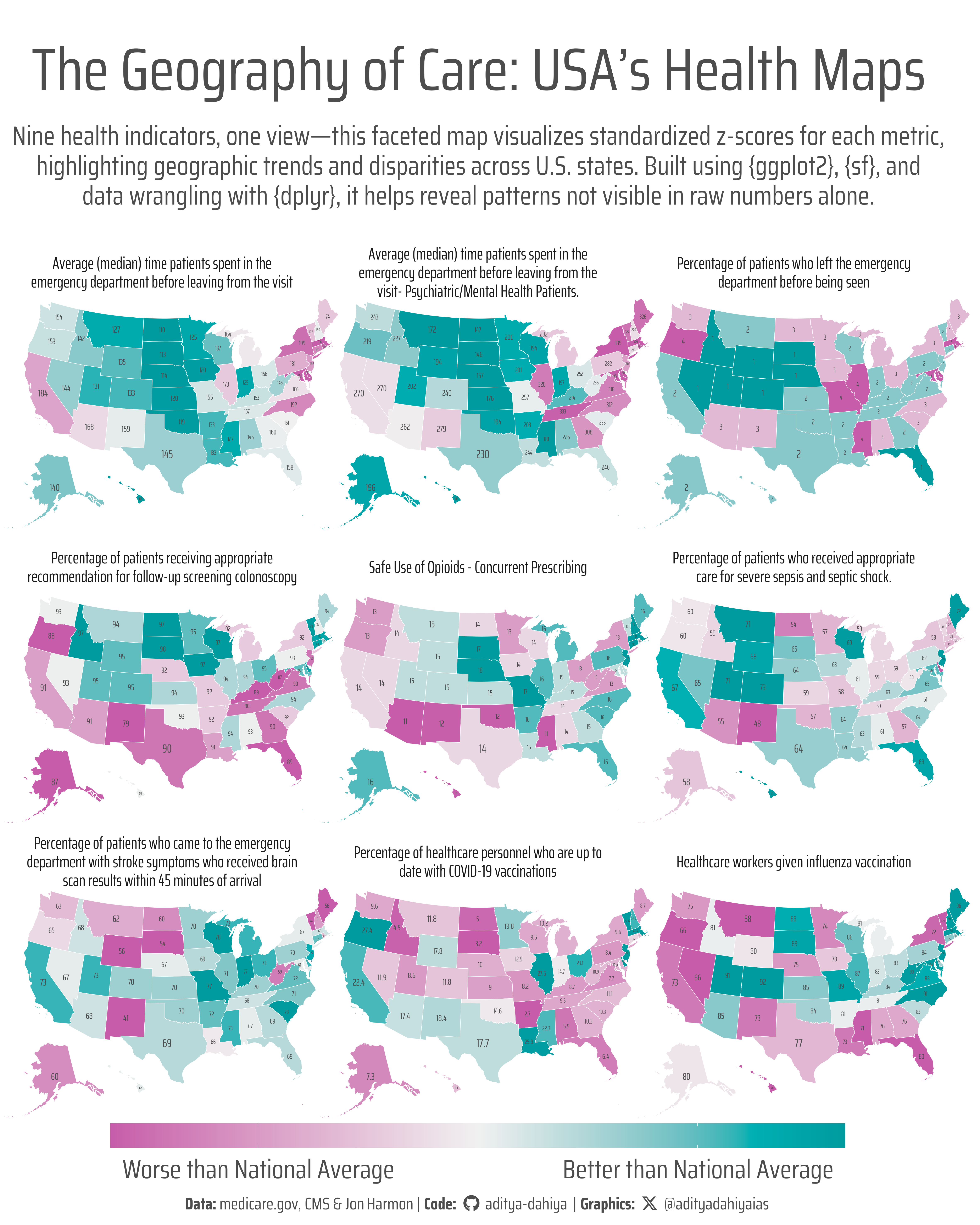
Nine health indicators, one view—this faceted map visualizes standardized z-scores for each metric, highlighting geographic trends and disparities across U.S. states. Built using {ggplot2}, {sf}, and data wrangling with {dplyr}, it helps reveal patterns not visible in raw numbers alone.
#TidyTuesday
Maps
USA
Chloropleth
Author
Aditya Dahiya
Published
April 8, 2025
About the Data
The dataset for this week’s #TidyTuesday explores state-level measurements of timely and effective care in hospitals across the United States, sourced from Medicare.gov. Collected and published by the Centers for Medicare and Medicaid Services (CMS), the data captures how hospitals perform across various metrics such as emergency room wait times and treatment timelines for different conditions. With 22 unique measure IDs covering six condition categories, each record includes the state, the measured outcome, and the relevant time window. This dataset provides an opportunity to analyze geographic disparities in care quality and timeliness, potentially uncovering how factors like state population, staffing levels, or hospital capacity affect patient experiences. It was curated by Jon Harmon from the Data Science Learning Community, with inspiration from a Visual Capitalist map by Kayla Zhu and Christina Kostandi, highlighting how emergency room wait times vary dramatically across states.
Figure 1: This graphic displays nine choropleth maps comparing U.S. states across major healthcare indicators such as ER visits, immunization rates, preventable hospitalizations, and mental health service use. Each map shows standardized z-scores, enabling meaningful comparisons despite differing units and scales. States with higher-than-average values are shaded in darker hues, revealing regional patterns and disparities in healthcare access and utilization.
How I made this graphic?
To create this faceted map visualization of U.S. state-level healthcare indicators, I primarily used the ggplot2 framework from the tidyverse suite for plotting, along with several powerful supporting packages. The spatial geometries were handled using sf, while data wrangling was done with dplyr, tidyr, and forcats. Each of the nine maps represents a different performance indicator (selected using their measure_id) and is scaled using standardized z-scores for comparability. The base maps came from usmapdata, and I used geom_sf() to draw state boundaries and geom_sf_text() to overlay actual indicator values. Color gradients were applied with paletteer and refined using colorspace, while plot text was enhanced via showtext and ggtext. The maps were arranged using facet_wrap(), revealing regional patterns—such as better emergency care metrics in the Midwest but lower vaccination scores. Final composition tweaks used patchwork, and social media icons were integrated with fontawesome for a polished and branded appearance. Overall, this approach combined geospatial visualization, normalization, and typography to craft an insightful and visually cohesive narrative.
Loading required libraries
Code
# Data Import and Wrangling Toolslibrary(tidyverse) # All things tidy# Final plot toolslibrary(scales) # Nice Scales for ggplot2library(fontawesome) # Icons display in ggplot2library(ggtext) # Markdown text support for ggplot2library(showtext) # Display fonts in ggplot2library(colorspace) # Lighten and Darken colourslibrary(magick) # Download images and edit themlibrary(ggimage) # Display images in ggplot2library(patchwork) # Composing Plotslibrary(sf) # For maps and area computationcare_state <- readr::read_csv('https://raw.githubusercontent.com/rfordatascience/tidytuesday/main/data/2025/2025-04-08/care_state.csv')
Visualization Parameters
Code
# Font for titlesfont_add_google("Saira",family ="title_font") # Font for the captionfont_add_google("Saira Extra Condensed",family ="caption_font") # Font for plot textfont_add_google("Saira Condensed",family ="body_font") showtext_auto()mypal <-c("yellow", "blue", "grey30")# cols4all::c4a_gui()# A base Colourbg_col <-"white"seecolor::print_color(bg_col)# Colour for highlighted texttext_hil <- mypal[3]seecolor::print_color(text_hil)# Colour for the texttext_col <- mypal[3]seecolor::print_color(text_col)line_col <-"grey30"# Define Base Text Sizebts <-120# Caption stuff for the plotsysfonts::font_add(family ="Font Awesome 6 Brands",regular = here::here("docs", "Font Awesome 6 Brands-Regular-400.otf"))github <-""github_username <-"aditya-dahiya"xtwitter <-""xtwitter_username <-"@adityadahiyaias"social_caption_1 <- glue::glue("<span style='font-family:\"Font Awesome 6 Brands\";'>{github};</span> <span style='color: {text_hil}'>{github_username} </span>")social_caption_2 <- glue::glue("<span style='font-family:\"Font Awesome 6 Brands\";'>{xtwitter};</span> <span style='color: {text_hil}'>{xtwitter_username}</span>")plot_caption <-paste0("**Data:** medicare.gov, CMS & Jon Harmon", " | **Code:** ", social_caption_1, " | **Graphics:** ", social_caption_2 )rm(github, github_username, xtwitter, xtwitter_username, social_caption_1, social_caption_2)# Add text to plot-------------------------------------------------plot_title <-"The Geography of Care: USA’s Health Maps"plot_subtitle <-"Nine health indicators, one view—this faceted map visualizes standardized z-scores for each metric, highlighting geographic trends and disparities across U.S. states. Built using {ggplot2}, {sf}, and data wrangling with {dplyr}, it helps reveal patterns not visible in raw numbers alone."
Exploratory Data Analysis and Wrangling
Code
# Overall exploration of the data# library(summarytools)# care_state |> # dfSummary() |> # view()# Lets look at the variables - names - meaning# care_state |> # distinct(measure_id, measure_name) |> # print(n = Inf)# Lets look at correlation between the various variables# care_state |># select(state, measure_id, score) |># pivot_wider(# id_cols = state,# names_from = measure_id,# values_from = score# ) |># select(-state) |># GGally::ggpairs()# Pair wise scatterplot is too heav to make sense.# Using ggcorrplot insteadcare_state |>select(state, measure_id, score) |>pivot_wider(id_cols = state,names_from = measure_id,values_from = score ) |>select(-state) |>cor(use ="pairwise.complete.obs") |> ggcorrplot::ggcorrplot() +scale_fill_gradient2(low ="red", high ="blue", mid ="white" )# Select out the relevant variables that make more sensecare_state |>filter( measure_id %in% selected_vars ) |>distinct(measure_id, measure_name)selected_vars <-c("OP_18b", "OP_18c", "OP_22", "OP_29", "SAFE_USE_OF_OPIOIDS", "SEP_1","OP_23", "HCP_COVID_19", "IMM_3" )# A correlation plot between the variablescare_state |>filter( measure_id %in% selected_vars ) |>select(state, measure_id, score) |>pivot_wider(id_cols = state,names_from = measure_id,values_from = score ) |>select(-state) |>cor(use ="pairwise.complete.obs") |> ggcorrplot::ggcorrplot() +scale_fill_gradient2(low ="red", high ="blue", mid ="white" )# A facet labeller vectordf_temp <- care_state |>filter(measure_id %in% selected_vars) |>distinct(measure_id, measure_name)facet_names <- df_temp$measure_name# Improve names (remove unwanted words)facet_names <-str_wrap(str_replace(df_temp$measure_name, "\\b(Higher|A lower|Lower)\\b.*", ""), 50)names(facet_names) <- df_temp$measure_id# Reverse the variable for which lower value is betterrev_vars =c("OP_18b", "OP_18c", "OP_22")rm(df_temp)# Create a final usable tibble for faceted map of USAdf1 <- care_state |>filter( measure_id %in% selected_vars ) |>select( state, measure_id, # measure_name, score ) |>group_by(measure_id) |>mutate(score =if_else( measure_id %in% rev_vars,-score, score ),# Using standardized z-score for Fill Scalescore_scaled = (score -mean(score, na.rm =TRUE)) /sd(score, na.rm =TRUE),score_display =if_else( score ==min(score, na.rm = T) | score ==max(score, na.rm = T), score,NA ) ) |>ungroup() |>mutate(measure_id =fct(measure_id, levels = selected_vars)) |>rename(abbr = state)# Check if values are propery distributed.# df1 |> # ggplot(aes(x = score_scaled)) +# geom_boxplot() +# facet_wrap(~measure_id, ncol = 1)df_plot <- usmapdata::us_map() |>select(abbr, full, geom) |>left_join(df1) |>mutate(area_var =as.numeric(st_area(geom)))
# Saving a thumbnaillibrary(magick)# Saving a thumbnail for the webpageimage_read(here::here("data_vizs", "tidy_us_states_care.png")) |>image_resize(geometry ="x400") |>image_write( here::here("data_vizs", "thumbnails", "tidy_us_states_care.png" ) )
Session Info
Code
# Data Import and Wrangling Toolslibrary(tidyverse) # All things tidy# Final plot toolslibrary(scales) # Nice Scales for ggplot2library(fontawesome) # Icons display in ggplot2library(ggtext) # Markdown text support for ggplot2library(showtext) # Display fonts in ggplot2library(colorspace) # Lighten and Darken colourslibrary(magick) # Download images and edit themlibrary(ggimage) # Display images in ggplot2library(patchwork) # composing Plotssessioninfo::session_info()$packages |>as_tibble() |>select(package, version = loadedversion, date, source) |>arrange(package) |> janitor::clean_names(case ="title" ) |> gt::gt() |> gt::opt_interactive(use_search =TRUE ) |> gtExtras::gt_theme_espn()
Table 1: R Packages and their versions used in the creation of this page and graphics