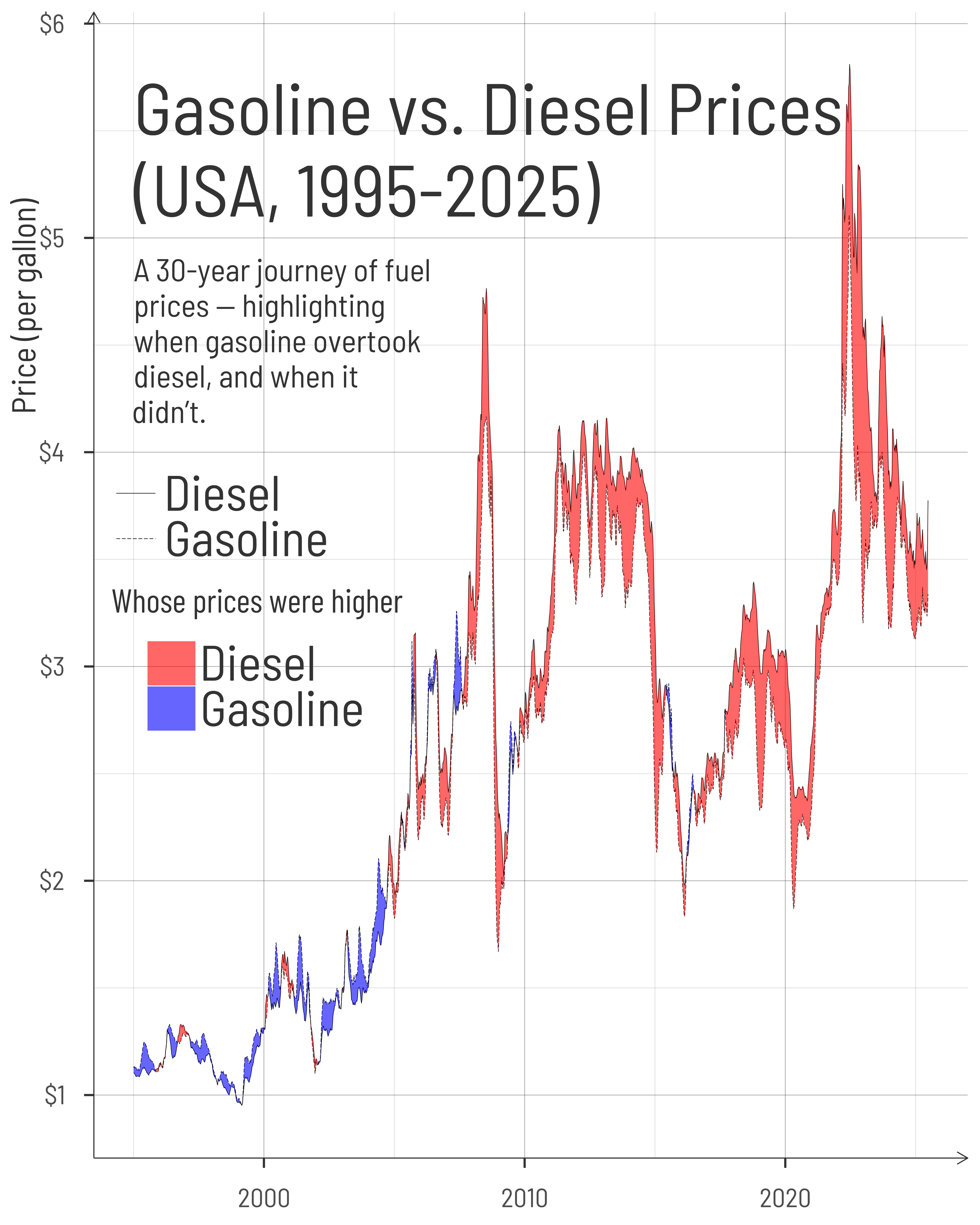
Three Decades of Gas and Diesel Prices in the U.S.

This graphic shows weekly U.S. fuel prices from 1995 to 2025, highlighting when gasoline prices exceeded diesel—and when the reverse was true.

#TidyTuesday
Line Graph
{ggbraid}
Author

Aditya Dahiya

Published

July 2, 2025

About the Data

This dataset explores weekly retail gas and diesel prices in the United States, sourced from the U.S. Energy Information Administration (EIA). Each Monday, the EIA collects prices from over 1,000 gasoline outlets and around 590 diesel stations across the country. These prices—captured as of 8:00 a.m. local time—include all taxes and represent the average self-serve cash pump price for different fuel grades and formulations. The gasoline data covers regular, midgrade, premium, and reformulated types, while diesel data reflects the cost of ultra low sulfur diesel (ULSD). The weekly time series used in this analysis was downloaded directly from this EIA Excel file. You can access the cleaned dataset prepared for this week’s #TidyTuesday challenge via GitHub. Special thanks to Jon Harmon and the Data Science Learning Community for curating and sharing this dataset for open exploration and learning.

Figure 1: Gasoline and diesel prices in the U.S. from 1995 to 2025, with shaded areas showing periods when gasoline was more expensive than diesel (in blue) or vice versa (in red). Patterns reflect economic shocks and long-term fuel trends.

How the Graphic Was Created

Loading required libraries

Code
pacman::p_load(
  tidyverse,            # All things tidy
  
  scales,               # Nice Scales for ggplot2
  fontawesome,          # Icons display in ggplot2
  ggtext,               # Markdown text support for ggplot2
  showtext,             # Display fonts in ggplot2
  colorspace,           # Lighten and Darken colours

  patchwork,            # Composing Plots
  sf                    # Making maps
)

weekly_gas_prices <- readr::read_csv('https://raw.githubusercontent.com/rfordatascience/tidytuesday/main/data/2025/2025-07-01/weekly_gas_prices.csv')

Visualization Parameters

Code
# Font for titles
font_add_google("Barlow",
  family = "title_font"
) 

# Font for the caption
font_add_google("Barlow Condensed",
  family = "caption_font"
) 

# Font for plot text
font_add_google("Barlow Semi Condensed",
  family = "body_font"
) 

showtext_auto()

# A base Colour
bg_col <- "white"
seecolor::print_color(bg_col)

# Colour for highlighted text
text_hil <- "grey20"
seecolor::print_color(text_hil)

# Colour for the text
text_col <- "grey20"
seecolor::print_color(text_col)

line_col <- "grey30"

# Define Base Text Size
bts <- 120

# Caption stuff for the plot
sysfonts::font_add(
  family = "Font Awesome 6 Brands",
  regular = here::here("docs", "Font Awesome 6 Brands-Regular-400.otf")
)
github <- "&#xf09b"
github_username <- "aditya-dahiya"
xtwitter <- "&#xe61b"
xtwitter_username <- "@adityadahiyaias"
social_caption_1 <- glue::glue("<span style='font-family:\"Font Awesome 6 Brands\";'>{github};</span> <span style='color: {text_hil}'>{github_username}  </span>")
social_caption_2 <- glue::glue("<span style='font-family:\"Font Awesome 6 Brands\";'>{xtwitter};</span> <span style='color: {text_hil}'>{xtwitter_username}</span>")
plot_caption <- paste0(
  "**Data:** U.S. Energy Information Administration", 
  " |  **Code:** ", 
  social_caption_1, 
  " |  **Graphics:** ", 
  social_caption_2
  )
rm(github, github_username, xtwitter, 
   xtwitter_username, social_caption_1, 
   social_caption_2)

# Add text to plot-------------------------------------------------
plot_subtitle <- str_wrap("....................", 85)
str_view(plot_subtitle)

plot_title <- "...................."

Exploratory Data Analysis and Wrangling

Code
prices <- weekly_gas_prices |> 
  filter(fuel == "gasoline" & grade == "regular" & formulation != "all")

prices |> 
  ggplot(aes(x = date, y = price, colour = formulation)) +
  geom_line()

weekly_gas_prices |> 
  distinct(fuel, grade, formulation)

weekly_gas_prices |> 
  filter(grade == "all" & formulation %in% c("all", NA)) |> 
  ggplot(aes(date, price, colour = fuel)) +
  geom_line()

weekly_gas_prices |> 
  filter(fuel == "gasoline" & formulation == "conventional") |> 
  filter(grade %in% c("regular", "premium")) |> 
  ggplot(aes(date, price, colour = grade)) +
  geom_line()

weekly_gas_prices |> 
  filter(fuel == "gasoline" & grade == "regular") |> 
  ggplot(aes(date, price, colour = formulation)) +
  geom_line()


# Let's focus on gap between gasoline and diesel prices
prices_long <- weekly_gas_prices |> 
  filter(grade == "all" & formulation %in% c("all", NA)) |> 
  select(-grade, -formulation) |> 
  filter(year(date) >= 1995) |> 
  mutate(fuel = str_to_title(fuel))


prices_wide <- prices_long |> 
  pivot_wider(
    id_cols = date,
    names_from = fuel,
    values_from = price
  ) |> 
  mutate(
    price_difference = Gasoline - Diesel
  )

pacman::p_load(ggbraid)

The Plot

Code
g <- ggplot() +
  geom_line(
    data = prices_long,
    mapping = aes(
      x = date,
      y = price, 
      linetype = fuel
    ),
    linewidth = 0.3
  ) +
  geom_braid(
    data = prices_wide,
    mapping = aes(
      x = date, 
      ymin = Diesel, 
      ymax = Gasoline, 
      fill = Gasoline > Diesel
      ),
    alpha = 0.6
  ) +
  
  # Annotations
  annotate(
    geom = "text",
    x = as_date("1995-01-01"), y = 5.1,
    label = "Gasoline vs. Diesel Prices\n(USA, 1995-2025)",
    hjust = 0,
    vjust = 0,
    size = bts / 1.3,
    colour = text_hil,
    family = "body_font",
    lineheight = 0.3
  ) +
  annotate(
    geom = "text",
    x = as_date("1995-01-01"), y = 4.9,
    label = str_wrap("A 30-year journey of fuel prices — highlighting when gasoline overtook diesel, and when it didn’t.", 25),
    hjust = 0,
    vjust = 1,
    size = bts / 3,
    colour = text_hil,
    family = "body_font",
    lineheight = 0.3
  ) +
  # Scales
  scale_linetype_manual(values = c("solid", "longdash")) +
  scale_fill_manual(
    values = c("red", "blue"),
    labels = c("Diesel", "Gasoline")
  ) +
  scale_y_continuous(
    labels = label_number(prefix = "$")
  ) +
 scale_x_date(
   date_labels = "%Y"
 ) +
  labs(
    fill = "Whose prices were higher",
    linetype = NULL,
    y = "Price (per gallon)",
    x = NULL
  ) +
  theme_minimal(
    base_family = "body_font",
    base_size = bts,
    base_line_size = bts / 200,
    base_rect_size = bts / 200
  ) +
  theme(
   
     # Overall
    text = element_text(
      margin = margin(0,0,0,0, "mm"),
      colour = text_col,
      lineheight = 0.3
    ),
    
    # Labels and Strip Text
    plot.caption = element_textbox(
      margin = margin(0,0,5,0, "mm"),
      hjust = 0.5,
      halign = 0.5,
      colour = text_hil,
      size = 0.7 * bts,
      family = "caption_font",
      fill = alpha("white", 0.6),
      box.color = NA,
      padding = unit(0.3, "lines"),
      r = unit(5, "mm")
    ),
    plot.caption.position = "plot",
    plot.title.position = "plot",
    plot.margin = margin(5,5,5,5, "mm"),
    
    
    # Legend
    legend.position = "inside",
    legend.position.inside = c(0.02, 0.6),
    legend.justification = c(0, 1),
    legend.direction = "vertical",
    
    legend.text.position = "right",
    legend.title.position = "top",
    
    legend.title = element_text(
      margin = margin(0,0,10,0, "mm"),
      hjust = 0.5,
      lineheight = 0.3,
      family = "caption_font"
    ),
    legend.text = element_text(
      margin = margin(0,0,0,3, "mm"),
      size = 1.5 * bts
    ),
    legend.margin = margin(0,0,0,0, "mm"),
    legend.box.spacing = unit(0, "mm"),
    legend.box.margin = margin(0,0,0,0, "mm"),
    legend.background = element_rect(
      fill = NA, colour = NA
    ),
    legend.key.width = unit(20, "mm"),
    legend.spacing.y = unit(10, "mm"),
    
    # Axes
    axis.ticks.length = unit(4, "mm"),
    axis.ticks = element_line(
      linewidth = bts / 100,
      colour = text_col
    ),
    panel.grid.major = element_line(
      colour = alpha(text_col, 0.4),
      linewidth = bts / 300,
      linetype = 1
    ),
    panel.grid.minor = element_line(
      colour = alpha(text_col, 0.2),
      linewidth = bts / 400,
      linetype = 1
    ),
    axis.line = element_line(
      colour = text_col,
      arrow = arrow(length = unit(5, "mm"))
    ),
    axis.title.y = element_text(
      margin = margin(0,-2,0,0, "mm"),
      hjust = 0.8
    ),
    axis.text = element_text(
      margin = margin(0,0,0,0, "mm")
    )
  )

ggsave(
  filename = here::here(
    "data_vizs",
    "tidy_usa_gas_prices.png"
  ),
  plot = g,
  width = 400,
  height = 500,
  units = "mm",
  bg = bg_col
)

Savings the thumbnail for the webpage

Code
# Saving a thumbnail

library(magick)

# Saving a thumbnail for the webpage
image_read(here::here("data_vizs", 
                      "tidy_usa_gas_prices.png")) |> 
  image_resize(geometry = "x400") |> 
  image_write(
    here::here(
      "data_vizs", 
      "thumbnails", 
      "tidy_usa_gas_prices.png"
    )
  )

Session Info

Code
pacman::p_load(
  tidyverse,            # All things tidy
  
  scales,               # Nice Scales for ggplot2
  fontawesome,          # Icons display in ggplot2
  ggtext,               # Markdown text support for ggplot2
  showtext,             # Display fonts in ggplot2
  colorspace,           # Lighten and Darken colours

  patchwork             # Composing Plots
)


sessioninfo::session_info()$packages |> 
  as_tibble() |> 
  dplyr::select(package, 
         version = loadedversion, 
         date, source) |> 
  dplyr::arrange(package) |> 
  janitor::clean_names(
    case = "title"
  ) |> 
  gt::gt() |> 
  gt::opt_interactive(
    use_search = TRUE
  ) |> 
  gtExtras::gt_theme_espn()
Table 1: R Packages and their versions used in the creation of this page and graphics