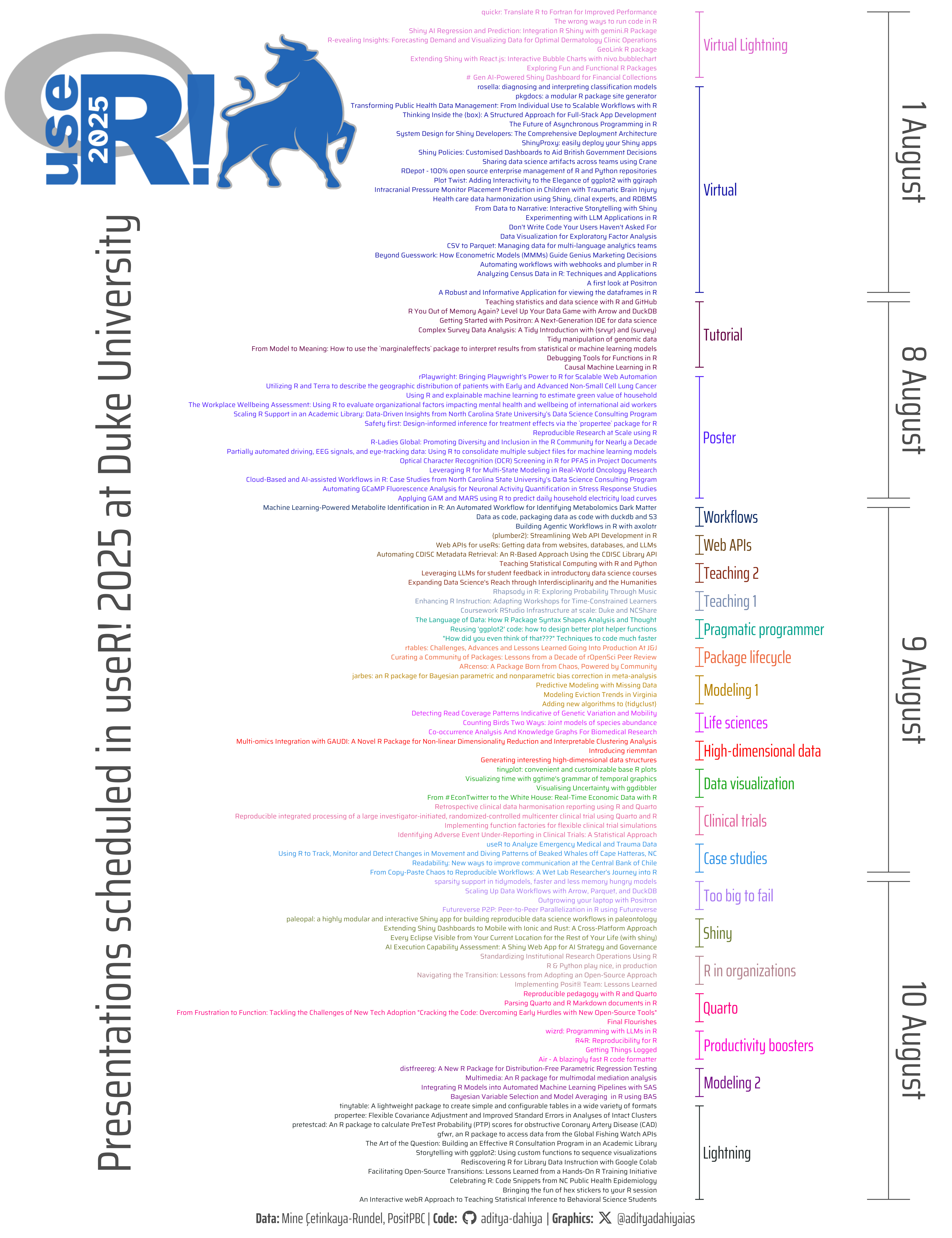
The lineup of presentations scheduled at useR! 2025, categorized by session and date.
#TidyTuesday
Author
Aditya Dahiya
Published
April 30, 2025
About the Data
This week’s dataset comes from the useR! 2025 conference, an annual gathering of R users, developers, and enthusiasts hosted by Duke University in Durham, NC, USA, from August 8–10, 2025 (with a virtual event on August 1). The data, curated by Mine Çetinkaya-Rundel, includes the full schedule of sessions—talks, tutorials, posters, and more—sourced from the conference’s submission portal. It contains metadata such as session titles, speakers, abstracts, room locations, and whether a video recording will be available. The dataset, available via the tidytuesdayR R package or directly from GitHub, invites exploration of themes, trends, and opportunities at the conference. Full program details for both virtual and in-person formats are available on the useR! 2025 website. Participants are encouraged to share their analyses using the hashtag #useR2025.
Figure 1: This graphic displays the lineup of presentations scheduled at useR! 2025, categorized by session and date. Each session is color-coded, with individual talk titles aligned along the y-axis. Horizontal markers group presentations under their respective sessions, while vertical labels indicate the conference dates. Annotations and spacing help highlight the structure of the event, giving a clear visual summary of when and where each talk is taking place.
How I made this graphic?
To visualize the schedule of presentations at useR! 2025, I first loaded and wrangled the session data using packages from the tidyverse ecosystem, including dplyr for data manipulation and ggplot2 for plotting. I utilized showtext to enable the use of custom Google Fonts and ggtext for styled markdown in text elements. fontawesome icons were embedded to add social media logos in the caption. The session metadata was then arranged using grouping and summarisation to calculate vertical spacing and alignment. I used patchwork for potential compositional flexibility (though not shown here), and magick along with ggimage to include the conference logo directly on the plot. Color palettes were selected with help from colorspace and cols4all. The final plot features titles, sessions, and dates placed precisely along the x-axis, using customized axes, fonts, and layout controls. Everything was neatly saved using ggsave() with background color and precise dimensions for clarity in publication or sharing.
Loading required libraries
Code
pacman::p_load( tidyverse, # All things tidy scales, # Nice Scales for ggplot2 fontawesome, # Icons display in ggplot2 ggtext, # Markdown text support for ggplot2 showtext, # Display fonts in ggplot2 colorspace, # Lighten and Darken colours magick, # Download images and edit them ggimage, # Display images in ggplot2 patchwork, # Composing Plots ggbrace # Drawing Curly braces in ggplot2)# Option 2: Read directly from GitHubuser2025 <- readr::read_csv('https://raw.githubusercontent.com/rfordatascience/tidytuesday/main/data/2025/2025-04-29/user2025.csv')user_logo <-image_read("https://user2025.r-project.org/img/logo.png")
Visualization Parameters
Code
# Font for titlesfont_add_google("Saira",family ="title_font") # Font for the captionfont_add_google("Saira Extra Condensed",family ="caption_font") # Font for plot textfont_add_google("Saira Condensed",family ="body_font") showtext_auto()# cols4all::c4a_gui()mypal <-c("#2165B6", "#B3B3B3")# A base Colourbg_col <-"white"seecolor::print_color(bg_col)# Colour for highlighted texttext_hil <-"grey40"seecolor::print_color(text_hil)# Colour for the texttext_col <-"grey40"seecolor::print_color(text_col)line_col <-"grey40"# Define Base Text Sizebts <-90# Caption stuff for the plotsysfonts::font_add(family ="Font Awesome 6 Brands",regular = here::here("docs", "Font Awesome 6 Brands-Regular-400.otf"))github <-""github_username <-"aditya-dahiya"xtwitter <-""xtwitter_username <-"@adityadahiyaias"social_caption_1 <- glue::glue("<span style='font-family:\"Font Awesome 6 Brands\";'>{github};</span> <span style='color: {text_hil}'>{github_username} </span>")social_caption_2 <- glue::glue("<span style='font-family:\"Font Awesome 6 Brands\";'>{xtwitter};</span> <span style='color: {text_hil}'>{xtwitter_username}</span>")plot_caption <-paste0("**Data:** Mine Çetinkaya-Rundel, PositPBC", " | **Code:** ", social_caption_1, " | **Graphics:** ", social_caption_2 )rm(github, github_username, xtwitter, xtwitter_username, social_caption_1, social_caption_2)# Add text to plot-------------------------------------------------plot_subtitle <-"Presentations scheduled in useR! 2025 at Duke University"
# Saving a thumbnaillibrary(magick)# Saving a thumbnail for the webpageimage_read(here::here("data_vizs", "tidy_useR_2025.png")) |>image_resize(geometry ="x400") |>image_write( here::here("data_vizs", "thumbnails", "tidy_useR_2025.png" ) )
Session Info
Code
pacman::p_load( tidyverse, # All things tidy scales, # Nice Scales for ggplot2 fontawesome, # Icons display in ggplot2 ggtext, # Markdown text support for ggplot2 showtext, # Display fonts in ggplot2 colorspace, # Lighten and Darken colours magick, # Download images and edit them ggimage, # Display images in ggplot2 patchwork, # Composing Plots ggbrace # Drawing Curly braces in ggplot2)sessioninfo::session_info()$packages |>as_tibble() |>select(package, version = loadedversion, date, source) |>arrange(package) |> janitor::clean_names(case ="title" ) |> gt::gt() |> gt::opt_interactive(use_search =TRUE ) |> gtExtras::gt_theme_espn()
Table 1: R Packages and their versions used in the creation of this page and graphics