Statistical distributions visualized through combined boxplots and violin plots.
#TidyTuesday
Author
Aditya Dahiya
Published
November 3, 2025
About the Data
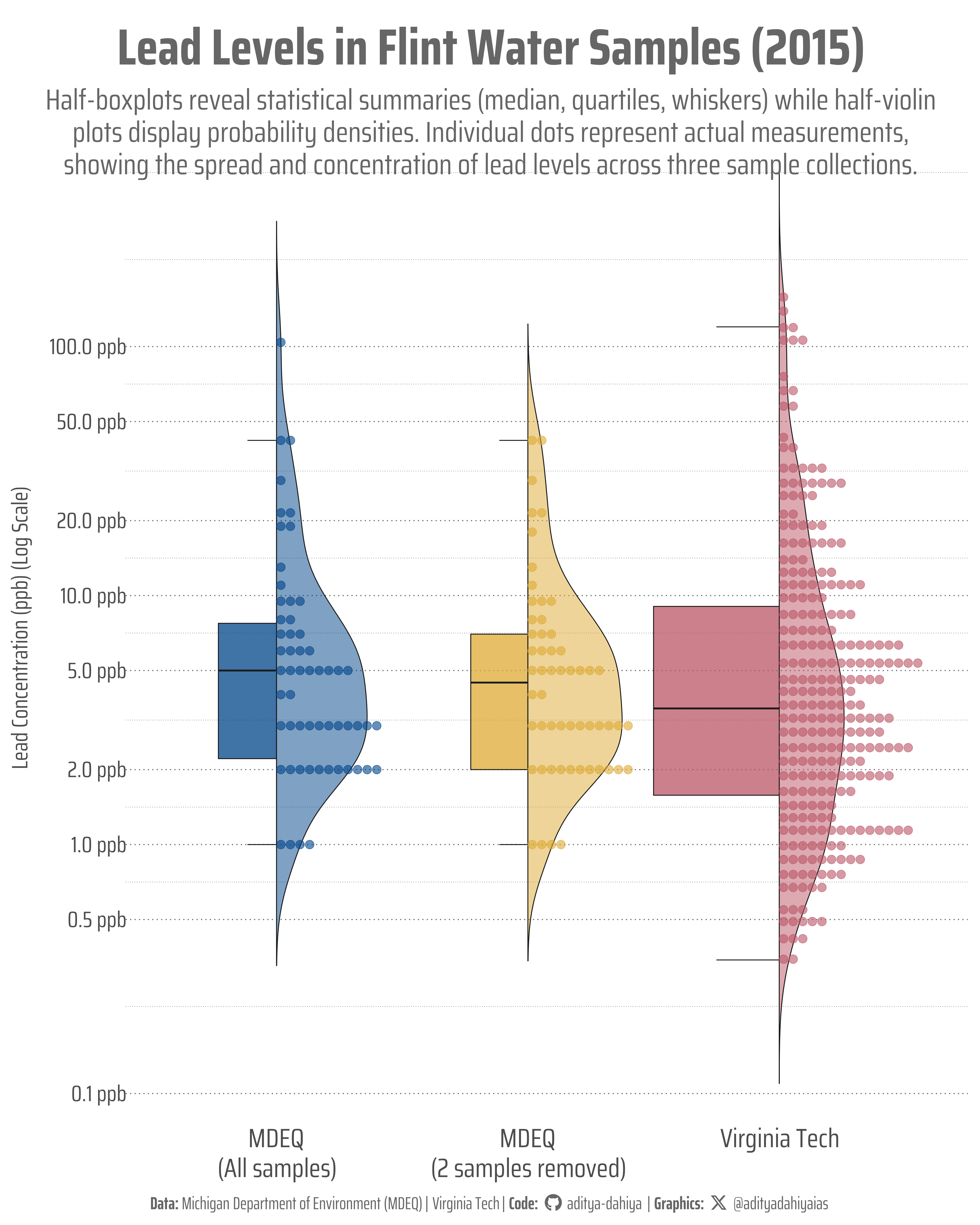
This dataset examines lead concentration levels in water samples collected from Flint, Michigan in 2015, during the city’s water crisis. The data comes from a 2018 paper by Loux and Gibson who advocate for using this as a teaching example in introductory statistics courses. The dataset includes two separate collections: samples gathered by the Michigan Department of Environment Quality (MDEQ) and samples from a citizen science project coordinated by Professor Marc Edwards and colleagues at Virginia Tech. The community-sourced samples were collected after concerns emerged about the MDEQ excluding certain samples from their analysis. You can read about the “murky” story behind this data and the ethical questions it raises about data handling. The data is part of the #TidyTuesday project, a weekly social data project in the R community, and was curated by Jen Richmond. All lead measurements are reported in parts per billion (ppb).
Figure 1: This visualization compares lead concentrations across three water sample collections from Flint, Michigan (2015). The y-axis shows lead levels in parts per billion (ppb) on a logarithmic scale. Each panel combines a half-boxplot (left) displaying the median, quartiles, and whiskers (range excluding outliers), with a half-violin plot (right) showing the probability density. Individual measurements appear as colored dots. The MDEQ dataset with all samples includes two high outliers (104 and 58 ppb) that were controversially removed in the second MDEQ analysis. Virginia Tech’s citizen science project collected 271 samples, showing higher variability and maximum lead levels reaching 158 ppb.
How I Made This Graphic
.
Loading required libraries
Code
pacman::p_load( tidyverse, # All things tidy scales, # Nice Scales for ggplot2 fontawesome, # Icons display in ggplot2 ggtext, # Markdown text support for ggplot2 showtext, # Display fonts in ggplot2 colorspace, # Lighten and Darken colours patchwork, # Composing Plots gghalves # For half geoms with ggplot2)flint_mdeq <- readr::read_csv('https://raw.githubusercontent.com/rfordatascience/tidytuesday/main/data/2025/2025-11-04/flint_mdeq.csv')flint_vt <- readr::read_csv('https://raw.githubusercontent.com/rfordatascience/tidytuesday/main/data/2025/2025-11-04/flint_vt.csv')
Visualization Parameters
Code
# Font for titlesfont_add_google("Saira",family ="title_font")# Font for the captionfont_add_google("Saira Condensed",family ="body_font")# Font for plot textfont_add_google("Saira Extra Condensed",family ="caption_font")showtext_auto()# A base Colourbg_col <-"white"seecolor::print_color(bg_col)# Colour for highlighted texttext_hil <-"grey40"seecolor::print_color(text_hil)# Colour for the texttext_col <-"grey30"seecolor::print_color(text_col)line_col <-"grey30"# Define Base Text Sizebts <-80# Caption stuff for the plotsysfonts::font_add(family ="Font Awesome 6 Brands",regular = here::here("docs", "Font Awesome 6 Brands-Regular-400.otf"))github <-""github_username <-"aditya-dahiya"xtwitter <-""xtwitter_username <-"@adityadahiyaias"social_caption_1 <- glue::glue("<span style='font-family:\"Font Awesome 6 Brands\";'>{github};</span> <span style='color: {text_hil}'>{github_username} </span>")social_caption_2 <- glue::glue("<span style='font-family:\"Font Awesome 6 Brands\";'>{xtwitter};</span> <span style='color: {text_hil}'>{xtwitter_username}</span>")plot_caption <-paste0("**Data:** Michigan Department of Environment (MDEQ) | Virginia Tech"," | **Code:** ", social_caption_1," | **Graphics:** ", social_caption_2)rm( github, github_username, xtwitter, xtwitter_username, social_caption_1, social_caption_2)# Add text to plot-------------------------------------------------plot_title <-"Lead Levels in Flint Water Samples (2015)"plot_subtitle <-"Half-boxplots reveal statistical summaries (median, quartiles, whiskers) while half-violin plots display probability densities. Individual dots represent actual measurements, showing the spread and concentration of lead levels across three sample collections."|>str_wrap(90)plot_subtitle |>str_view()
# Saving a thumbnaillibrary(magick)# Saving a thumbnail for the webpageimage_read(here::here("data_vizs","tidy_water_lead_samples.png")) |>image_resize(geometry ="x400") |>image_write( here::here("data_vizs","thumbnails","tidy_water_lead_samples.png" ) )
Session Info
Code
sessioninfo::session_info()$packages |>as_tibble() |># The attached column is TRUE for packages that were # explicitly loaded with library() dplyr::filter(attached ==TRUE) |> dplyr::select(package,version = loadedversion, date, source ) |> dplyr::arrange(package) |> janitor::clean_names(case ="title" ) |> gt::gt() |> gt::opt_interactive(use_search =TRUE ) |> gtExtras::gt_theme_espn()
Table 1: R Packages and their versions used in the creation of this page and graphics