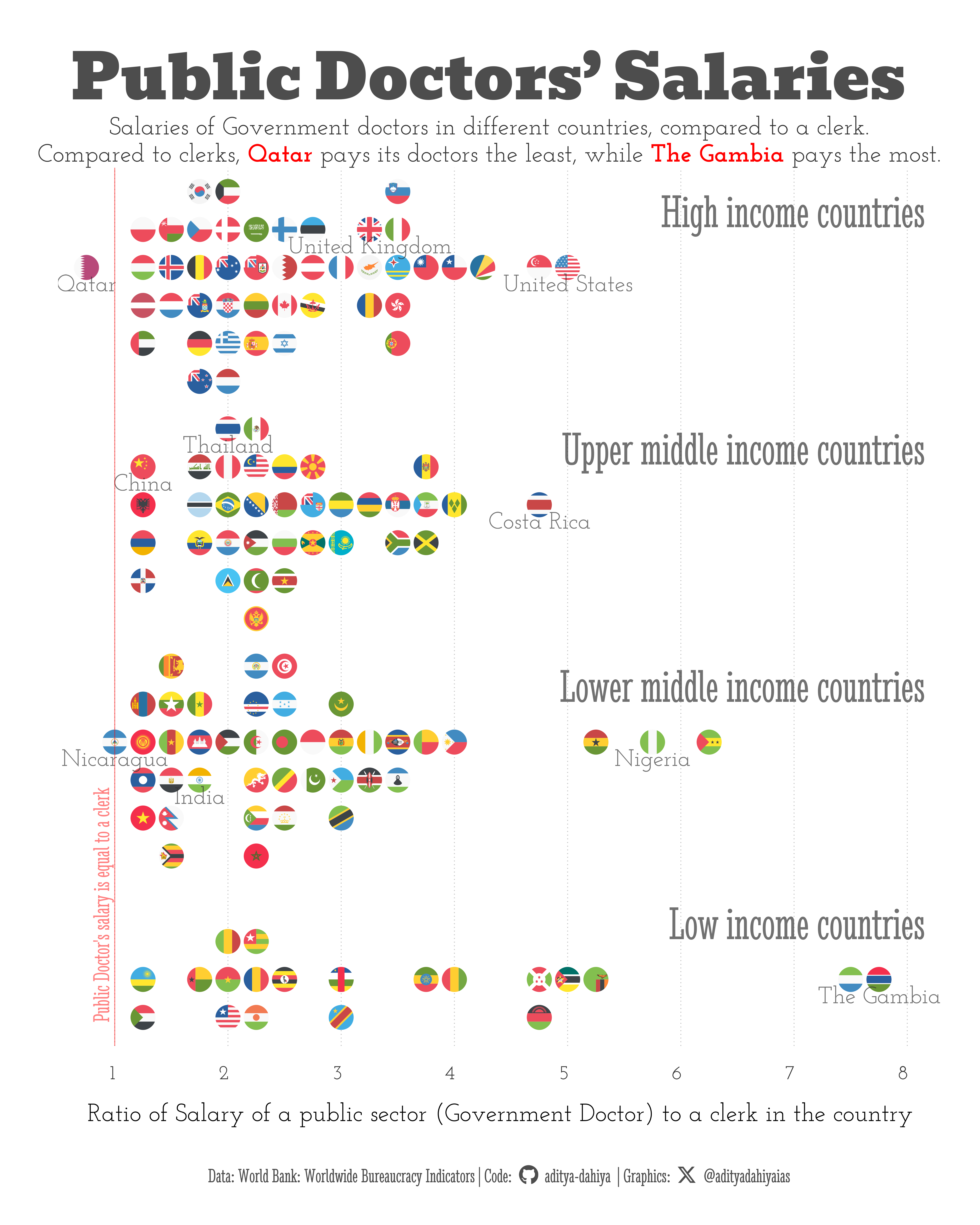
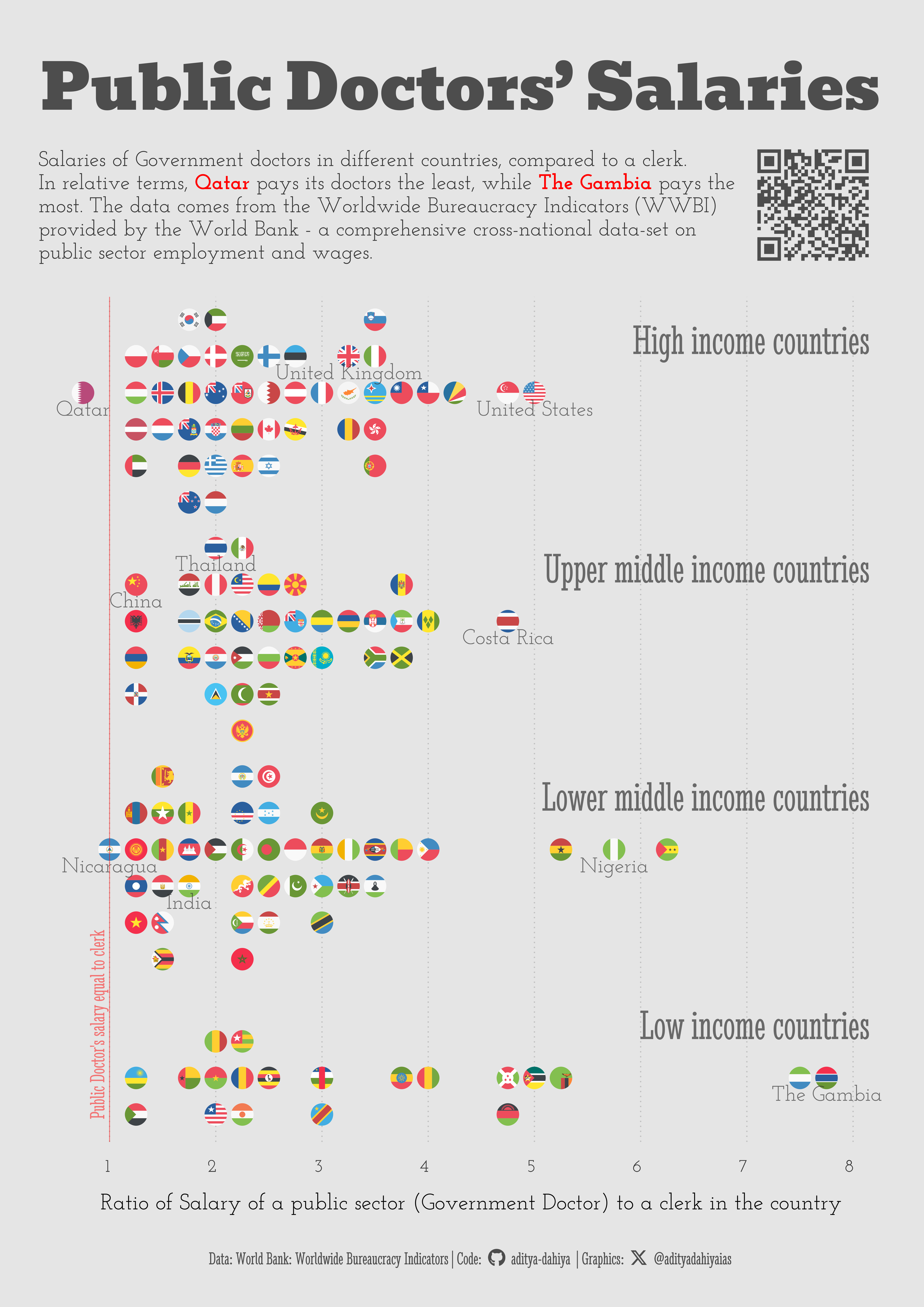
Comparison of the salaries of the Government Doctors in different countries
#TidyTuesday
Governance
Public Health
A4 Size Viz
Author
Aditya Dahiya
Published
April 30, 2024
For these visualization(s), we are examining the Worldwide Bureaucracy Indicators (WWBI) dataset provided by the World Bank. The WWBI database offers a comprehensive cross-national dataset on public sector employment and wages. Its goal is to bridge an information gap, aiding researchers, development practitioners, and policymakers in gaining a deeper insight into various aspects such as the personnel dimensions of state capability, the public sector’s role within the labor market, and the fiscal implications of the public sector wage bill. The dataset is compiled from administrative data and household surveys, complementing existing expert perception-based approaches.
How I made this graphic?
Loading required libraries, data import & creating custom functions
Code
# Data Import and Wrangling Toolslibrary(tidyverse) # All things tidylibrary(janitor) # Cleaning names etc.# Final plot toolslibrary(scales) # Nice Scales for ggplot2library(fontawesome) # Icons display in ggplot2library(ggtext) # Markdown text support for ggplot2library(showtext) # Display fonts in ggplot2library(colorspace) # Lighten and Darken colourslibrary(patchwork) # Combining plotslibrary(ggbeeswarm) # For beeswarm plots# library(ggfx) # Outer glow in the map# library(magick) # Adding images to plot# library(ggthemes) # Themes for ggplot2# # # Mapping tools# library(rnaturalearth) # Maps of the World # library(sf) # All spatial objects in R# library(geojsonio) # To read geojson files into R# Load Datawwbi_data <- readr::read_csv('https://raw.githubusercontent.com/rfordatascience/tidytuesday/master/data/2024/2024-04-30/wwbi_data.csv')wwbi_series <- readr::read_csv('https://raw.githubusercontent.com/rfordatascience/tidytuesday/master/data/2024/2024-04-30/wwbi_series.csv')wwbi_country <- readr::read_csv('https://raw.githubusercontent.com/rfordatascience/tidytuesday/master/data/2024/2024-04-30/wwbi_country.csv')
Exploratory Data Analysis & Data Wrangling
Code
# The indicator we want to display is Public Doctors salaryselected_indicator <- wwbi_series |>filter(str_detect(indicator_name, "Pay compression ratio in public sector, by occupation: Hospital doctor")) |>select(indicator_code) |>pull(indicator_code)# Names of Countries to display in the graphicdisplay_countries <-c("India", "United States", "China", "United Kingdom", "United States", "Nigeria", "Qatar", "Costa Rica", "Thailand","Nicaragua", "The Gambia")df <- wwbi_data |>filter(indicator_code == selected_indicator) |>left_join( wwbi_country |>select(country_code, short_name, code2 = x2_alpha_code, region, income_group) |>mutate(code2 =str_to_lower(code2)) ) |>left_join(wwbi_series) |>select(-indicator_code) |>mutate(display_name =if_else( short_name %in% display_countries, short_name,NA ) )# List of countries with flags in ggflagsflag_cons <- ggflags::lflags |>names()# Creating a custom y-axis variable and an interval x-axis variable to plot flagslevels_income <-c("Low income","Lower middle income","Upper middle income","High income" )# An intermediate stepdf1 <- df |>select(-indicator_name) |>filter(code2 %in% flag_cons) |># Roudning to make it easier to plot flags nicelymutate(value =round_to_fraction(value, 4)) |>mutate(income_group =fct(income_group, levels = levels_income))df2 <- df1 |>group_by(income_group, value) |>slice_head(n =6) |># Geting number of countries in each intervalcount() |>rename(gp_nos = n)
Manually positioning in a sort-of bee-swarm:
I have a vector c(1,2,3,4,5,6). I want to convert it into c(0.08, -0.08, 0.24, 0.24, 0.4, -0.4). You can achieve this transformation manually for now.
Code
# A position multiplication Factor (to manually create a beeswarm)position_vector <-seq(-0.4, +0.4, length.out =6)position_vectorplotdf <- df1 |>left_join(df2) |>group_by(income_group, value) |>arrange(income_group, value) |>mutate(group_num =row_number()) |>mutate(y_jizz =case_when( group_num ==1~+0.08, group_num ==2~-0.08, group_num ==3~+0.24, group_num ==4~-0.24, group_num ==5~+0.40, group_num ==6~-0.40, )) |>mutate(y_var =as.numeric(income_group) + y_jizz)# Labelling income groups - a tibbledf_labels <-tibble(x_var =8.5,y_var = (1:4+0.25),label =paste0(levels_income, " countries"),income_group = levels_income)
Visualization Parameters
Code
# Font for titlesfont_add_google("Bevan",family ="title_font") # Font for the captionfont_add_google("Stint Ultra Condensed",family ="caption_font") # Font for plot textfont_add_google("Josefin Slab",family ="body_font") showtext_auto()# Background Colourbg_col <-"grey90"# Colour for the texttext_col <-"grey20"# Colour for highlighted texttext_hil <-"grey30"# Annotation colourann_col <-"red"# Caption stuff for the plotsysfonts::font_add(family ="Font Awesome 6 Brands",regular = here::here("docs", "Font Awesome 6 Brands-Regular-400.otf"))github <-""github_username <-"aditya-dahiya"xtwitter <-""xtwitter_username <-"@adityadahiyaias"social_caption_1 <- glue::glue("<span style='font-family:\"Font Awesome 6 Brands\";'>{github};</span> <span style='color: {text_hil}'>{github_username} </span>")social_caption_2 <- glue::glue("<span style='font-family:\"Font Awesome 6 Brands\";'>{xtwitter};</span> <span style='color: {text_hil}'>{xtwitter_username}</span>")
Annotation Text for the Plot
Code
plot_title <-"Public Doctors' Salaries"plot_caption <-paste0("Data: **World Bank:** Worldwide Bureaucracy Indicators", " | **Code:** ", social_caption_1, " | **Graphics:** ", social_caption_2 )plot_subtitle <- glue::glue("Salaries of Government doctors in different countries, compared to a clerk.<br>Compared to clerks, <b style='color:{ann_col}'>Qatar</b> pays its doctors the least, while <b style='color:{ann_col}'>The Gambia</b> pays the most.")
Previous Plot / Graphic attempt - using geom_beeswarm() - it doesn’t work for geom_flag()
Code
ts =80g_base <-ggplot(data = df |>filter(!is.na(income_group)),mapping =aes(x = value,y = income_group,colour = income_group,fill = income_group) ) +# Actual points for the Countriesgeom_point(size =8,pch =1,stroke =1,position =position_beeswarm(cex =2.5,method ="hex",priority ="density",corral ="omit",corral.width =1.2 ),alpha =0.4 ) +scale_x_continuous(limits =c(0, 8),breaks =c(2,3,4,6,7,8) ) +# Labels for the countries and their valuesgeom_text(aes(label = display_name ),position =position_beeswarm(cex =2.5,method ="hex",priority ="density",corral ="omit",corral.width =1.2 ),lineheight =0.35,size = ts /5 ) +# Basic annotations for the backgroundannotate(geom ="text",label ="Public Doctor's salary is equal to a clerk",x =0.95, y =4.5,angle =90,hjust =1,vjust =0,colour = ann_col,alpha =0.5,family ="caption_font",size = ts /3 ) +geom_vline(xintercept =1,colour = ann_col,linetype =1,linewidth =0.5,alpha =0.5 ) +annotate(geom ="text",label ="Public Doctor's salary is 4 times that of a clerk",x =5.05, y =4.5,angle =-90,hjust =0,vjust =0,colour = ann_col,alpha =0.5,family ="caption_font",size = ts /3 ) +geom_vline(xintercept =5,colour = ann_col,linetype =1,linewidth =0.5,alpha =0.5 ) +geom_text(aes(label =paste0(income_group, " countries"),x =8.5 ),hjust ="inward",nudge_y =+0.2,family ="caption_font",size = ts/1.5 ) +# Labelslabs(x ="Ratio of Salary of a public sector (Government Doctor) to a clerk in the country",y =NULL,title = plot_title,subtitle = plot_subtitle,caption = plot_caption ) +# Themeing customizationtheme_minimal(base_family ="body_font",base_size = ts ) +theme(panel.grid.major.y =element_blank(),panel.grid.minor.y =element_blank(),legend.position ="none",panel.grid.minor.x =element_blank(),plot.caption =element_textbox(family ="caption_font",colour = text_hil,hjust =0.5 ),plot.title =element_markdown(family ="title_font",colour = text_hil,hjust =0.5,size =3*ts ),plot.subtitle =element_markdown(family ="body_font",colour = text_col,hjust =0.5,lineheight =0.35 ),panel.grid.major.x =element_line(linetype =3,linewidth =0.5,colour ="grey75" ),axis.text.y =element_blank(),axis.ticks =element_blank(),axis.text.x =element_text(colour = text_col,hjust =1, margin =margin(0,0,0,0,"mm") ),plot.title.position ="plot" )# # geom_flag(# mapping = aes(country = code2),# size = 4,# # pch = 1,# position = position_beeswarm(# cex = 3,# method = "hex",# priority = "density",# corral = "omit",# corral.width = 1.2# )# )# # # # # # # An example label in markdown: Not to use for now# label = glue::glue("<span style='font-size:9pt; color:black'>{short_name}</span><br><span style='color:{text_col}'>{value}</span>")
The Actual Base Plot / Graphic
Code
ts =90g_base <-ggplot(data = plotdf,mapping =aes(x = value,y = y_var,colour = income_group) ) +# Points for countries ggflags::geom_flag(aes(country = code2),size =12 ) +# while building plot, I use geom_point() as a replacement# to geom_flag to save plot rendering time# geom_point(# size = 8# ) +scale_x_continuous(limits =c(0.5, 8.3),breaks =1:8,expand =expansion(0) ) +scale_y_continuous(limits =c(0.8, 4.5),expand =expansion(0) ) +# Labels for the countries and their valuesgeom_text(aes(label = display_name, y = y_var -0.1),lineheight =0.35,size = ts /3,vjust =0,colour = text_col,alpha =0.7,family ="body_font" ) +# Basic annotations for the backgroundannotate(geom ="text",label ="Public Doctor's salary equal to clerk",x =0.95, y =0.9,angle =90,hjust =0,vjust =0,colour = ann_col,alpha =0.5,family ="caption_font",size = ts /3 ) +geom_vline(xintercept =1,colour = ann_col,linetype =1,linewidth =0.5,alpha =0.5 ) +# annotate(# geom = "text",# label = "Public Doctor's salary is 4 times that of a clerk",# x = 5.05, # y = 4.5,# angle = -90,# hjust = 0,# vjust = 0,# colour = ann_col,# alpha = 0.5,# family = "caption_font",# size = ts / 3# ) +# geom_vline(# xintercept = 5,# colour = ann_col,# linetype = 1,# linewidth = 0.5,# alpha = 0.5# ) +# Names / Labels for the income groupsgeom_text(data = df_labels,mapping =aes(x =8.15,y = y_var,label = label ),hjust ="inward",vjust =0,family ="caption_font",size = ts /1.5,colour = text_col,alpha =0.7 ) +# Labelslabs(x ="Ratio of Salary of a public sector (Government Doctor) to a clerk in the country",y =NULL,title = plot_title,subtitle = plot_subtitle,caption = plot_caption ) +# Themeing customizationtheme_minimal(base_family ="body_font",base_size = ts ) +theme(panel.grid.major.y =element_blank(),panel.grid.minor.y =element_blank(),legend.position ="none",panel.grid.minor.x =element_blank(),plot.caption =element_textbox(family ="caption_font",colour = text_hil,hjust =0.5 ),plot.title =element_markdown(family ="title_font",colour = text_hil,hjust =0.5,size =2.5* ts,margin =margin(5,0,2,0, "mm") ),plot.subtitle =element_markdown(family ="body_font",colour = text_col,hjust =0.5,lineheight =0.35,margin =margin(0,0,0,0, "mm") ),panel.grid.major.x =element_line(linetype =3,linewidth =0.5,colour ="grey75" ),axis.text.y =element_blank(),axis.title.y =element_blank(),axis.ticks =element_blank(),axis.text.x =element_text(colour = text_col,hjust =1, margin =margin(0,0,0,0,"mm") ),plot.title.position ="plot" )# geom_flag(# mapping = aes(country = code2),# size = 4,# # pch = 1,# position = position_beeswarm(# cex = 3,# method = "hex",# priority = "density",# corral = "omit",# corral.width = 1.2# )# )
Savings the graphics
Code
ggsave(filename = here::here("data_vizs", "tidy_wbi.png"),plot = g_base,width =400, # Best Twitter Aspect Ratio = 4:5height =500, units ="mm",bg ="white")library(magick)# Saving a thumbnail for the webpageimage_read(here::here("data_vizs", "tidy_wbi.png")) |>image_resize(geometry ="400") |>image_write(here::here("data_vizs", "thumbnails", "tidy_wbi.png"))
A4 Inforgraphic, Insets and QR Code
Code
plot_title <-"Public Doctors' Salaries"plot_subtitle <- glue::glue("Salaries of Government doctors in different countries, compared to a clerk.<br>In relative terms, <b style='color:{ann_col}'>Qatar</b> pays its doctors the least, while <b style='color:{ann_col}'>The Gambia</b> pays the<br>most. The data comes from the Worldwide Bureaucracy Indicators (WWBI) <br> provided by the World Bank - a comprehensive cross-national data-set on<br>public sector employment and wages.")g_base <-ggplot(data = plotdf,mapping =aes(x = value,y = y_var,colour = income_group) ) +# Points for countries ggflags::geom_flag(aes(country = code2),size =12 ) +# Scalesscale_x_continuous(limits =c(0.5, 8.3),breaks =1:8,expand =expansion(0) ) +scale_y_continuous(limits =c(0.8, 4.5),expand =expansion(0) ) +# Labels for the countries and their valuesgeom_text(aes(label = display_name, y = y_var -0.1),lineheight =0.35,size = ts /3,vjust =0,colour = text_col,alpha =0.7,family ="body_font" ) +# Basic annotations for the backgroundannotate(geom ="text",label ="Public Doctor's salary equal to clerk",x =0.95, y =0.9,angle =90,hjust =0,vjust =0,colour = ann_col,alpha =0.5,family ="caption_font",size = ts /3 ) +geom_vline(xintercept =1,colour = ann_col,linetype =1,linewidth =0.5,alpha =0.5 ) +# Names / Labels for the income groupsgeom_text(data = df_labels,mapping =aes(x =8.15,y = y_var,label = label ),hjust ="inward",vjust =0,family ="caption_font",size = ts /1.5,colour = text_col,alpha =0.7 ) +# Labelslabs(x ="Ratio of Salary of a public sector (Government Doctor) to a clerk in the country",y =NULL,title = plot_title,subtitle = plot_subtitle,caption = plot_caption ) +# Themeing customizationtheme_minimal(base_family ="body_font",base_size = ts ) +theme(panel.grid.major.y =element_blank(),panel.grid.minor.y =element_blank(),legend.position ="none",panel.grid.minor.x =element_blank(),plot.caption =element_textbox(family ="caption_font",colour = text_hil,hjust =0.5 ),plot.title =element_markdown(family ="title_font",colour = text_hil,hjust =0.5,size =2.8* ts,margin =margin(10,0,10,0, "mm") ),plot.subtitle =element_markdown(family ="body_font",colour = text_col,hjust =0,lineheight =0.35,margin =margin(3,100,15,0, "mm"),size =0.95* ts ),panel.grid.major.x =element_line(linetype =3,linewidth =0.75,colour ="grey75" ),axis.text.y =element_blank(),axis.title.y =element_blank(),axis.ticks =element_blank(),axis.text.x =element_text(colour = text_col,hjust =1, margin =margin(0,0,0,0,"mm") ),plot.title.position ="plot" )# Text Inset (Description of the Dataset)# QR Code for the ploturl_graphics <-paste0("https://aditya-dahiya.github.io/projects_presentations/data_vizs/",# The file name of the current .qmd file"tidy_wbi", ".html")#plot_qr <-ggplot(data =NULL, aes(x =0, y =0, label = url_graphics) ) + ggqr::geom_qr(colour = text_hil, fill = bg_col,size =2 ) +coord_fixed() +theme_void() +theme(plot.background =element_rect(fill =NA, colour =NA ) )g <- g_base +inset_element(p = plot_qr,left =0.75, right =1.08,bottom =1, top =1.2,align_to ="plot" ) +plot_annotation(theme =theme(plot.background =element_rect(fill ="transparent",colour ="transparent" ) ) )# A4 infographic Versionggsave(filename = here::here("data_vizs", "a4_tidy_wbi.png"),plot = g,width =210*2, # Best Twitter Aspect Ratio = 4:5height =297*2, units ="mm",bg = bg_col)
The A4-sized Info-graphic
Info-graphics for comparison of different job-pairs:
Code
sel_names <- wwbi_series |>filter(str_detect(indicator_name, "Pay compression ratio in public sector, by occupation:")) |>mutate(indicator_name =str_remove( indicator_name,"Pay compression ratio in public sector, by occupation: " ) ) |>mutate(indicator_name =str_remove( indicator_name," \\(clerk as reference\\)" ) )xdf1 <- wwbi_data |>filter(indicator_code %in% sel_names$indicator_code) |>left_join(sel_names) |>select(country_code, indicator_name, value)xdf1library(GGally)xdf2 <- xdf1 |>pivot_wider(id_cols = country_code,names_from = indicator_name,values_from = value )# GGally::ggpairs(# data = xdf2,# columns = 2:ncol(plotdf)# ) +# coord_fixed()# Identified Combinations# Doctors vs. Nurses# Judges vs. Senior Officers
Government Salaries: Doctors vs. Nurses
Code
# List of countries with flags in ggflagsflag_cons <- ggflags::lflags |>names()bg_col <-"white"# Background Colourmyfill <-c("#006aff","#ff9900") # Various fill coloursmycol <-"blue"# Various colours for annotations # Important Countries to displaydisplay_cons <-c("India", "United States", "China","United Kingdom", "Pakistan","Qatar", "Thailand","Australia", "Chile", "Ethiopia" )# Plot rectangles for backgroundrectangle1 <-tibble(x =c(0, 0, 1, 1, 0),y =c(0, 1, 1, 0, 0))rectangle2 <-tibble(x =c(0, 1, 1, 0, 0),y =c(1, 1, 5, 5, 1))# Text for the Plotplot_title <-"Govt. Salaries : Doctors vs. Nurses"plot_caption <-paste0("Data: **World Bank (2017):** Worldwide Bureaucracy Indicators", " | **Code:** ", social_caption_1, " | **Graphics:** ", social_caption_2 )plot_subtitle <- glue::glue("In every country, public-sector doctors are paid more than nurses, and in <b style='color:{mycol}'>some countries</b>,<br>doctors get more than twice. This graph compares their salaries relative to those of clerks<br>in the same country. Countries further away from the diagonal line have a bigger wage<br>gap between doctors and nurses. Those countries higher up along the diagonal line pay<br>both doctors and nurses much more than they pay their clerks. The number in brackets<br>is ratio of doctors to nurses’ salaries.")# Base Test Sizets =80# Drop some overplotted countriescn_to_drop <-c("tc", "iq", "dk", "sk", "ec","ps", "by", "es", "eg", "gw","ky", "bt")# Getting final data-set readyplotdf <- xdf1 |>filter(str_detect(indicator_name, "Hospital")) |>mutate(indicator_name = snakecase::to_snake_case(indicator_name)) |>pivot_wider(id_cols = country_code,names_from = indicator_name,values_from = value ) |>mutate(display_ratio =round(hospital_doctor / hospital_nurse, 1) ) |>left_join( wwbi_country |>select(country_code, short_name,code2 = x2_alpha_code) ) |>mutate(code2 =str_to_lower(code2)) |>filter(code2 %in% flag_cons) |>mutate(size_var =if_else( short_name %in% display_cons,24,12) ) |>arrange(desc(size_var), hospital_doctor) |>mutate(col_var =if_else( display_ratio >2.1,"a","b" )) |>filter(hospital_doctor <4.2) |>filter(!(code2 %in% cn_to_drop))# Checking overplotted countries# plotdf |> # ggplot(aes(x = hospital_nurse, y = hospital_doctor,# label = code2)) + # geom_text(alpha = 0.5) +# coord_fixed(xlim = c(1, 2),# ylim = c(1.5, 2.5))# The actual graphic -------------------------------------------g_base <- plotdf |>ggplot(mapping =aes(x = hospital_nurse,y = hospital_doctor ) ) +# Annotations --------------------------------------geom_abline(slope =1,colour = text_col,alpha =0.5,linewidth =1 ) +annotate(geom ="text",x =3.3, y =3.33,hjust =1, vjust =0,label ="Line of equality: Doctors and Nurses get paid equally",angle =45,size =24, family ="body_font",colour = text_col ) +annotate(geom ="text",x =1.03, y =0.8,hjust =0, vjust =1,label =str_wrap("Countries in the light-blue rectangle pay doctors and nurses less than clerks.", 30),lineheight =0.25,angle =0,size =24, family ="body_font",colour = myfill[1] |>darken(0.4) ) +annotate(geom ="text",x =0.23, y =4,hjust =1, vjust =1,label =str_wrap("Countries in the light-orange rectangle pay their nurses less than clerks, but doctors more than clerks.", 80),lineheight =0.25,angle =90,size =24, family ="body_font",colour = myfill[2] |>darken(0.4) ) +# Rectangles for the backgroundgeom_polygon(data = rectangle1, aes(x = x, y = y), fill = myfill[1], color ="transparent",alpha =0.25 ) +geom_polygon(data = rectangle2, aes(x = x, y = y), fill = myfill[2], color ="transparent",alpha =0.25 ) +# The actual data to be plotted ggflags::geom_flag(mapping =aes(country = code2 ),size =10 ) +# During trials, used geom_point instead of geom_flag# geom_point(# alpha = 0.2,# size = 5,# pch = 16# ) +# Names of Countries and Ratiogeom_text(mapping =aes(label =paste0(short_name, "\n(", display_ratio, ")"),size = size_var,colour = col_var ),nudge_y =-0.04,family ="body_font",check_overlap =TRUE,lineheight =0.25,vjust =1 ) +scale_size_identity() +scale_colour_manual(values =c(mycol, text_col)) +# Scales and Coordinatescoord_fixed(ylim =c(0.5, 4.2),xlim =c(0.2, 3.6) ) +scale_y_continuous(breaks =1:4,expand =expansion(0) ) +scale_x_continuous(breaks =1:3,expand =expansion(0) ) +# Lableslabs(x ="Public Nurses' Salary (times that of a clerk)",y ="Public Doctors' Salary (times that of a clerk)",title = plot_title,subtitle = plot_subtitle,caption = plot_caption ) +# Themeing customizationtheme_minimal(base_family ="body_font",base_size = ts ) +theme(panel.grid.minor.y =element_blank(),legend.position ="none",panel.grid.minor.x =element_blank(),plot.caption =element_textbox(family ="caption_font",colour = text_hil,hjust =1 ),plot.title =element_markdown(family ="title_font",colour = text_hil,hjust =0,size =2.3* ts,margin =margin(10,0,5,0, "mm") ),plot.subtitle =element_markdown(family ="body_font",colour = text_col,hjust =0,lineheight =0.35,margin =margin(0,0,10,0, "mm") ),panel.grid.major =element_line(linetype =3,linewidth =0.5,colour ="grey75" ),axis.ticks =element_line(colour = text_col,linewidth =0.75 ),axis.title =element_text(colour = text_col,hjust =1,margin =margin(0,0,0,0, "mm"),size =1.5* ts ),axis.text =element_text(colour = text_col,hjust =1, size = ts,margin =margin(0,0,0,0,"mm") ),axis.line =element_line(linetype =1,colour = text_col,linewidth =0.75,arrow =arrow() ),plot.title.position ="plot" )# Saving the plotggsave(filename = here::here("data_vizs", "tidy_wbi_doctors_nurses.png"),plot = g_base,width =210*2, # Best Twitter Aspect Ratio = 4:5height =297*2, units ="mm",bg = bg_col)
A scatterplot comparing the salaries of Doctors and Nurses in the public sector in different countries. Every country pays doctors more than nurses, but some pay doctors much more than their nurses.