Comparison of the salaries of the Government Doctors and Nurses across the Globe
#TidyTuesday
Governance
Public Health
A4 Size Viz
Author
Aditya Dahiya
Published
May 12, 2024
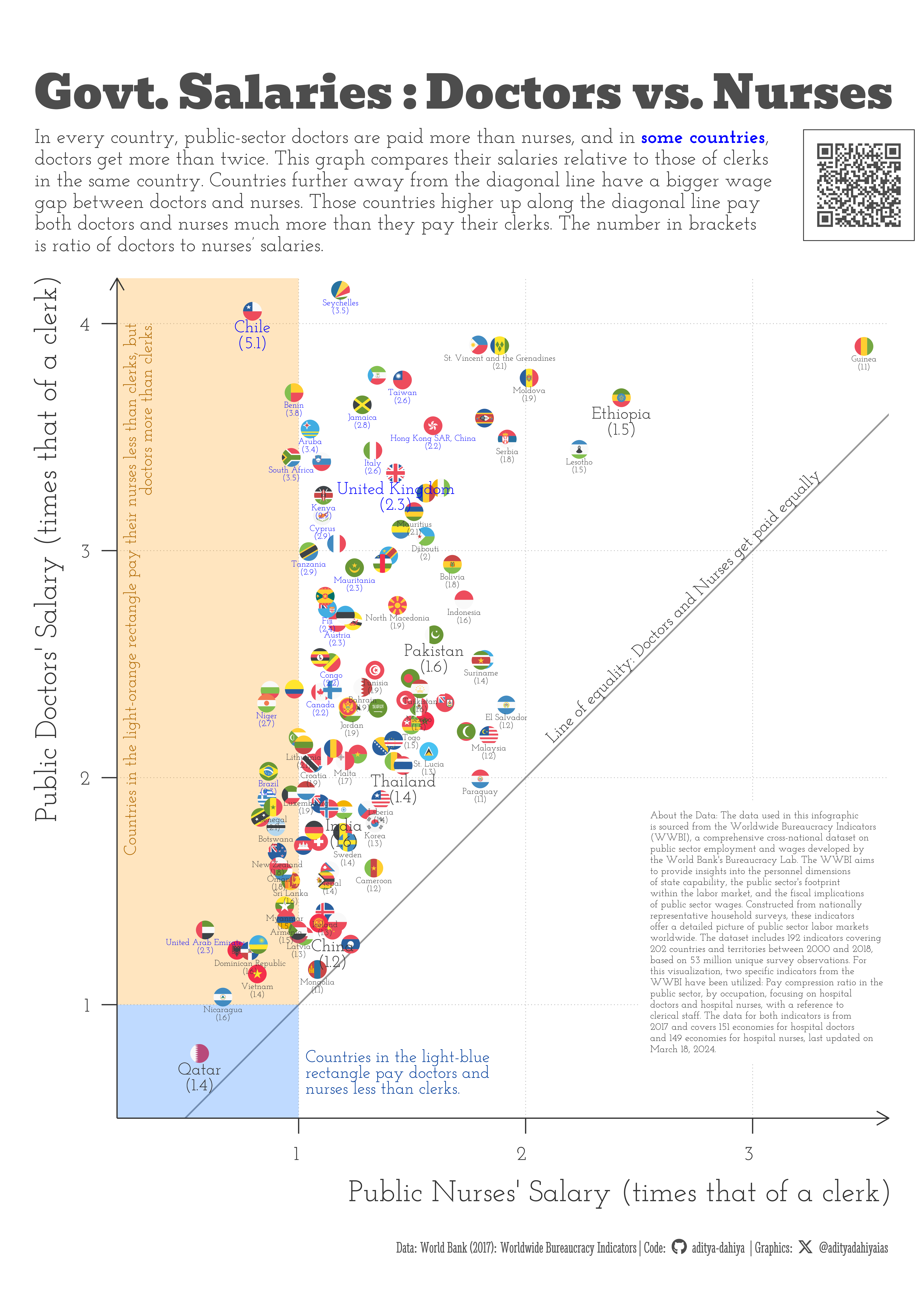
The data used in this infographic is sourced from the Worldwide Bureaucracy Indicators (WWBI), a comprehensive cross-national dataset on public sector employment and wages developed by the World Bank’s Bureaucracy Lab. The WWBI aims to provide insights into the personnel dimensions of state capability, the public sector’s footprint within the labor market, and the fiscal implications of public sector wages. Constructed from nationally representative household surveys, these indicators offer a detailed picture of public sector labor markets worldwide. The dataset includes 192 indicators covering 202 countries and territories between 2000 and 2018, based on 53 million unique survey observations. For this visualization, two specific indicators from the WWBI have been utilized: Pay compression ratio in the public sector, by occupation, focusing on hospital doctors and hospital nurses, with a reference to clerical staff. The data for both indicators is from 2017 and covers 151 economies for hospital doctors and 149 economies for hospital nurses, last updated on March 18, 2024.
A scatterplot comparing the salaries of Doctors and Nurses in the public sector in different countries. Every country pays doctors more than nurses, but some pay doctors much more than their nurses.
How I made this graphic?
Loading required libraries, data import & creating custom functions
Code
# Data Import and Wrangling Toolslibrary(tidyverse) # All things tidylibrary(janitor) # Cleaning names etc.# Final plot toolslibrary(scales) # Nice Scales for ggplot2library(fontawesome) # Icons display in ggplot2library(ggtext) # Markdown text support for ggplot2library(showtext) # Display fonts in ggplot2library(colorspace) # Lighten and Darken colourslibrary(patchwork) # Combining plotslibrary(ggbeeswarm) # For beeswarm plots# library(ggfx) # Outer glow in the map# library(magick) # Adding images to plot# library(ggthemes) # Themes for ggplot2# # # Mapping tools# library(rnaturalearth) # Maps of the World # library(sf) # All spatial objects in R# library(geojsonio) # To read geojson files into R# Load Datawwbi_data <- readr::read_csv('https://raw.githubusercontent.com/rfordatascience/tidytuesday/master/data/2024/2024-04-30/wwbi_data.csv')wwbi_series <- readr::read_csv('https://raw.githubusercontent.com/rfordatascience/tidytuesday/master/data/2024/2024-04-30/wwbi_series.csv')wwbi_country <- readr::read_csv('https://raw.githubusercontent.com/rfordatascience/tidytuesday/master/data/2024/2024-04-30/wwbi_country.csv')
Visualization Parameters
Code
# Font for titlesfont_add_google("Bevan",family ="title_font") # Font for the captionfont_add_google("Stint Ultra Condensed",family ="caption_font") # Font for plot textfont_add_google("Josefin Slab",family ="body_font") showtext_auto()# Background Colourbg_col <-"grey90"# Colour for the texttext_col <-"grey20"# Colour for highlighted texttext_hil <-"grey30"# Annotation colourann_col <-"red"# Caption stuff for the plotsysfonts::font_add(family ="Font Awesome 6 Brands",regular = here::here("docs", "Font Awesome 6 Brands-Regular-400.otf"))github <-""github_username <-"aditya-dahiya"xtwitter <-""xtwitter_username <-"@adityadahiyaias"social_caption_1 <- glue::glue("<span style='font-family:\"Font Awesome 6 Brands\";'>{github};</span> <span style='color: {text_hil}'>{github_username} </span>")social_caption_2 <- glue::glue("<span style='font-family:\"Font Awesome 6 Brands\";'>{xtwitter};</span> <span style='color: {text_hil}'>{xtwitter_username}</span>")
Code to generate info-graphics for comparison of different job-pairs:
Code
sel_names <- wwbi_series |>filter(str_detect(indicator_name, "Pay compression ratio in public sector, by occupation:")) |>mutate(indicator_name =str_remove( indicator_name,"Pay compression ratio in public sector, by occupation: " ) ) |>mutate(indicator_name =str_remove( indicator_name," \\(clerk as reference\\)" ) )sel_names[3,1]xdf1 <- wwbi_data |>filter(indicator_code %in% sel_names$indicator_code) |>left_join(sel_names) |>select(country_code, indicator_name, value)xdf1library(GGally)xdf2 <- xdf1 |>pivot_wider(id_cols = country_code,names_from = indicator_name,values_from = value )# GGally::ggpairs(# data = xdf2,# columns = 2:ncol(plotdf)# ) +# coord_fixed()# Identified Combinations# Doctors vs. Nurses# Judges vs. Senior Officers
Government Salaries: Doctors vs. Nurses
Code
# List of countries with flags in ggflagsflag_cons <- ggflags::lflags |>names()bg_col <-"white"# Background Colourmyfill <-c("#006aff","#ff9900") # Various fill coloursmycol <-"blue"# Various colours for annotations # Important Countries to displaydisplay_cons <-c("India", "United States", "China","United Kingdom", "Pakistan","Qatar", "Thailand","Australia", "Chile", "Ethiopia" )# Plot rectangles for backgroundrectangle1 <-tibble(x =c(0, 0, 1, 1, 0),y =c(0, 1, 1, 0, 0))rectangle2 <-tibble(x =c(0, 1, 1, 0, 0),y =c(1, 1, 5, 5, 1))# Text for the Plotplot_title <-"Govt. Salaries : Doctors vs. Nurses"plot_caption <-paste0("Data: **World Bank (2017):** Worldwide Bureaucracy Indicators", " | **Code:** ", social_caption_1, " | **Graphics:** ", social_caption_2 )plot_subtitle <- glue::glue("In every country, public-sector doctors are paid more than nurses, and in <b style='color:{mycol}'>some countries</b>,<br>doctors get more than twice. This graph compares their salaries relative to those of clerks<br>in the same country. Countries further away from the diagonal line have a bigger wage<br>gap between doctors and nurses. Those countries higher up along the diagonal line pay<br>both doctors and nurses much more than they pay their clerks. The number in brackets<br>is ratio of doctors to nurses’ salaries.")# Base Test Sizets =80# Drop some overplotted countriescn_to_drop <-c("tc", "iq", "dk", "sk", "ec","ps", "by", "es", "eg", "gw","ky", "bt")# Getting final data-set readyplotdf <- xdf1 |>filter(str_detect(indicator_name, "Hospital")) |>mutate(indicator_name = snakecase::to_snake_case(indicator_name)) |>pivot_wider(id_cols = country_code,names_from = indicator_name,values_from = value ) |>mutate(display_ratio =round(hospital_doctor / hospital_nurse, 1) ) |>left_join( wwbi_country |>select(country_code, short_name,code2 = x2_alpha_code) ) |>mutate(code2 =str_to_lower(code2)) |>filter(code2 %in% flag_cons) |>mutate(size_var =if_else( short_name %in% display_cons,24,12) ) |>arrange(desc(size_var), hospital_doctor) |>mutate(col_var =if_else( display_ratio >2.1,"a","b" )) |>filter(hospital_doctor <4.2) |>filter(!(code2 %in% cn_to_drop))# Checking overplotted countries# plotdf |> # ggplot(aes(x = hospital_nurse, y = hospital_doctor,# label = code2)) + # geom_text(alpha = 0.5) +# coord_fixed(xlim = c(1, 2),# ylim = c(1.5, 2.5))# The actual graphic -------------------------------------------g_base <- plotdf |>ggplot(mapping =aes(x = hospital_nurse,y = hospital_doctor ) ) +# Annotations --------------------------------------geom_abline(slope =1,colour = text_col,alpha =0.5,linewidth =1 ) +annotate(geom ="text",x =3.3, y =3.33,hjust =1, vjust =0,label ="Line of equality: Doctors and Nurses get paid equally",angle =45,size =24, family ="body_font",colour = text_col ) +annotate(geom ="text",x =1.03, y =0.8,hjust =0, vjust =1,label =str_wrap("Countries in the light-blue rectangle pay doctors and nurses less than clerks.", 30),lineheight =0.25,angle =0,size =24, family ="body_font",colour = myfill[1] |>darken(0.4) ) +annotate(geom ="text",x =0.23, y =4,hjust =1, vjust =1,label =str_wrap("Countries in the light-orange rectangle pay their nurses less than clerks, but doctors more than clerks.", 80),lineheight =0.25,angle =90,size =24, family ="body_font",colour = myfill[2] |>darken(0.4) ) +# Rectangles for the backgroundgeom_polygon(data = rectangle1, aes(x = x, y = y), fill = myfill[1], color ="transparent",alpha =0.25 ) +geom_polygon(data = rectangle2, aes(x = x, y = y), fill = myfill[2], color ="transparent",alpha =0.25 ) +# The actual data to be plotted ggflags::geom_flag(mapping =aes(country = code2 ),size =10 ) +# During trials, used geom_point instead of geom_flag# geom_point(# alpha = 0.2,# size = 5,# pch = 16# ) +# Names of Countries and Ratiogeom_text(mapping =aes(label =paste0(short_name, "\n(", display_ratio, ")"),size = size_var,colour = col_var ),nudge_y =-0.04,family ="body_font",check_overlap =TRUE,lineheight =0.25,vjust =1 ) +scale_size_identity() +scale_colour_manual(values =c(mycol, text_col)) +# Scales and Coordinatescoord_fixed(ylim =c(0.5, 4.2),xlim =c(0.2, 3.6) ) +scale_y_continuous(breaks =1:4,expand =expansion(0) ) +scale_x_continuous(breaks =1:3,expand =expansion(0) ) +# Lableslabs(x ="Public Nurses' Salary (times that of a clerk)",y ="Public Doctors' Salary (times that of a clerk)",title = plot_title,subtitle = plot_subtitle,caption = plot_caption ) +# Themeing customizationtheme_minimal(base_family ="body_font",base_size = ts ) +theme(panel.grid.minor.y =element_blank(),legend.position ="none",panel.grid.minor.x =element_blank(),plot.caption =element_textbox(family ="caption_font",colour = text_hil,hjust =1 ),plot.title =element_markdown(family ="title_font",colour = text_hil,hjust =0,size =2.3* ts,margin =margin(10,0,5,0, "mm") ),plot.subtitle =element_markdown(family ="body_font",colour = text_col,hjust =0,lineheight =0.35,margin =margin(0,0,10,0, "mm") ),panel.grid.major =element_line(linetype =3,linewidth =0.5,colour ="grey75" ),axis.ticks =element_line(colour = text_col,linewidth =0.75 ),axis.title =element_text(colour = text_col,hjust =1,margin =margin(0,0,0,0, "mm"),size =1.5* ts ),axis.text =element_text(colour = text_col,hjust =1, size = ts,margin =margin(0,0,0,0,"mm") ),axis.line =element_line(linetype =1,colour = text_col,linewidth =0.75,arrow =arrow() ),plot.title.position ="plot" )
Adding Inset and QR code
Code
inset_text1 <-str_wrap("About the Data: The data used in this infographic is sourced from the Worldwide Bureaucracy Indicators (WWBI), a comprehensive cross-national dataset on public sector employment and wages developed by the World Bank's Bureaucracy Lab. The WWBI aims to provide insights into the personnel dimensions of state capability, the public sector's footprint within the labor market, and the fiscal implications of public sector wages. Constructed from nationally representative household surveys, these indicators offer a detailed picture of public sector labor markets worldwide. The dataset includes 192 indicators covering 202 countries and territories between 2000 and 2018, based on 53 million unique survey observations. For this visualization, two specific indicators from the WWBI have been utilized: Pay compression ratio in the public sector, by occupation, focusing on hospital doctors and hospital nurses, with a reference to clerical staff. The data for both indicators is from 2017 and covers 151 economies for hospital doctors and 149 economies for hospital nurses, last updated on March 18, 2024.", width =55, whitespace_only =FALSE ) |>str_view()# A QR Code for the infographicurl_graphics <-paste0("https://aditya-dahiya.github.io/projects_presentations/data_vizs/",# The file name of the current .qmd file"tidy_wbi_doctors_nurses", ".html")# remotes::install_github('coolbutuseless/ggqr')# library(ggqr)plot_qr <-ggplot(data =NULL, aes(x =0, y =0, label = url_graphics) ) + ggqr::geom_qr(colour = text_hil, fill = bg_col,size =1.5 ) +coord_fixed() +theme_void() +theme(plot.background =element_rect(fill =NA, colour =NA ),panel.background =element_rect(fill =NA,colour = text_col,linewidth =1 ) )# Compiling the plotsg <- g_base +annotate(geom ="label",x =2.5,y =1.9,label = inset_text1,family ="body_font",lineheight =0.3,hjust =0,vjust =1,size =14,colour = text_col,fill = bg_col,label.padding =unit(5, "mm"),label.size =0 ) +inset_element(p = plot_qr,left =0.88, right =1.05,bottom =1.04, top =1.16,align_to ="plot",clip =FALSE ) +plot_annotation(theme =theme(plot.background =element_rect(fill ="transparent",colour ="transparent" ) ) )
Saving the graphic
Code
# Saving the plotggsave(filename = here::here("data_vizs", "a4_tidy_wbi_doctors_nurses.png"),plot = g,width =210*2, # Best Twitter Aspect Ratio = 4:5height =297*2, units ="mm",bg = bg_col)library(magick)# Saving a thumbnail for the webpageimage_read(here::here("data_vizs", "a4_tidy_wbi_doctors_nurses.png")) |>image_resize(geometry ="400") |>image_write(here::here("data_vizs", "thumbnails", "tidy_wbi_doctors_nurses.png"))