Europe’s Energy Pivot: Mapping the Gas Import Revolution
Visualizing the dramatic shift in Russian natural gas dependency across European countries from 2021 to 2023
Chloropleth
Maps
{scatterpie}
Pie Chart
Author
Aditya Dahiya
Published
August 25, 2025
About the Data
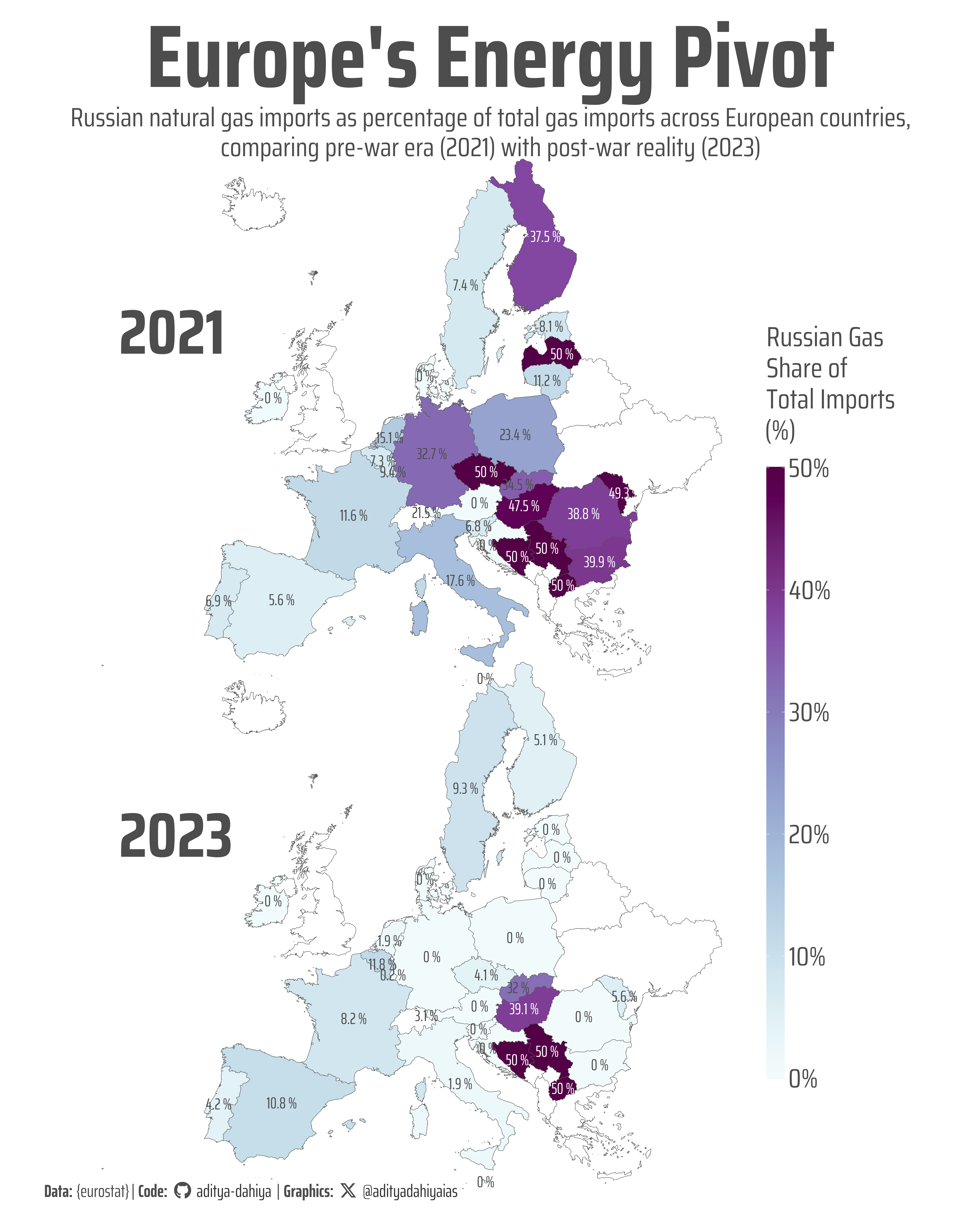
This analysis uses natural gas import data from Eurostat, the official statistical office of the European Union. The dataset (nrg_ti_gas) contains information on natural gas trade imports measured in millions of cubic meters, broken down by importing country and partner country. The visualization compares two critical time periods: 2021, representing the pre-Ukraine War baseline when European energy relationships were still largely intact, and 2023, reflecting the post-invasion reality after Russia’s full-scale attack on Ukraine in February 2022. This temporal comparison reveals the dramatic shift in European energy dependency, showing how individual EU member states reduced their reliance on Russian gas imports following the conflict. The data specifically tracks the percentage share of Russian gas imports relative to total gas imports for each country, illustrating the varying degrees of energy transition and diversification efforts across Europe. Countries like Germany, which historically had high Russian gas dependency through pipelines like Nord Stream, show particularly striking changes between these two periods, while others maintained different import patterns based on their geographic location, existing infrastructure, and policy responses to the crisis.
The Eurostat energy statistics provide comprehensive coverage of EU member states and are considered the authoritative source for European energy trade data, making this analysis particularly valuable for understanding the geopolitical and economic impacts of the Ukraine conflict on European energy security.
Figure 1: This map visualizes the dramatic shift in European natural gas imports from Russia between 2021 (pre-war) and 2023 (post-invasion). Darker purple shades indicate higher percentages of Russian gas dependency, while lighter shades show lower reliance. The comparison reveals how the 2022 Ukraine conflict fundamentally reshaped Europe’s energy landscape, with many countries significantly reducing their Russian gas imports. Percentages displayed on each country show the exact share of total gas imports sourced from Russia.
How I Made This Graphic (1)
The first visualization was created using R and leverages several powerful packages for data manipulation, mapping, and visualization. The foundation begins with {tidyverse} for data wrangling and {eurostat} for directly accessing European statistical data through the get_eurostat() function. The mapping capabilities come from {sf} for spatial operations and {rnaturalearth} for obtaining world map geometries. Geographic data processing involved transforming coordinate reference systems (from WGS84 to EPSG:3035 for proper European projection) and using spatial operations like st_intersection() to crop the world map to European boundaries. The visualization itself was built with {ggplot2} using geom_sf() for mapping polygons and geom_sf_text() for country labels showing percentage values. Typography was enhanced using {showtext} to load custom Google Fonts (Saira family), while {ggtext} enabled markdown formatting in plot elements. Colour palettes were applied using {paletteer} with the “grDevices::Purples” scale, and the final layout used facet_wrap() to create side-by-side comparison panels for 2021 and 2023. The coordinate system was set using coord_sf() with EPSG:3035 projection, optimized for European cartographic display, and the plot was exported using ggsave() with precise dimensions for high-quality output.
Loading required libraries
Code
pacman::p_load( tidyverse, # All things tidy eurostat, # Package for EUROSTAT data rvest, # Package for harvesting web data scales, # Nice Scales for ggplot2 fontawesome, # Icons display in ggplot2 ggtext, # Markdown text support for ggplot2 showtext, # Display fonts in ggplot2 colorspace, # Lighten and Darken colours patchwork, # Composing Plots sf, # Spatial Operations scatterpie # To make pie charts on top of maps)
Visualization Parameters
Code
# Font for titlesfont_add_google("Saira",family ="title_font") # Font for the captionfont_add_google("Saira Condensed",family ="body_font") # Font for plot textfont_add_google("Saira Extra Condensed",family ="caption_font") showtext_auto()# A base Colourbg_col <-"white"seecolor::print_color(bg_col)# Colour for highlighted texttext_hil <-"grey30"seecolor::print_color(text_hil)# Colour for the texttext_col <-"grey30"seecolor::print_color(text_col)line_col <-"grey40"# Custom Colours for dotscustom_dot_colours <- paletteer::paletteer_d("nbapalettes::cavaliers_retro")# Custom size for dotssize_var <-14# Define Base Text Sizebts <-80# Caption stuff for the plotsysfonts::font_add(family ="Font Awesome 6 Brands",regular = here::here("docs", "Font Awesome 6 Brands-Regular-400.otf"))github <-""github_username <-"aditya-dahiya"xtwitter <-""xtwitter_username <-"@adityadahiyaias"social_caption_1 <- glue::glue("<span style='font-family:\"Font Awesome 6 Brands\";'>{github};</span> <span style='color: {text_hil}'>{github_username} </span>")social_caption_2 <- glue::glue("<span style='font-family:\"Font Awesome 6 Brands\";'>{xtwitter};</span> <span style='color: {text_hil}'>{xtwitter_username}</span>")plot_caption <-paste0("**Data:** {eurostat}", " | **Code:** ", social_caption_1, " | **Graphics:** ", social_caption_2 )rm(github, github_username, xtwitter, xtwitter_username, social_caption_1, social_caption_2)# Add text to plot-------------------------------------------------plot_title <-"Europe's Energy Pivot"plot_subtitle <-"Russian natural gas imports as percentage of total gas imports across European countries, comparing pre-war era (2021) with post-war reality (2023)"|>str_wrap(90)str_view(plot_subtitle)
Getting the data and Wrangling
Code
# Example: fetch natural gas import volumes by country and partner# For brevity, this example uses get_eurostat (requires eurostat package) gas_raw <-get_eurostat("nrg_ti_gas", time_format ="num") |> janitor::clean_names()# gas_raw |> # distinct(geo)# # gas_raw |> # distinct(time_period) |> # arrange(desc(time_period))# Compute total and Russian share by country and yeargas_by_country <- gas_raw |>filter( unit =="MIO_M3",# (geo %in% c("AT","DE","FR","IT","PL","ES","SE",# "BG","HU","SK","CZ","RO","SI","RS")# ), time_period %in%c(2021, 2023) ) |>group_by(geo, time_period) |>summarise(total_import =sum(values, na.rm=TRUE),russia_import =sum(values[partner =="RU"], na.rm=TRUE) ) |>ungroup() |>mutate(share_russia = russia_import / total_import) |>left_join(# Convert geo (iso2) to ISO3tibble(geo = countrycode::codelist$iso2c, iso3 = countrycode::codelist$iso3c) |>filter(!is.na(geo), !is.na(iso3) ) )library(rnaturalearth)# Get world map in WGS84 firstworld_map <- rnaturalearth::ne_countries(returnclass ="sf", scale ="large") |>select(iso_a3, name, geometry) |>rename(iso3 = iso_a3) |>mutate(iso3 =if_else( name =="France","FRA", iso3 ) ) |>st_transform("EPSG:3857")# Create bounding box in WGS84 (same CRS as world_map)bbox_polygon <-st_bbox(c(xmin =-25, ymin =33, xmax =40, ymax =70)) |>st_as_sfc() |>st_set_crs("EPSG:4326") |>st_transform("EPSG:3857")# Testing to see Europe and World Map# world_map |> # ggplot() +# geom_sf() +# geom_sf(# data = bbox_polygon,# fill = "red"# ) +# coord_sf(# ylim = c(-80, 80),# default_crs = "EPSG:4326"# )# Crop to Europe first, then transformeurope_map <- world_map |>st_intersection(bbox_polygon) |># Transform after croppingst_transform("EPSG:3035") |># Remove margins non-Europe countriesfilter(!(iso3 %in%c("RUS", "GRL", "TUR", "SYR","JOR", "IRQ", "LBN", "CYP","-99", "ISR", "GEO", "DZA","TUN", "LBY", "MAR")) )# europe_map |> # ggplot() +# geom_sf() +# geom_sf_text(aes(label = iso3))plotdf <- gas_by_country |>left_join(europe_map) |>st_as_sf() |>filter(!is.nan(share_russia))rm(gas_raw, world_map, bbox_polygon)
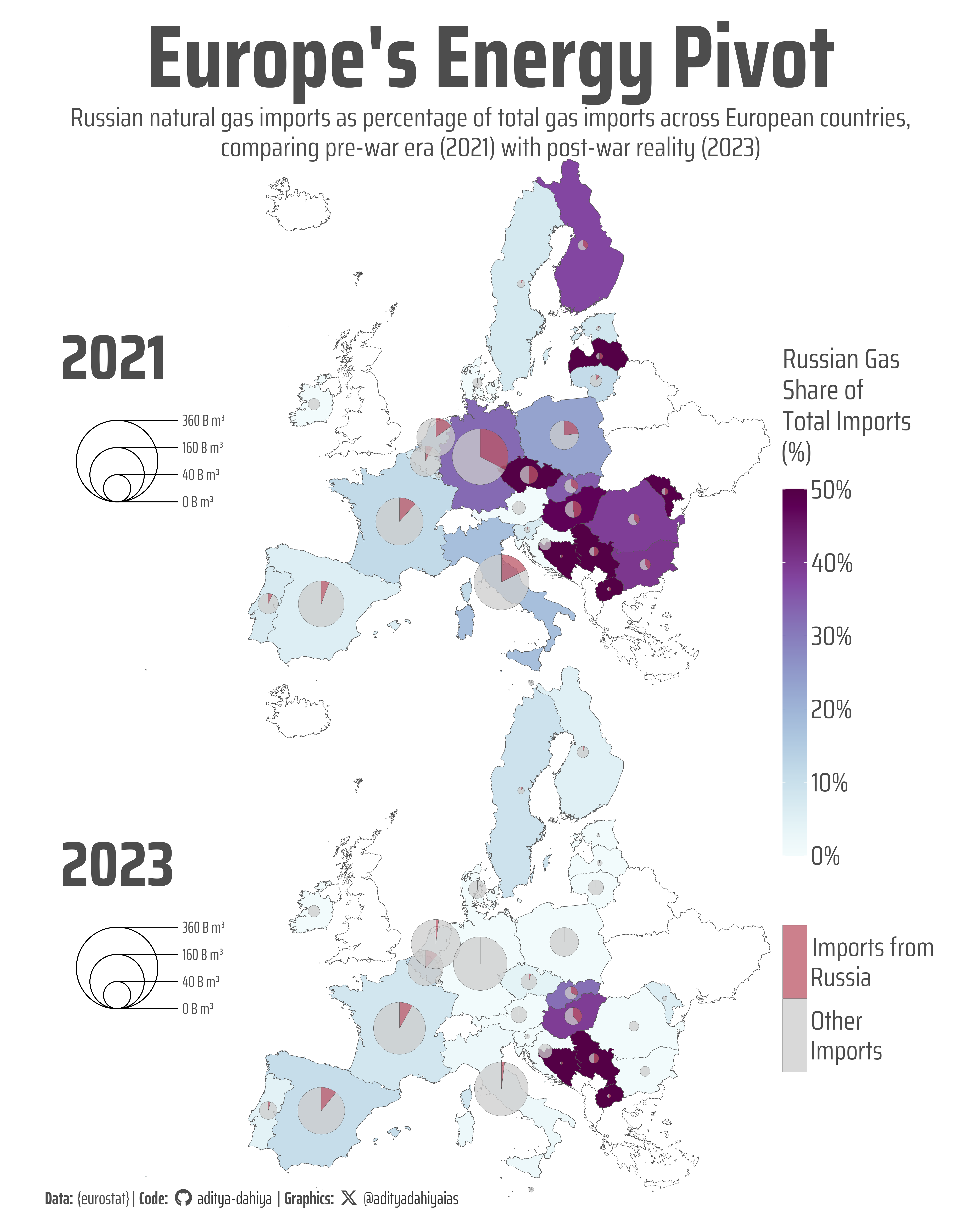
A scatterpie plot of the same Chloropleth (to represent volumes)
This enhanced visualization combines choropleth mapping with scatter pie charts to show both the proportion and absolute volume of European natural gas imports. The technical foundation remained similar to the first version, using R with {tidyverse}, {eurostat}, and {sf} for data manipulation and spatial operations. However, this iteration introduced the {scatterpie} package as the key innovation, allowing pie charts to be overlaid on the map at each country’s centroid. The process involved several critical steps: first, extracting country centroids using st_centroid() and st_coordinates() to position the pie charts accurately; second, calculating a scaling factor to make pie chart sizes proportional to total import volumes using sqrt(total_import) * scale_factor; and third, restructuring the data to separate Russian imports from other sources for the pie chart segments. The {ggnewscale} package enabled multiple fill scales—one for the choropleth background showing Russian gas share percentages, and another for the pie chart colors distinguishing Russian imports (red) from other sources (grey). Custom legend positioning was achieved using geom_scatterpie_legend() with precise coordinate placement, while strip labels for the years were manually positioned using a separate data frame. The dual encoding approach—choropleth for proportions and scatter pies for volumes—creates a rich, layered visualization that reveals both the dependency patterns and the scale of energy trade across European countries before and after the Ukraine conflict.
This map reveals Europe’s dramatic energy transition between 2021 and 2023, combining two visual layers to tell the complete story. The choropleth (background colors) shows Russian gas dependency as a percentage of total imports, with darker purple indicating higher reliance. The overlaid pie charts represent absolute import volumes—larger circles mean more total gas imports, with red segments showing Russian sources and grey representing other suppliers. This dual visualization reveals both the scale of energy trade and the proportion of Russian dependency, illustrating how countries like Germany dramatically reduced both their reliance on and absolute volumes of Russian gas following the Ukraine invasion.
Savings the thumbnail for the webpage
Code
# Saving a thumbnaillibrary(magick)# Saving a thumbnail for the webpageimage_read(here::here("data_vizs", "viz_euro_energy_imports_2.png")) |>image_resize(geometry ="x400") |>image_write( here::here("data_vizs", "thumbnails", "viz_euro_energy_imports.png" ) )
Session Info
Code
pacman::p_load( tidyverse, # All things tidy eurostat, # Package for EUROSTAT data rvest, # Package for harvesting web data scales, # Nice Scales for ggplot2 fontawesome, # Icons display in ggplot2 ggtext, # Markdown text support for ggplot2 showtext, # Display fonts in ggplot2 colorspace, # Lighten and Darken colours patchwork, # Composing Plots sf # Spatial Operations)sessioninfo::session_info()$packages |>as_tibble() |> dplyr::select(package, version = loadedversion, date, source) |> dplyr::arrange(package) |> janitor::clean_names(case ="title" ) |> gt::gt() |> gt::opt_interactive(use_search =TRUE ) |> gtExtras::gt_theme_espn()
Table 1: R Packages and their versions used in the creation of this page and graphics