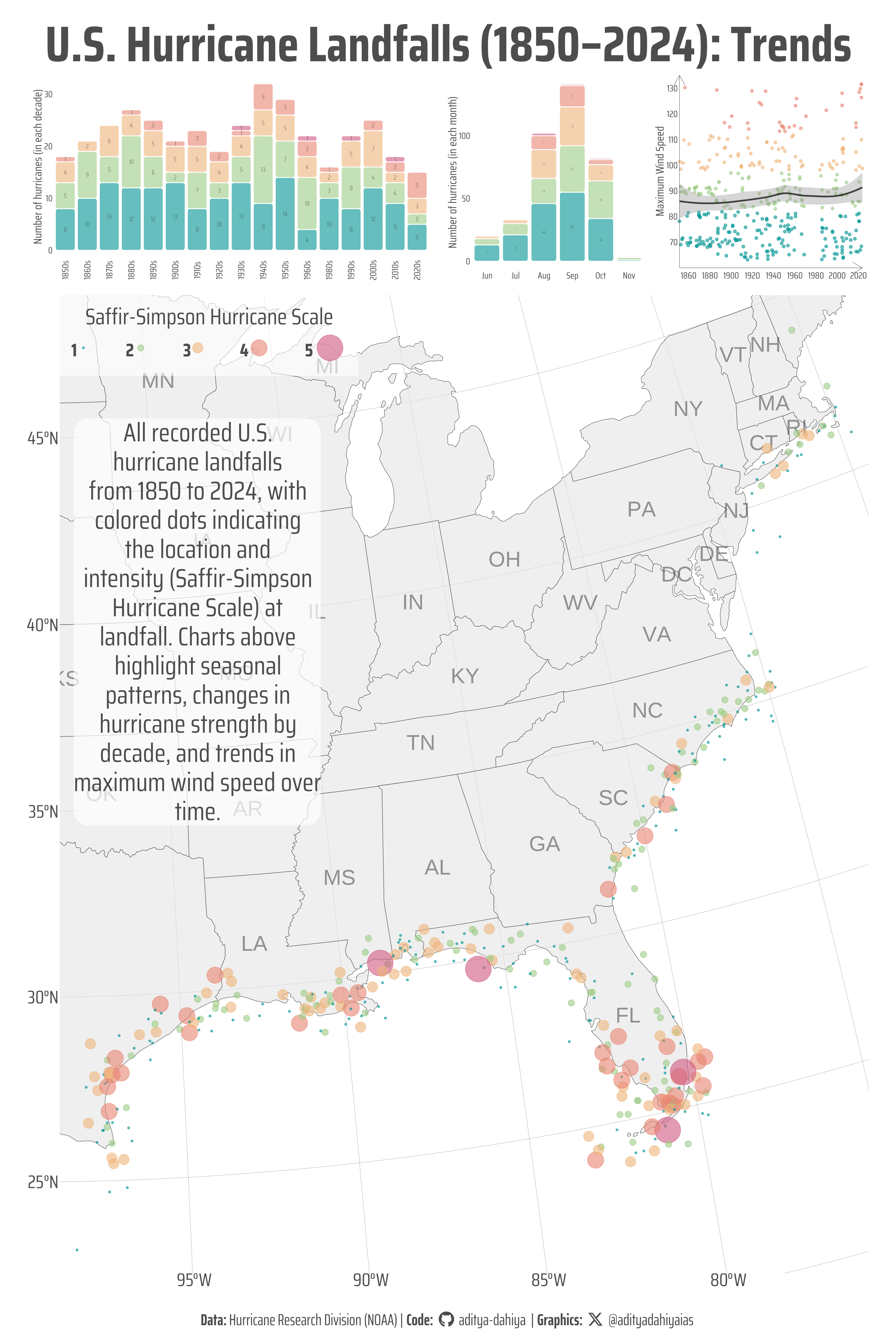
This graphic maps all U.S. hurricane landfalls from 1850 to 2024, showing location and intensity at landfall. Inset charts reveal seasonal patterns, decadal trends in storm strength, and rising maximum wind speeds over time.
Geocomputation
{ggmap}
Maps
Webscraping
{rvest}
{sf}
Data Is Plural
{ggrepel}
Author
Aditya Dahiya
Published
April 11, 2025
About the Data
The data on U.S. hurricane landfalls is sourced from NOAA’s Hurricane Research Division, which maintains two key tables. The first table provides an overview of hurricanes since the 1850s, including year, month, name, affected states, Saffir-Simpson category, central pressure, and wind speed. A second, more detailed table adds landfall dates, coordinates, and other metrics but has gaps in the late 1970s–early 1980s. These datasets are valuable for climatological research, though users should note inconsistencies in record-keeping over time. For methodology, see NOAA’s Saffir-Simpson scale.
Figure 1: This visualization maps every recorded hurricane landfall along the U.S. coast from 1850 to 2024, with dot colors representing storm intensity on the Saffir-Simpson scale. The inset charts provide additional context: hurricanes are most frequent in September, higher-intensity storms have become more common in recent decades, and maximum wind speeds show a gradual upward trend over time. The graphic draws on NOAA’s detailed hurricane records and offers a long-term view of how these powerful storms have impacted the U.S. coastline over nearly two centuries.
How I made this graphic?
Loading required libraries, data import
Code
# Plot touch-up toolslibrary(scales) # Nice Scales for ggplot2library(fontawesome) # Icons display in ggplot2library(ggtext) # Markdown text support for ggplot2library(showtext) # Display fonts in ggplot2library(colorspace) # Lighten and Darken colours# Getting geographic data library(sf) # Simple Features in Rlibrary(ggmap) # Getting raster mapslibrary(terra) # Cropping / Masking rasterslibrary(tidyterra) # Rasters with ggplot2library(osmdata) # Open Street Maps datalibrary(ggspatial) # Scales and Arrows on maps# Data Wrangling & ggplot2library(tidyverse) # All things tidylibrary(patchwork) # Composing plotslibrary(janitor) # For clean column name handlinglibrary(rvest) # Web Scraping# URL of the webpageurl <-"https://www.aoml.noaa.gov/hrd/hurdat/UShurrs_detailed.html"# Read the HTML content of the pagepage <-read_html(url)# Extract the first table from the page and convert it to a tibbleraw_data <- page |>html_element("table") |># Target the table elementhtml_table() |># Convert to data frameas_tibble() # Convert to tibble
Date/Time: Date and time when the circulation center crosses the U.S. coastline (including barrier islands). Time is estimated to the nearest hour.
Max Winds: Estimated maximum sustained (1 min) surface (10 m) winds to occur along the U. S. coast.
SSHWS: The estimated Saffir-Simpson Hurricane Scale at landfall based upon maximum 1-min surface winds.
Cent Press: The central pressure of the hurricane at landfall. Central pressure values in parentheses indicate that the value is a simple estimation (based upon a wind-pressure relationship), not directly measured or calculated.
Visualization Parameters
Code
# Font for titlesfont_add_google("Saira",family ="title_font") # Font for the captionfont_add_google("Saira Extra Condensed",family ="caption_font") # Font for plot textfont_add_google("Saira Condensed",family ="body_font") showtext_auto()mypal <-c("#009392FF", "#9CCB86FF", "#EEB479FF", "#E88471FF", "#CF597EFF")# A base Colourbg_col <-"white"seecolor::print_color(bg_col)# Colour for highlighted texttext_hil <-"grey30"seecolor::print_color(text_hil)# Colour for the texttext_col <-"grey20"seecolor::print_color(text_col)# Define Base Text Sizebts <-90# Caption stuff for the plotsysfonts::font_add(family ="Font Awesome 6 Brands",regular = here::here("docs", "Font Awesome 6 Brands-Regular-400.otf"))github <-""github_username <-"aditya-dahiya"xtwitter <-""xtwitter_username <-"@adityadahiyaias"social_caption_1 <- glue::glue("<span style='font-family:\"Font Awesome 6 Brands\";'>{github};</span> <span style='color: {text_hil}'>{github_username} </span>")social_caption_2 <- glue::glue("<span style='font-family:\"Font Awesome 6 Brands\";'>{xtwitter};</span> <span style='color: {text_hil}'>{xtwitter_username}</span>")plot_caption <-paste0("**Data:** Hurricane Research Division (NOAA)", " | **Code:** ", social_caption_1, " | **Graphics:** ", social_caption_2 )rm(github, github_username, xtwitter, xtwitter_username, social_caption_1, social_caption_2)# Alpha Values for dots and coloursalpha_value =0.6# Add text to plot-------------------------------------------------plot_title <-"U.S. Hurricane Landfalls (1850–2024): Trends"plot_subtitle <-"All recorded U.S. hurricane landfalls from 1850 to 2024, with colored dots indicating the location and intensity (Saffir-Simpson Hurricane Scale) at landfall. Charts above highlight seasonal patterns, changes in hurricane strength by decade, and trends in maximum wind speed over time."
Data Wrangling
Code
drop_rows <-paste0(185:202, "0s")base_map <- usmapdata::us_map()df1 <- raw_data |># Remove first 3 rowsslice(-1:-3) |># Select first 10 columnsselect(1:13) |># Use row 4 (now first row after slicing) as column names janitor::row_to_names(1) |># Convert all columns to appropriate types readr::type_convert() |># Clean the names of the columns janitor::clean_names() |># Drop the rows that are row-headers (i.e. 1850s, 1860s, ...)filter(!(number %in% drop_rows)) |>mutate(# Extract numeric value and direction from latitudelat =as.numeric(str_extract(latitude, "\\d+\\.?\\d*")),lat_dir =str_extract(latitude, "[NS]"),# Extract numeric value and direction from longitudelon =as.numeric(str_extract(longitude, "\\d+\\.?\\d*")),lon_dir =str_extract(longitude, "[WE]"),# Convert to signed decimal degreeslat =if_else(lat_dir =="S", -lat, lat),lon =if_else(lon_dir =="W", -lon, lon) ) |>filter(!is.na(lat) &!is.na(lon)) |># Convert to sf object (WGS84 coordinate system)st_as_sf(coords =c("lon", "lat"), crs =4326) |># Remove intermediate columnsselect(-ends_with("_dir"), -latitude, -longitude) |>mutate(# Convert date column into proper datesdate = date |>str_replace("\\D+$", "") |># Remove non-digits at endmdy(), # Convert to date# Extract maximum wind speed, and Saffir-Simpson Hurricane Scalemax_winds_kt =parse_number(max_winds_kt),ss_hws =parse_number(ss_hws),pressure =parse_number(central_pressure_mb),# Parse time column (handles UTC/Zulu times)time =parse_time(time, format ="%H%MZ"),# Remove all quotation marksstorm_names =str_remove_all(storm_names, pattern ='\"') |>str_to_title(),storm_names =if_else(str_detect(storm_names, "---"),NA, storm_names ),decade =paste0(floor(year(date) /10) *10, "s") ) |>select(-rm_wnm, -oci_mb, -central_pressure_mb) |>relocate(geometry, .after =everything()) |>filter(!is.na(date) &!is.na(ss_hws)) |># Convert to CRS of US Mapst_transform(crs =st_crs(base_map))# Set the values for controlling the extent of the mapst_bbox(df1)xlim_values <-st_bbox(df1)[c(1, 3)]ylim_values <-st_bbox(df1)[c(2, 4)]bbox_raster <-st_bbox(df1 |>st_transform("EPSG:4326"))names(bbox_raster) <-c("left", "bottom", "right", "top")
# Saving a thumbnaillibrary(magick)# Saving a thumbnail for the webpageimage_read(here::here("data_vizs", "viz_usa_hurricanes.png")) |>image_resize(geometry ="x400") |>image_write( here::here("data_vizs", "thumbnails", "viz_usa_hurricanes.png" ) )
Combining {ggrepel} with {sf}
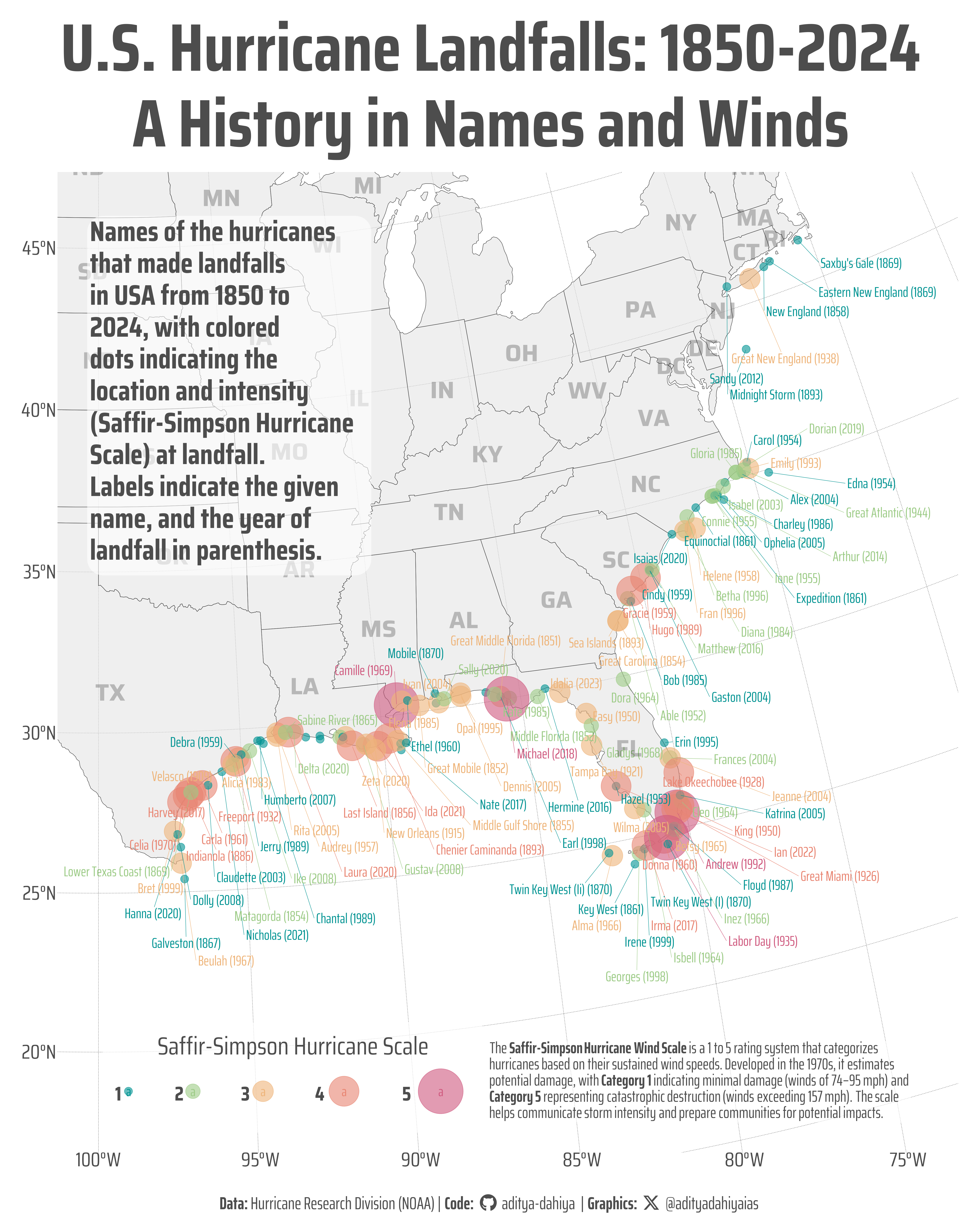
The following code generates a map showcasing named hurricanes that made landfall in the USA between 1850 and 2024. It utilizes a suite of packages to handle data processing, spatial operations, and plotting. The script begins by filtering the dataset df1 using filter() from the {dplyr} package to exclude entries with missing storm names, and selects the first occurrence for each using slice(), ensuring that only the earliest landfall per storm is visualized.
The visualization is built using {ggplot2}. The map is constructed by adding the hurricane landfall points with geom_sf(), colored and sized based on the Saffir-Simpson scale. The {ggblend} package’s blend() function is employed to apply a “darken” blending mode, enhancing contrast between layers. Labels for hurricane names and years are added with geom_text_repel() from {ggrepel}, which ensures non-overlapping text annotations. State abbreviations are added using geom_sf_text(), and a subtitle is included using annotate().
Code
# Get data only on the named Hurricanesdf1 |>st_drop_geometry() |>filter(!is.na(storm_names)) |>count(storm_names, sort = T)df2 <- df1 |>filter(!is.na(storm_names)) |>group_by(storm_names) |>slice(1) |>ungroup()# BBOX for names hurricanes landfall pointsxlim_values <-st_bbox(df2)[c(1, 3)]ylim_values <-st_bbox(df2)[c(2, 4)]library(ggrepel)library(ggmap)base_raster_raw <-get_stadiamap(bbox = bbox_raster,zoom =7,maptype ="stamen_terrain_background")base_raster <-rast(base_raster_raw) |> terra::crop(base_map |>st_transform("EPSG:4326")) terra::mask(base_map |>st_transform("EPSG:4326"))ggplot() +geom_spatraster_rgb(data = base_raster,alpha = alpha_value )base_map <- geodata::gadm(country ="USA",level =1,)plot_subtitle <-"Names of the hurricanes that made landfalls in USA from 1850 to 2024, with colored dots indicating the location and intensity (Saffir-Simpson Hurricane Scale) at landfall. Labels indicate the given name, and the year of landfall in parenthesis."sshws_annotation <-"The **Saffir-Simpson Hurricane Wind Scale** is a 1 to 5 rating system that categorizes hurricanes based on their sustained wind speeds. Developed in the 1970s, it estimates potential damage, with **Category 1** indicating minimal damage (winds of 74–95 mph) and **Category 5** representing catastrophic destruction (winds exceeding 157 mph). The scale helps communicate storm intensity and prepare communities for potential impacts."|>str_wrap(90) |>str_replace_all("\\n", "<br>")g <-ggplot() +# geom_spatraster_rgb(# data = base_raster,# alpha = alpha_value# ) +geom_sf(data = base_map,colour = text_col,alpha = alpha_value ) +geom_sf(data = df2,mapping =aes(colour =as.character(ss_hws),size = ss_hws ),alpha = alpha_value ) |> ggblend::blend("darken") +scale_size(range =c(4, 24),transform ="exp" ) + ggrepel::geom_text_repel(data = df2,mapping =aes(geometry = geometry,label =paste0(storm_names, " (", year(date), ")"),colour =as.character(ss_hws) ),family ="caption_font",segment.size =0.2,min.segment.length =unit(0.1, "pt"),force =10,force_pull =0.1,stat ="sf_coordinates",position = ggrepel::position_nudge_repel(x =1, y =-2 ),lineheight =0.25,size = bts /5 ) +geom_sf_text(data = base_map,mapping =aes(label = abbr),size = bts /3,colour =alpha(text_col, 0.3),check_overlap = T,family ="title_font",fontface ="bold" ) +# Add subtitleannotate(geom ="label",x =-100.5,y =46,label =str_wrap(plot_subtitle, 25),size = bts /2.5,lineheight =0.3,hjust =0,vjust =1,family ="body_font",fill =alpha(bg_col, 0.6),label.size =NA,label.padding =unit(0.1, "lines"),colour = text_hil,fontface ="bold" ) +# Add Text Annotation on SS HWS Scaleannotate(geom ="richtext",x =-87.5,y =19.5,label = sshws_annotation,size = bts /4.5,lineheight =0.33,hjust =0,vjust =1,family ="caption_font",fill =alpha(bg_col, 0.6),label.size =NA,label.padding =unit(0.1, "lines"),colour = text_hil ) +coord_sf(crs =st_crs(df2),default_crs ="EPSG:4326",xlim =c(-100, -70),ylim =c(17, 45) ) +labs(colour ="Saffir-Simpson Hurricane Scale",size ="Saffir-Simpson Hurricane Scale",x =NULL, y =NULL ) +scale_colour_manual(values = mypal ) +labs(title ="U.S. Hurricane Landfalls: 1850-2024\nA History in Names and Winds",# subtitle = str_wrap(plot_subtitle, 90),caption = plot_caption ) +# Theme and beautification of plottheme_minimal(base_family ="body_font",base_size = bts ) +theme(# Overallplot.margin =margin(5,5,5,5, "mm"),plot.title.position ="plot",plot.caption.position ="plot",text =element_text(colour = text_hil ), # Grid and Axespanel.grid =element_line(linewidth =0.2,colour = text_hil,linetype =3 ),axis.text.x =element_text(margin =margin(0,0,0,0, "mm")),axis.text.y =element_text(margin =margin(0,0,0,0, "mm")),axis.ticks =element_blank(),axis.ticks.length =unit(0, "mm"),# Legendlegend.position ="inside",legend.position.inside =c(0.05, 0.02),legend.justification =c(0, 0),legend.title.position ="top",legend.direction ="horizontal",legend.box ="horizontal",legend.title =element_text(margin =margin(0,0,2,0, "mm"),hjust =0.5 ),legend.text =element_text(margin =margin(2,0,0,0, "mm"),hjust =0.5,face ="bold" ),legend.text.position ="left",legend.background =element_rect(fill =alpha("white", 0.7), colour =NA ),legend.margin =margin(5,5,5,5, "mm"),legend.box.margin =margin(5,5,5,5, "mm"),legend.spacing.y =unit(1, "cm"),legend.spacing.x =unit(3, "cm"),# Labelsplot.title =element_text(hjust =0.5,size = bts *2.7,margin =margin(5,0,5,0, "mm"),family ="body_font",lineheight =0.3,face ="bold" ),plot.subtitle =element_text(hjust =0.5, family ="body_font",lineheight =0.3,margin =margin(0,0,0,0, "mm") ),plot.caption =element_textbox(hjust =0.5,halign =0.5, margin =margin(10,0,0,0, "mm"),family ="caption_font",size =0.7* bts ) )ggsave(plot = g,filename = here::here("data_vizs", "viz_usa_hurricanes_2.png" ),height =50,width =40,units ="cm",bg = bg_col)
This map visualizes all named hurricanes that made landfall in the USA between 1850 and 2024. Each colored dot marks a landfall location, with size and color representing the storm’s intensity based on the Saffir-Simpson Hurricane Wind Scale. Labels display the hurricane’s name and year of landfall. The background terrain map and state boundaries provide geographical context, offering a clear view of historical hurricane patterns across the U.S. coastline.
Saving a thumbnail
Code
# Saving a thumbnaillibrary(magick)# Saving a thumbnail for the webpageimage_read(here::here("data_vizs", "viz_usa_hurricanes_2.png")) |>image_resize(geometry ="x400") |>image_write( here::here("data_vizs", "thumbnails", "viz_usa_hurricanes.png" ) )
Session Info
Code
# Plot touch-up toolslibrary(scales) # Nice Scales for ggplot2library(fontawesome) # Icons display in ggplot2library(ggtext) # Markdown text support for ggplot2library(showtext) # Display fonts in ggplot2library(colorspace) # Lighten and Darken colours# Getting geographic data library(sf) # Simple Features in Rlibrary(ggmap) # Getting raster mapslibrary(terra) # Cropping / Masking rasterslibrary(tidyterra) # Rasters with ggplot2library(osmdata) # Open Street Maps datalibrary(ggspatial) # Scales and Arrows on maps# Data Wrangling & ggplot2library(tidyverse) # All things tidylibrary(patchwork) # Composing plotslibrary(janitor) # For clean column name handlinglibrary(rvest) # Web Scrapingsessioninfo::session_info()$packages |>as_tibble() |>select(package, version = loadedversion, date, source) |>arrange(package) |> janitor::clean_names(case ="title" ) |> gt::gt() |> gt::opt_interactive(use_search =TRUE ) |> gtExtras::gt_theme_espn()
Table 1: R Packages and their versions used in the creation of this page and graphics