Data from the World Bank and visualization techniques using {ggstream}, {ggplot2}, and {paletteer} to illustrate changes in HIV incidence across continents.
World Bank Data
A4 Size Viz
Public Health
{ggstream}
Author
Aditya Dahiya
Published
November 7, 2025
About the Data
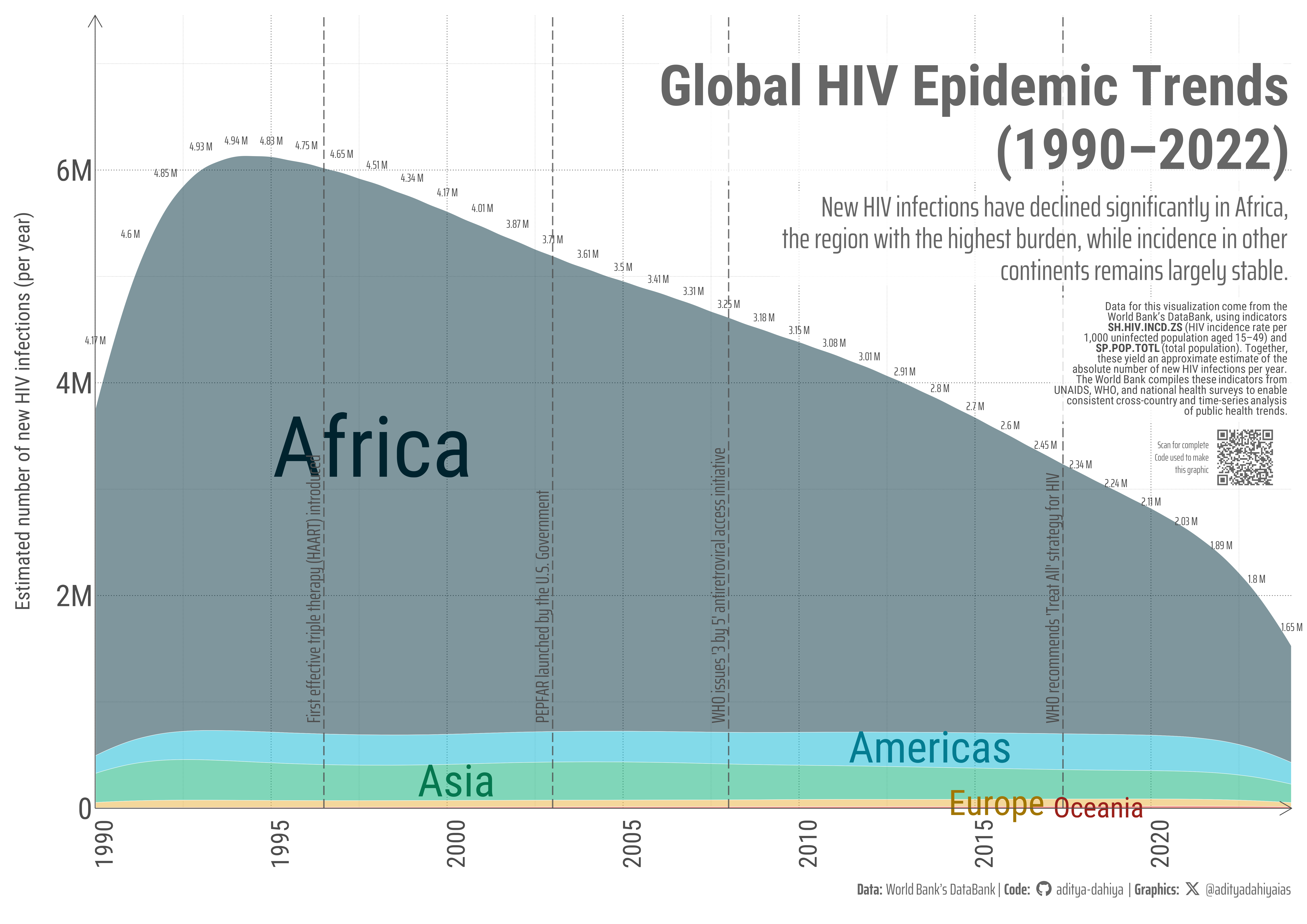
The data used in this visualization come from the World Bank’s DataBank, accessed programmatically through the R package {wbstats}. Two main indicators were combined: SH.HIV.INCD.ZS — the estimated number of new HIV infections per 1,000 uninfected population aged 15–49, and SP.POP.TOTL — the total population. Together, they provide an approximation of the absolute number of new HIV cases per year by country. The World Bank compiles these indicators from sources such as UNAIDS, the World Health Organization (WHO), and national health ministries, ensuring comparability across time and regions. Additional metadata and definitions are available through the World Development Indicators catalogue.
This graphic shows the estimated annual number of new HIV infections from 1990 to 2022, grouped by continent. The x-axis represents time in years, while the y-axis indicates the approximate number of new HIV cases per year. Each colored stream depicts a continent’s contribution to global new infections, with stream thickness reflecting case volume. The numeric labels above the plot show the estimated global total of new HIV infections for each year, highlighting Africa’s dominant yet declining share.
How I made this graphic?
Loading required libraries, data import & creating custom functions
Code
# Data Import and Wrangling Toolspacman::p_load( tidyverse, # Data Wrangling and Plotting scales, # Nice scales for ggplot2 fontawesome, # Icons display in ggplot2 ggtext, # Markdown text support ggplot2 showtext, # Display fonts in ggplot2 colorspace, # Lighten and darken colours patchwork, # Combining plots together magick, # Image processing and editing wbstats, # World Bank data access ggstream, # Stream Plots in R scales # Nice scales with ggplot2)# 1. Download, merge, compute continent & approximate absolute new cases, and total prevalence of HIV/AIDSrawdf1 <-wb_data("SH.HIV.INCD.ZS", start_date =1960, end_date =2024 )rawdf2 <-wb_data("SP.POP.TOTL", start_date =1960, end_date =2024 )rawdf3 <-wb_data("SH.DYN.AIDS.ZS", start_date =1960, end_date =2024)aids_milestones <- tibble::tibble(date =c(1981.5, # mid-year1983.5,1987.0,1995.5,1996.5,2001.5,2003.0,2008.0,2012.5,2014.5,2017.5,2021.5 ),description =c("First AIDS cases reported by CDC (U.S.)","HIV virus identified as cause of AIDS","AZT approved — first antiretroviral drug","UNAIDS established to coordinate global response","First effective triple therapy (HAART) introduced","UN adopts Declaration of Commitment on HIV/AIDS","PEPFAR launched by the U.S. Government","WHO issues '3 by 5' antiretroviral access initiative","Global HIV incidence begins to decline","UNAIDS 90–90–90 targets announced","WHO recommends 'Treat All' strategy for HIV","UNAIDS launches 95–95–95 targets for 2030" )) |>slice(5, 7, 8, 11)
Visualization Parameters
Code
# Font for titlesfont_add_google("Roboto",family ="title_font") # Font for the captionfont_add_google("Saira Extra Condensed",family ="caption_font") # Font for plot textfont_add_google("Roboto Condensed",family ="body_font") showtext_auto()# A base Colourbg_col <-"white"seecolor::print_color(bg_col)# Colour for highlighted texttext_hil <-"grey40"seecolor::print_color(text_hil)# Colour for the texttext_col <-"grey30"seecolor::print_color(text_col)line_col <-"grey30"# Define Base Text Sizebts <-80# Caption stuff for the plotsysfonts::font_add(family ="Font Awesome 6 Brands",regular = here::here("docs", "Font Awesome 6 Brands-Regular-400.otf"))github <-""github_username <-"aditya-dahiya"xtwitter <-""xtwitter_username <-"@adityadahiyaias"social_caption_1 <- glue::glue("<span style='font-family:\"Font Awesome 6 Brands\";'>{github};</span> <span style='color: {text_hil}'>{github_username} </span>")social_caption_2 <- glue::glue("<span style='font-family:\"Font Awesome 6 Brands\";'>{xtwitter};</span> <span style='color: {text_hil}'>{xtwitter_username}</span>")plot_caption <-paste0("**Data:** World Bank's DataBank"," | **Code:** ", social_caption_1," | **Graphics:** ", social_caption_2)rm( github, github_username, xtwitter, xtwitter_username, social_caption_1, social_caption_2)
Annotation Text for the Plot
Code
plot_title <-"Global HIV Epidemic Trends\n(1990–2022)"str_view(plot_title)plot_subtitle <-"New HIV infections have declined significantly in Africa, the region with the highest burden, while incidence in other continents remains largely stable."|>str_wrap(60)str_view(plot_subtitle)inset_text <-"Data for this visualization come from the World Bank’s DataBank, using indicators **SH.HIV.INCD.ZS** (HIV incidence rate per 1,000 uninfected population aged 15–49) and **SP.POP.TOTL** (total population). Together, these yield an approximate estimate of the absolute number of new HIV infections per year. The World Bank compiles these indicators from UNAIDS, WHO, and national health surveys to enable consistent cross-country and time-series analysis of public health trends."|>str_wrap(50) |>str_replace_all("\\n", "<br>")str_view(inset_text)
Exploratory Data Analysis & Data Wrangling
Code
bg_col# 1. Download, merge, compute continent & approximate absolute new casesdf <- rawdf1 |>select(iso2c, iso3c, date, country, SH.HIV.INCD.ZS) |>inner_join( rawdf2 |>select(iso2c, iso3c, date, country, SP.POP.TOTL), relationship ="many-to-many" ) |># compute new cases and continent, drop NA, aggregate by continent-yearmutate( continent = countrycode::countrycode(iso2c, "iso2c", "continent"), new_cases = SH.HIV.INCD.ZS /1000* SP.POP.TOTL ) |>filter(!is.na(new_cases), !is.na(continent)) |>group_by(date, continent) |>summarise(total_cases =sum(new_cases, na.rm =TRUE), .groups ="drop")# Size Varsize_var_df <- df |>group_by(continent) |>summarise(size_var =sum(total_cases) )df <- df |>left_join( size_var_df )# 2. Extract stream polygon coordinates from stat_ggstream (used to position labels)stream_coords <- (ggplot(df, aes(x = date, y = total_cases, fill = continent)) +geom_stream(extra_span =0.2, bw =0.75, color ="grey20",linewidth =0.2,type ="ridge" )) |>ggplot_build() |> (\(b) b$data[[1]])() # anonymous fn to pluck the computed data frame# 3. Compute top boundary per x (date) and attach global totalstop_y <- stream_coords |>group_by(x) |>summarise(ymax =max(y, na.rm =TRUE), .groups ="drop") |>rename(date = x) |>mutate(date =round(date, 0)) |>left_join( df |>group_by(date) |>summarise(global_cases =sum(total_cases, na.rm =TRUE), .groups ="drop") ) |>slice_max(order_by = ymax, n =1, by = date)
# A QR Code for the infographicurl_graphics <-paste0("https://aditya-dahiya.github.io/projects_presentations/data_vizs/",# The file name of the current .qmd file"wb_aids_incidence", ".html")# remotes::install_github('coolbutuseless/ggqr')# library(ggqr)plot_qr <-ggplot(data =NULL, aes(x =0, y =0, label = url_graphics) ) + ggqr::geom_qr(colour = text_hil, fill = bg_col,size =1 ) +annotate(geom ="text",x =-0.08,y =0,label ="Scan for complete\nCode used to make\nthis graphic",hjust =1,vjust =0.5,family ="caption_font",colour = text_hil,size = bts /6,lineheight =0.35 ) +coord_fixed(clip ="off") +theme_void() +theme(plot.background =element_rect(fill =NA, colour =NA ),panel.background =element_rect(fill =NA,colour =NA ),plot.margin =margin(0, 10, 0, 0, "mm") )# Compiling the plotsg_full <- g +inset_element(p = plot_qr,left =0.92, right =0.98,bottom =0.48, top =0.53,align_to ="full",clip =FALSE ) +plot_annotation(theme =theme(plot.background =element_rect(fill ="transparent",colour ="transparent" ) ) )ggsave(filename = here::here("data_vizs","wb_aids_incidence.png" ),plot = g_full,width =297*2,height =210*2,units ="mm",bg = bg_col)
Savings the graphics
Code
# Saving a thumbnail for the webpageimage_read(here::here("data_vizs", "wb_aids_incidence.png")) |>image_resize(geometry ="400") |>image_write(here::here("data_vizs", "thumbnails", "wb_aids_incidence.png"))
Session Info
Code
# Data Import and Wrangling Toolspacman::p_load( tidyverse, # Data Wrangling and Plotting scales, # Nice scales for ggplot2 fontawesome, # Icons display in ggplot2 ggtext, # Markdown text support ggplot2 showtext, # Display fonts in ggplot2 colorspace, # Lighten and darken colours patchwork, # Combining plots together magick, # Image processing and editing wbstats, # World Bank data access ggstream, # Stream Plots in R scales # Nice scales with ggplot2)sessioninfo::session_info()$packages |>as_tibble() |># The attached column is TRUE for packages that were # explicitly loaded with library() dplyr::filter(attached ==TRUE) |> dplyr::select(package,version = loadedversion, date, source ) |> dplyr::arrange(package) |> janitor::clean_names(case ="title" ) |> gt::gt() |> gt::opt_interactive(use_search =TRUE ) |> gtExtras::gt_theme_espn()
Table 1: R Packages and their versions used in the creation of this page and graphics