Visualizing World Bank fertility data (1960-2024) using {wbstats}, {ggplot2}, and LOESS smoothing to reveal population-weighted continental trends across 195 countries.
World Bank Data
A4 Size Viz
Governance
Demographics
Public Health
Author
Aditya Dahiya
Published
October 26, 2025
About the Data
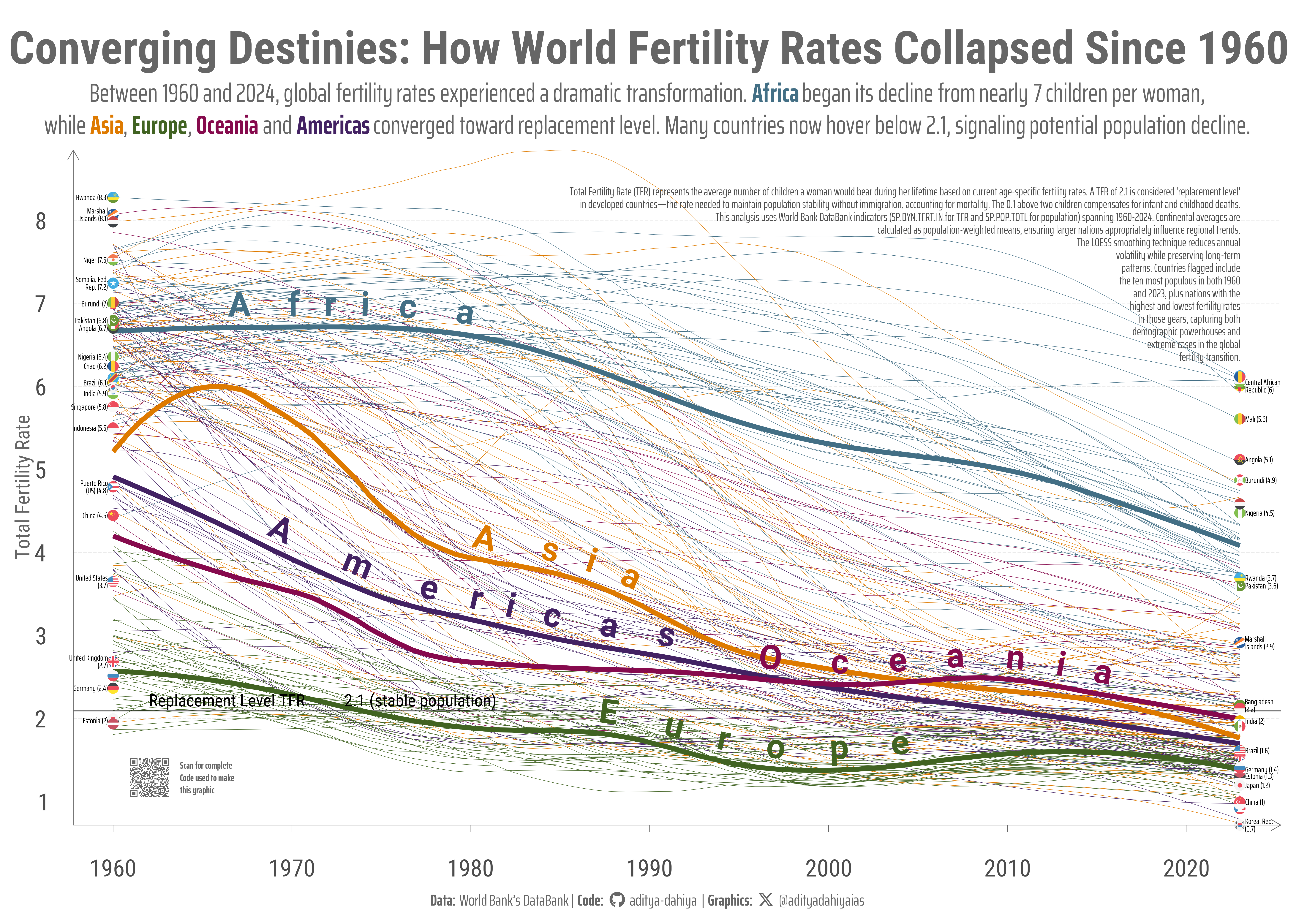
Total Fertility Rate (TFR) represents the average number of children a woman would bear during her lifetime based on current age-specific fertility rates. A TFR of 2.1 is considered ‘replacement level’ in developed countries—the rate needed to maintain population stability without immigration, accounting for mortality. The 0.1 above two children compensates for infant and childhood deaths. This analysis uses World Bank DataBank indicators SP.DYN.TFRT.IN for TFR and SP.POP.TOTL for population, spanning 1960-2024. Data was accessed using the wbstats R package.
Continental averages are calculated as population-weighted means, ensuring larger nations like China, India, Nigeria, and the United States appropriately influence regional trends.
This graphic displays Total Fertility Rate (TFR) trends from 1960 to 2024 for 195 countries, grouped by continent. Each thin line represents one country’s fertility journey smoothed using LOESS regression (span=0.5). Bold lines show population-weighted continental averages (span=0.3). The horizontal reference line at 2.1 marks the replacement level fertility. Flags identify the ten most populous countries in 1960 and 2023, plus nations with extreme fertility rates, illustrating both demographic giants and outliers in the global fertility transition.
How I made this graphic?
Loading required libraries, data import & creating custom functions
Code
# Data Import and Wrangling Toolspacman::p_load( tidyverse, # Data Wrangling and Plotting scales, # Nice scales for ggplot2 fontawesome, # Icons display in ggplot2 ggtext, # Markdown text support ggplot2 showtext, # Display fonts in ggplot2 colorspace, # Lighten and darken colours patchwork, # Combining plots together magick, # Image processing and editing wbstats # World Bank data access)# indicators <- wbstats::wb_indicators()# # indicators |># filter(str_detect(indicator, "fertility")) |> # select(indicator_desc) |> # pull() |> # str_wrap(80) |> # str_view()# # indicators |> # filter(str_detect(indicator_id, "SP.DYN.TFRT.IN")) # # indicators |> # mutate(indicator = str_to_lower(indicator)) |> # filter(str_detect(indicator, "total population")) |> # View()# # indicators |># filter(str_detect(indicator, "Total population"))# # indicators |># filter(str_detect(indicator_id, "SP.POP.TOTL"))selected_indicators <-c("SP.DYN.TFRT.IN","SP.POP.TOTL")rawdf <-wb_data(indicator = selected_indicators,start_date =1900,end_date =2025 ) |> janitor::clean_names()
Exploratory Data Analysis & Data Wrangling
Code
# rawdf |> # pull(date) |> # unique()# A Dataset for countriesdf1 <- rawdf |>filter(!(str_detect(country, "Hong Kong|Macao"))) |># filter(# date %in% c(seq(1960, 2024, 5), 2024)# ) |> rename(year = date,tfr = sp_dyn_tfrt_in,pop = sp_pop_totl ) |>mutate(iso2c =str_to_lower(iso2c) ) |>mutate(continent = countrycode::countrycode( iso3c,origin ="iso3c",destination ="continent",warn =FALSE ) ) |>filter(!is.na(continent))# A Dataset for continentsdf2 <- df1 |>group_by(year, continent) |>summarise(tfr =weighted.mean(x = tfr,w = pop,na.rm = T ) ) |>ungroup() |>group_by(continent) |>mutate(tfr_smooth =predict(loess(tfr ~ year, span =0.3, data =cur_data()),newdata =cur_data() ) ) |>ungroup() |># Add customized hjust values for adding the labels of continents at the# right place for easy viewingleft_join(tibble(continent =c("Africa", "Americas", "Asia", "Europe", "Oceania"),hjust_var =c(0.1, 0.2, 0.4, 0.6, 0.85) ) )# Manually select few coutnries that I want to add flags of in the graphselected_cons <-c(df1 |>filter(year ==2023) |>slice_max(order_by = pop, n =10) |>pull(iso2c) , df1 |>drop_na() |>filter(year ==1960) |>slice_max(order_by = pop, n =10) |>pull(iso2c) , df1 |>filter(year ==1960) |>filter(!is.na(tfr)) |>slice_max(order_by = tfr, n =3) |>pull(iso2c) , df1 |>filter(year ==2023) |>filter(!is.na(tfr)) |>slice_max(order_by = tfr, n =8) |>pull(iso2c) , df1 |>filter(year ==1960) |>filter(!is.na(tfr)) |>slice_min(order_by = tfr, n =3) |>pull(iso2c) , df1 |>filter(year ==2023) |>filter(!is.na(tfr)) |>slice_min(order_by = tfr, n =3) |>pull(iso2c) ) |>unique()df3 <- df1 |>filter(year %in%c(1960, 2023)) |>filter(iso2c %in% selected_cons) |>mutate(hjust_var =case_when( year ==1960~1, year ==2023~0,.default =0.5 ),nudgex_var =case_when( year ==1960~-0.3, year ==2023~0.3,.default =0 ) )
Visualization Parameters
Code
# Font for titlesfont_add_google("Roboto",family ="title_font") # Font for the captionfont_add_google("Saira Extra Condensed",family ="caption_font") # Font for plot textfont_add_google("Roboto Condensed",family ="body_font") showtext_auto()# A base Colourbg_col <-"white"seecolor::print_color(bg_col)# Colour for highlighted texttext_hil <-"grey40"seecolor::print_color(text_hil)# Colour for the texttext_col <-"grey30"seecolor::print_color(text_col)line_col <-"grey30"# Define Base Text Sizebts <-80# mypal <- paletteer::paletteer_d("calecopal::superbloom2")# mypal <- paletteer::paletteer_d("fishualize::Etheostoma_spectabile")# mypal <- paletteer::paletteer_d("lisa::MarcChagall")mypal <- paletteer::paletteer_d("lisa::KazimirMalevich")# Caption stuff for the plotsysfonts::font_add(family ="Font Awesome 6 Brands",regular = here::here("docs", "Font Awesome 6 Brands-Regular-400.otf"))github <-""github_username <-"aditya-dahiya"xtwitter <-""xtwitter_username <-"@adityadahiyaias"social_caption_1 <- glue::glue("<span style='font-family:\"Font Awesome 6 Brands\";'>{github};</span> <span style='color: {text_hil}'>{github_username} </span>")social_caption_2 <- glue::glue("<span style='font-family:\"Font Awesome 6 Brands\";'>{xtwitter};</span> <span style='color: {text_hil}'>{xtwitter_username}</span>")plot_caption <-paste0("**Data:** World Bank's DataBank"," | **Code:** ", social_caption_1," | **Graphics:** ", social_caption_2)rm( github, github_username, xtwitter, xtwitter_username, social_caption_1, social_caption_2)# cols4all::c4a_gui()
Annotation Text for the Plot
Code
plot_title <-"Converging Destinies: How World Fertility Rates Collapsed Since 1960"str_view(inset_text)plot_subtitle <- glue::glue("Between 1960 and 2024, global fertility rates experienced a dramatic transformation. <span style='color:#436F85FF;'>**Africa**</span> began its decline from nearly 7 children per woman,<br> while <span style='color:#DE7A00FF;'>**Asia**</span>, <span style='color:#416322FF;'>**Europe**</span>, <span style='color:#860A4DFF;'>**Oceania**</span> and <span style='color:#432263FF;'>**Americas**</span> converged toward replacement level. Many countries now hover below 2.1, signaling potential population decline.")inset_text <-"Total Fertility Rate (TFR) represents the average number of children a woman would bear during her lifetime based on current age-specific fertility rates. A TFR of 2.1 is considered 'replacement level'\nin developed countries—the rate needed to maintain population stability without immigration, accounting for mortality. The 0.1 above two children compensates for infant and childhood deaths.\nThis analysis uses World Bank DataBank indicators (SP.DYN.TFRT.IN for TFR and SP.POP.TOTL for population) spanning 1960-2024. Continental averages are\ncalculated as population-weighted means, ensuring larger nations appropriately influence regional trends.\nThe LOESS smoothing technique reduces annual\nvolatility while preserving long-term\npatterns. Countries flagged include\nthe ten most populous in both 1960\nand 2023, plus nations with the\nhighest and lowest fertility rates\nin those years, capturing both\ndemographic powerhouses and\nextreme cases in the global\nfertility transition."
# A QR Code for the infographicurl_graphics <-paste0("https://aditya-dahiya.github.io/projects_presentations/data_vizs/",# The file name of the current .qmd file"wb_tfr_pop_tree", ".html")# remotes::install_github('coolbutuseless/ggqr')# library(ggqr)plot_qr <-ggplot(data =NULL, aes(x =0, y =0, label = url_graphics) ) + ggqr::geom_qr(colour = text_hil, fill = bg_col,size =0.7 ) +annotate(geom ="text",x =0.075,y =0,label ="Scan for complete\nCode used to make\nthis graphic",hjust =0,vjust =0.5,family ="caption_font",colour = text_hil,size = bts /6,lineheight =0.35,fontface ="bold" ) +coord_fixed(clip ="off") +theme_void() +theme(plot.background =element_rect(fill =NA, colour =NA ),panel.background =element_rect(fill =NA,colour =NA ),plot.margin =margin(0, 10, 0, 0, "mm") )# Compiling the plotsg_full <- g +inset_element(p = plot_qr,left =0.02, right =0.15,bottom =0.04, top =0.1,align_to ="panel",clip =FALSE ) +plot_annotation(theme =theme(plot.background =element_rect(fill ="transparent",colour ="transparent" ) ) )ggsave(filename = here::here("data_vizs","a4_wb_tfr_pop_tree.png" ),plot = g_full,width =297*2,height =210*2,units ="mm",bg = bg_col)
Savings the graphics
Code
# Saving a thumbnail for the webpageimage_read(here::here("data_vizs", "a4_wb_tfr_pop_tree.png")) |>image_resize(geometry ="400") |>image_write(here::here("data_vizs", "thumbnails", "wb_tfr_pop_tree.png"))
Session Info
Code
pacman::p_load( tidyverse, # Data Wrangling and Plotting scales, # Nice scales for ggplot2 fontawesome, # Icons display in ggplot2 ggtext, # Markdown text support ggplot2 showtext, # Display fonts in ggplot2 colorspace, # Lighten and darken colours patchwork, # Combining plots together magick, # Image processing and editing wbstats # World Bank data access)sessioninfo::session_info()$packages |>as_tibble() |># The attached column is TRUE for packages that were # explicitly loaded with library() dplyr::filter(attached ==TRUE) |> dplyr::select(package,version = loadedversion, date, source ) |> dplyr::arrange(package) |> janitor::clean_names(case ="title" ) |> gt::gt() |> gt::opt_interactive(use_search =TRUE ) |> gtExtras::gt_theme_espn()
Table 1: R Packages and their versions used in the creation of this page and graphics