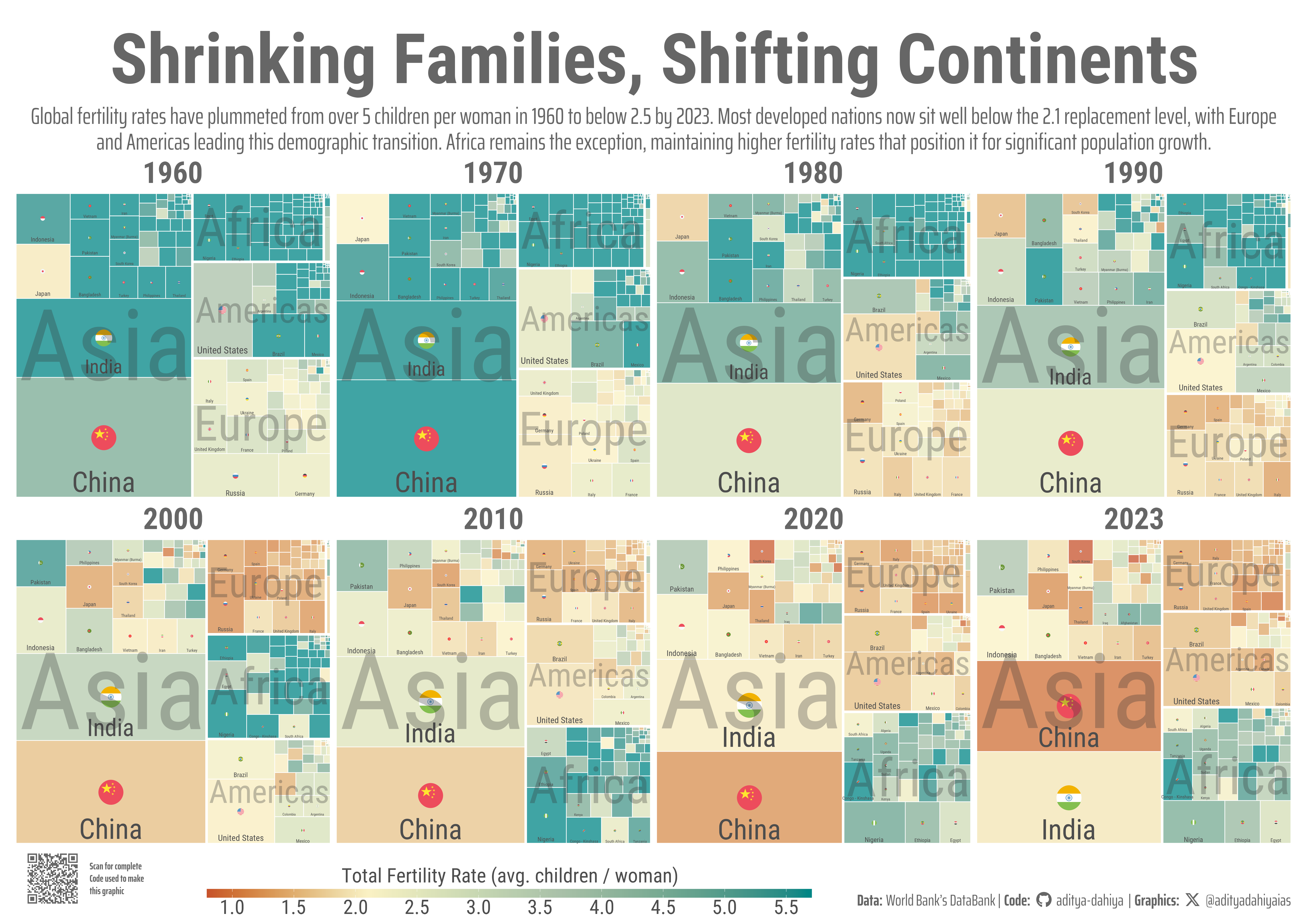
A hierarchical treemap visualization where rectangle size reflects population and color intensity shows fertility rates
World Bank Data
A4 Size Viz
Governance
Demographics
Public Health
{treemapify}
{ggflags}
Author
Aditya Dahiya
Published
November 1, 2025
About the Data
Total Fertility Rate (TFR) represents the average number of children a woman would bear during her lifetime based on current age-specific fertility rates. A TFR of 2.1 is considered ‘replacement level’ in developed countries—the rate needed to maintain population stability without immigration, accounting for mortality. The 0.1 above two children compensates for infant and childhood deaths. This analysis uses World Bank DataBank indicators SP.DYN.TFRT.IN for TFR and SP.POP.TOTL for population, spanning 1960-2024. Data was accessed using the wbstats R package.
This treemap displays countries as rectangles proportional to population size, arranged by continent. Color intensity indicates Total Fertility Rate, with cooler tones below 2.1 (replacement level) and warmer tones above. Larger countries show both names and flags for clarity. The visualization integrates {ggplot2},{treemapify} for spatial layouts, and {ggflags} for flag graphics, processing World Bank demographic data spanning 1960-2023 to reveal global fertility trends across eight time points.
How I made this graphic?
Loading required libraries, data import & creating custom functions
Code
# Data Import and Wrangling Toolspacman::p_load( tidyverse, # Data Wrangling and Plotting scales, # Nice scales for ggplot2 fontawesome, # Icons display in ggplot2 ggtext, # Markdown text support ggplot2 showtext, # Display fonts in ggplot2 colorspace, # Lighten and darken colours patchwork, # Combining plots together magick, # Image processing and editing wbstats, # World Bank data access treemapify # Making Tree-Maps with ggplot2)# indicators <- wbstats::wb_indicators()# # indicators |># filter(str_detect(indicator_id, "SP.DYN.TFRT.Q")) |> # pull(indicator_id) |> # paste0(collapse = ", ")# select(indicator_desc) |># pull() |># str_wrap(80) |># str_view()# # indicators |># filter(str_detect(indicator_id, "SP.DYN.TFRT.IN"))# # indicators |># mutate(indicator = str_to_lower(indicator)) |># filter(str_detect(indicator, "total population")) |># View()# # indicators |># filter(str_detect(indicator, "Total population"))# # indicators |># filter(str_detect(indicator_id, "SP.POP.TOTL"))# Q1 represents the lowest (poorest) wealth quintile.# Q5 represents the highest (richest) wealth quintile.# Q2, Q3, and Q4 represent the intermediate wealth quintiles.selected_indicators <-c(# "SP.DYN.TFRT.Q1", # "SP.DYN.TFRT.Q2", # "SP.DYN.TFRT.Q3", # "SP.DYN.TFRT.Q4", # "SP.DYN.TFRT.Q5","SP.DYN.TFRT.IN","SP.POP.TOTL")# indicators |> # object.size() |> # print(units = "Mb")rawdf <-wb_data(indicator = selected_indicators,start_date =1900,end_date =2025 ) |> janitor::clean_names()# rawdf |> # object.size() |> # print(units = "Mb")# # rawdf |> # drop_na() |> # count(date, sort = T)
Visualization Parameters
Code
# Font for titlesfont_add_google("Roboto",family ="title_font") # Font for the captionfont_add_google("Saira Extra Condensed",family ="caption_font") # Font for plot textfont_add_google("Roboto Condensed",family ="body_font") showtext_auto()# A base Colourbg_col <-"white"seecolor::print_color(bg_col)# Colour for highlighted texttext_hil <-"grey40"seecolor::print_color(text_hil)# Colour for the texttext_col <-"grey30"seecolor::print_color(text_col)line_col <-"grey30"# Define Base Text Sizebts <-80# mypal <- paletteer::paletteer_d("calecopal::superbloom2")# mypal <- paletteer::paletteer_d("fishualize::Etheostoma_spectabile")# mypal <- paletteer::paletteer_d("lisa::MarcChagall")mypal <- paletteer::paletteer_d("lisa::KazimirMalevich")# Caption stuff for the plotsysfonts::font_add(family ="Font Awesome 6 Brands",regular = here::here("docs", "Font Awesome 6 Brands-Regular-400.otf"))github <-""github_username <-"aditya-dahiya"xtwitter <-""xtwitter_username <-"@adityadahiyaias"social_caption_1 <- glue::glue("<span style='font-family:\"Font Awesome 6 Brands\";'>{github};</span> <span style='color: {text_hil}'>{github_username} </span>")social_caption_2 <- glue::glue("<span style='font-family:\"Font Awesome 6 Brands\";'>{xtwitter};</span> <span style='color: {text_hil}'>{xtwitter_username}</span>")plot_caption <-paste0("**Data:** World Bank's DataBank"," | **Code:** ", social_caption_1," | **Graphics:** ", social_caption_2)rm( github, github_username, xtwitter, xtwitter_username, social_caption_1, social_caption_2)
Annotation Text for the Plot
Code
plot_title <-"Shrinking Families, Shifting Continents"plot_subtitle <-"Global fertility rates have plummeted from over 5 children per woman in 1960 to below 2.5 by 2023. Most developed nations now sit well below the 2.1 replacement level, with Europe and Americas leading this demographic transition. Africa remains the exception, maintaining higher fertility rates that position it for significant population growth."|>str_wrap(180)str_view(plot_subtitle)inset_text <-"..................."
Exploratory Data Analysis & Data Wrangling
Code
# rawdfvalid_codes <- countrycode::codelist$iso3c[!is.na(countrycode::codelist$iso3c)]# A Dataset for countriesdf1 <- rawdf |>filter(iso3c %in% valid_codes) |>rename(year = date,tfr = sp_dyn_tfrt_in,pop = sp_pop_totl ) |>mutate(iso2c =str_to_lower(iso2c) ) |>mutate(continent = countrycode::countrycode( iso3c,origin ="iso3c",destination ="continent",warn =FALSE ),country = countrycode::countrycode( iso3c,origin ="iso3c",destination ="country.name.en" ) ) |>filter(!is.na(continent)) |># Filter out ISO codes before plotting for which Flags exist (drop the few wrong ones)filter(iso2c %in%names(ggflags::lflags)) # ISO3C for countries whose names we want to display in the tree map# selected_cons <- df1 |># group_by(year, continent) |># slice_max(order_by = pop, n = 5) |> # pull(iso3c) |> # unique()# Define desired continent order (bottom-left to top-right)continent_order <-c("Africa", "Asia", "Europe", "Americas", "Oceania")# Range of Font Sizes for Country Name and Flag Size in graphiccfs <-c(bts /20, bts /2)ffs <-c(bts /100, bts /6)# Actual data processing and wranglingplotdf <- df1 |>filter(year %in%c(seq(1960, 2020, 10), 2023)) |>drop_na() |>group_by(year, continent) |>mutate(continent_pop =sum(pop, na.rm = T)) |>ungroup() |>mutate(continent =fct_reorder(continent, continent_pop, .desc =TRUE)) |># Now process data to produce coordinates using {treemapify}split(~year) |>map_dfr(~ { layout <- treemapify::treemapify( .x,area ="pop",subgroup ="continent" ) }) |>left_join( df1 ) |># Further final improvements in the plot - minor adjustments of text and flag sizes, locationsgroup_by(year) |>mutate(country_fs = cfs[1] + (pop -min(pop)) / (max(pop) -min(pop)) * (cfs[2] - cfs[1]),flag_fs = ffs[1] + (pop -min(pop)) / (max(pop) -min(pop)) * (ffs[2] - ffs[1]) ) |>ungroup()plotdf_grouped <- plotdf |>group_by(year, continent) |>summarise(xmin =min(xmin),xmax =max(xmax),ymin =min(ymin),ymax =max(ymax),.groups ="drop" )# Check the rangesrange(plotdf$country_fs)range(plotdf$flag_fs)
# A QR Code for the infographicurl_graphics <-paste0("https://aditya-dahiya.github.io/projects_presentations/data_vizs/",# The file name of the current .qmd file"wb_tfr_pop_treemap", ".html")# remotes::install_github('coolbutuseless/ggqr')# library(ggqr)plot_qr <-ggplot(data =NULL, aes(x =0, y =0, label = url_graphics) ) + ggqr::geom_qr(colour = text_hil, fill = bg_col,size =0.9 ) +annotate(geom ="text",x =0.045,y =0,label ="Scan for complete\nCode used to make\nthis graphic",hjust =0,vjust =0.5,family ="caption_font",colour = text_hil,size = bts /6,lineheight =0.35,fontface ="bold" ) +coord_fixed(clip ="off") +theme_void() +theme(plot.background =element_rect(fill =NA, colour =NA ),panel.background =element_rect(fill =NA,colour =NA ),plot.margin =margin(0, 10, 0, 0, "mm") )# Compiling the plotsg_full <- g +inset_element(p = plot_qr,left =0, right =0.12,bottom =0, top =0.09,align_to ="full",clip =FALSE ) +plot_annotation(theme =theme(plot.background =element_rect(fill ="transparent",colour ="transparent" ) ) )ggsave(filename = here::here("data_vizs","a4_wb_tfr_pop_treemap.png" ),plot = g_full,width =297*2,height =210*2,units ="mm",bg = bg_col)
Savings the graphics
Code
# Saving a thumbnail for the webpageimage_read(here::here("data_vizs", "a4_wb_tfr_pop_treemap.png")) |>image_resize(geometry ="400") |>image_write(here::here("data_vizs", "thumbnails", "wb_tfr_pop_treemap.png"))
Session Info
Code
pacman::p_load( tidyverse, # Data Wrangling and Plotting scales, # Nice scales for ggplot2 fontawesome, # Icons display in ggplot2 ggtext, # Markdown text support ggplot2 showtext, # Display fonts in ggplot2 colorspace, # Lighten and darken colours patchwork, # Combining plots together magick, # Image processing and editing wbstats # World Bank data access)sessioninfo::session_info()$packages |>as_tibble() |># The attached column is TRUE for packages that were # explicitly loaded with library() dplyr::filter(attached ==TRUE) |> dplyr::select(package,version = loadedversion, date, source ) |> dplyr::arrange(package) |> janitor::clean_names(case ="title" ) |> gt::gt() |> gt::opt_interactive(use_search =TRUE ) |> gtExtras::gt_theme_espn()
Table 1: R Packages and their versions used in the creation of this page and graphics