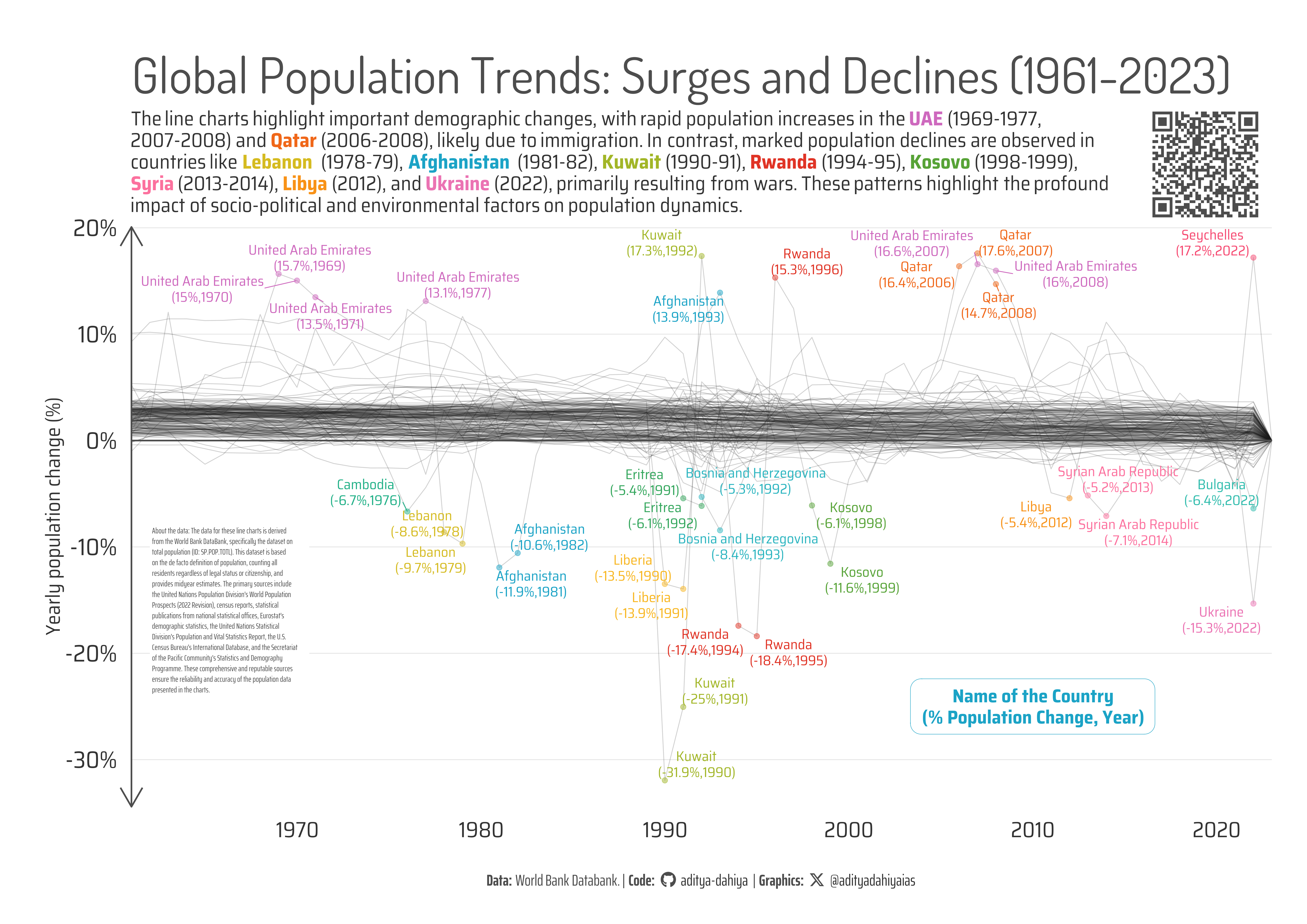
The yearly percentage changes in population for various countries from 1961 to 2023, highlighting significant increases and sharp declines.
#TidyTuesday
A4 Size Viz
World Bank
Author
Aditya Dahiya
Published
May 22, 2024
Global Population Trends: Surges and Declines (1961-2023)
The data used for these line charts is sourced from the World BankDataBank, which compiles midyear population estimates based on the de facto definition of population, encompassing all residents regardless of legal status or citizenship. This data, spanning from 1961 to 2023, includes inputs from various reputable sources such as the United Nations Population Division, national statistical offices, Eurostat, and the U.S. Census Bureau. The graphic illustrates the yearly percentage changes in population for different countries, highlighting significant demographic shifts.
The analysis reveals notable population increases in countries like the UAE (1969-1977, 2007-2008) and Qatar (2006-2008), likely driven by immigration. Conversely, the charts emphasize sharp population declines due to war or natural disasters in countries such as Lebanon (1978-79), Afghanistan (1981-82), Kuwait (1990-91), Rwanda (1994-95), Kosovo (1998-1999), Syria (2013-2014), Libya (2012), and Ukraine (2022).
These trends provide a stark visualization of how political instability, conflict, and crises can dramatically impact population dynamics.
This graphic depicts the yearly percentage changes in population for various countries from 1961 to 2023, highlighting significant increases due to immigration and sharp declines resulting from war and natural disasters.
How I made this graphic?
Getting the data
Code
# Data Import and Wrangling Toolslibrary(tidyverse) # All things tidylibrary(janitor) # Cleaning names etc.library(wbstats) # Fetching World Bank Data# Final plot toolslibrary(scales) # Nice Scales for ggplot2library(fontawesome) # Icons display in ggplot2library(ggtext) # Markdown text support for ggplot2library(showtext) # Display fonts in ggplot2library(gganimate) # For animationrawdf <-wb_data(indicator ="SP.POP.TOTL",start_date =1960,end_date =2023,return_wide =FALSE,gapfill =TRUE,mrv =65)
Setting Parameters
Code
# Font for titlesfont_add_google("Dosis",family ="title_font") # Font for the captionfont_add_google("Saira Extra Condensed",family ="caption_font") # Font for plot textfont_add_google("Saira Semi Condensed",family ="body_font") text_col <-"grey20"text_hil <-"grey30"mypal <- paletteer::paletteer_d("ggthemes::Hue_Circle")showtext_auto()bg_col <-"white"# Caption stuff for the plotsysfonts::font_add(family ="Font Awesome 6 Brands",regular = here::here("docs", "Font Awesome 6 Brands-Regular-400.otf"))github <-""github_username <-"aditya-dahiya"xtwitter <-""xtwitter_username <-"@adityadahiyaias"social_caption_1 <- glue::glue("<span style='font-family:\"Font Awesome 6 Brands\";'>{github};</span> <span style='color: {text_col}'>{github_username} </span>")social_caption_2 <- glue::glue("<span style='font-family:\"Font Awesome 6 Brands\";'>{xtwitter};</span> <span style='color: {text_col}'>{xtwitter_username}</span>")ts =80plot_title <-"Global Population Trends: Surges and Declines (1961-2023)"plot_subtitle <- glue::glue("The line charts highlight important demographic changes, with rapid population increases in the <b style='color:{mypal[16]}'>UAE</b> (1969-1977,<br>2007-2008) and <b style='color:{mypal[11]}'>Qatar</b> (2006-2008), likely due to immigration. In contrast, marked population declines are observed in<br>countries like <b style='color:{mypal[8]}'>Lebanon </b> (1978-79), <b style='color:{mypal[1]}'>Afghanistan </b> (1981-82), <b style='color:{mypal[7]}'>Kuwait </b>(1990-91), <b style='color:{mypal[12]}'>Rwanda </b>(1994-95), <b style='color:{mypal[6]}'>Kosovo </b>(1998-1999),<br><b style='color:{mypal[14]}'>Syria</b> (2013-2014), <b style='color:{mypal[10]}'>Libya </b>(2012), and <b style='color:{mypal[15]}'>Ukraine </b>(2022), primarily resulting from wars. These patterns highlight the profound<br>impact of socio-political and environmental factors on population dynamics.")str_view(plot_subtitle)plot_caption <-paste0("**Data:** World Bank Databank. | ","**Code:** ", social_caption_1, " | **Graphics:** ", social_caption_2 )inset_text <-"About the data: The data for these line charts is derived from the World Bank DataBank, specifically the dataset on total population (ID: SP.POP.TOTL). This dataset is based on the de facto definition of population, counting all residents regardless of legal status or citizenship, and provides midyear estimates. The primary sources include the United Nations Population Division's World Population Prospects (2022 Revision), census reports, statistical publications from national statistical offices, Eurostat's demographic statistics, the United Nations Statistical Division's Population and Vital Statistics Report, the U.S. Census Bureau's International Database, and the Secretariat of the Pacific Community's Statistics and Demography Programme. These comprehensive and reputable sources ensure the reliability and accuracy of the population data presented in the charts."ggplot() +labs(subtitle = plot_subtitle) +theme(plot.subtitle =element_markdown())