NYT’s Presidential precinct data for the 2024 U.S. general election

R project leveraging election-level data from The New York Times to produce insightful and visually engaging graphics using {ggplot2} and {sf}.

Data Visualization
Maps
USA
{sf}
Gecomputation
Geopolitics
Author

Aditya Dahiya

Published

April 7, 2025

About the Data

This comprehensive dataset compiles detailed, precinct-level results and geographic boundaries from the 2024 presidential election. It integrates official voting records and spatial data as described in the New York Times Election Map Data article and is further enriched by the interactive presentation found in the NYT Election Map Precinct Results. In addition, the GitHub repository maintained by The New York Times provides national-level downloads and detailed documentation, reflecting the robust, transparent approach of their election team.

Loading required packages

Code
# Data wrangling & visualization
library(tidyverse)  # Data manipulation & visualization

# Spatial data handling
library(sf)         # Import, export, and manipulate vector data
library(terra)      # Import, export, and manipulate raster data

# ggplot2 extensions
library(tidyterra)  # Helper functions for using terra with ggplot2

# Final plot tools
library(scales)               # Nice Scales for ggplot2
library(fontawesome)          # Icons display in ggplot2
library(ggtext)               # Markdown text in ggplot2
library(showtext)             # Display fonts in ggplot2
library(patchwork)            # Composing Plots
library(ggspatial)            # Scales and Arrows in Maps

bts = 11 # Base Text Size
sysfonts::font_add_google("Saira Condensed", "body_font")
sysfonts::font_add_google("Saira", "title_font")
sysfonts::font_add_google("Saira Extra Condensed", "caption_font")
showtext::showtext_auto()
# A base Colour
bg_col <- "white"
seecolor::print_color(bg_col)

# Colour for highlighted text
text_hil <- "grey30"
seecolor::print_color(text_hil)

# Colour for the text
text_col <- "grey20"
seecolor::print_color(text_col)


# Caption stuff for the plot
sysfonts::font_add(
  family = "Font Awesome 6 Brands",
  regular = here::here("docs", "Font Awesome 6 Brands-Regular-400.otf")
)
github <- "&#xf09b"
github_username <- "aditya-dahiya"
xtwitter <- "&#xe61b"
xtwitter_username <- "@adityadahiyaias"
social_caption_1 <- glue::glue("<span style='font-family:\"Font Awesome 6 Brands\";'>{github};</span> <span style='color: {text_hil}'>{github_username}  </span>")
social_caption_2 <- glue::glue("<span style='font-family:\"Font Awesome 6 Brands\";'>{xtwitter};</span> <span style='color: {text_hil}'>{xtwitter_username}</span>")
plot_caption <- paste0(
  "**Data**:  New York Times (2024 Precinct-Level Election Results)",
  "  |  **Code:** ", 
  social_caption_1, 
  " |  **Graphics:** ", 
  social_caption_2
  )
rm(github, github_username, xtwitter, 
   xtwitter_username, social_caption_1, 
   social_caption_2)

Getting the data

Code
# url1 <- "https://int.nyt.com/newsgraphics/elections/map-data/2024/national/precincts-with-results.topojson.gz"

# url2 <- "https://int.nyt.com/newsgraphics/elections/map-data/2024/national/precincts-with-results.csv.gz"

# Warning: Almost 1 GB of download
# nyt_raw_1 <- st_read(paste0("/vsigzip//vsicurl/", url1))

# Save data to disk temporarily to use again during code trial
# saveRDS(nyt_raw_1, file = "temp_nyt_election_data.rds")

# Read in the pre-saved data
nyt_raw_1 <- readRDS("temp_nyt_election_data.rds")

Graphic 1

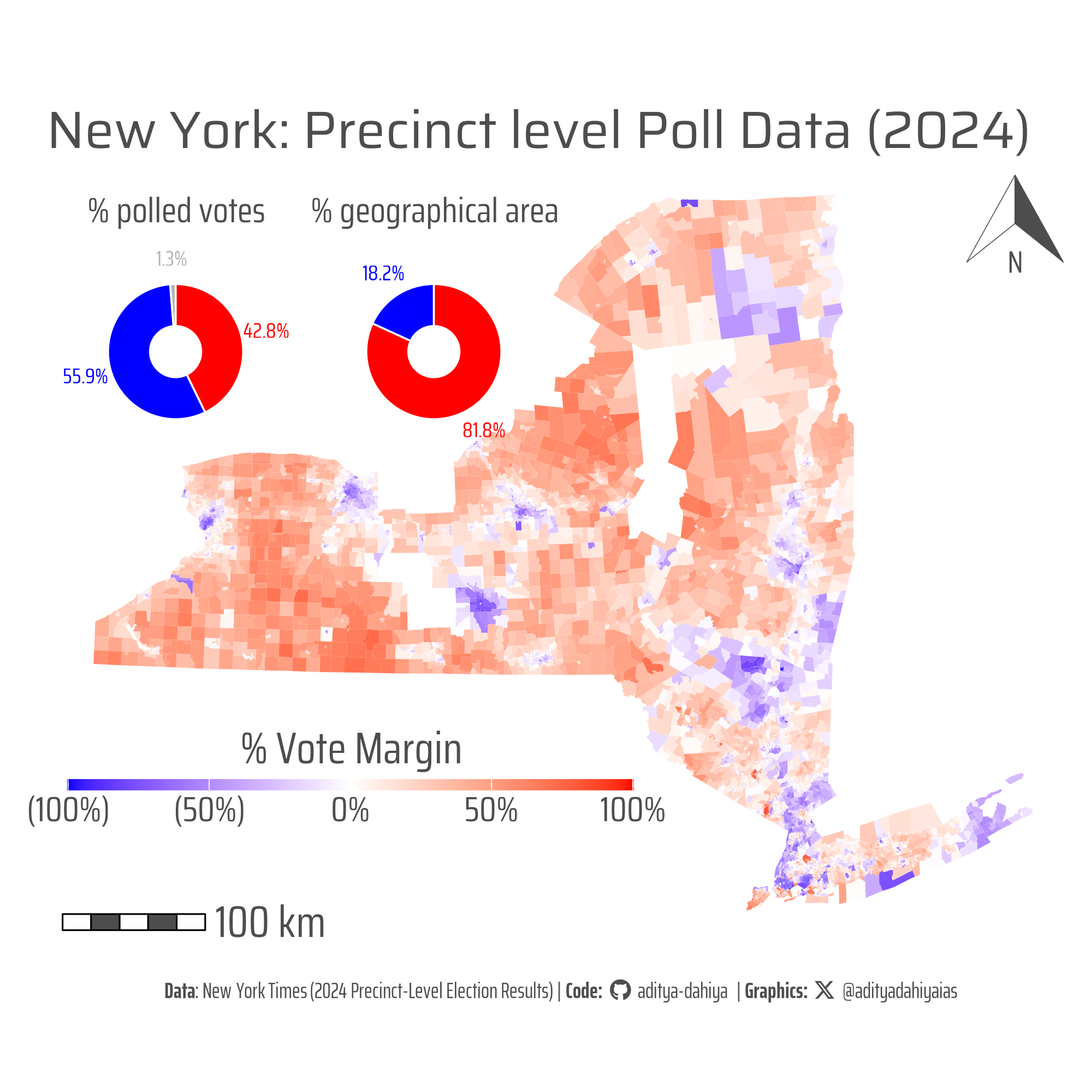
Beyond the color: A 56%-to-44% vote split becomes 81% red on the map—highlighting how choropleth displays can distort election outcomes by omitting population density considerations.

Figure 1: When map visuals mask reality: New York’s election map shows 81% red despite a 56% vote share for Democrats, underscoring the disconnect between spatial representation and voter turnout. This precinct-level election map of New York State uses a color gradient based on the margin calculated as (Republican votes – Democratic votes) divided by total votes, shading areas red for Republican advantage and blue for Democratic. Despite Democrats receiving 56% of the total vote—as shown in the accompanying pie chart—81% of the map is colored red, highlighting how traditional choropleth maps can mislead by neglecting population density variations. For more detailed data, refer to the NYT Election Map Data and the associated GitHub repository.

A basic chloropleth of the State of New York

Code
# Explore the State of New York
nyt_raw_1 |> 
  st_drop_geometry() |> 
  as_tibble() |> 
  filter(state == "NY")

# Check CRS
nyt_raw_1 |> 
  st_crs()

# Assign CRS and make data for the Selected State
df1 <- nyt_raw_1 |> 
  st_set_crs("EPSG:4326") |> 
  dplyr::filter(state == "NY") |> 
  mutate(perc_rep = ((votes_rep - votes_dem)/votes_total))

df_bbox <- st_bbox(df1)

# A custom Lambert Equal Area Projection for the State
new_crs = paste0("+proj=laea +x_0=0 +y_0=0 +lon_0=", 
                ((df_bbox$xmin + df_bbox$xmax) / 2), 
                " +lat_0=", 
                ((df_bbox$ymin + df_bbox$ymax) / 2))

# Compute Geographical Area of red and blue areas
sf_use_s2(FALSE)

df2 <- df1 |> 
  mutate(
    area = as.numeric(st_area(geometry)),
    vote_var = if_else(
      perc_rep > 0,
      "Republican",
      "Democrat"
    )
  ) |> 
  st_drop_geometry() |> 
  as_tibble() |> 
  group_by(vote_var) |> 
  summarize(
    area = sum(area) / 1e9
  ) |> 
  mutate(
    perc = area / sum(area)
  )


g <- df1 |> 
  ggplot() +
  geom_sf(
    mapping = aes(fill = perc_rep),
    colour = "transparent",
    linewidth = 0.01
  ) +
  scale_fill_gradient2(
    low = "blue",
    high = "red",
    mid = "white",
    midpoint = 0,
    na.value = "grey50",
    labels = scales::label_percent(
      style_negative = "parens"
    )
  ) +
  ggspatial::annotation_north_arrow(
    location = "tr",
    style = north_arrow_orienteering(
      line_width = 0.5,
      line_col = text_hil,
      fill = c(bg_col, text_hil),
      text_family = "body_font",
      text_col = text_hil,
      text_size = 40
    )
  ) +
  ggspatial::annotation_scale(
    location = "bl",
    text_family = "body_font",
    text_col = text_hil,
    bar_cols = c(bg_col, text_hil),
    text_cex = 5
  ) +
  ggthemes::theme_map(
    base_family = "body_font",
    base_size = 60
  ) +
  coord_sf(
    crs = new_crs
  ) +
  labs(
    title = "New York: Precinct level Poll Data (2024)",
    fill = "% Vote Margin",
    caption = plot_caption
  ) +
  theme(
    text = element_text(
      margin = margin(0,0,0,0, "pt"),
      colour = text_hil
    ),
    plot.margin = margin(0,0,0,0, "pt"),
    legend.position = "inside",
    legend.position.inside = c(0.02, 0.15),
    legend.justification = c(0,0),
    legend.direction = "horizontal",
    legend.margin = margin(0,0,0,0, "pt"),
    legend.box.margin = margin(0,0,0,0, "pt"),
    legend.text = element_text(
      margin = margin(3,0,0,0, "pt"),
      hjust = 0.5
    ),
    legend.title = element_text(
      margin = margin(0,0,5,0, "pt"),
      hjust = 0.5
    ),
    legend.title.position = "top",
    legend.key.height = unit(5, "pt"),
    legend.key.width = unit(50, "pt"),
    plot.caption = element_textbox(
      hjust = 0.5,
      halign = 0.5,
      family = "caption_font",
      margin = margin(0,0,10,0, "pt"),
      size = 30
    ),
    plot.title = element_text(
      margin = margin(20,0,0,0, "pt"),
      family = "title_font"
    )
  )

ggsave(
  plot = g,
  filename = here::here("projects", "images", "nyt_election_data_1.png"),
  height = 2000,
  width = 2000,
  units = "px",
  bg = "white"
)

Get some pie charts on areas and votes polled

Code
g1 <- df1 |> 
  st_drop_geometry() |> 
  as_tibble() |> 
  summarise(
    across(
      .cols = c(votes_dem, votes_rep, votes_total),
      .fns = function(x)(sum(x, na.rm = T))
    )
  ) |> 
  mutate(others = votes_total - (votes_dem + votes_rep)) |> 
  select(-votes_total) |> 
  pivot_longer(
    cols = everything(),
    names_to = "vote_var",
    values_to = "value_var"
  ) |> 
  mutate(perc = value_var / sum(value_var)) |> 
  ggplot(
    aes(x = 1, y = perc, fill = vote_var, 
        label = paste0(round(100*perc, 1), "%"))
  ) +
  geom_col(
    colour = bg_col,
    linewidth = 0.4
  ) +
  geom_text(
    aes(x = 2, colour = vote_var),
    position = position_stack(
      vjust = 0.5
    ),
    family = "body_font",
    size = 10
  ) +
  scale_fill_manual(
    values = c("grey70", "blue", "red")
  ) +
  scale_colour_manual(
    values = c("grey70", "blue", "red")
  ) +
  scale_x_continuous(
    limits = c(0, 2.1),
    expand = expansion(0)
  ) +
  coord_polar(theta = "y", clip = "off") +
  labs(
    title = "% polled votes"
  ) +
  theme_void(
    base_size = 40,
    base_family = "body_font"
  ) +
  theme(
    legend.position = "none",
    plot.title = element_text(
      hjust = 0.5, 
      margin = margin(0,0,0,0, "pt"),
      colour = text_hil
    )
  )


g2 <- df2 |> 
  ggplot(
    aes(x = 1, y = perc, fill = vote_var, 
        label = paste0(round(100*perc, 1), "%"))
  ) +
  geom_col(
    colour = bg_col,
    linewidth = 0.4
  ) +
  geom_text(
    aes(x = 2, colour = vote_var),
    position = position_stack(
      vjust = 0.5
    ),
    family = "body_font",
    size = 10
  ) +
  scale_fill_manual(
    values = c("blue", "red")
  ) +
  scale_colour_manual(
    values = c("blue", "red")
  ) +
  scale_x_continuous(
    limits = c(0, 2.1),
    expand = expansion(0)
  ) +
  coord_polar(theta = "y", clip = "off") +
  labs(
    title = "% geographical area",
    fill = NULL
  ) +
  theme_void(
    base_size = 40,
    base_family = "body_font"
  ) +
  theme(
    legend.position = "none",
    plot.title = element_text(
      hjust = 0.5, 
      margin = margin(0,0,0,0, "pt"),
      colour = text_hil
    ),
    text = element_text(
      colour = text_hil
    )
  )

Compile Plot

Code
library(patchwork)

gfull <- g + 
  inset_element(
    p = g1,
    left = 0, right = 0.25,
    top = 0.95, bottom = 0.6,
    align_to = "panel"
  ) +
  inset_element(
    p = g2,
    left = 0.25, right = 0.5,
    top = 0.95, bottom = 0.6,
    align_to = "panel"
  )

ggsave(
  plot = gfull,
  filename = here::here("projects", "images", 
                        "nyt_election_data_1.png"),
  height = 2000,
  width = 2000,
  units = "px",
  bg = "white"
)

Thumbnail for page

Code
library(magick)
image_read(
  here::here("projects", "images",
             "nyt_election_data_1.png")
) |> 
  image_resize("x400") |> 
  image_write(
    here::here(
      "projects", "images",
      "nyt_election_data.png"
    )
  )

Graphic 2

Summarizing the data over entire USA by State, but now comparing a chloropleth map with a non-contiguous cartogram

Code
# Get state wise data compiled

df4 <- nyt_raw_1 |> 
  st_drop_geometry() |> 
  as_tibble() |> 
  group_by(state) |> 
  summarise(
    across(
      .cols = c(votes_dem, votes_rep, votes_total),
      .fns = sum
    )
  ) |> 
  mutate(
    perc_margin = ((votes_rep - votes_dem)/votes_total)
  ) |> 
  rename(abbr = state)

df5 <- usmapdata::us_map() |> 
  left_join(df4) |> 
  mutate(area_var = as.numeric(st_area(geom))/1e6) |> 
  left_join(
    usdata::pop_age_2019 |> 
      dplyr::distinct(state, state_total_population) |> 
      rename(abbr = state)
  )

library(cartogram)

df_cart <- df5 |> 
  cartogram::cartogram_ncont(weight = "state_total_population")

df6 <- bind_rows(
  df5 |> mutate(facet_var = "A"), 
  df_cart |> mutate(facet_var = "B")
) |> 
  mutate(
    facet_var
  )

facet_labels <- c("Geographical Map", "A non-contiguous Cartogram")
names(facet_labels) <- c("A", "B")

g <- df6 |> 
  ggplot(
    mapping = aes(
      fill = perc_margin
    )
  ) +
  geom_sf() +
  scale_fill_gradient2(
    limits = c(-0.3, 0.3),
    oob = scales::squish,
    low = "blue",
    high = "red",
    mid = "white",
    midpoint = 0,
    na.value = "grey70",
    labels = scales::label_percent(
      style_negative = "parens"
    )
  ) +
  geom_sf_text(
    mapping = aes(
      label = abbr,
      geometry = geom
    ),
    size = 8, 
    colour = "black",
    family = "body_font"
  ) +
  ggspatial::annotation_north_arrow(
    location = "bl",
    style = north_arrow_orienteering(
      line_width = 0.5,
      line_col = text_hil,
      fill = c(bg_col, text_hil),
      text_family = "body_font",
      text_col = text_hil,
      text_size = 40
    )
  ) +
  ggspatial::annotation_scale(
    location = "br",
    text_family = "body_font",
    text_col = text_hil,
    bar_cols = c(bg_col, text_hil),
    text_cex = 5,
    line_col = text_hil
  ) +
  ggthemes::theme_map(
    base_family = "body_font",
    base_size = 60
  ) +
  coord_sf(clip = "off") +
  facet_wrap(
    ~facet_var, ncol = 1,
    labeller = labeller(facet_var = facet_labels)
  ) +
  labs(
    title = "Land vs. People: Mapping the 2024 U.S. Vote",
    fill = "% Vote Margin",
    caption = plot_caption
  ) +
  theme(
    text = element_text(
      margin = margin(0,0,0,0, "pt"),
      colour = text_hil
    ),
    plot.margin = margin(0,0,0,0, "pt"),
    legend.position = "inside",
    legend.position.inside = c(0.5, -0.05),
    legend.justification = c(0.5, 0),
    legend.direction = "horizontal",
    legend.margin = margin(0,0,0,0, "pt"),
    legend.box.margin = margin(0,0,0,0, "pt"),
    legend.text = element_text(
      margin = margin(3,0,0,0, "pt"),
      hjust = 0.5
    ),
    legend.title = element_text(
      margin = margin(0,0,5,0, "pt"),
      hjust = 0.5
    ),
    legend.title.position = "top",
    legend.key.height = unit(5, "pt"),
    legend.key.width = unit(50, "pt"),
    plot.caption = element_textbox(
      hjust = 0.5,
      halign = 0.5,
      family = "caption_font",
      margin = margin(30,0,10,0, "pt"),
      size = 30
    ),
    plot.title = element_text(
      margin = margin(20,0,0,0, "pt"),
      family = "title_font",
      hjust = 0.5
    ),
    panel.background = element_rect(
      fill = NA, colour = NA
    ),
    strip.background = element_rect(
      fill = NA, colour = NA
    ),
    strip.text = element_text(
      colour = text_hil,
      family = "title_font",
      size = 60, 
      margin = margin(10,0,0,0, "pt")
    ),
    legend.background = element_rect(
      fill = NA, colour = NA
    )
  )

ggsave(
  plot = g,
  filename = here::here("projects", "images", "nyt_election_data_2.png"),
  height = 3200,
  width = 2000,
  units = "px",
  bg = "white"
)
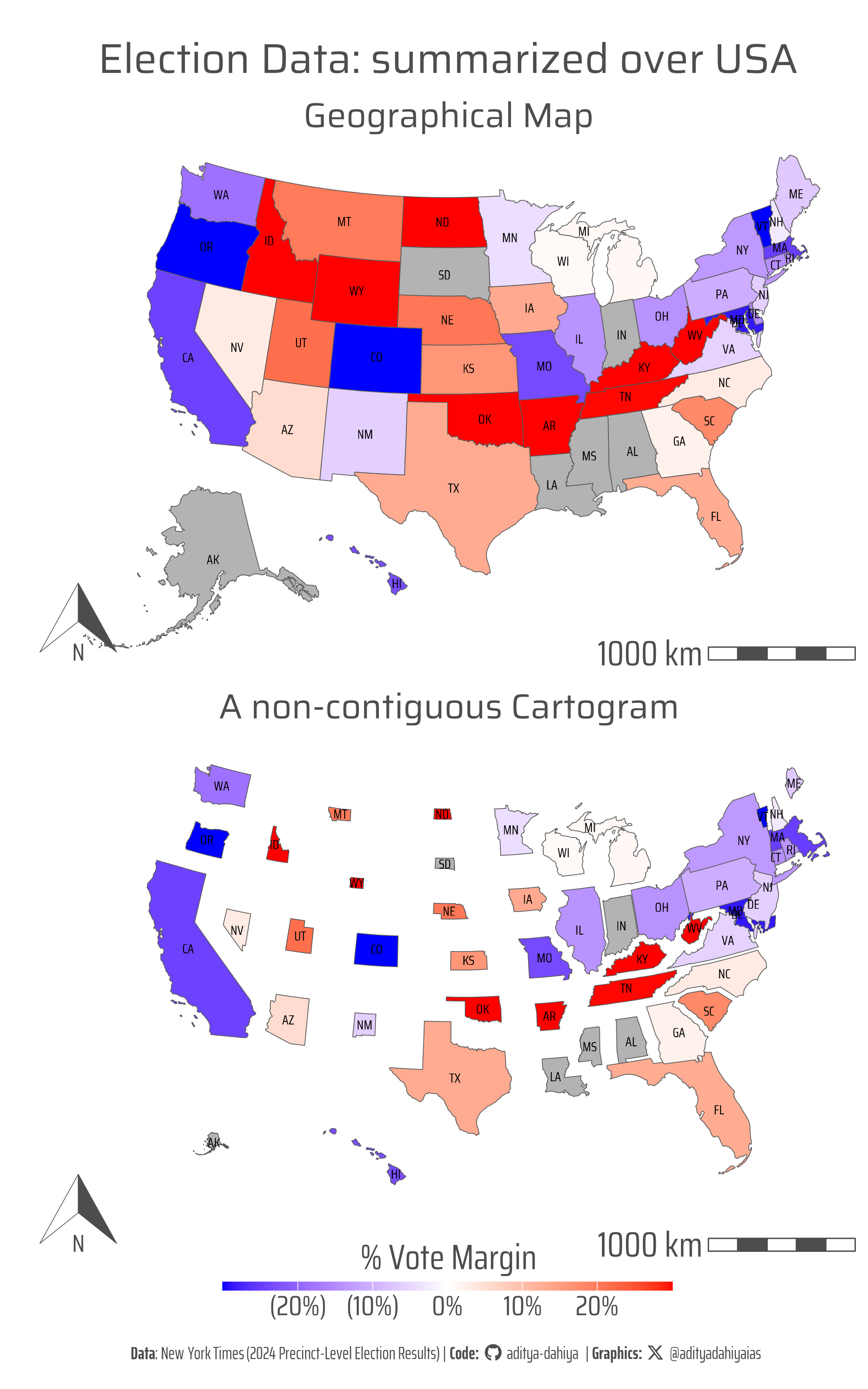
Figure 2: This graphic presents two views of the 2024 U.S. Presidential Election results using precinct-level data. The left map is a choropleth showing each state’s winning party—blue for Democrats, red for Republicans—with darker shades indicating larger victory margins. The right map is a non-contiguous cartogram where each state is resized based on its population, highlighting how densely populated (and often Democratic-leaning) states carry more electoral weight. While Republicans dominate in geographic area, the cartogram reveals the demographic strength behind the Democratic vote, illustrating the contrast between land size and population influence in national elections.

Graphic 3

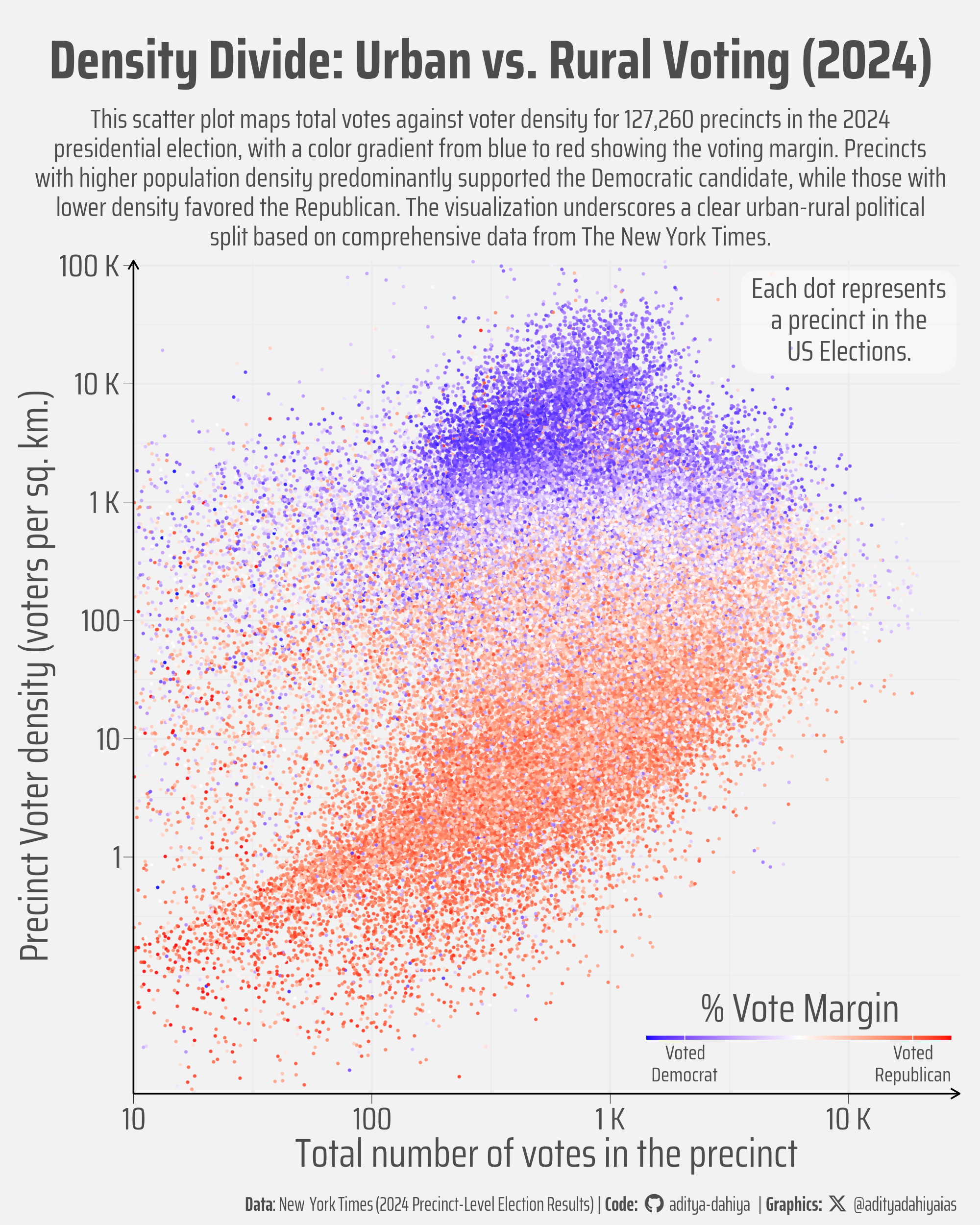
Figure 3: This scatter plot visualizes the 2024 presidential election results across 127,260 U.S. precincts, sourced from The New York Times. The x-axis shows the total number of votes per precinct (log scale), while the y-axis represents voter density (voters per square kilometer, log scale). Each dot represents a precinct, colored by voting margin: blue for Democratic wins, red for Republican wins, with a gradient in between. The plot reveals a clear pattern—densely populated precincts (higher on the y-axis) tend to favor Democrats, while sparsely populated ones lean Republican, illustrating the urban-rural electoral divide.

This graphic, designed to explore the relationship between voter density and voting patterns in the 2024 presidential election, was created using R and several key packages. The data, sourced from The New York Times’ comprehensive precinct-level results, was first loaded and processed using the sf package for spatial data handling and the tibble package for data manipulation. The st_set_crs function was used to set the coordinate reference system to EPSG:4326, ensuring accurate geographic area calculation, while st_area from the sf package calculated precinct areas for determining voter density (total votes divided by area). The voting margin was computed as the difference between Republican and Democratic votes divided by total votes. For visualization, the ggplot2 package was employed to create a scatter plot, using geom_point to plot total votes against voter density, coloured by voting margin. To manage the wide range of values, log10 transformations were applied to both axes with scale_x_continuous and scale_y_continuous, with labels formatted using scales::label_number and cut_short_scale from the scales package. The color gradient was defined with scale_colour_gradient2, mapping blue to Democratic wins and red to Republican wins.

Code:

Code
bts = 60

sf_use_s2(FALSE)

df7 <- nyt_raw_1 |> 
  st_set_crs("EPSG:4326") |> 
  mutate(
    area = as.numeric(st_area(geometry))/1e6,
    voter_density = votes_total / area,
    perc_rep = ((votes_rep - votes_dem)/votes_total)
  ) |> 
  st_drop_geometry() |> 
  as_tibble()

# Check the distribution of total votes
df7 |> 
  ggplot(aes(votes_total)) +
  geom_boxplot() +
  scale_x_continuous(trans = "log10")

# Check the distribution of voter density
df7 |> 
  ggplot(aes(voter_density)) +
  geom_boxplot() +
  scale_x_continuous(trans = "log10")

# Thus, we need a log scale on X-axis and Y-axis.

# Keep Selected variables needed for plotting
df7 |> names()
plotdf <- df7 |> 
  select(id, state, votes_total, voter_density, perc_rep)
plotdf |> 
  summary()

plotdf |> 
  select(-id, -state) |> 
  drop_na()
# Start Plot
g <- plotdf |> 
  ggplot(
    mapping = aes(
      x = votes_total,
      y = voter_density,
      colour = perc_rep
    )
  ) +
  geom_point(
    size = 0.2,
    alpha = 0.75,
    position = position_jitter(
      width = 0.2
    )
  ) +
  
  # Add Text Annotation
  annotate(
    geom = "label",
    x = 1e4, y = 5e4,
    label = "Each dot represents\na precinct in the\nUS Elections.",
    family = "body_font",
    hjust = 0.5, 
    vjust = 0.7,
    lineheight = 0.3,
    colour = text_hil,
    size = bts / 4,
    fill = alpha("white", 0.4),
    label.size = NA,
    label.padding = unit(0.1, "lines") 
  ) +
  scale_x_continuous(
    limits = c(10, 2e4),
    transform = "log10",
    labels = scales::label_number(
      scale_cut = cut_short_scale(space = T)
    ),
    expand = expansion(c(0, 0.05)),
    breaks = 10^(1:5)
  ) +
  scale_y_continuous(
    transform = "log10",
    labels = scales::label_number(
      scale_cut = cut_short_scale(space = T),
      accuracy = 1
    ),
    expand = expansion(0),
    limits = c(0.01, 1.1e5),
    breaks = c(10^(0:5))
  ) +
  scale_colour_gradient2(
    low = "blue",
    high = "red",
    mid = "white",
    midpoint = 0,
    na.value = "transparent",
    breaks = c(-0.75, 0.75),
    labels = c("Voted\nDemocrat", "Voted\nRepublican")
  ) +
  coord_cartesian(
    clip = "off"
  ) +
  theme_minimal(
    base_family = "body_font",
    base_size = bts,
    base_line_size = bts/150,
    base_rect_size = bts/150
  ) +
  labs(
    title = "Density Divide: Urban vs. Rural Voting (2024)",
    subtitle = str_wrap("This scatter plot maps total votes against voter density for 127,260 precincts in the 2024 presidential election, with a color gradient from blue to red showing the voting margin. Precincts with higher population density predominantly supported the Democratic candidate, while those with lower density favored the Republican. The visualization underscores a clear urban-rural political split based on comprehensive data from The New York Times.", 100),
    caption = plot_caption,
    colour = "% Vote Margin",
    x = "Total number of votes in the precinct",
    y = "Precinct Voter density (voters per sq. km.)"
  ) +
  theme(
    
    # Overall
    text = element_text(
      margin = margin(0,0,0,0, "pt"),
      colour = text_hil
    ),
    plot.margin = margin(0,10,0,10, "pt"),
    panel.border = element_blank(),
    plot.background = element_rect(fill = NA, colour = NA),
    panel.background = element_rect(fill = NA, colour = NA),
    legend.background = element_rect(fill = NA, color = NA),
    plot.title.position = "plot",
    plot.caption.position = "plot",
    
    # Legend
    legend.position = "inside",
    legend.position.inside = c(0.99, 0.01),
    legend.justification = c(1, 0),
    legend.direction = "horizontal",
    legend.margin = margin(0,0,0,0, "pt"),
    legend.box.margin = margin(0,0,0,0, "pt"),
    legend.text = element_text(
      margin = margin(3,0,0,0, "pt"),
      hjust = 0.5,
      lineheight = 0.3,
      size = bts / 2
    ),
    legend.title = element_text(
      margin = margin(0,0,5,0, "pt"),
      hjust = 0.5
    ),
    legend.title.position = "top",
    legend.key.height = unit(2, "pt"),
    legend.key.width = unit(30, "pt"),
    plot.caption = element_textbox(
      hjust = 1,
      halign = 1,
      family = "caption_font",
      margin = margin(10,0,5,0, "pt"),
      size = 30
    ),
    plot.title = element_text(
      margin = margin(20,0,10,0, "pt"),
      hjust = 0.5,
      face = "bold",
      size = 1.4 * bts
    ),
    plot.subtitle = element_text(
      margin = margin(0,0,5,0, "pt"),
      lineheight = 0.3,
      hjust = 0.5,
      size = bts / 1.5
    ),
    
    # Axes
    panel.spacing = unit(0, "pt"),
    axis.title.x = element_text(margin = margin(0,0,0,0, "pt")),
    axis.title.y = element_text(margin = margin(0,0,0,0, "pt")),
    axis.text.x = element_text(
      margin = margin(2,2,2,2, "pt")
    ),
    axis.text.y = element_text(
      margin = margin(2,2,2,2, "pt")
    ),
    axis.line = element_line(
      arrow = arrow(length = unit(5, "pt"))
    ),
    axis.ticks = element_line(
      linewidth = 0.1
    ),
    axis.ticks.length = unit(5, "pt")
  )

ggsave(
  plot = g,
  filename = here::here("projects", "images", 
                        "nyt_election_data_3.png"),
  height = 2000 * 5 / 4,
  width = 2000,
  units = "px",
  bg = "grey95"
)