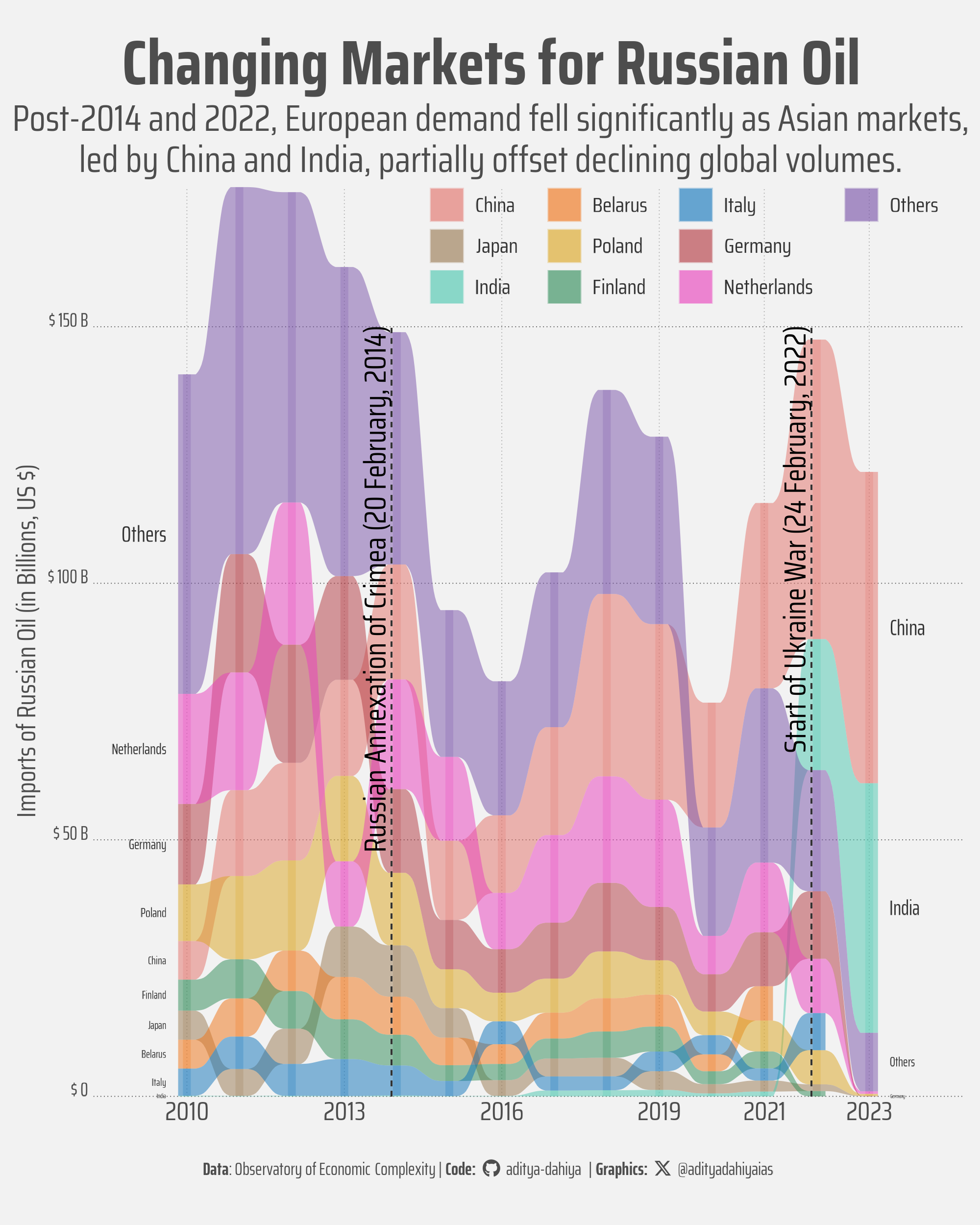
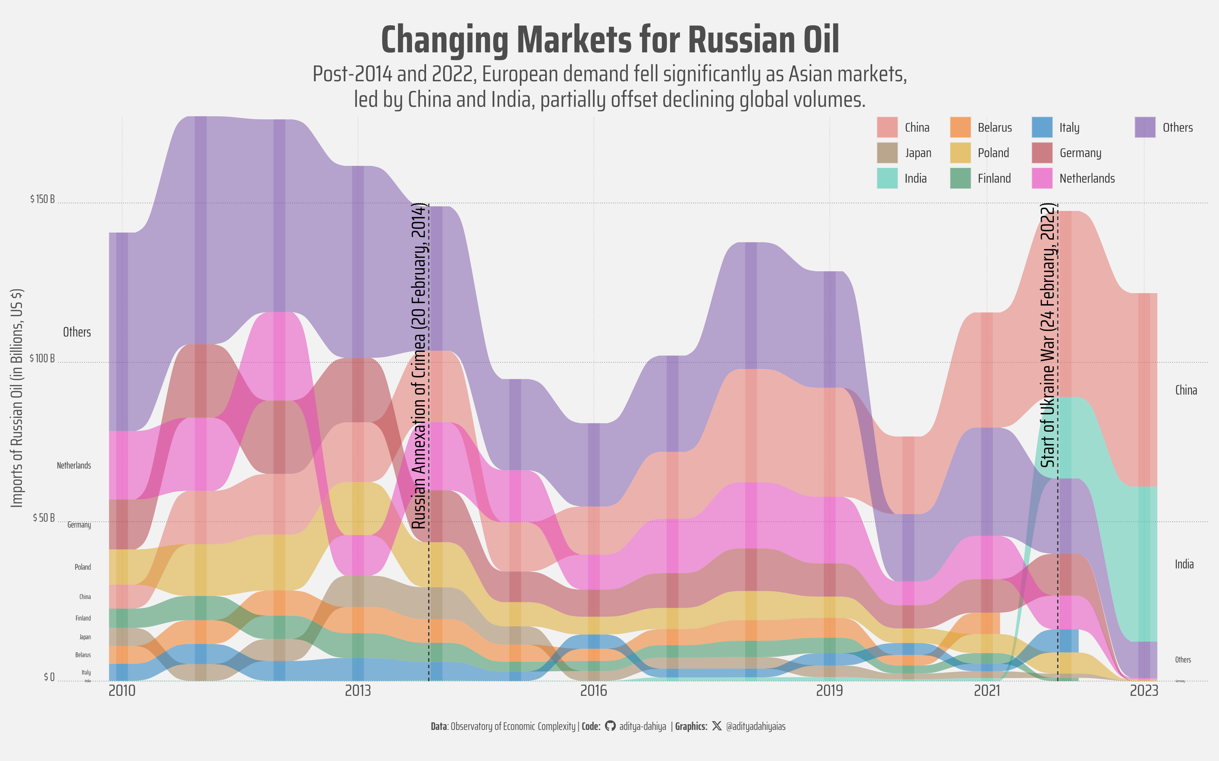
An alluvial plot for Changing Markets for Russian Oil
Post-2014 and 2022: European decline, Asian growth, but lower total exports.
Data Visualization
Gecomputation
Geopolitics
{ggalluvial}
Sankey Diagram
Alluvial Plot
Author
Aditya Dahiya
Published
August 5, 2025
About the Data
The trade data presented in this analysis was sourced from the Observatory of Economic Complexity (OEC), a leading platform for visualizing and analyzing international trade data. The dataset specifically utilizes the BACI (Base pour l’Analyse du Commerce International) database, which is maintained by CEPII (Centre d’Études Prospectives et d’Informations Internationales). The data covers textile woven fabric exports (HS4 code: 52709) from European Union countries to various importing nations from 2010 to 2023. BACI provides harmonized bilateral trade flows at the product level, offering comprehensive coverage of world merchandise trade with high-quality data reconciliation procedures. The data was accessed through the OEC’s Tesseract API, which provides programmatic access to their extensive trade databases.
Figure 1: This alluvial diagram displays the flow of Russian oil exports to major importing countries from 2010 to 2023. The horizontal axis represents years, while the vertical axis shows trade values in billions of US dollars. Each colored band (alluvium) represents a specific importing country, with band width proportional to import volume. The flowing streams illustrate how trade relationships evolved over time, with countries maintaining, gaining, or losing market share. Vertical dashed lines mark key geopolitical events in 2014 and 2022 for temporal reference.
Data Acquisition from OEC API
The trade data was programmatically retrieved from the Observatory of Economic Complexity’s Tesseract API using a loop-based approach developed with assistance from Claude Sonnet 4 and Google Gemini 2.5. The technique employed {httr} for making GET requests and {jsonlite} for parsing JSON responses, iterating through years 2010-2023 to fetch textile woven fabric exports (HS4 code: 52709) from EU countries. Each API call was constructed by dynamically replacing a year placeholder in the base URL, with error handling to check HTTP status codes and a respectful 0.5-second delay between requests using Sys.sleep(). The yearly datasets were stored in a list and combined using bind_rows() from {dplyr}, with column names cleaned using rename_with() and regular expressions to ensure consistency across the final consolidated dataset.
Code
# Load required librarieslibrary(httr)library(jsonlite)library(tibble)library(dplyr)# Define the base URL (without year parameter)base_url <-"https://api-v2.oec.world/tesseract/data.jsonrecords?cube=trade_i_baci_a_92&drilldowns=Importer+Country&include=Exporter+Country:eurus;Year:YEAR_PLACEHOLDER;HS4:52709&locale=en&parents=true&measures=Trade+Value"# Define years to fetchyears <-2010:2023# Initialize empty list to store data from each yearyearly_data_list <-list()# Loop through each yearfor (year in years) {cat("Fetching data for year:", year, "\n")# Create URL for current year current_url <-gsub("YEAR_PLACEHOLDER", year, base_url)# Make the API request response <-GET(current_url)# Check if the request was successfulif (status_code(response) ==200) {# Parse the JSON content json_content <-content(response, "text", encoding ="UTF-8")# Convert JSON to R data structure data_list <-fromJSON(json_content, flatten =TRUE)# Extract the data recordsif (is.list(data_list) &&"data"%in%names(data_list)) { year_data <-as_tibble(data_list$data) } elseif (is.data.frame(data_list)) { year_data <-as_tibble(data_list) } else {# If it's a list of records, convert directly year_data <-as_tibble(data_list) }# Add year column year_data$Year <- year# Store in list yearly_data_list[[as.character(year)]] <- year_datacat("Successfully fetched", nrow(year_data), "records for", year, "\n") } else {cat("Error fetching data for year", year, ": HTTP status code", status_code(response), "\n")cat("Response content:", content(response, "text"), "\n") }# Add a small delay between requests to be respectful to the APISys.sleep(0.5)}# Combine all yearly data into one tibbleif (length(yearly_data_list) >0) { trade_data <-bind_rows(yearly_data_list)# Clean up column names (remove spaces, make lowercase) trade_data <- trade_data %>%rename_with(~gsub(" ", "_", tolower(.x)))# Move Year column to the front trade_data <- trade_data %>%select(year, everything())# Display summary informationcat("\n=== FINAL RESULTS ===\n")cat("Total records:", nrow(trade_data), "\n")cat("Years covered:", paste(sort(unique(trade_data$year)), collapse =", "), "\n")cat("Columns:", ncol(trade_data), "\n")cat("\nColumn names:\n")print(names(trade_data))cat("\nFirst 6 rows:\n")print(head(trade_data))cat("\nData summary by year:\n") year_summary <- trade_data %>%group_by(year) %>%summarise(records =n(),.groups ='drop' )print(year_summary)} else {cat("No data was successfully fetched.\n")}# Clean workspace - keep only trade_datarm(list =setdiff(ls(), "trade_data"))
pacman::p_load( ggalluvial, # Alluvial diagrams and flow visualizations tidyverse, # Data manipulation & visualization scales, # Nice scales for ggplot2 fontawesome, # Icons display in ggplot2 ggtext, # Markdown text in ggplot2 showtext, # Display fonts in ggplot2 patchwork, # Composing plots ggalluvial # Alluvial Plots in R with ggplot2)bts =40# Base Text Sizesysfonts::font_add_google("Saira", "title_font")sysfonts::font_add_google("Saira Condensed", "body_font")sysfonts::font_add_google("Saira Extra Condensed", "caption_font")showtext::showtext_auto()# A base Colourbg_col <-"white"seecolor::print_color(bg_col)# Colour for highlighted texttext_hil <-"grey30"seecolor::print_color(text_hil)# Colour for the texttext_col <-"grey20"seecolor::print_color(text_col)# Caption stuff for the plotsysfonts::font_add(family ="Font Awesome 6 Brands",regular = here::here("docs", "Font Awesome 6 Brands-Regular-400.otf"))github <-""github_username <-"aditya-dahiya"xtwitter <-""xtwitter_username <-"@adityadahiyaias"social_caption_1 <- glue::glue("<span style='font-family:\"Font Awesome 6 Brands\";'>{github};</span> <span style='color: {text_hil}'>{github_username} </span>")social_caption_2 <- glue::glue("<span style='font-family:\"Font Awesome 6 Brands\";'>{xtwitter};</span> <span style='color: {text_hil}'>{xtwitter_username}</span>")plot_caption <-paste0("**Data**: Observatory of Economic Complexity"," | **Code:** ", social_caption_1, " | **Graphics:** ", social_caption_2 )rm(github, github_username, xtwitter, xtwitter_username, social_caption_1, social_caption_2)
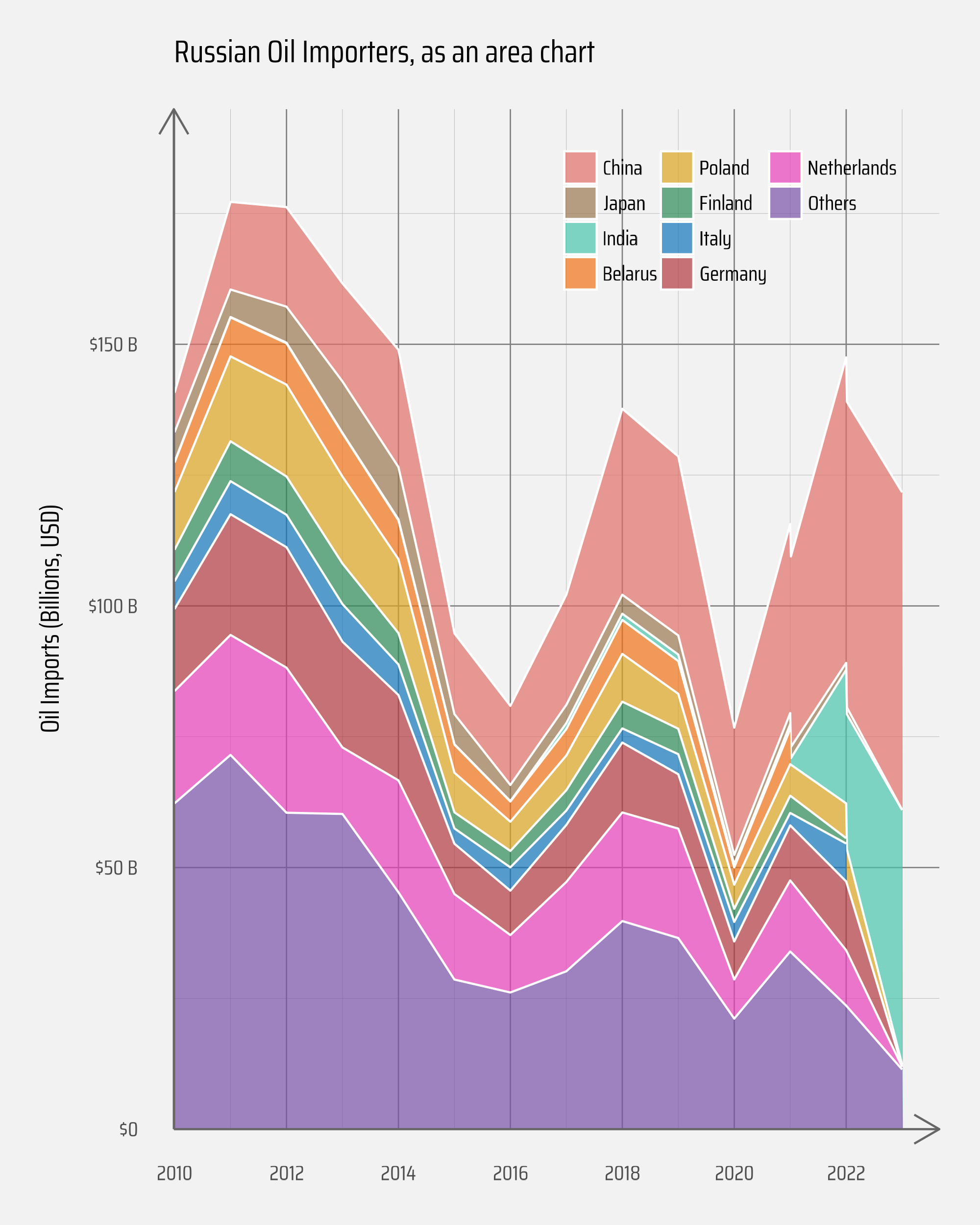
Creating the Russian Oil Exports Area Chart
This stacked area chart was built using {ggplot2}’s geom_area() function to show cumulative trade values over time. The data preprocessing used {dplyr} and fct_lump_n() from {forcats} to identify the top 9 importing countries by trade value, consolidating smaller importers into an “Others” category. The visualization employed white borders between areas for visual separation, alpha transparency for subtle layering, and {paletteer}’s “basetheme::royal” palette. Scale formatting was handled by {scales} functions like label_number() with cut_short_scale() to display values in billions with dollar prefixes, while the legend was positioned inside the plot area using ggplot2’s legend.position.inside parameter.
Figure 2: Stacked area chart showing cumulative Russian oil imports by top importing countries from 2010-2023, with each colored layer representing a different nation’s trade volume over time.
Creating the Russian Oil Exports Alluvial Plot
This alluvial diagram was created using R’s powerful {ggalluvial} package, which extends {ggplot2} to create flow visualizations that show how categorical data changes over time. The visualization process began with data manipulation using {dplyr} functions like fct_lump_n() from {forcats} to identify the top 9 importing countries by trade value, grouping smaller importers into an “Others” category. The core visualization leverages geom_alluvium() to create the flowing bands between years and geom_stratum() to define the categorical blocks at each time point. Country labels were strategically positioned using stat_stratum() with position_nudge() to place them at the start (2010) and end (2023) of the timeline, with text sizing based on trade values. Historical context was added through vertical dashed lines created with geom_segment() and rotated text annotations marking the 2014 Crimean annexation and 2022 Ukraine war. The color palette came from {paletteer}, while typography was enhanced using {showtext} to incorporate Google Fonts, and the overall aesthetic was refined with a custom theme_minimal() configuration that positioned legends, adjusted margins, and styled grid lines to create a clean, publication-ready visualization.
# Saving a thumbnaillibrary(magick)# Saving a thumbnail for the webpageimage_read(here::here("projects", "images", "russia_oil_exports_3.png")) |>image_resize(geometry ="x400") |>image_write( here::here("projects", "images", "russia_oil_exports.png" ) )
Session Info
Code
pacman::p_load( ggalluvial, # Alluvial diagrams and flow visualizations tidyverse, # Data manipulation & visualization scales, # Nice scales for ggplot2 fontawesome, # Icons display in ggplot2 ggtext, # Markdown text in ggplot2 showtext, # Display fonts in ggplot2 patchwork, # Composing plots ggalluvial # Alluvial Plots in R with ggplot2)
package 'ggalluvial' successfully unpacked and MD5 sums checked

The downloaded binary packages are in
    C:\Users\dradi\AppData\Local\Temp\Rtmp6HnxW2\downloaded_packages