# Load required packages
library(tigris)
# Get New York City Administrative boundary (county-based)
nyc_map <- counties(state = "NY", cb = TRUE, class = "sf") |>
dplyr::filter(NAME %in% c("New York", "Kings",
"Queens", "Bronx", "Richmond")) |>
st_union() |>
st_as_sf() |>
st_transform("EPSG:4326")
# Get Coastline Map
nyc_map2 <- rnaturalearth::ne_countries(
country = "United States of America",
scale = "large",
returnclass = "sf") |>
st_crop(st_bbox(nyc_map))
# Combine to get City map excluding Water
nyc_map <- st_intersection(nyc_map, nyc_map2)
# Test Check the map
ggplot(
data = st_intersection(nyc_map, nyc_map2)
) +
geom_sf()
# Get Subway Lines and Subway Stops (called Tube in London)
library(osmdata)
subway_lines_nyc <- opq(bbox = st_bbox(nyc_map)) |>
add_osm_feature(
key = "railway",
value = "subway"
) |>
osmdata_sf()
subway2 <- subway_lines_nyc$osm_lines |>
st_intersection(nyc_map)
subway_stations_nyc <- opq(bbox = st_bbox(nyc_map)) |>
add_osm_feature(
key = "railway",
value = "subway_entrance"
) |>
osmdata_sf()
subway3 <- subway_stations_nyc$osm_points |>
st_intersection(nyc_map)
# subway_route_nyc <- opq(bbox = st_bbox(nyc_map)) |>
# add_osm_feature(
# key = "railway",
# value = c("light_rail", "monorail", "tram")
# ) |>
# osmdata_sf()
#
# subway4 <- subway_route_nyc$osm_lines |>
# st_intersection(nyc_map)
# A test map for nyc and subway stations
ggplot() +
geom_sf(data = nyc_map) +
geom_sf(
data = subway3,
colour = "red",
size = 0.5
) +
geom_sf(
data = subway2,
colour = "blue"
)
subway_stops <- subway3
subway_lines <- subway2
subway_stops_buffer_1km <- subway_stops |>
st_union() |>
st_buffer(dist = 1000) |>
st_intersection(nyc_map)
subway_stops_buffer_2km <- subway_stops |>
st_union() |>
st_buffer(dist = 2000) |>
st_intersection(nyc_map)
# Years to plot
selected_year = seq(1991, 2022, 3)
# a blank tibble to start with
pop_compute <- tibble()
# Buffer Zones of 1 km and 2 km around the Subway Stations
compute_areas <- c(subway_stops_buffer_1km, subway_stops_buffer_2km) |>
st_as_sf() |>
rename(geometry = x)
for(i in selected_year) {
rast <- rast(paste0("GlobPOP_Count_30arc_", i, "_I32.tiff")) |>
terra::crop(nyc_map) |>
terra::mask(nyc_map, touches = FALSE)
rast[rast <= 0] <- 0.001
names(rast) <- "year_vals"
total_rast_pop <- rast |>
values() |>
as_tibble() |>
filter(!is.na(year_vals)) |>
summarise(
n = n(),
mean_pop = mean(year_vals, na.rm = T),
total_pop = n * mean_pop
)
pop_compute <- bind_rows(
pop_compute,
rast |>
terra::extract(compute_areas) |>
as_tibble() |>
group_by(ID) |>
summarise(
n = n(),
mean_pop = mean(year_vals, na.rm = T)
) |>
mutate(
year = i,
zone = c("1 km", "2 km"),
total_pop = n * mean_pop,
tot_del_pop = total_rast_pop$total_pop,
perc_pop = total_pop / total_rast_pop$total_pop
)
)
paste0("rast_", i) |>
assign(rast)
}
## Compile into a one multi-layered raster -----------------------------
# Initialize an empty SpatRaster object
rast_stack <- NULL
# Loop through each year and add the raster if it exists
for (y in selected_year) {
rast_name <- paste0("rast_", y) # Construct variable name
if (exists(rast_name)) { # Check if raster exists
rast <- get(rast_name) # Retrieve raster
if (is.null(rast_stack)) {
rast_stack <- rast # Initialize with first available raster
} else {
rast_stack <- c(rast_stack, rast) # Append to SpatRaster
}
} else {
message(paste("Skipping year", y, "as raster is missing"))
}
}
names(rast_stack) <- as.character(selected_year)
varnames(rast_stack) <- as.character(selected_year)
# Check total population of nyc
pop_compute |>
ggplot(
aes(x = year, y = tot_del_pop)
) +
geom_col() +
facet_wrap(~zone) +
scale_y_continuous(labels = label_number(scale_cut = cut_short_scale()))
# Rework the dataset so that it can be displayed on coord_sf()
plotdf1 <- pop_compute |>
mutate(
lyr = as.character(year)
) |>
mutate(
x_max = case_when(
zone == "1 km" ~ -74.16,
zone == "2 km" ~ -74.06,
.default = NA
),
x_min = case_when(
zone == "1 km" ~ -74.24,
zone == "2 km" ~ -74.14,
.default = NA
),
y_max = 40.7 + ((0.1 * perc_pop) * 1 / 0.75),
y_min = 40.7
) |>
mutate(
geometry = pmap(
list(x_min, x_max, y_min, y_max),
~ st_polygon(list(matrix(
c(..1, ..3, # Bottom-left
..2, ..3, # Bottom-right
..2, ..4, # Top-right
..1, ..4, # Top-left
..1, ..3), # Closing the polygon
ncol = 2, byrow = TRUE
)))
)
) |>
st_as_sf() |>
st_set_crs("EPSG:4326")
ggplot() +
geom_sf(
data = plotdf1,
mapping = aes(fill = zone),
linewidth = 0.2,
colour = "grey30"
) +
geom_text(
data = plotdf1,
mapping = aes(
label = paste0(round(perc_pop * 100, 1),"%",
"\n<", zone),
y = y_max,
x = (x_min + x_max)/2
),
colour = "grey30",
vjust = 1.2,
hjust = 0.5,
size = 2,
lineheight = 0.45
) +
facet_wrap(
~lyr,
) +
scale_fill_manual(
name = "Distance to nearest\nTube Station",
values = c(
alpha("red", 0.3),
alpha("yellow", 0.3)
)
) +
coord_sf(
default_crs = "EPSG:4326",
ylim = c(40.5, 40.9),
xlim = c(-74.35, -73.7),
expand = FALSE
) +
theme_minimal(
base_size = 12
)
# Check change in percentage population near Tube Station over time
pop_compute |>
ggplot(
aes(
x = year,
y = perc_pop
)
) +
geom_col() +
scale_x_continuous(
breaks = selected_year
) +
facet_wrap(~zone) +
theme(
axis.text.x = element_text(
angle = 90
)
)
# Convert 2021 and 2022 rasters to integer class, instead of double
rast_stack$`2021` <- as.int(rast_stack$`2021`)
g1 <- ggplot() +
geom_spatraster(
data = rast_stack
) +
scale_fill_gradient2(
low = "white",
high = "grey20",
na.value = "transparent",
transform = "sqrt",
name = "Population\ndensity (persons\n/ sq. km.)",
breaks = c(0, 100, 2000, 1e4, 3e4),
limits = c(10, 5e4),
oob = scales::squish,
labels = scales::label_number(scale_cut = cut_short_scale())
) +
geom_sf(
data = nyc_map,
fill = NA,
linewidth = 0.7
) +
geom_sf(
data = subway_stops_buffer_2km,
fill = alpha("yellow", 0.2),
colour = "transparent",
linewidth = 0.1
) +
geom_sf(
data = subway_stops_buffer_1km,
fill = alpha("red", 0.2),
colour = "transparent",
linewidth = 0.1
) +
geom_sf(
data = subway_stops,
colour = "blue",
size = 0.5,
alpha = 0.5
) +
geom_sf(
data = subway_lines,
colour = "blue",
linewidth = 0.1
) +
ggnewscale::new_scale_fill()+
geom_sf(
data = plotdf1,
mapping = aes(fill = zone),
linewidth = 0.2,
colour = "grey30"
) +
geom_text(
data = plotdf1,
mapping = aes(
label = paste0(round(perc_pop * 100, 1),"%",
"\n<", zone),
y = y_max,
x = (x_min + x_max)/2
),
colour = "grey30",
vjust = 1.2,
hjust = 0.5,
size = 8,
lineheight = 0.4
) +
scale_fill_manual(
name = "Distance to\nnearest Tube\nStation",
values = c(
alpha("red", 0.3),
alpha("yellow", 0.3)
)
) +
coord_sf(
default_crs = "EPSG:4326",
ylim = c(40.48, 40.94),
xlim = c(-74.28, -73.68),
expand = FALSE,
clip = "off"
) +
facet_wrap(
~lyr,
ncol = 4
) +
labs(
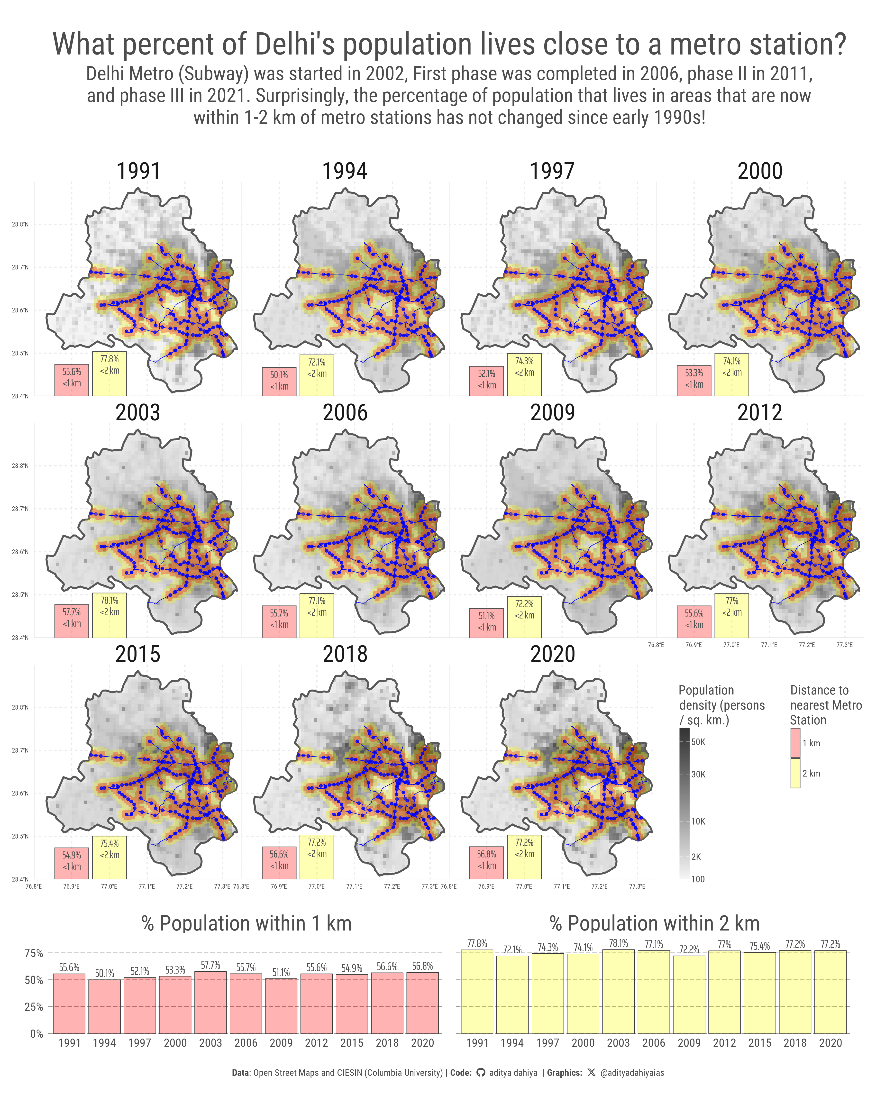
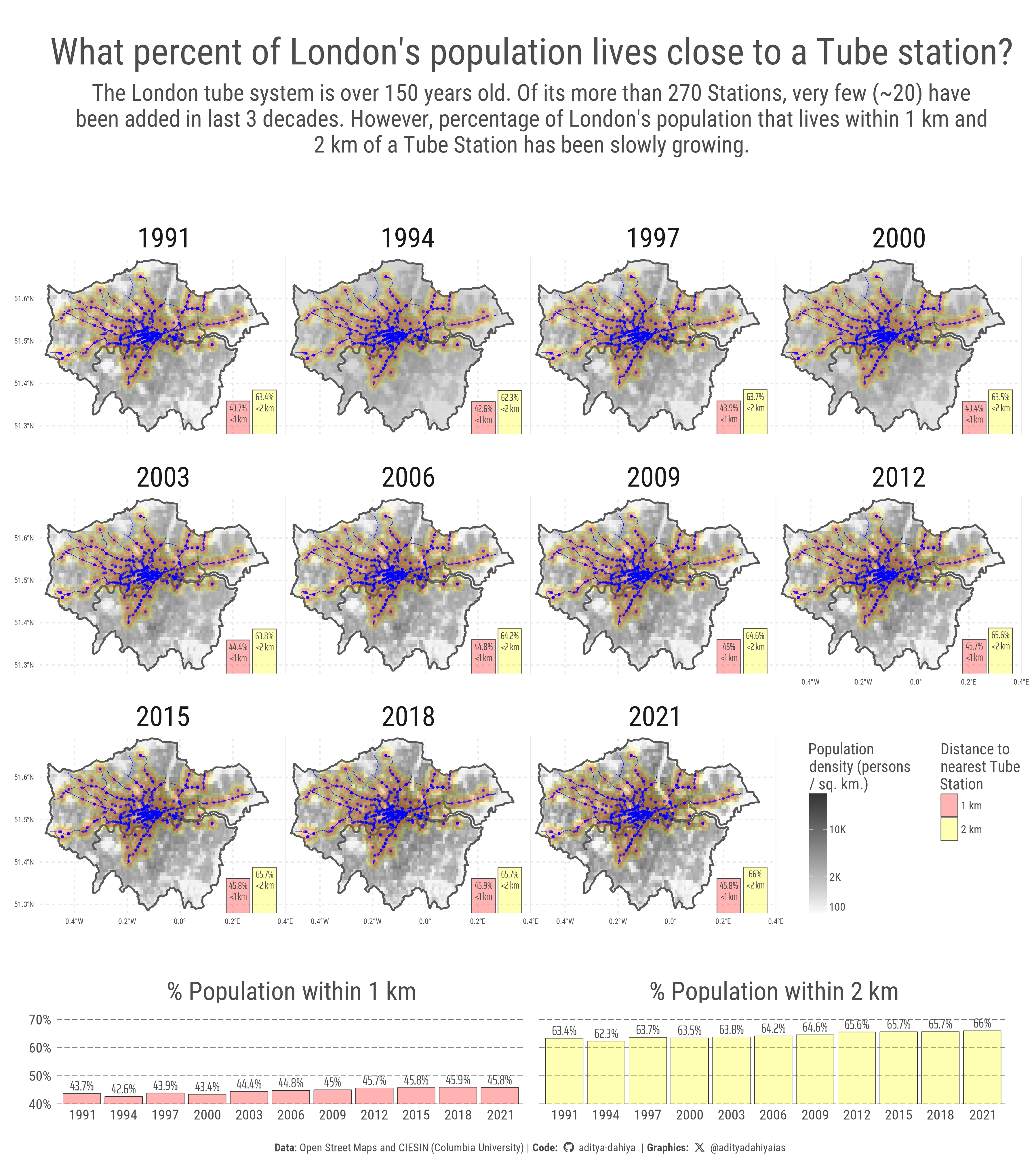
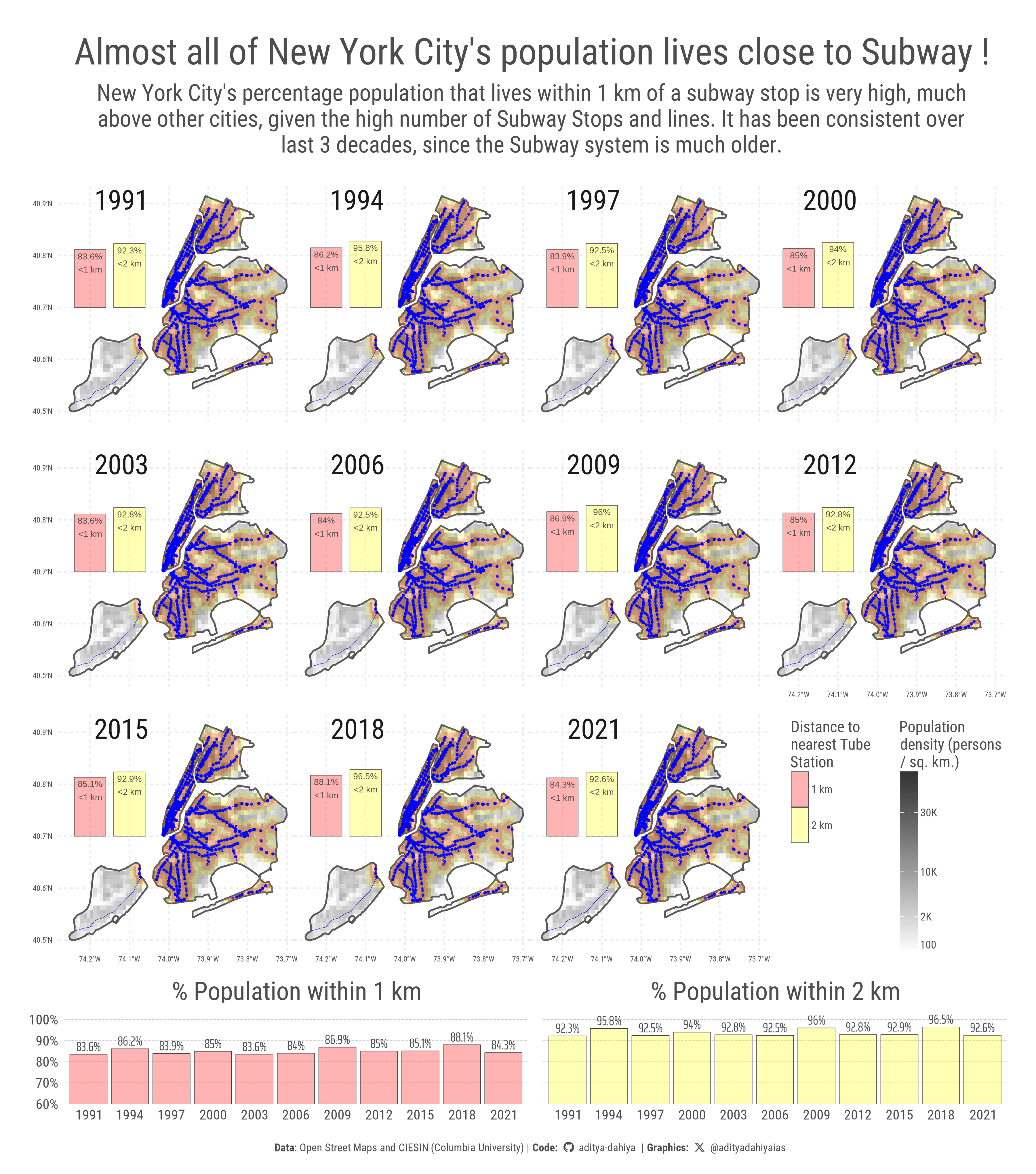
title = "Almost all of New York City's population lives close to Subway !",
subtitle = str_wrap("New York City's percentage population that lives within 1 km of a subway stop is very high, much above other cities, given the high number of Subway Stops and lines. It has been consistent over last 3 decades, since the Subway system is much older.", 100),
caption = plot_caption,
x = NULL,
y = NULL
) +
theme(
text = element_text(
colour = "grey30"
),
legend.position = "inside",
panel.grid = element_line(
linewidth = 0.6,
linetype = 3
),
# Customizing the Legend
legend.position.inside = c(1, 0),
legend.justification = c(1, 0),
legend.direction = "vertical",
legend.box = "horizontal",
legend.box.margin = margin(0,1,0,0, "pt"),
legend.margin = margin(0,0,0,0, "pt"),
legend.title.position = "top",
legend.title = element_text(
margin = margin(0,0,2,0, "pt"),
lineheight = 0.3,
size = bts * 1.7
),
legend.text = element_text(
margin = margin(0,0,0,2, "pt"),
size = bts * 1.2
),
legend.key.height = unit(30, "pt"),
legend.key.width = unit(15, "pt"),
plot.margin = margin(5,0,5,0, "pt"),
plot.title = element_text(
margin = margin(15,0,10,0, "pt"),
size = 4 * bts,
hjust = 0.5
),
plot.subtitle = element_text(
margin = margin(0,0,0,0, "pt"),
lineheight = 0.3,
hjust = 0.5,
size = 2.5 * bts
),
plot.caption = element_textbox(
halign = 0.5,
hjust = 0.5,
size = bts * 1.2,
margin = margin(150,0,0,0, "pt")
),
panel.spacing = unit(0, "pt"),
panel.background = element_rect(
fill = "transparent",
colour = "transparent"
),
strip.text = element_text(
margin = margin(25,0,-25,0, "pt"),
hjust = 0.2,
size = bts * 3
),
axis.ticks = element_blank(),
axis.ticks.length = unit(0, "pt")
)
# An inset graph of changes over years
strip_labels <- c(
"% Population within 1 km",
"% Population within 2 km"
)
names(strip_labels) <- unique(plotdf1$zone)
g2 <- ggplot(
data = plotdf1,
mapping = aes(
x = as.character(year),
y = perc_pop,
fill = zone
)
) +
geom_col(
colour = "grey20",
linewidth = 0.2
) +
geom_text(
mapping = aes(
label = paste0(round(100 * perc_pop, 1), "%")
),
hjust = 0.5,
vjust = -0.35,
size = 12,
colour = "grey30",
family = "caption_font"
) +
scale_y_continuous(
labels = label_percent(),
expand = expansion(c(0, 0.2))
) +
scale_fill_manual(
values = c(
alpha("red", 0.3),
alpha("yellow", 0.3)
)
) +
coord_cartesian(
ylim = c(0.6, 1)
) +
facet_wrap(
~zone,
labeller = labeller(zone = strip_labels)
) +
labs(x = NULL, y = NULL) +
theme(
panel.grid = element_blank(),
panel.grid.major.y = element_line(
linewidth = 0.15,
linetype = "longdash",
colour = "grey70"
),
legend.position = "none",
axis.ticks.length = unit(0, "pt"),
axis.text = element_text(
size = 36
),
strip.text = element_text(
size = 66,
margin = margin(0,0,0,0, "pt"),
colour = "grey30"
)
)
g <- g1 +
inset_element(
p = g2,
left = 0, right = 1,
bottom = 0.02, top = 0.17,
align_to = "full"
)
ggsave(
plot = g,
filename = here::here(
"projects", "images",
"cities_pop_subway_5.png"
),
height = 1200 * 3.4,
width = 1200 * 3,
units = "px",
bg = "white"
)