Chapter 1
Introduction
This chapter has no exercises, hence there are no solutions to display. Instead, we delve into various ggplot2 add-on packages installed in Section 1.5
Installing packages and loading libraries
Code for installing the various packages required for this book: –
install.packages(c(
  "colorBlindness", "directlabels", "dplyr",
  "ggforce", "gghighlight", "ggnewscale", "ggplot2", "ggraph",
  "ggrepel", "ggtext", "ggthemes", "hexbin", "Hmisc", "mapproj",
  "maps", "munsell", "ozmaps", "paletteer", "patchwork",
  "rmapshaper", "scico", "seriation", "sf", "stars", "tidygraph", "tidyr", "wesanderson"
))
Interesting ggplot2 add-on packages
Let’s have a look at some important features of the packages: –
colorBlindness
The colorBlindness R package (Ou 2021) is specifically crafted to curate a diverse array of secure color palettes suitable for various plot types like heat-maps and pie charts. Its aim is to ensure that the resulting visualizations are accessible and comprehensible to all users. Additionally, it features a Color Vision Deficiency (CVD) simulator, a tool that facilitates the emulation of color vision deficiencies for improved accessibility.
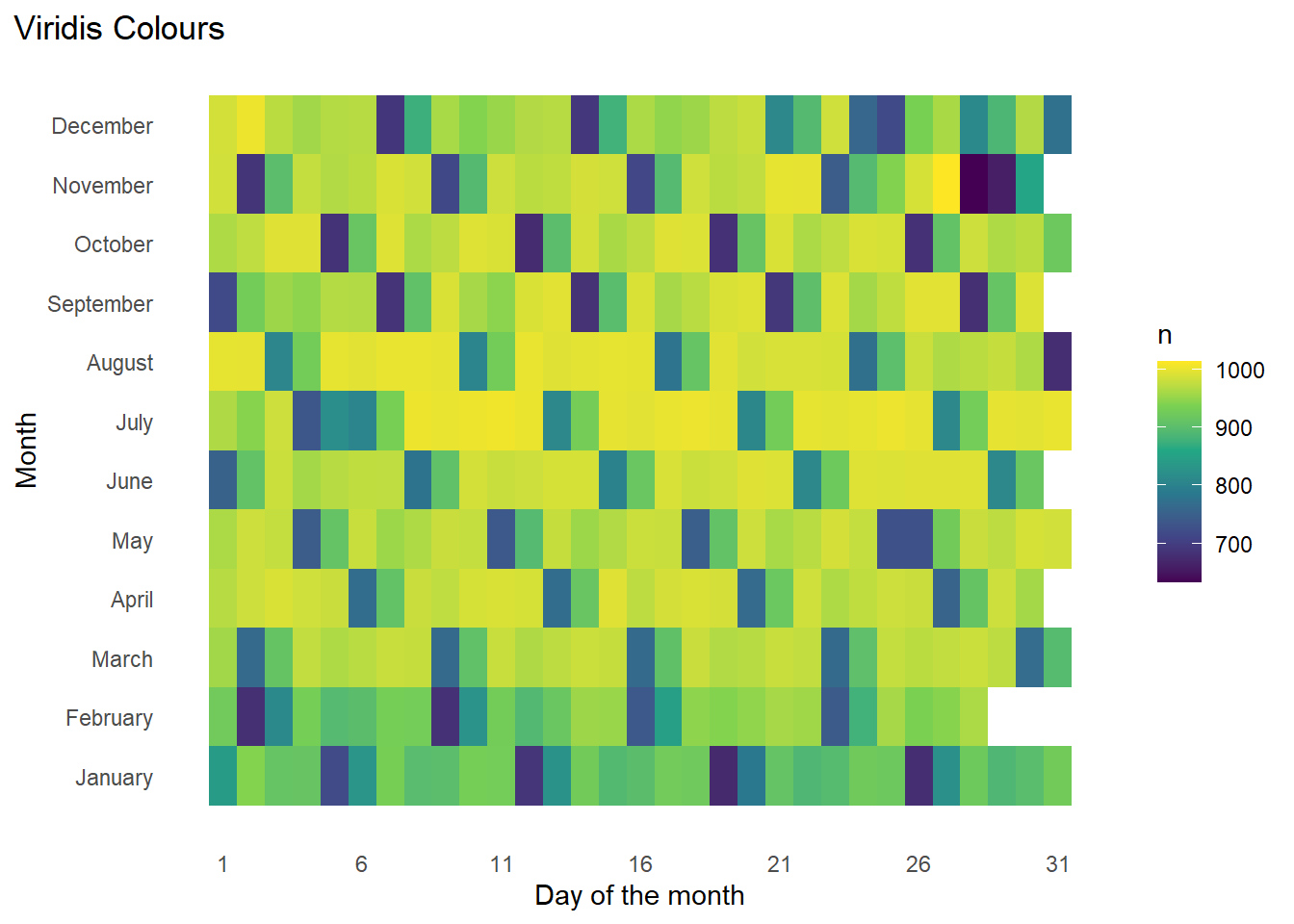
Figure 1 shows a basic heat-map created with geom_tile() and nycflights13 (Wickham 2021) data-set with different colour schemes.
Code
library(colorBlindness)
g1 <- flights |>
  group_by(month, day) |>
  count() |>
  ggplot(aes(x = day,
             y = month,
             fill = n)) +
  geom_tile() +
  theme_minimal() +
  labs(y = "Month", x = "Day of the month") +
  scale_y_continuous(breaks = 1:12,
                     labels = month.name) +
  scale_x_continuous(breaks = seq(1, 31, 5)) +
  theme(panel.grid = element_blank(),
        plot.title.position = "plot")

g1 + labs(title = "Default ggplot2 colours")

g1 + scale_fill_viridis_c() + labs(title = "Viridis Colours")
Now, using cvdPlot() from the package colorBlindness to check the plot’s view ( Figure 2 ) to different people.
Code
cvdPlot(g1 + scale_fill_viridis_c())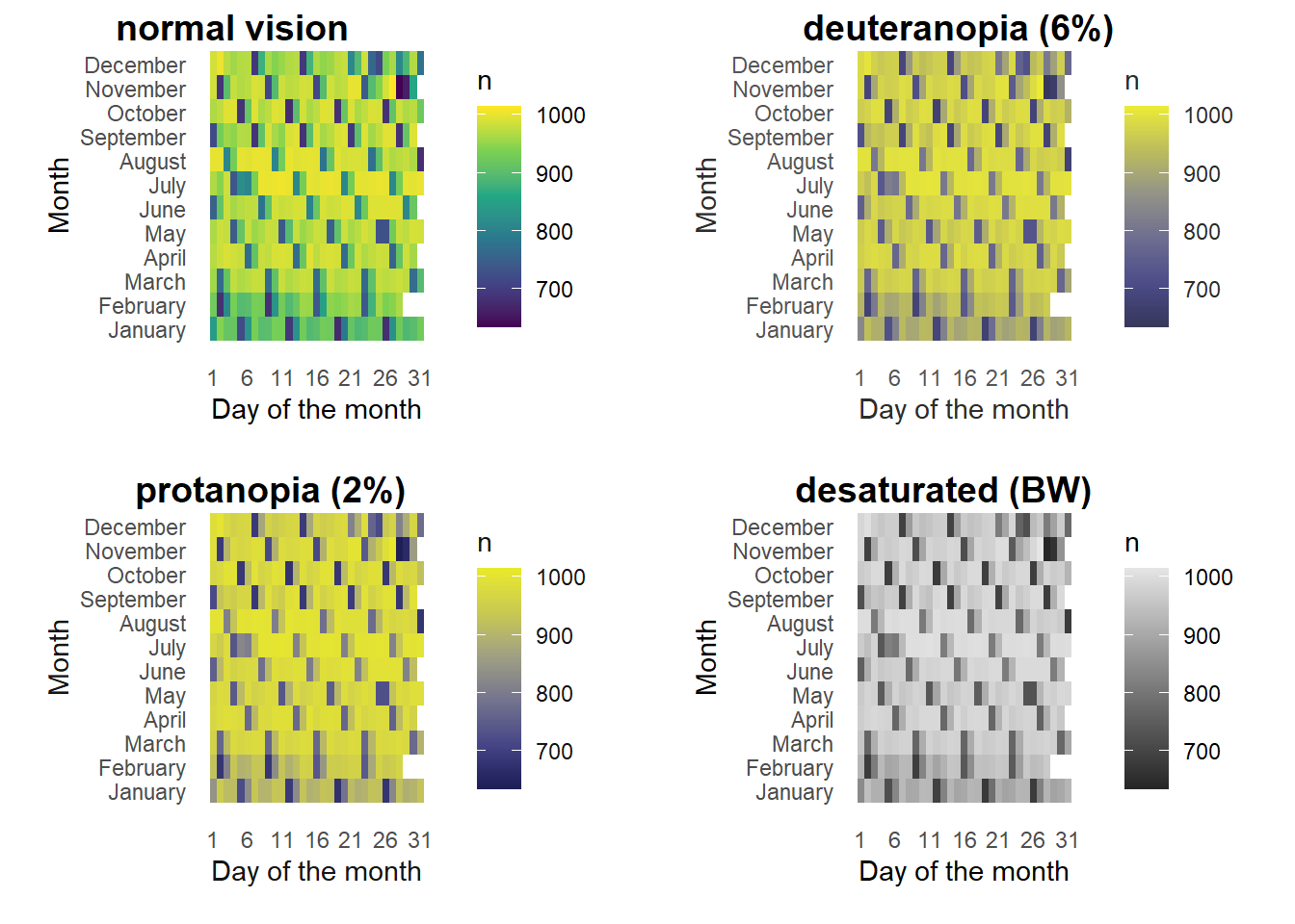
directlabels
The directlabels package (Hocking 2023) allows us to label plots easily, using various methods listed here. An example is shown in Figure 3 .
Code
library(directlabels)
g2 <- flights |>
  filter(carrier %in% c("AA", "DL", "UA", "US", "WN")) |>
  group_by(month, carrier) |>
  summarise(avg_delay = mean(dep_delay, na.rm = TRUE)) |>
  ggplot(aes(x = month, y = avg_delay,
             group = carrier,
             col = carrier)) +
  geom_line() +
  geom_point() +
  theme_classic() +
  labs(x = "Month", y = "Average Departure Delay (min.)") +
  scale_x_continuous(breaks = 1:12, labels = month.abb) +
  scale_color_brewer(palette = "Set1")

gridExtra::grid.arrange(
g2 |> direct.label(method = "angled.boxes") +
  labs(title = "method = \"angled.boxes\""),

g2 |> direct.label(method = "last.polygons") +
  labs(title = "method = \"last.polygons\""),

g2 |> direct.label(method = "top.bumpup") +
  labs(title = "method = \"top.bumpup\""),

g2 |> direct.label(method = "first.polygons") +
  labs(title = "method = \"first.polygons\"") ,
nrow = 2, ncol = 2)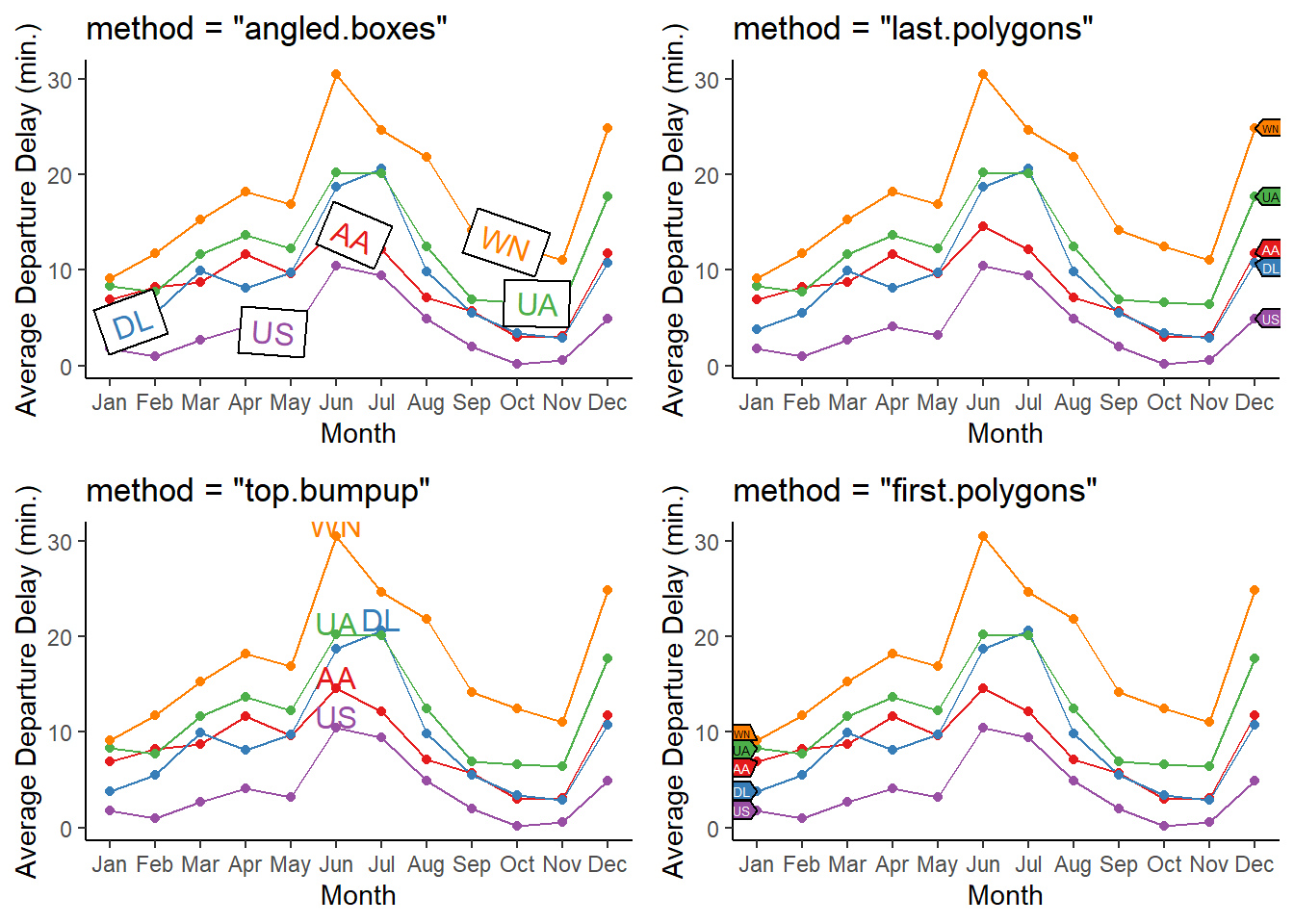
ggforce
The ggforce package (Pedersen 2022) is, in effect, a collection of geoms and other features to add on to the ggplot2 collection. Once particularly nice one is facet_zoom() as depicted in Figure 4 . This feature allows you to focus on a specific portion of the data by creating a zoomed-in view, while preserving the complete dataset in a separate panel. We can zoom in on either the x-axis, the y-axis, or both simultaneously.
Code
library(ggforce)
library(ggthemes)

flights |>
  filter(carrier == "AA" & month == 1) |>
  ggplot(aes(x = dep_delay,
             y = arr_delay)) +
  geom_jitter(alpha = 0.2) +
  geom_smooth(se = FALSE, col = "red") +
  facet_zoom(y = arr_delay < 0,
             x = dep_delay < 0) +
  labs(y = "Arrival Delay (minutes)", x = "Departure Delay (minutes)")
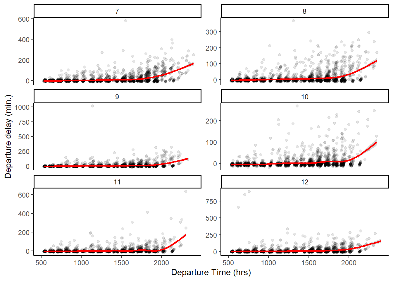
Another nice one is facet_wrap_paginate() which enables you to break down a faceted plot into multiple pages. You can specify the number of rows and columns per page, along with the page number you want to plot. The function will automatically generate only the appropriate panels. The Figure 5 shows an example with a for(){} loop.
Code
for (i in 1:2) {

  print(
    flights |>
      filter(carrier == "AA") |>
      ggplot(aes(x = dep_time,
                 y = dep_delay)) +
      geom_jitter(alpha = 0.1,
                 shape = 19) +
      geom_smooth(col = "red") +
      facet_wrap_paginate(~ month,
                          nrow = 3,
                          ncol = 2,
                          scales = "free_y",
                          page = i) +
      scale_x_continuous(limits = c(500, 2400)) +
      theme_classic() +
      labs(x = "Departure Time (hrs)", y = "Departure delay (min.)")
  )
}
gghighlight
The gghighlight package (Yutani 2022) is an amazing tool to highlight only types of groups in a plot, and can even be used with faceting. The Figure 6 shows an example with a single plot, and Figure 7 shows the same example with faceting.
Code
flights |>
  mutate(dep_hour = dep_time %/% 100) |>
  group_by(carrier, dep_hour) |>
  summarize(avg_delay = mean(dep_delay, na.rm = TRUE)) |>
  ggplot(aes(x = dep_hour,
             y = avg_delay,
             col = carrier,
             group = carrier)) +
  geom_line(lwd = 1, alpha = 0.75) +
  xlim(c(5, 24)) + ylim(c(-10, 300)) +
  labs(x = "Departure Time (hr.)", y = "Average Departure Delay (min.)") +
  theme_minimal()

flights |>
  mutate(dep_hour = dep_time %/% 100) |>
  group_by(carrier, dep_hour) |>
  summarize(avg_delay = mean(dep_delay, na.rm = TRUE)) |>
  ggplot(aes(x = dep_hour,
             y = avg_delay,
             col = carrier,
             group = carrier)) +
  geom_line(lwd = 1, alpha = 0.75) +
  xlim(c(5, 24)) + ylim(c(-10, 300)) +
  labs(x = "Departure Time (hr.)", y = "Average Departure Delay (min.)") +
  theme_minimal() +
  gghighlight::gghighlight(carrier == "AA")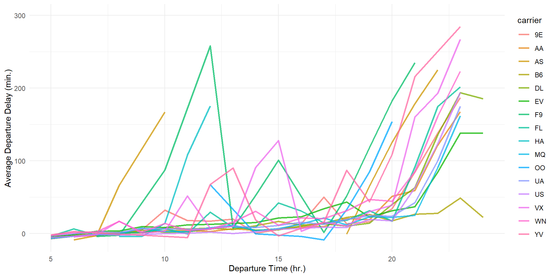

Code
flights |>
  mutate(dep_hour = dep_time %/% 100) |>
  group_by(carrier, dep_hour) |>
  summarize(avg_delay = mean(dep_delay, na.rm = TRUE)) |>
  ggplot(aes(x = dep_hour,
             y = avg_delay,
             col = carrier,
             group = carrier)) +
  geom_line(lwd = 1, alpha = 0.75) +
  xlim(c(5, 24)) + ylim(c(-10, 300)) +
  theme_minimal() +
  gghighlight::gghighlight(carrier %in% c("AA", "UA", "US", "DL")) +
  facet_wrap(~ carrier) +
  scale_color_brewer(palette = "Dark2") +
  labs(x = "Departure Time (hr.)", y = "Average Departure Delay (min.)",
title = "Comparing depature delays of 4 major carriers with others") 
ggnewscale
The ggnewscale package (Campitelli 2023) allows you to use two or more different color scales (or, any other scales like fill, shape, linetype etc. in the same plot. The Figure 8 is directly copied from the website of the package, and credits to
Code
library(ggnewscale)
# Equivalent to melt(volcano)
topography <- expand.grid(x = 1:nrow(volcano),
                          y = 1:ncol(volcano))
topography$z <- c(volcano)

# point measurements of something at a few locations
set.seed(42)
measurements <- data.frame(x = runif(30, 1, 80),
                           y = runif(30, 1, 60),
                           thing = rnorm(30))

ggplot(mapping = aes(x, y)) +
  geom_contour(data = topography, aes(z = z, color = stat(level))) +
  # Color scale for topography
  scale_color_viridis_c(option = "D") +
  # geoms below will use another color scale
  new_scale_color() +
  geom_point(data = measurements, size = 3, aes(color = thing)) +
  # Color scale applied to geoms added after new_scale_color()
  scale_color_viridis_c(option = "A") +
  theme_void() +
  labs(title = "The ggnewscale package allows use of multiple color scales") +
  theme(legend.position = "bottom")
magick
The magick package (Ooms 2023) is a tool to handle and process images in R. It can be used to read .png , .jpeg , .svg and other images. While there are a plethora of features, the primary one I use are given below. Note that I have created the logo for this book solutions using magick and cropcircles .
Code
library(magick)

# Reading in the image
book_logo <- image_read("https://ggplot2-book.org/cover.jpg")

# Looking at the image in your computer's browser or default app
image_browse(book_logo)

# Editing the image to add 3rd Edition and Solutions Manual words
book_logo <- book_logo |>
  image_annotate("Solutions Manual (& beyond)\nfor                   ",
                 color = "white",
                 location = "+80+125",
                 size = 30,
                 font = "helvetica",
                 weight = 700) |>
  image_annotate("Third Edition",
             strokecolor = "white",
             color = "white",
             boxcolor = "#EEB301",
             location = "+75+480",
             style = "italic",
             size = 35)

# Saving the image
image_write(book_logo,
            "book_cover.jpg",
            format = "jpeg")
cropcircles
We can use the cropcircles package (Oehm 2023) to crop images into a rounded and hexagonal logo for my current book, as an example. (Note: the package generated a transparent background for me only in .png format).
We can also create hexagonal logos with this, as shown here.
![]()
Code
library(cropcircles)

# A round logo
round_logo <- book_logo |>
  image_crop("600x600+0+30")

image_read(
  circle_crop(round_logo,
              just = "top",
              border_colour = "black",
              border_size = 7)) |>
  image_write("book_logo.png",
format = "png")![]()
Code
library(magick)
# Creating a hex
book_logo <- image_read("https://ggplot2-book.org/cover.jpg")

book_logo <- book_logo |>
  image_annotate("Solutions Manual \n  (& beyond) for",
                 color = "white",
                 location = "+150+105",
                 size = 30,
                 font = "helvetica",
                 weight = 700) |>
  image_annotate("        Third Edition",
             strokecolor = "white",
             color = "white",
             boxcolor = "#EEB301",
             location = "+75+480",
             style = "italic",
             size = 35) |>
  image_crop("600x600+0+30")

image_read(
  hex_crop(
    book_logo,
    just = "top",
    border_size = 8,
    border_colour = "black"
  )
) |>
  image_write("hex_logo.png")
cowplot
We can use a very popular add-on cowplot (Wilke 2020) for some interesting and nice themes like theme_minimal_hgrid(), for keeping only particular lines in a ggplot. Further, it allows to place plots in a grid with joint labels.
Code
library(cowplot)
diamonds |>
count(cut) |>
ggplot(aes(x = cut, y = n)) +
geom_col(fill = "#c51b8a") +
theme_minimal_hgrid() +
scale_y_continuous(labels = scales::label_number_si()) +
labs(x = "Cut of the Diamond",
y = "Number of diamonds (in thousands)")
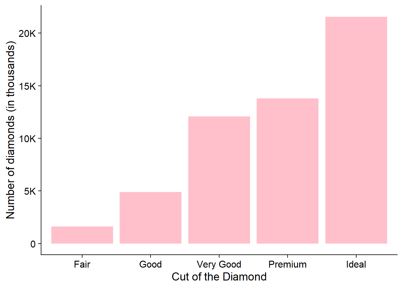
diamonds |>
count(cut) |>
ggplot(aes(x = cut, y = n)) +
geom_col(fill = "pink") +
scale_y_continuous(labels = scales::label_number_si()) +
labs(x = "Cut of the Diamond",
y = "Number of diamonds (in thousands)") +
theme_half_open()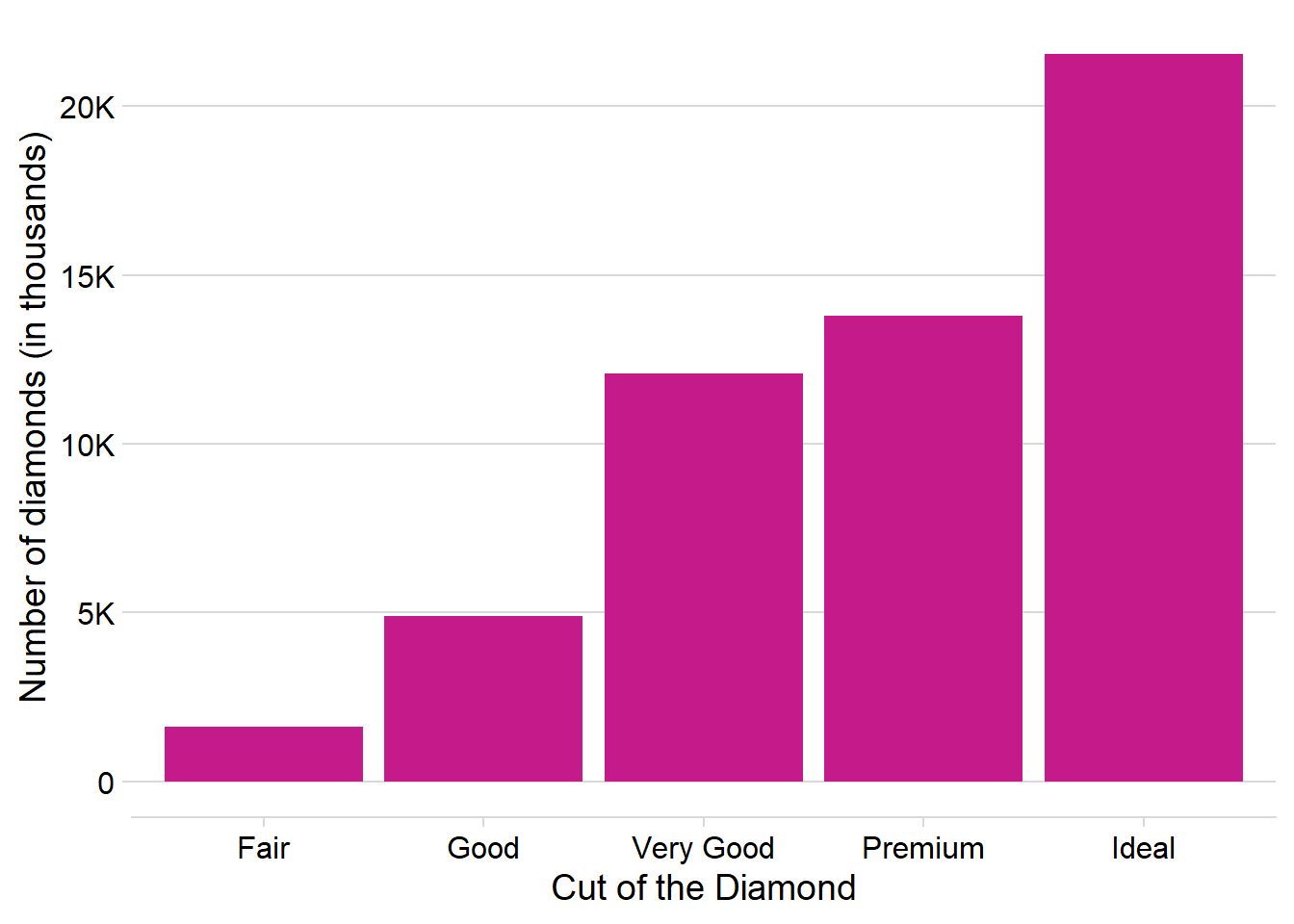
ggspatial
The ggspatial package (Dunnington 2023) provides some nice add-on features to ggplot2 maps like map scale (using annotation_scale() ) and a north arrow (using annotation_north_arrow() ). An example is shown below: –
Code
library(tidyverse)
library(ggspatial)
library(sf)

# Reading in the Haryana Map Data
read_sf(here::here("data",
                                  "haryana_map",
                                  "HARYANA_DISTRICT_BDY.shp")) |>
  janitor::clean_names() |>
  mutate(
    district = str_replace_all(district,
                               pattern = ">",
                               replacement = "A"),
    state = str_replace_all(state,
                            pattern = ">",
                            replacement = "A"),
    district = case_when(
      district == "FAR|DABAD" ~ "FARIDABAD",
      district == "J|ND" ~ "JIND",
      district == "PAN|PAT" ~ "PANIPAT",
      district == "SON|PAT" ~ "SONIPAT",
      .default = district
    ),
    district = snakecase::to_title_case(district)
      ) |>

  # Plot the State of Haryana in India
  ggplot(aes(geometry = geometry,
             label = district)) +
  geom_sf(fill = "lightgrey",
          col = "white") +
  geom_sf_text(size = 3) +

  # Add a north arrow
  annotation_north_arrow(location = "tl") +

  # Add a scale
  annotation_scale(bar_cols = c("lightgrey",
                                "darkgrey"),
                   location = "bl") +
  # Theme & Labels
  labs(x = NULL, y = NULL,
       title = "Map of the State of Haryana (India)",
       subtitle = "Adding North arrow and Scale using `ggspatial`") +
  theme_minimal()
ggfittext
The ggfittext package (Wilkins 2023) offers a versatile solution for incorporating text (instead of geom_text()) into plots with automated handling of resizing, rescaling, and color adaptation to fit within polygons or boxes. Its key functions include:
geom_fit_text(): This function dynamically resizes text to fit within a specified box. By automatically inferring the width and height of the designated box,geom_fit_text()reduces the size of text that exceeds these dimensions. Noteworthy parameters such asreflow = TRUEandgrow = TRUEenable text warping and size incrementation, respectively. Additionally, thecontrast = TRUEfeature automatically adjusts the text color to complement varying backgrounds, as commonly encountered in heatmaps.geom_bar_text(): Serving a similar purpose, this function extends its capabilities to bar plots, stacked bar plots, and dodged/side-by-side bar plots. It encompasses the same functionalities asgeom_fit_text(), providing seamless integration of text within these specific plot types.
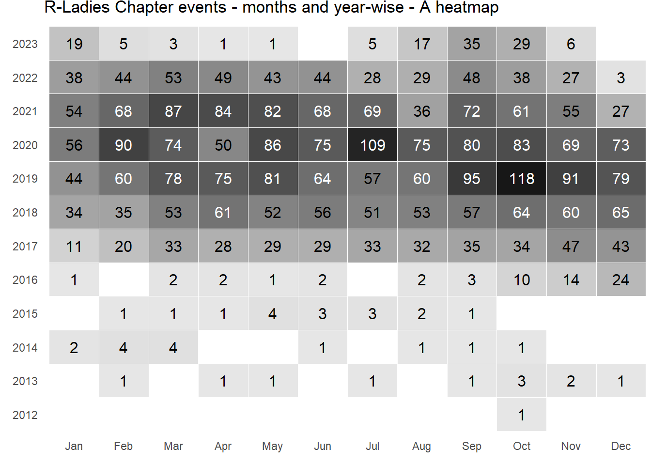
Two examples are shown in Figure 10 .
Code
library(tidyverse)
library(ggfittext)

df <- readr::read_csv('https://raw.githubusercontent.com/rfordatascience/tidytuesday/master/data/2023/2023-11-21/rladies_chapters.csv') |>
  select(date, location) |>
  mutate(year = year(date),
         month = month(date, label = TRUE, abbr = TRUE)) |>
  count(year, month) |>
  mutate(year = as.character(year))

# Actual Plots------------------------------------------------------------------
df |>
  count(year, wt = n) |>
  ggplot(aes(x = n,
             y = year,
             label = n)) +
  geom_col(col = NA) +
  geom_bar_text(contrast = TRUE) +
  theme_minimal() +
  labs(x = NULL, y = NULL,
       title = "Number of R-Ladies Chapter Events over the years") +
  theme(axis.line = element_blank(),
        panel.grid = element_blank())


df |>
  ggplot(aes(x = month,
             y = year,
             fill = n,
             label = n)) +
  geom_tile(col = "white") +
  geom_fit_text(contrast = TRUE) +
  scale_fill_gradient(low = "#e6e6e6", high = "#171717") +
  theme_minimal() +
  theme(panel.grid = element_blank(),
        legend.position = "none",
        axis.title = element_blank(),
        plot.margin = unit(c(0,0,10,10), "pt")
  ) +
  labs(title = "R-Ladies Chapter events - months and year-wise - A heatmap")
ggdist
The ggdist R package (Kay 2024) introduces geoms like half_eye (implemented with stat_slabinterval()) and stat_dotsinterval() that enable the creation of rain-cloud plots. These plots offer an effective and clear visualization of data distribution, incorporating uncertainty representation. To illustrate, here’s an example in Figure 11 utilizing the diamonds dataset from ggplot2.
Code
library(tidyverse)
library(ggdist)


# Data-set of diamonds priced greater than $10,000
diamonds |>
  filter(price > 10000 & color == "J") |>

  # Setting axes and aesthetics
  ggplot(aes(x = cut,
             y = carat,
             fill = cut)) +

   # Drawing the Cloud on right side of the boxplot
  stat_slabinterval(adjust = 3,
                    position = "dodge",
                    justification = -0.1,
                    alpha = 0.5,
                    scale = 0.3,
                    point_fill = "white",
                    shape = 21) +
  # Rain Drops on the left hand side
  stat_dotsinterval(
            side = "left",
            justification = 1.05,
            dotsize = 3,
            stackratio = 0.75,
            layout = "hex") +
  # Labels
  labs(x = "Cut", y = "Carat",
       color = "Cut", fill = "Cut",
       title = "Raincloud plot of Diamonds' Carat",
       subtitle = "Distribution of Carat across Cuts in Diamonds of J Colour above $10,000 in price") +

  # Scales
  scale_y_continuous(limits = c(1.5, 3.0)) +

  scale_fill_brewer(palette = "Set2") +

  # Theme
  theme_classic() +
  theme(legend.position = "none",
        axis.title = element_text(hjust = 1,
                                  face = "bold"))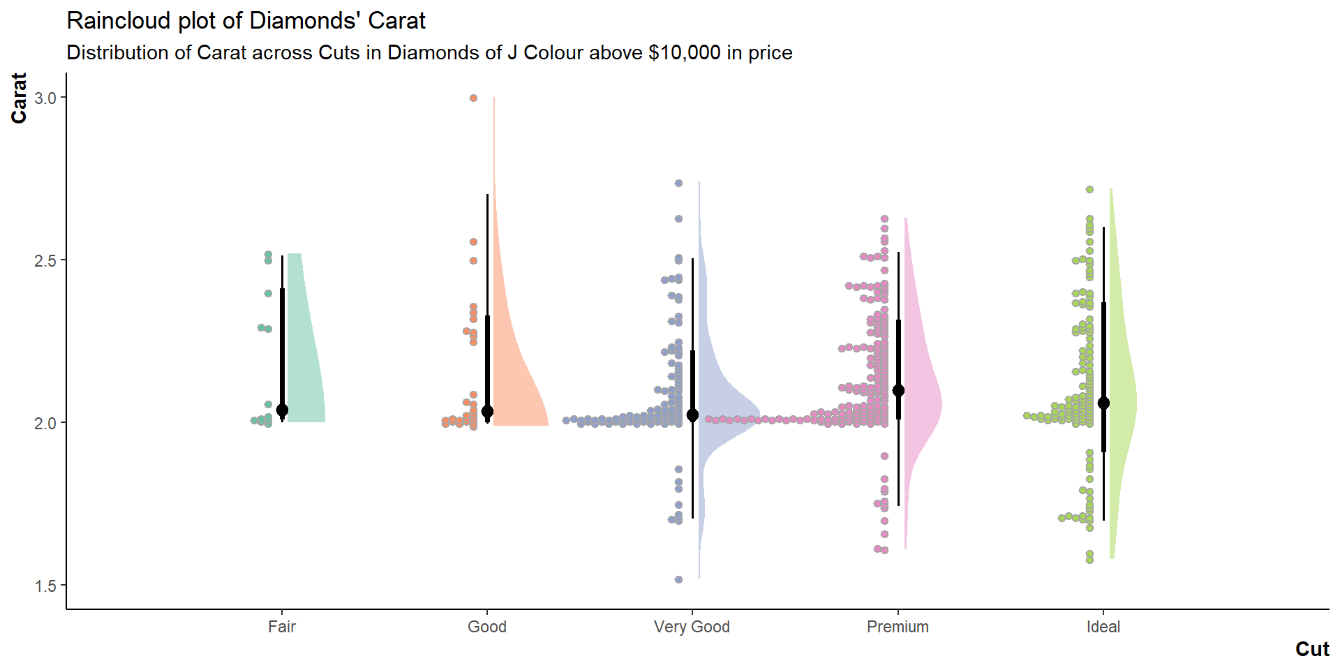
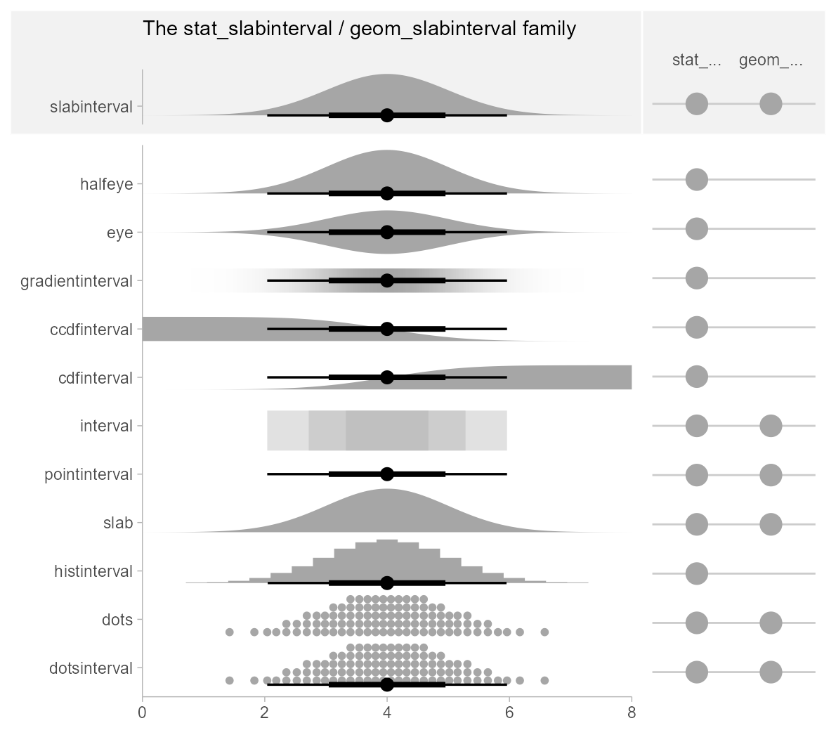
The list of geoms available for use in ggdist can be accessed here, and are shown in the adjoining figure.
Note: Rain-cloud Plots are made by combining stat_halfeye() + stat_dotsinterval()
ggstream
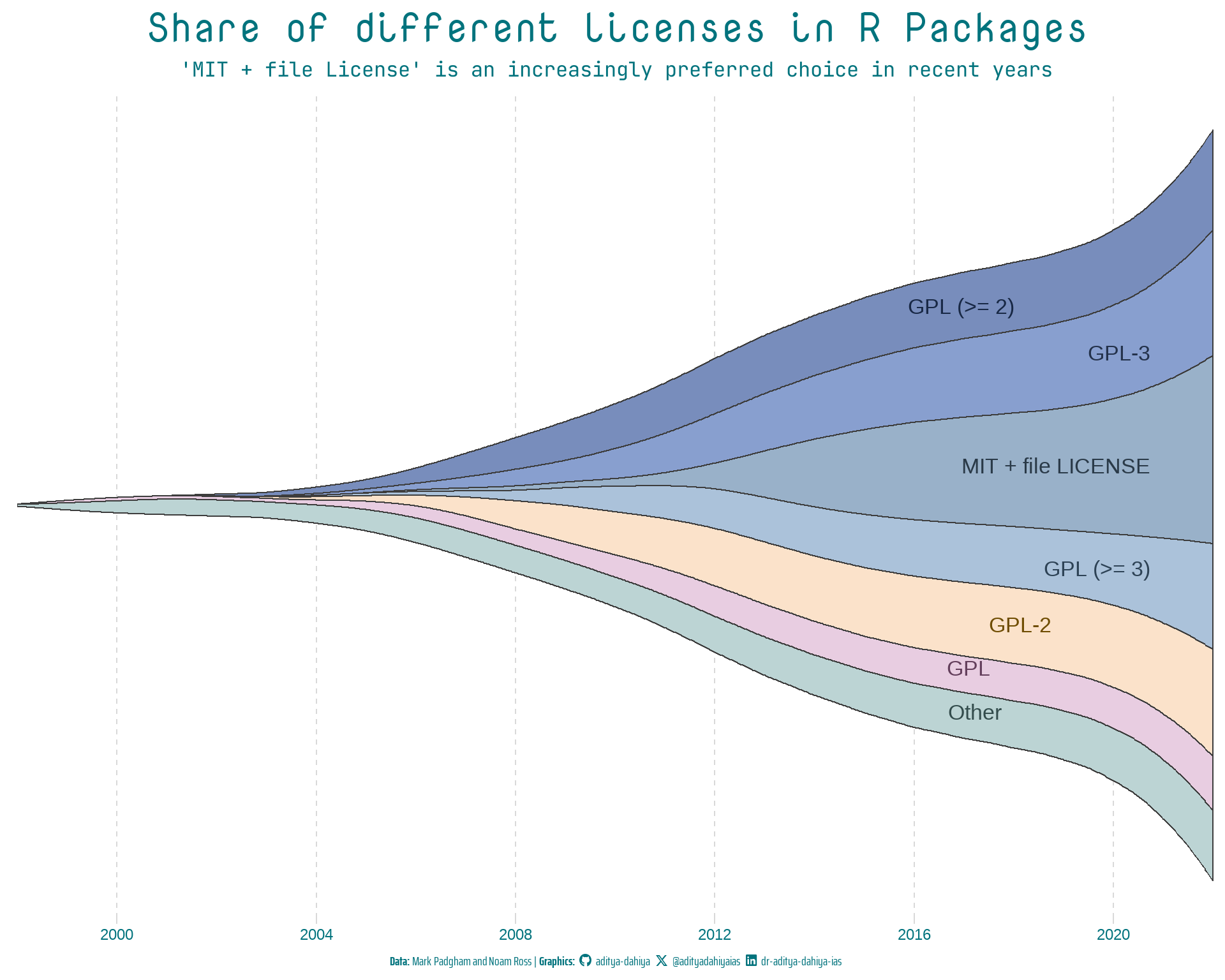
ggstream (Sjoberg 2021) is a tool designed to provide a straightforward yet robust implementation of streamplots or stream-graphs. Streamplots, essentially stacked area plots, are commonly employed for visualizing time series data. The package introduces a key function, geom_stream(). We can input our data and employ this function to create a fundamental stream graph. The default behavior of geom_stream() utilizes the “mirror” type, arranging streams symmetrically around the X-axis. Alternative options include “ridge,” stacking from the X-axis, and “proportional,” where streams sum up to 1. An example of the versatility of ggstream is shown in Figure 12 .
Code
library(fontawesome)
library(showtext)
library(ggtext)
# Load fonts
font_add_google("Nova Mono",
family = "title_font") # Font for titles
font_add_google("Saira Extra Condensed",
family = "caption_font") # Font for the caption
font_add_google("JetBrains Mono",
family = "body_font") # Font for plot text
showtext_auto()
text_col = "#01737d"
# Caption stuff
sysfonts::font_add(family = "Font Awesome 6 Brands",
regular = here::here("docs", "Font Awesome 6 Brands-Regular-400.otf"))
github <- ""
github_username <- "aditya-dahiya"
xtwitter <- ""
xtwitter_username <- "@adityadahiyaias"
linkedin <- ""
linkedin_username <- "dr-aditya-dahiya-ias"
social_caption <- glue::glue("<span style='font-family:\"Font Awesome 6 Brands\";'>{github};</span> <span style='color: {text_col}'>{github_username} </span> <span style='font-family:\"Font Awesome 6 Brands\";'>{xtwitter};</span> <span style='color: {text_col}'>{xtwitter_username}</span> <span style='font-family:\"Font Awesome 6 Brands\";'>{linkedin};</span> <span style='color: {text_col}'>{linkedin_username}</span>")
plot_caption <- paste0("**Data:** Mark Padgham and Noam Ross | ", "**Graphics:** ", social_caption)
rpkgstats |>
mutate(license = as_factor(license)) |>
mutate(license = fct_lump_n(license, n = 6)) |>
mutate(year = year(date),
month = month(date)) |>
group_by(year, license) |>
count() |>
group_by(year) |>
mutate(prop = n / sum(n),
yeartotal = sum(n)) |>
ungroup() |>
mutate(id = row_number()) |>
ggplot(
aes(
x = year,
y = n,
fill = license,
label = license
)
) +
geom_stream(bw = 0.85,
sorting = "onset",
color = "#3d3d3d") +
geom_stream_label(aes(color = license),
hjust = "inward",
size = 9) +
labs(
x = NULL, y = NULL,
title = "Share of different licenses in R Packages",
subtitle = "'MIT + file License' is an increasingly preferred choice in recent years",
caption = plot_caption
) +
scale_x_continuous(expand = expansion(0),
breaks = breaks_width(width = 4)) +
scale_y_log10() +
scale_fill_manual(values = paletteer_d("nord::afternoon_prarie") |>
colorspace::lighten(0.3)) +
scale_color_manual(values = paletteer_d("nord::afternoon_prarie") |>
colorspace::darken(0.6)) +
cowplot::theme_minimal_vgrid() +
theme(
legend.position = "none",
panel.grid.major.x = element_line(linetype = 2),
axis.line.y = element_blank(),
axis.ticks.y = element_blank(),
axis.text.y = element_blank(),
plot.title = element_text(family = "title_font",
size = 48,
face = "bold",
colour = text_col,
hjust = 0.5),
plot.subtitle = element_text(family = "body_font",
colour = text_col,
hjust = 0.5,
size = 24),
plot.caption = element_textbox(family = "caption_font",
colour = text_col,
hjust = 0.5,
size = 15),
axis.text.x = element_text(size = 18, color = text_col)
)
gganimate
The gganimate package (Pedersen and Robinson 2022) in R stands as a powerful tool for transforming static ggplot2 visualizations into dynamic and animated graphics. By seamlessly integrating with the ggplot2 ecosystem, gganimate enables users to breathe life into their plots, adding a temporal dimension to the presentation of data trends and patterns. L
Whether visualizing changes over time, showcasing transitions between different states, or animating the evolution of data-driven narratives, gganimate opens up new avenues for exploration and communication in the realm of data visualization. An example is shown in the Figure 13 below.
Code
gganim2 <- flights |>

   # Filter the flights dataset to include only the top 9 carriers
  filter(carrier %in% carriers_to_plot) |>

  # Create new columns: 'date' by combining year, month, and day, and
  # 'month' to represent the month as a label
  mutate(date = make_date(year = year, month = month, day = day),
         month = month(date, label = TRUE, abbr = FALSE)) |>

  # Select specific columns for the subsequent analysis
  select(date, month, carrier, arr_delay) |>

  # Group the data by 'month' and 'carrier', and calculate the average arrival delay
  group_by(month, carrier) |>
  summarize(
    avg_delay = mean(arr_delay, na.rm = TRUE)
  ) |>

  # Join the full names of airlines for the annotations in the animated plot
  left_join(nycflights13::airlines, by = join_by(carrier)) |>

  # Remove the 'carrier' column after joining and rename 'name' to 'carrier'
  select(-carrier) |>
  rename(carrier = name) |>

  # Calculate the rank of average delay, considering ties
  mutate(delay_rank = rank(avg_delay, ties.method = "first")) |>

  # Create a ggplot object with specific aesthetics for the rectangles
  ggplot(aes(xmin = 0,
             xmax = avg_delay,
             y = delay_rank,
             ymin = delay_rank - 0.45,
             ymax = delay_rank + 0.45,
             fill = carrier
             )
         ) +

  # Add filled rectangles with transparency
  geom_rect(alpha = 0.5) +

  # Add text labels for average delay values
  geom_text(aes(x = avg_delay,
                label = as.character(round(avg_delay, 1))),
            hjust = "left") +

  # Add text labels for carriers
  geom_text(aes(x = 0, label = carrier), hjust = "left") +

  # Add a label indicating the month
  geom_label(aes(label = month),
             x = 4500, y = 1,
             fill = "white", col = "black",
             size = 10,
             label.padding = unit(0.5, "lines")) +

  # Customize labels and titles
  labs(x = NULL, y = NULL,
       title = "Average flight arrival delay (in minutes) during {closest_state}") +

  # Apply a classic theme
  theme_classic() +

  # Customize plot appearance
  theme(legend.position = "none",
        axis.line.y = element_blank(),
        axis.text.y = element_blank(),
        axis.ticks.y = element_blank(),
        axis.line.x = element_blank(),
        title = element_text(size = 20, hjust = 0.5)) +

  # Create multiple subplots for each month
  facet_wrap(~ month) +

  # Remove facet labels
  facet_null() +

  # Transition the plot by 'month'
  transition_states(month)

# Animate the ggplot object with specified settings
animate(gganim2,
        duration = 40,
        fps = 10,
        width = 800,
        height = 500,
        start_pause = 10,
        end_pause = 20)
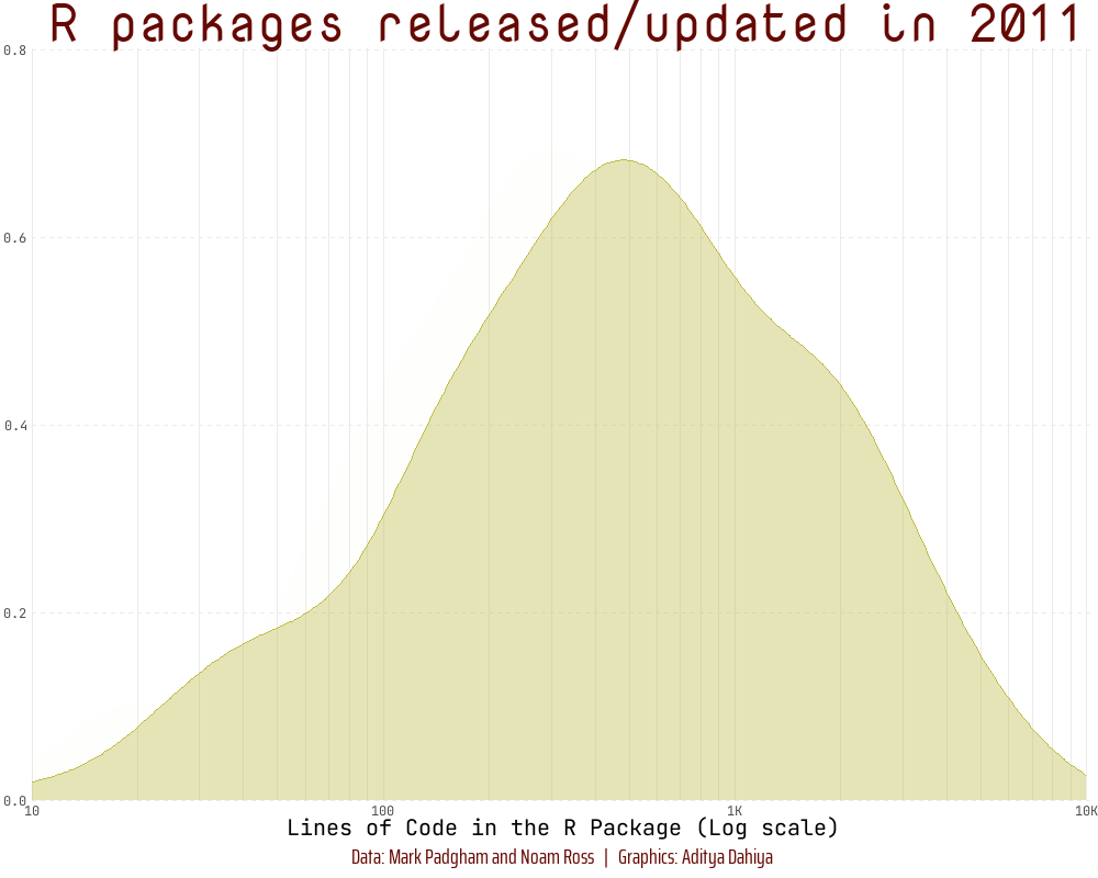
Another example is shown below in Figure 14 that depicts the use of shadow_mark() to retain previous years’ data as the animation progresses.
Code
library(fontawesome)
library(showtext)
library(ggtext)

# Load fonts
font_add_google("Nova Mono",
                family = "title_font")       # Font for titles
font_add_google("Saira Extra Condensed",
                family = "caption_font")     # Font for the caption
font_add_google("JetBrains Mono",
                family = "body_font")        # Font for plot text
showtext_auto()

plot_caption <- "Data: Mark Padgham and Noam Ross   |   Graphics: Aditya Dahiya"


# Defining minor breaks for the x-axis
mb <- unique(
  as.numeric(
    (1:10) %o% 10 ^ (0:5)
  )
)

df3 <- rpkgstats |>
  mutate(year = year(date)) |>
  select(package, year, loc_R) |>
  filter(loc_R != 0 & !is.na(loc_R))


fill_palette <- paletteer_d("khroma::smoothrainbow")[22:34]
col_palette <- fill_palette |> colorspace::darken(0.4)

anim <- df3 |>
  filter(year > 2010) |>
  ggplot(aes(loc_R,
             fill = factor(year),
             col = factor(year),
             frame = year)) +
  geom_density(alpha = 0.4) +
  scale_x_log10(
    minor_breaks = mb,
    expand = expansion(c(0, 0.005)),
    labels = label_number_si(),
    breaks = (10^(1:4)),
    limits = c(10, 10^4)) +
  scale_y_continuous(expand = expansion()) +
  scale_fill_manual(values = fill_palette) +
  scale_color_manual(values = fill_palette) +
  labs(
    x = "Lines of Code in the R Package (Log scale)",
    y = NULL,
    title = "R packages released/updated in {as.integer(frame_time)}",
    caption = plot_caption) +
  theme_minimal() +
  theme(
    panel.grid.minor.y = element_blank(),
    panel.grid.major.y = element_line(linetype = 2),
    panel.grid.major.x = element_line(colour = "#ebebeb"),
    panel.grid.minor.x = element_line(colour = "#ebebeb"),
    plot.title = element_text(family = "title_font",
                              size = 36,
                              hjust = 0.5,
                              color = col_palette[11]),
    axis.text = element_text(family = "body_font"),
    axis.title = element_text(family = "body_font",
                              size = 15),
    legend.position = "none",
    plot.caption = element_text(
      family = "caption_font",
      hjust = 0.5 ,
      margin = margin(12, 0, 5, 0),
      size = 15,
      colour = col_palette[11])
  )

anim

# Final animation to render
animate(
  plot = anim +
    transition_time(year) +
    shadow_mark(alpha = alpha/4) +
    ease_aes("linear") +
    enter_fade() +
    exit_fade(),
  fps = 20,
  duration = 12,
  end_pause = 40,
  height = 800,
  width = 1000
  )
Dynamic Plots: ggiraph
The ggiraph package (Gohel and Skintzos 2023) in R enhances the capabilities of traditional ggplot2 visualizations by introducing interactivity. This package allows us to create interactive (with shiny) and dynamic (as shown below) ggplot2 visualizations, primarily through the incorporation of HTML and JavaScript elements.
With ggiraph, you can add interactivity to various ggplot2 charts, such as scatter plots, bar charts, and maps, enabling users to hover over elements for additional information, click on points of interest, and explore data in a more engaging manner. The interactivity is achieved by leveraging the capabilities of web technologies, making it particularly useful for creating interactive graphics for online presentations or dashboards. You can customize tool-tips, add hyperlinks, and create interactive legends, providing a versatile tool for data exploration and communication. The package is explained nicely in ggiraph-book.
Code
# Loading Libraries
library(tidyverse)
library(ggiraph)
library(gt)
library(patchwork)
library(sf)

# Loading and Cleaning Tehsil (Sub-Districts) Map of Haryana
haryana_map <- read_sf(here::here("data", "haryana_map", "HARYANA_SUBDISTRICT_BDY.shp")) |>
  janitor::clean_names() |>
  mutate(
    district = str_replace_all(district, ">", "A"),
    tehsil = str_replace_all(tehsil, ">", "A"),
    tehsil = str_replace_all(tehsil, "@", "U"),
    tehsil = str_replace_all(tehsil, "\\|", "I"),
    district = str_replace_all(district, "\\|", "I")
  ) |>
  mutate(
    district = snakecase::to_title_case(district),
    tehsil = snakecase::to_title_case(tehsil),
    shape_area = round(shape_area/1e6, 2)
  )

# Interactive Map
g1 <- haryana_map |>
  ggplot(aes(geometry = geometry,
             data_id = tehsil,
             tooltip = paste0("Sub-Division: ", tehsil,
                              "\nDistrict: ", district,
                              "\nArea: ", shape_area, " sq. km."),
             fill = shape_area)) +
  geom_sf_interactive() +
  ggthemes::theme_map() +
  ggspatial::annotation_north_arrow(location = "tl") +
  ggspatial::annotation_scale(location = "bl") +
  scale_fill_gradient_interactive(low = "yellow", high = "red",
                      name = "Sub-Division Area (in sq. km.)",
                      trans = "log10") +
  theme(legend.position = "bottom")

# Interactive Horizontal Bar Plot
g2 <- haryana_map |>
  group_by(district) |>
  mutate(district_area = sum(shape_area)) |>
  arrange(desc(district_area)) |>
  ungroup() |>
  mutate(id = row_number()) |>
  ggplot(aes(y = reorder(district, -id),
             x = shape_area,
             group = tehsil,
             fill = shape_area,
             label = district,
             data_id = tehsil,
             tooltip = paste0("Sub-Division: ", tehsil,
                              "\nDistrict: ", district,
                              "\nArea: ", shape_area, " sq. km."))) +
  geom_col_interactive(position = "stack", col = "white") +
  scale_fill_gradient_interactive(low = "yellow", high = "red",
                                  name = "Sub-Division Area (in sq. km.)",
                                  trans = "log10") +
  scale_x_continuous(labels = scales::label_number_si()) +
  labs(y = "District", x = "Area (in sq. km.)") +
  theme_minimal() +
  theme(panel.grid = element_blank(),
        axis.ticks.y = element_blank(),
        legend.position = "none",
        axis.text.y = element_text(margin = margin(r = 0)),
        axis.title = element_text(hjust = 1))

my_layout <- "
AAB
AAB
"

css_default_hover <- girafe_css_bicolor(primary = "#4f0882",
                                        secondary = "#4f0882")

set_girafe_defaults(
  opts_hover = opts_hover(css = css_default_hover),
  opts_zoom = opts_zoom(min = 1,
                        max = 4),
  opts_tooltip = opts_tooltip(css = "padding:3px;background-color:#333333;color:white;"),
  opts_sizing = opts_sizing(rescale = TRUE),
  opts_toolbar = opts_toolbar(saveaspng = FALSE, position = "bottom", delay_mouseout = 5000)
)

girafe(
  code = print(g1 + g2 +
           plot_layout(design = my_layout) +
           plot_annotation(
             title = "Sub-Divisions of Haryana",
             subtitle = "An interactive plot with Sub-Division-wise area",
             caption = "Data: Survey of India. | Graphics by: Aditya Dahiya using {ggiraph} R package"
           ) &
           theme(plot.title = element_text(hjust = 0.5),
                 plot.subtitle = element_text(hjust = 0.5)))
  )
Themes for ggplot2
| Source | Description / Link | |
|---|---|---|
| 1. | Extensive List of ggplot2 Themes |
https://yutannihilation.github.io/allYourFigureAreBelongToUs/1/ |
| 2. |
ggtech Package |
Themes inspired by big tech companies (AirBnb, Facebook, Google). GitHub Repository: https://github.com/ricardo-bion/ggtech |
| 3. |
hrbrthemes Package |
Typography-centric themes and components for ggplot2. GitHub Repository: https://github.com/hrbrmstr/hrbrthemes |
| 4. |
tvthemes Package |
Themes based on popular TV shows (The Simpsons, Game of Thrones). GitHub Repository: https://github.com/Ryo-N7/tvthemes |
| 5. | Other Packages with Themes |
cowplot Package, ggthemes Package |
| 6. |
ggplot2 Extensions |
Gallery webpage https://exts.ggplot2.tidyverse.org/gallery/ |
| 7. | ggiraph |
Create interactive ggplots. Website: https://davidgohel.github.io/ggiraph/ |
| 8. | Interactive Data Visualization Resources by Carson Sievert | “Interactive web-based data visualization with R, plotly, and shiny.” Website: https://plotly-r.com/index.html |
I intend to add more packages as and when I come across them. Watch out for this space in the future too.