library(tidyverse)      # tidy tools data wrangling
library(ggtext)         # text into ggplot2
library(sf)             # maps and plotting
library(here)           # files location and loading
library(showtext)       # Using Fonts More Easily in R Graphs
library(ggimage)        # Using images in ggplot2
library(rvest)          # Get states population data
library(fontawesome)    # Social Media icons
library(ggtext)         # Markdown Text in ggplot2
library(patchwork) # For combining plotsChapter 9
Arranging Plots
Libraries and Data
Code
# Loading the data
diwali <- readr::read_csv('https://raw.githubusercontent.com/rfordatascience/tidytuesday/master/data/2023/2023-11-14/diwali_sales_data.csv') |>
  janitor::clean_names()

india_map <- st_read(here("data", "india_map", "India_State_Boundary.shp")) |>
  mutate(state = str_to_title(State_Name),
         .keep = "unused")
Reading layer `India_State_Boundary' from data source
`C:\Users\dradi\Documents\Post-Harvard Academics\ggplot2book3e\data\india_map\India_State_Boundary.shp'
using driver `ESRI Shapefile'
Simple feature collection with 37 features and 1 field
Geometry type: MULTIPOLYGON
Dimension: XY
Bounding box: xmin: 7583508 ymin: 753607.8 xmax: 10843390 ymax: 4452638
Projected CRS: WGS 84 / Pseudo-MercatorCode
# Getting population Data from web scraping
state_pop <- rvest::read_html("https://www.indiacensus.net/") |>
  html_nodes("table")

state_pop <- state_pop[1] |>
  html_table()

state_pop <- state_pop[[1]] |>
  janitor::clean_names() |>
  select(2, 4) |>
  rename(
    state = state_name,
    population = estimated_population_in_2023
  )

state_pop <- state_pop |>
  mutate(population = parse_number(population))

# Correct names for some states in india_map
india_map <- india_map |>
  mutate(state = case_when(
    state == "Tamilnadu" ~ "Tamil Nadu",
    state == "Chhattishgarh" ~ "Chhattisgarh",
    state == "Telengana" ~ "Telangana",
    state == "Jammu And Kashmir" ~ "Jammu & Kashmir",
    state == "Andaman & Nicobar" ~ "Andaman & Nicobar Islands",
    state == "Daman And Diu And Dadra And Nagar Haveli" ~ "Dadra and Nagar Haveli",
    .default = state
  ))

# Number of customers per capita and Avg. Purchase per customer
df1 <- diwali |>
  count(state, sort = TRUE) |>
  full_join(state_pop) |>
  mutate(cust_m_pop = 1000000 * n / population) |>
  arrange(desc(cust_m_pop)) |>
  rename(customers = n) |>
  select(state, customers, cust_m_pop)

df2 <- diwali |>
  group_by(state) |>
  summarise(purchase = sum(amount, na.rm = TRUE)) |>
  full_join(df1) |>
  mutate(purc_cust = purchase / customers) |>
  select(state, cust_m_pop, purc_cust) |>
  mutate(
    state = case_when(
      state == "Jammu and Kashmir" ~ "Jammu & Kashmir",
      state == "Orissa" ~ "Odisha",
      .default = state)
  )


mapdf <- df2 |>
  full_join(india_map, relationship = "many-to-many") |>
  # Simplifying geometry to drastically reduce plotting time
  mutate(
    geometry = st_simplify(geometry,
                           preserveTopology = FALSE,
                           dTolerance = 1000)
  )
9.1 Laying out plots side by side
Starting by defining some basic parameters, colours and annotations for the final plot
Code
# Load fonts
font_add_google("Pragati Narrow")
font_add_google("Pacifico")
font_add_google("Roboto")
showtext_auto()
body_font <- "Roboto" # Font for plot legends, body etc.
title_font <- "Pacifico" # Font for titles, subtitles
caption_font <- "Pragati Narrow" # Font for the caption
# Define colours
map1_col = c("yellow", # Colours for Chloropleth g1
"red")
map2_col = c("#cdeff7", # Colours for Chloropleth g2
"#1f76f0")
ts = 45 # Text Size
bg_col <- "white" # Background Colour
text_col <- "black" # Colour for the text
text_hil <- "red" # Colour for highlighted text
# Add text to plot
plot_title <- "Diwali Sales: Insights"
plot_subtitle <- "#TidyTuesday. Insights about the Diwali sales data."
sysfonts::font_add(family = "Font Awesome 6 Brands",
regular = here::here("docs", "Font Awesome 6 Brands-Regular-400.otf"))
github <- ""
github_username <- "aditya-dahiya"
xtwitter <- ""
xtwitter_username <- "@adityadahiyaias"
mastodon <- ""
mastodon_username <- "@adityadahiya@mastodon.social"
social_caption <- glue::glue(
"<span style='font-family:\"Font Awesome 6 Brands\";'>{github};</span> <span style='color: #000000'>{github_username} </span>
<span style='font-family:\"Font Awesome 6 Brands\";'>{xtwitter};</span> <span style='color: #000000'>{xtwitter_username}</span>"
)
plot_caption <- paste0("**Data**: kaggle.com<br>", social_caption)The first plot g1 (as shown in Figure 1) shows map of India, with number of customers (per million population) from different states in the Data-Set.
Code
g1 <- mapdf |>
      ggplot(aes(fill = cust_m_pop,
                 geometry = geometry,
                 label = state)) +
      geom_sf() +
      geom_sf_text(aes(alpha = !is.na(cust_m_pop)),
                   size = ts/15) +
      coord_sf() +
      scale_fill_continuous(low = map1_col[1],
                            high = map1_col[2],
                            na.value = bg_col,
                            trans = "log10") +
      scale_alpha_discrete(range = c(0, 1)) +
      guides(alpha = "none", fill = "colorbar") +

      ggthemes::theme_map() +
      labs(fill = "Customer Numbers\n(per mil. pop.)",
           subtitle = "Customer numbers (per million population)") +
      theme(plot.subtitle = element_text(size = ts/3,
                                      family = body_font,
                                      hjust = 0.5),
            legend.text = element_text(size = ts/6,
                                       family = body_font),
            legend.title = element_text(size = ts/6,
                                        family = body_font,
                                        vjust = 0.5),
            legend.position = "right",
            legend.background = element_rect(fill = NULL),
            legend.key.width = unit(2, "mm"))
g1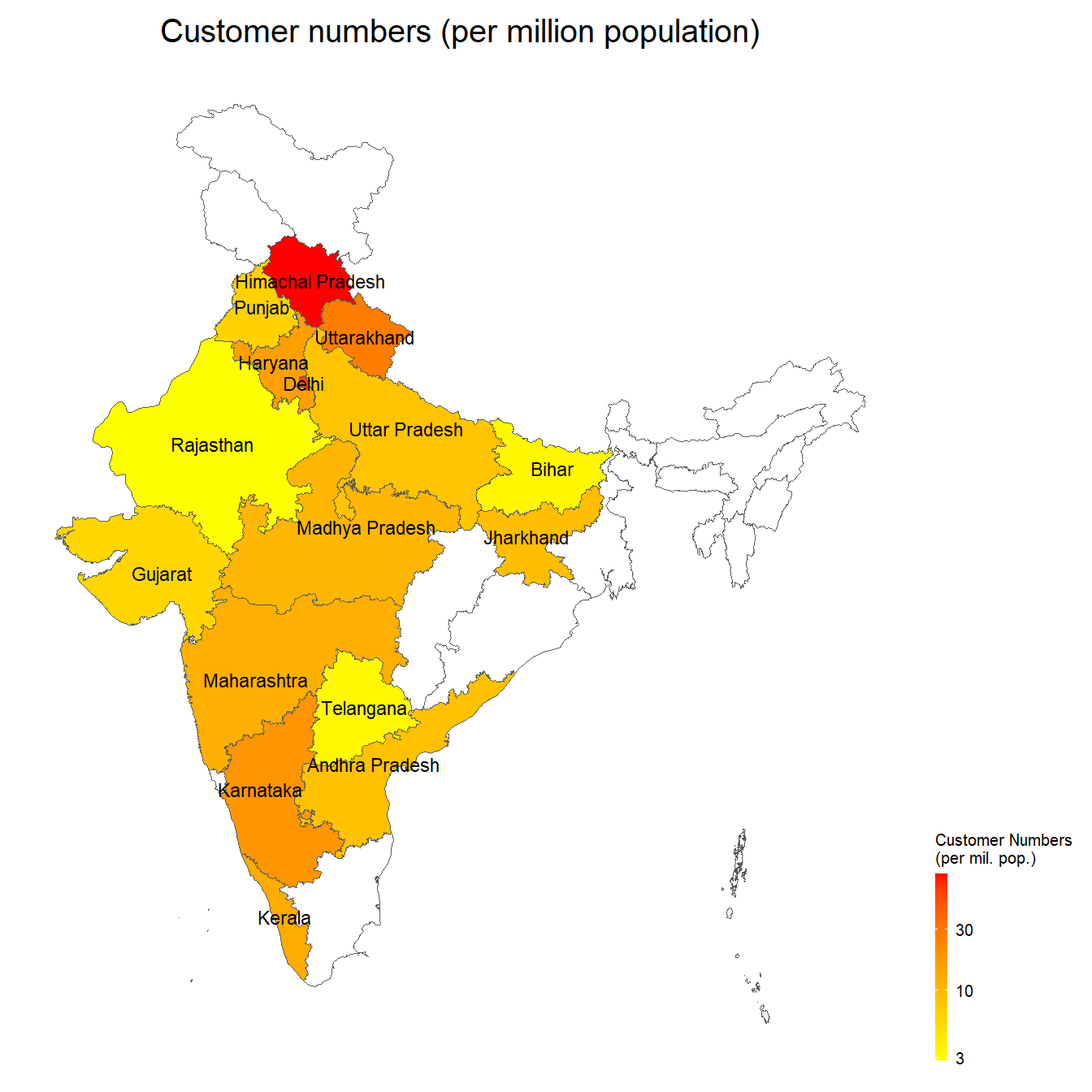
The second plot g2 (as shown in Figure 2) shows map of India, with average spending per customer in the Diwali Sales dataset from different states.
Code
g2 <- mapdf |>
      ggplot(aes(fill = purc_cust,
                 geometry = geometry,
                 label = state)) +
      geom_sf() +
      geom_sf_text(aes(alpha = !is.na(purc_cust)),
                   size = ts/15) +
      coord_sf() +
      scale_fill_continuous(low = map2_col[1],
                            high = map2_col[2],
                            na.value = bg_col,
                            labels = scales::label_comma(prefix = "Rs."),
                            breaks = c(8000, 10000)) +
      scale_alpha_discrete(range = c(0, 1)) +
      guides(alpha = "none", fill = "colorbar") +

      ggthemes::theme_map() +
      labs(fill = "Average Customer\nSpending (Rs.)",
           subtitle = "Average customer spending (in Rupees)") +
      theme(plot.subtitle = element_text(size = ts/3,
                                      family = body_font,
                                      hjust = 0.5),
            legend.text = element_text(size = ts/6,
                                       family = body_font),
            legend.title = element_text(size = ts/6,
                                        family = body_font,
                                        vjust = 0.5),
            legend.position = "right",
            legend.background = element_rect(fill = NULL),
            legend.key.width = unit(2, "mm"))
g2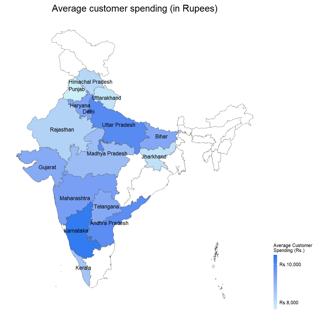
Now, we lay the two plots side by side using patchwork: —
Code
g1 + g2 +
  plot_layout(guides = "collect") &
  plot_annotation(
    title = "Diwali Sales Data",
    caption = "Source: #TidyTuesday, kaggle.com"
  ) &
  theme(
    plot.title = element_text(hjust = 0.5,
                              size = ts/2),
    plot.caption = element_text(hjust = 0.5,
                                size = ts/5)
  )
Another Figure 4 shows the age distribution of customers in the data-set: —
Code
g3 <- diwali |>
  count(age_group) |>
  mutate(fill_var = age_group == "26-35") |>
  ggplot(aes(x = n, y = age_group, fill = fill_var)) +
  geom_col() +
  labs(subtitle = "Maximum customers are aged 26-35",
       y = "Customer Age Group",
       x = "Number of customers") +
  scale_x_continuous(labels = scales::label_number_si()) +
  scale_fill_manual(values = c("grey", "orange")) +
  cowplot::theme_minimal_vgrid() +
  theme(axis.ticks.y = element_blank(),
        panel.grid = element_line(linetype = 2),
        axis.line.y = element_blank(),
        panel.border = element_blank(),
        plot.subtitle = element_text(hjust = 0.5,
                                  size = ts/2),
        axis.text = element_text(size = ts/4),
        axis.title = element_text(ts/3),
        legend.position = "none")

g3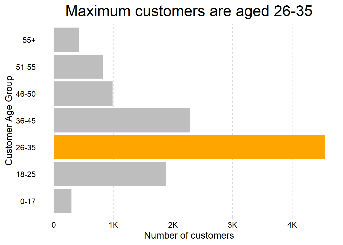
Another Figure 5 shows a heat-map of the products sold category-wise in different states from the data-set: —
Code
# Create ordering of groups
st_vec <- diwali |>
  count(state, sort = TRUE) |>
  pull(state) |>
  rev()
pr_vec <- diwali |>
  count(product_category, sort = TRUE) |>
  pull(product_category)


g4 <- diwali |>
  count(state, product_category, wt = orders, sort = TRUE) |>
  mutate(
    state = fct(state, levels = st_vec),
    product_category = fct(product_category, levels = pr_vec)
  ) |>
  ggplot(aes(y = state, x = product_category, fill = n)) +
  geom_tile(col = "white") +
  geom_text(aes(label = n), size = ts/18) +
  scale_fill_gradient(low = "white",
                      high = "red",
                      na.value = "white",
                      trans = "log2",
                      breaks = c(1, 10, 50, 200, 500)) +
  labs(x = NULL, y = NULL,
       fill = "Number of products sold",
       subtitle = "Certain items are more popular in some states") +
  theme_minimal() +
  theme(panel.grid = element_blank(),
        axis.text.x = element_text(angle = 90,
                                   hjust = 1),
        legend.position = "right",
        legend.title = element_text(angle = 90,
                                    hjust = 0,
                                    vjust = 1),
        axis.text = element_text(size = ts/4),
        plot.subtitle = element_text(size = ts/4))
g4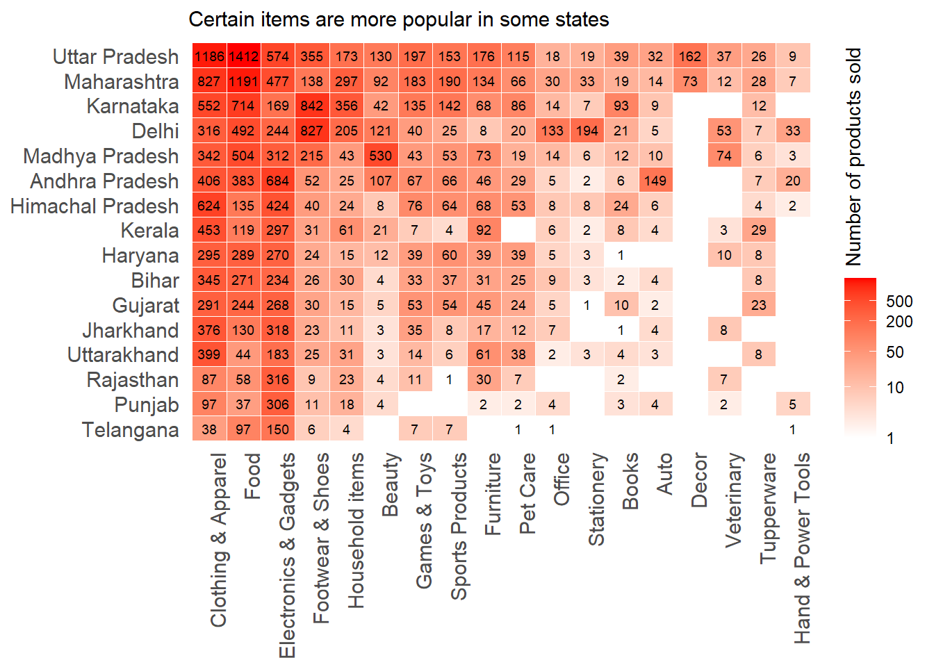
Combining the two Figure 4 and Figure 5 using patchwork: —
Code
g3 + g4 +
  plot_layout(design = "
              ABB
              ABB") +
  plot_annotation(
    title = "Insights from Diwali Sales Data",
    tag_levels = "I",
    tag_prefix = "Figure "
  ) &
  theme(
    plot.subtitle = element_text(hjust = 0,
                                 size = ts/4),
    plot.title = element_text(hjust = 0.5,
                              size = ts/1.5),
    plot.tag.position = "top",
    plot.tag = element_text(face = "italic",
                            size = ts/5)
  )
9.2 Arranging plots on top of each other
The Figure 7 shows the use of inset_element() to depict arranging plots on top of one-another using patchwork.
Code
g3inset <-
  g3 +
  labs(subtitle = NULL) +
  theme(
    axis.title = element_text(size = ts/5),
    axis.text = element_text(size = ts/6),
    plot.background = element_rect(fill = "white")
  )

g1 +
  theme(
    legend.position = "bottom",
    legend.key.width = unit(10, "mm"),
    legend.key.height = unit(2, "mm")
  ) +
  inset_element(
    g3inset,
    top = 0.3,
    bottom = 0,
    left = 0.5,
    right = 1
  )
Also, we can use wrap_elements() to wrap arbitrary graphics in a patchwork-compliant patch, as shown in Figure 8 below.
Code
library(magick)

img <- image_read("https://static.vecteezy.com/system/resources/previews/010/795/495/non_2x/diwali-lamp-icon-free-vector.jpg") |>
  image_resize("x200")


g1 +
  labs(title = "Diwali Sales Data",
       subtitle = "Customer numbers (per million population)") +
  theme(
    plot.title = element_text(hjust = 0.5, size = ts/1.5),
    legend.position = "bottom",
    legend.key.width = unit(10, "mm"),
    legend.key.height = unit(2, "mm")
  ) +
  inset_element(
    g3inset,
    top = 0.3,
    bottom = 0,
    left = 0.5,
    right = 1
  ) +
  inset_element(
    p = ggplot() +
      annotation_raster(raster = img, -Inf, Inf, -Inf, Inf) +
      theme_void() +
      coord_fixed(),
    top = 1,
    bottom = 0.7,
    left = 0.6,
    right = 0.9
  )
References
Pedersen, Thomas Lin. 2023. “Patchwork: The Composer of Plots.” https://CRAN.R-project.org/package=patchwork.