This Chapter has no exercises to solve, so I use various datasets to explore and customize colour scales and legends in ggplot2.
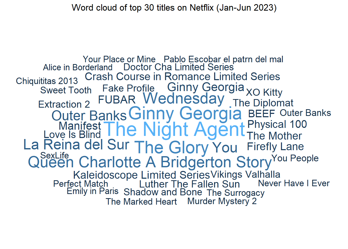
For this Chapter, let’s use the data on Engagement (Hours Watched) report from Netflix which lists, in descending order, all 18,000+ titles viewed for 50,000+ hours on the platform in the first half of 2023. Credits to the Data is Plural newsletter by Jeremy Singer-Vine for circulating this data-set. I recommend subscribing to this newsletter for some amazing data-sets.
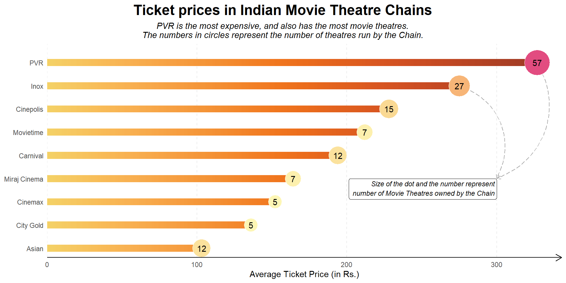
The Figure 1 shows use of two fill scales, one for geom_col() and other for geom_point() , both within the same plot. This is possible with use of ggnewscale(Campitelli 2023) that allows us to specify a new fill or colour scale within the same plot.
Code
# Loading datasetmovies<-read_csv("https://raw.githubusercontent.com/HarshaDevulapalli/indian-movie-theatres/master/indian-movie-theatres.csv")# Using two fill scales in 1 ggplot objectlibrary(ggnewscale)plotdf<-movies|>group_by(theatre_chain)|>summarise( n =n(), avg_price =mean(average_ticket_price, na.rm =TRUE))|>drop_na()|>filter(n>=5)|>mutate( theatre_chain =factor(theatre_chain), theatre_chain =fct_reorder(theatre_chain, avg_price), avg_price =round(avg_price, 0))# Creating a gradient in the geom_col fillplotdf_fill<-plotdf|># Group input by rows: to compute on a data frame a row-at-a-time.rowwise()|># Create Varssummarise(theatre_chain =theatre_chain, avg_price =avg_price, fill_col =list(1:avg_price), height =1)%>%# Long formunnest(cols =fill_col)plotdf|>ggplot(aes(x =avg_price, y =theatre_chain))+geom_col( data =plotdf_fill,aes(fill =fill_col, x =height), width =0.3, position ="stack")+# Annotationsannotate( geom ="curve", x =plotdf|>filter(theatre_chain=="PVR")|>pull(avg_price), y =9, xend =300, yend =4, linetype =5, arrow =arrow(length =unit(2, "mm")), col ="darkgrey", curvature =-0.5)+annotate( geom ="curve", x =plotdf|>filter(theatre_chain=="Inox")|>pull(avg_price), y =8, xend =300, yend =4, linetype =5, arrow =arrow(length =unit(2, "mm")), col ="darkgrey", curvature =-0.5)+annotate( geom ="label", x =300, y =4, label ="Size of the dot and the number represent\nnumber of Movie Theatres owned by the Chain", hjust ="inward", vjust =1, size =3, fontface ="italic", col ="black")+# Colour Scalespaletteer::scale_fill_paletteer_c("ggthemes::Orange-Gold")+# Using a Second Colour Scale in same ggplot2new_scale_fill()+# Lollipop Graph, circlesgeom_point(aes(x =avg_price, size =n, fill =n), pch =21, col ="white")+geom_text(aes(label =n), hjust =0.5, vjust =0.5)+paletteer::scale_fill_paletteer_c("grDevices::PinkYl", direction =-1)+scale_size_continuous(range =c(8, 15))+labs( x ="Average Ticket Price (in Rs.)", y =NULL, title ="Ticket prices in Indian Movie Theatre Chains", subtitle ="PVR is the most expensive, and also has the most movie theatres.\nThe numbers in circles represent the number of theatres run by the Chain.")+scale_x_continuous(expand =expansion(c(0, 0.05)))+scale_y_discrete(expand =expansion(c(0.05, 0.1)))+theme_minimal()+theme( legend.position ="none", panel.grid.major.y =element_blank(), panel.grid.minor.x =element_blank(), panel.grid.major.x =element_line(linetype =2), axis.line.x =element_line(arrow =arrow(length =unit(3, "mm"))), plot.title =element_text(face ="bold", size =18, hjust =0.5), plot.subtitle =element_text(face ="italic", hjust =0.5), plot.title.position ="plot")
Figure 1: Using multiple continuous colour scales in a lollipop chart
11.3 Discrete colour scales
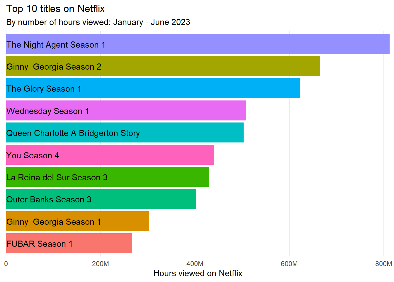
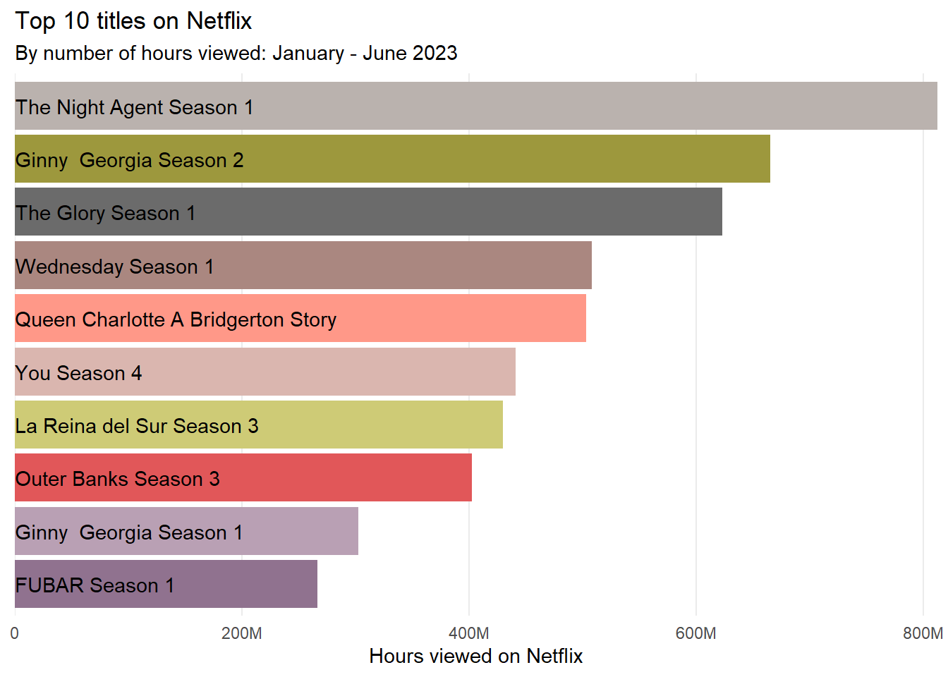
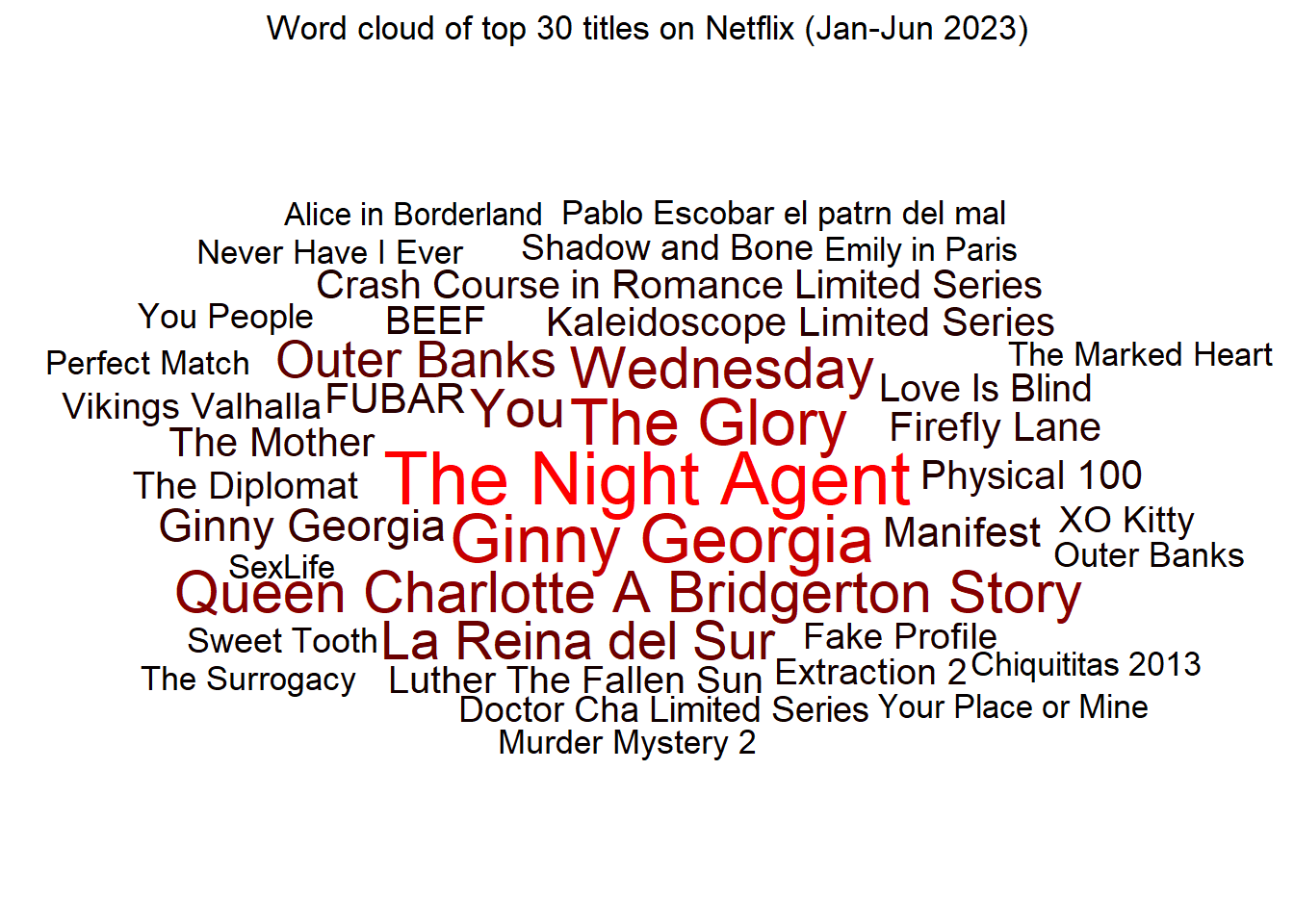
Now, I use the data-set with ggwordcloud(Le Pennec and Slowikowski 2023) to make word-clouds of top Netflix Titles. The Figure 2 shows the top 10 titles on Netflix by number of hours viewed between January - June 2023, with default colour schemes in ggplot2. The word-cloud shows the use of a continuous colour scale for text colour based on the number of hours viewed.
Figure 3: Top 10 titles on Netflix by number of hours viewed: January - June 2023
11.7 Legend Position
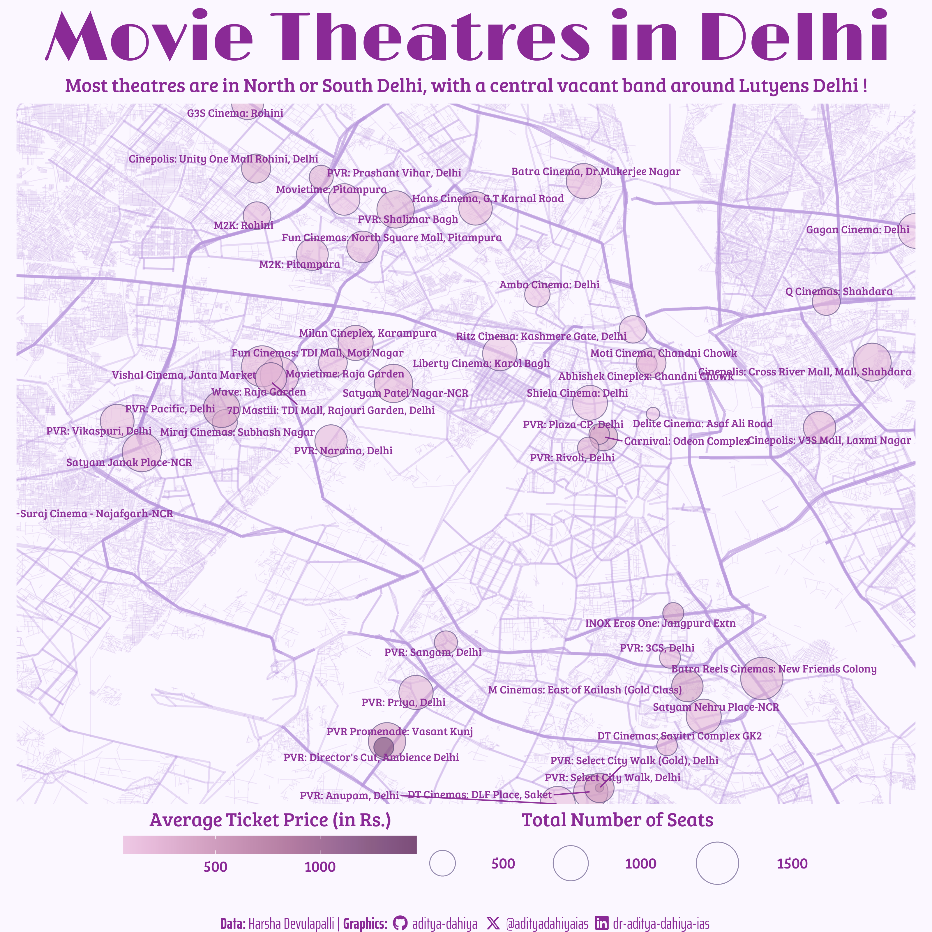
To demonstrate the use of theme(legend.position = "..."), I use the data on New Delhi’s movie theaters to produce a customized colored map in shades of purple, as shown below in Figure 4
Code
#==============================================================================## Library Load-in---------------------------------------------------------------#==============================================================================#library(tidyverse)# Data wrangling and plottinglibrary(osmdata)# Wrapper for Overpass API from Open Street Mapslibrary(janitor)# Cleaning nameslibrary(sf)# For plotting mapslibrary(here)# Files location and loadinglibrary(paletteer)# Lots of Color Palettes in Rlibrary(colorspace)# Lightening and Darkening Colorslibrary(showtext)# Using Fonts More Easily in R Graphslibrary(fontawesome)# Social Media iconslibrary(ggtext)# Markdown Text in ggplot2library(patchwork)# For compiling plotslibrary(magick)# Work with Images and Logoslibrary(ggimage)# Background Image#==============================================================================## Data Load-in------------------------------------------------------------------#==============================================================================#del_mov<-read_csv("https://raw.githubusercontent.com/HarshaDevulapalli/indian-movie-theatres/master/indian-movie-theatres.csv")|>filter(city=="Delhi")main_roads<-st_read(here::here("data", "delhi_osm","delhi_main_roads.shp"))st_crs(main_roads)<-"WGS 84"minor_roads<-st_read(here::here("data", "delhi_osm","delhi_minor_roads.shp"))st_crs(minor_roads)<-"WGS 84"very_minor_roads<-st_read(here::here("data", "delhi_osm","delhi_veryminor_roads.shp"))st_crs(very_minor_roads)<-"WGS 84"#==============================================================================## Data Wrangling----------------------------------------------------------------#==============================================================================#coords<-del_mov|>summarise( top =max(lat), bottom =min(lat), left =min(lon), right =max(lon))|>as_vector()# Adjust to remove the one leftmost (westward) cniema hall - outlierpercentage_removal_factor=0.2coords[3]<-coords[3]+((coords[4]-coords[3])*percentage_removal_factor)# Impute average value to NAsimpute_na<-median(del_mov$average_ticket_price, na.rm =TRUE)del_mov<-del_mov|>mutate(average_ticket_price =if_else(is.na(average_ticket_price),impute_na,average_ticket_price))#==============================================================================## Options & Visualization Parameters--------------------------------------------#==============================================================================## Load fontsfont_add_google("Limelight", family ="title_font")# Font for titlesfont_add_google("Saira Extra Condensed", family ="caption_font")# Font for the captionfont_add_google("Bree Serif", family ="body_font")# Font for plot textshowtext_auto()# Colour Palettemypal_c<-paletteer::scale_colour_paletteer_c("ggthemes::Purple")mypal<-paletteer::paletteer_d("rcartocolor::Purp")# Define colourslow_col<-mypal[4]# Low colourhi_col<-mypal[6]# High colourbg_col<-mypal[3]|>lighten(0.9)# Background Colourtext_col<-mypal[1]|>darken(0.6)# Colour for the texttext_hil<-mypal[6]|>darken(0.4)# Colour for the title# Caption stuffsysfonts::font_add(family ="Font Awesome 6 Brands", regular =here::here("docs", "Font Awesome 6 Brands-Regular-400.otf"))github<-""github_username<-"aditya-dahiya"xtwitter<-""xtwitter_username<-"@adityadahiyaias"linkedin<-""linkedin_username<-"dr-aditya-dahiya-ias"social_caption<-glue::glue("<span style='font-family:\"Font Awesome 6 Brands\";'>{github};</span> <span style='color: {text_col}'>{github_username} </span> <span style='font-family:\"Font Awesome 6 Brands\";'>{xtwitter};</span> <span style='color: {text_col}'>{xtwitter_username}</span> <span style='font-family:\"Font Awesome 6 Brands\";'>{linkedin};</span> <span style='color: {text_col}'>{linkedin_username}</span>")# Add text to plot--------------------------------------------------------------plot_title<-"Movie Theatres in Delhi"subtitle_text<-"Most theatres are in North or South Delhi, with a central vacant band around Lutyens Delhi !"plot_subtitle<-paste(strwrap(subtitle_text, 100), collapse ="\n")plot_caption<-paste0("**Data:** Harsha Devulapalli | ", "**Graphics:** ", social_caption)#==============================================================================## Data Visualization------------------------------------------------------------#==============================================================================#g<-ggplot()+geom_sf( data =main_roads|>mutate(geometry =st_simplify(geometry, dTolerance =50, preserveTopology =TRUE)), mapping =aes(geometry =geometry), color =low_col, linewidth =1, alpha =0.4)+geom_sf( data =minor_roads|>mutate(geometry =st_simplify(geometry, dTolerance =1, preserveTopology =TRUE)), color =low_col, linewidth =0.7, alpha =0.3)+geom_sf( data =very_minor_roads|>mutate(geometry =st_simplify(geometry, dTolerance =10, preserveTopology =TRUE)), color =low_col, linewidth =0.3, alpha =0.2)+geom_point( data =del_mov, mapping =aes( x =lon, y =lat, size =total_seats, fill =average_ticket_price), pch =21, color =text_hil, alpha =0.6)+ggrepel::geom_text_repel( data =del_mov, mapping =aes( x =lon, y =lat, label =theatre_name), alpha =0.95, family ="body_font", colour =text_col, seed =42, size =10, segment.color =text_col)+coord_sf( xlim =coords[c("left", "right")], ylim =coords[c("bottom", "top")], expand =FALSE)+scale_fill_paletteer_c("ggthemes::Purple")+scale_size_continuous(range =c(1, 15))+labs(title =plot_title, subtitle =plot_subtitle, caption =plot_caption, fill ="Average Ticket Price (in Rs.)", size ="Total Number of Seats")+theme_void()+guides(fill =guide_colorbar(title.position ="top", barheight =unit(0.5, "cm"), barwidth =unit(8, "cm")), size =guide_legend(title.position ="top", keywidth =unit(0.5, "cm"), keyheight =unit(0.5, "cm"), label.hjust =0))+theme( plot.caption =element_textbox(family ="caption_font", hjust =0.5, colour =text_col, size =unit(40, "cm")), plot.title =element_text(hjust =0.5, size =unit(175, "cm"), margin =margin(0.3,0,0.2,0, unit ="cm"), family ="title_font", face ="bold", colour =text_col), plot.subtitle =element_text(hjust =0.5, size =unit(50, "cm"), family ="body_font", colour =text_col, margin =margin(0,0,0.2,0, unit ="cm")), plot.background =element_rect(fill =bg_col, color =bg_col, linewidth =0), legend.position ="bottom", legend.text =element_text(hjust =0.5, size =unit(40, "cm"), family ="body_font", colour =text_col), legend.title =element_text(hjust =0.5, size =50, family ="body_font", colour =text_col, margin =margin(0,0,0,0)), legend.box.margin =margin(0,0,0.5,0, unit ="cm"), legend.box ="horizontal", legend.spacing.y =unit(0.2, "cm"))#=============================================================================## Image Saving-----------------------------------------------------------------#=============================================================================#ggsave( filename =here::here("docs", "delhimovies_tidy.png"), plot =g, device ="png", dpi ="retina", width =unit(10, "cm"), height =unit(10, "cm"), bg =bg_col)#=============================================================================## Data Collection Work---------------------------------------------------------#=============================================================================############################################# DO NOT RUN CODE: To download initial Delhi data############################################ Saving the coordinates bounding box for Delhi Mapcoords<-del_mov|>summarize( top =max(lat), bottom =min(lat), left =min(lon), right =max(lon))|>as_vector()coords# Code used for Delhi area: Downloading the Delhi map (1.4 GB !!) cty<-opq(bbox =coords)cty_roads<-cty|>add_osm_feature(key ="highway")|>osmdata_sf()main_roads<-cty_roads$osm_lines|>filter(highway%in%c("primary", "trunk"))|>clean_names()minor_roads<-cty_roads$osm_lines|>filter(highway%in%c("tertiary", "secondary"))very_minor_roads<-cty_roads$osm_lines|>filter(highway%in%c("residential"))st_write( obj =main_roads|>select(geometry), dsn =here::here("data", "delhi_main_roads.shp"), append =FALSE)st_write( obj =minor_roads|>select(geometry), dsn =here::here("data", "delhi_minor_roads.shp"), append =FALSE)st_write( obj =very_minor_roads|>select(geometry), dsn =here::here("data", "delhi_veryminor_roads.shp"), append =FALSE)# rm(main_roads)# rm(minor_road)
Figure 4: Map of New Delhi with locations of Movie Theatres, along with number of seats in each (size of circles) and average ticket price (colour of the circle).
Some other packages for colour palettes in R
paletteer:
The {paletteer} R package (Hvitfeldt 2021b), developed by Emil Hvitfeldt, serves as a comprehensive repository of diverse color palettes sourced from various R packages. With a unified interface, {paletteer} aims to streamline the usage of these palettes, analogous to the “caret of palettes.” Featuring a collection of 2538 palettes obtained from CRAN packages, the palettes are categorized into discrete and continuous scales. The paletteer gallery facilitates easy exploration and implementation of these palettes in data visualization through ggplot2, providing users with copy/pastable R code for seamless integration.
RColorBrewer:
This package sources color palettes from ColorBrewer, delivering a diverse range of qualitative, sequential, and diverging color schemes for ggplot.
viridis:
Designed for both colorblind individuals and black-and-white printing, viridis provides perceptually uniform color maps that enhance data visualization.
viridisLite:
A streamlined version of viridis, viridisLite offers the same high-quality color maps with reduced dependencies for efficient use in ggplot.
wesanderson:
Inspired by Wes Anderson films, this package provides a unique and aesthetically pleasing set of color palettes, adding a distinctive touch to ggplot visuals.
ggsci:
Drawing inspiration from scientific journals like Nature and Science, ggsci offers color palettes that lend a professional and research-oriented look to ggplot visualizations.
nord:
Inspired by the Nord color scheme, this package delivers modern and elegant color palettes for ggplot, adding a contemporary feel to data visualizations.
iWantHue:
Enabling users to generate and explore color palettes based on criteria such as color count and harmony, iWantHue provides flexibility and customization for ggplot visuals.
colorspace:
Based on the HCL (Hue-Chroma-Luminance) color space, colorspace offers perceptually uniform and visually appealing color palettes for ggplot, enhancing the aesthetic quality of visualizations.
dichromat:
Specifically catering to individuals with color vision deficiencies, dichromat provides color palettes that prioritize accessibility for improved data visualization experiences in ggplot.
ggthemes:
Inspired by popular data visualization libraries and software like Excel, Tableau, and Stata, ggthemes offers a variety of color palettes and themes to diversify ggplot visuals.