Chapter 14
Scales and guides
A dummy data set to use for demonstrating scales in ggplot2 is shown in Figure 1
Code
tb <- tibble(
  v_random_number = sample(0:100, size = 10, replace = FALSE),
  v_continuous = 1:10,
  v_discrete = sample(letters, 10),
  v_expo = (1:10)^4
)

tb |> gt() |> gt_theme_538()| v_random_number | v_continuous | v_discrete | v_expo |
|---|---|---|---|
| 6 | 1 | i | 1 |
| 89 | 2 | m | 16 |
| 45 | 3 | v | 81 |
| 100 | 4 | c | 256 |
| 12 | 5 | e | 625 |
| 84 | 6 | n | 1296 |
| 2 | 7 | u | 2401 |
| 59 | 8 | x | 4096 |
| 55 | 9 | w | 6561 |
| 61 | 10 | r | 10000 |
14.1 Theory of scales and guides
Scale specification, naming scheme and fundamental scale types are shown in Figure 2.
Code
g <- tb |>
  ggplot(
    aes(
      x = v_continuous,
      y = v_random_number,
      colour = v_discrete
    )
  ) +
  geom_point(size = 4) +
  paletteer::scale_color_paletteer_d(
    "palettetown::croconaw"
  ) +
  labs(
    subtitle = "ggplot2 automatically assigns scale_*_continuous() to X and Y axis in this plot.\nThe colour scale becomes scale_colour_discrete()"
  ) +
  theme_cowplot() +
  theme(
    legend.position = "bottom"
  )
g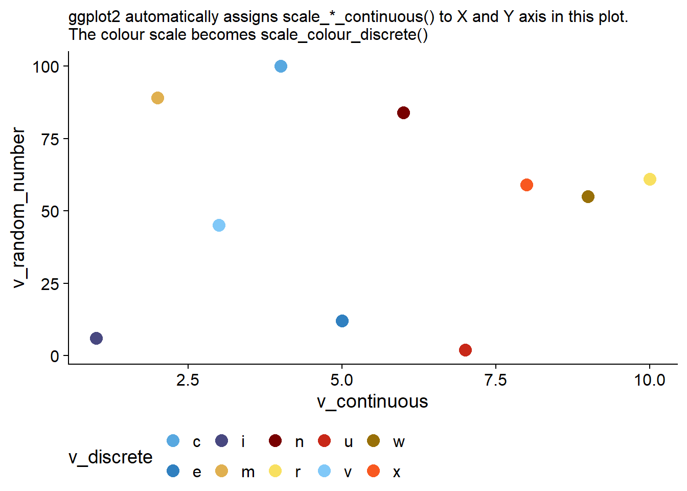
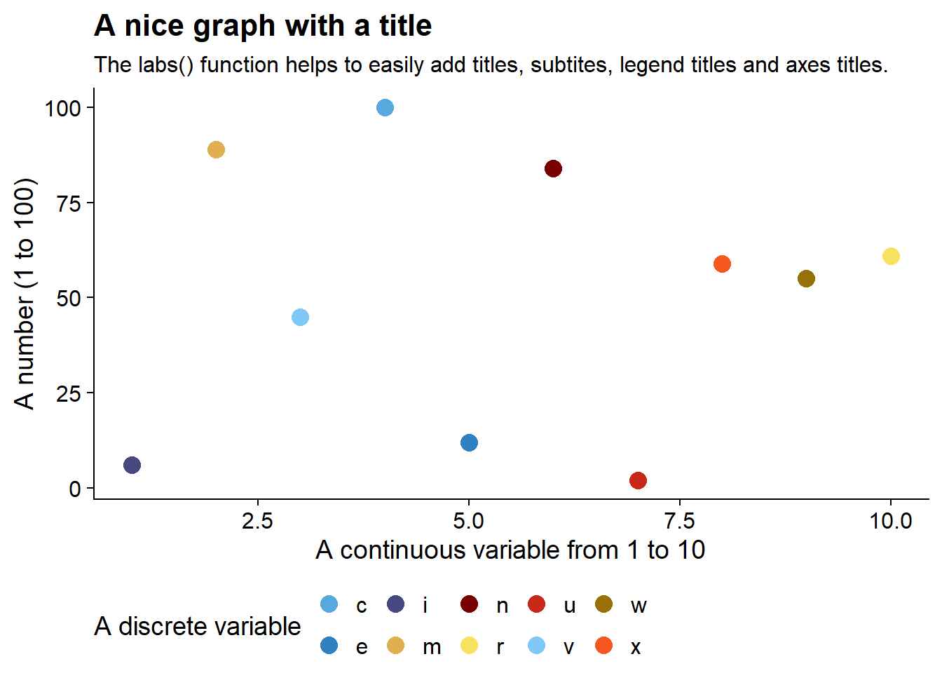
14.2 Scale names
The scales can be easily names, wither in the main scale_*_*() function using the argument name = "..." , or, more easily using the labs() helper function as shown below in Figure 3
Code
g +
  labs(
    title = "A nice graph with a title",
    x = "A continuous variable from 1 to 10",
    y = "A number (1 to 100)",
    colour = "A discrete variable",
    subtitle = "The labs() function helps to easily add titles, subtites, legend titles and axes titles."
  )
14.3 Scale breaks
The breaks = argument to the scale_*_*() functions is useful in determining the axis-ticks and lines or the colour levels in the legend to be displayed, as shown below in Figure 4
Code
g1 <- tb |>
  ggplot(aes(x = v_continuous,
             y = v_expo,
             colour = v_discrete)) +
  geom_point(
    size = 6
    ) +
  scale_x_continuous(
    breaks = seq(0, 10, 2),
    name = "Breaks at even numbers"
  ) +
  scale_y_continuous(
    name = "Exponentially increasing numbers\nBreaks at interval of 2000",
    breaks = seq(0, 10000, 2000)
  ) +
  labs(
    title = "Using breaks argument in scale_*_* functions",
    subtitle = "This plot shows customized breaks at interval of 2 on x-axis and 1000 on y-axis"
  ) +
  theme_cowplot() +
  theme(legend.position = "none")
g1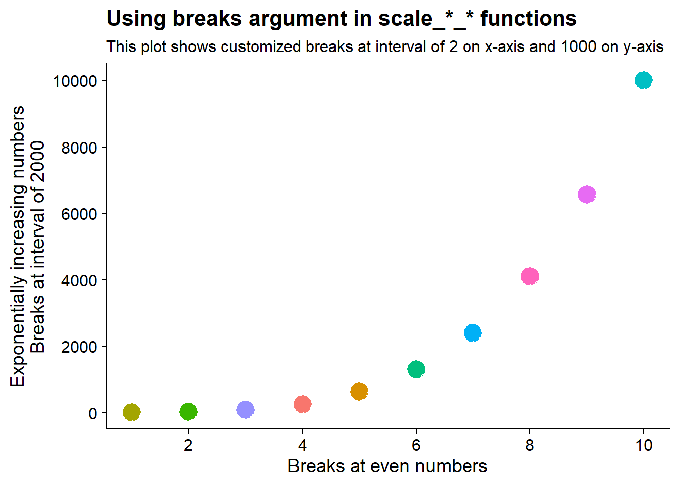
14.4 Scale limits
The Figure 5 shows an example of setting scale limits using the limit = argument in scale_*_*() functions in ggplot2. In this example, Y-axis limited upto 8000; and colour scale limtied to levels between a to h only.
Code
g2 <- g1 +
  scale_y_continuous(
    limits = c(0, 8000),
    name = "Limits from 0 to 8000"
  ) +
  scale_colour_discrete(
    limits = letters[1:8],
    na.value = "lightgrey",
    name = "Limited to characters between a to h"
  ) +
  labs(
    title = "Setting scale limits",
    subtitle = "Y-axis limited upto 8000; and colour scale limtied to a - h only"
  ) +
  theme(legend.position = "bottom")
g2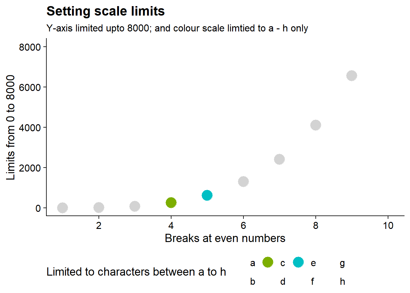
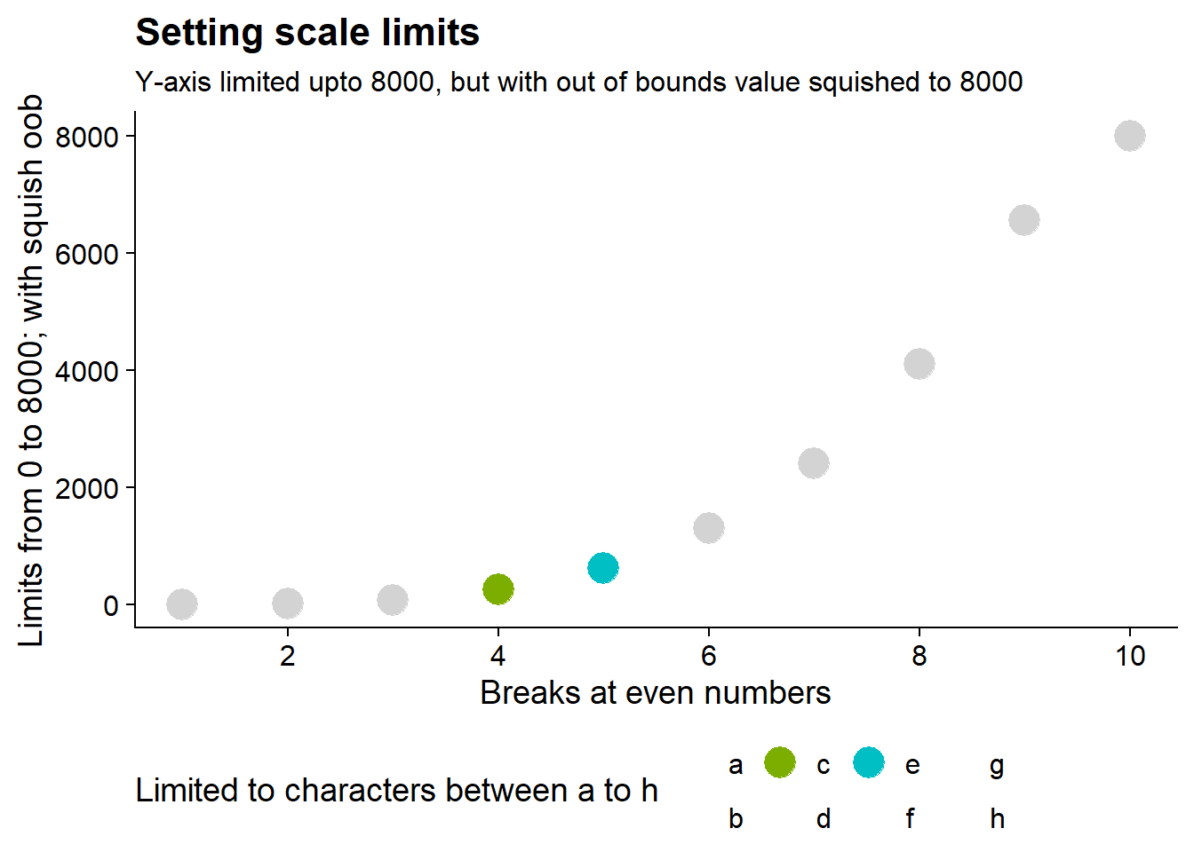
Further, with the oob = argument we can control the behavior of out-of-bounds data, as shown in Figure 6 below to squish to data onto the nearest limits.
Code
g2 +
  scale_y_continuous(
    limits = c(0, 8000),
    name = "Limits from 0 to 8000; with squish oob",
    oob = squish
  ) +
  labs(
    subtitle = "Y-axis limited upto 8000, but with out of bounds value squished to 8000"
  )
14.5 Scale guides
To demonstrate the use of guides() function, we customize the colour legend from Figure 4 to generate a customized legend in Figure 7
Code
g4 <- g1 +
  theme(legend.position = "bottom") +
  labs(
    title = "Customized Legend",
    colour = "Using guide_legend() to customize legend") +
  guides(
    colour = guide_legend(
      direction = "vertical",
      reverse = TRUE,
      nrow = 2,
      override.aes = list(
        size = 4
      ),
      theme = theme(
        legend.text = element_text(
          face = "bold"
        )
      )
    )
  )
g4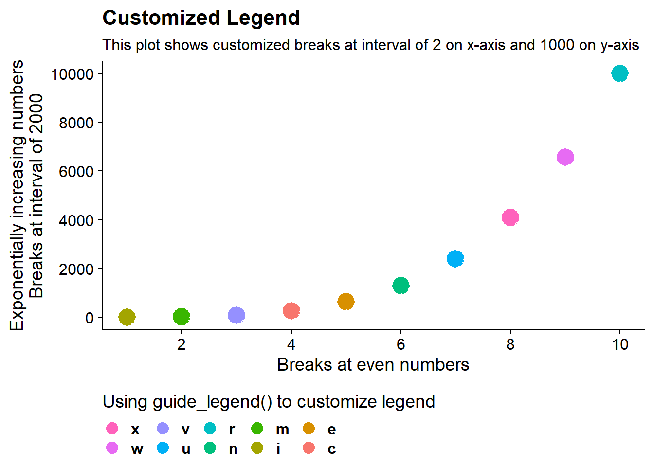
14.6 Scale transformation
The continuous scales in Figure 7 can be transformed using the trans argument in the scale_*_*() function, as shown in Figure 8 below.
Code
g4 +
  scale_y_continuous(
    trans = "log2",
    name = "Transformed Y-Axis\nwith powers of Two"
  ) +
  labs(subtitle = "Transformed Y-Axis to the powers of 2",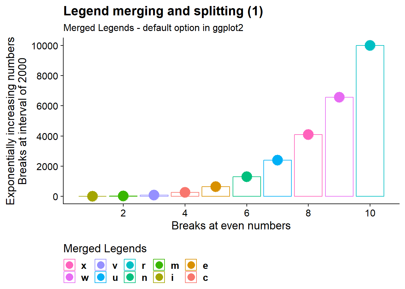
title = "Transformed Axes")14.7 Legend merging and splitting
The Figure 9 shows us that if we’ve mapped colour to both points and lines, the keys will show both points and lines.
Code
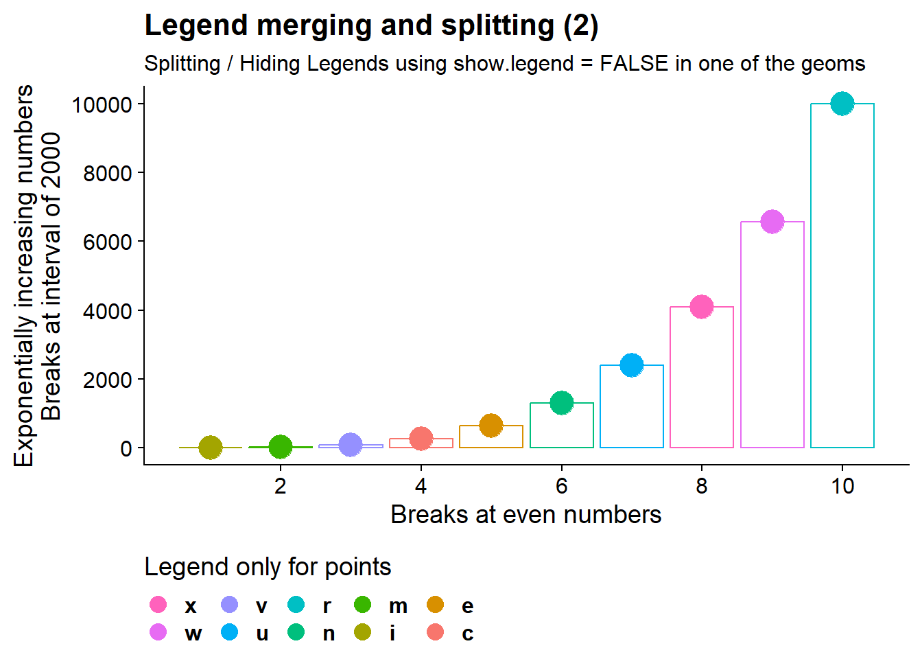
The Figure 10 shows us how we can split or hide legends for certain geoms - here we-ve hidden the colour legend for lines / column bars - so the key will show only points (and not lines).
Code
14.8 Legend key glyphs
Using the same graph as the last section, the Figure 11 demonstrates the use of argument key_glyph = within a geom_*() function to change the glyph used in the key of the graph.
