library(tidyverse)# Data wrangling and plottinglibrary(ggthemes)# ggplot2 themeslibrary(patchwork)# Composing multiple plotslibrary(ggiraph)# Interactive ggplot2 graphslibrary(ggstream)# Stream graphs in Rlibrary(paletteer)# Huge color palettes aggregatorlibrary(scales)# Scales for plotslibrary(gganimate)# Animations# Loading Dataurl<-'https://raw.githubusercontent.com/rfordatascience/tidytuesday/master/data/2023/2023-12-26/cran_20221122.csv'rpkgstats<-readr::read_csv(url)# Focussing on number of lines of code (LOC) and files in R directory of packagesdf1<-rpkgstats|>select(package, version, date, files_R, loc_R)
10.1 Numeric position scales
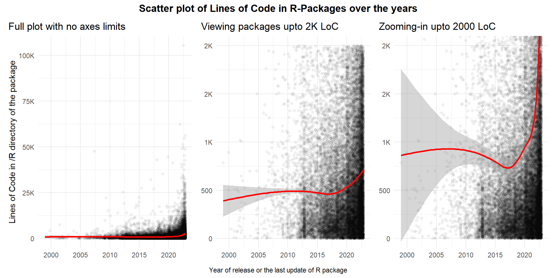
The Figure 1 demonstrates the use of Limits and Zooming-In features in ggplot2.
Figure 1: Demonstrating use of ylim(), scale_y_*() and coord_cartesian() to manually control limits of a plot
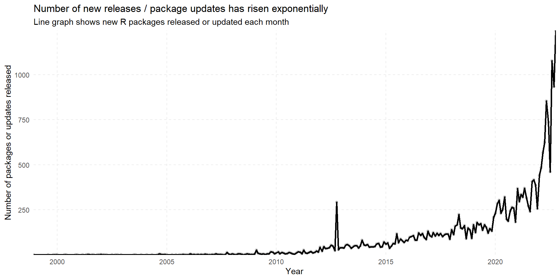
We can also demonstrate Visual range expansion in the following example exploring number of R packages updated or released over time on CRAN in Figure 2. We also demonstrate the use of scale_y_continuous(expand = expansion(0)) and scale_x_date(expand = expansion(0)) to remove any extra space between the graph and x-axis labels and y-axis labels.
Figure 2: Number of R packages released / updated each month
The best use of expand = expansion(0) comes with heat-maps. Here is an example in Figure 3 demonstrating the number of packages of R updated or released each month of the year, since 1999. We’ve made it interactive using ggiraph to make it more appealing to the user.
Figure 3: An interactive heat-map for number of R package releases or updates each month
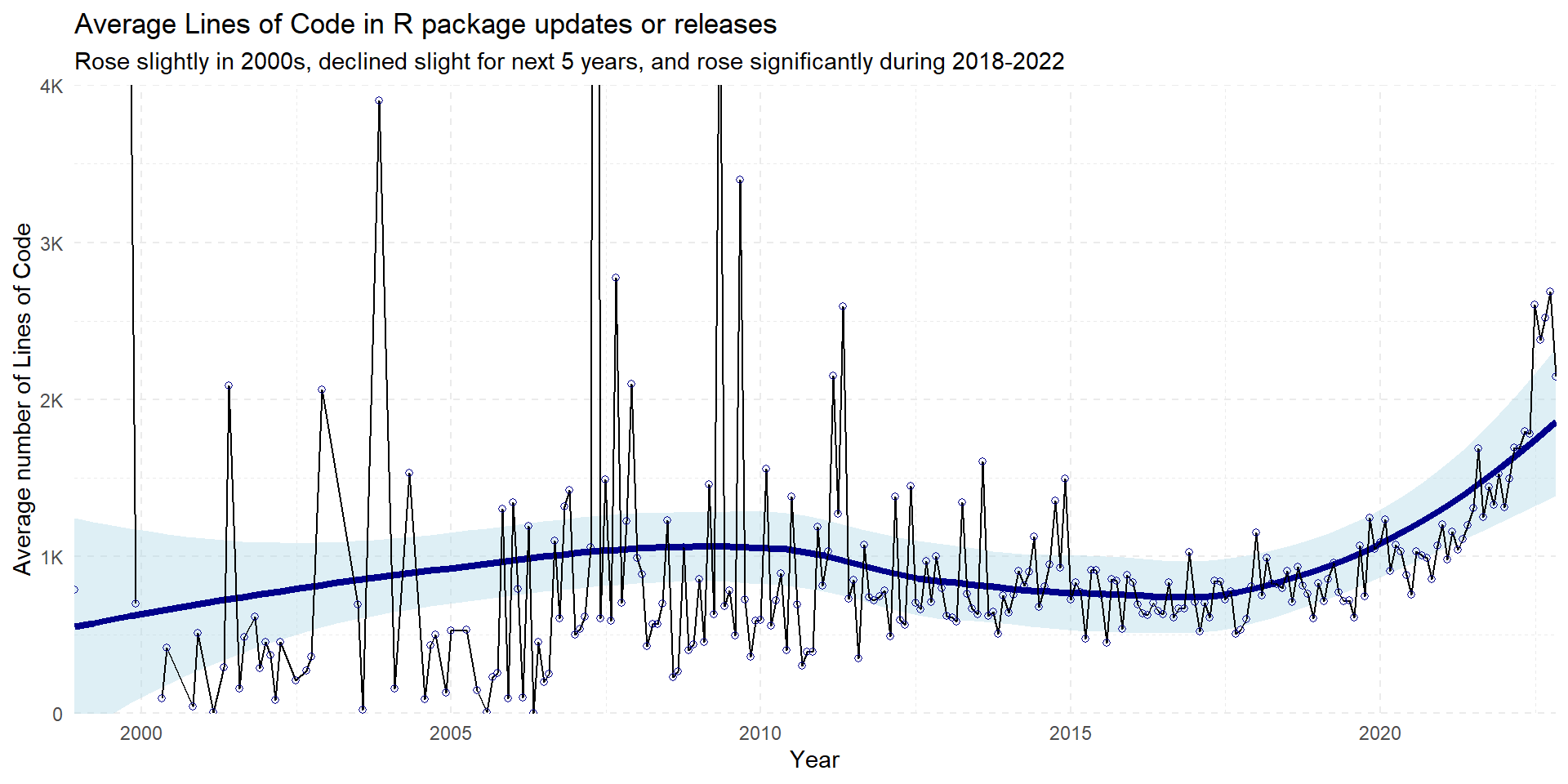
Now, lets have a look at the average number of Lines of Code in the R packages updated or released each month in an interactive heat-map in Figure 4 . We also can view the trend of average number of lines of code in R packages updated/released over time Figure 5, along with a loess smoother trend-line. In the Figure 5, note the use of coord_cartesian(ylim = c(0, 4000)) to zoom-in on the lower part of y-axis without removing values above 4000 from the plot.
Figure 5: A line-graph for average number of Lines of Code in the R packages over time
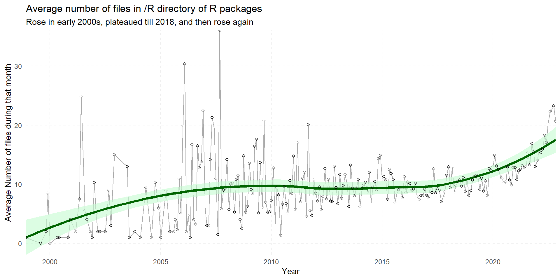
Finally, the Figure 6 looks at the average number of files in the R package releases/updates over the years, both as a heat map in Figure 6 (a), and as a line graph in Figure 6 (b).
Code
g3<-df2|>ggplot(aes(x =year, y =month, fill =avg_files))+geom_tile_interactive(aes(tooltip =paste0(month, " ", year, "\nPackages udpated / released: ", n,"\nAvg. Lines of Code: ", round(avg_loc, 0),"\nAvg. number of Files in Code: ",avg_files), data_id =id), hover_nearest =FALSE)+scale_fill_gradient2(low ="white", high ="darkgreen", trans ="log10", na.value ="white", labels =scales::label_number_si())+scale_x_continuous(expand =expansion(0))+scale_y_discrete(expand =expansion(0))+labs(title ="Average Number of files in /R directory code", x =NULL, y =NULL, fill ="Average number of Files")+theme_minimal()+theme( legend.position ="bottom", legend.key.width =unit(15, "mm"), panel.grid =element_blank(), plot.title =element_text(hjust =0.5, size =15), plot.title.position ="plot", axis.text =element_text(size =12), legend.title =element_text(vjust =0.5, size =12))girafe( ggobj =g3, options =list(opts_hover(css ="stroke:black;stroke-width:1px;")))df2|>mutate(time =make_date(year =year, month =month))|>ggplot(aes(x =time, y =avg_files))+geom_line(col ="darkgrey")+geom_smooth(lwd =1.5, alpha =0.6, col ="darkgreen", fill ="#c5fcd1")+geom_point(col ="black", fill ="white", pch =1)+labs(title ="Average number of files in /R directory of R packages", subtitle ="Rose in early 2000s, plateaued till 2018, and then rose again", x ="Year", y ="Average Number of files during that month")+scale_y_continuous(expand =expansion(0), labels =scales::label_number_si())+scale_x_date(expand =expansion(0), labels =scales::label_date_short())+theme_minimal()+theme( panel.grid.minor =element_blank(), panel.grid.major =element_line(linetype =2))
(a) An interactive heat-map for average number of files in the /R directory of the R packages updated or released during the month
(b) A line-graph for average number of files in the /R directory of the updated or newly released R packages over time
Figure 6: Using heatmap and line graph to look at Average number of file in the /R directory of the updated / released R packages
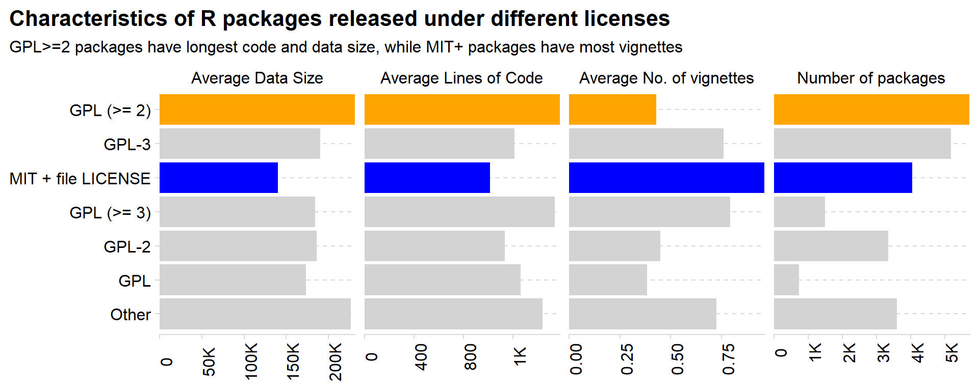
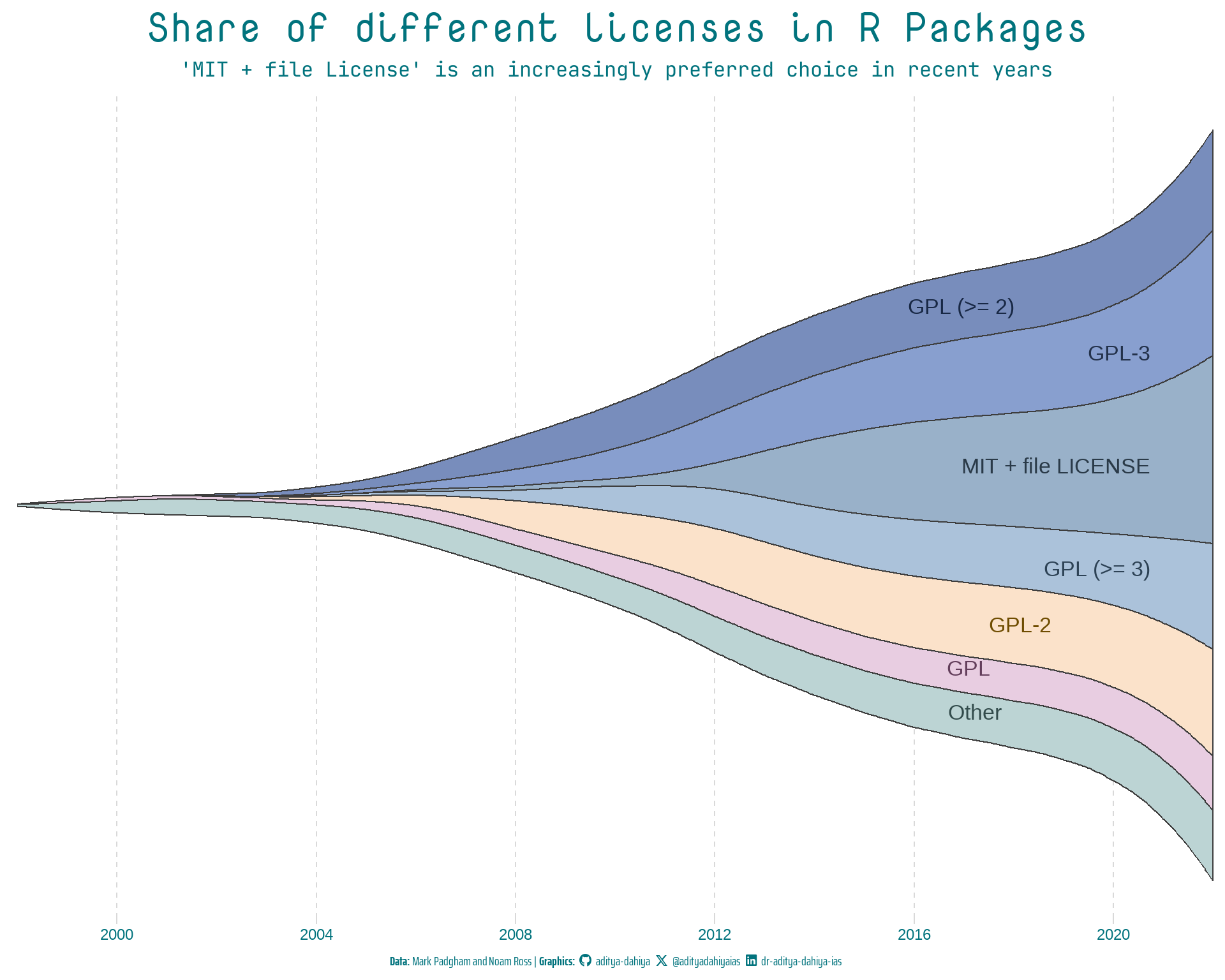
Now, let us explore the kind of licenses used by R package updates or releases over the years. The Figure 7 shows the share of different licenses in an interactive stacked bar chart, while Figure 8 shows different characteristics of packages with these licenses: —
Figure 7: Exploring the licenses of R package updates and releases
Code
strip_text=c("Average Data Size","Average Lines of Code","Average No. of vignettes","Number of packages")names(strip_text)<-c("avg_dt_size","avg_loc","avg_vignettes","n")rpkgstats|>mutate(license =as_factor(license))|>mutate(license =fct_lump_n(license, n =6))|>mutate(year =year(date), month =month(date))|>group_by(license)|>summarise( avg_loc =mean(loc_R, na.rm =TRUE), avg_vignettes =mean(num_vignettes, na.rm =TRUE), avg_dt_size =mean(data_size_total, na.rm =TRUE), n =n())|>arrange(license)|>mutate(id =row_number())|>mutate(license =fct_reorder(license, -id))|>select(-id)|>pivot_longer(cols =-license, names_to ="indicator", values_to ="value")|>mutate(col_var =case_when(license=="GPL (>= 2)"~"a",license=="MIT + file LICENSE"~"b", .default ="c"))|>ggplot(aes(x =value, y =license, fill =col_var))+geom_col()+facet_wrap(~indicator, scales ="free_x", nrow =1, labeller =as_labeller(strip_text))+labs(x =NULL, y =NULL, title ="Characteristics of R packages released under different licenses", subtitle ="GPL>=2 packages have longest code and data size, while MIT+ packages have most vignettes")+scale_x_continuous(labels =scales::label_number_si(), expand =expansion(0))+scale_fill_manual(values =c("orange", "blue", "lightgrey"))+cowplot::theme_minimal_hgrid()+theme( axis.text.x =element_text(angle =90), legend.position ="none", plot.title.position ="plot", panel.grid.major.y =element_line(linetype =2))
Figure 8: Faceted plot on average characteristics of packages with difference licenses
In the section 10.1.4 Breaks, we use the same data to modify the breaks in an axis. Instead of the stacked bar-plot we made above, we can also make a stream graph using ggstream(Sjoberg 2021) to make the graph more visually appealing, while changing the breaks on x-axis etc. As shown in the stream graph in Figure 9, it gives a better overall view: —
Code
library(fontawesome)library(showtext)library(ggtext)# Load fontsfont_add_google("Nova Mono", family ="title_font")# Font for titlesfont_add_google("Saira Extra Condensed", family ="caption_font")# Font for the captionfont_add_google("JetBrains Mono", family ="body_font")# Font for plot textshowtext_auto()text_col="#01737d"# Caption stuffsysfonts::font_add(family ="Font Awesome 6 Brands", regular =here::here("docs", "Font Awesome 6 Brands-Regular-400.otf"))github<-""github_username<-"aditya-dahiya"xtwitter<-""xtwitter_username<-"@adityadahiyaias"linkedin<-""linkedin_username<-"dr-aditya-dahiya-ias"social_caption<-glue::glue("<span style='font-family:\"Font Awesome 6 Brands\";'>{github};</span> <span style='color: {text_col}'>{github_username} </span> <span style='font-family:\"Font Awesome 6 Brands\";'>{xtwitter};</span> <span style='color: {text_col}'>{xtwitter_username}</span> <span style='font-family:\"Font Awesome 6 Brands\";'>{linkedin};</span> <span style='color: {text_col}'>{linkedin_username}</span>")plot_caption<-paste0("**Data:** Mark Padgham and Noam Ross | ", "**Graphics:** ", social_caption)rpkgstats|>mutate(license =as_factor(license))|>mutate(license =fct_lump_n(license, n =6))|>mutate(year =year(date), month =month(date))|>group_by(year, license)|>count()|>group_by(year)|>mutate(prop =n/sum(n), yeartotal =sum(n))|>ungroup()|>mutate(id =row_number())|>ggplot(aes( x =year, y =n, fill =license, label =license))+geom_stream(bw =0.85, sorting ="onset", color ="#3d3d3d")+geom_stream_label(aes(color =license), hjust ="inward", size =9)+labs( x =NULL, y =NULL, title ="Share of different licenses in R Packages", subtitle ="'MIT + file License' is an increasingly preferred choice in recent years", caption =plot_caption)+scale_x_continuous(expand =expansion(0), breaks =breaks_width(width =4))+scale_y_log10()+scale_fill_manual(values =paletteer_d("nord::afternoon_prarie")|>colorspace::lighten(0.3))+scale_color_manual(values =paletteer_d("nord::afternoon_prarie")|>colorspace::darken(0.6))+cowplot::theme_minimal_vgrid()+theme( legend.position ="none", panel.grid.major.x =element_line(linetype =2), axis.line.y =element_blank(), axis.ticks.y =element_blank(), axis.text.y =element_blank(), plot.title =element_text(family ="title_font", size =48, face ="bold", colour =text_col, hjust =0.5), plot.subtitle =element_text(family ="body_font", colour =text_col, hjust =0.5, size =24), plot.caption =element_textbox(family ="caption_font", colour =text_col, hjust =0.5, size =15), axis.text.x =element_text(size =18, color =text_col))
Figure 9: Visualizing the change in dominance of different licenses over time with a stream graph. Using customized breaks in the x-axis for the graph.
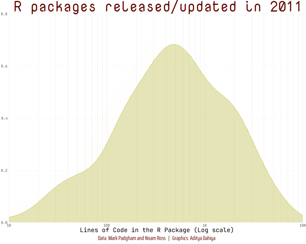
To demonstrate transformations of scales (Section 10.1.7), we create a log10 scale on the x-axis in an animated histogram depicting the distribution of the Lines of Code in R packages over the years using {scales} (Wickham and Seidel 2022) and {gganimate} (Pedersen and Robinson 2022), as depicted below: —
Code
library(fontawesome)library(showtext)library(ggtext)# Load fontsfont_add_google("Nova Mono", family ="title_font")# Font for titlesfont_add_google("Saira Extra Condensed", family ="caption_font")# Font for the captionfont_add_google("JetBrains Mono", family ="body_font")# Font for plot textshowtext_auto()plot_caption<-"Data: Mark Padgham and Noam Ross | Graphics: Aditya Dahiya"# Defining minor breaks for the x-axismb<-unique(as.numeric((1:10)%o%10^(0:5)))df3<-rpkgstats|>mutate(year =year(date))|>select(package, year, loc_R)|>filter(loc_R!=0&!is.na(loc_R))fill_palette<-paletteer_d("khroma::smoothrainbow")[22:34]col_palette<-fill_palette|>colorspace::darken(0.4)anim<-df3|>filter(year>2010)|>ggplot(aes(loc_R, fill =factor(year), col =factor(year), frame =year))+geom_density(alpha =0.4)+scale_x_log10( minor_breaks =mb, expand =expansion(c(0, 0.005)), labels =label_number_si(), breaks =(10^(1:4)), limits =c(10, 10^4))+scale_y_continuous(expand =expansion())+scale_fill_manual(values =fill_palette)+scale_color_manual(values =fill_palette)+labs( x ="Lines of Code in the R Package (Log scale)", y =NULL, title ="R packages released/updated in {as.integer(frame_time)}", caption =plot_caption)+theme_minimal()+theme( panel.grid.minor.y =element_blank(), panel.grid.major.y =element_line(linetype =2), panel.grid.major.x =element_line(colour ="#ebebeb"), panel.grid.minor.x =element_line(colour ="#ebebeb"), plot.title =element_text(family ="title_font", size =36, hjust =0.5, color =col_palette[11]), axis.text =element_text(family ="body_font"), axis.title =element_text(family ="body_font", size =15), legend.position ="none", plot.caption =element_text( family ="caption_font", hjust =0.5 , margin =margin(12, 0, 5, 0), size =15, colour =col_palette[11]))anim# Final animation to renderanimate( plot =anim+transition_time(year)+shadow_mark(alpha =alpha/4)+ease_aes("linear")+enter_fade()+exit_fade(), fps =20, duration =12, end_pause =40, height =800, width =1000)# anim_save(filename = here::here("docs", "anim_rpkgs.gif"))
10.2 Date-time position scales
The Figure 10 below demonstrates the use of Breaks (Section 10.2.1), Minor Breaks (Section 10.2.2) and custom labels (Section 10.2.3) taught in the book for date scales in ggplot2.
Code
library(fontawesome)# Social Media iconslibrary(ggtext)# Markdown Text in ggplot2library(showtext)# Load fontsfont_add_google("Nova Mono", family ="title_font")# Font for titlesfont_add_google("Saira Extra Condensed", family ="caption_font")# Font for the captionfont_add_google("JetBrains Mono", family ="body_font")# Font for plot textshowtext_auto()# Palettes and Coloursfill_palette<-paletteer::paletteer_d("MetBrewer::Hiroshige")|>colorspace::lighten(0.5)col_palette<-fill_palette|>colorspace::darken(0.8)text_col=col_palette[10]# Caption stuffsysfonts::font_add(family ="Font Awesome 6 Brands", regular =here::here("docs", "Font Awesome 6 Brands-Regular-400.otf"))github<-""github_username<-"aditya-dahiya"xtwitter<-""xtwitter_username<-"@adityadahiyaias"linkedin<-""linkedin_username<-"dr-aditya-dahiya-ias"social_caption<-glue::glue("<span style='font-family:\"Font Awesome 6 Brands\";'>{github};</span> <span style='color: {text_col}'>{github_username} </span> <span style='font-family:\"Font Awesome 6 Brands\";'>{xtwitter};</span> <span style='color: {text_col}'>{xtwitter_username}</span> <span style='font-family:\"Font Awesome 6 Brands\";'>{linkedin};</span> <span style='color: {text_col}'>{linkedin_username}</span>")plot_caption<-paste0("**Data:** Mark Padgham and Noam Ross | ", "**Graphics:** ", social_caption)# Number of n top packages to studyn=10t_p<-c("ggplot2", "tibble", "tidyr", "readr", "dplyr", "stringr", "purrr", "forcats")# Finding the top n packagestop_pkgs<-rpkgstats|>select(imports)|>separate_longer_delim(cols =imports, delim =", ")|>drop_na()|>count(imports, sort =TRUE)|>pull(imports)top_pkgs<-top_pkgs[1:n]# Plotg<-rpkgstats|>select(date, imports)|>separate_longer_delim(cols =imports, delim =", ")|>drop_na()|>filter(imports%in%top_pkgs)|>mutate( date =floor_date(date, unit ="year"), imports =case_when(imports%in%t_p~"tidyverse", .default =imports))|>group_by(date)|>count(imports)|>mutate(prop =n/sum(n))|>ggplot(aes( x =date, y =prop, fill =imports, label =imports, color =imports))+geom_stream( type ="proportional")+geom_stream_label( type ="proportional", family ="body_font", size =unit(20, "mm"), hjust ="inward")+labs( x =NULL, y ="% imports (amongst top packages)", title ="Top R packages used as imports", subtitle ="The core tidyverse packages have become increasingly popular as imports for other R packages!", caption =plot_caption)+scale_x_datetime(expand =expansion(), date_breaks ="2 years", date_labels ="%Y")+scale_y_continuous(expand =expansion(0), labels =label_percent())+scale_fill_manual(values =fill_palette)+scale_color_manual(values =col_palette)+theme_minimal()+theme( panel.grid =element_blank(), legend.position ="none", panel.grid.major.x =element_line(linetype =2), axis.ticks.y =element_blank(), plot.title =element_text(family ="title_font", size =unit(120, "mm"), face ="bold", colour =text_col, hjust =0.5), plot.subtitle =element_text(family ="caption_font", colour =text_col, hjust =0.5, size =unit(70, "mm")), plot.caption =element_textbox(family ="caption_font", colour =text_col, hjust =0.5, size =unit(30, "mm")), axis.text =element_text(family ="body_font", size =unit(40, "mm"), color =text_col), axis.title =element_text(family ="body_font", size =unit(50, "mm"), color =text_col, hjust =0.5, margin =margin(0,0,0,0)), plot.background =element_rect(fill ="white", colour ="white"), plot.title.position ="plot")ggsave( filename =here::here("docs", "rpkg_imports.png"), plot =g, height =unit(10, "cm"), width =unit(10, "cm"))
Figure 10: A proportional stream-plot showing the percentage of imports (amongst top packages) which belong to a particular R package.
10.3 Discrete Position Scales
Using limits, breaks and labels on discrete scales
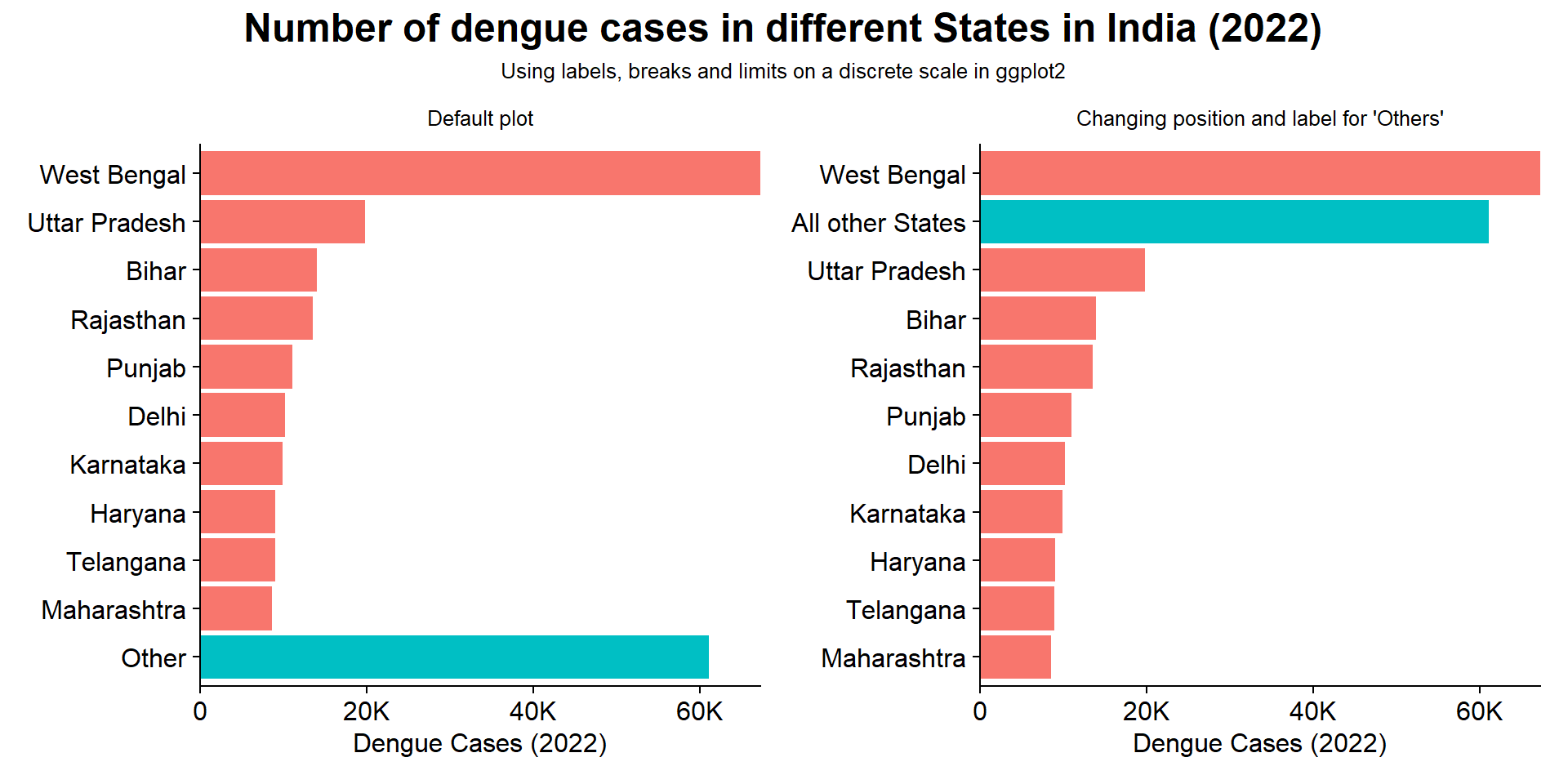
The Figure 11 demonstrates the use of scale_y_discrete() to customize the position of, and the label for a specific value (“Other States”) on the y-axis.
Code
library(tidyverse)library(here)library(patchwork)dengue<-read_csv(here("data", "dengue_india.csv"))dendf<-dengue|>rename(country =adm_0_name, state =adm_1_name, year =Year, cases =dengue_total, definition =case_definition_standardised)|>select(country, state, year, cases, definition)|>mutate(state =if_else(state=="ARUNACHAL\nPRADESH","ARUNACHAL PRADESH",state))df1<-dendf|>filter(year==2022)|>group_by(state)|>summarise(total =sum(cases, na.rm =TRUE))|>ungroup()|>mutate( state =str_to_title(state), state =factor(state), state =fct_lump_n(state, n =10, w =total))label_state<-df1|>group_by(state)|>summarise(total =sum(total))|>arrange(desc(total))|>pull(state)g1<-df1|>ggplot(aes(y =reorder(state, total), x =total, fill =state=="Other"))+geom_col()+labs(x ="Dengue Cases (2022)", y =NULL, subtitle ="Default plot")+scale_x_continuous( labels =scales::label_number_si(), expand =expansion(0))+cowplot::theme_half_open()+theme(legend.position ="none")g2<-g1+scale_y_discrete( limits =rev(label_state), labels =c(Other ="All other States"))+labs(subtitle ="Changing position and label for 'Others'")ts=12g1+g2+plot_annotation( title ="Number of dengue cases in different States in India (2022)", subtitle ="Using labels, breaks and limits on a discrete scale in ggplot2", theme =theme( plot.title =element_text(face ="bold", hjust =0.5, size =1.5*ts), plot.subtitle =element_text(hjust =0.5, size =0.8*ts)))&theme( axis.text =element_text(size =ts), axis.title =element_text(size =ts), plot.subtitle =element_text(size =0.8*ts, hjust =0.5))
Figure 11: The use of scale_y_discrete to change labels and position of values on the y axis
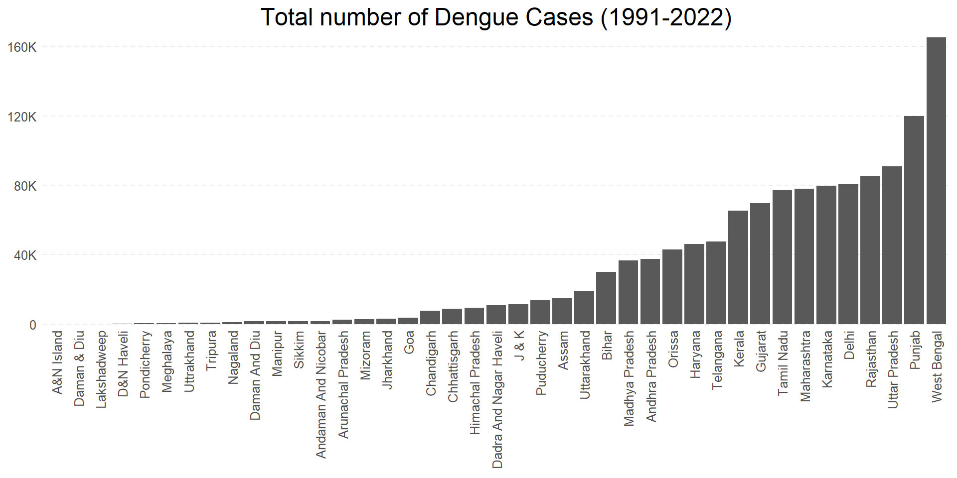
The Figure 12 shows customization of Label Positions using helper function guides() or the argument guides = giude_axis() within x- or y-axis scale function to change angle and dodge position of the labels.
Figure 12: Number of total Dengue Fever cases ever reported in different states of India (1991 - 2022)
10.4 Binned position scales
The Figure 13 demonstrates a use for scale_x_binned() when we might want to use histogram like scale labels even for scatter-plots or bar plots. Here we show the number cases year-wise (between Jan 1 - Dec 31) of a year for each state, from 1991 to 2022. Since our x-axis variable is not a continuous one, the use of scale_x_binned() does not serve any purpose here, and this is not a good example.
Figure 13: Number of dengue fever cases in each state, over a period of 1991 to 2022
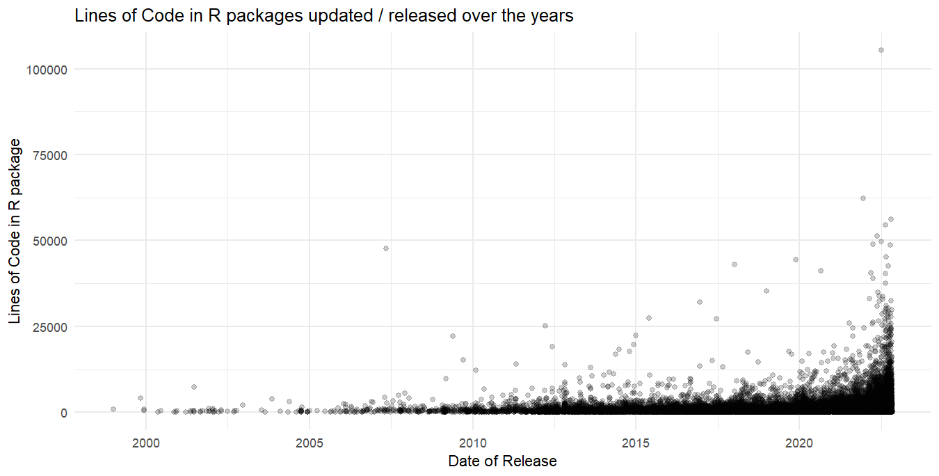
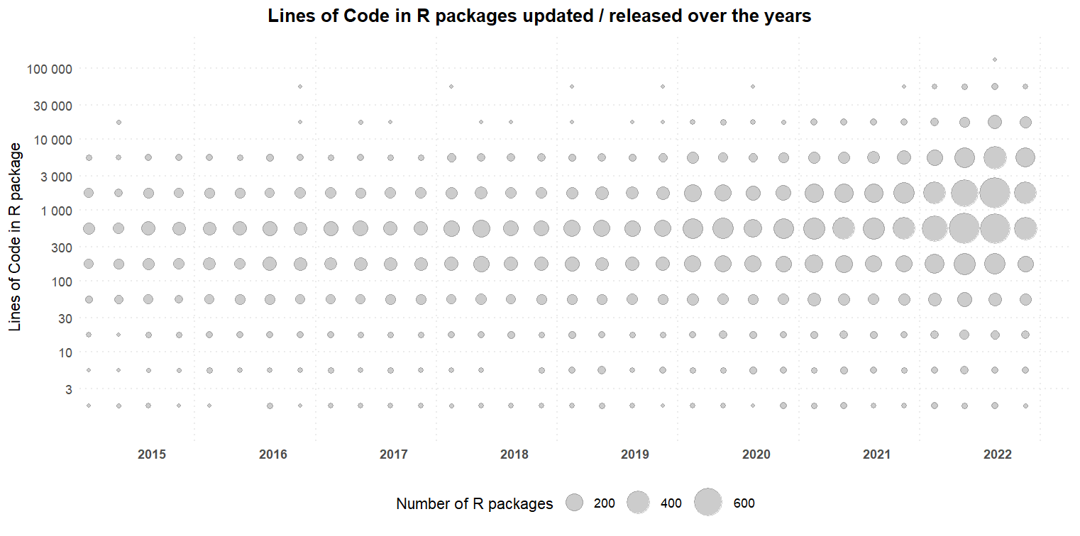
So, let’s use scale_y_binned() in a plot where it’s use is better expressed, as in Figure 15. Here, we plots the number of R packages released each month vs. Lines of Code over the years in the form of a scatter plot in Figure 14, leading to a crowded plot with with limited ease of understanding. Next, we bin the y-axis, i.e. Lines of Code along with a log10 transformation, and break-up x-axis (dates) into quarters of the years. Now, the scatter plot in Figure 15 seems much easier to understand.
Code
df1|>drop_na()|>filter(date>as_datetime("2015-01-01"))|>ggplot(aes(x =date, y =loc_R))+geom_point(alpha =0.2)+labs(x ="Date of Release", y ="Lines of Code in R package", title ="Lines of Code in R packages updated / released over the years")+theme_minimal()+theme()df1|>drop_na()|>filter(date>as_datetime("2015-01-01"))|>mutate(qtr =floor_date(date, unit ="quarter"), qtr =as_date(qtr))|>ggplot(aes(x =qtr, y =loc_R))+geom_count(alpha =0.2)+scale_x_date(breaks =scales::breaks_width("1 year", offset ="-45 days"), date_minor_breaks ="3 months", date_labels ="%Y", expand =expansion(c(0.01, 0.05)))+scale_y_binned(trans ="log10", labels =scales::label_number())+scale_size(range =c(1, 10))+labs(x =NULL, y ="Lines of Code in R package", title ="Lines of Code in R packages updated / released over the years", size ="Number of R packages")+theme_minimal()+theme( legend.position ="bottom", panel.grid.major.y =element_line(linetype ="dotted"), panel.grid.major.x =element_line(linetype ="dotted"), panel.grid.minor.x =element_blank(), plot.title =element_text(hjust =0.5, face ="bold"), axis.text.x =element_text(vjust =1, hjust =+2, face ="bold"), plot.title.position ="plot")
Figure 14: Scatter plot without scales modification. Difficult to spot the trend.
Figure 15: Use of scale_y_binned and log10 transformation, along with scale_datetime() to easily view trends
References
Clarke, Joe, Ahyoung Lim, Pratik R. Gupte, David M. Pigott, Wilbert G van Panhuis, and Oliver Brady. 2023. “OpenDengue: Data from the OpenDengue Database.” figshare. https://doi.org/10.6084/M9.FIGSHARE.24259573.V3.
Clarke, Joe; Lim, Ahyoung; Gupte, Pratik R.; Pigott, David M.; van Panhuis, Wilbert G; Brady, Oliver (2023). OpenDengue: data from the OpenDengue database. Version [1.2]. figshare. Dataset. https://doi.org/10.6084/m9.figshare.24259573.v3↩︎