Chapter 15
Coordinate Systems
To begin with, lets create a dummy data set shown in Figure 1
Code
set.seed(123)
tb <- tibble(
  v_integer = 1:20,
  v_squared = v_integer ^ 2,
  v_regress = round(
    (v_integer ^ 2) +
      rnorm(
        20, mean = 0, sd = 1),
    2),
  v_random = sample(1:100, 20, replace = FALSE),
  v_discrete = sample(LETTERS[1:4], 20, replace = TRUE)
)
tb |>
  gt() |>
  cols_align("center") |>
gt_theme_538()| v_integer | v_squared | v_regress | v_random | v_discrete |
|---|---|---|---|---|
| 1 | 1 | 0.44 | 15 | B |
| 2 | 4 | 3.77 | 32 | A |
| 3 | 9 | 10.56 | 7 | A |
| 4 | 16 | 16.07 | 9 | C |
| 5 | 25 | 25.13 | 41 | A |
| 6 | 36 | 37.72 | 74 | B |
| 7 | 49 | 49.46 | 23 | A |
| 8 | 64 | 62.73 | 27 | C |
| 9 | 81 | 80.31 | 60 | A |
| 10 | 100 | 99.55 | 53 | C |
| 11 | 121 | 122.22 | 98 | B |
| 12 | 144 | 144.36 | 91 | D |
| 13 | 169 | 169.40 | 93 | C |
| 14 | 196 | 196.11 | 38 | D |
| 15 | 225 | 224.44 | 34 | D |
| 16 | 256 | 257.79 | 69 | B |
| 17 | 289 | 289.50 | 72 | B |
| 18 | 324 | 322.03 | 76 | C |
| 19 | 361 | 361.70 | 63 | D |
| 20 | 400 | 399.53 | 13 | B |
15.1 Linear coordinate systems
Let’s use the example plot in Figure 2 to demonstrate the various changes / customization possible with ggplot2 with coordinates.
Code
g1 <- tb |>
  ggplot(
    aes(
      x = v_integer,
      y = v_regress
    )
  ) +
  geom_smooth(
    se = TRUE,
    colour = "grey",
    fill = "lightgrey",
    alpha = 0.5
  ) +
  geom_point(
    aes(colour = v_discrete),
    size = 3
  ) +
  scale_colour_brewer(palette = "Dark2") +
  theme_minimal() +
  theme(axis.line = element_line(arrow = arrow()))
g1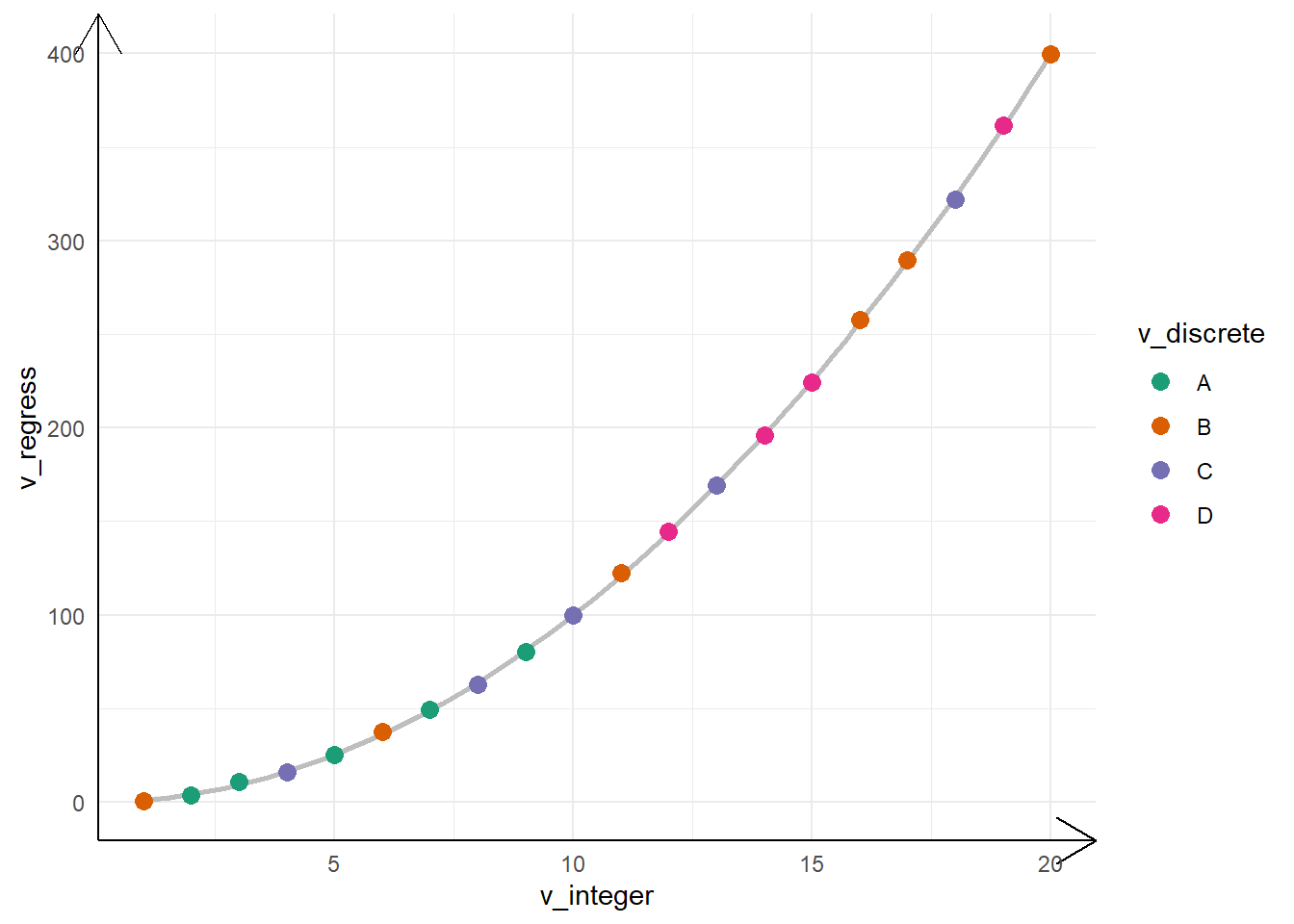
15.1.1 Zooming into a plot with coord_cartesian()
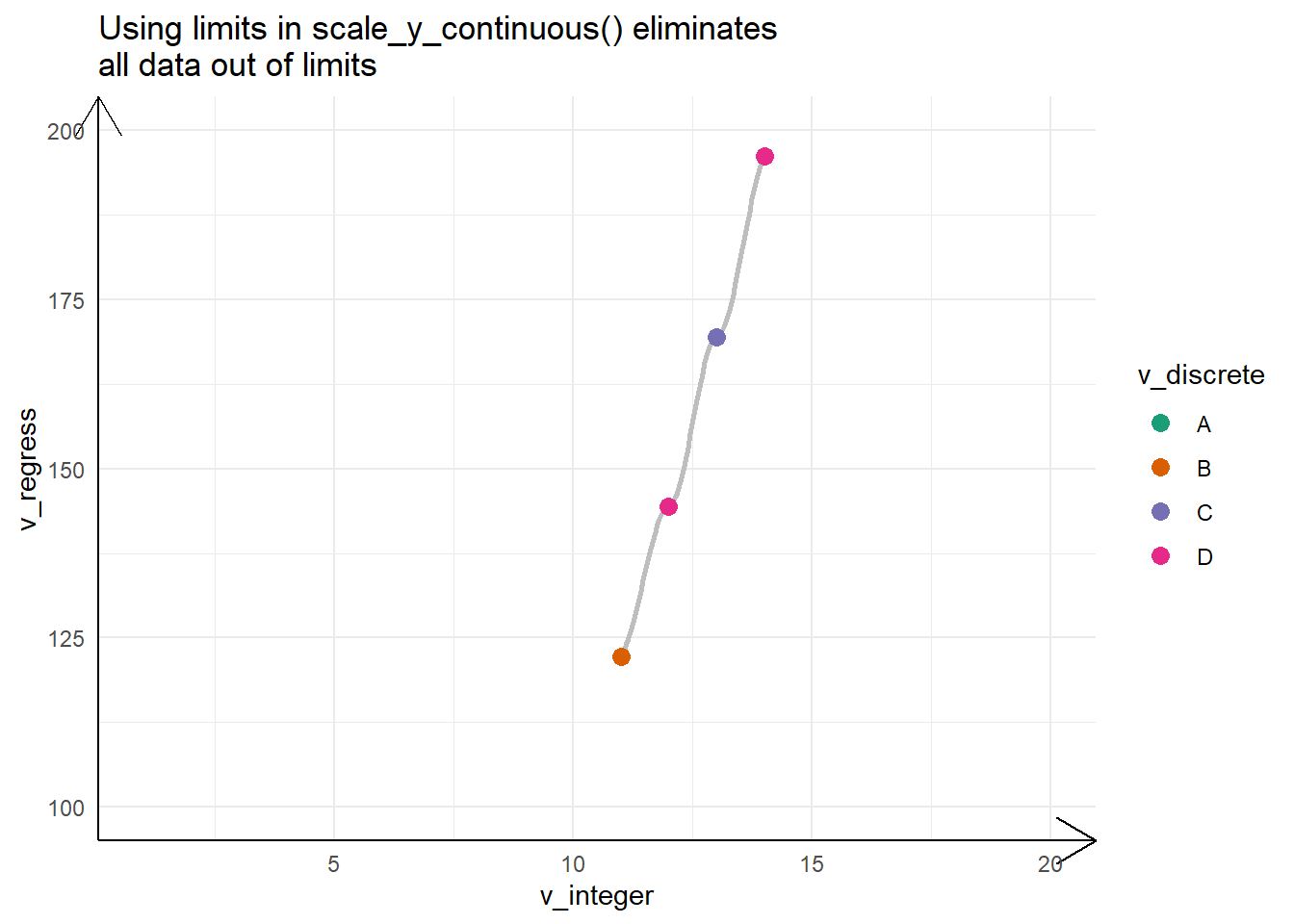
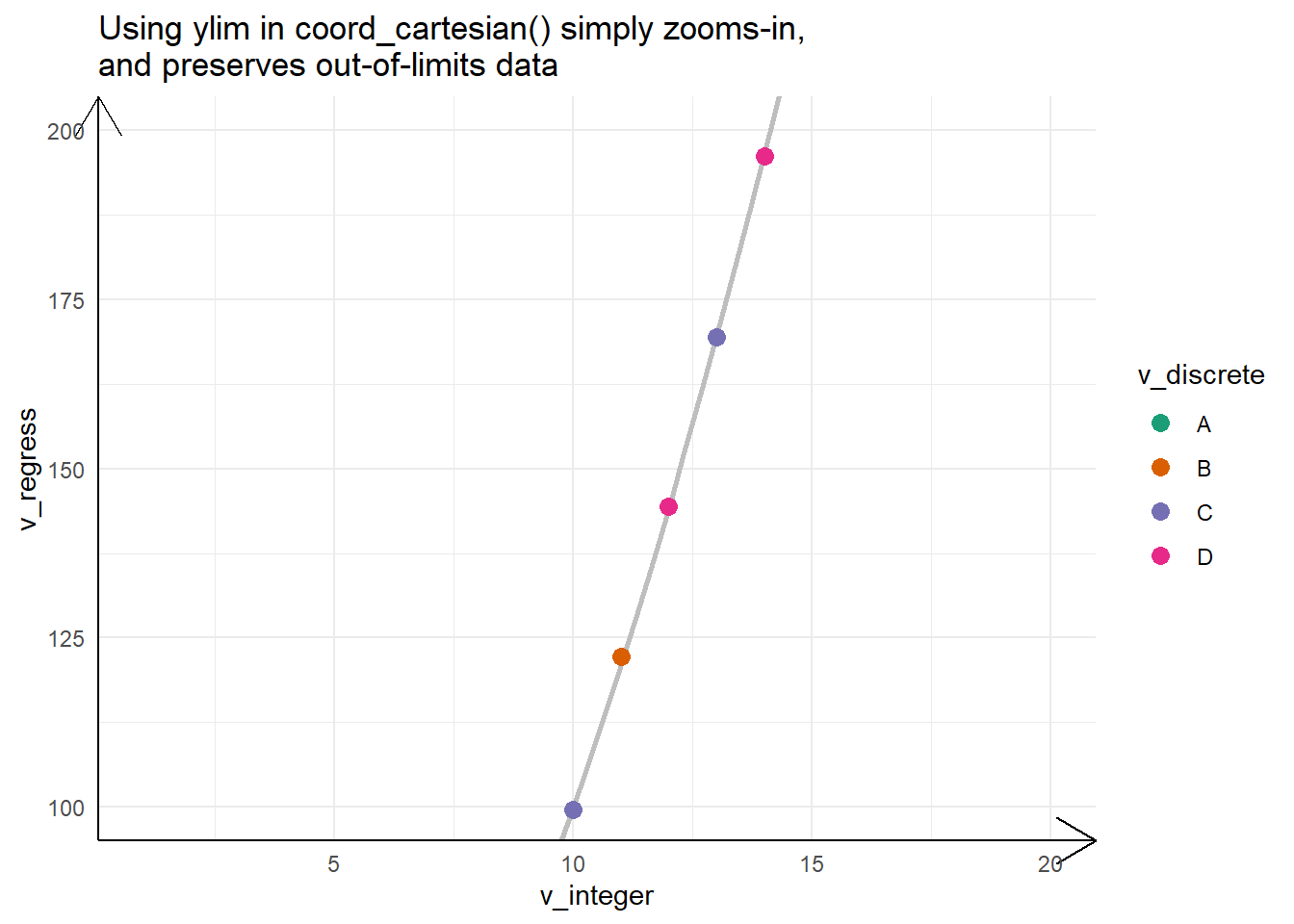
The Figure 3 shows an example of zooming into a plot with coord_cartesian() and its difference from the other option using scale_*_continuous(limits = *) .
Code
g1 +
  labs(title = "The Base Plot shows entire data")

g1 + scale_y_continuous(limits = c(100, 200)) +
  labs(title = "Using limits in scale_y_continuous() eliminates\nall data out of limits")

g1 + coord_cartesian(ylim = c(100, 200)) +
  labs(title = "Using ylim in coord_cartesian() simply zooms-in,\nand preserves out-of-limits data")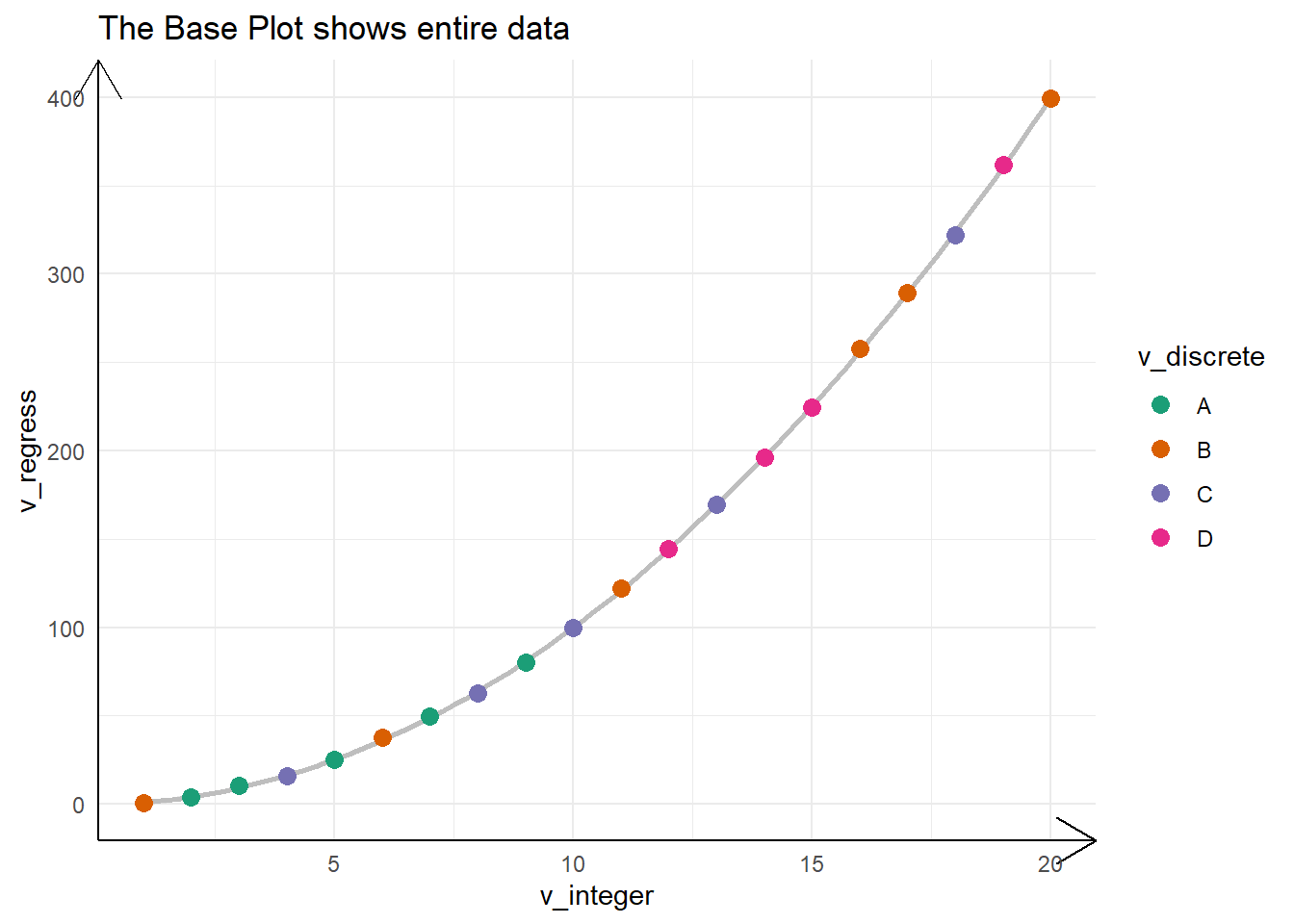
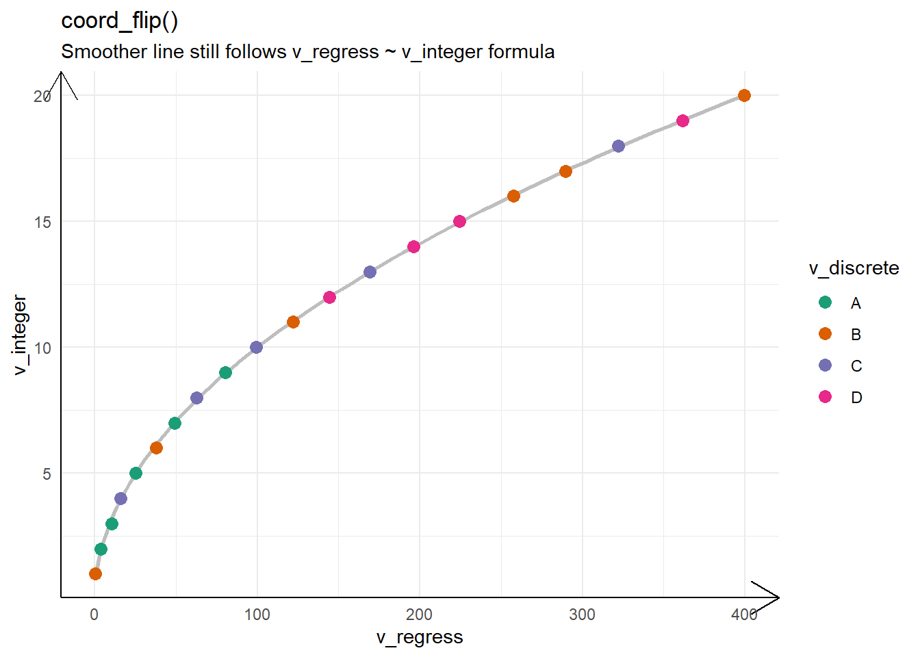
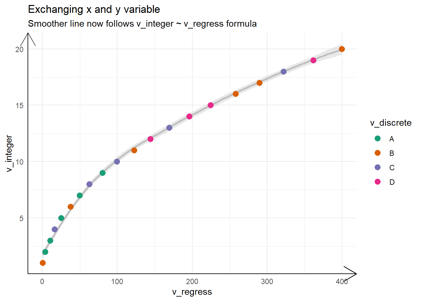
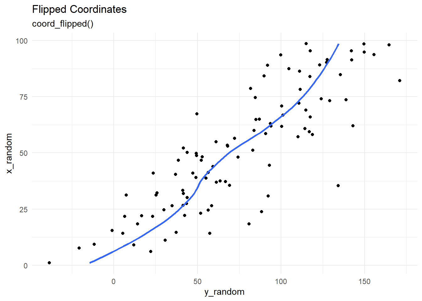
15.1.2 Flipping the axes with coord_flip()
The Figure 4 shows examples of flipping the coordinates, and reasoning as to why it may be better than changing X-axis and Y-axis variables manually, especially if we are using geom_smooth() which uses y ~ x formula by default.
Code
g1 + labs(title = "The base plot",
                subtitle = "Dependent variable is v_regress, and independent var is v_integer")

g1 +
  coord_flip() +
  labs(title = "coord_flip()",
       subtitle = "Smoother line still follows v_regress ~ v_integer formula")

tb |>
  ggplot(
    aes(
      y = v_integer,
      x = v_regress
    )
  ) +
  geom_smooth(
    se = TRUE,
    colour = "grey",
    fill = "lightgrey",
    alpha = 0.5
  ) +
  geom_point(
    aes(colour = v_discrete),
    size = 3
  ) +
  scale_color_brewer(palette = "Dark2") +
  theme_minimal() +
  theme(axis.line = element_line(arrow = arrow())) +
  labs(title = "Exchanging x and y variable",
       subtitle = "Smoother line now follows v_integer ~ v_regress formula")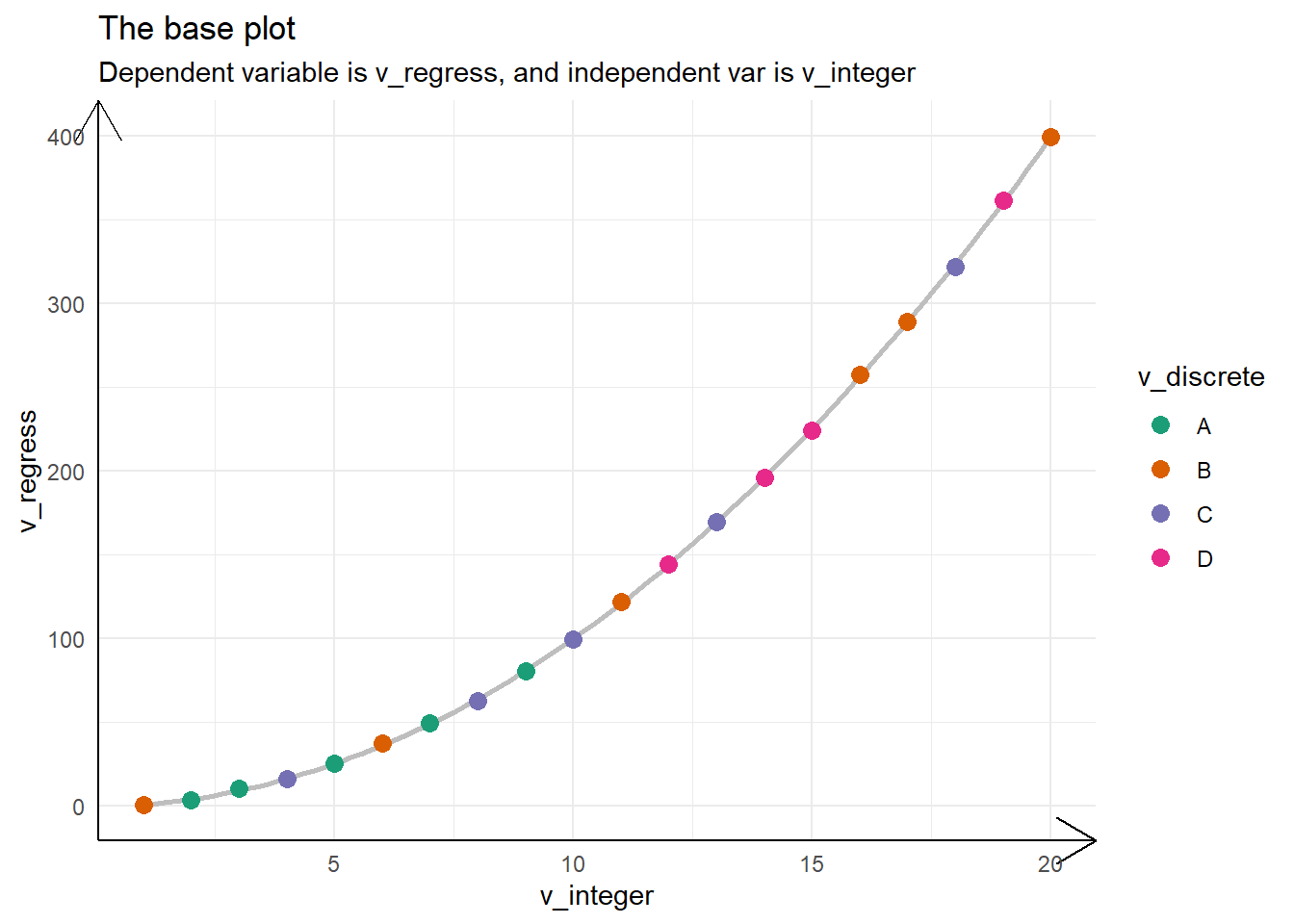
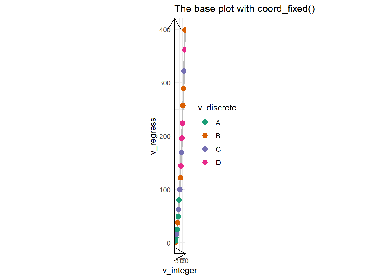
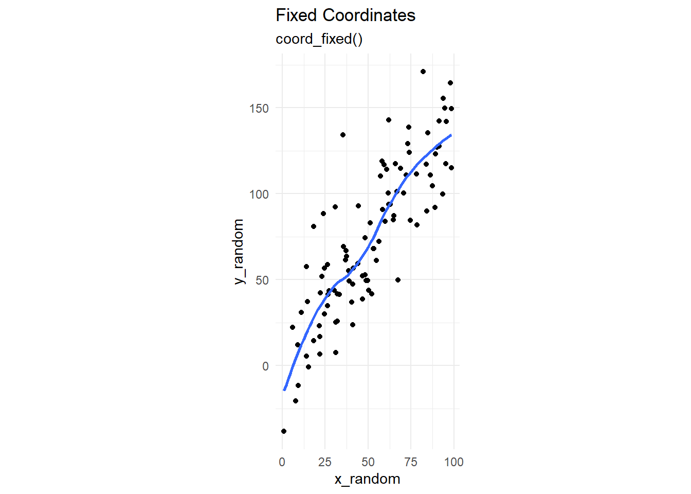
15.1.3 Equal scales with coord_fixed()
The Figure 5 shows the same three graphs above, but in a much better sense now that coordinates are fixed to be equal.
Code
g1 + labs(title = "The base plot")

g1 + coord_fixed() + labs(title = "The base plot with coord_fixed()")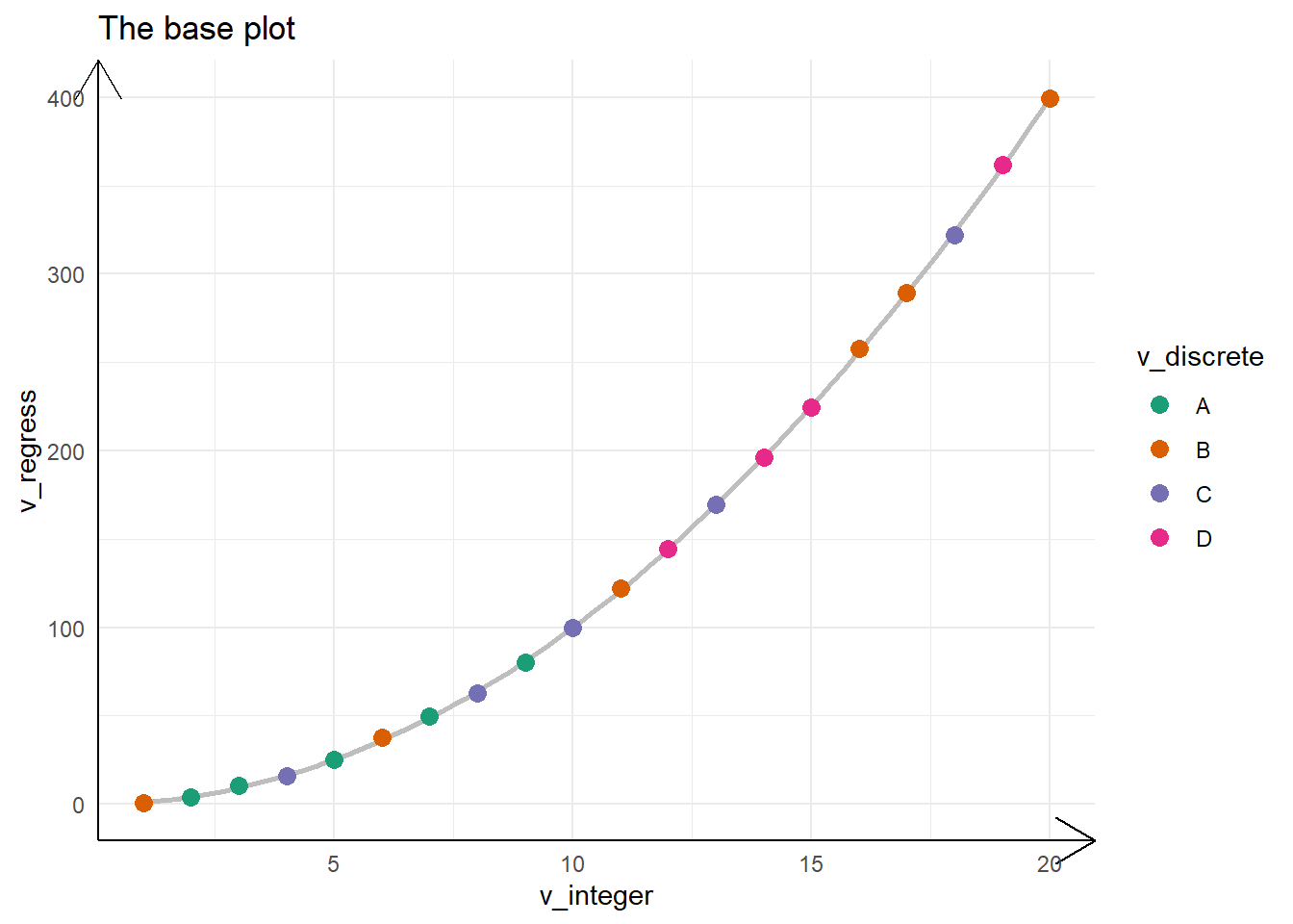
15.2 Non-linear coordinate systems
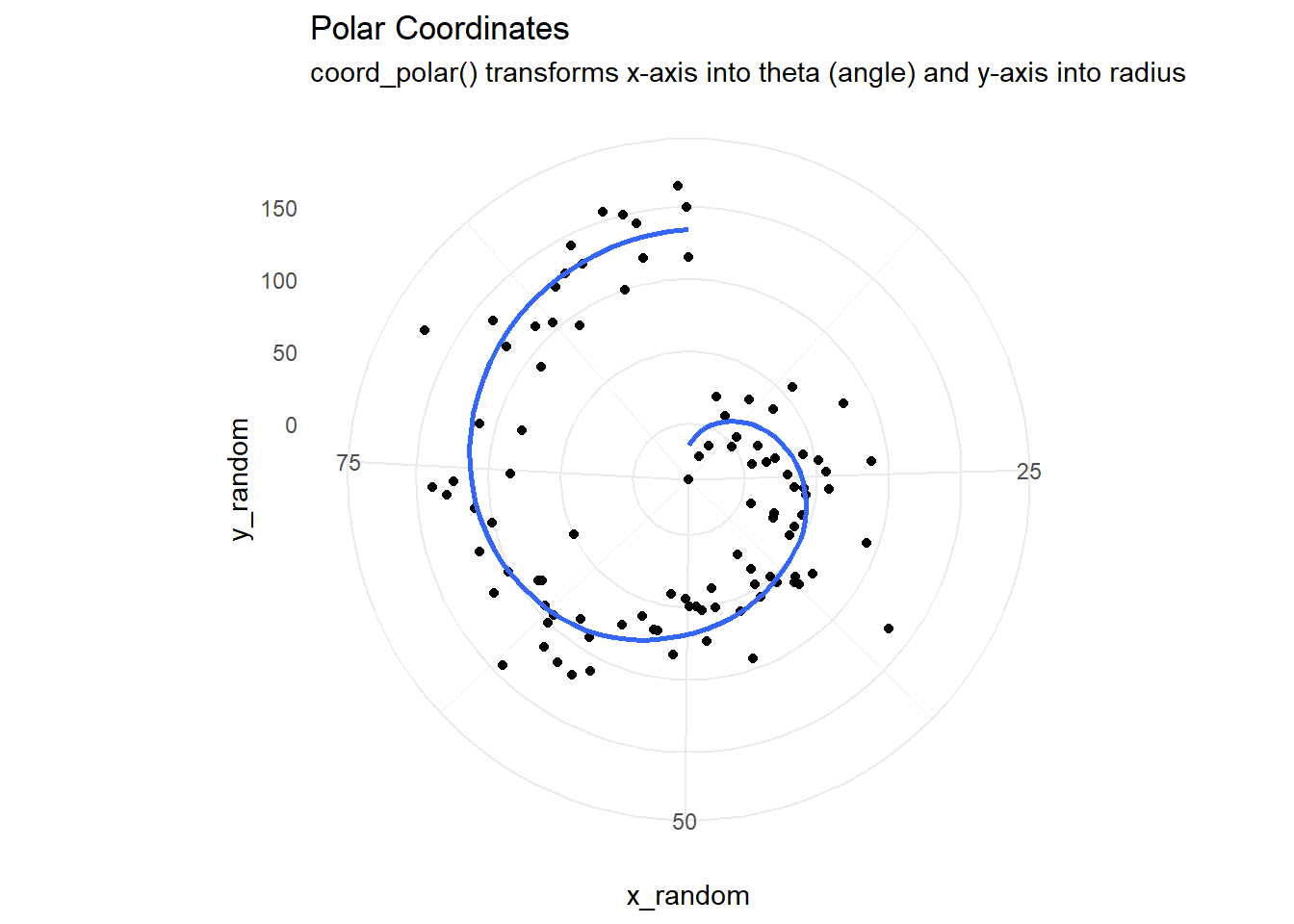
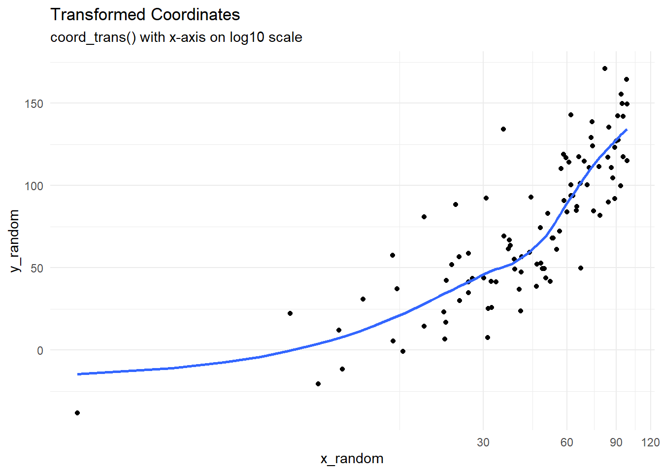
The Figure 6 demonstrates five types of coordinate systems - first three linear, and the last two non-linear.
Code
tb <- tibble(
  x_random = runif(100, min = 0, max = 100),
  y_random = (1.5 * x_random) + (rnorm(100, 0, 25))
)

g1 <- ggplot(tb, aes(x_random, y_random)) +
  geom_point() +
  geom_smooth(se = FALSE) +
  labs(title = "Cartesian Coordinates") +
  theme_minimal()

g1

g1 + coord_flip() +
  labs(title = "Flipped Coordinates",
       subtitle = "coord_flipped()")

g1 + coord_fixed() +
  labs(title = "Fixed Coordinates",
       subtitle = "coord_fixed()")

g1 + coord_polar() +
  labs(title = "Polar Coordinates",
       subtitle = "coord_polar() transforms x-axis into theta (angle) and y-axis into radius")

g1 + coord_trans(x = "log10") +
  labs(title = "Transformed Coordinates",
       subtitle = "coord_trans() with x-axis on log10 scale")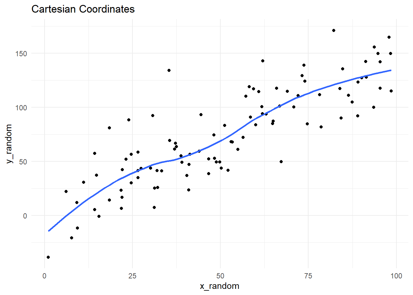
15.2.1 Transformations with coord_trans()
The impact of coord_trans() can be demonstrated in Figure 7 shown below.
Code
g1 +
  coord_trans(x = "log2") +
  scale_x_continuous(breaks = 2^(1:8)) +
  theme(panel.grid.minor = element_blank()) +
  labs(
    title = "Transformation to Log 2 scale",
    subtitle = "Note that x-axis has equidistant powers of 2"
)15.2.2 Polar coordinates with coord_polar()
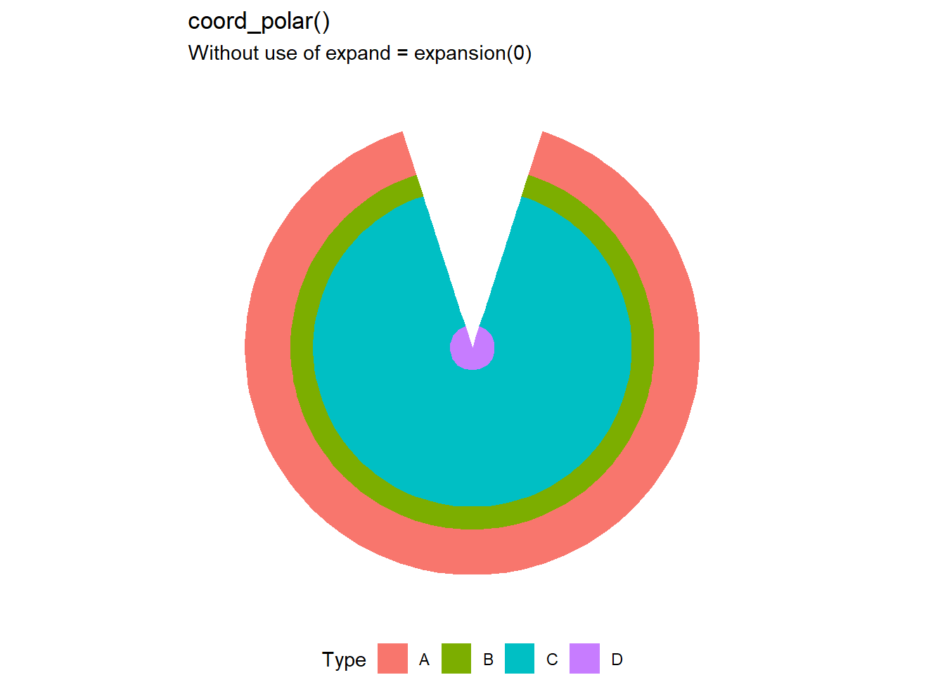
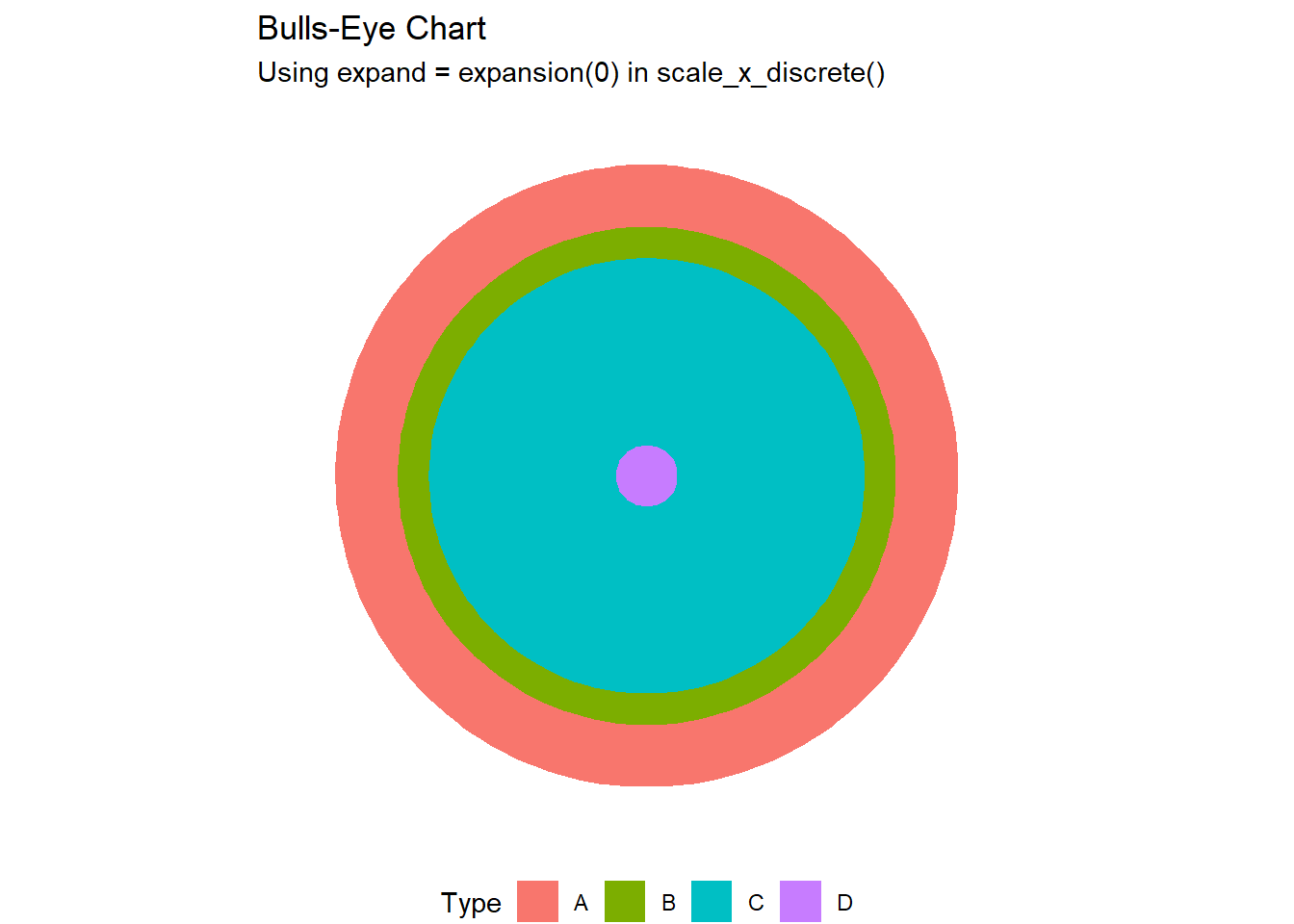
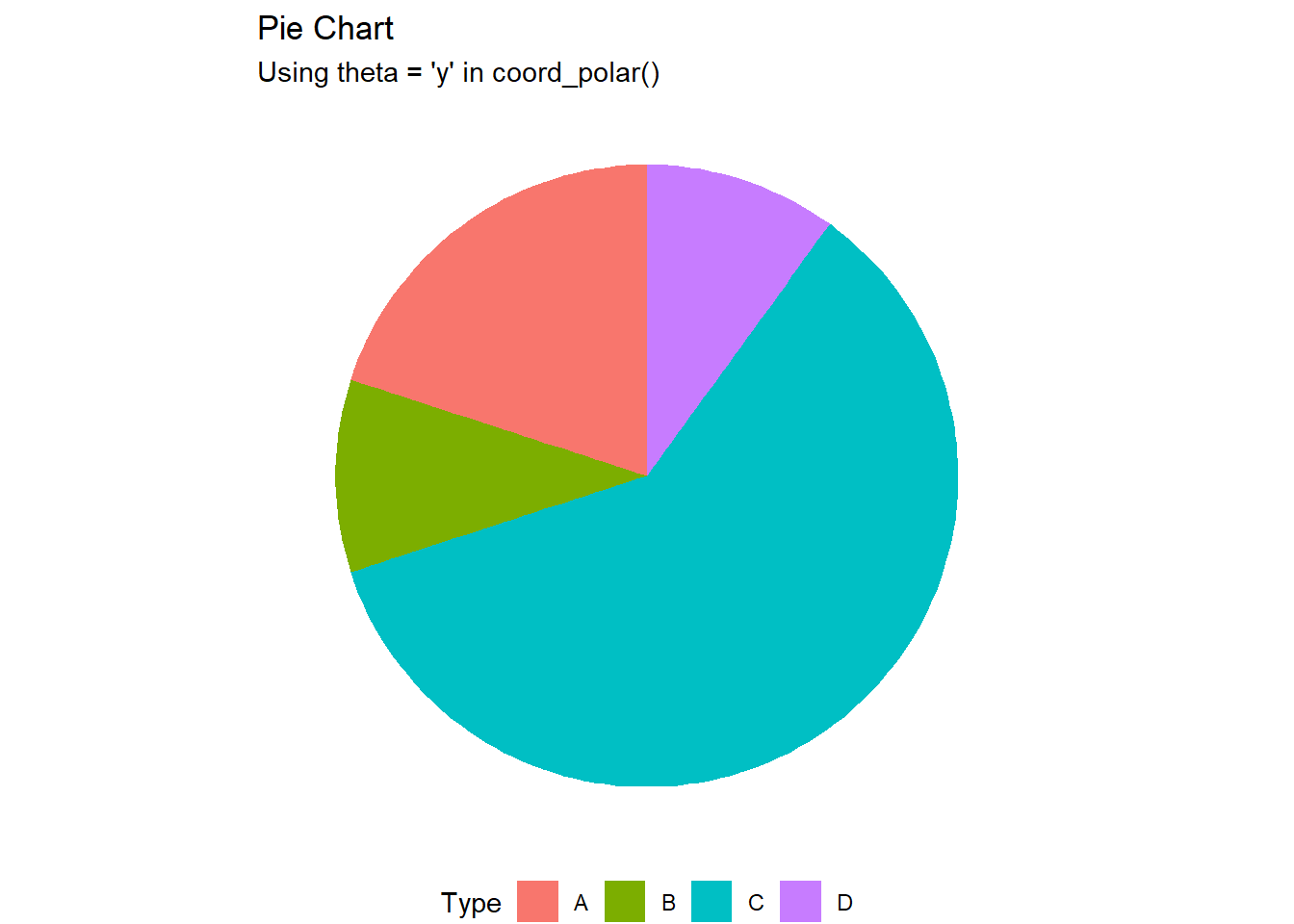
The Figure 8 demonstrates various uses of coord_polar()
Code
tb2 <- tibble(
  Type = sample(LETTERS[1:4], size = 10, replace = T)
)

g2 <- tb2 |>
  ggplot(aes(x = "1", fill = Type)) +
  geom_bar() +
  labs(title = "A Stacked Bar-Chart") +
  theme_void() +
  theme(legend.position = "bottom")

g2


g2 +
  coord_polar() +
  labs(title = "coord_polar()",
       subtitle = "Without use of expand = expansion(0)")

g2 +
  coord_polar() +
  scale_x_discrete(expand = expansion(0)) +
  labs(title = "Bulls-Eye Chart",
       subtitle = "Using expand = expansion(0) in scale_x_discrete()")

g2 +
  coord_polar(theta = "y") +
  labs(title = "Pie Chart",
       subtitle = "Using theta = 'y' in coord_polar()")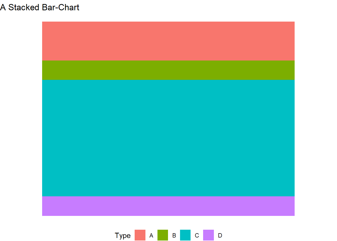
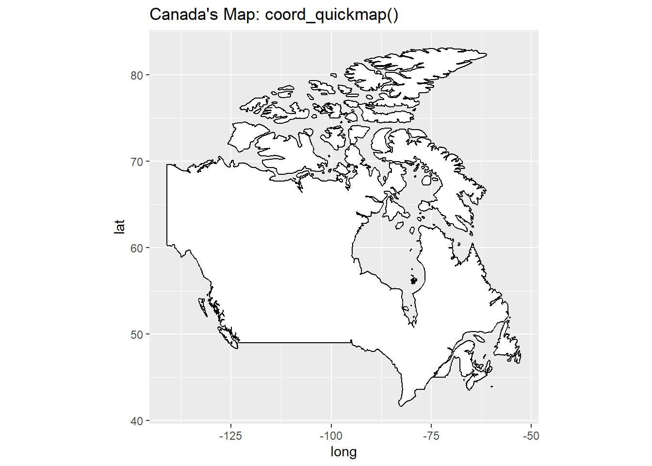
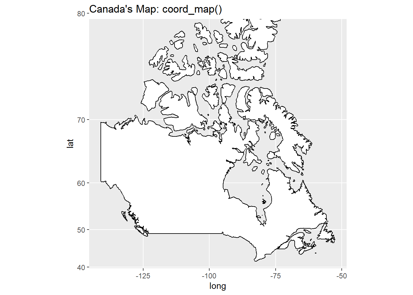
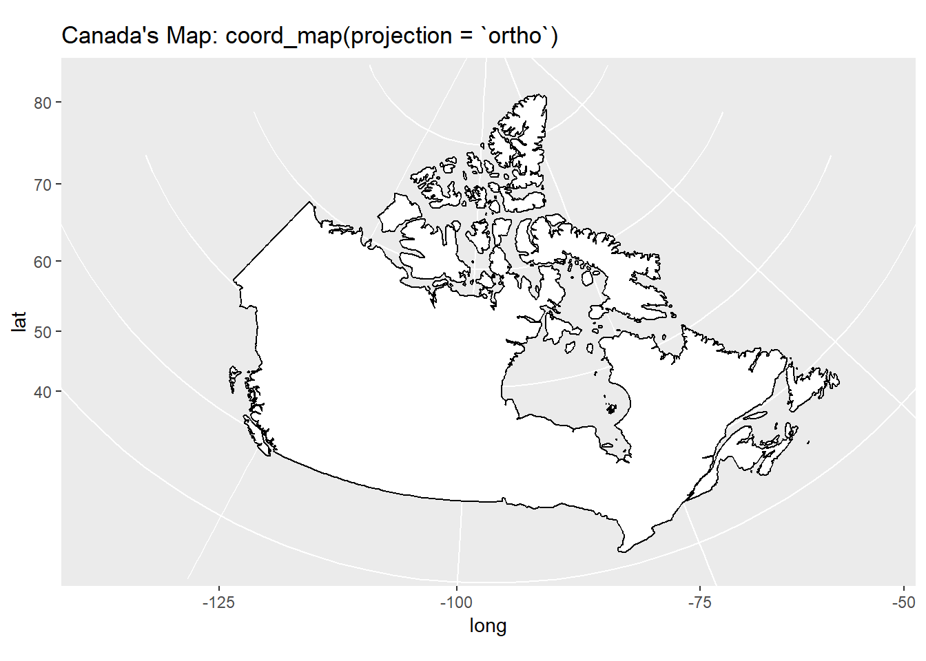
15.2.3 Map projections with coord_map()
Here, in Figure 9, we show the map of Canada with different projections.
Code
g3 <- map_data(
  database = "world",
  regions = "canada"
) |>
  ggplot(
    aes(
      x = long,
      y = lat,
      group = group
    )
  ) +
  geom_polygon(
    fill = "white",
    colour = "black"
  ) +
  theme(legend.position = "none") +
  labs(title = "Canada's Map: coord_cartesian()")

g3 +
  coord_quickmap() +
  labs(title = "Canada's Map: coord_quickmap()")

g3 +
  coord_map() +
  labs(title = "Canada's Map: coord_map()")

g3 +
  coord_map("ortho") +
  labs(title = "Canada's Map: coord_map(projection = `ortho`)")